Archives for June 2017

Fresh Baked: June 30, 2017

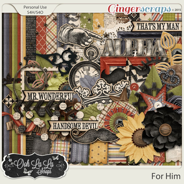
It’s nearly the end of the month. Wait … it is the end of the month! But that doesn’t mean the end of some amazing designs!

Remember when you spend $10 in the store, you get a great new collab!

fwp3222
https://store.gingerscraps.net/GingerBread-Ladies-Collab-Chillax.html

[Read more…]

Sneak Peeks June 29th, 2017

Happy last couple days of June! Fourth of July Weekend is upon us! For me, its my birthday on Monday so it’s nice to have a 4 day weekend to celebrate that =). So not only do I have sneak peeks for products releasing tomorrow, I have a sneak peek with the Buffet debuting on Saturday!

Releasing tomorrow from

From Aimee Harrison

From Craft-tastrophic

From Neia Scraps

From Miss Fish


From Pretty in Green

And heres a peek of the awesome buffet!!

Tutorial Tuesday (Photoshop Elements)

Over-the-Top TITLES

I don’t know about the rest of you but I’ve had a ridiculously busy week. Actually, all of June has been ridiculously busy! So this week’s tutorial is a quick-and-dirty little how-to that was inspired by some of the layouts popping up on my Facebook feed. I thought I’d show you how to have your title looking like it’s coming right out of a fantastic panoramic photo. So I went through some of my favourite scenic shots and chose this one of the Crescent City Connection bridge over the Mississippi River in New Orleans. In the screenshot below, the transparent canvas underneath it is 12×12, because I thought I’d use that size canvas… but…

I changed my mind and cropped it down to the same size as the photo.

Then I took a look through my fonts (using MainType 7.0, of course!) and found a meaty, slab-type font that would be perfect for my purpose. It’s called Konga Pro and it’s got that lazy, Deco summer-day kind of look to it. I typed out my title and enlarged it to stretch from one side of my canvas to the other. The photo’s visibility is turned off so I don’t get confused.

Then I copied my photo (CRTL/CMD>J) and moved the copy on top of my title as I’ve shown below.

Visibility of the first photo is still off for this step. Clip the photo to the title; CTRL/CMD>G is your WSNH shortcut.

If you’re happy with the placement and appearance, go ahead and merge your clipping mask and photo layers.  Select both the layers in the Layers panel then WSNH = CTRL/CMD>E

Now to set the title apart from the photo. Choose a colour from the photo to use for a narrow stroke around the outside. I chose one of the dark blue shades. You want a visible separation but nothing really obvious; since my photo is a night shot, dark was my choice, but if you’re using a winter scene or a beach scene, it might be better to choose a lighter colour. You’ll know it’s right when you see it.

I went with 10 pixels for this outline, just to tighten it up and give a bit of definition. I centered it on the edge to smooth out the jagged pixels.

As you can see below, it looks just fine.

Another stroke outside the first one will add a little more distinction. I tried white and 20 pixels.

Not loving it! The white is too much, and too wide. So for my next version, I dropped the width down to 10 pixels again.

I made the stroke a greenish-grey pulled from the horizon. Not really working either.

But this bronze from the lights reflecting on the water is subtle, and it looks much nicer to my eye. I’m going to go with this one.

Pop in a bit of a drop shadow and it’s just the look I was after!

With the shadow, it’s got some dimension. Give it a shot with one of your favourite scenic photos and a hefty font and see how you like it!

Let’s Celebrate – SUMMER!

We are in the full swing of Summer in the northern part of the world. With that comes some summery digital scrapbooking goodies. Man-oh-man…GingerScraps has so much of that in store! We have a section just for those summery goodies. Today we are going to take a look at a lot of those.  Next week we will take a look at some of the lovely winter digital scrapbooking supplies for our friends south of the equator. 🙂 All images below are linked. Get ready. I am going to overload you with summer goodness!

Happy Summer: A collaboration from our GingerScraps designers.


Imagine tropical sunrises, tropical drinks and watching the sunset…that is what this gorgeous collection is all about. With all those reds, oranges, golds and outlined trees, this collectioni is just perfect for those beach vacation photos.


Even though Summer is over in the Northern Hemisphere, those in the Southern Hemisphere will be entering Summer and heading for the beach. No matter your hemisphere, scrap all of your family’s Summer fun with Oh Hot Day, the new digital scrap kit by JB Studio. Created in the same color palette as Today and Everyday, Oh Hot Day is the perfect addition to help you stretch your stash.

[Read more…]

June Designer Spotlight: Tinci Designs

Omigosh, it just occurred to me that I haven’t posted the Designer Spotlight get-to-know-you post for this month and it’s almost over! Better late than never, am I right? So let’s get to know the lovely Krisztina, the creative mind behind Tinci Designs. I asked her the following questions…

J: How long have you been designing?

K: I made my first template pack during the spring of 2011. There was a short period, while I was making kits too, but then I realised, that my true passion is the creation of templates.

J: What is your design process?

K: I draw inspiration from different galleries and from Pinterest. Sometimes I spend days thinking about what kind of template to make. When I got a bright idea, I finish my work quickly. I have a fantastic team, they make amazing inspirational pages.

J: What motivates and inspires you as a designer?

K: I really enjoy making digital scrapbook pages. Since a few years I’ve been making photo albums from pictures of our family, vacations and important events. I often favor myself with making such templates, that will fit into my next photo album. Then I look forward to how others use my templates with their personal style.


J: What do you use to create your designs? (software, add-ons etc)

K: I am working with Photoshop CS6.

J: Describe your design workspace.

K: I have a PC desk, just a simple place in our dining room.

J: Do you craft outside of the digital world?

K: Not

J: What kit currently available in your GingerScraps store is your favourite, and why?

K: My favorite product at this moment is Favorite Minutes 1. template pack. I like this pack, because this well illustrates my style.

J: What’s your favourite thing about GingerScraps?

K: Since I started designing, I’ve sold my products in several stores. More than one year ago I came accross Gingerscraps store, and I found a home here. I really like working here as a designer and as a member of the store own creative team. Everybody is very kind, the place has a homely atmosphere. As soon as anyone needs help, someone will come and help. It is the best place!

J: Tea or coffee?

K: Tea

J: What was the last book you read?

K: I’m reading one of the newest novel of a Hungarian author, Búzavirág from Janka Fábián. It is a fictional story about the life of a Hungarian actress starting from the 1900s, who made it to Hollywood and became a famous actress.

J: Do you have a guilty pleasure?

K: My addiction is Nutella and salted peanut. Maybe I was a squirell in my previous life?

J: If time travel were possible, where would you go and why?

K: If I had a time machine, I would travel to a paralel universe, where fairies, kobolds, mages and other magical creatures live. Or to a future where there is peace, and robots makes our life a lot easier. I’m always a dreamer.

J: If you could have any super power, what would it be?

K: If I could have a super power, I’d choose to be able to get to anywhere in an instant. I want to visit a lot of places in the world.

Thank you for giving us a peek into your life, Krisztina!

Sneak Peeks June 22, 2017

Happy Summer! Our designers have jammed packed a ton of great new releases! So lets get to them!

From Mags Graphics

From Aimee Harrison

From Tinci

From Miss Fish

From JoCee

From Ponytails

From Lindsay Jane

From Craft-tastrophic

From Miss Mis

Tutorial Tuesday (Photoshop Elements)

Becoming an ALPHA Female

Mary left a comment on the tutorial Chalking it Up to Inspiration where she asked for some tips on using those alphas that come with many designers’ kits. She said she found them difficult to use and needed some tips for using them effectively. So that’s what we’re going to talk about today.

When I first started digi-scrapping, I didn’t use kit alphas much because, like Mary, I found them cumbersome to work with. So many things about my workflow have changed over the years and I’ve found some methods that really work for me, so I’m going to share some of them with you today. One of Mary’s comments was about finding them. Each scrapper is going to do things differently according to how they organize information in their heads, so the following is meant as a suggestion, not a directive.

I’ve read a lot of posts in various places about organizing supplies and I’ve tried lots of methods. The one that works for me best is to use folders. I make folders for everything! When I unzip my downloads, I try very hard to organize them right away; I rename them with the designer’s name and kit name then move them into the folder I’ve created for the store where I bought them. My GingerScraps  folder is HUGE!! I also take everything out of the folders the designer has put them in so I can see the whole kit when I open the folder. I used to do that with the alphas too, but found that didn’t work for me. Now they go in a subfolder of the kit folder. (Are you confused yet?) I can tell at a glance which of my kits have matching alphas. They appear in the file with a little arrow in front of the kit name as shown below. That little arrow indicates there is a subfolder. Is this making sense?

Here’s where things get interesting. You can let Windows do the work for you. Other scrappers have talked about tagging every. Single. Element. And. Paper… but you don’t have to! Designers usually call their various bits and bobs simple names like “button”, “paper” or “flower” so if you pop that keyword into the Windows search box in the upper right corner and tell it what area of your hard drive to search, it’ll go get everything with that keyword attached to it.

Because I’ve put my alphas into subfolders, my search will turn up both folders and individually named alphas as shown below. Depending on how many folders you have, this search can take awhile, so I usually open another window and start pulling my papers and elements for the layout I’m working on. Some of you may know that I like to mix up items from several kits into a single layout so I might want to use a different alpha than the one the kit provides.

Once I’ve decided on the alpha I want to use and the title I’m going to create, I’ll open a new canvas on my workspace. The size of this canvas isn’t critically important because you’ll be able to resize everything once you’ve put it together to your satisfaction. Just give yourself lots of room.

I use Elements 12, which has an unfortunate glitch in it. Everything that is dragged and dropped onto a canvas is transformed into a “smart object” and it takes on the size of the canvas it’s pulled onto. (A workaround for this is to open the element on the workspace and drag it DOWN onto the layout in the Photo Bin, which sizes it according to the original file.) Adobe has taken care of this glitch in later versions – 13 and above – so if your software is more recent, you won’t have to pay attention to this business. The screenshot below shows what V.12 does, which isn’t a big problem if your alpha is ALL-CAPS, like this one from the Seatrout Scraps collection Maybelle. It’s the kit I plan to create my layout with, so of course I had to try it out.

As you can see from the screenshot above, this DOES present a problem in terms of getting all the letters to fit the canvas. I select all the letter layers in the Layers panel so I can resize everything at the same time. WSNH, right?

You can use the Distribute tool to space your letters but it’s not always the best way to do it. I prefer to just eye-ball the spacing. If it looks right, you’ll know. Sometimes I have to resize a couple of times to get everything to fit on the canvas. It’s easy to move blocks of letters together if you’re only worried about a single space being too big or too small; just select the layers those letters are on in the Layers panel and move ’em.

Take a good look at your title to see if you like it. I think all the letters in lockstep looks blah. So I’m going to make some tweaks.

How does this look? Nah….

So I moved the last 3 letters over so they overlap where the “s”s are, and that looks better.

How about staggering them with a little overlap? Do I like that better? I think I do!

I wanted to try out several alphas for this title, so next I looked at this one from Ooh La La ScrapsShabby Chic collection. It has both upper- and lowercase letters so there’ll be a couple of extra steps.

To overcome the “smart object” issue, I select all the lower case letters in the Layers panel EXCEPT the letters “b”, “d”, “f”, “g”, “h”, “i”, “j”, “k”, “l”, “p”, “q” “t” and “y”. If the “z” has a tail on it, I don’t select it either. The reason for NOT selecting those is that they either supposed to be the same height as the CAPs, or they extend below the baseline. Instead, I use these letters to guide my resizing efforts. This example doesn’t show you what to do with those letters that dangle, the ones that you DON’T resize. I’ll talk about that below.

The screenshot below shows you what I mean. You can use the bounding box to help you get the size just right – the top of the bounding box is just touching the top of the “i”.

Once again, there’s a size/space problem. Or is there?

I think I like the overlap, so let’s leave it there.

Or, creatively, I might tilt one of the letters slightly. I like to do that especially with the letter “o”, but “s” looks cool tipped too.

But let’s try a staggered arrangement… remember to shadow the letters that overlap others. Otherwise it will look odd. Maybe not to your eyes, but somebody will notice – and you want them to be overcome by the beauty of your work, not the wonky missing shadows, right?!

I wanted to try just one more alpha, one that’s sort of a glossy script from WimpychomersPurple is Her Passion. It’s a little hard to see in the screenshots because it’s white, so you might have to move your head/screen around a bit to see what I’m showing you. If you’re not using guides – lines that make it easier to position things, this might encourage you to do it. This tip will help you to align those dangling “g”s, “p”s, “q”s and “y”s. To create a guide place your cursor on the upper (or far left for a vertical guide) edge and click/drag down (or over) to one of your lowercase letters. You can then resize other letters one at a time, and you can align the danglers by nudging them downward until the top of the letter is even with the top of the resized lowercase ones. When you don’t need the guide any more you can click on View>Guides (or CTRL/CMD>;) and it’ll go away.

This alpha looks a lot like cursive writing, especially after I overlapped the swashes a bit.

I think, for this layout, the title needs a little more oomph. So I’m going to make my canvas a little bit bigger. It’s fine side-to-side, but needs to be a bit bigger top-to-bottom. Image>Resize>Canvas Size (CTRL/CMD>Alt>C) brings up the menu shown below. I just added 1/2 an inch to the height. You would need to take this step if you’re using danglers too, because your baseline isn’t going to rest at the bottom of the canvas.

Then I dropped a paper behind my alpha. I dragged it from the workspace DOWN onto the canvas, and then shrunk it to fit, rather than dragging it UP from the Photo Bin onto the canvas and then resizing up but it isn’t important. Then I clicked on the title thumbnail to select the edges of the alpha.

By going to Select>Modify>Expand then keying in 30 pixels, the marching ants will move 30 pixels out from the edges of the alpha.

Go back to Select>Inverse (CTRL/CMD>Shift>I) to invert the area selected to the excess paper. Then Delete or CTRL/CMD>X and all that extra paper is cut away.

It looks good, but still needs something. You might also notice that the paper layer thumbnail looks strange. That’s because the paper layer is larger than the canvas so I cropped the canvas to eliminate that. CTRL/CMD>C activates the Crop tool.

See how different the layer thumbnail looks now?

I’m going to put a glittery edge around the paper, so I added a new layer ABOVE the paper cutout, then clicked on the layer thumbnail to get my marching ants. Then I added a stroke – colour doesn’t matter – to the paper. Edit>Stroke (Outline Selection) and a number in the box – 10 pixels here ON THE NEW LAYER gives me something to attach my glitter style to.

Now we’re cookin’! It has so much more presence now.

The second-to-last step is to put a slight shadow on the alpha layer so it looks like it’s been written with gel. Then as a very last step I merge or link the layers so when I go to drag the title onto my layout, it all goes together.

So I’ve shown you three different kit alphas and three different options for their use. I hope this has you thinking a little more kindly toward those alphas and I hope to be seeing them in use on your creations! Which option do you think I chose for my layout?

Remember, if you’ve used a technique from these tutorials, post your finished layout in the GingerScraps Facebook Tutorial Tuesday Challenge Gallery for an opportunity to have YOUR chance to challenge me. If you’re not a Facebooker, you can post a link to the layout you’ve created with the tutorial you used in the comments section here on the Blog. I’ll get a notification and will then enter you into the draw. The first week of each month I’ll have a random draw of all entries and the winner will be announced at the end of the first tutorial of that month.

Let’s Celebrate – Father’s Day!

In our family there are more guys than gals. I find myself snapping up nearly every masculine kit/collection that comes my way. Here are GingerScraps we have a section dedicated to not only all things manly, but to Father’s Day as well. With Father’s day just a few days away here in the states, I thought we could take a look at things to scrap those men and boys in our lives. All images below are linked to their counterpart in the store.

Whether your favorite guy is your dad, husband, brother or son, let them know they’re your favorite guy by scrapping all those manly memories with My Favorite Guy, the new digital scrapbook kit by JB Studio. My Favorite Guy has been created in a beautiful color palette of blue and orange, and is chock full of elements and word bits that will help you document all the fun memories of the guys in your life.


Dapper: From our GingerScraps designers.


About Dad is truly about so much more than Father’s Day. I’ve included lots of elements in many themes that men tend to enjoy; sports, gaming and tech, tools and wood-working, hunting & fishing, beer and bbq, menswear, and perhaps some of their less favorite things like household chores. There is a ton of word art which means I couldn’t show it all to you in the preview and a half-dozen journal cards too. I’ve included a number of wordarts featuring words like grandpa, papa, and neutrals like guy. This is a go-to extremely versatile kit for pages about the men in your lives.


Summer is here so get your grill on! License to Grill is the ultimate summer cookout collection, packed with everything you need to document a good old fashioned BBQ, family gatherings, tailgate parties, 4th of July cookouts, even the self-proclaimed “grill master” in your family … Overflowing with my own custom-drawn graphics, this collection includes burgers and hot dogs, steaks and skewers, condiments and grilling utensils, beer and soda bottles, grills, flames, plus many other grilling elements and patterns to make for tasty lasting memories.


Monthly Mix: Hey Handsome: A collaboration from our GingerScraps designers. Father’s Day. Summer. Brothers. Sons. Fathers. All the males in your life are meant to be celebrated! With this kit, now you can do it, perfectly! Show off those wonderful men in your life!


Man Of The House: A collaboration from our GingerScraps designers.


Perfect for layouts about a special man in your life, your own father, your other half, or grandfathers alike, this kit is a must-have to scrap the men in your life. Full of manly accessories and bold masculine colors.


King of the Grill – Digital Scrapbooking Kit by Ponytails Designs BBQ… with a pair of tongs, some flames, and a big chunk of meat a man establishes himself as a specialty gourmet chef. Each grill master has his own style and special marinade, and much time is spent discussing the ins and outs of the process with buddies. Standing over a grill, a man can feel like a “real” man providing meat for his family. (And behind every grill master there’s usually a woman doing the bulk of the work!)


My Dad Kit from Blue Heart Scraps, to coordinate with the June 2015 Buffet. Includes 15 textured papers (6 plain, 9 patterned) and 54 elements.


Fresh Baked: June 16, 2017

Happy Friday! The middle of the month is upon us! Sunday is Father’s Day and the 20th is the first official day of Summer! It’s going to be a great week, you can tell, just by looking at the kits that the designers have created! Plenty of template series are being released as well! There’s something for everyone!

Remember when you spend $10 in the store, you get a great new collab!

fwp322
https://store.gingerscraps.net/GingerBread-Ladies-Collab-Chillax.html

[Read more…]

Sneak Peeks June 15th, 2017

Happy Thursday! Even though Summer doesn’t officially start until next week, it sure feels like Summer! Beat the heat and scrap this weekend with awesome new kits and templates from our amazing designers!

From Tinci

From Craft-tastrophic


From JoCee

From Neia Scraps

From CathyK

Have a wonderful weekend!