Raindrops Keep Falling on My Head
![]()
Actually, here in north-central Alberta it’s snowing on my head today….
Last week’s tutorial elicited quite a few comments. Pam mentioned in hers that she liked the sandy look but wanted to know how to make digital raindrops and Lynden Blossom wanted to know what I planned to do with my sandy leaf. So your faithful scribe set out to meet those directives. (Sorry, Jill. There is no tutorial arising from my Color Challenge layout.)
I started with a 12×12 blank, transparent canvas. Then I chose the Elliptical Marquee tool to make my droplets.
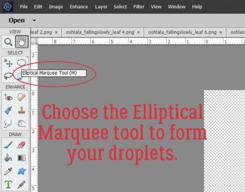
Water droplets are spherical when they’re suspended in space and have a domed appearance when they’re on a surface. So I set the Tool Options to Fixed Ratio 1:1 to give me a perfect circle. I clicked-and-dragged out my first droplet and filled it with white using the Paint Bucket.
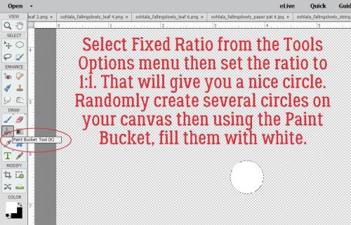
You can click-and-drag out a random (odd) number of drops of varying sizes using that method, or you can just copy that first one then resize them to suit.
I made 5 round drops to start with. Then, because the photo I used in my layout looked stormy, I thought I’d add some falling drops too. The Custom Shape tool has a raindrop in the default shapes, so it was pretty simple to click-and-drag out a raindrop using white again.
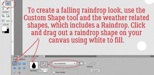
I want to be able to resize and alter the shape a little bit, but there’s a raindrop!
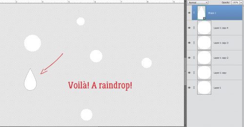
To be able to make changes to the image, I Simplified the layer.
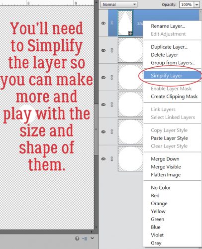
Then I could change the angle on the drop to match the direction the rain would be falling from in the photo. I copied (CTRL/CMD>J)the layer a few times and resized them randomly.
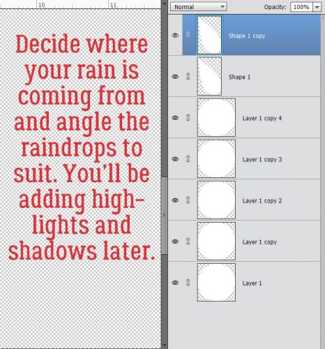
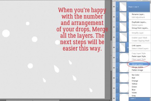
After I had a good (odd) number of droplets, I Merged all the layers together. (CTRL/CMD>E) That way I could apply my next few steps to all of them in one click.
We’ve talked about Styles before in several other tutorials. What they are is a group of adjustments that make the layer take on a different look. Way down at the bottom of the list of Styles in PSE’s defaults is one called Wow Plastic. That’s the one I used. The menu looks like this.
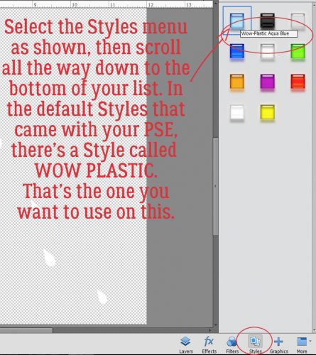
One click on that Wow Plastic Aqua Blue turned them all into this.
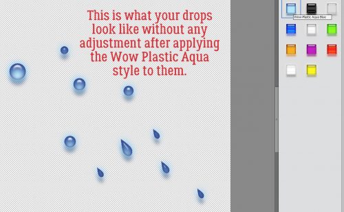
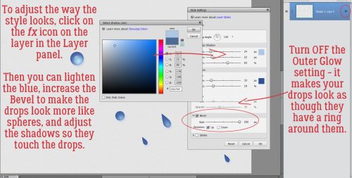
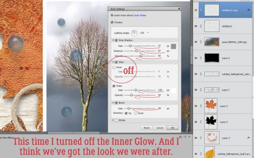
I felt the blue was too blue, so I double-clicked on the fx icon on the layer in the Layers panel to get into the adjustment menu. I changed the blue on the shadow layer to one much lighter, and I turned off the Outer Glow setting because it made the drops look like they had a wire ring around them. The Bevel went to the max setting to make them look more spherical.
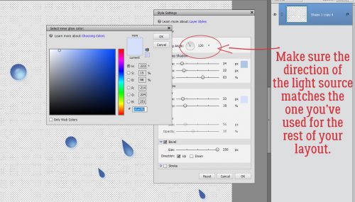
I also made sure the light source was coming from the same direction so there’s no visual conflict.
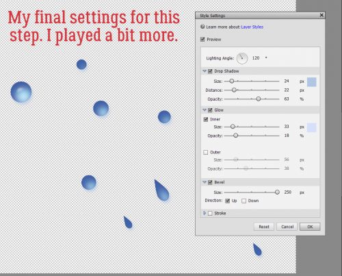
Below are my final adjustment settings.
As I’ve mentioned before, I have a variety of purchased Styles in my stash – including a water set, but I wanted to make sure everybody could accomplish the look without having to buy anything else.
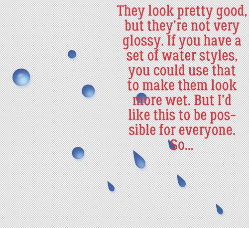
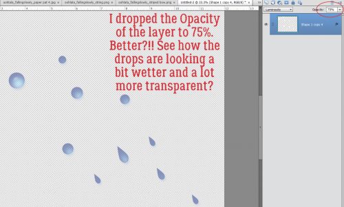
But OH they’re blue!! So I dropped the Opacity to 75%.
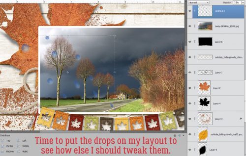
Then it was time to see how they all looked on my layout. So I dropped them onto it and moved it into place.
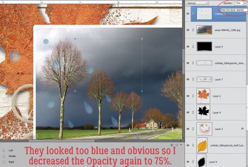
They still looked too blue and obvious so I dropped the Opacity again to 75% and liked it better.
But alas, they’re not very WET. I didn’t want to mess up what I’d already done, so I Duplicated (CTRL/CMD>J)the layer to give me a throw-away if what I wanted to try didn’t work.
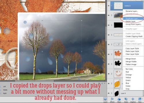
Because the two layers are only 75% Opacity, I can see the underlying layer through the top one. That’s helpful; I went into Enhance>Adjust Color>Adjust Hue/Saturation (CTRL/CMD>U) and played with that.
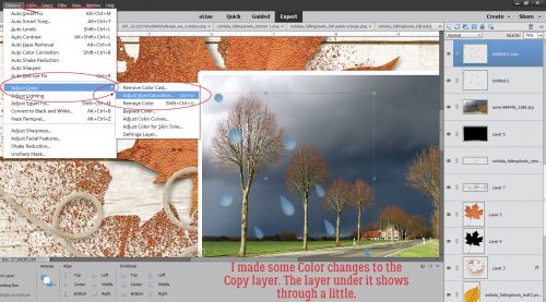
I took the Saturation down to 0 and increased the Lightness to +20. Now it’s got a stormy gray look to the top layer.
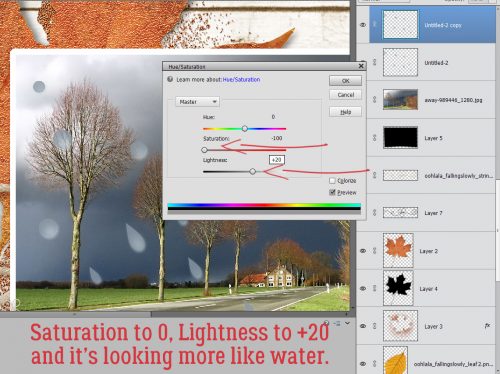
Now it’s looking more like a water droplet on the leaf, but not so much on the photo. Hmm.
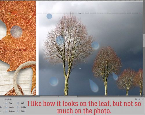
There has to be a way…
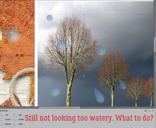
Back I went to the Styles>Wow Plastic menu and this time I chose the Clear style. I’m still on that copy layer on top of my original droplet layer.
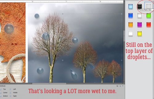
A few tweaks of the Style in the fx menu and NOW I’m happy!! For this adjustment I turned off the INNER Glow. You could follow all of these steps on your blank canvas before moving it to your layout now that I’ve done all the experimentation for you. 😉
You can see my entire layout in the Gallery. For the layout I used Ooh La La Scraps‘ Falling Slowly collection (sans Styles) and a photo I found on Pixabay. (If you’re not familiar with Pixabay, you need to check it out!)
Happy Hallowe’en!
![]()