Another Way to Have the Photo You REALLY Wanted, Not the One You Got
![]()
I have another amazingly simple Guided Edit to show you today. When I took the photo of the young lady you’ll see in a moment, I didn’t really have any control over the situation and wanted a shot of her one way or another. Later, when I started looking at my photos critically, I saw an opportunity to create the photo I REALLY wanted and at the same time, I had food for another tutorial, so prepare to be awed!

The cars in the photo of the piper are really distracting, but I knew I wouldn’t get another chance to get a photo of her alone. She was preparing to lead a “parade” of Irish Canadians into a field for a special event and there would be a lot of people in the way later. So I went for it. The lighting in the second photo is similar and the time of day is similar so I chose it for my new background.
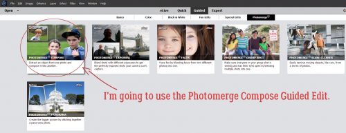
This was my very first attempt to use this Guided Edit, so don’t feel intimidated. It’s very user-friendly! It’s called Photomerge Compose and it lets you move things from one photo into another quite quickly and easily.

The first step is to drag and drop the “source” photo onto the workspace. I’m going to move the woman from in front of the cars and stand her in front of the cork tree, so I put the photo of her here.

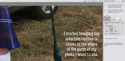
The second step was to begin defining the part of the photo I wanted to merge with the background photo. I started with the Quick Selection Tool. If you’re not familiar with that tool, it uses a brush to add or subtract parts of your photo. I dragged a fairly small brush over her body and bagpipes to crudely select her from her background.

As I dragged my brush over the photo, marching ants appeared around the areas I’d selected. It really doesn’t have to be precise at this stage because there are several occasions for fine-tuning the selection in later steps.

I like to zoom in on my image so I can be more precise, but when I’ve gotten what I want selected in the area I can see, I need to shift the area I’m working on to another part of the photo. It’s easily accomplished here by using the Hand Tool to click and drag on the photo to another area. Then I clicked on the Quick Selection Tool button on the tool panel again and went back to work.

Once I had a (very) crude outline of the woman I used the same tool with the Subtract setting to remove more areas of the background.
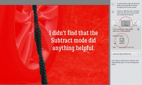
I was THRILLED to see how this next tool works! The Outline Select tool makes refining the edges of a selection so much easier and cleaner! Who knew?

Whoa! It uses a red mask to cover up the parts of the photo I’ve already excluded and lets me see how raggedy the edges of my selection really are. The brush for this tool can be either dragged around the edges to smooth them or to slice away small areas by clicking on them.

I tried to see some redeeming quality to the Subtract mode for this tool, but couldn’t really see one.
If my image still needed a bit more refining, I have the option of using the Refine Select setting and it’s good with a small brush to crisp up the edges where fine detail exists and for areas where colour differences are very subtle. I could push out the edge a little or pull it in a little where needed.

When I was satisfied with my selection, I clicked on the Next button at the bottom right corner of the workspace. Elements automatically moved my woman onto the photo of the cork tree.

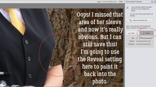
Well, look at that! I wasn’t all that careful when I hit the Next and now I see I missed an area of her sleeve with my selection. But have no fear! I can fix it!! I moved her down a bit so she looked like she really was standing under the tree using the Move and Resize button. Then I clicked on the Reveal tool. It let me “paint” her sleeve back into the photo.
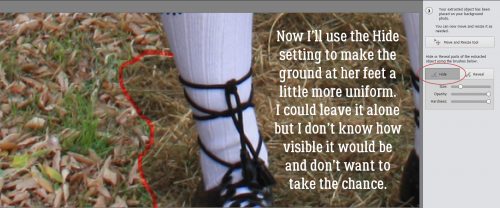
Down by her feet, I didn’t bother to select out the grass, and now by using the Hide tool I can “paint” in the leaves and grass as it is under the tree.
It really was easy!

As I said at the beginning, I had two photos that had very similar lighting and saturation, taken as they were at roughly the same time of day, with similar weather conditions. So I didn’t need to make much of an adjustment. But this Guided Edit knows not every pair of photos are going to play so well together. The top button shown is called Auto Match Color Tone. When I clicked it, I didn’t see any difference. So then I went on to look at lighting. Could I tweak it a smidge to make it look mroe natural?
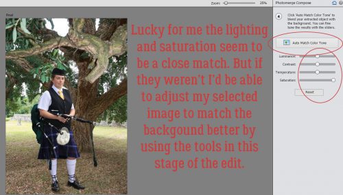
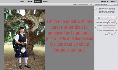
Well, I adjusted both the Luminance and the Contrast just a tiny bit.
Because she was standing under some trees in the original photo and is here too, she wouldn’t be casting much of a shadow, so my work was done.

I’m so happy with how this turned out and I know I’ll be using this again!
![]()