![]()
Fontography with Alphas
I’m a bit under the weather today but didn’t want to leave y’all hanging so I whipped together a little discussion on how to pair those awesome alphas that come in so many of the kits at GingerScraps with the perfect font. The inspiration for this came from my friend Bea, known as beatricemi. I like to use alphas, that’s no secret, and they’re great for those layouts where you want a title and a subtitle.
A lot of the same principles I talked about in the tutorial on pairing fonts also apply to pairing an alpha with a font. They need to compliment each other, as well as the overall theme of your layout, but you don’t want them to be too matchy-matchy. You want one of them to be the boss, the alpha being the most likely choice, since you’ll be adding a drop shadow to it. You want your font to be legible.


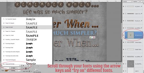
By far the best tip I can give you for this task is to try them on for size. In Photoshop Elements, (before you Simplify the text layer) you can preview your text in each of your fonts just by highlighting the text then scrolling through your font library with the arrow keys. The software will change the text right in front of you. You’ll know right away which ones DON’T work, but might have to play around a bit with some of the ones that DO work. Nothing is carved in stone until you say it is!
![]()