Summertime Funtime Fonts
![]()
So… I finally got around to updating the master link list for all the Tutorial Tuesday posts yesterday. This is TT post #139!! Amazing… that I’ve found that much to yammer on about! While I was going over the list, I realized that I haven’t done a post with summertime fonts and such. Here in the northern hemisphere, we’ve just past the summer solstice and welcomed the formal season. We’re under a huge bank of rain clouds and parts of Alberta and BC got snow on the 21st, so we’re not feeling summer love right now, but I’ve got a baker’s dozen today, a mixture of fonts and ding bats, all found free at dafont.com.
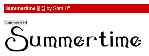
First up is this font, ironically named Summertime. It’s pretty and would be an amazing title font for garden photos, weddings and other celebrations.
Next up is a fun font with some alternate characters from some of the letters, like that cure sun for the “O”.
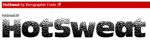
If you live in the parts of the world where temperatures soar in the summer, (or you have annual forest fires 🙁 )this font might catch your eye.

This one made me almost spew my coffee. It looks just like I did at work last Tuesday! But I think it could be super for titles.
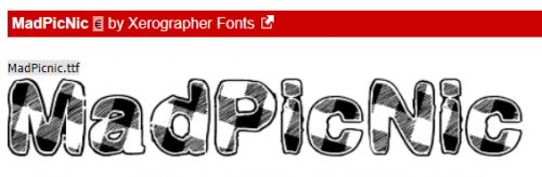
Think about doing this one in a dark red, and you’ve got a great picnic layout title. Or a cookout, if you go for gingham tablecloths.
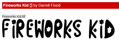
This one I threw in because two big celebrations are coming up fast. Canada Day and Independence Day. So fireworks are a natural.
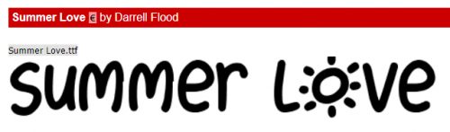
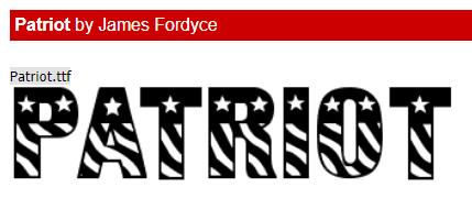
This one and the next are different takes on a similar theme. I can’t decide which one I like better.
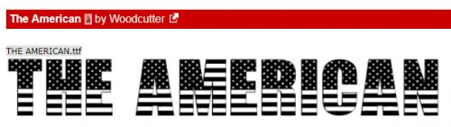
Can you?
Now for some ding bats. Ding bats are little mini line drawings that can be used in the same way as a font, but with very interesting and fun results.
These are all very summery and could be used in so many ways.
This set could be used for more adult layouts. They’re solid, but by duplicating the layers, it would be easy to change colours and add glitter.

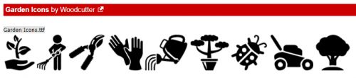
Same for these ones. I’m an avid gardener and have scads of garden photos. I’ll have to think about how I can use these.
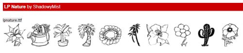
This set has a mixture of images. The cactus could be incorporated into a desert layout title with that Summer Fire font. Amiright?
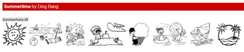
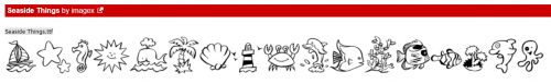
This set looks like so much fun! A day at the beach…
I have one last piece of news to add to this week’s post. Tomorrow is my last day of work in my real job. After 24 years of pediatric critical care nursing, I’m retiring. So I’ll have more time for hobbies… <does the happy dance> which is great timing, because I jumped on the Adobe sale for Elements 2019. Time to learn a few new tricks! (More to come on my retirement plans when I have them firmed up.) Have a great week, see you right here again next Tuesday!
![]()
oh brother .. i TRY to be a recovering fontaholic BUT someone always jumps in to feed my addiction!!! GREAT font choices … and between the two patriotic ones, i have to go with Patriot since i’m more apt to go with curves. so i will see you those two patriotic ones and raise you Patriot Anthem (also at Dafont). that one is curvy AND has fireworks!!! lucky girl to retirement!!! i have one more year until mine … so i will be expecting some PSE 2019 tuts … i’m still slightly on the fence (although i did download the trial) .. that way when i retire, i will have some fun learning to look forward! stay cool (yes, summer has set in here in the NE … NJ .. hot and humid and UGH!!!!).
and .. i looked closer at the Summer Icons .. LOVE those!!! so many cute little icons that would look great as accents on a LO! or directly on a photo in the LO either in black or white. great choices! thank you!
I love fonts … and have started to collect waaay too many! Thanks for this collection of fun summer fonts! I’m going to have to start checking out those ding bat fonts; I haven’t used any yet but I can see the many possibilities for their use.
Congratulations on your retirement!! I hope that whatever you decide to do in your free time, that you have the time to keep writing up these great tutorials!!! & where would we find this master link list for all your past tutorials?
Congratulations on your upcoming retirement! Awesome!
Congratulations on your retirement!! Enjoy!! Loving these fonts – thanks for posting them!
Hey Jan, CONGRATS!! on your retirement. Gee, if you worked at the hospital I work at I’d be interviewing you for a story in our employee newsletter! Yep, that’s what I do. Meet interesting people and tell their stories. I even take the photos sometimes, too. Happy retirement. I’m sure you will be missed.
Jan – enjoy your retirement! And thanks for updating the Tutorial list! You have passed on much knowledge – can’t wait to see what interesting information is to come!
First and most importantly, Congratulations on your retirement. Before long you will be wondering how you ever had time for a full time job!
Now second…More fonts, UGH!, I love the different creative fonts and using a basic like arial and myrad pro are relegated to journaling when I can’t find something better. However, can you give some ideas on how to categorize the fonts. I have a hard remembering what I have, 2. deciding on categories for the fonts, 3. seeing what the font looks like and if there are numbers and punctuations without loading on computer, 4. Organizing them so I can better find what I want. I know you did a Tut (May 23, 2017) using main type by High logic and I did download it. (only using the free version) Doesn’t work for me like it does you, Can never tell is the font automaticlly was added to the program when I put it in my font folder and if it was, since I dont know what type of categories to use, I dont know how to tag it anyway.
Well thanks for letting me spew, back to re-reading your tut to see what I misssed and most importantly, Congrats on retirement
I’m more in love with Patriot too. I’ll give Patriotic Anthem a look-see.
I’ve used PSE 2019 to do a layout and didn’t find it any different to work with for the basics. But there are some things I’m going to take a closer look at, particularly in the Test tool. Stay tuned!
Oh yes!! Do look at ding bats! They’re so cool!!
The master list of tutorials is here: https://gingerscraps.net/gsblog/2018/12/tutorial-tuesday-tutorials/
Well that would be a first – an interview with someone who doesn’t have a plaque on a door somewhere and a spot on the org chart. I’m still wrapping my head around being retired. It’s a bit surreal.
Oh Ellen! MainType is whatever you decide you want it to be. You get to decide what tags you use, and you can use keywords that are meaningful for you. Tags that I use are things like “serif”, “sans serif”, “cartoon”, “script”, “handwritten”, “printed”, “kiddie”, “Christmas”, “Hallowe’en”, “all caps” and that kind of thing. It’s labour-intensive to set it all up, but it saves SO much time later! When you install a font (or 40) on your computer, MainType will find them all and add them to your database. Then you’d go in and tag them with your chosen tags. You can also use more than one tag, like “cartoon” and “Christmas”. Then you could use either keyword to find them. I ended up buying the full version because I was way over 2000 fonts and ding bats, so it was worth it.
Thanks for the link to the master list!!!!