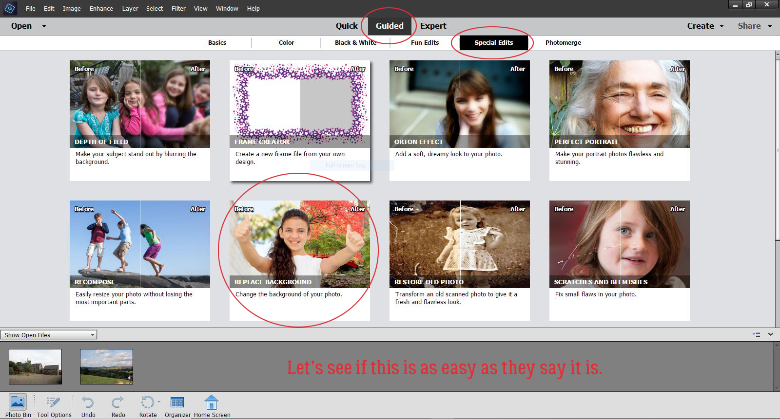
Background Check
![]()
Well, this didn’t turn out to be the fantabulous tutorial I had planned… let it be a cautionary tale instead! (I seem to be providing a lot of those lately.) What I was hoping would be simple and fun turned out to be more work than I expected, but it’s all good. I learned a few things while I was doing it and can provide tips for you to make it better for you. And that’s the goal with these tuts, right?
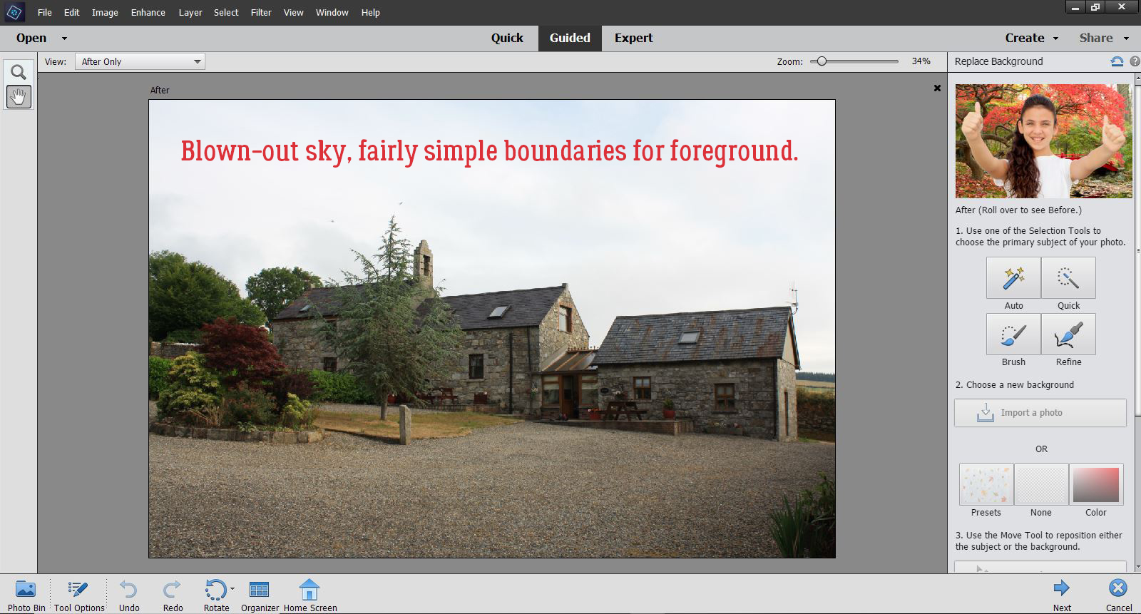
Starting with Photoshop Elements 2018, a Guided Edit for replacing an undesirable background was included in the Special Edits menu. I have SO many photos with blown-out skies that I’d love to replace with something more attractive, so I pulled one out of my Ireland 2018 folder. Let me say right now that next time I do this, I’ll be making some changes in how I do it. I’ll describe those changes as I go along.
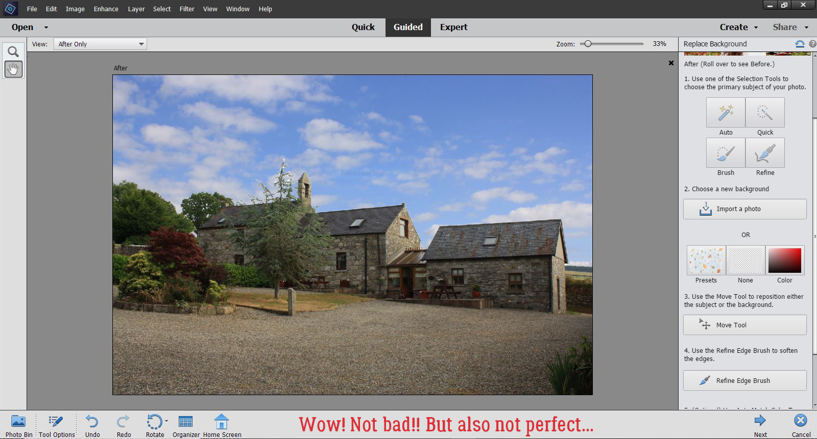
So here’s my base photo, the one I want to improve on. The sky is pretty blown-out; this can be prevented in-camera through the use of neutral density filters, but I haven’t mastered that technique yet. It’s on my list… Anyway, I thought this would be a fairly simple edit, since the foreground is fairly sharply defined. When you try this, you might want to avoid trees. Just sayin’.
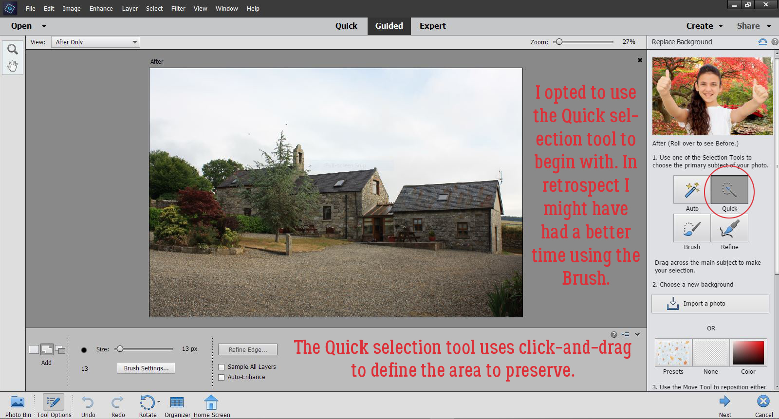
I tried the Auto selection tool but felt like it lacked control so I backed up and went with the Quick selection tool instead. It worked pretty well, for the most part. With a little more patience at this stage, I might have saved some time and effort later but that’s all part of the learning curve. I think the Brush tool might have been a better choice, and I’ll be trying that out in future edits.
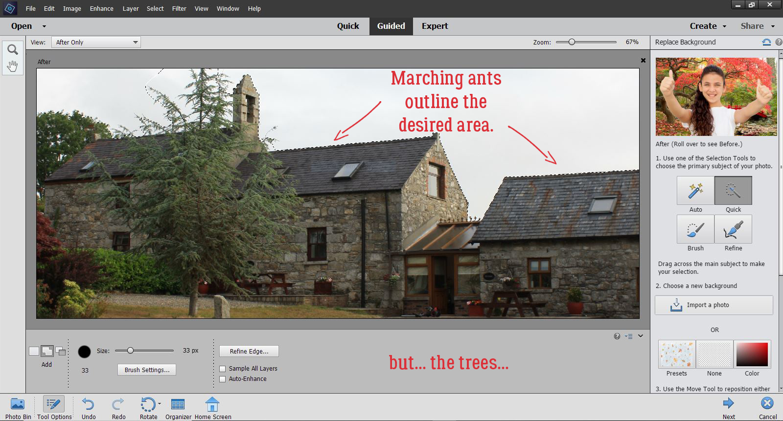
Once I’d brought most of the foreground image into the selection, it was time for fine-tuning. See the marching ants along the roofline? The spruce in the foreground extends past the roof and needs to be included in the image. The trees on the far left are inside the selection already but will need some tweaking too.
When I moved to the Refine selection tool, the selected area turned red. The settings for this are customizable; I went with the defaults. With the mask at 80% Opacity, I can see where the mask obscures areas I want to include, and the white area is where I need to extend the selection.
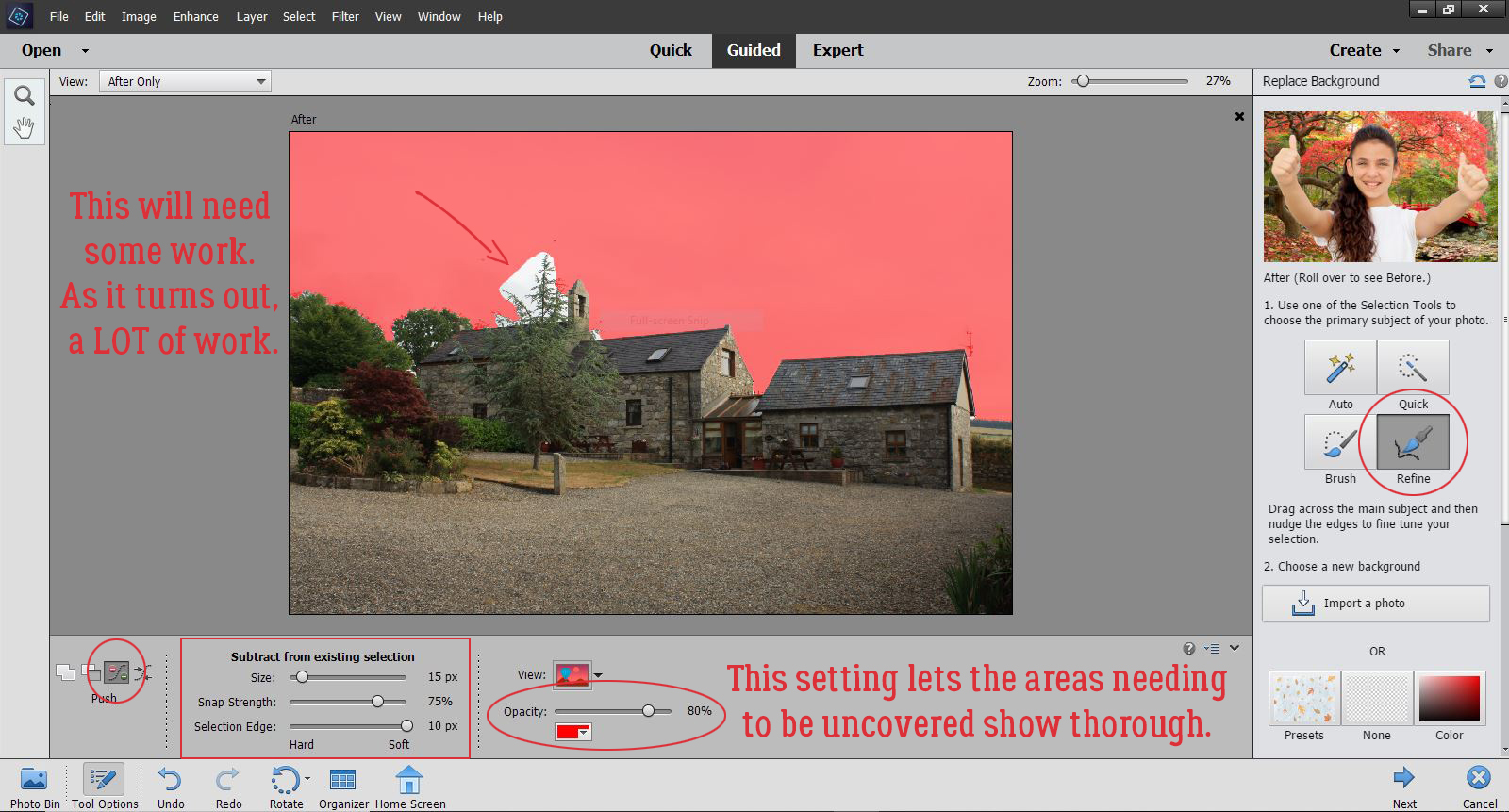
I found this part of the process to be a little frustrating. I couldn’t zoom in to see what I was doing. The Refine tool is supposed to “snap” to the outline where two colours abut, and perhaps if I changed the tool setting for Snap Strength to 100% it might have worked better for me. Having gone through the whole Edit, this is where I would choose to spend my time Refining in future.
At this point, I went ahead and chose the photo with the desired background by clicking on the Import a photo bar. It opened up the folder where I got my original image, and lucky for me, there were a few choices of a nicer background in there. But it would be easy enough to go to a different folder and pick something there.
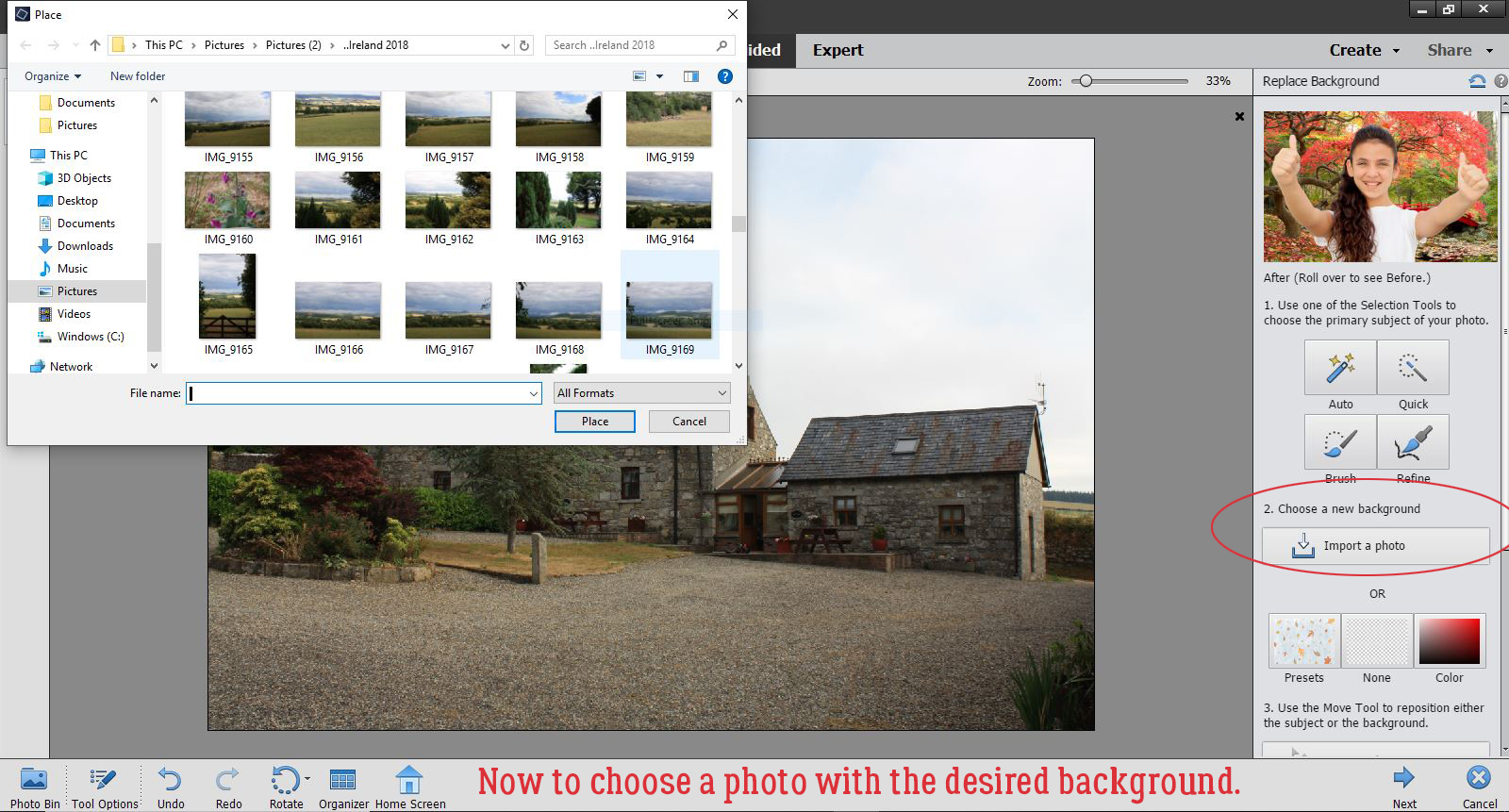
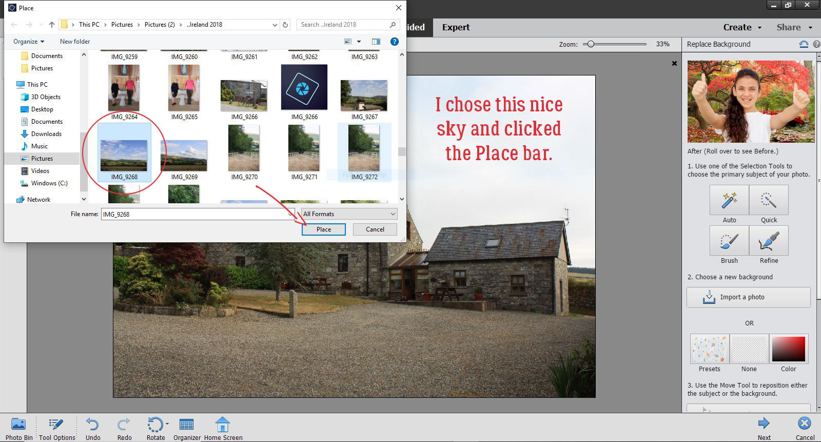
I had this lovely landscape of blue sky with puffy white clouds that will fill the selected area beautifully. So I selected it and clicked Place. If I didn’t have a photo with something nice that would work, I could have used one of the Presets or a solid colour, or nothing at all.
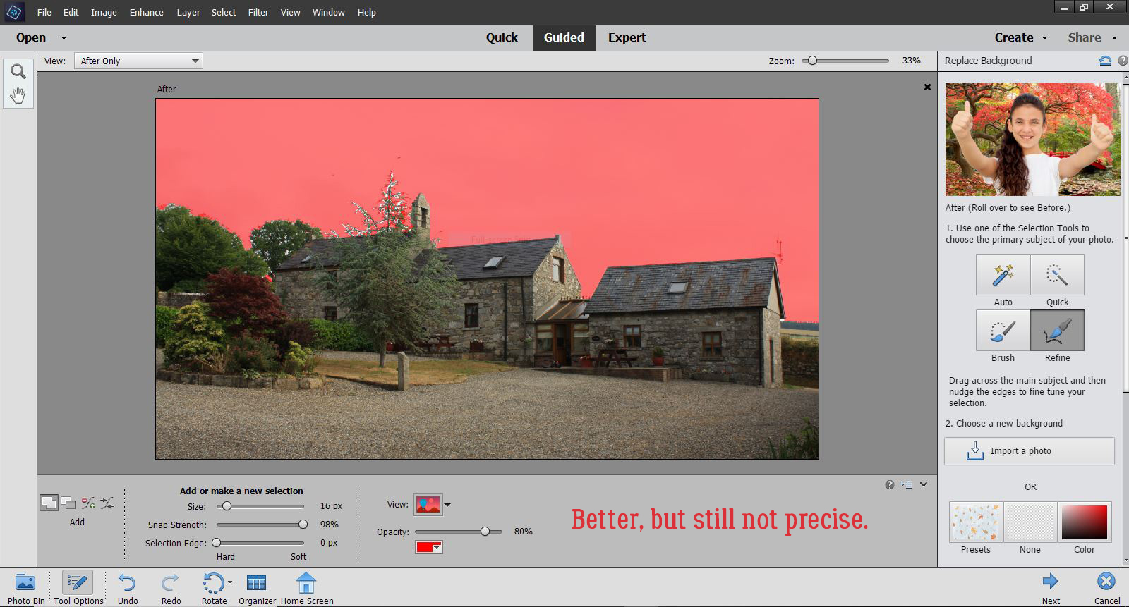
One click and this is where I found myself! If you don’t look to closely, it looks pretty good. But there are still some obvious white patches at the ends of the spruce branches.
So I zoomed in a bit and clicked on the Refine Edge Brush then Subtract. (Add would just uncover more of the blown-out sky.) Then I started bringing the blue sky up to the edges of the branches. I used a smallish brush and 100% Opacity. And it took FOREVER!
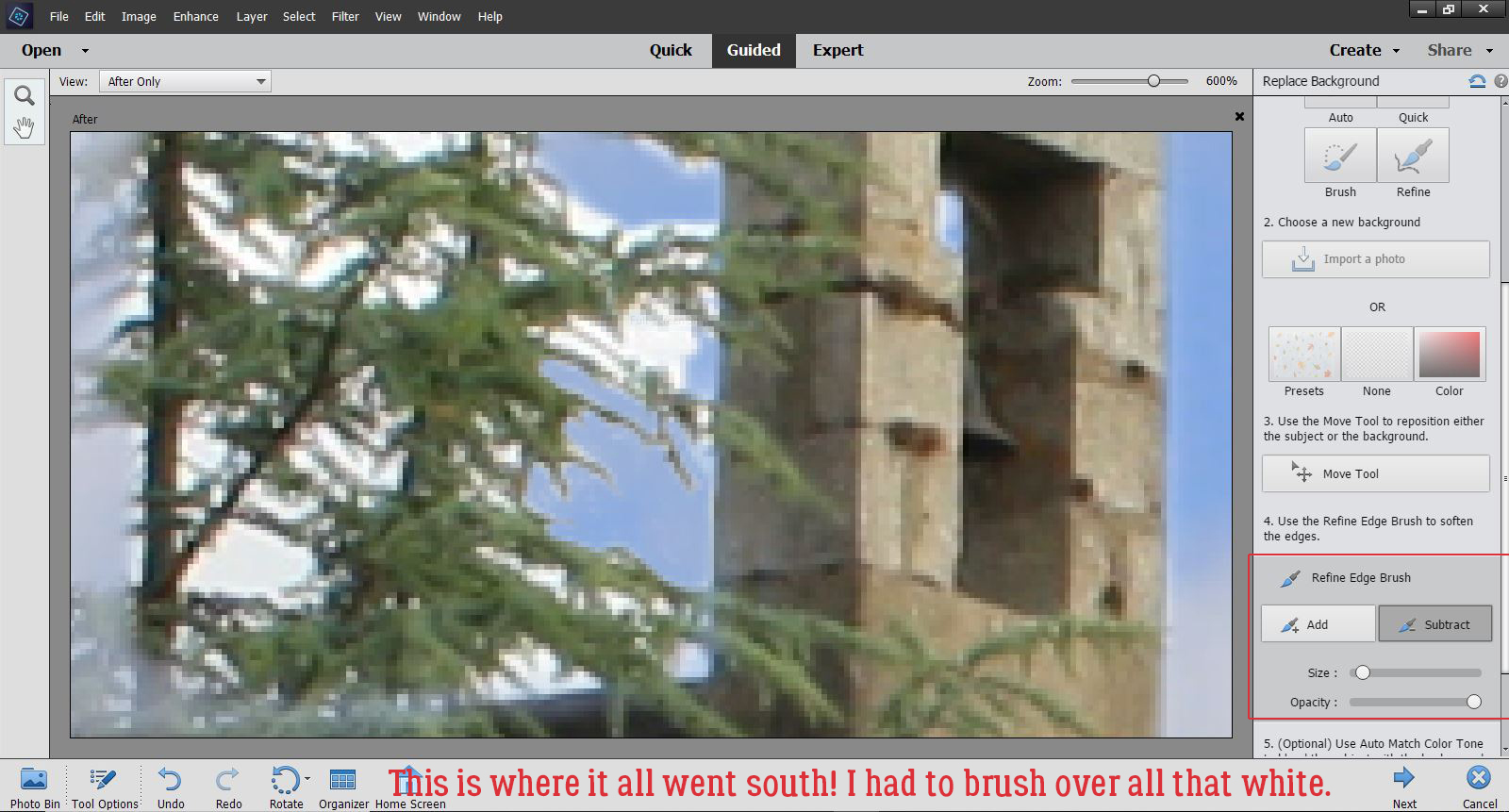
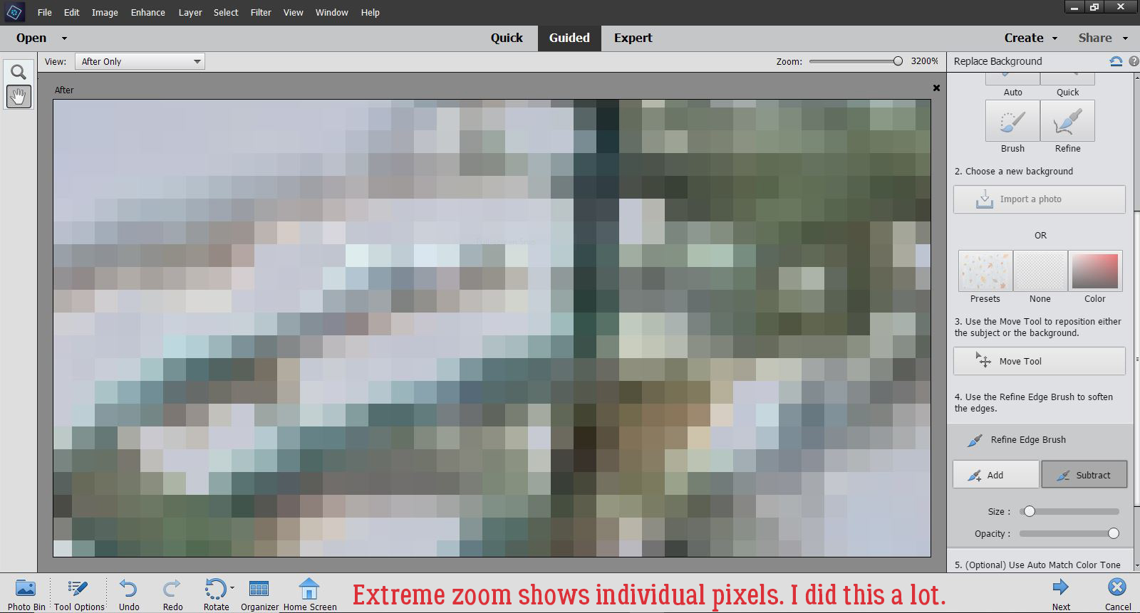
Extreme zoom was helpful at times, and not so much at others. Add in the unreliability of my “left-click” bar on the touchpad and you can see how it was a time suck. And frustrating. But I did get a better handle on how much pressure is needed to engage the “left-click” bar and keep it engaged.
One thing I found disconcerting, and a bit annoying, was that when I used the Hand tool to move the zoomed image around, the Refine Edge Brush looked like it was still active, but it wasn’t. Clicking again on the Hand tool didn’t turn it off, and I never thought to try clicking on the magnifying glass to see if that would work. Next time! At any rate, each time I moved the zoomed image, I had to deselect the Refine Edge Brush, REselect it and resize the tip to make it more controllable. I can see there needs to be some more experimentation with this Edit.
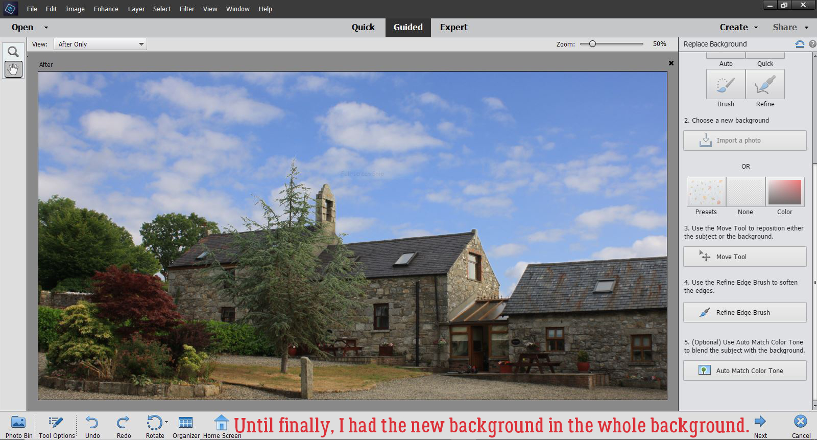
Eventually, I was happy with what I was seeing, both up close and from a distance. There’s still a little bit of a glow around the farthest-left-most tree, but it’s not obvious.
There’s one last option in this Edit, the Auto Match Color Tone tool. I decided to click it to see what it does.
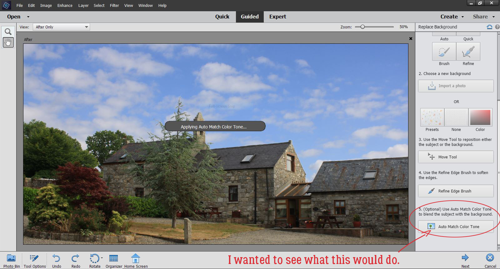
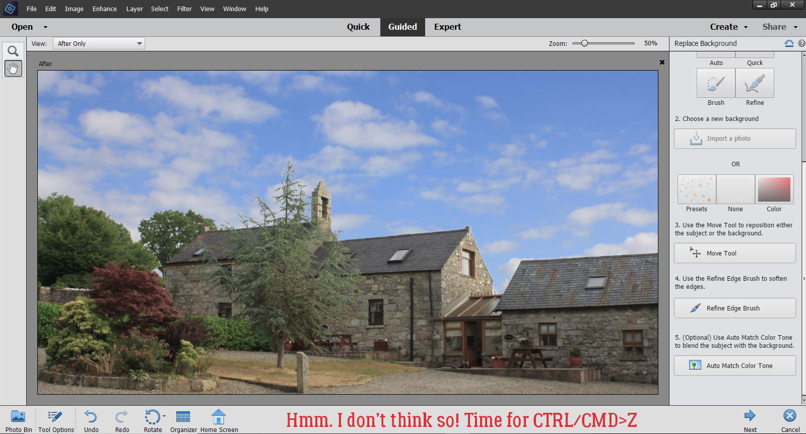
Ick!! It lightened and softened the image too much!! So I Undid that step.
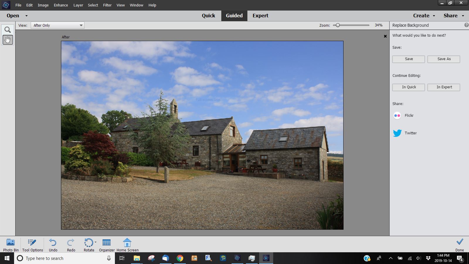
Now that I’m satisfied with my results I had another choice to make, what to do with it now. I chose to Save As it, with a new name so I’d know I’d edited it. But if I was ready to use it for a layout, I could have clicked on a Continue Editing bar and carried on. By this, I mean moving into the Expert Edit work space. In this space there are layers created during the Guided Edit that can then be tweaked more, for a much more satisfactory result. Some of the layers will have layer masks, which allows for pixel-by-pixel adjustments and are non-destructive. Meaning that if I remove a little too much I can paint it back in.
I know I’ll use this Guided Edit again, with the suggestions I’ve made firmly in mind. If I discover anything new, I’ll come back and edit this post to keep you all up to speed. (Thanks Ellen!)
Did you notice anything about this tutorial? The screenshots are so much bigger than usual – I learned something new about WordPress today!! I used the Windows Snipping Tool as Lori (teamkobza) suggested a couple of weeks back and it was less work than my previous method, so that’s a bonus. And then… when I imported them into WordPress, they were tiny; resizing them within WP made them really blurry. Then I noticed an advanced edit option that let me choose the original image size. BOOM! <doing the happy dance all over the living room>
See you next week!!
![]()
Wow, in the end, your picture turned out awesome. Love tutorials that show you what not to. I did find that I could see only 3/4 ‘s of the screen. All the instructions were there though. The right-hand sidebar (DESIGNERS {GINGERBREAD LADIES}) was also right down the center of the page. I am working on a lap top so it might be ok for people working on a ful sized screen. Very helpful tut 🙂 Thank you
I had the same issue as Sherry with seeing the photos (I also use a laptop). I had to scroll sideways to see what you were selecting on the right-hand side of the PSE window … if I zoomed my tab out, the instructions were too small for me to read.
Wonderful tutorial — yes, trees (or hair) can be a pain when selecting them…
Same thing as the ladies above and also using a laptop but loved the tutorial! Lots of work for you but helps us to know what to do. Thanks!
Replying to Sherry, Pam and Carolyn: Well that kinda cut me off at the knees! I thought I was so smrt… (no, that’s not a typo, it’s a joke I have with a friend when someone really messes up). I’ve resized all the screenshots so they fit under the text and now I know what size I need and how to make it so, I won’t make that mistake again! Sorry it took me so long to reply; I hope you all knew that I’d find a way to fix it for y’all! When I read your comments I checked the post out on my phone and was crushed! But I was at the University with my son while he had the medical world’s longest abdominal ultrasound EVER and didn’t have a chance to fix it until now.
Jan, thanks so much for resizing the photos — you really didn’t have to do that!!
I pray that your son is okay! I didn’t realize that an ultrasound could take so long; I pray that with their thoroughness they found whatever they were looking for…
Thank you, Jan for taking the time to fix the tutorial. I hope all is well with you and yours.
Sherry
OF COURSE I had to resize the screenshots! The tutorial wouldn’t be of much use otherwise.
The thoroughness of his scan was partly because there was a student doing it. She wasn’t going to miss anything! His anatomy isn’t quite normal either, so finding things that needed to be visualized took some extra time. To my somewhat less-than-educated eye, everything in there looked pretty good. (I’ve seen LOTS of abdominal ultrasounds in my career!) Thank you for your concern!