It’s a Total Eclipse!
![]()
Greetings! As promised, today I’m going to show you a paper-to-digi technique that CalGirl (Steph) brought to my attention. It’s called the Eclipse Technique, and I’ll tell you, the digi version is a LOT less work than the paper one. To get this effect with paper, first the letters need to be cut from the foreground paper. Then several layers of each letter are cut from the background paper, stacked and glued together onto the back of the foreground paper letters. Then some foam adhesive pieces are added to the bottom of the stack, the stack is stuck into the cut-out areas and it looks like this card created by Amy Koenders from Stampin’ Up. It’s a really pretty look, and so simple to obtain digitally.
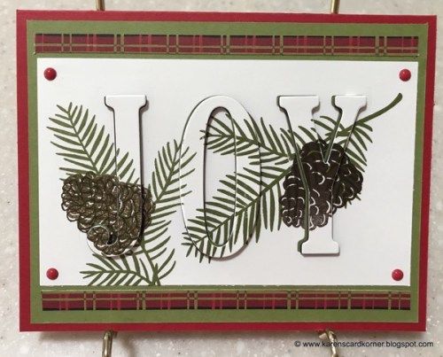
I think the best choice for a background paper for this technique will be a solid, but a paper with a tiny print might work well too. To look really fabulous, the foreground paper should have some sort of design. In the card image above, the pine branches and cones were stamped onto the foreground paper. Digitally, that’s a step you can skip unless you really want to do it. When you see my finished layout you’ll know how I went on that. I planned to use a template for my layout so I did the process with the papers I planned to use, in the way I planned to use them. The solid is from the GingerBread Ladies Warm and Cozy January gift-with-purchase collab, and the foreground paper is from Ilonka Designs‘ Rejoice kit.

The font I used is called Amadeust Regular. Choose a font that has some oomph to it, so you get the full effect. (Although we’re not gluing together skinny little strips of paper so I bet it would be fine to go with something more scripty or delicate too.) Make sure you have two copies of your foreground paper before you go on to the following steps. Turn the visibility of your top layer off so you can see what’s happening.

You can use any colour you want for your text because that layer is going to be deleted later. This it the title for my layout. At this stage, your text layer needs to be underneath your lower paper layer; I’ve made it visible here just for clarity.

Now Select your text by CTRL/CMD>clicking on the Layer Thumbnail. That will turn on the marching ants.

Make sure your active layer is the lower paper layer now. You’re going to Edit>Cut the text out of your lower paper layer. Keyboard shortcut for this is CTRL/CMD>X.

With both the text layer and upper paper layer visibility turned off, you can see the background paper through the “holes”. When you add a drop shadow to that upper paper layer, the appearance of your cut-outs will change.

If you want to, you can move your text layer up to just underneath the upper paper layer, but it’s not essential. Again, Select the outline of your text the same way. CTRL/CMD>Click on the text layer thumbnail. But this time we’re going to shrink the selected area just a tiny bit. Select>Modify>Contract is shown.
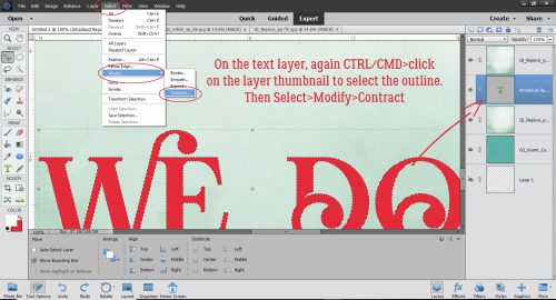
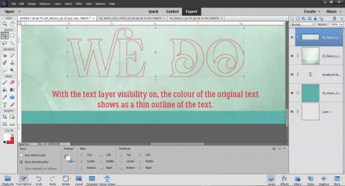
In the dialog box for that task type in the number 2, which will move the marching ants toward the centre by 2 pixels. It doesn’t have to be much, just a wee little bit.

The next step is to Invert the Selection. Select>Inverse or CTRL/CMD>shift>I.

With this step we’re going to cut away everything BUT the letters themselves. Edit>Cut or CTRL/CMD>X.

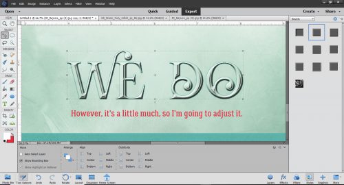
Aha! See the red outline of my text? That’s exactly what I wanted to see.
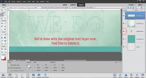
The original text layer has served its purpose, so you can go ahead and delete it, or simply turn it off.
I made a copy of the INSIDE letter layer and will be working on the very topmost layer in the next step.

Here’s the fun part. We’re going to apply a Bevel Style to that topmost layer. Click on the Styles button at the lower right of your workspace and choose Bevels from the Styles menu.

I tried almost all of the Bevels on for size before settling on the Scalloped Edge style shown below.

It’s not exactly what I was looking for so I made some adjustments.
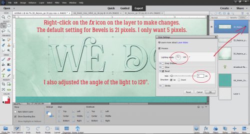
To adjust any Style or Effect on a layer, double-click on the fx to the far right of the layer in the layers panel. The menu box has several options you can change. I adjusted the Lighting Angle to 120°, which is the angle my template uses. The default setting for Bevels is 21 pixels, but that’s not the look I want so I decreased the amount of Bevel down to 5 pixels.
Then to make the offset look a little more obvious, I added a solid colour Fill Layer in the same turquoise as my background paper to the bottom letters-only layer. Layer>New Fill Layer>Solid Color.

Ensure the box next to Use Previous Layer to Create Clipping Mask is checked and that the Opacity of the fill layer is 100%.

Then I Merged the two layers together.

Here the only layer not visible is the original text layer. I think it looks pretty awesome! I know it seems like even more work than the paper version, but it’s an illusion. Explaining it all makes it look like more work than it is.

When I put my layout together, I decided to add some brushes and some glossy glitter to the patterned paper layer. See how the white brush crosses the edge of the “O”? I love this technique and I think I’ll be using it a lot more.

Thanks Steph!
![]()
Thanks, Steph, for finding these cool ideas — & thank you, Jan, for showing us how to create them digitally! This is a really cool look!! I’m going to have to make the time to go through this one!
Thank you for the tutorial. I use Photoshop CS but i am sure I can follow these instruction in that. Is there an easy way to see all the Tutorials or do I have to scroll through the blog?
The process won’t be significantly different with CS.
You can find a linked list of all my tutorials here: https://gingerscraps.net/gsblog/2018/12/tutorial-tuesday-tutorials/ I just need to make sure it’s up to date!