One BIG Word – Using a Title as a Divider
![]()
This week’s tutorial is brought to you by Ellen (gmae) and Ann (ScrappinRosie). As you’ve likely noticed, Ellen is one of my topic-generators, bringing me ideas for tutorials fairly regularly. This one came to me via private message: “I came across this layout by ScrappinRosie and of course I love it. I know I can figure out how to do this but some others may not so I thought it may make a nice tut sometime. You did a tut about joining letters with extra swashes which is a good reference but some may not know how to decide what may make a good font to use in the first place and could a printed font even work.”

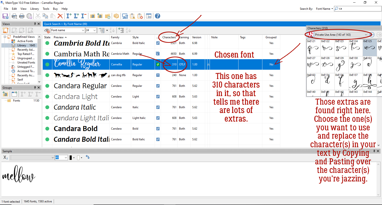
The tutorial Ellen referenced about using the extra characters that come with some fonts can be found here. As for choosing a font for this type of application, MainType has a handy way to show which fonts have extra glyphs – swashes, curlicues, whatever you want to call them. It’s discussed in the tutorial but for a little refresher, here’s a screenshot to help you out. (I just upgraded to the most current version of MainType, so I haven’t tagged any of my 1645 fonts yet. Gotta be in the mood, know what I mean?)
I started by opening a 12×12 scrapbook page canvas on my work space then surveyed my collection of fonts to see which ones would give the look I wanted. The title for my page was going to completely transect my layout, and it had to work with the mood of the layout. The things I considered were how I wanted the layout to feel, how the title would work with my chosen photo(s) and how large I wanted it to be. If my subject was something less emotive, I might have chosen a more upright, less fancy font. But “mellow” cries out for swirls!
The font I used is Camellia Regular; there are free versions that don’t include the extra characters so you might want to check first. I purchased my version from Font Bundles as part of a script bundle. Be sure to look at your font stash to see which ones might have the swashes included; you might have some really good ones already! For this step, any colour will do because it’s not forever. I replaced the “m” and the “w” with glyphs from the font extras to extend the beginning and end of the word. In some of the later screenshots you can see that in the layers panel – there are symbols in place of the letters in the name of the layer. If your chosen title will have more than one word like Ann’s does, you’ll need to ensure that the words physically touch, and that can be accomplished by using a long tail glyph to connect them.

It looked good but I thought that as a title it probably needed to be a bit more present. Remember that text layers are “smart” until you Simplify then, meaning you can’t change their appearance in any way other than colour and size. To add a Stroke – a heavier outline – the text couldn’t be “smart”. I Simplified the text layer by right-clicking on the layer and choosing Simplify Layer from the dropdown menu.

There are a couple of ways to make things bigger, and applying a Stroke is the easiest and gives the best results if done correctly. Edit>Stroke (Outline Selection)
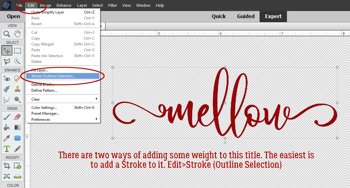
Generally speaking, Strokes can be dainty or bulldozer-y, and everything in between, depending on the effect you’re looking for. With text, applying a Stroke needs a light touch. If you make your stroke too big, it’ll obliterate the loops and swirls and completely defeat the font you chose. If you apply your Stroke Inside the selection, it might not make a lot of difference. If you apply it Outside the selection there may be a tiny gap between the object and the Stroke – and that can be a disastrous thing to discover several steps down the road. So when I apply a Stroke to text, I choose Center, which puts the Stroke directly over the edge, half inside, half outside. Going with 4 pixels is usually a good number, adding just a bit more weight but without making your loops into lumps.

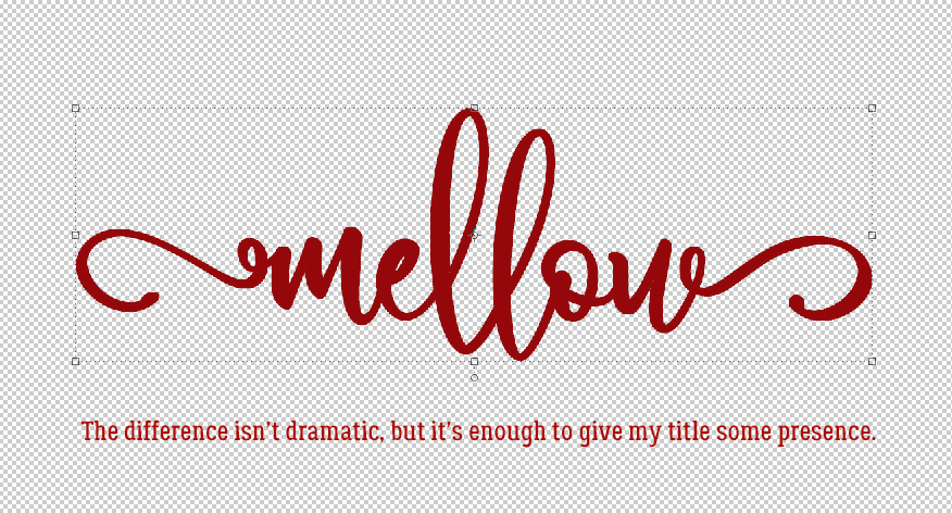
As you can see, the difference isn’t really obvious. But now the title has oomph!
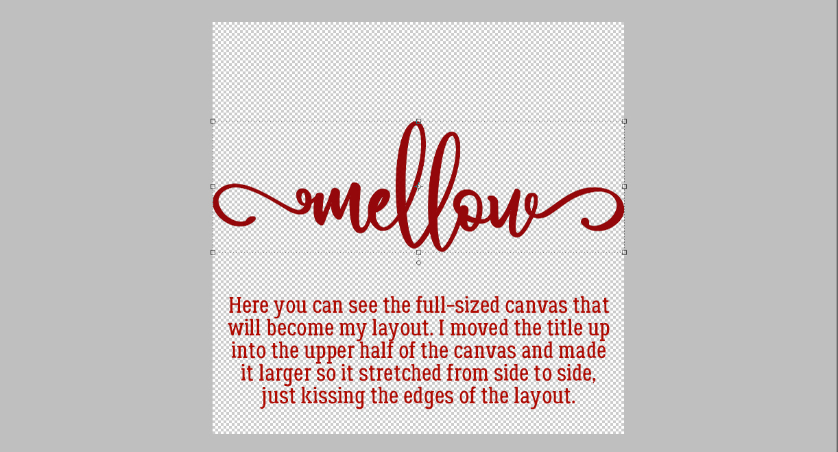
The next step is to Resize the title so it extends all the way across the layout. I went horizontal, but yours could be vertical or diagonal. I plan to put a photo at the top of the layout with the title overlying, but you could easily use different papers for your layout. It’s important to have the title touching the edges of the canvas, as you’ll see in the next frame.
Because I want the lower paper to follow the contours of the title, I’m going to create myself a clipping mask. To do that I first need to make a Copy of my title layer. Right-click>Duplicate Layer or CTRL/CMD>J

Then I went back to the original title layer and using the Paint Bucket tool, I Filled in the space where my paper will go with solid white. If my title didn’t touch the edges of the canvas or with multiple words that weren’t touching, when I dumped my Paint Bucket, it would have filled the whole 12×12 space! Where the title touches the edges, it forms a dam to keep the paint inside.

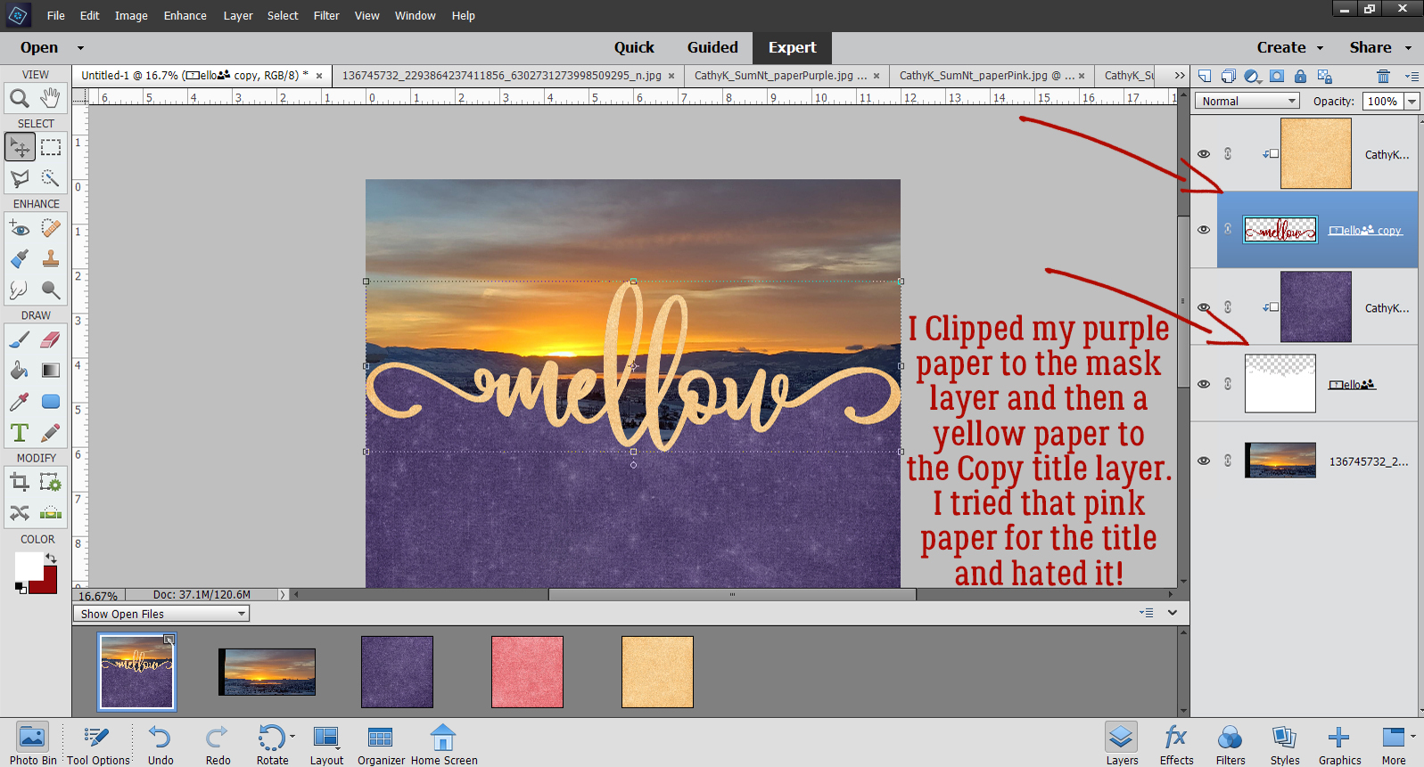
I want to be able to see the title against my photo and I’ll probably Clip a paper to it. I don’t want the lower paper to cover the title though, so to ensure that, I’m going to Select the title from that clipping mask layer and remove it. I CTRL/CMD>Clicked on the Copy title layer’s thumbnail but kept the clipping mask layer active. That isolates the title from the rest of the mask. You may be able to see the marching ants in the screenshot.

Still on the clipping mask layer, I Cut away the title: Edit>Cut or CTRL/CMD>X

And with the Copy title invisible, this is what my clipping mask layer looks like.

I decided I needed to put my photo in place to see if I needed to move the title up or down. The clipping mask could be expanded vertically if needed to ensure my purple paper will cover the whole bottom. I put the photo under the other layers and adjusted the size to fit my space (and to crop out a post!). For those who are wondering, this is the view from our deck!

Clipping my purple paper to the clipping mask came next, then clipping paper to my title layer. The keyboard shortcut for clipping something to something else is CTRL/CMD>G for PSE versions lower than 15 and CTRL/CMD>ALT>G for versions 15+.
I thought I might add just a bit more interest to the title so I added a Texture Filter: Filter>Texture>Texturizer.

There are some options for what kind of texture you can use with this Filter tool: Brick, Burlap, Canvas or Sandstone. Each has a different look and I chose Burlap for this. Adjustments are Scaling (size of the texture), Relief (depth of the texture) and direction of the Light source. You can see what your Filter looks like on the Preview. I didn’t want the texture to be the focus, but rather a supporting detail so I went with 50% Scaling, 2 for Relief and the Light is coming from the upper right.

There it is! Definite, but subtle.

Last step is to add a shadow to the title! I could use a Shadow Style but I’m so used to creating my own custom shadows that I do it automatically. Once I’m done with that I can add my embellishments and journaling. Et voilà!

Have you seen a layout that wowed you but you’re not sure how to achieve the same results? Maybe I can help!
![]()
For a PDF version of this tutorial, go here. (linked)
Love this tutorial. I have often wondered how these were done … Now I know 🙂
Your tutorials are always do-able and useful.
Thank you so much for all the time that you invest in them for us.
You are very much appreciated.
Just one more thing !!!
I just noticed that it is downloadable in PDF format !!!
That is so awesome. Thank you 🙂
I’m so glad to hear that people are able to make use of these tuts. I try hard to make them achievable for even the most inexperienced scrapper. You can thank Ginger for the PDFs! She asked me if I could do it, and because the site is her bread and butter, we had to find a way to make them secure. But she did all the hard work on that, and is doing the conversions. So it’s a collaborative activity!
Great tut! Thank you. I’ve taken up bird watching and just made a quick practice page using the word ‘birdwatching’, in Ballerina script filling in a few areas with flourishes, as the divider word and it is the start to a new layout!
Is there a place to post our pages that we make using your tutorials?
Thanks, really want to practice this method.
Another home run as always and I love love love the pdf!
I’ve been waiting for an opportunity to try this out, and this morning I did it! I was amazed at how easy it was, and such beautiful results. Thank you for making these techniques so accessible!
Awesome! Isn’t it fun?
Jan, I used your tut for my layout posted in March’s A Year of Blessings, #60. I have another layout with a one word title just waiting for the right challenge.
I just posted my other layout I referred to in my March 27 comment. It’s here, May 2021 – Magical Scraps Galore’s Surprise Challenge , #4.
Kathy that’s amazing! Good job!!!