Write Your Troubles in Sand
![]()
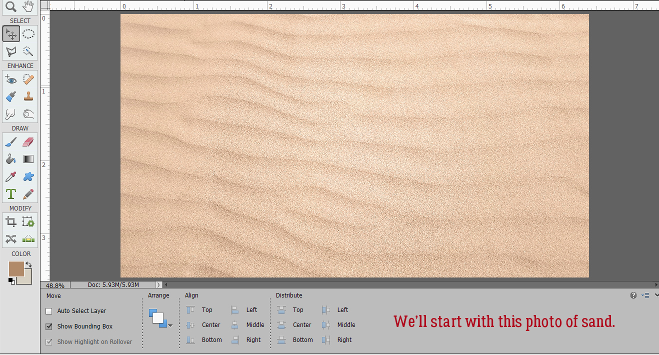
It looks like manipulating fonts is the theme for January! I love it when readers bring their ideas to me and challenge me to find a way to put them into practice. After the Ninja post, Sherry Pennington dropped this into the comments: “While we are on the topic of fonts, you wouldn’t happen to have one for Snow Writing or Sand Writing ?? I can find tuts and actions for Photoshop but nothing for PSE.” So I set about looking into that and ran with it! I found a video tutorial based on PSE, posted by the brilliant George Peirson of How-To Gurus that looked pretty easy, but I was disappointed that it didn’t look totally real. The following is built on his work, with my own finishing touches. [Spoiler alert: there are a LOT of screenshots, but some of them are for review.] First though, I had to find a suitable photo of sand.
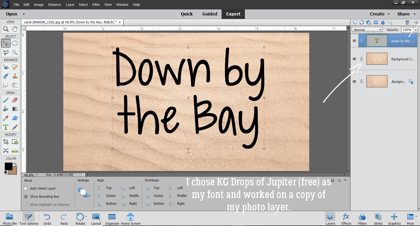
Then I had to choose a font. I want to always offer options here that aren’t going to cost you any money, so with that in mind, I opted to use KG Drops of Jupiter, which is available free at dafont.com. While writing in the sand can be accomplished with a variety of found objects like sticks, shells and so on, I chose a font that looked like it could have been written with a finger, something all of us have.
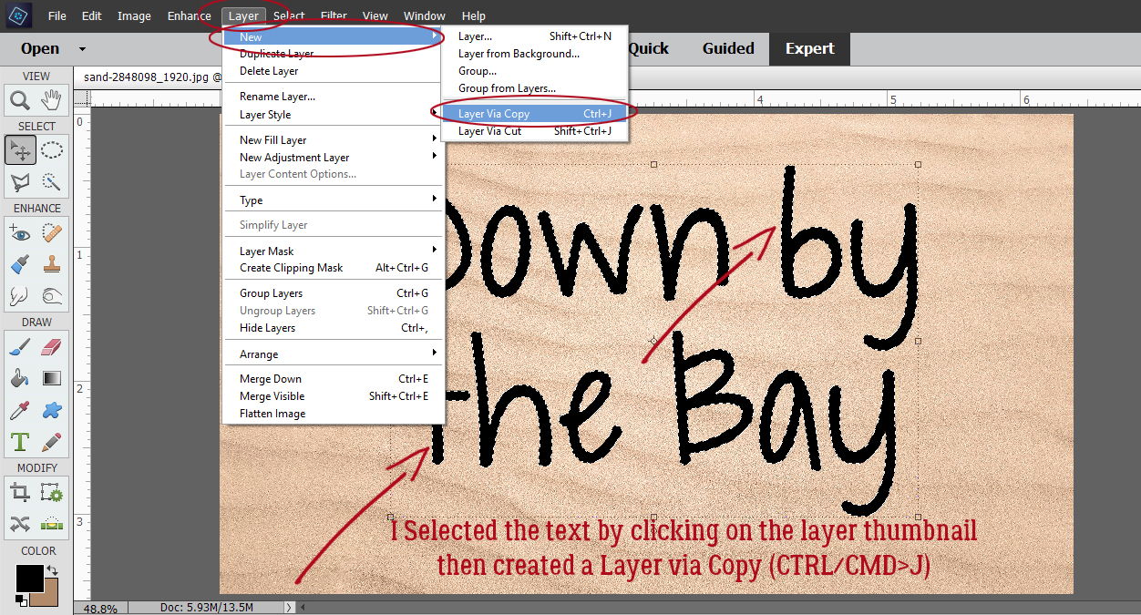
We’ve made Copy layers in a lot of previous tutorials but I’ve never really shown this method of doing it. It’s great because it creates a layer with JUST THE SAND! And it eliminates a couple of steps, so that’s always going to be a winner for me. I clicked on the layer thumbnail of the text layer, got my ants marching around the edges, and then with a copy of the sand photo active, I clicked Layer>New>Layer Via Copy. (Actually, you know I used the shortcut CTRL/CMD>J. 😉 )
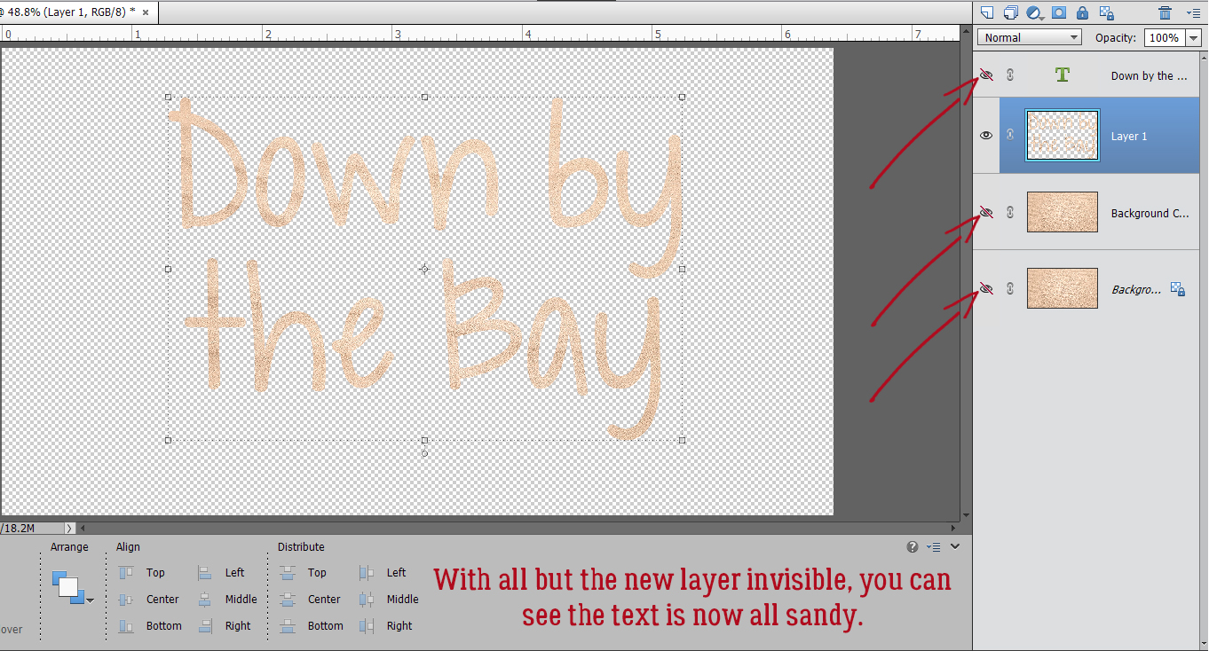
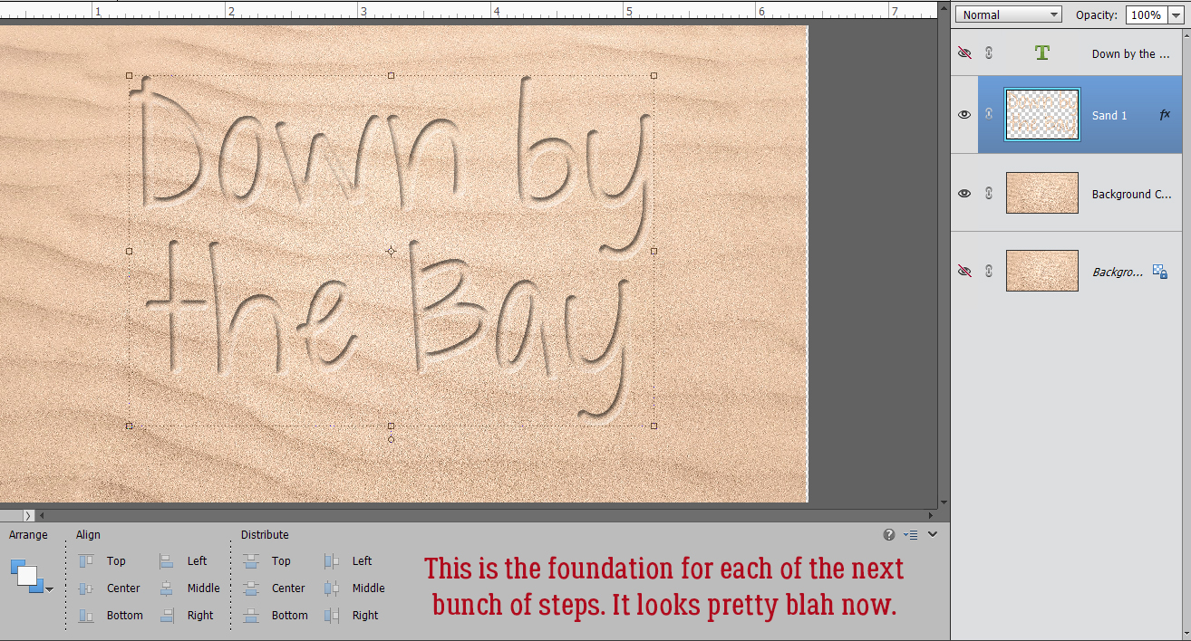
This was accomplished in just 2 steps! (I’ve turned the other layers’ visibility off so you can see just the text Copy layer.) Okay, that don’t impress me much.
To make it look like this text is actually depressed in the sand, we’ll need to add a Bevel. But this method I’m showing you is a bit different and much more useful for this specific technique. Instead of clicking on the Styles button at the lower right and choosing Bevels from the menu, I did this: Layer>Layer Style>Style Settings. I’d never done it this way before, but had to give it a try!
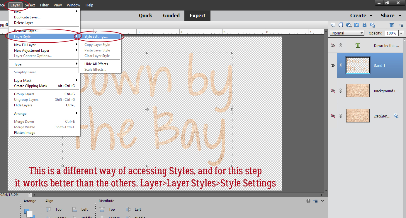
This menu opened up with nothing selected, but all the options right there.
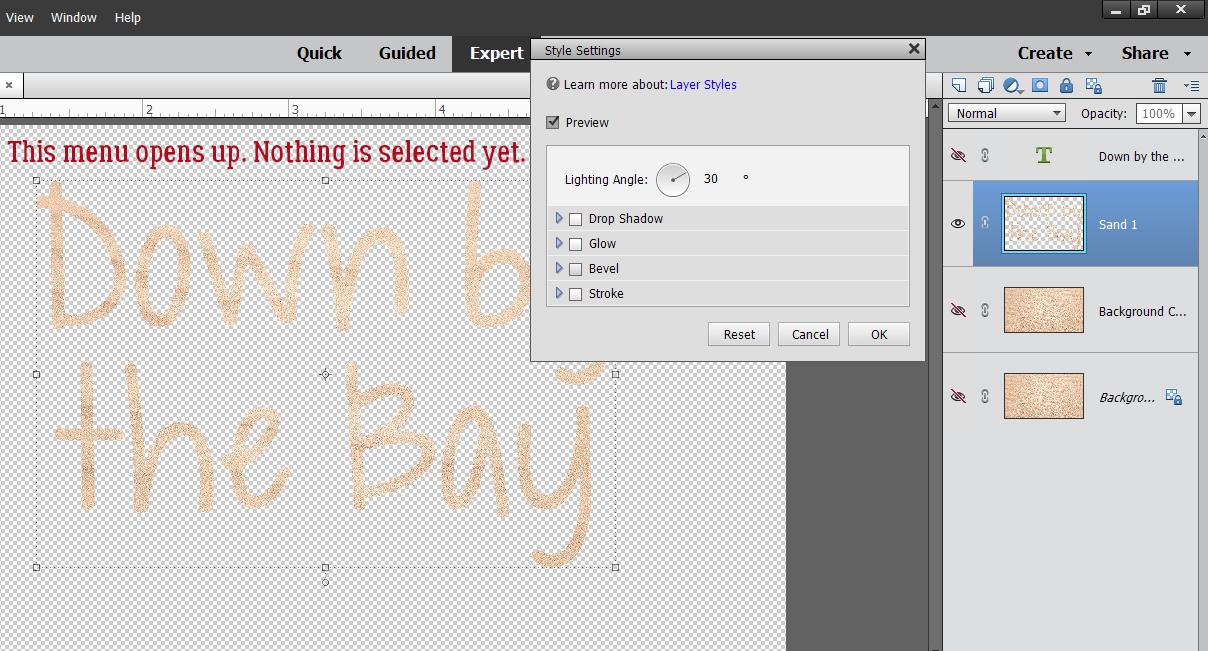
When I clicked on Bevel, this adjustment panel opened. Notice the default settings are very different from the defaults you’d see if you went to Styles>Bevels route. 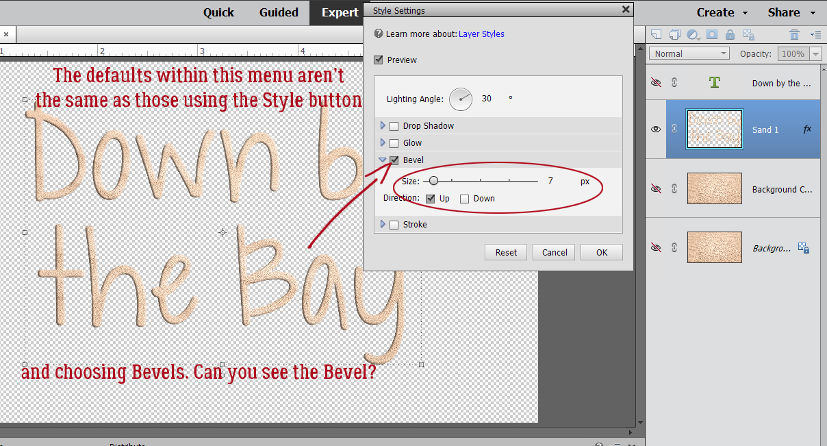
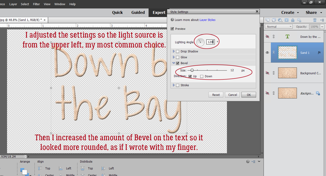
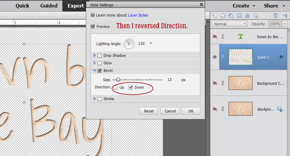
I wanted the centres of the letters to be quite round, since I’m “writing” with my finger. So I increased the Bevel to 12 pixels. I also reset the Lighting Angle to 120°, which is MY default setting. You’ll consider the angle of the light in the photos for your layout and the angle of the light for the drop shadows you’ll use when choosing these settings.
To carve the text into the sand the Bevel has to go down.
And after these few steps it looks like this.
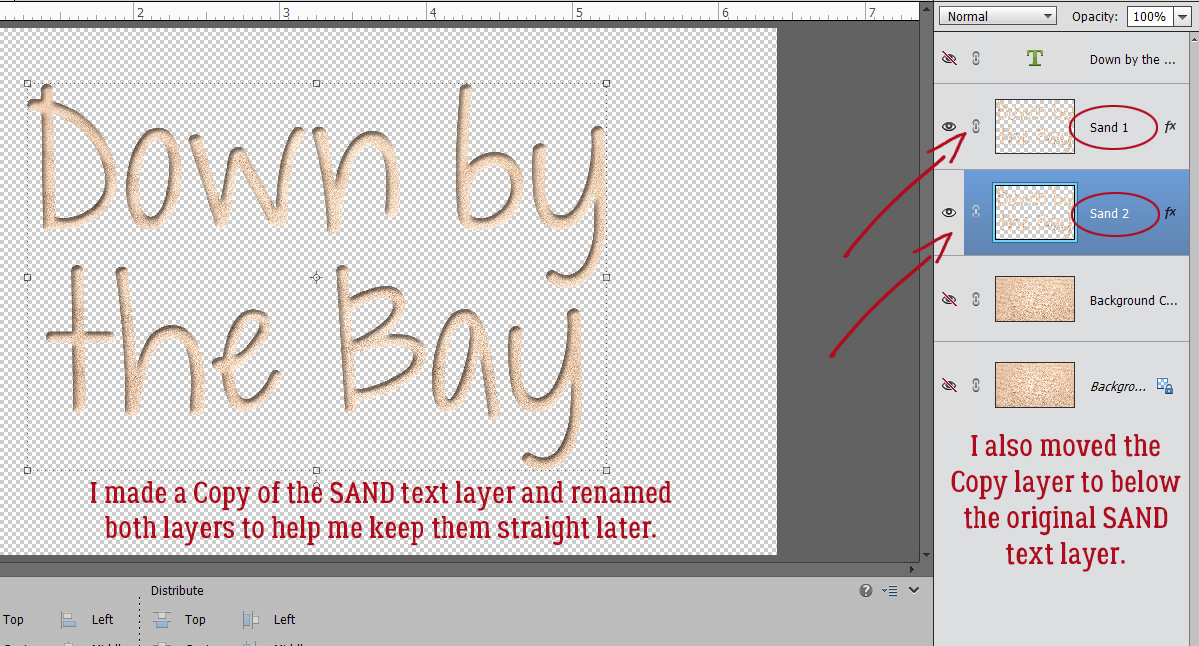
I don’t always bother renaming the layers in the layers panel, but for this technique it makes a huge difference in the execution, because we’re going to do a bunch of copying and tweaking so knowing which layer is which will really be helpful. So I renamed this sand text layer SAND 1. Then I made a Copy (CTRL/CMD>J) and renamed it to SAND 2 before moving that SAND 2 layer below the first SAND layer. Refer to the screenshot if this is confusing.
This step seems silly, because it undoes what we just did to the SAND 1 layer, but on SAND 2 we’re going to flip the Bevel back to Up.
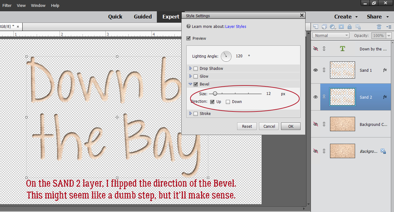
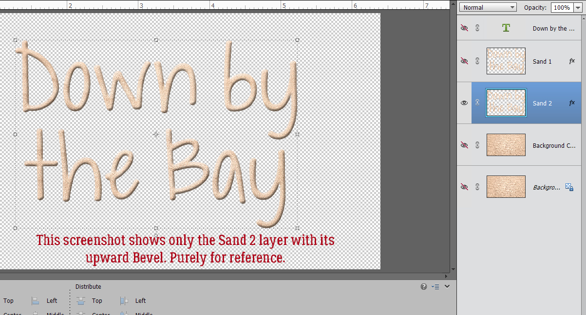
This image is purely for reference. It shows SAND 2 with its upward Bevel.
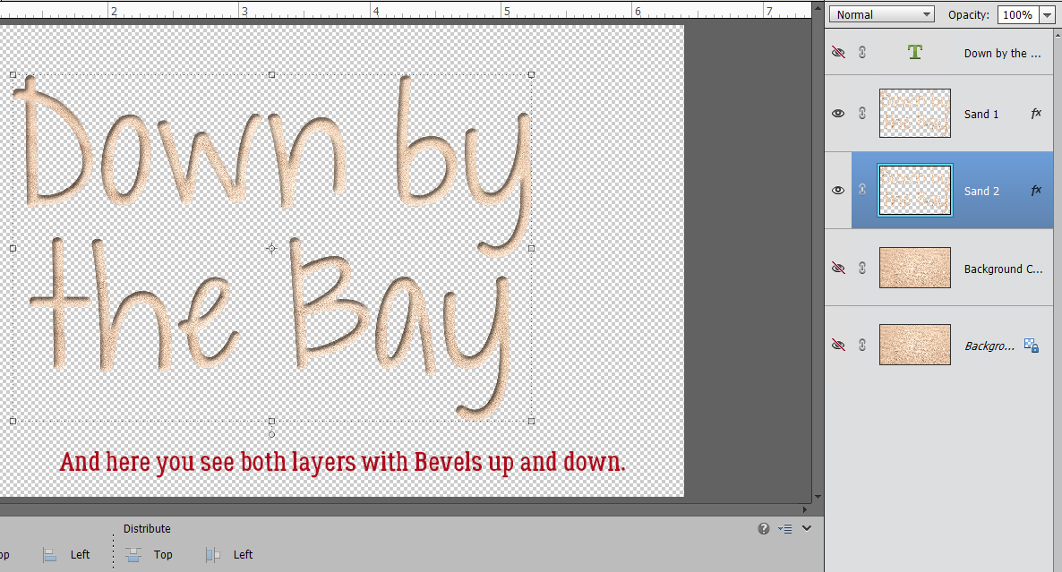
And this image has both SAND 1 and SAND 2 visible, but not obviously so.
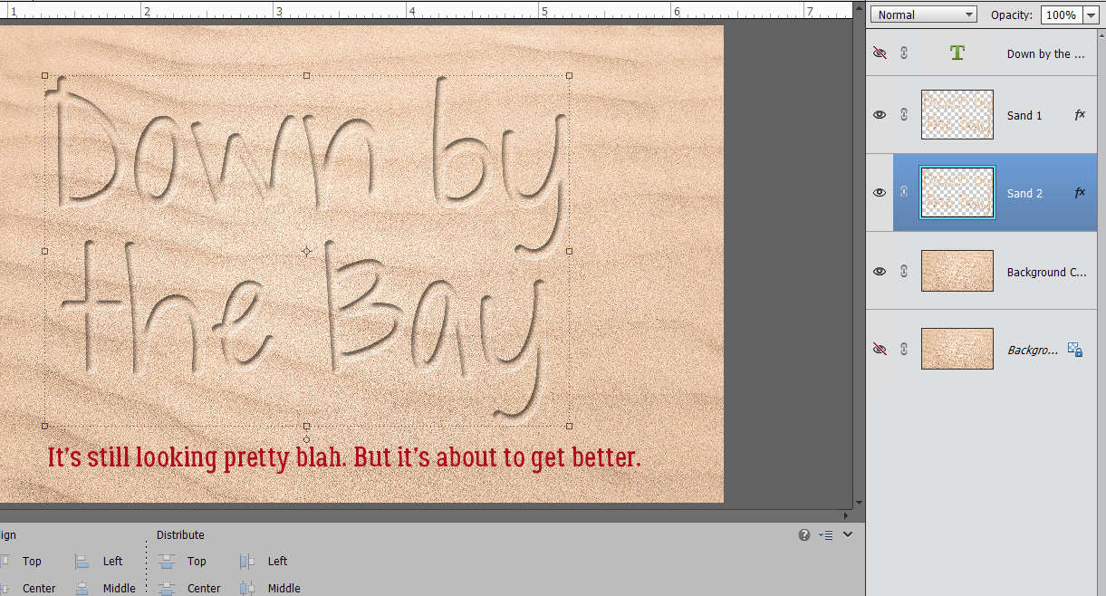
With the sand photo layer visible the text looks like this. Ho hum.
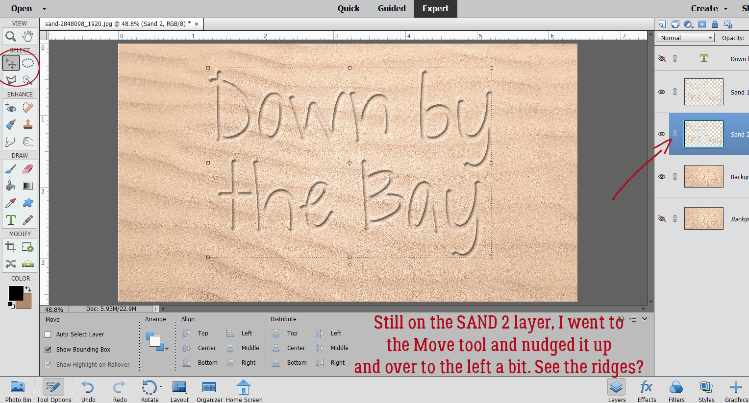
As you know, when your write in wet sand, some of the sand gets pushed up into a ridge along the edges of each letter. To achieve this effect, I activated the Move tool and nudged SAND 2 over to the left and upward a little bit. Okay, that’s a little better.
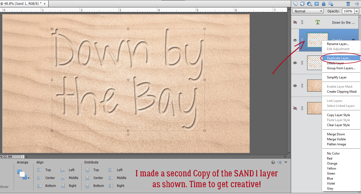
Time for another Copy of the SAND 1 layer. You can Duplicate Layer or just CTRL/CMD>J it.
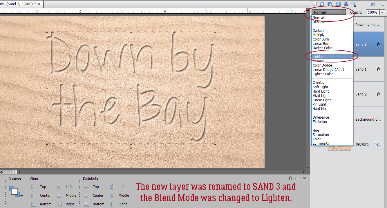
This new SAND 3 layer will have a Blend Mode change to Lighten.
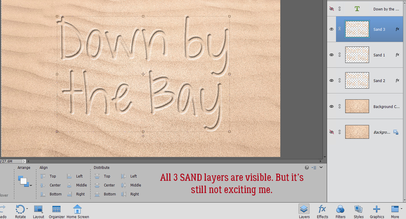
The changes are subtle. And it’s still not blowing me away.
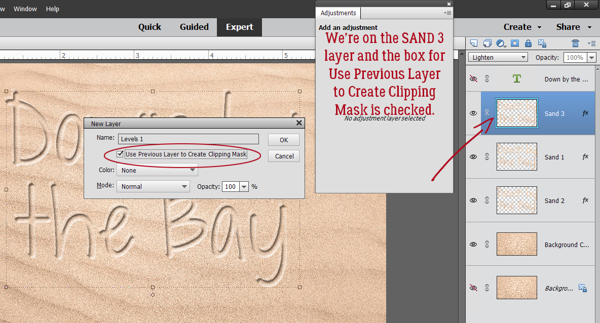
So we’re going to do something I’ve never shown you before. (Because I’ve never used it… but I’m going to now!) Let’s add a Levels Adjustment Layer! Click Layer>New Adjustment Layer>Levels…
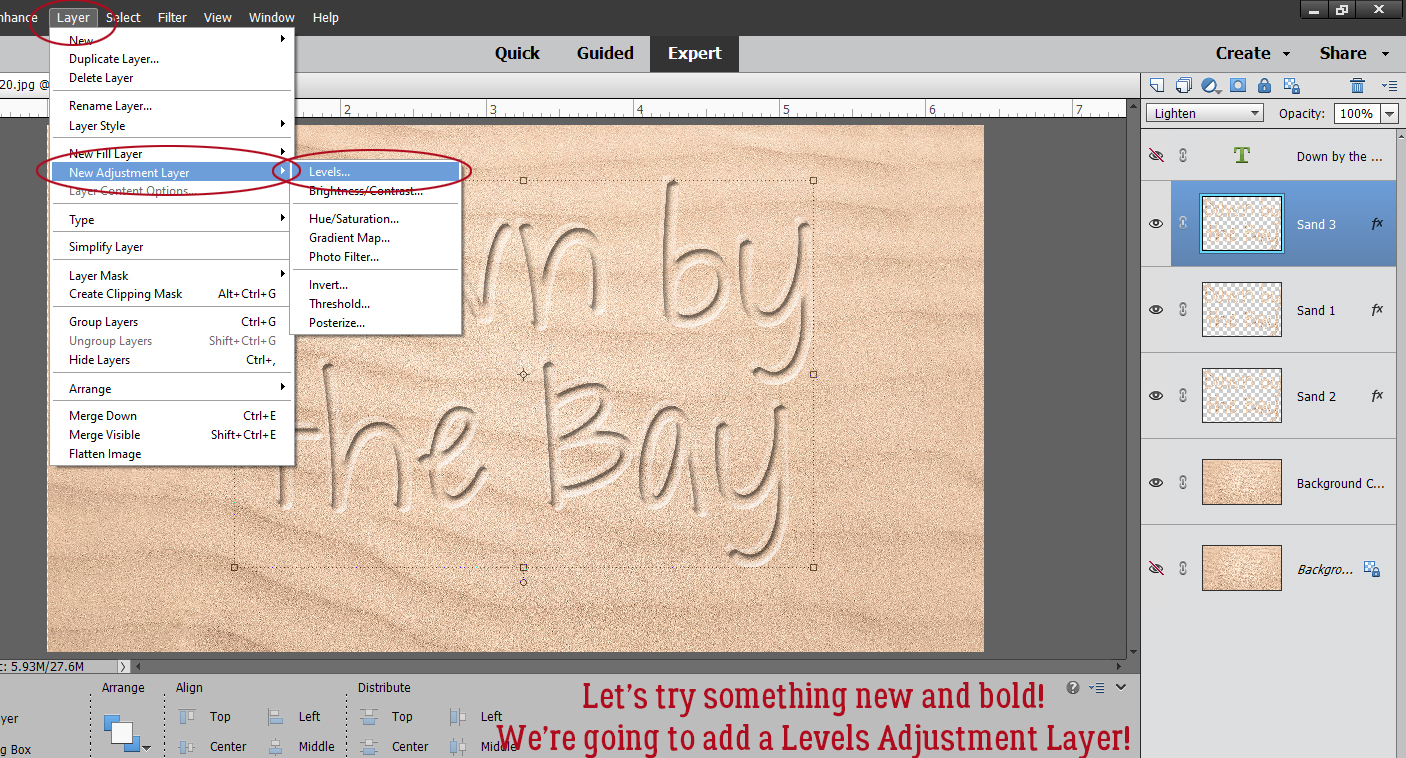
Make sure you’re on SAND 3. Check the Use Previous Layer to Create Clipping Mask. This is going to become the Shadow layer, so you can rename the layer to reflect that if it will help.
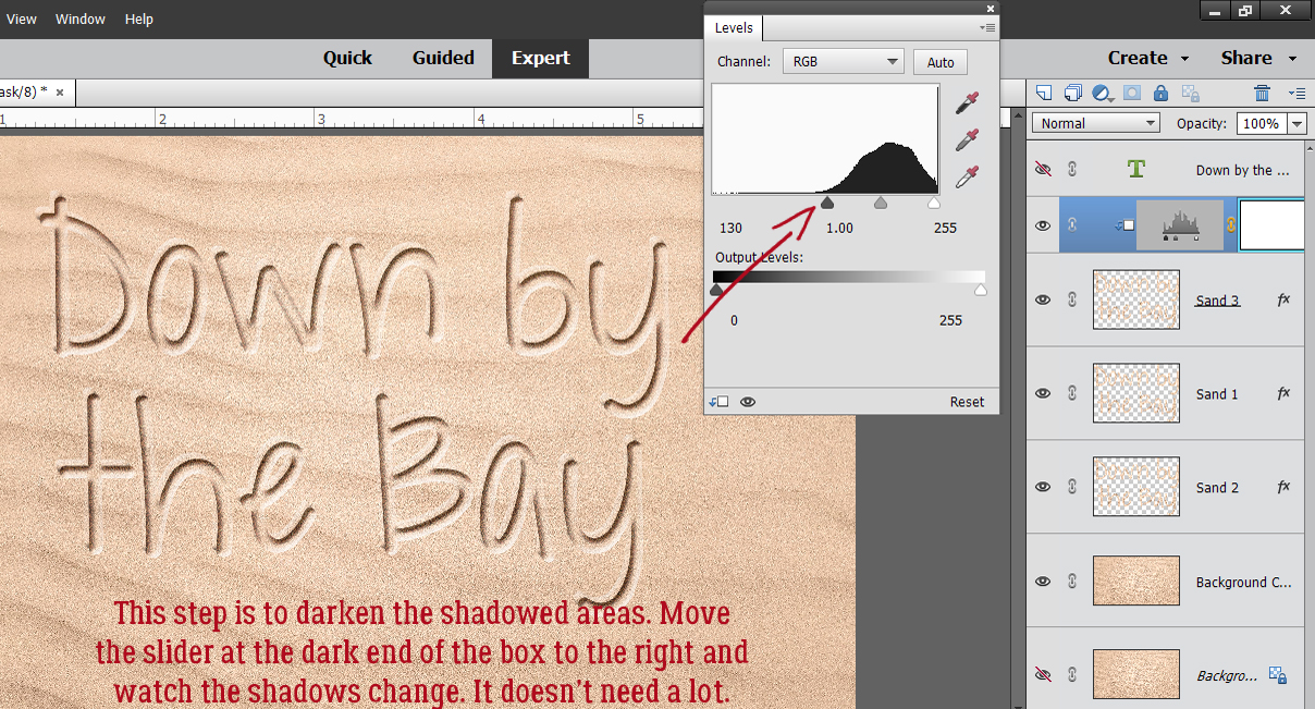
In the adjustment menu box with the image in it, drag the dark slider to the right to darken the shadowed areas just a bit. It doesn’t need much.
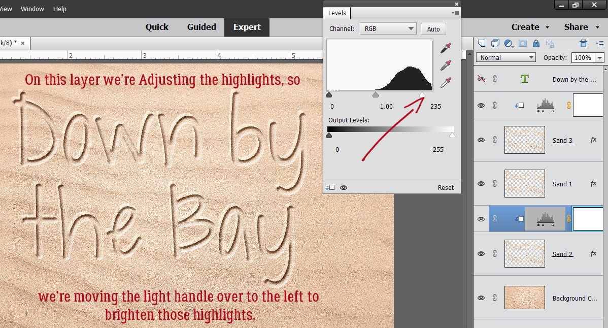
Now move down to SAND 2 and do the same thing. Layer>New Adjustment Layer>Levels…
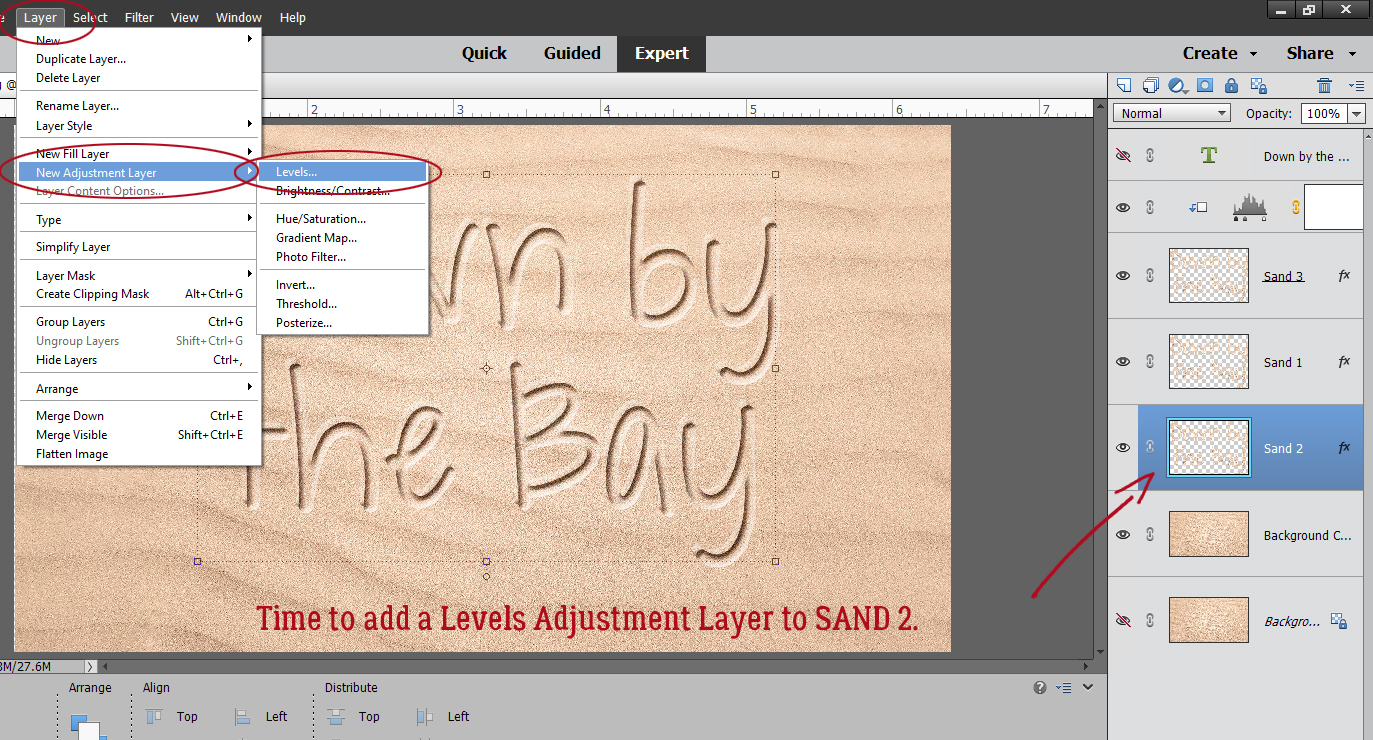
Make sure you’re Creating a Clipping Mask.
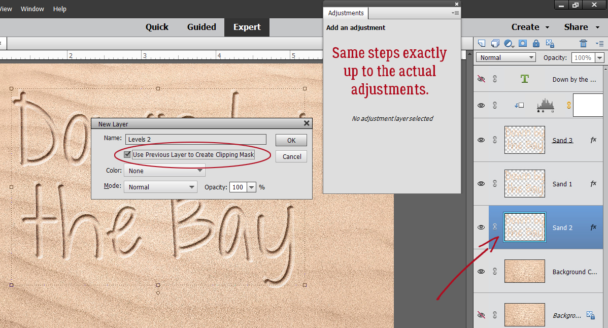
Only this time we’re working on the highlights, so we’re going to pull the light slider to the left a bit.
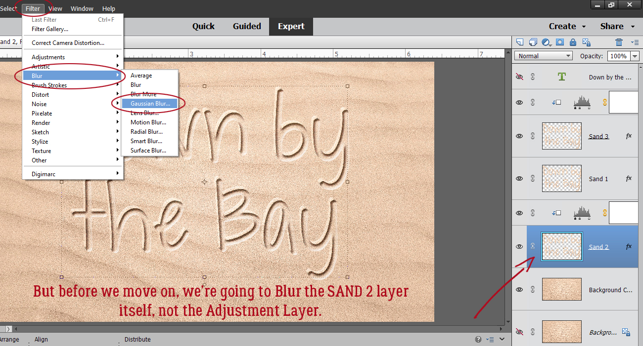
This layer looks a little too sharp so we’ll add a Gaussian Blur to it. Filter>Blur>Gaussian Blur
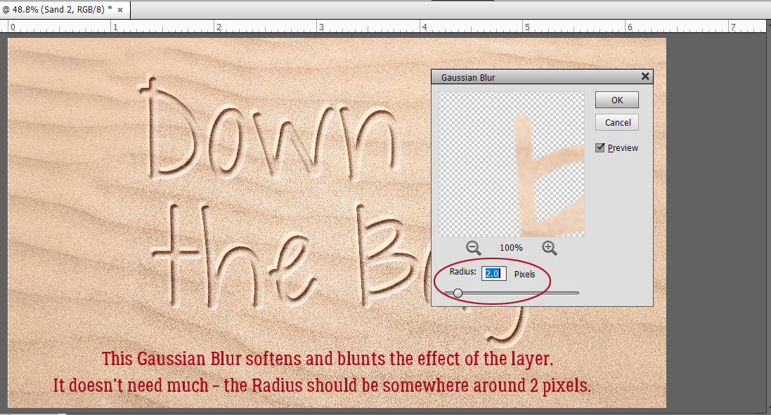
And it just need a teeny-weeny bit of blur, a Radius of about 2 pixels.
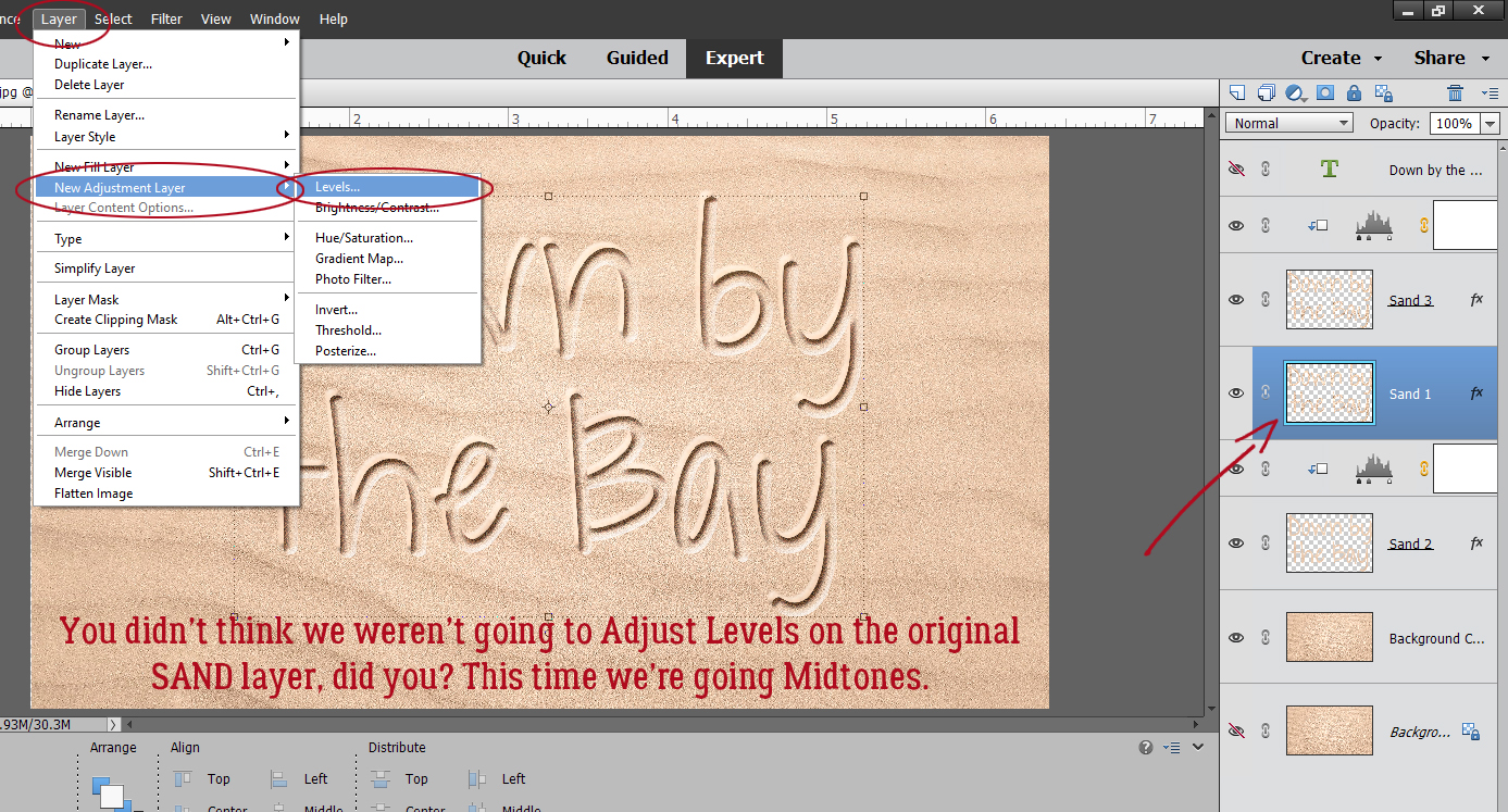
Were you thinking we were done with the Adjustment Layer masks? Nope… we’re going to add one to the SAND 1 layer now – which should be in the middle of the SAND stack – and tweak the Midtones.
Just to review…

By sliding the centre slider to the right a bit, it deepens the midtones and makes the letters look more realistic. Whenever you’re pulling sliders, always watch what’s happening to your image so you don’t go too far. However… you can definitely still go back and readjust each of these Adjustment Layer masks if needed. 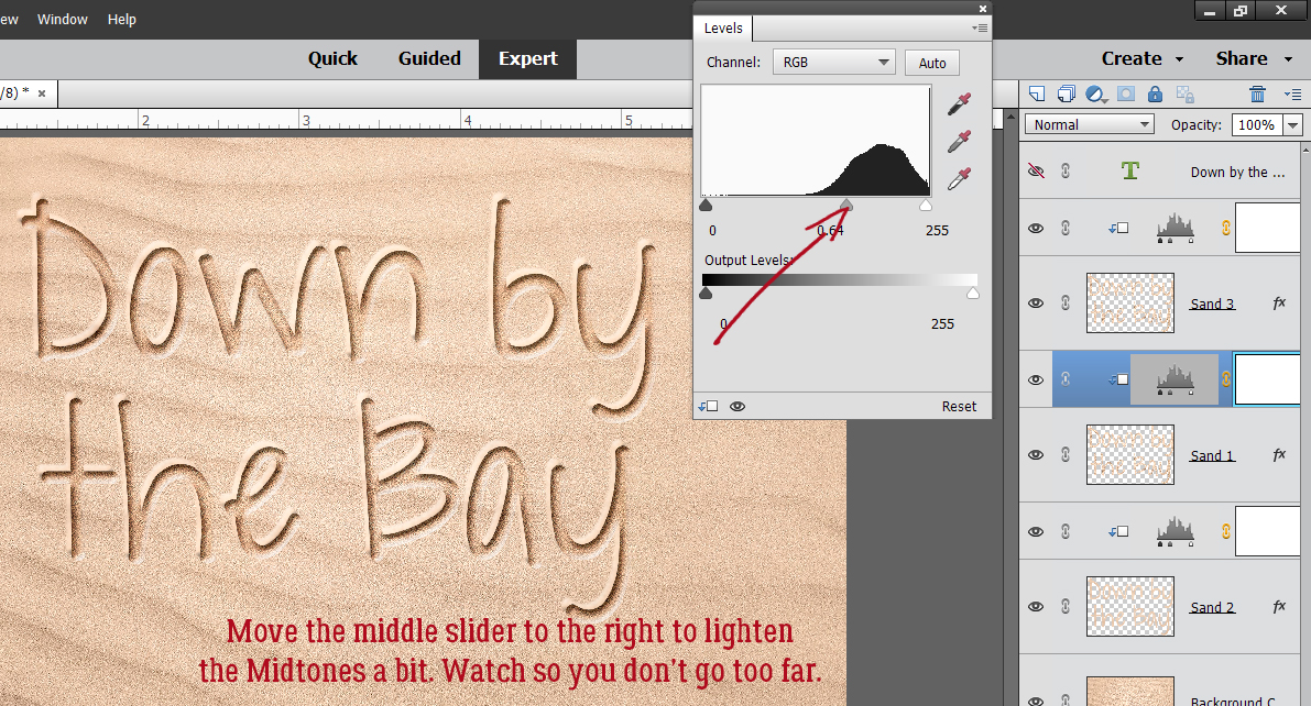
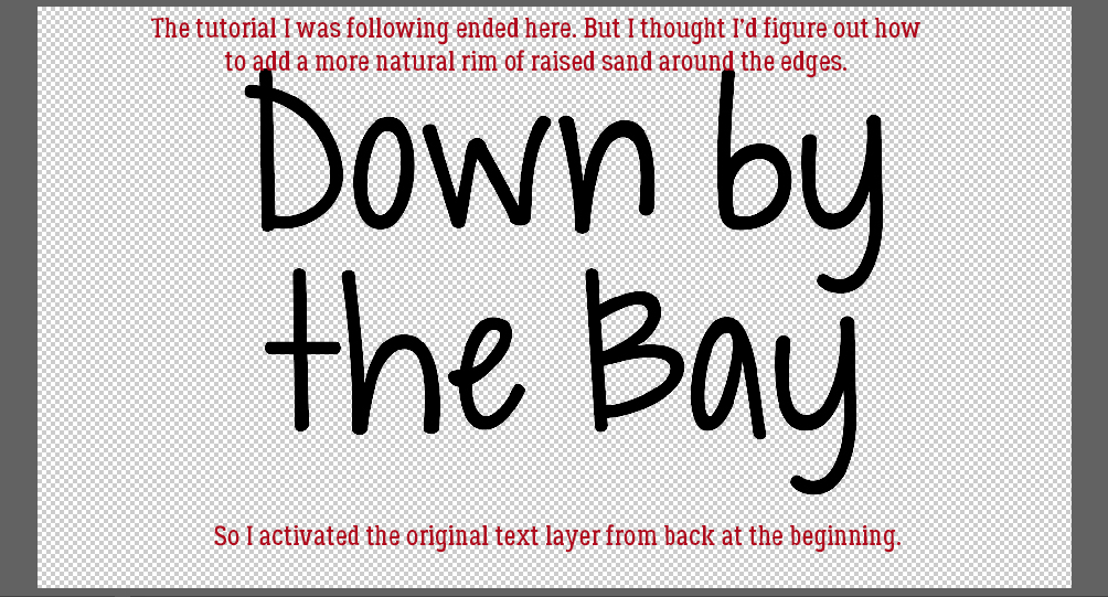
This was where the tutorial from George ended. But to my eye, it still didn’t look real enough. When looking at images of actual writing in actual sand, they all had some crumbly grainy rims of raised sand, and this looked too perfect. What to do? I reactivated the original text layer from way back at the beginning.
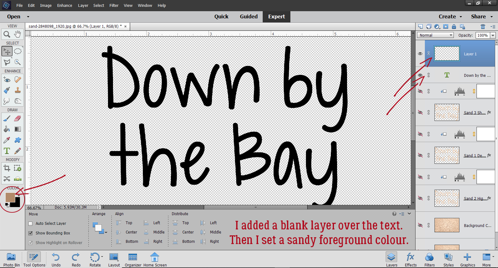
Then I added a new blank layer ABOVE the text and set my foreground colour to something sandy-looking.
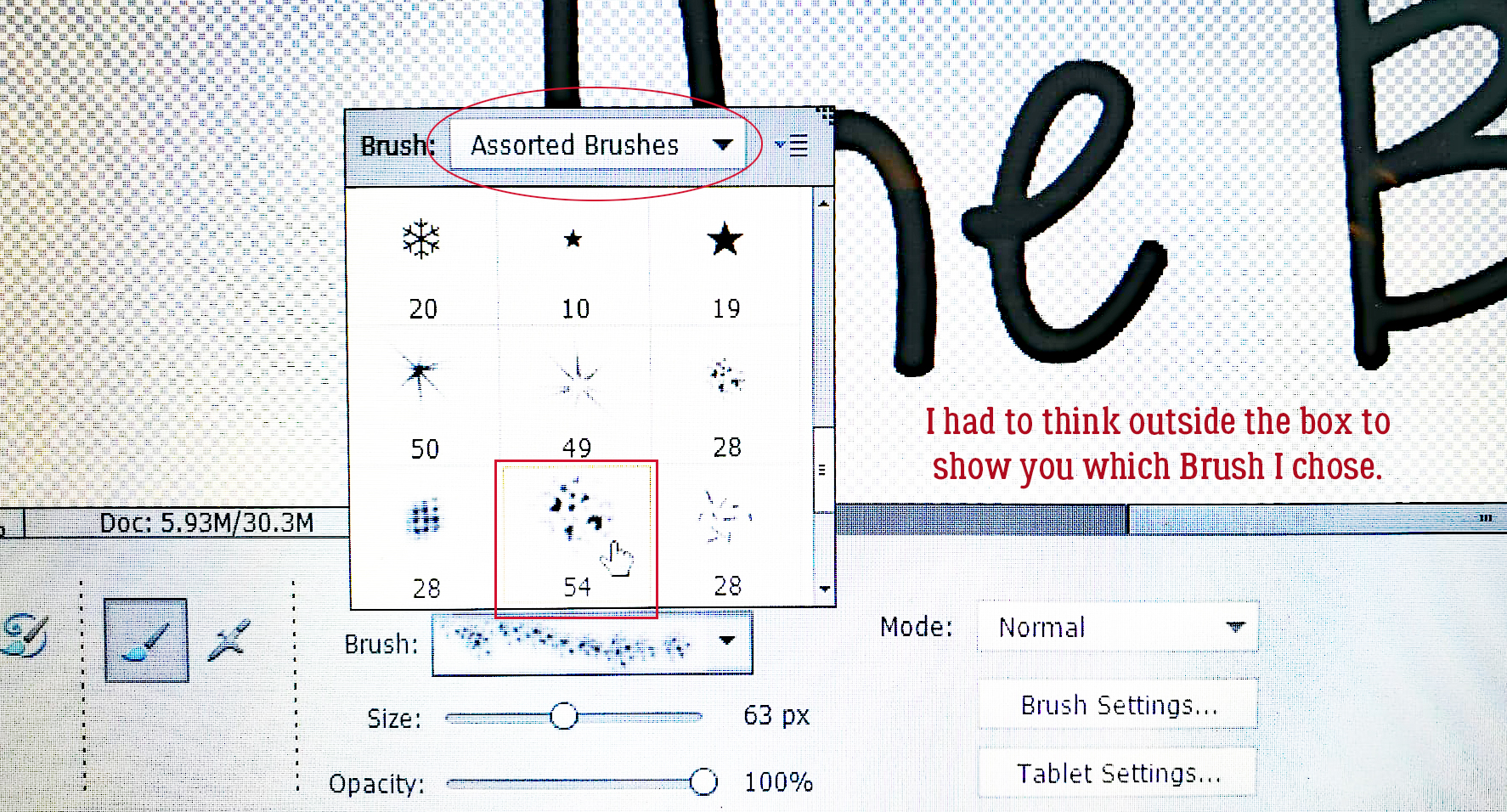
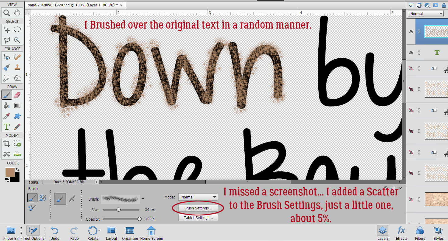
Every time I tried to show you how I chose my Brush, the selection box kept disappearing. So this is a photo from my phone. Assorted Brushes is a set that comes with the PSE software. I chose a texture brush from the set.
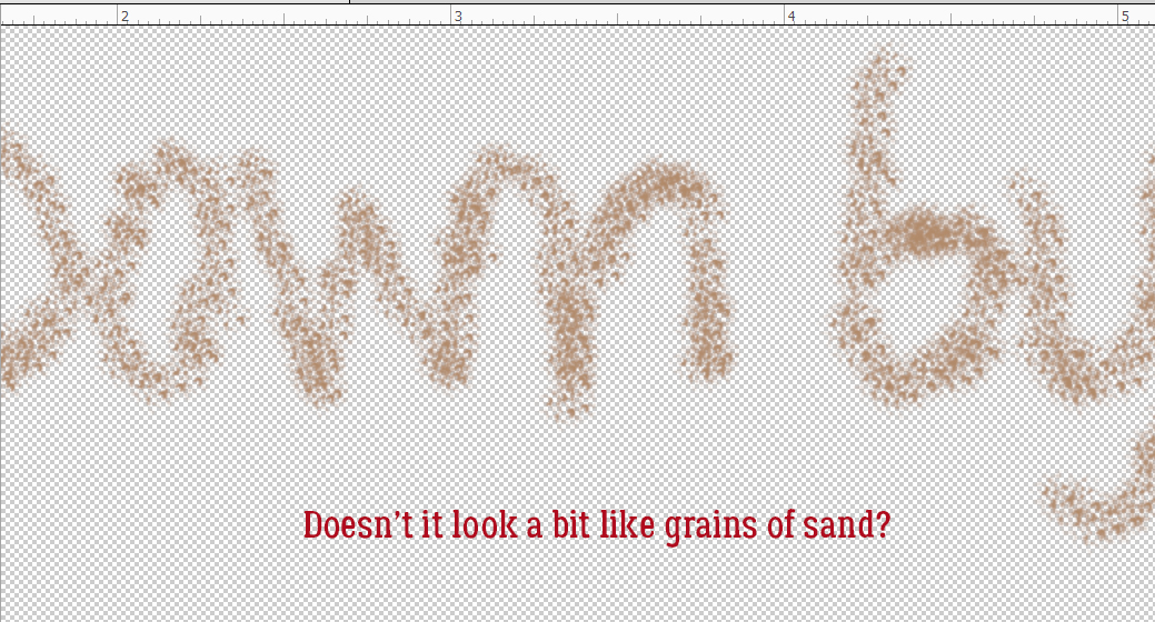
Then I got ahead of myself and missed a screenshot. I went into the Brush Settings and added a small Scatter, about 5%, so the edges would be more natural. Then I started brushing over the text in a random pattern, making it a bit heavier wherever a finger stroke would have started or ended. I think it looks suitably crumbly.
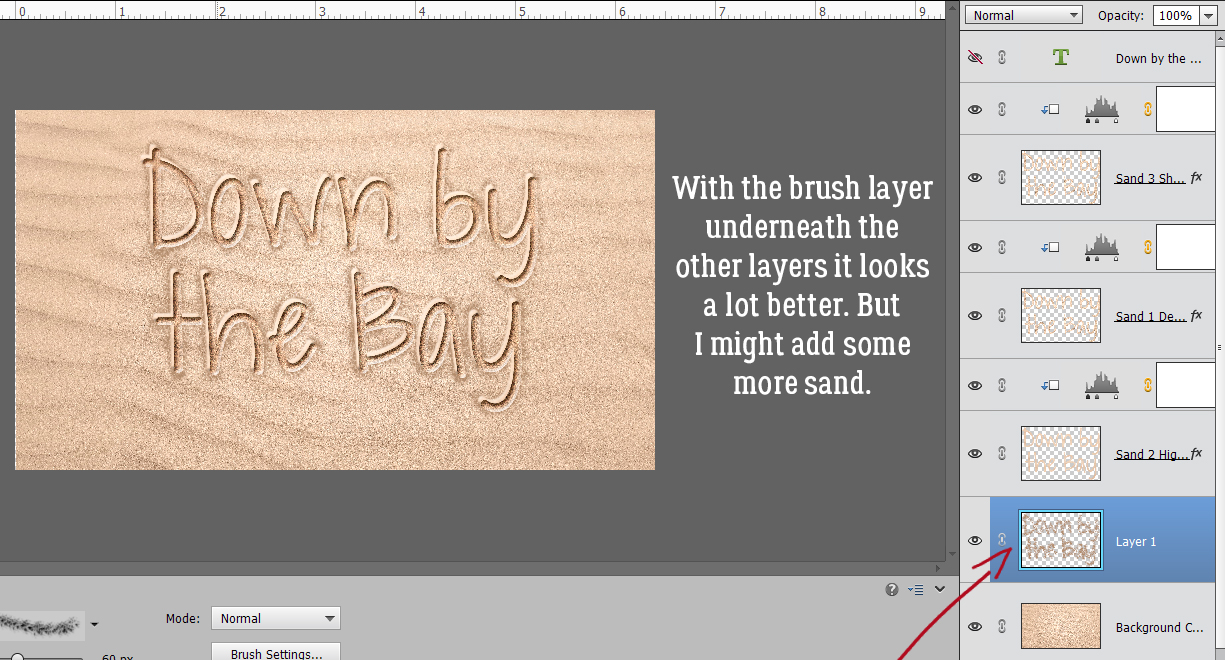
With only my brush layer visible I was able to see where it might need a bit more sand.
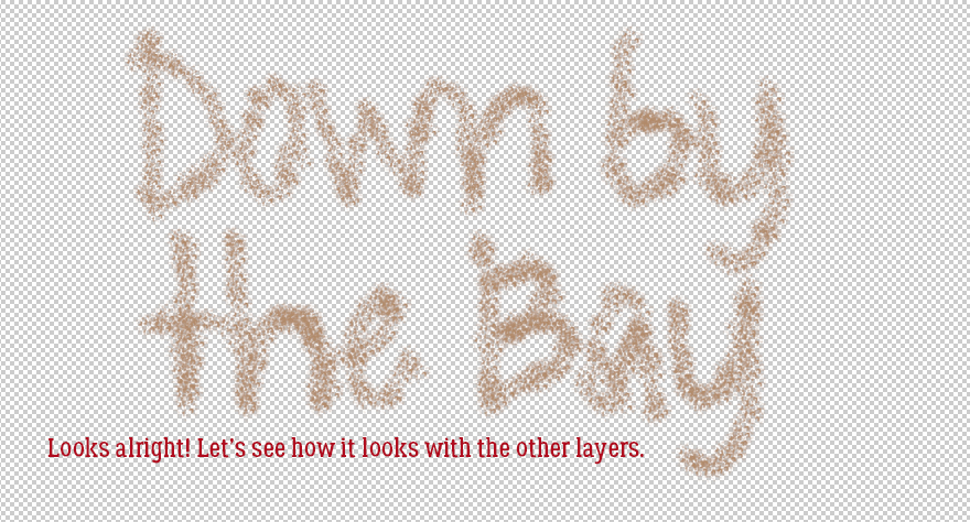
That looks more like it!
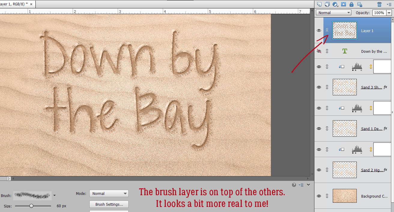
In this image the brush layer is still on the top. It’ll need to be moved down the stack so it sits underneath the SAND layers, but it looks pretty good.
Zooming out with the crumbly layer at the bottom lets me see the full effect. I think the raised edges are still too perfect.
So I brushed some sandy clumps onto the SAND 2 LAYER (not the Adjustment Layer). I think it looks pretty real now. Now, this is just the basic technique. The text can be skewed for photos where the sand isn’t perpendicular to the lens, but that’s a topic for another time.
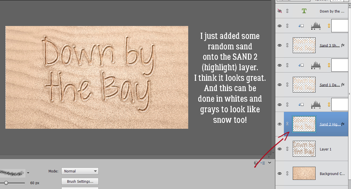
This technique can be done with whites and grays too, so it looks like writing in the snow. (If you’re really cheeky, you could add some yellow in there too… ) Sherry, I hope this is what you were looking for. It seems like it’s labour-intensive, but it really isn’t too bad.
Next week we might be manipulating text again. I haven’t decided yet!
Here is a link to the PDF version of this tutorial: https://bit.ly/2KRnSr3
![]()
Thanks, good choice of font for this.
Very interesting! I have photoshop, I have to try.
I love this! I definitely want to try it – thank you!
Thanks for this tutorial, Jan. Your end result is terrific — I think the brush work really adds to the realism! & thanks for all the step-by-step photos!! I like being able to see exactly what you are referring to, so I can follow your steps exactly!
Thanks for the kind words, Pam. I always hope people aren’t put off by the number of images in a tutorial, but I also want the tricks I’m showing to be accessible to everyone, regardless of their degree of comfort with the software. It’s usually a compromise!
It’s actually a lot easier than it looks. I was pleasantly surprised as I worked through the steps. And I learned a couple of things in the process!
Thanks for giving the PDF. I am always trying to copy and paste…..
That’s all GINGER!
WoW Jan, you nailed it !!
I am seeing this a little late (No computer playtime until now) and it is fantastic. Your results by adding the crumble really make the sand look real. I can’t wait to give this a try. Thank you so much 🙂
PS: I have the perfect photo for yellow snow. My daughter in law will love it !! my son will not …..lol.
Amazing tutorial. Thank you so much. I really appreciate the pdf too – I am saving it in my How To folder!!!
Sherry, I’m so glad this is what you were looking for. It’s a fun technique and not nearly as hard as I thought it would be.
Jan: You really put a lot of thought and effort into this tutorial. Love all the screenshots. Clever ideas and reasoning.
Thanks for the kind words, Terri. I try hard to make it worth people’s time to read my scribblings.