A Baker’s Dozen of Father’s Day Fonts
![]()
It’s been a while since I showed you some new fonts, and with Father’s Day coming up I thought I’d look at the selection at dafont.com to see if I could find some more great masculine fonts to share. I have so many frilly, scripty, swashy fonts, but not so many that are more suited to the men in my life. I found a dozen that fit the bill very well and have a bonus set of dingbats at the end. (I also downloaded <coughcough> fourteen others…) Each font name is linked to the dafont.com website so you can quickly and easily grab the ones you want. Let’s have a look at what I’m liking.
First up is this one that made me laugh out loud. Daddy Cartoon is cute, but still would work for those layouts where Dad’s being silly.

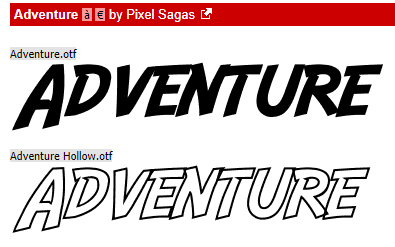
Next is this Indiana Jones-inspired font Adventure. Great for titles and easy to read, this could be your go-to for your manly layouts.
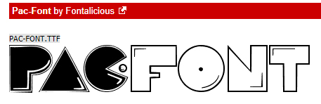
Pac-Font took me right back to the early days of my marriage, when we had one little person in our house. My husband has always had a deep and abiding love for video games, and this one would be right up his alley.
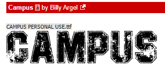
I like the grunginess of Campus. It makes me think of workshops, garages, paint shops and that sort of stereotypically male environment.
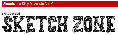
This serif-style font is pretty grungy too, but in a less formal way. It’s called Sketchzone and I could see it working well for both titles and subtitles.
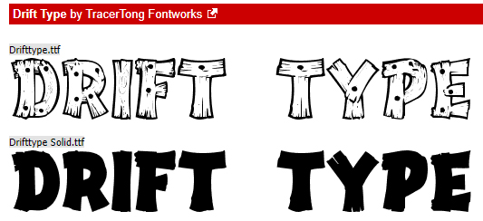
For some reason, this one made me think of tree houses and forts with “No Gurlz Allowed” signs. Don’t you think Drift Type would fit right in?
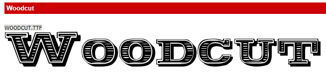
Woodcut immediately made me think of chisels and carving tools. A bevel added to this would turn it into a stunning alpha and it’s already shadowed!
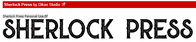
I could see Sherlock Press as a stand-out title font for heritage layouts, with photos of men with handlebar moustaches and neatly parted hair.
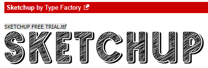
Sketchup is another font that looks hand-drawn and would look wonderful on any layout about creativity.
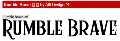
I think Rumble Brave has a steampunk look to it. I’d probably use it for layouts filled with gears, nail heads, staples, maybe a pocket watch… Yes?
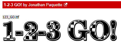
To me, 1-2-3 Go! suggests car racing, with the checkered-flag bits embedded in the characters. With a little manipulation it could be a smashing alpha.
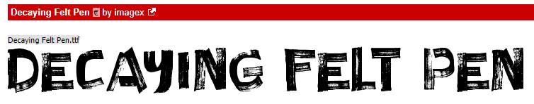
The last font on the list is one I HAD to include after my tutorial last week. Decaying Felt Pen just made me laugh.
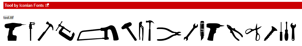
Now for the one dingbat that has the incongruent name Tool Font. It’s not really a font… but the silhouettes are pretty sharp!
I’ll be making a Father’s Day card and some birthday cards soon for my grand-daughter, whose birthday is June 29th, and her big brother, birthday July 1st, Maybe I’ll make one for my son-in-law whose birthday is July 3rd……. we’re THAT family. You may see one of these turn up in a tut in the coming weeks, if inspiration strikes and it’s worth sharing.
Link to PDF version of this tutorial: https://bit.ly/2SCNmfD
![]()
great fonts! FYI- Sherlock, Skethchup, Rumble & Tool Fonts aren’t linked
Thanks for letting me know. All fixed!
Very fun fonts! Guys are always hard so these look very helpful- thanks!