Exploring Uncharted Territory (Elements Features)
![]()
Something about Elements popped up on my Pinterest feed the other night that had me scratching my head. How had I not explored this before? I’m talking about the Graphics menu. It’s a treasure trove! And I think it’ll be really useful for those new-to-digiscrapping who are still building up their stash. I know when I was first finding my way, I downloaded a lot of freebies – because they were free, I had nothing and I was on a budget – that I ended up never using. The things to be found in the Graphics menu will be a bit like that for a lot of us, but without having a look we’d never know. So let’s explore!
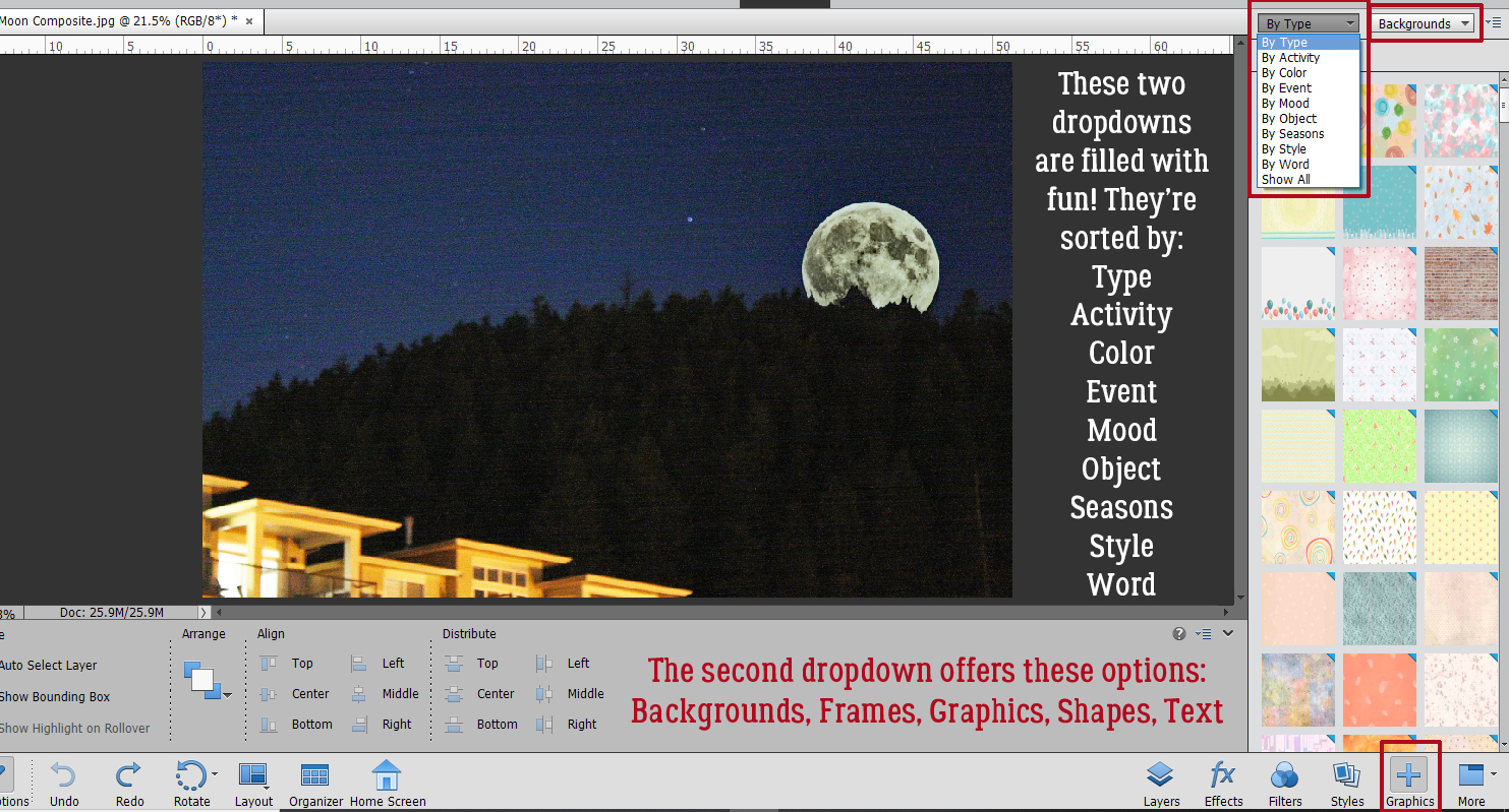
If your workspace doesn’t look like mine, you might not have that Graphics button down in the lower right corner. Not to worry. You can find the goodies by clicking Window>Graphics (or by clicking F7). The menu includes two dropdowns chock full of options.
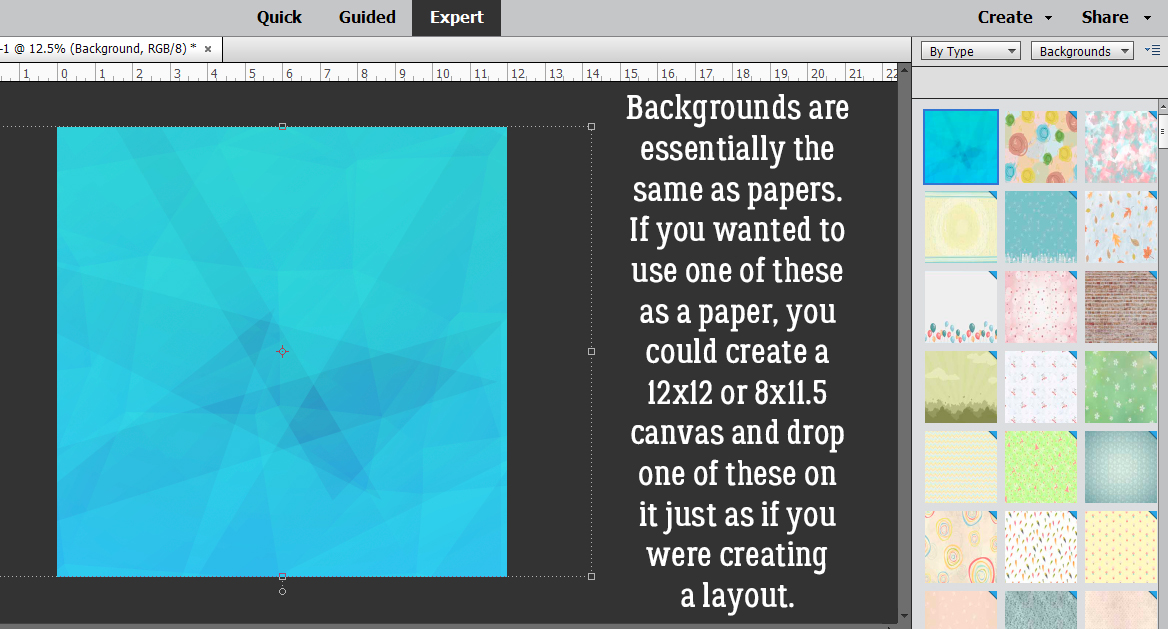
I think top-to-bottom-left-to-right makes the most sense, so we’ll start with By Type: Backgrounds. You can think of Backgrounds as papers. There are a TON of them in this menu. They’re rectangular and in landscape orientation so if you prefer to scrap in a square configuration, you may need to move the Background to give you the section you want visible. They aren’t necessarily as elegant as designer papers, but they’ll do in a pinch!
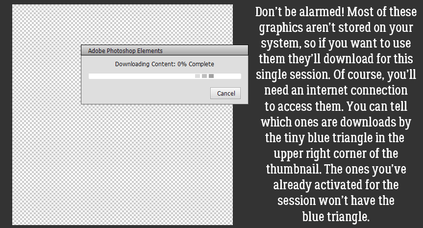
Okay, so when you see this, don’t panic! Most of these Graphics don’t live inside your computer. You’ll need an internet connection so they can be downloaded into your software for the session at hand. Elements is a real resource hog already, so this is a bonus.
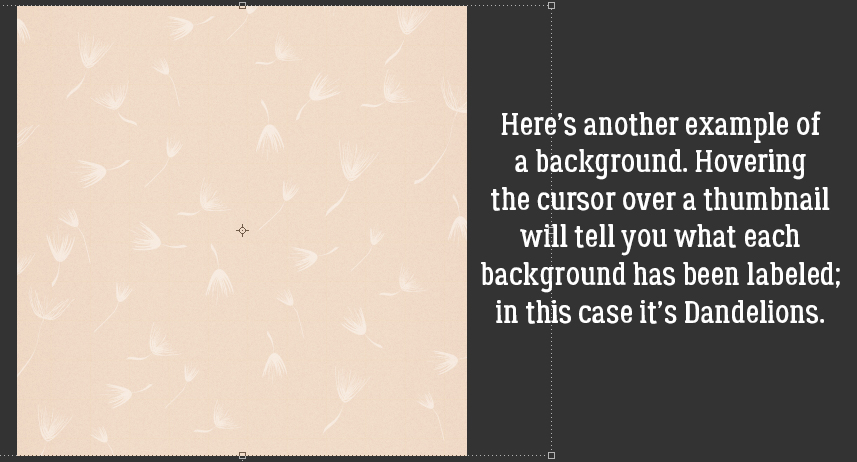
I’m not going to show you a lot of these. I liked the name of this one when I hovered my cursor over it, so I opened it.
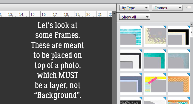
Next up are the Frames. I WILL show you a few of these, because they’re pretty awesome! I don’t often use frames of any kind for my layouts, but I may start now that I’ve found these! It took me a minute (or ten) to figure out how to make them work but once I got it, I ran with it! For them to work properly, your photo CANNOT be a “Background“, it has to be a “layer“. Right-click on your photo layer in the Layers panel and select Layer from Background and you’re on your way.
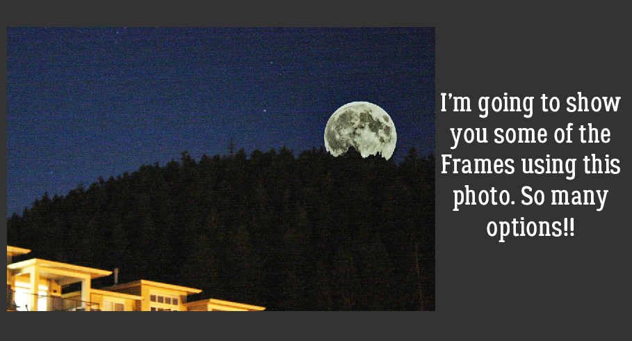
This is the composite photo I created awhile back in the tutorial on compositing. I’m going to use it as my example.
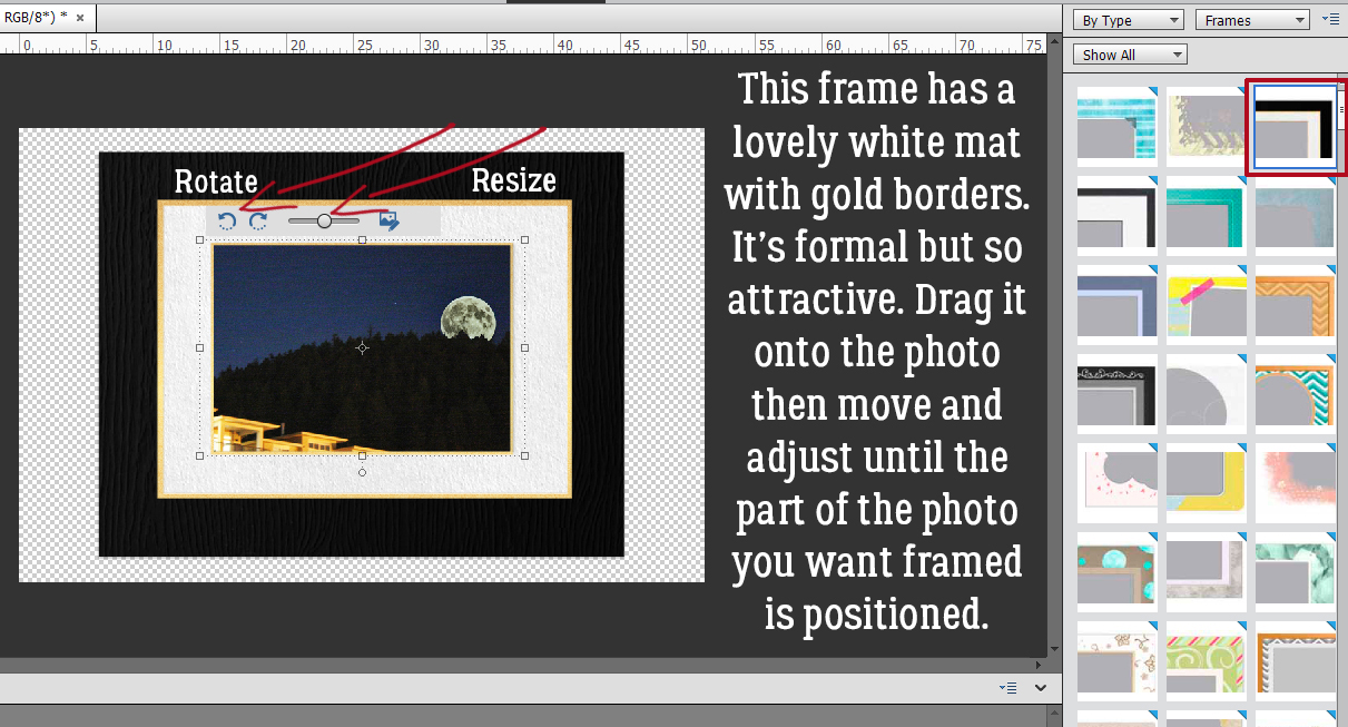
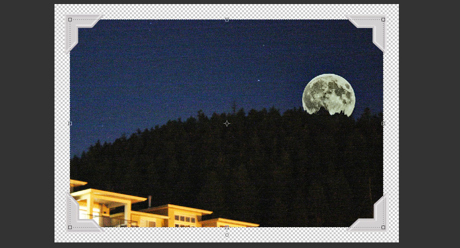
Once you’ve selected a Frame from the menu and clicked on it to apply, you’ll see this. See the transparent background around it? No need for cropping or cutting it out with the Marquee tool! The slider lets you make your photo bigger or smaller so that the area of it you want in the frame can be fine-tuned. And the circular arrows are for rotating the photo 90° left or right.
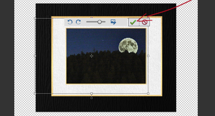
After you’ve tweaked, hit the green checkmark and carry on!
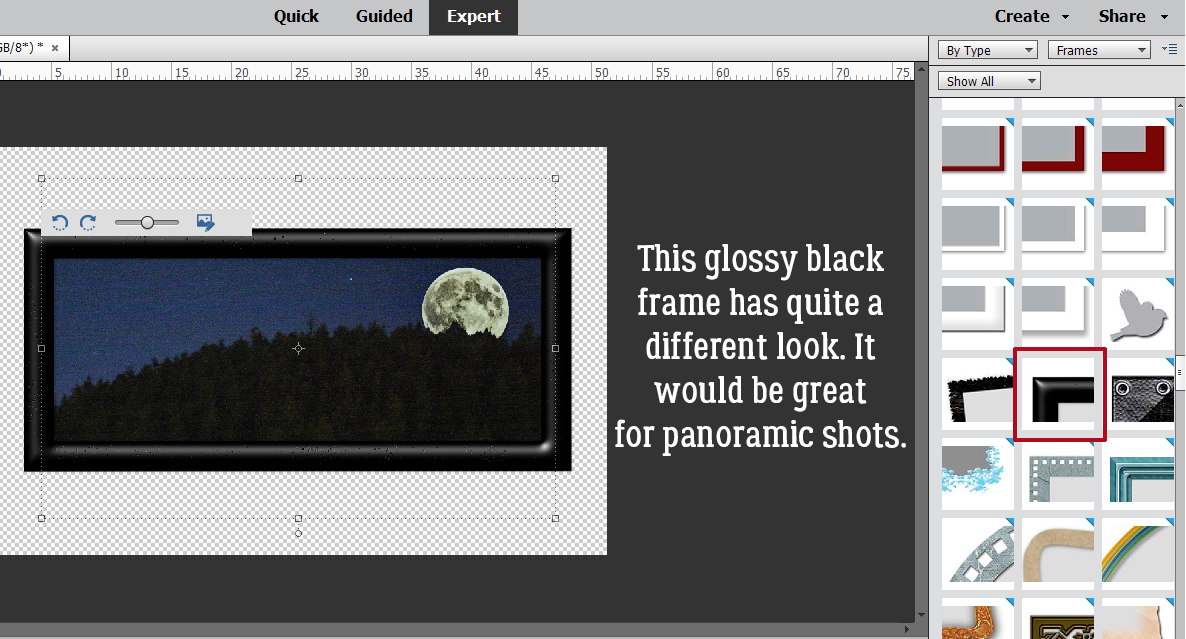
I tried a few of these Frames. I like the look of this black glossy one for panoramic photos… like the millions of sunset photos I have.
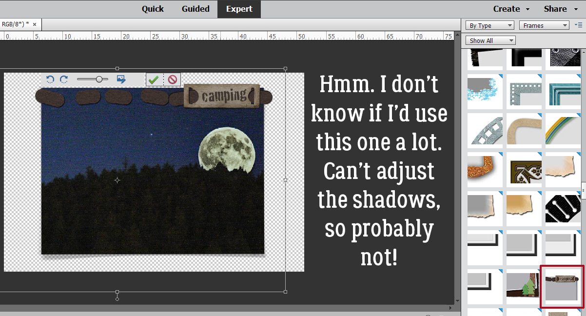
This one didn’t excite me much!
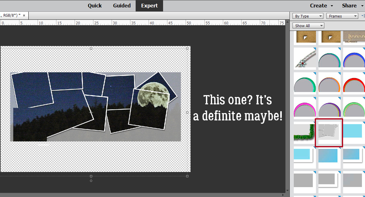
But the collage Frame? I LOVE it!!
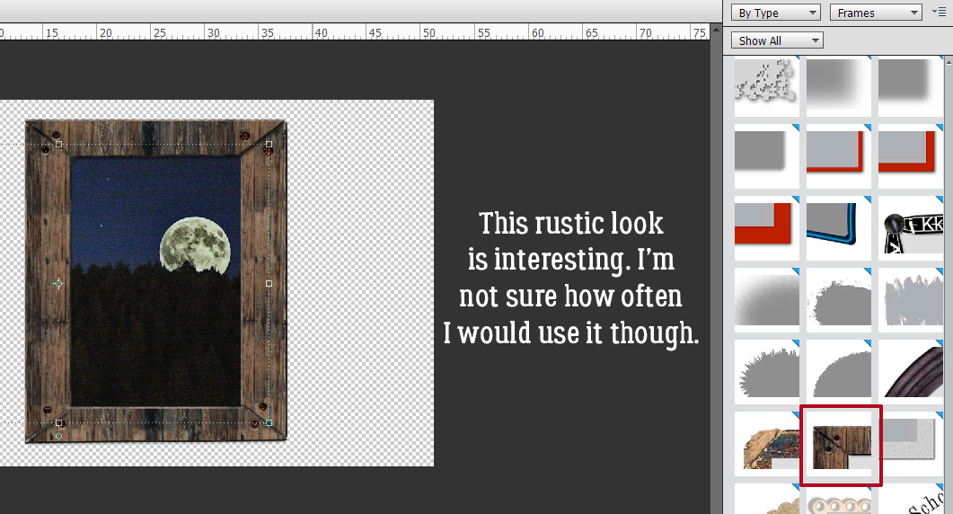
This rustic one would be great for an Old-West layout, or a heritage layout of pioneering ancestors.
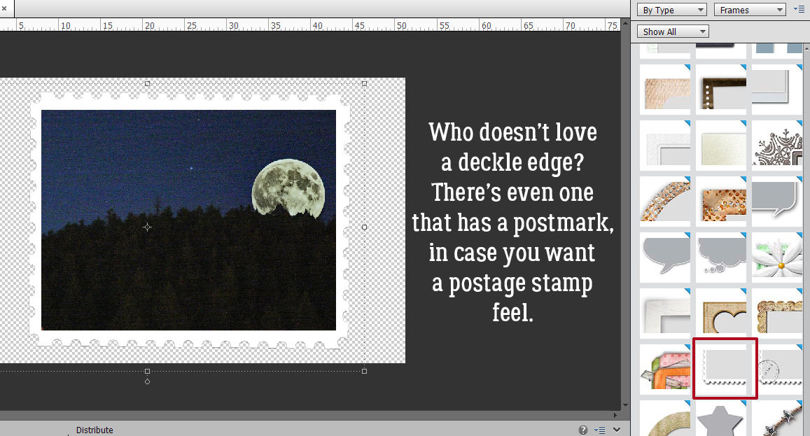
The late 1950s and early 1960s were the heyday for deckle edges. There’s another one right next to it on the menu that also has a postmark, to give the photo a postage stamp appearance.
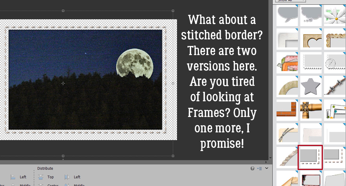
Then there are the two stitched borders. Quicker than sorting through my stash to find some stitches…
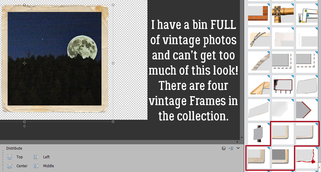
I do actually have a bin full of vintage photos. These four vintage Frames could be lovely additions to the ones I’ve scanned and cropped.
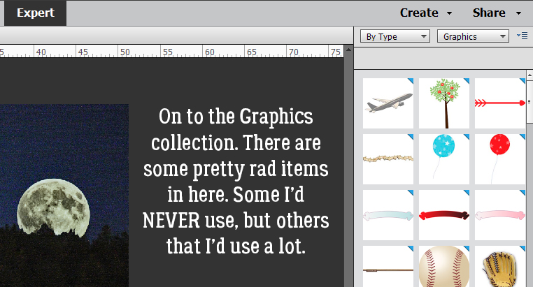
The Graphics group is also huge. There are all sorts of goodies in here!
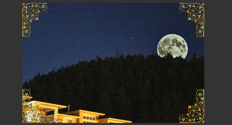
Like this fabulous gold filigree photo corner (or is it a corbel? I’m watching DIY shows on HGTV as I work).
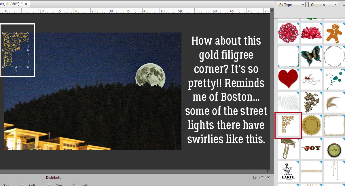
If I cropped out those brilliantly-lit houses in the lower left corner of my photo these filigrees would be even more amazing.
Looking for something more traditional? My mom had a box of black paper photo corners. Bet yours did too!
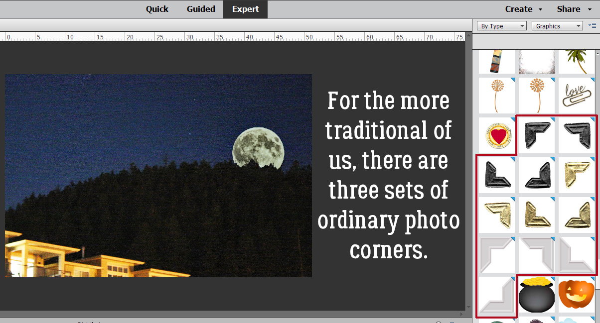
The white ones are a bit more modern-looking, but still traditional.
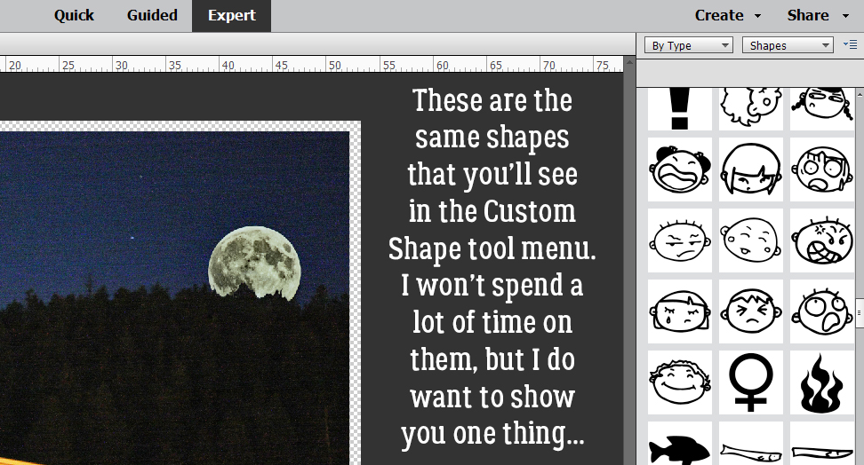
The Shapes menu is exactly the same as the Custom Shapes/Cookie Cutter one.
The Shape layer is under the photo, with the edge Selected by CTRL/CMD>clicking on the Shape thumbnail. The photo layer is the active layer and I’m going to add a white stroke to the outline.
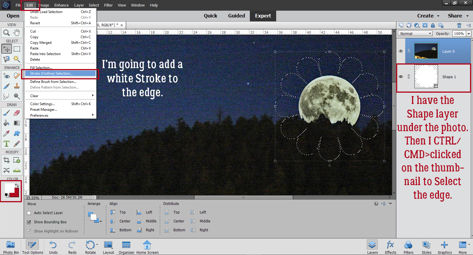
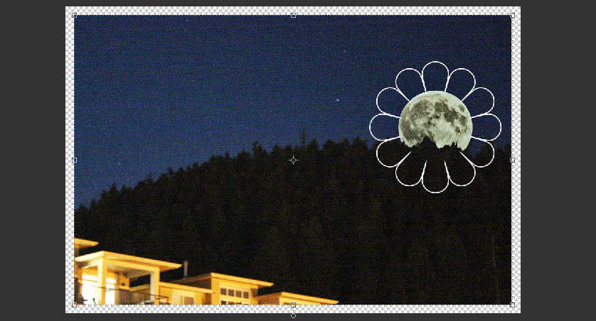
Cheesy? Yeah, a bit. But it was fun to turn the moon into a flower! If I put this Stroke on its own layer I might Erase the parts of the petals that overlap the trees. What do you think?
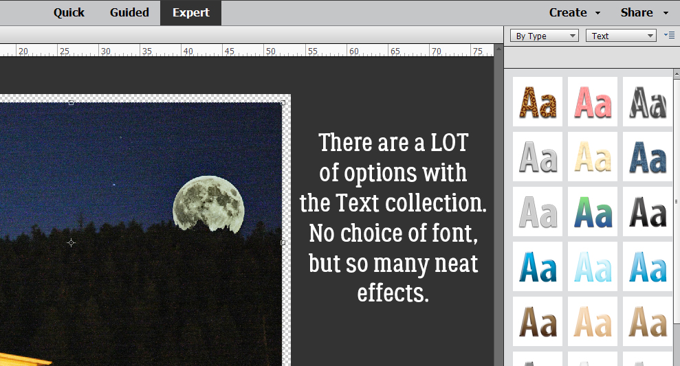
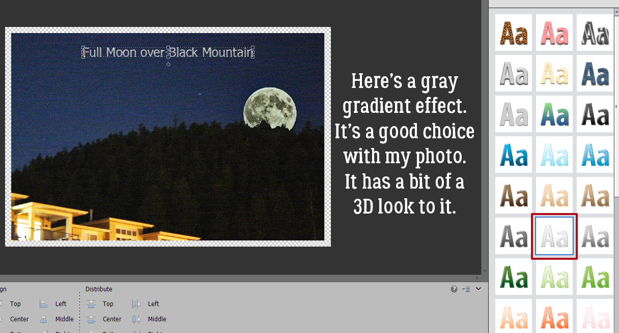
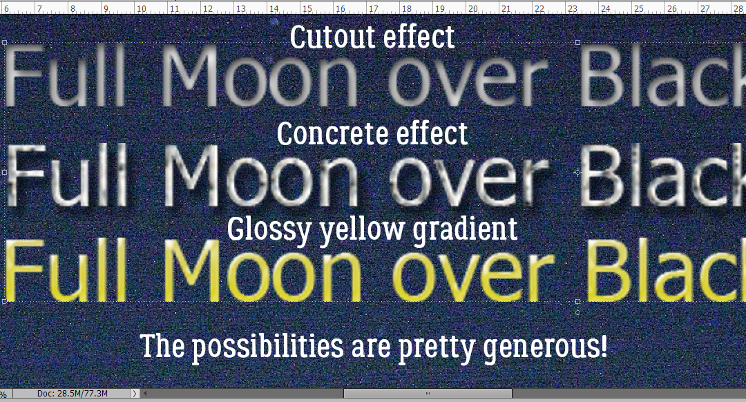
The Text options are many! Several variations of effect in every colour. Only drawback is there’s no choice of font.
I think this might look equally “right” if I’d gone with one of the soft yellow gradients like the one two spaces down to the left. But the grey pulls its look from the moon.
Here are a few more samples.
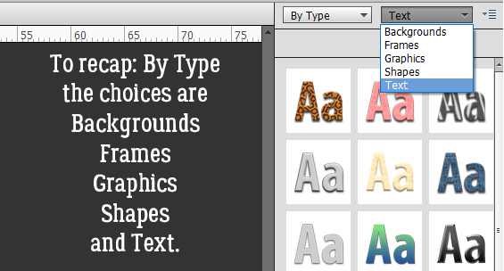
So let’s recap a bit by going over the categories one by one, starting with By Type. Each of the categories will include all the Graphics from each of the groups that correspond to the tag.
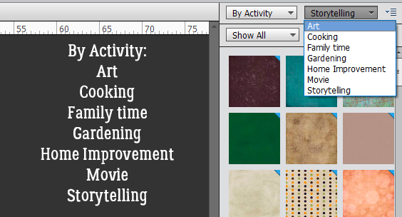
Then By Activity.
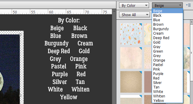
And By Color.
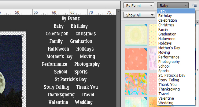
By Event offers some great choices!
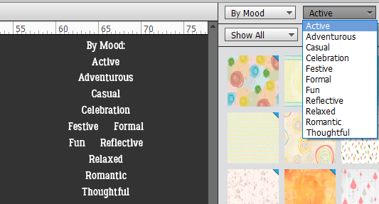
Which of us isn’t moody at times? All the appropriate Graphics here are sorted By Mood.
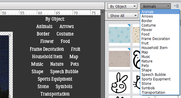
It might be quicker to find exactly what you’re looking for by choosing By Object.
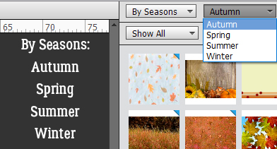
So many people scrap by the season so this By Season sort takes the guesswork out of finding all the right stuff.
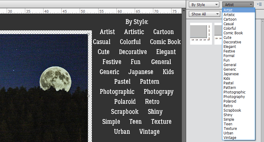
Here, By Style means something different than the usual Elements Styles. There are literally more than two dozen Graphics styles here.
You may never use any of these but isn’t it nice to know they’re there?
The saga of the crumbling laptop continues. The replacement I ordered arrived but it doesn’t work! Turns out it isn’t new (as I thought it was) and hadn’t been factory reset. I’m a bit tech-savvy so I did a factory reset but wasn’t able to go any further. I’ll be shipping it back and waiting on a different machine I ordered that might not be here until some time in August – it’s coming right from the plant. Meanwhile, I’ll limp along with this one, hoping it doesn’t completely die before I have a functioning replacement. Sigh.
PDF Version: https://bit.ly/2SXRK99
![]()
Thank you Jan for the Tutorial. I had seen the Graphics tab but never investigated.
Lots of interesting options to play with.
My PSE is so old that I don’t even have a Graphics button or the option under Window! LOL Fortunately, when I clicked F7, everything appeared. Thank you for this tutorial!