Faking the Wood Burning Look
![]()
Last week Ellen (gmae) sent me this message:
Hi Jan, The above YouTube is for wood burning in Photoshop. He talks through this way too quickly for me so it will take me a few stop and go’s to get the directions down pat to try in Elements but I can see it being great for rustic, western, and camping titles. Since its from Photoshop not Elements there are some things he says to do that may take some figuring. My first attempt not so wood burning looking. Has a lot to do with the styles he puts on at the end I think. Just an FYI if you look at this.
Well, you know how much I love a challenge! And this one was a doozy. As Ellen said, it’s all about the styles he puts on at the end. Because this tutorial is adapted from Photoshop AND a 7 minute video, there are 46 screenshots so I can show each step clearly. That doesn’t mean it’s hard or will take all day. I just want to be sure even the most inexperienced user can follow along.
I’ll be demonstrating using a word art file from Word Art World‘s Jen Arbon. The woodgrain paper is from the GingerBread Ladies‘ Cabin Fever collab kit. If you’d like to use your own text or image, the technique will be exactly the same. [Simplify your text layer though!]

To start off, I made a Copy of the word art layer. You can right-click on the layer and choose Duplicate Layer then click OK on the pop-up, or you can use the keyboard shortcut CTRL/CMD>J. [It’s been awhile since I explained the keyboard shortcuts. These are simple keystrokes that take the place of several steps using the other methods of achieving something. I use Windows, which has a CTRL key. On a Mac, it would be a CMD key. Windows uses ALT and Mac uses OPT. So when I show you a keyboard shortcut I’ll give you both Windows and Mac keys.]
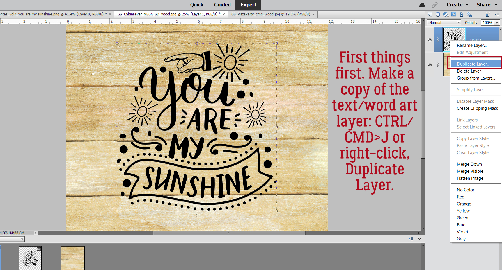
Next I created a new blank layer BETWEEN the two word art layers by holding down the CTRL/CMD key and clicking on the New Layer icon [looks like a sheet of paper with a corner dog-eared] from the top left of the Layers panel. The CTRL/CMD key tells Elements to put it UNDER the active layer.

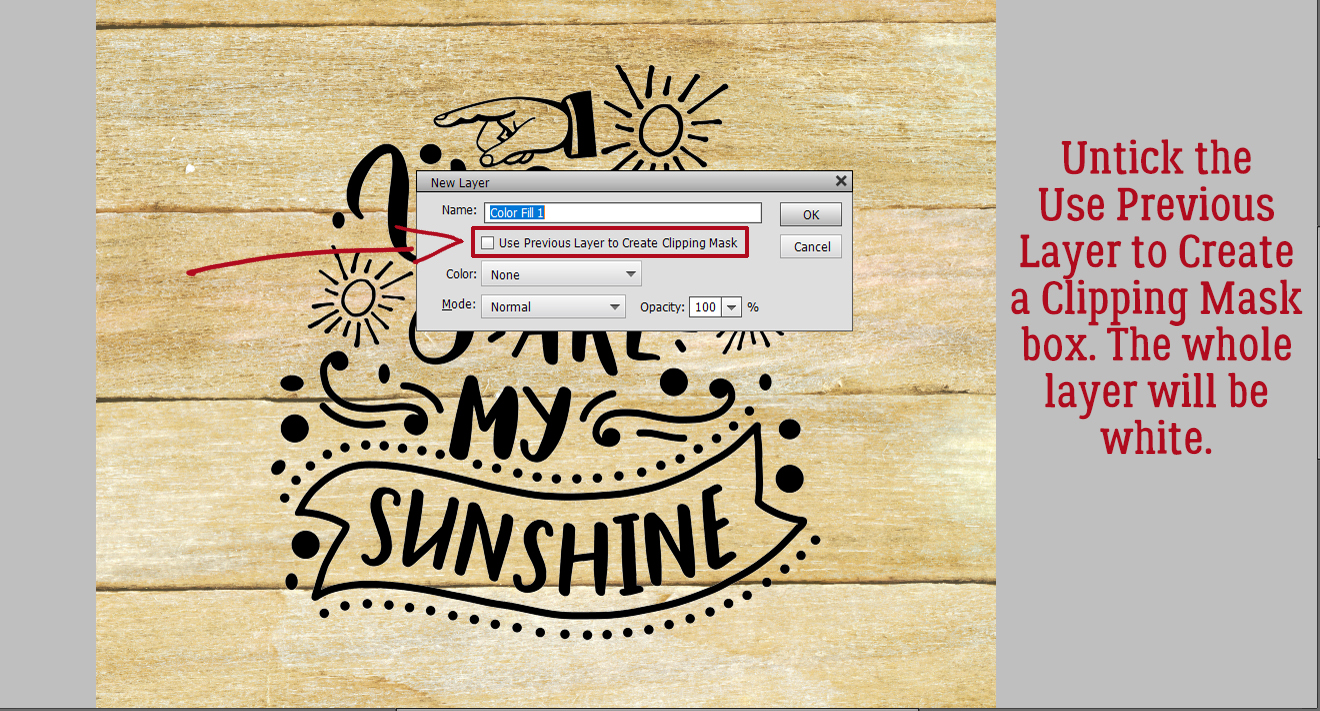
With the blank layer active, I made the layer solid white: Layer>New Fill Layer>Solid Color

Since I’m filling the whole layer with white the box for Use Previous Layer to Create Clipping Mask can be unticked.
There are a couple of ways to choose a colour from the Color Picker: click on an area of a photo/paper/element with the Eyedropper tool, click on a spot inside the colour swatch or type in the colour number. Pure white is “ffffff“.

Then I Merged the white layer with the word art Copy layer: SHIFT>click on the two layers then right-click and choose Merge Layers or even simpler, CTRL/CMD>E.

Now I have three layers, with the wood paper on the bottom of the stack and the black-and-white word art layer on top as shown. I want to Select just the word art on the black-and-white layer so I CTRL/CMD>clicked on the layer thumbnail [the little image on the left of the layer in the panel] of the word art with the black-and-white layer active. See the marching ants?

I want to Modify the Selection. I clicked Select>Modify>Expand as shown.

I only want it to Expand by 1 pixel.

To fill that hairline space with black [in the foreground colour box] I clicked ALT/OPT>D and Elements did the work.

Next I Inverted the colours so the word art is white on black by just clicking CTRL/CMD>I. This tutorial has a bunch of things I’ve never tried before. This is the first one. Filter>Stylize>Wind.

This menu opens up. Make sure the Method is Wind. The Direction doesn’t matter at this point. You can see in the Preview pane what the Filter will do.

This Filter will be applied two more times. Elements will remember the last Filter used, so you can click Filter and Wind will be right at the top. Or, even easier, just click CTRL/CMD>F. Just make sure it’s applied three times in total.

This is what it’s supposed to look like. Don’t be alarmed!!

Now I’m going to do the Filter step again. Because I’m going to make a change to the settings I can’t just CTRL/CMD>F my way there.

This time the Direction has to be changed so the streaks go the opposite way.

Here’s after the first hit with the Wind Filter. The change isn’t very obvious.

So I hit it again two more times! CTRL/CMD>F and CTRL/CMD>F.

Wow! But don’t worry, that’s what it should look like!

And then I Inverted the colours again so the word art was once again black-on-white. CTRL/CMD>I.

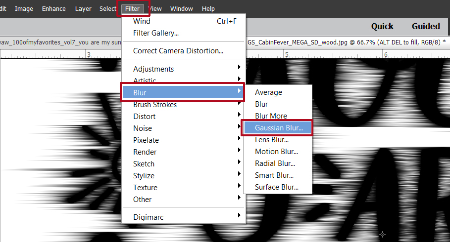
I’m not done with Filters yet. This time I’m going to add a Filter>Blur>Gaussian Blur to the mix.
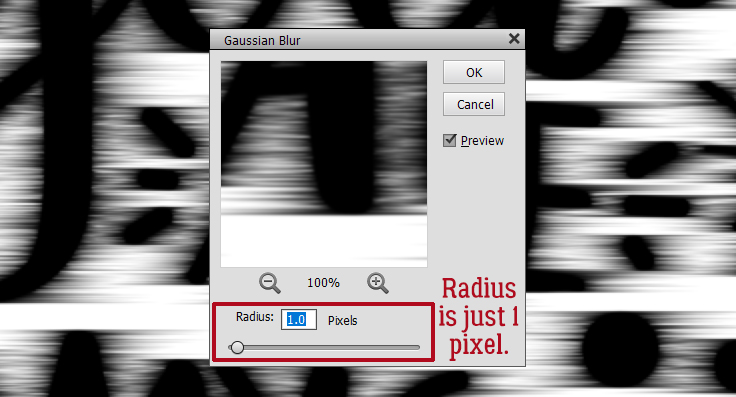
But not too much of a Blur… just a Radius of 1 pixel.
The black is a bit harsh, so I clicked Enhance>Adjust Lighting>Levels. Keyboard shortcut: CTRL/CMD>L.

And I changed the Output Level from 0 to 72. That grays the black a bit, but not too much.

Remember Blend Modes? They’re such a great tool!! I changed the Blend Mode to Color Burn by clicking on that bar above the Layers panel that usually says Normal and choosing Color Burn from the dropdown list.

Now the sugars in the wood look like they’ve been caramelized!

It’s a little TOO obvious, so I dropped the Opacity of the layer to 60%.

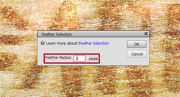
Once again I Selected the edges of the word art by CTRL/CMD>clicking on the word art layer thumbnail with the altered word art layer active. Then I did something else I’ve never tried before… Select>Feather to soften the edges of the caramelized areas just a teensy bit.

I gave it a Feather Radius of 2 pixels. Everything about this needs a light touch.
With the edges still Selected, I added a new Fill Layer. Layer>New Fill Layer>Solid Color. This new Fill Layer will be the base for the next few steps.

Again, I didn’t need to tick the Use Previous Layer to Create Clipping Mask, because only the Selected areas will be filled. On this settings menu, I dropped the Opacity of the Fill to 40%.

The Color Picker opened, and I wanted pure black. The code number for black is 000000.

After I created the Fill Layer, I Simplified it so the mask went away. Right-click on the layer and choose Simplify Layer.

Next I made 2 Copies of this black Fill Layer and turned Visibility for the top two Copy Layers off. I wanted to see what was happening to each active layer, starting with the original Fill Layer. [In Photoshop the next several steps can all be accomplished on the same layer, but Elements isn’t that skillful. Each step needs its own layer. *Where have you heard that before?*]

To the bottom Fill Layer, I added a Bevel Style. Click on the Styles button at the bottom of the Layers panel then choose Bevels. From the dropdown menu choose Simple Outer as shown. [If you hover the cursor over the thumbnails in the dropdown, a description box opens so you know what’s what.]

Each of the Styles has a default setting, but you can easily change the settings by double-clicking on the fx icon on the far right of the layer. The settings menu opens. Here I changed the Lighting Angle to 130°, the Drop Shadow settings to Size 29 pixels, Distance 13 pixels, and Opacity 22%, then the Bevel settings to 20 pixels and the Direction to Down.

Next I activated the first Copy Layer just above the layer I last worked on, but this time I chose Styles>Inner Shadows.
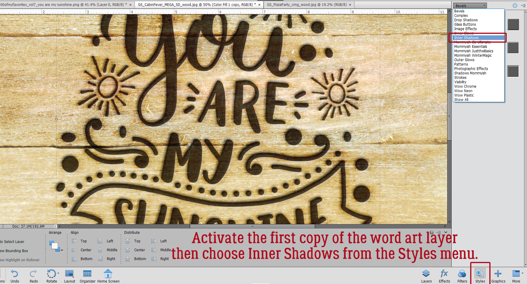
I double-clicked the fx icon and from the settings I made the Lighting Angle 147°, Size 50 pixels, Distance 4 pixels and Opacity 20%.

Then I changed the Blend Mode for this layer to Linear Burn.

It’s looking pretty good!

I wanted just a bit more depth to the image so I activated the top Copy Layer and from the Styles menu I chose Outer Glows.

I used Simple from the menu as shown.

After double-clicking on the fx icon, I adjusted the settings: Lighting Angle 130°, Size 21 pixels and Opacity 25%.

The Outer Glow layer looked odd on top so I moved it to the bottom of the Copy Layer stack and lowered the Opacity to 10%. This took a bit of experimentation based on what I wanted to see.

Last but not least, I turned the original word art layer’s visibility back on. I’m quite pleased with how it turned out.

Some comments: The way this technique looks in the end will depend on several factors. If you use a smooth wood paper, your burned area will be smooth too. If you use a darker or lighter wood paper, you may need to fiddle with Opacity to get the looks you want. Obviously, doing this to a darker wood will result in darker burned areas, and it may be hard to see. On a lighter coloured wood, it may look too black, and again, you’d need to make some tweaks. I scrapped my work (and about 100 screenshots) 4 times before I was comfortable with this enough to show it to you. Don’t be afraid to make some of your own decisions! If you’re not happy with it, make some changes!!
PDF Version: https://bit.ly/3zAdEQ4
![]()
WoW !!!!! Awesome tutorial Jan 🙂
Thank you !!
Hey Jan!
Has anyone ever told you you are awesome? 🙂 If not let me be the first. (or the hundredth or just keep repeating it!) Now I can see why my attempts failed. It’s those multiple layers at the end. Don’t know why I never thought to do that. Maybe it’s because sometimes I need someone to hit me with a 2×4. Consider me hit. hopefully next time I will remember when I try something without your help lol. I hope you had more fun than frustration figuring this out and that everyone else enjoys all your hard work. I know I do! Thanks again!
I had fun sorting this one out. It took HOURS of watching 30 seconds of video, playing with the instructions, watching 30 more seconds of video, realizing Elements doesn’t do that, scrapping the whole thing and starting over, then doing it all again. But every time I do one of these adaptations I learn something new that will help with the next one, so it’s worth it. Thanks for the kind words! (Maybe I should hit Ginger up for a raise?)
Glad you liked it, Sherry!
Yup! you need a raise! Tripled at least. Well worth it!
Hi Jan,
I’m not sure where to post this so I hope it’s ok to send a tutorial request to you here. I love these alpha strip layouts and I have been trying to figure out how to shape the strip against the letter. So far I haven’t found a way that looks right. Would appreciate any help you can offer. I have a couple of examples but don’t know how to send them to you.
Sherry, I love getting requests like yours. You can always send me a private message through the Forum. Any time! My user name is ObiJanKenobi. You can send me the examples that way and I’ll see what I can do.