Colour Palettes, Swatches and How to Use Them
![]()
Hey ladies! Welcome back!! Did you know that my very first Tutorial Tuesday Blog post appeared FIVE years ago yesterday? I never dreamed we’d still be here, learning new things together after this long. It’s amazing! [And I already have topics lined up for the next two tuts. Crazy!!]
This week I’d like to shine the light on colour – challenges, swatches, palettes and colour codes. I had a request for this info, but I can’t find the original correspondence so I can’t remember who asked for it. My apologies. Essentially, her questions were how she could save swatches and how she could make better use of those alpha-numeric colour codes the Color Picker assigns to the rainbow. [It’s raining here today – something that hasn’t happened much for more than four months. Rain is on my brain.] So let’s talk.
Our friendly GingerScraps designers host the Forum Challenges, as you know. Each month there’s a Color Challenge, where the hostess provides the Challenge palette, most often by supplying a swatch, but sometimes it’s a photo or simply a list. I’m a Color Challenge nerd, 100%. If there’s a swatch in the Forum thread, there will be a swatch somewhere on my layout. I typically tuck it under the edge of a paper or photo, but it’s there if you look for it. This is how I make it part of my workflow. I right-click on the image in the thread and select Save Image As from the dropdown.
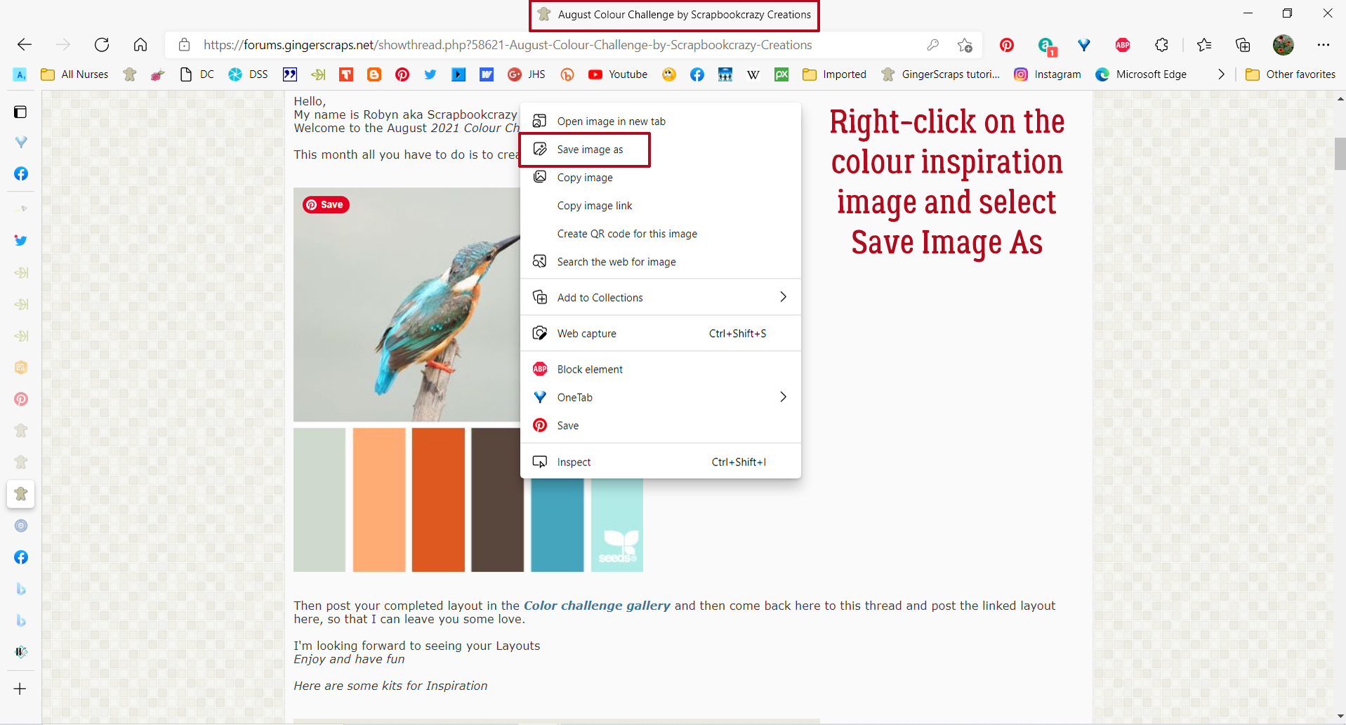
Usually at this point I’ve already decided I’m doing a Color Challenge and have created a subfolder to put all my pieces-parts into for ease of access. So it’s easy for me to decide where I’ll put the swatch image. I renamed it here for clarity but I don’t bother when it’s just for me.
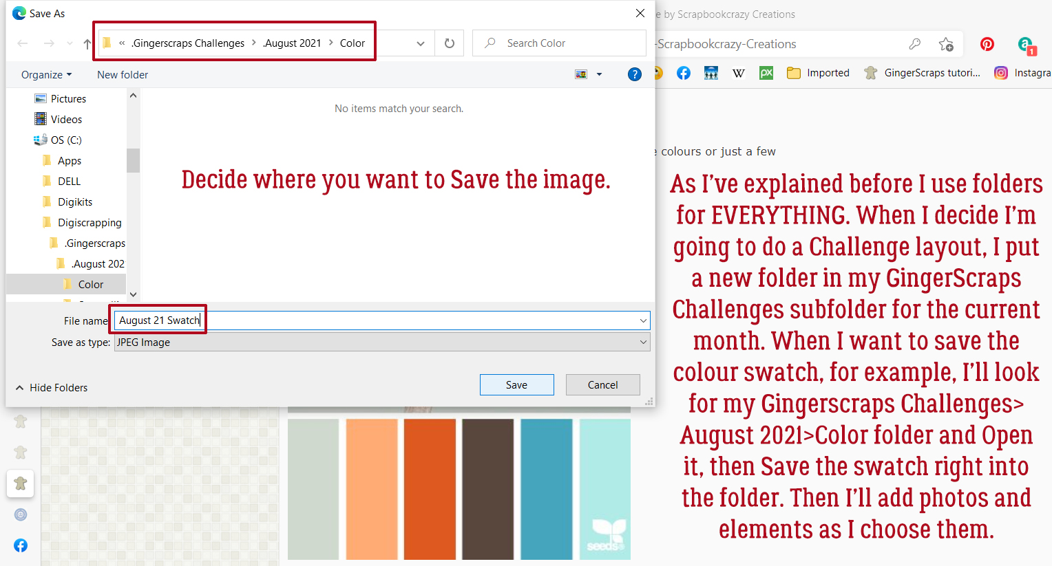
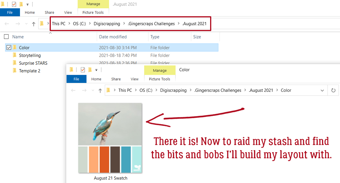
Now that it’s in my Challenge folder I can go to my stash and pick my papers and elements. This palette reminds me of my daughter’s wedding, so I chose some photos from that folder then paired them with Ooh La La Scraps‘ Just Breathe and Pocket Full of Sunshine. The colours aren’t a perfect match but they’re in the ballpark.
I’ve already done a tutorial on recolouring so this next part will be mostly just review. If you want a more detailed look at the subject, you can look here. In the context of this tutorial you’ll see how I use the swatch to get my chosen elements to match the colours as closely as I can.
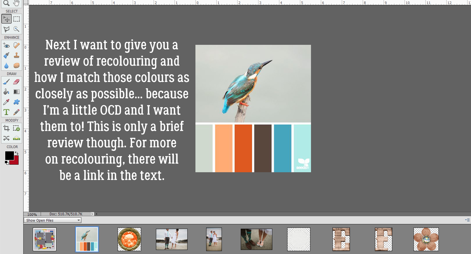
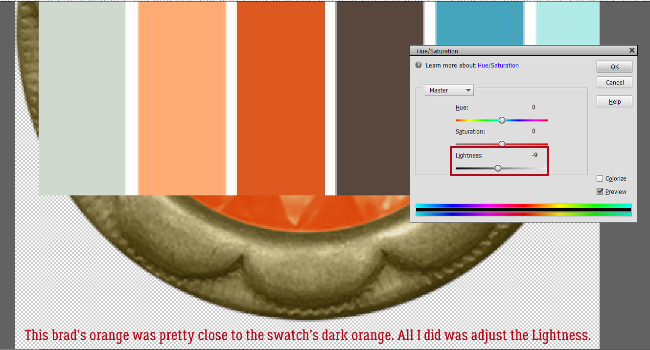
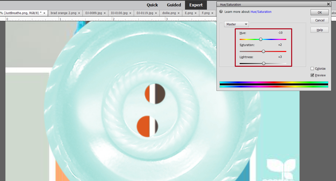
I start by dropping the swatch on top of whatever it is I want to adjust and moving it around so the colours touch. Sometimes no adjustment is necessary. To easily adjust colour, click Enhance>Adjust Color>Adjust Hue/Saturation… [CTRL/CMD>U] then play with the sliders. For this orange brad, I just needed a minor tweak of Lightness and it slid right into place. Once I’m happy with the change, I Delete the swatch layer – it’s still in my Photo Bin so don’t worry about it getting lost. The changes I’ve made to the brad will be kept until I close Elements.
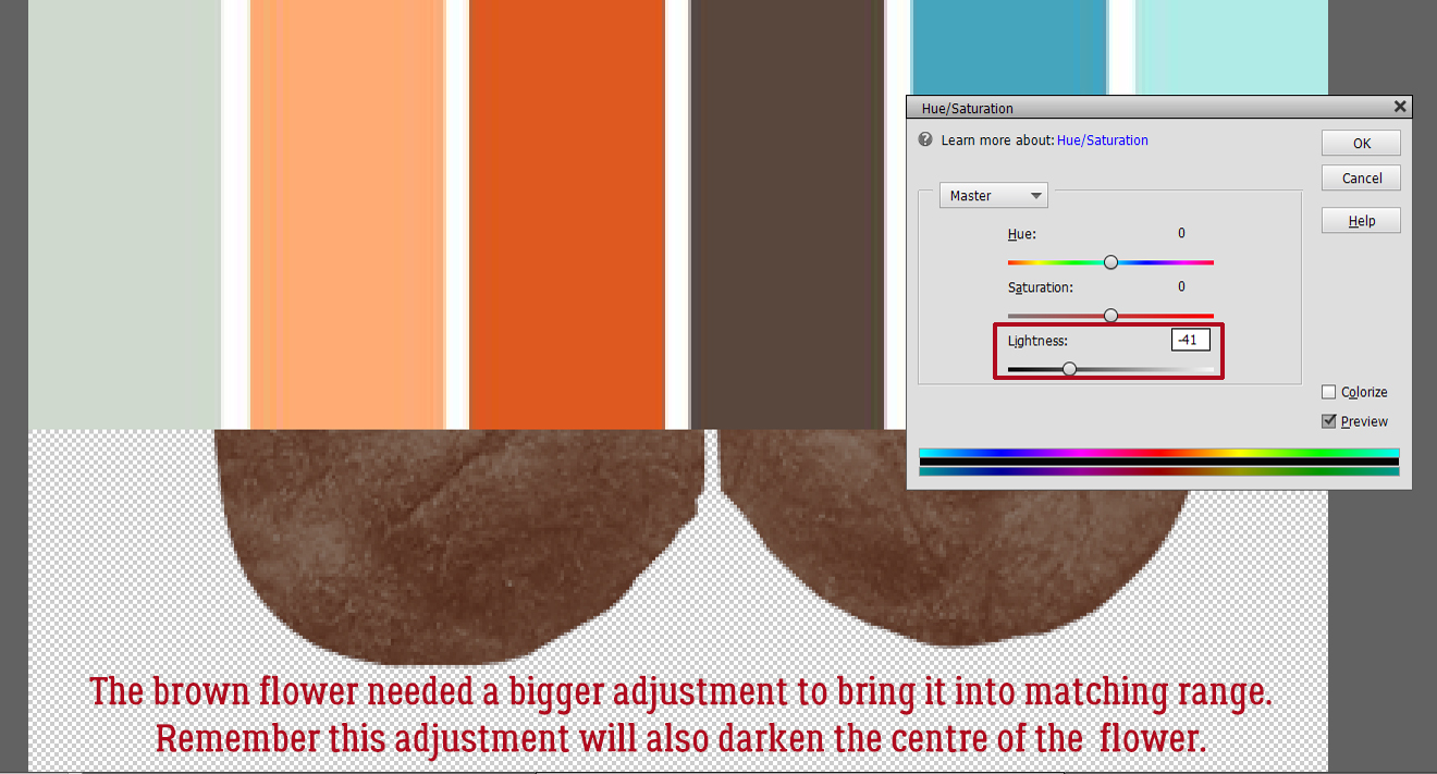
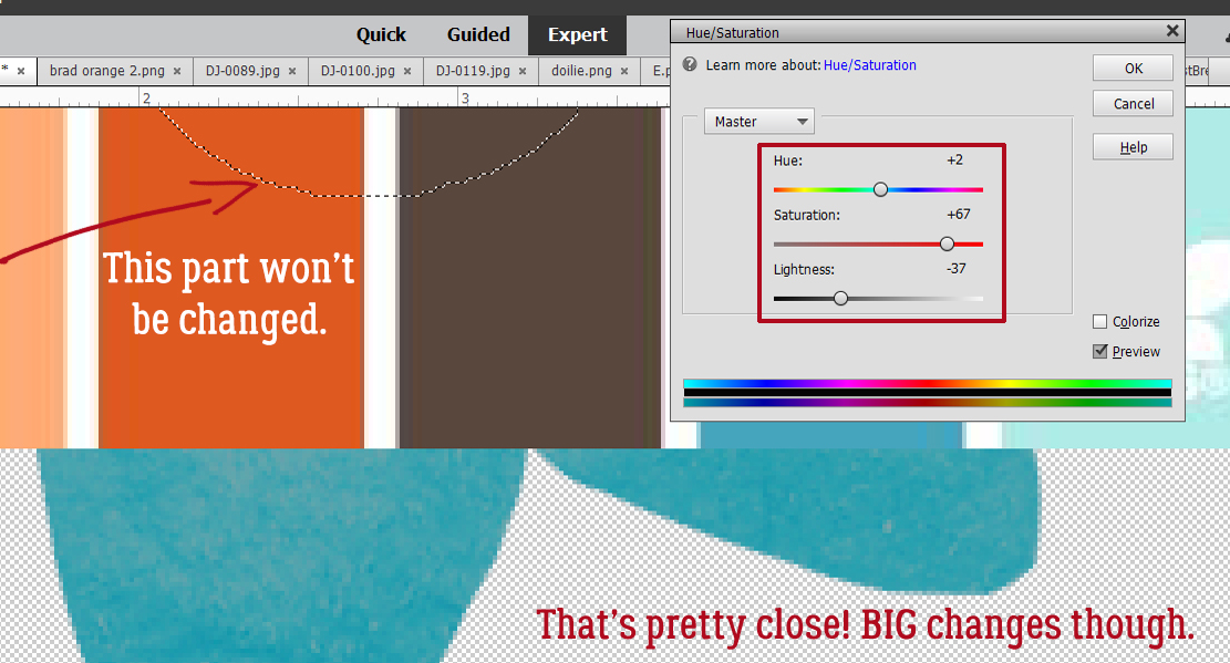
Here I’m adjusting the brown flower. It took a bit more convincing to change. Just remember that any colour adjustments you make to something composite like this flower will be made to the entire object unless you exclude some parts.
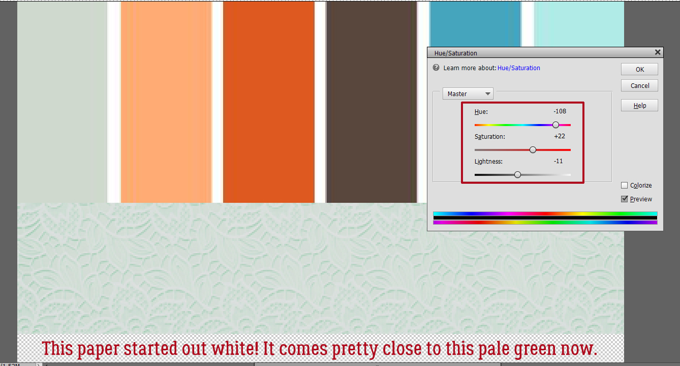
Can you believe this paper was originally a bright off-white?
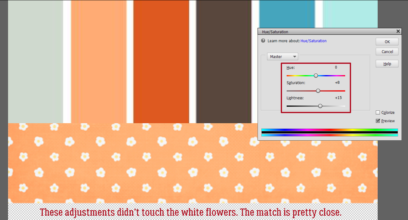
I was happy to see that making these adjustments to this paper didn’t touch the white flowers. I like the contrast.
This button looks pretty good too!
Here’s a quick refresher on selective recolouring; I don’t want to change the button in the middle of this flower. I used the Magic Wand took to outline it with those marching ants.
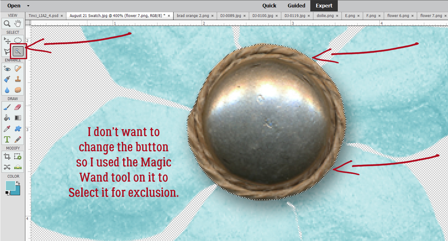
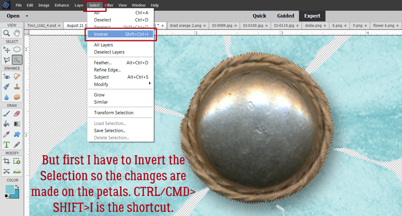
Without this step ALL that would be altered is the button. So I Inverted the Selection: Select>Inverse [CTRL/CMD>SHIFT>I]
Here you can see the marching ants around the button Selection. It’s not being touched by the adjustments made to the petals. They needed a lot of persuading!
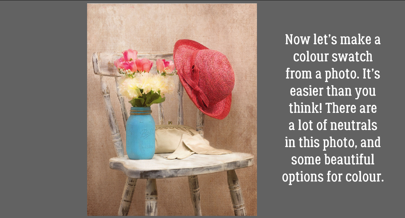
Now let’s make a swatch of our own! It’s easy to do, and can really make a difference to your work. This photo has a lot of neutrals in it, but the Ball jar, flowers, hat… they’re all beautiful.
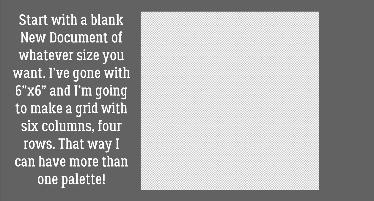
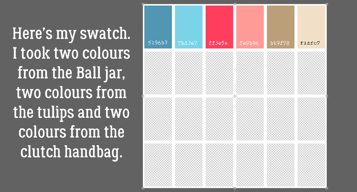
Start off with a blank New Document [CTRL/CMD>N] of whatever size you think will work based on how many colours you plan to add to your palette and with a transparent background. Make it something that is easy to divide. I’m making a grid with six columns and four rows, for a total of 24 colour blocks.
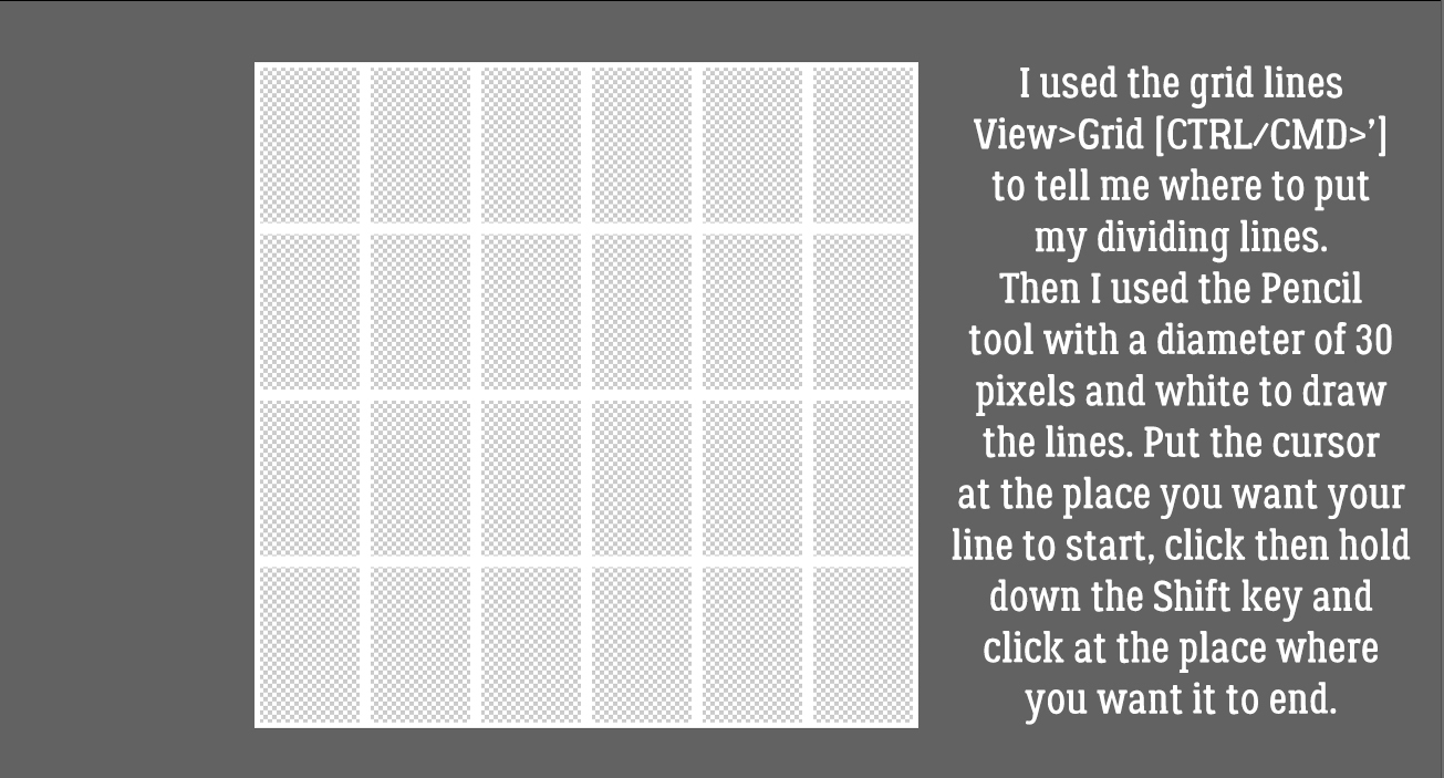
Elements has many hidden tools like the Grid. It’s activated by clicking View>Grid [CTRL/CMD>’] The parameters of your grid can be personalized in the Edit>Preferences menu. Mine are set to a major division every inch with guidelines every 1/4 inch. Using the Pencil tool with a diameter of 30 pixels and white in the foreground, I clicked at the top of the canvas at the 1 inch mark then held down the SHIFT key and clicked again at the bottom at the 1 inch mark. Then I worked across the canvas in the same way until I had 6 columns all 1 inch wide. Then I worked across, putting my lines at 1 1/2 inches apart.
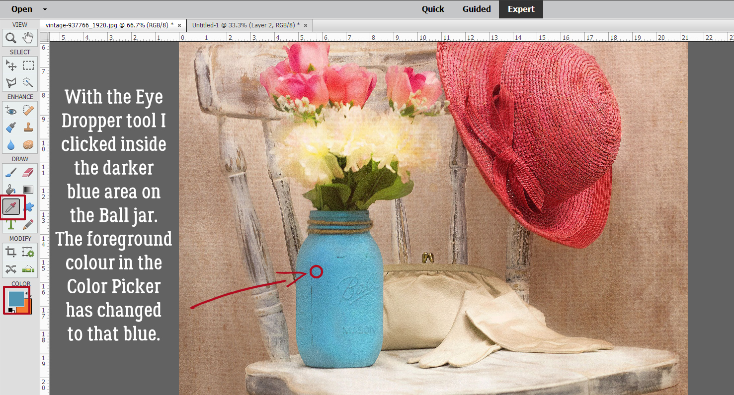
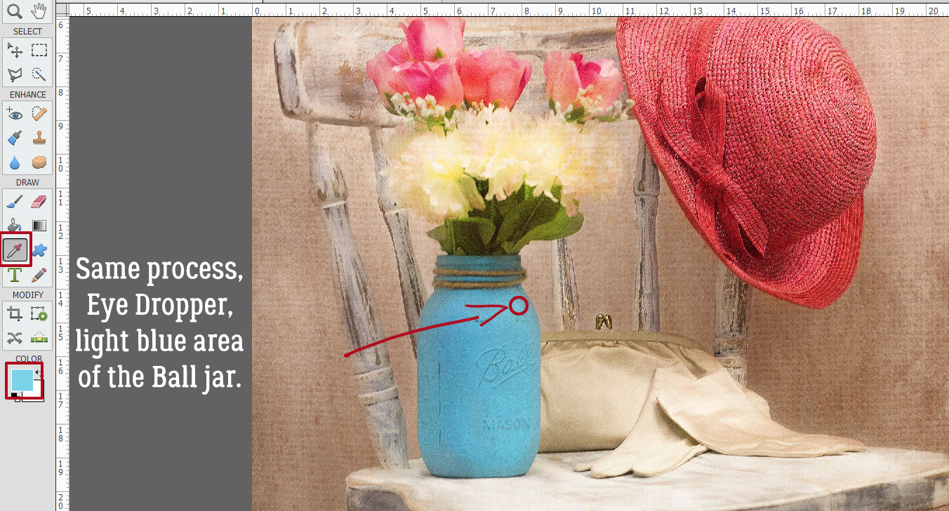
I used the Eye Dropper tool [CTRL/CMD>I] to choose a spot on the darker, shadowed area of the Ball jar.
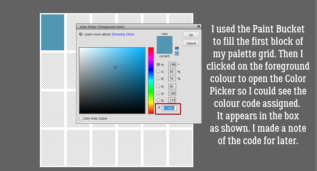
Next I used the Paint Bucket tool [CTRL/CMD>K] to fill the first block on my grid with that blue colour. I want to include the colour code on my swatch so then I clicked on the foreground colour – the darker blue – and made a note of the code in the box shown. If you trust your memory you don’t need to write the code down… I typed the colour code on top of the block in white and then Simplified the text layer – right-click and Simplify Layer. Why? If I didn’t, and I later needed to change the colour of my text for better visibility, ALL the unsimple text boxes would change too. No bueno!
 Following the same process I used the Eye Dropper to pick a spot of lighter blue.
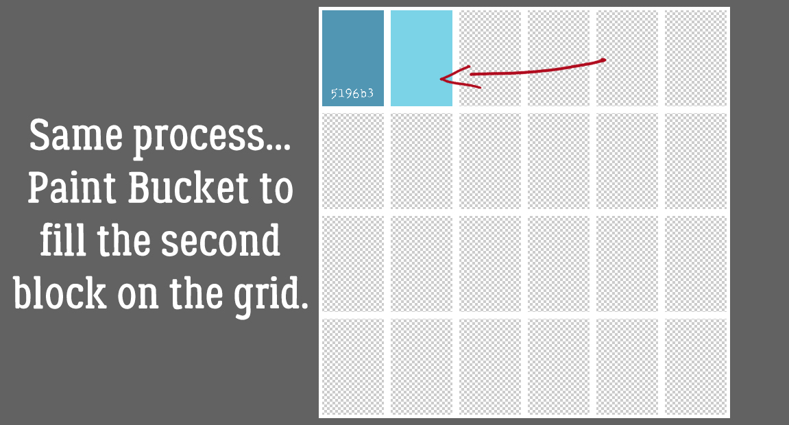
And filled the second colour block with the Paint Bucket.
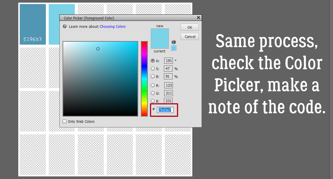
Then getting the colour code from the Color Picker.
And here’s my palette derived from my Pixabay photo. I picked colours from the Ball jar, the tulips and the satin clutch purse. You might have chosen differently, and isn’t it grand that we’re all unique?!
Curious about the layout I built this tutorial around? It’s here.
Have fun with colour!
PFD Version: https://bit.ly/2WDWxyi
![]()
[…] 230. Colour Palettes, Swatches and How to Use Them […]