Creating a Title Echo for Your Layout
![]()
PDF Version : https://bit.ly/3x5YvpI
This week’s tutorial was inspired by Ellen (gmae); the directions are based on a video tut by Gina Harper and when I tell you I learned a couple of FANTASTIC Work Smart Not Hard [WSNH] tricks, trust me… they’re going to be game-changers. I’m going to walk you through creating a title with an echo, like the one I created for my Greyfriars layout. And it’s easy!

Start off with a brand new 12×12 canvas; you might notice I’ve got a solid white background here and that’s not my usual MO. Since we’ll be working with text layers the background doesn’t make any difference. I want to be sure you see exactly what’s happening and the contrast will help with that. Select a font for your title. Choose one that is clean and upright (ie a sans serif font), with some stage presence. I’m using Gill Sans MT Bold but Impact, Futura and Avenir would work too. You’ll be using only upper case letters. Set the Size to 100 points, the Color to black and choose Center for your text position.

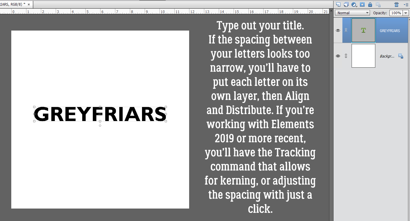
Type out your title. A one-word title would be best. If the spacing between the letters looks too narrow, the technique won’t work as neatly. If you’re using an Elements version previous to Elements 2019, there is no tool option for kerning (adjusting the spacing of your letters) so you’d then need to put all your letters on their own layer, position them then Merge the layers together. So maybe try a few other sans serif fonts first!

When you’ve got your text sorted, use the Move Tool Align Option to put the text in the Middle of the canvas top-to-bottom and Center it side-to-side.

Next, decrease the Opacity of the text layer to 50%. We’re going to apply a Stroke and I want you to be able to see it.

Add a new blank layer above the text layer. Then CTRL/CMD>click inside the text layer’s thumbnail – that image of what’s on the layer – to Select the edges of the text. That’s how Elements will know where to put the outline. Click Edit>Stroke (Outline) Selection…

Your Stroke settings: Width 10 pixels. Color Black. Location Inside. Leave the other default settings as is.

After your Stroke is in place, Select>Deselect Layers or CTRL/CMD>D to lose the marching ants.

To reduce confusion Rename the Stroke layer to Echo Bottom. Double-click on the layer’s name and type it in the box.

Now choose the Rectangle Marquee Tool; set the Aspect to Fixed Size, W to 12 in and H to 6 in. Basically you want to put that rectangle on half of the canvas.

Set the rectangle at the top of the canvas. The lower edge of it will be exactly at the middle top-to-bottom. Next, click CTRL/CMD>SHIFT>J. This will cut the pixels inside the rectangle away from those outside it, and create a new layer with them on it. That’s WSNH Tip #1. Rename that new layer Echo Top. 
Move the new Echo Top layer up toward the top of the canvas so it separates from the title. Leave a bit of space between the top of the title and the bottom of the Echo. Here’s WSNH Tip #2… Hold down the SHIFT key when you drag an object and it will stay aligned with its previous position, either top-to-bottom or side-to-side.

Since an echo is a less-obvious duplicate of something, decrease the Opacity of this layer to 50%.

WSNH Tip #3! Hold down the SHIFT and ALT/OPT keys when you click and drag an object and Elements will make a duplicate of the object. Think how much this could speed up your scrapping with templates… all those flowers can be quickly duplicated and moved with fewer steps. Mind blown.

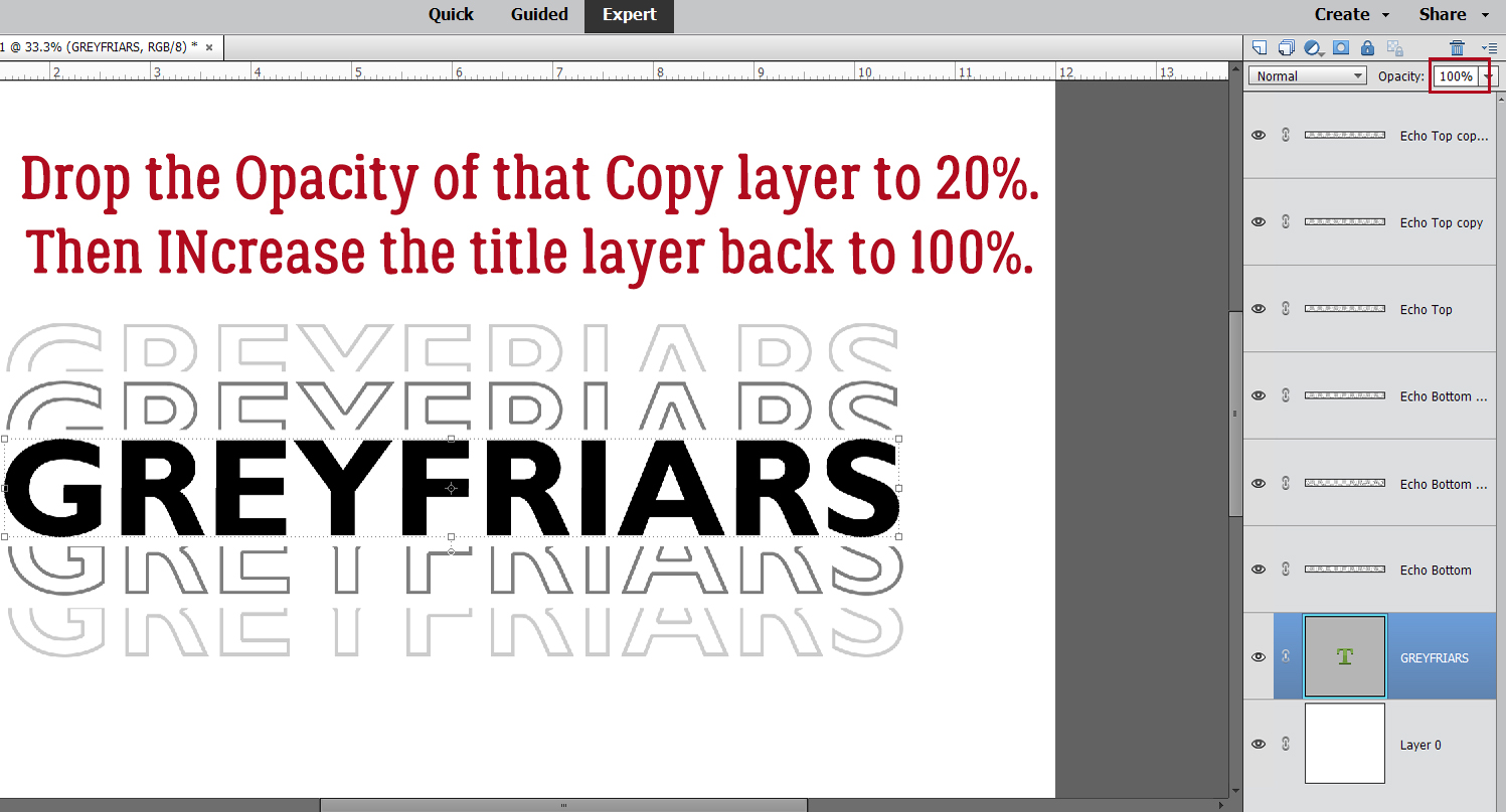
You should have two Echo Top layers now, one at 50% and the new one decreased to 20% Opacity.

Now to get the bottom sorted. As you can see, your padawan forgot to use the SHIFT key when she dragged the Echo Bottom layer down. And it’s obvious! I’ll nudge it into alignment before we go on to the next step.

Like for the Echo Top, that first Echo Bottom layer’s Opacity drops to 50%.

All aligned again… Hold down the SHIFT>ALT/OPT keys and drag the last Echo Bottom layer into place.

If needed you can adjust the spacing of your Echo layers so they’re closer to or farther away from the title. Change the Opacity of the lowest Echo Bottom layer to 20% and increase the title layer’s Opacity back to 100%. You’re done!!

What if you don’t want a black-and-gray title? You can change the color by Merging the layers then adding a Layer>Fill Layer>Solid Color and choose a color from your photos or papers. Or you could do what I did and add a Layer Style to the title. Leaving the Echoes gray worked with my subject, so I just put a wrought iron layer style on the title. But really, the possibilities are almost endless. When you’re ready to add it to your layout, either Link the layers together – click the little chain icon on each layer – or Merge them so you can drag them onto your layout all as one piece. Play with it, have fun with it!
When this tutorial posts, I’ll be miles away from home helping my “baby” sister celebrate her 50th birthday. My brother is having a hip replaced in Friday, so I’ll see him too. Have a great week!
PDF Version : https://bit.ly/3x5YvpI
![]()