Celebrating Dads and Grads
![]()
PDF VERSION: https://bit.ly/3mRG9nD
This past weekend I was making a Father’s Day card for my dad and birthday cards for my oldest grandson and only granddaughter. Do you think I could find a font I liked for my Father’s Day card? Because I HAD to get the card in the mail, I went with something lackluster and decided I’d find some better options for next time. And while I was at it, I looked for some fonts to celebrate graduations too. All the fonts to come below are free at dafont.com and I’m barely scratching the surface; have a look around and you’ll see. Each font’s name is linked directly to the website for quick-and-easy downloads. Enjoy!
Let’s start with the grads, since a lot of those have already happened. First up is Sports Jersey. It’s pretty generic school-wise, and can easily represent any level of education. I could see it working well with the title echo tutorial.

XII Don’t Mess With Vikings is similar, but narrower and bulkier. It would be easy to echo too!

I like Striped Campus because it reminds me of old-school lettermen’s jackets. Each of the grad fonts are suitable for both titles and journaling.

In a way, Fine College does too. I think these two serif fonts could be echo-able if there’s enough space between the letters and the echoes. I might have to try it. All of these fonts are Father’s-Day-worthy as well.

Now for the Dads… Wrestlemania would be a great title font and is legible enough for journaling. (In our family though, wrestling is more of a gal-thing: my grandmother was a huge fan, while a (female) cousin and her daughters are all champion wrestlers.)

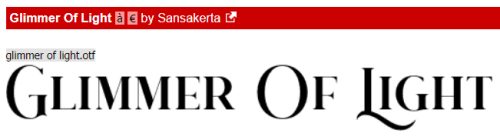
This Glimmer of Light font is so classy and elegant! As you can see, it’s an all-caps font with some swashy letters.
With a hint of western flair, Dakota is masculine without being toxically so. It’s another all-caps font, and is good for both titles and text.

Here’s another classy but masculine font called Baroneys. It’s got a bit of an art deco look to it and zoomed in, there’s some flannel texture too.

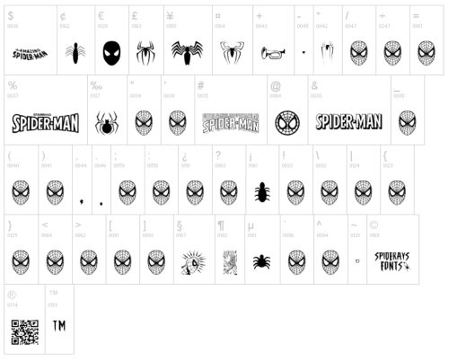
I chose this one because it’s so much fun. The Amazing Spider-Man brings Peter Parker to life!

These extra characters can be used for all kinds of things.
If your Dad is the rugged, outdoorsy expert in antiquities type, Indiana Jonas has you covered.

Or… if he’s a gear-head robot master in his early 40s, there’s always Transformers.

Woodcut is for the man who likes camping, fishing or woodworking. There are so many ways this font can be customized too.

And rounding out our baker’s dozen, Sherlock Press is masculine but urbane, like Holmes himself. I think it might lend itself to the echo technique too.

Which one is your favourite? I can’t choose.
Next week will be a Challenge Spotlight tutorial, and your turn to shine.
PDF VERSION: https://bit.ly/3mRG9nD
![]()
Sherlock Press is the one for me. The others are just too “rah rah guy”. Sherlock is perfection. IMHO, of course.
Thanks for sharing all these cool fonts! I love those last 2 school fonts.