Challenge Spotlight: Word Art
![]()
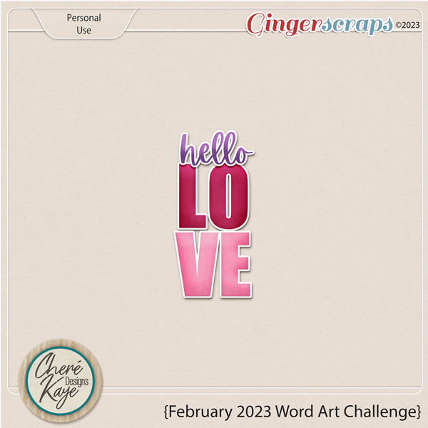
This month we’re looking at Word Art, the challenge sponsored and hosted by Cheré Kaye Designs. The supplied word art looks like this:
Now, you’d be forgiven for thinking you have no possible use for word art, but there are so many ways to be creative with it if you just give yourself permission. I’m going to show you, in the order they were posted, the first 16 layouts posted to the Word Art Challenge Gallery using this exact word art so you can see some of the ways it can be made your own. Each layout is linked to the Gallery so you can get a better look or offer some good vibes to the scrapper. Just click on the scrapper’s Forum handle!
The first layout is from demma_b13. She’s used the word art exactly as it was designed, pulling the colours for her layout from it and adding some photos of a very sweet little gnome to go with her kit selection. I like how she’s “painted” the big heart over the edge of the top photo. That touch of transparency is divine!

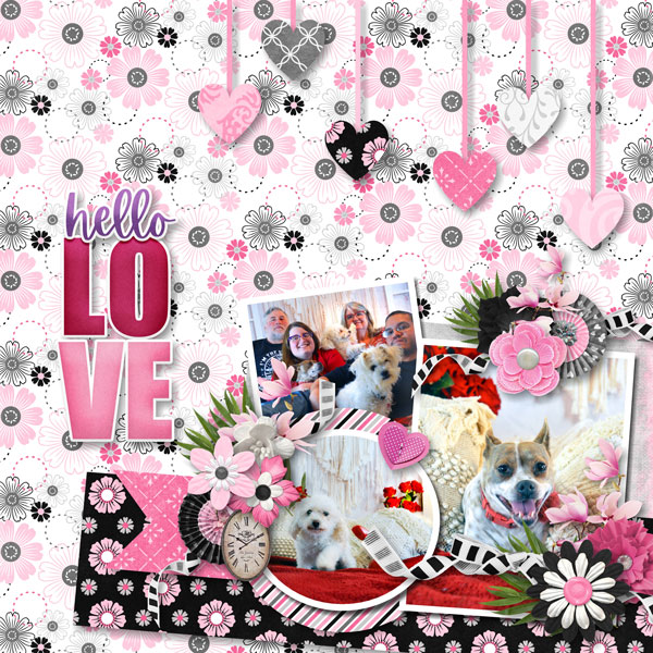
Here, trinanne has used the word art as is too, but made it the focal point of the layout, surrounded by photos of her loved ones.

As you can see, scrapcrazy has departed from the traditional. A simple layout about a very handsome dog needed something a little less “romantic”, so she recoloured everything to work with her photo and kit choice. I’m intrigued by the gradient effect she’s used on the outline for “love”. So cool!

Here again, the unaltered word art is supported by the colours in both the photos and the kit dkane has chosen. Just gorgeous!

For her layout, lulutoo has recoloured the letters in “love” to coordinate with the russet and peach tones of her kit. Those colours work so nicely with her vintage-looking photos.

When I first looked at alexandergirl68‘s layout, I didn’t notice that the mask she used makes a heart, I was so caught up in the photo of that precious baby! For the word art, she dispensed with the white border, pulled from the varied shades of russet ink for the letters, and added a shadow to make them look cut from cardstock.

branma has left the word art unchanged and used the same background paper as trinanne to show off her photos. Those pops of black add dimension and interest. The depth of her shadow gives the word art a embossed appearance.
Here, dhariana has recoloured the word art, ditched the white border and added a stitched border to the “love”. Clever!

Look at these kitties! The nuzzles! alasandra has clipped two different papers to the letters in “love”, while sticking closely to the original palette.

When creating her layout, firstoscartgrouch used the colours in the word art for inspiration, leaving it as it, but adding some flowers and a bunny sniffing them to replicate the subject of her photos.

I like how larkd has incorporated the word art into her clustered border. The purple in “hello” is the only place purple appears on the layout, causing it to draw the eye to her photo.

Here’s a novel idea! Not only has chigirl recoloured the word art to coordinate with her layout, she’s turned it into a tag.

The word art’s original colours wouldn’t work at all with ranchcreations‘ photos, so she clipped a paper to it. By using a brown paper for the word art and for the brad border under her square photo, she’s bringing the eye right to her large photo.

The word art on nimble4u‘s layout looks like it’s made from something very sturdy and offset with those foam tape things paper scrappers and card-makers use.
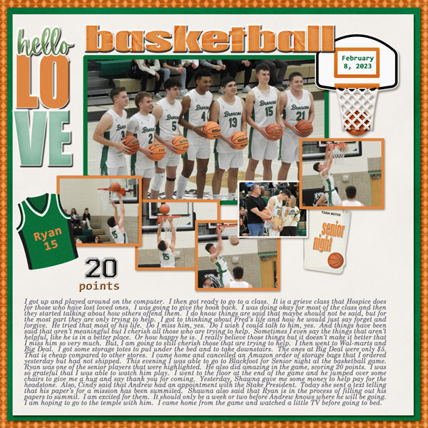
I would have known this is a KatherineWoodin layout anywhere! Katherine is so diligent about chronicling life every day; I stand in awe. She recoloured to pick up the colours of the boys’ uniforms and their basketballs. The way she’s shadowed it, it looks like it could be acrylic, not paper. Good job, Katherine!
We’ve seen quite a lot cats this time around! (I’m not a cat person, but know a few.) Our last layout is from lebjs, where the word art is as designed. She’s cleverly used strips of white as whiskers to give her main photo the appearance of a cat’s face. So sweet!

I wish someone would have used some layer styles to really customize the word art. Maybe I’ll do a mock-up to see how it would look.
I have a question for you all about dating your layouts. Do you include the date? How do you do that? Do you have a preferred method of including it, such as using a tab or paper strip? I’m working up an idea passed on to me by gmae (Ellen) and need your input. Please send me a private message (ObiJanKenobi) and share your wisdom!
![]()
I am thrilled to see my page is one of the ones featured in your blog post. The Word Art Challenge has really gotten me to see Word Art in a new way. It’s so much fun, discovering the various ways you can make it uniquely your own.