Scraplifting Mother Bear
![]()
PDF Version : https://bit.ly/3UEo7aA
Faithful reader Karen is in need of some creative distraction and has been combing through the Gallery looking for inspiration. She asked me if I could help her emulate an effect she saw on one of the layouts posted by Julie, aka Mother Bear. Now, Julie is a veteran of the digital scrapbooking game, prolific is her middle name and I’m sure she has a million tricks up her sleeve. But believe me, if I can scraplift her, anybody can. Let’s look at the layout Karen likes.

This beautiful layout was created using a non-GingerScraps designer’s product. The aspect of it Karen loves is the blended photo along the right side of the layout. I could definitely just do a rapid-fire tutorial on how to make a photo look like that, but I thought maybe I’d go all the way and scraplift the whole layout.
I found a template in my stash, from Jumpstart Designs‘ Synchronicity collection (retired), that I could easily adapt to my purpose. I’ll show you how.

The masked area of the template needed to be on the right side, so I Rotated the entire template 90° to the right. The framed photo spot was a bit big, so I resized it then made a Copy slightly larger and tilted a smidge. Some of the embellishments needed to be moved around, but here’s the basic recipe.

The mask wasn’t quite right, even with its new orientation. So I tried a combo of things until I was happy.

Julie‘s layouts always have an ethereal look, many of them with blended photos and solid, neutral papers in the background. I dropped a pretty cream-coloured paper with a hint of texture to it into the background then Clipped my main photo to the masked area. It’s a start!

To achieve the blended look the next step was to change the Blend Mode (snicker) of the PHOTO layer to Screen. Screen is one of the Modes that lightens an image. Elements has very kindly grouped those in the drop-down menu.

I know you’re going to feel cheated, but there’s only one more step to get that big photo blended perfectly. And that’s to decrease the Opacity on the MASK layer to about 40%. This step is very subjective and you may find 40% is too light for you. If you watch your canvas as you adjust the Opacity, you can fine-tune your image to your satisfaction.

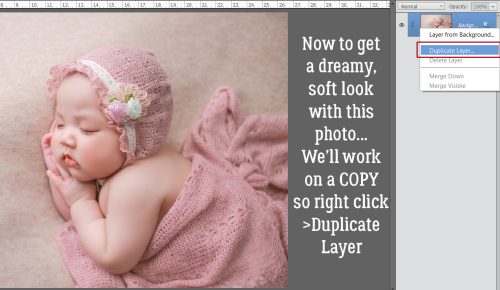
Now to emulate the look of the second photo. I suspect Julie uses Photoshop filter Actions for this part. Looking at her Gallery, many of her photos have a similar and distinctive look to them… sharply detailed but faded. There are lots of free Actions available if you know where to look. I don’t want any of you to go out and buy a bunch of things you might only use once, so finding a way to recreate the look using just Elements software will always be my goal. Make a Copy of the photo, please! Right-click on the layer then choose Duplicate Layer from the menu. [Keyboard shortcut: CTRL/CMD>J]

If you didn’t use the keyboard shortcut, this cue will appear. Elements wants to know where to put the Copy. Just click OK and it’ll settle down right on top of the original.

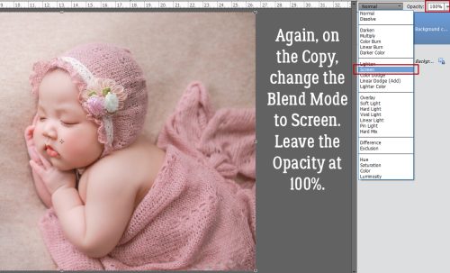
Working on the Copy, change the Blend Mode to Screen. (This is also a really easy way to adjust those photos that are a bit too dark to be good.)

See how this change looks? (If you’re simply adjusting for an under-exposed photo, you’d adjust the Opacity of this Copy until it looks *normal*.)

… which is what I did here.

Because I never Save OVER any of my originals, I’m happy to Merge Layers here to make handling the altered photo easier. Right-click>Merge Layers [or CTRL/CMD>E] If you’d rather Link the layers instead, click on the icon at the left side of the layer looking like a piece of chain instead.

To get the sharp definition click Enhance>Shake Reduction.

Elements will choose an area of the image to focus its effort on, shown below by the marching-ants box. You can adjust the Sensitivity of the tool if you choose; I kept the defaults.

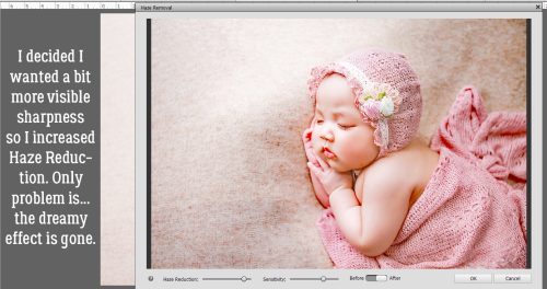
The change is subtle; I could see it easiest in her eyelashes and around her fingers. To further boost the sharpness, I clicked Enhance>Haze Removal. [CTRL/CMD>SHIFT>Z]

The defaults pretty much undo what I’ve done to the photo so far… but all is not lost.

I fixed it by moving the sliders around.

For this layout, composition-wise, the photos should be looking at each other, or toward the centre of the layout, so I’m just going to Image>Rotate>Flip Horizontal and fit it into the framed photo spots. The rest of the scraplift is simply placing embellishments in the right places.

How do you think I did?

[Photos from Bong Baby House Photos]
![]()