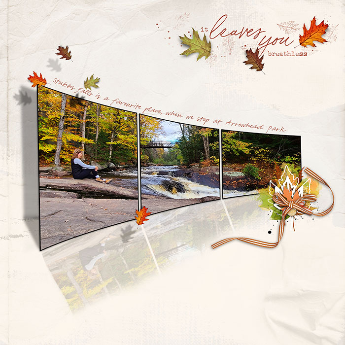
Is it Thanksgiving, or Giving Thanks?
This year, Thanksgiving has a completely different meaning for most of us. Here in Canada, our celebrations at Thanksgiving are always much less exuberant than those of our neighbours to the south (and six weeks earlier). Even so, we had to make some accommodations to the times we’re living in. When this year began, I imagined our Thanksgiving to include my elderly parents, my sister and brother, our daughter and son-in-law and the three of us, all around the table with a big turkey in the centre. Instead, it was the three of us, our daughter and son-in-law and the world’s smallest turkey. But it was how it had to be. With the whole of the United States heading into their 4-day (or is it a week now?) Thanksgiving extravaganza at the same time that the weather has pushed people indoors AND a rapid increase in COVID spread has begun, it looks like the perfect storm to this observer. So I’d like to take a few moments to encourage everyone to think about the real meaning of “thanksgiving”.
Every one of us, no matter where we are or what’s happening in our lives, has something to be thankful for this year. Some of us have big things – graduations, weddings, promotions, new homes, new family members. Some of us have small things – a new friend, a better job (or any job!), learning a new skill, time for DIY projects, finding something long thought to be lost forever. But all of us have SOMETHING. An attitude of gratitude starts with recognizing that, and what better time to start making that shift than at Thanksgiving?
I know people are tired of restrictions and want life to be the way it was before. There’s a lot of temptation to just say to heck with it… I’m out! But the thing about this situation is that we have lots of examples of how short-term sacrifice bears long-term benefit. The Spanish Flu pandemic is one example. Far more people died in those two years than we could possibly imagine, but the ones who survived have allowed US to exist! They too hated the restrictions placed on them – much harsher than the ones we’re faced with, to be honest. But in the end, they did what needed to be done. World War 11 gives us another strong model of personal privation that ultimately kept the world spinning. Just like this crisis, the effects were stronger and lasted longer in some areas than others. I think they had it far worse than we do… compulsory identification of all citizens and aliens, food and gasoline rationing, blackouts, restricted travel, internment camps and conscription all came into being. And for the most part, people did what needed doing without much resistance. But they didn’t have many of the amenities we take for granted. The internet for example! With it we can not only stay in contact with each other, but we can SEE each other without being in the same place. Imagine how a farm family in 1944 would have loved the opportunity to visit with neighbours without even leaving home! We have unlimited options for amusement right in our own homes, while they had to shelter in place in the dark every night. We have easy access to whatever food choices we might make, and can have it brought right to the door; no thought of “this is all the hamburger we have for the month”. We have an international army of scientists working flat out to understand how COVID works, how to treat it better, how to save lives and to develop vaccines so that NEXT year, we’ll have a real reason to be thankful as we gather with the people we love. We’re really very lucky, but we don’t appreciate it when we focus on what we’re giving up.
So what does this have to do with scrapbooking, you ask. Everything! Scrapbooks record the significant people and events in our lives so we can remember them later. The good parts… and if you’re “real”, the bad too. My challenge to each of you is to take a few minutes just to think about what – and who – you really need in your life. Why are your choices important to you? What are you prepared to do to keep them? What do you have to celebrate in 2020? What makes it worth celebrating? And to finish up, are you ready to be thankful for what you already have? I am. I hope you are too.
![]()
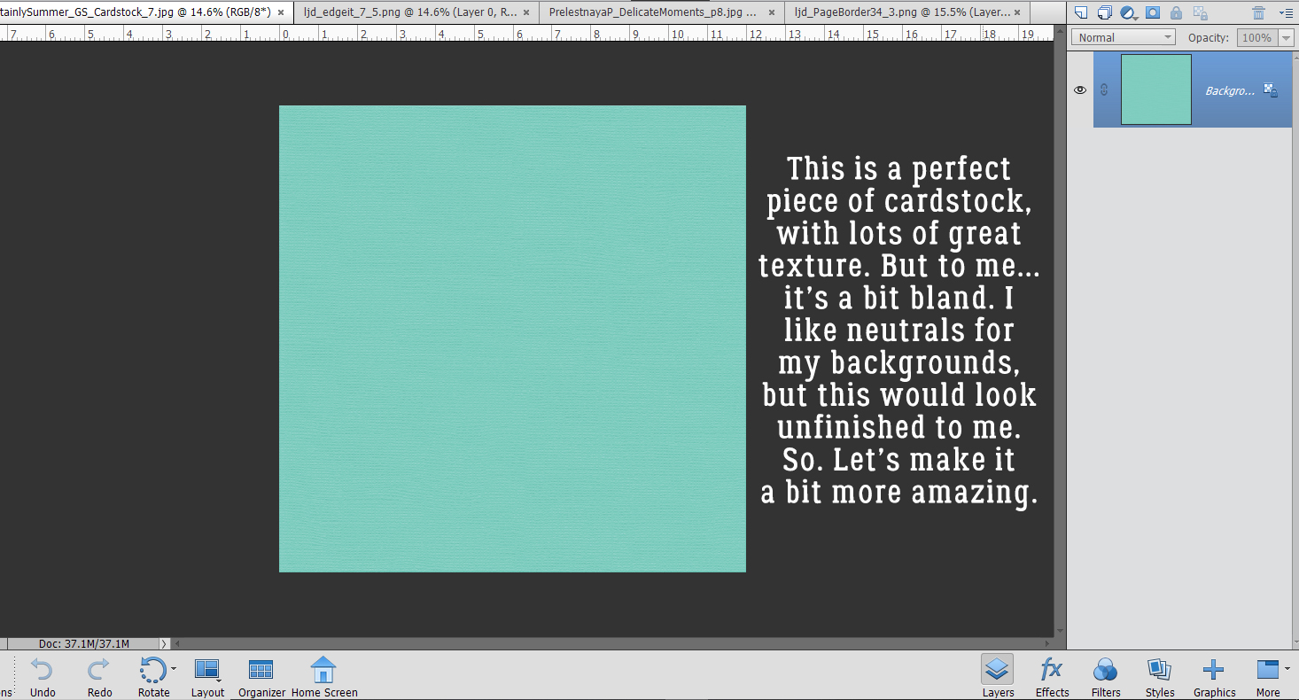
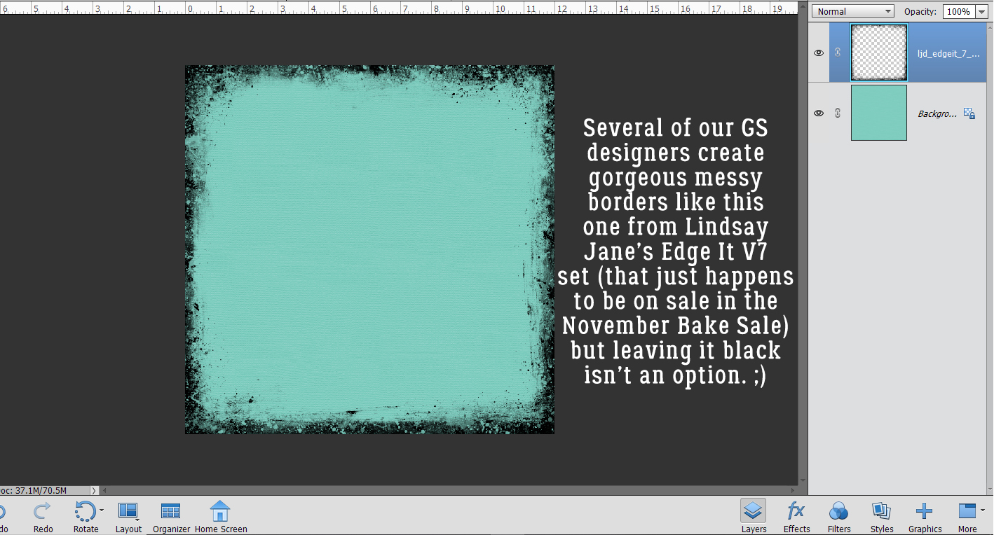
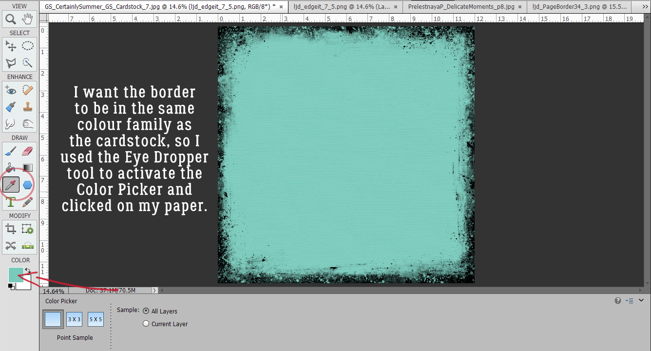
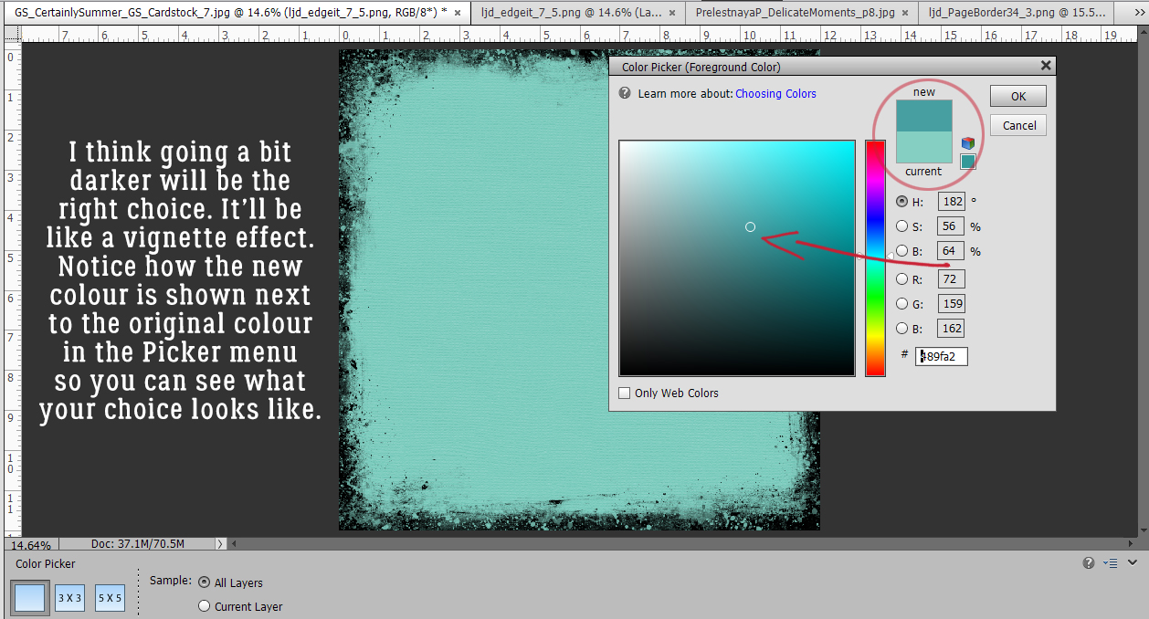
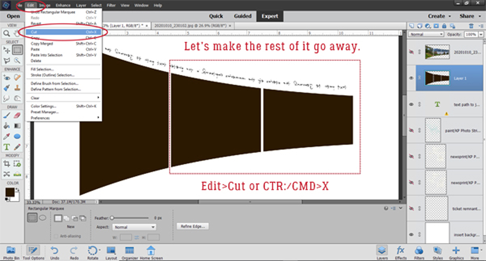
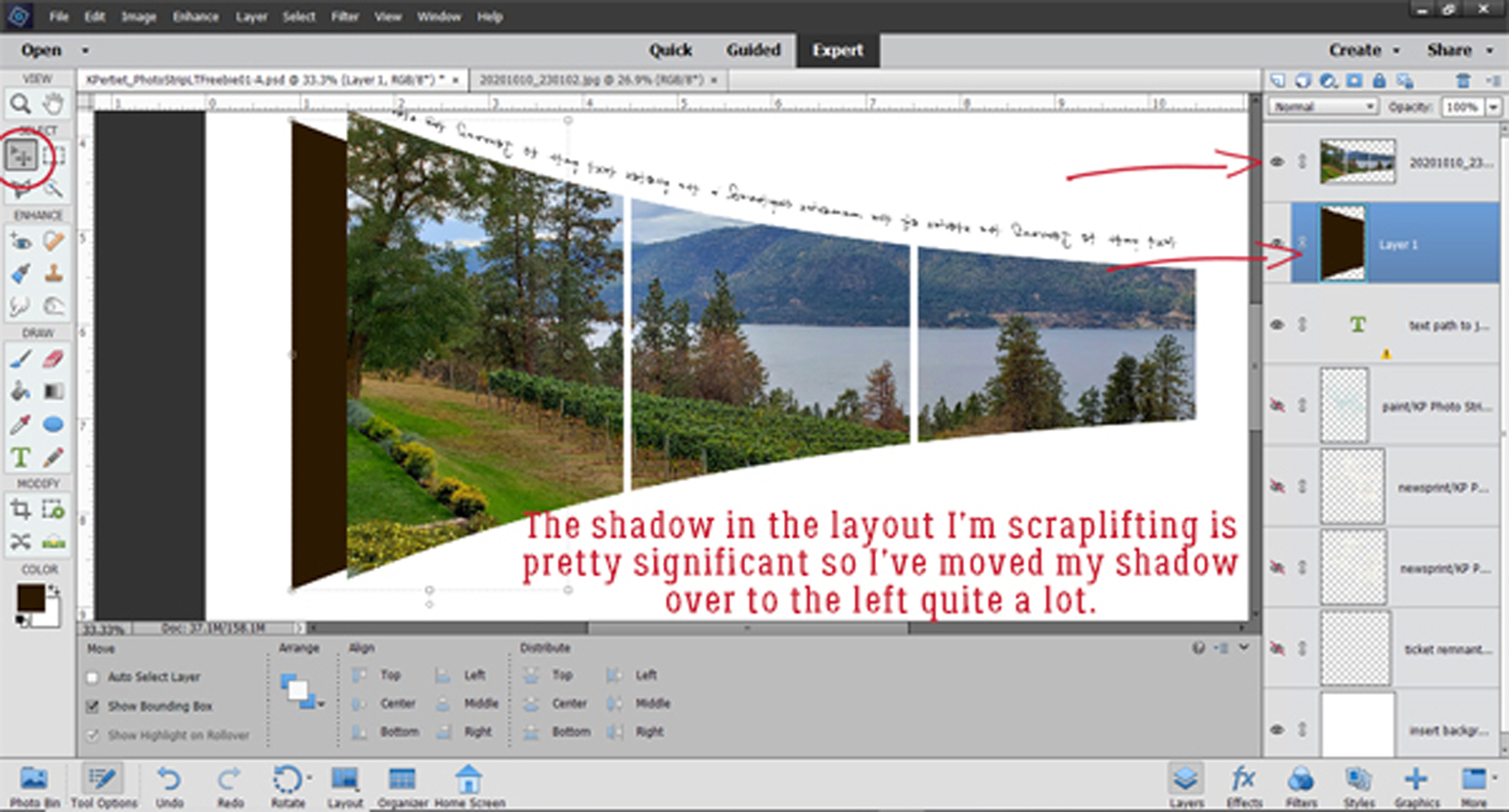
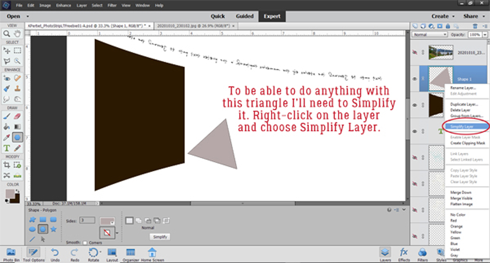
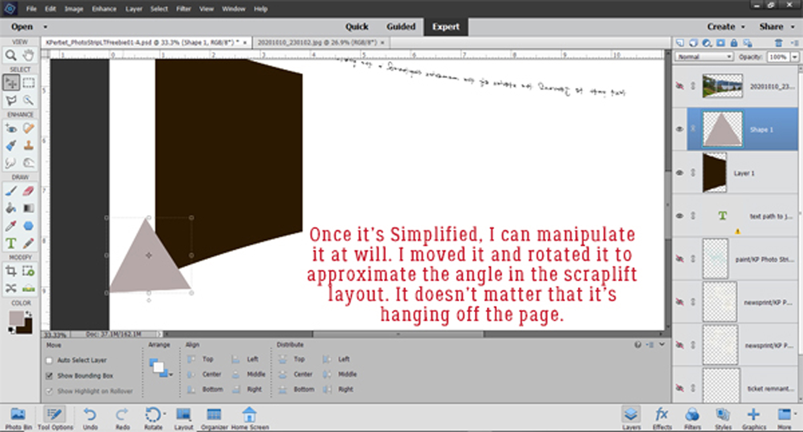
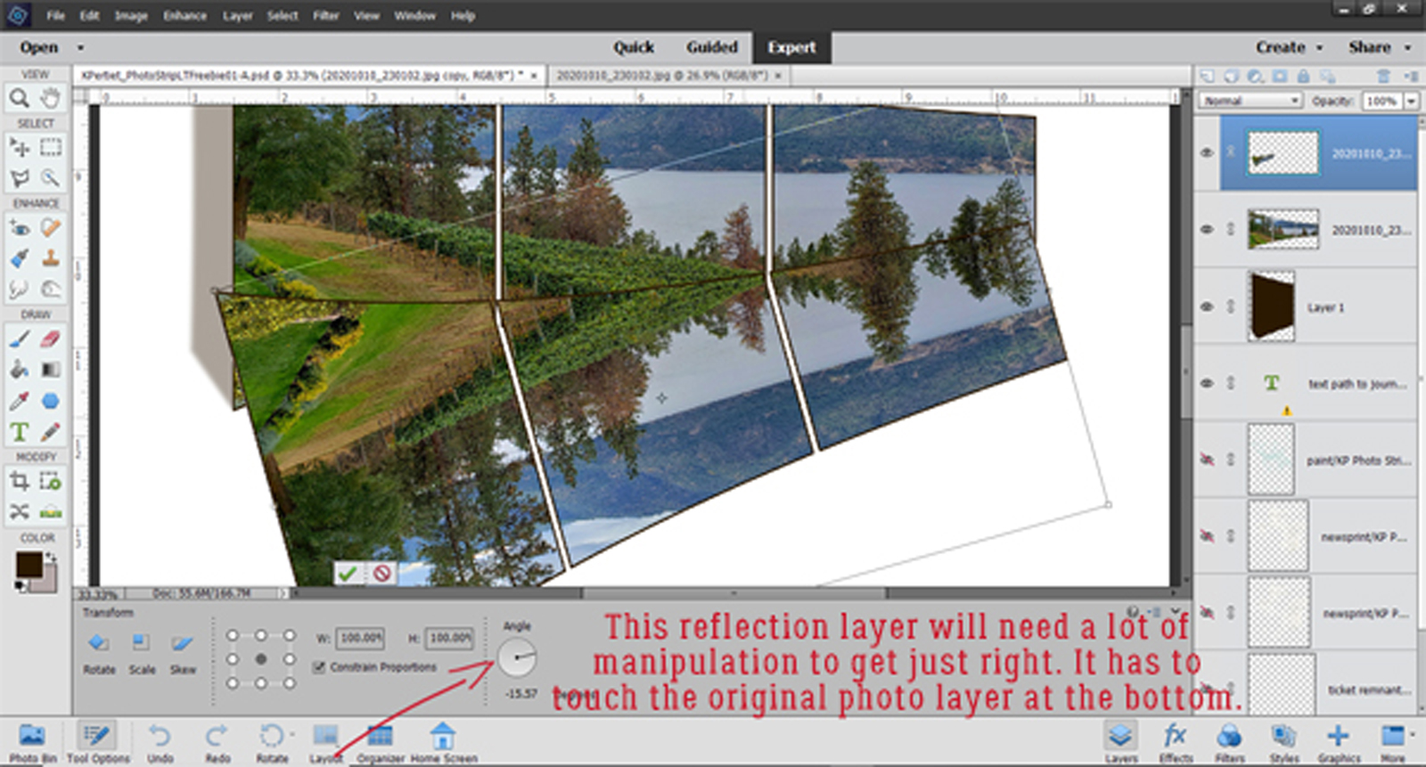
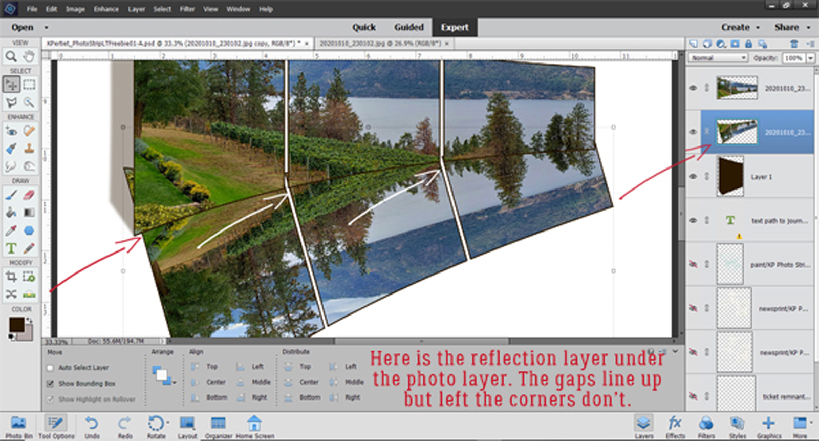
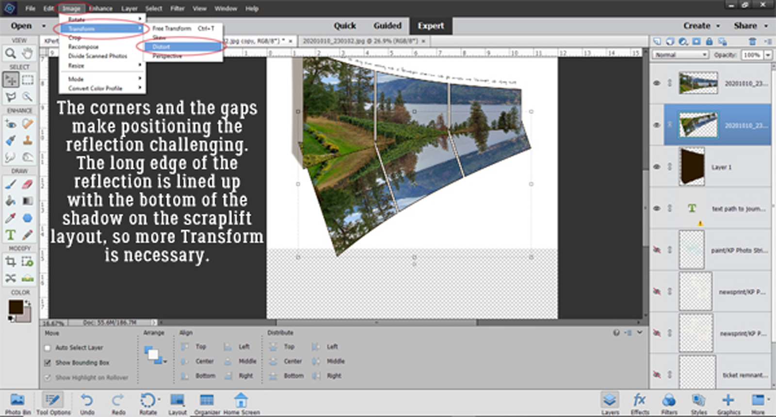
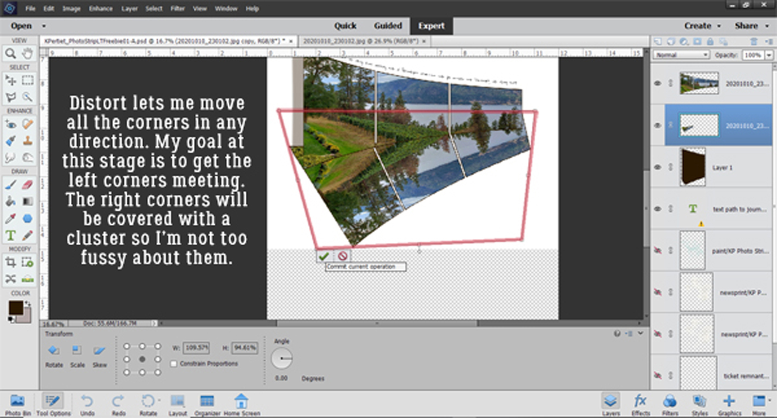
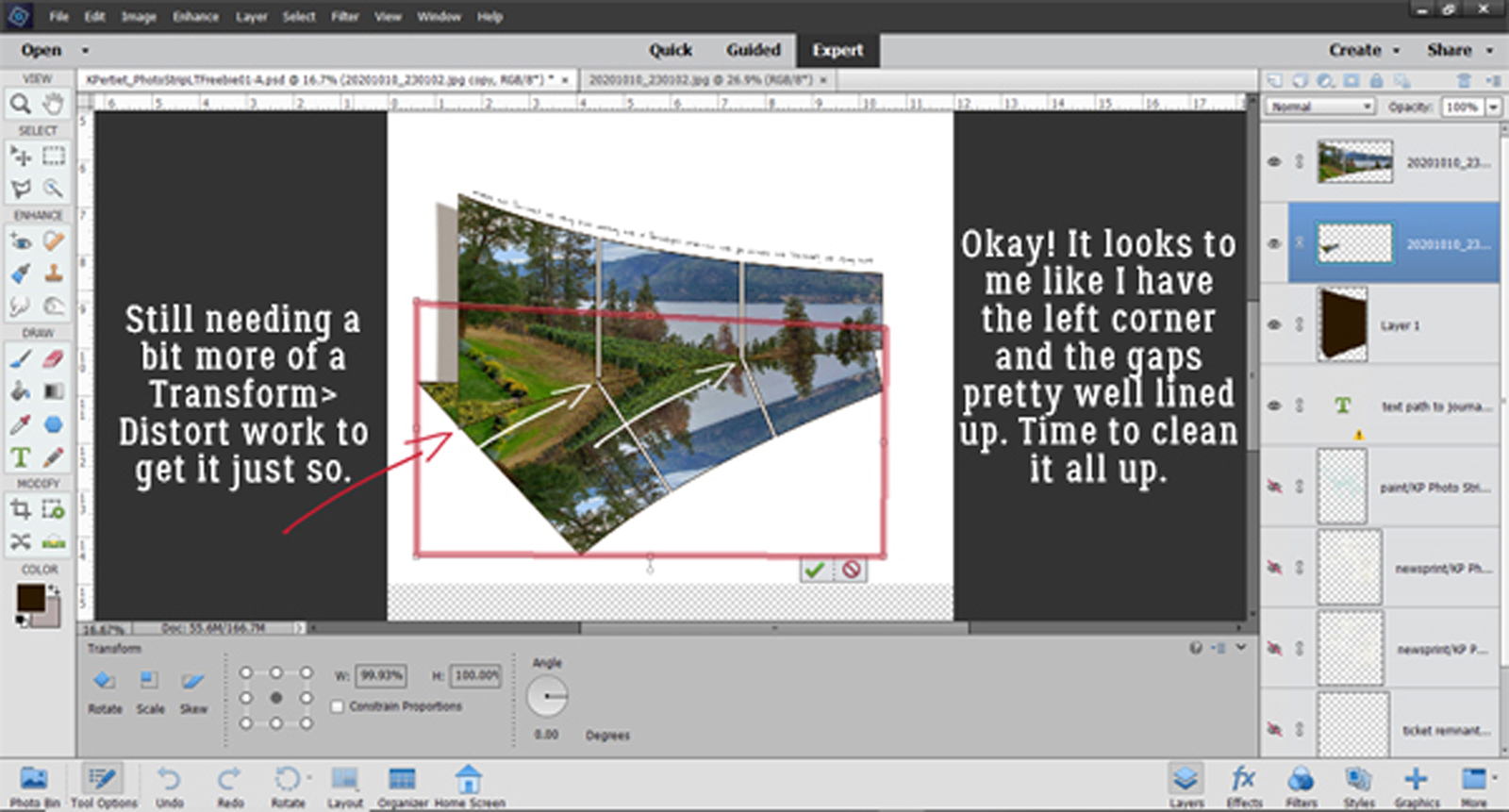
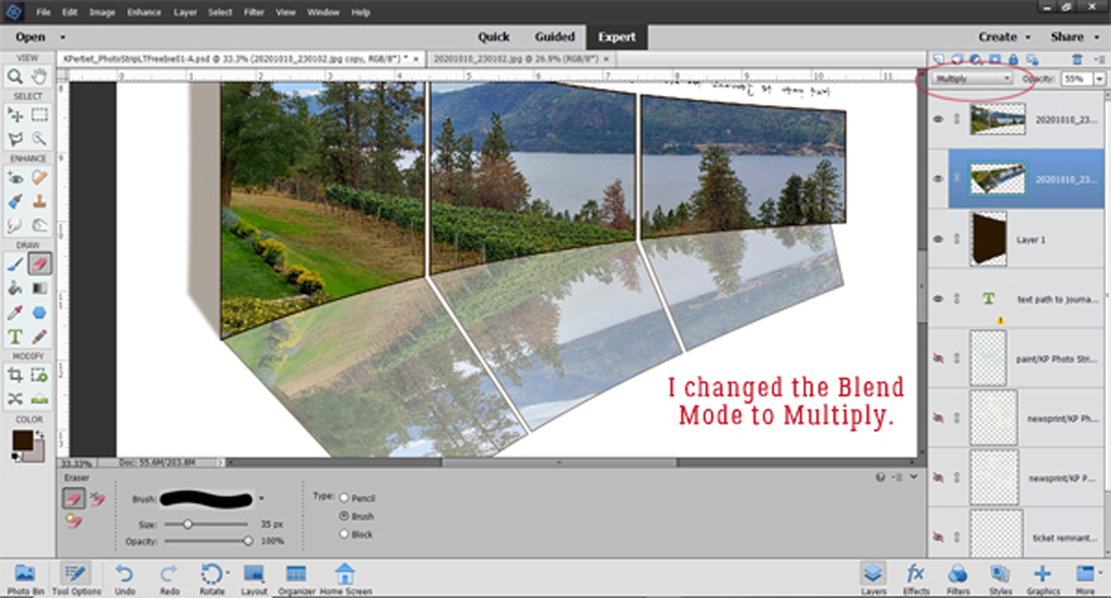
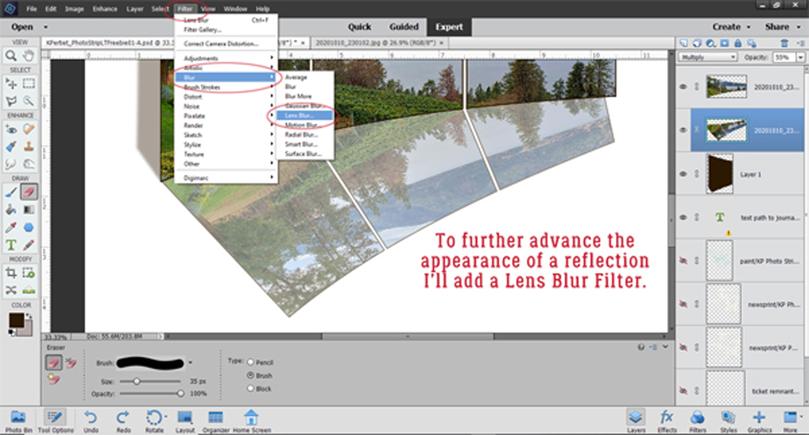
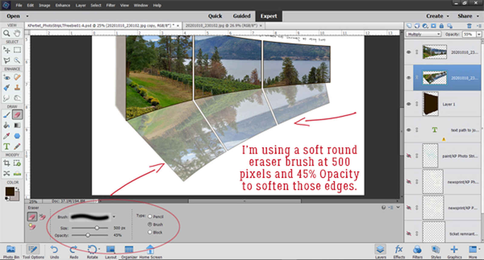
 it with the same darker teal that I used before.