Photoshop Layer Style Pattern Adjustments

Did you know that, when using the full version of Photoshop, you can easily adjust the position of a pattern within a Photoshop Layer Style? Photoshop Elements does not have the option available, but there is a work-around.  It’s very easy! Here’s how:

Photoshop:

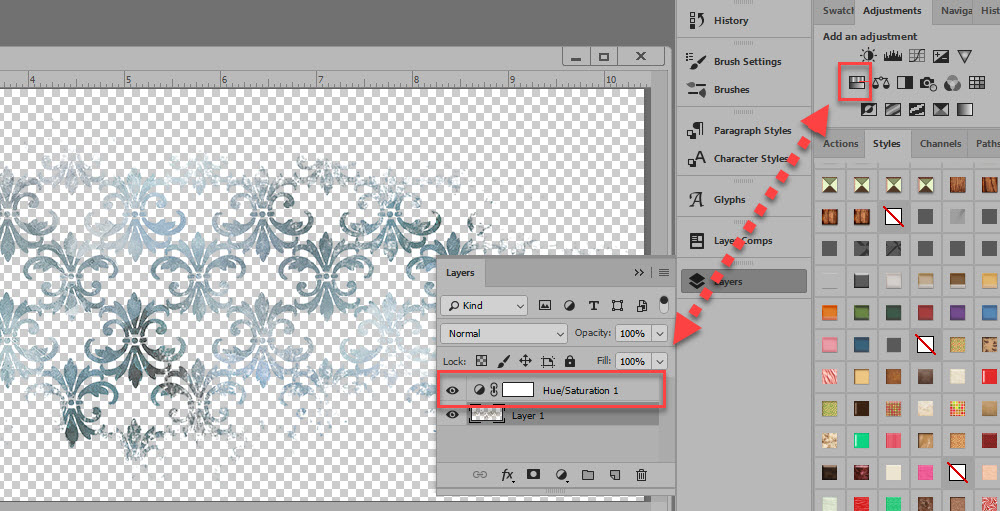
1. In the Layers Panel select the layer that has the style you want to adjust.

Moving a Pattern in a Layer Style Tutorial Snickerdoodle Designs


2. Click on “Effects” (or anywhere in the “Effects” area, but not on the name of the Layer itself). This will open the Layer Style Panel.

3. Click on “Pattern Overlay” in the Layer Style options box on the left to make it active.

4. You can see the entire Pattern on the right, in the Pattern Overlay options box. This is handy for re-positioning reference.

5. Move to your document. Place your cursor on the object to which you have applied the style. In the image above, I have placed the cursor on the rounded rectangle.

6. Left click and hold down with your mouse, then move your cursor around within the bounds of the object to reposition the pattern.

7. When you are happy with the result, release the mouse.

So how is this useful?

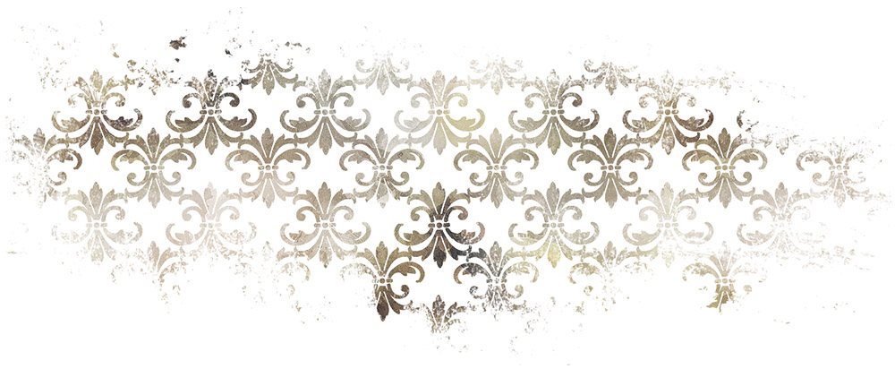
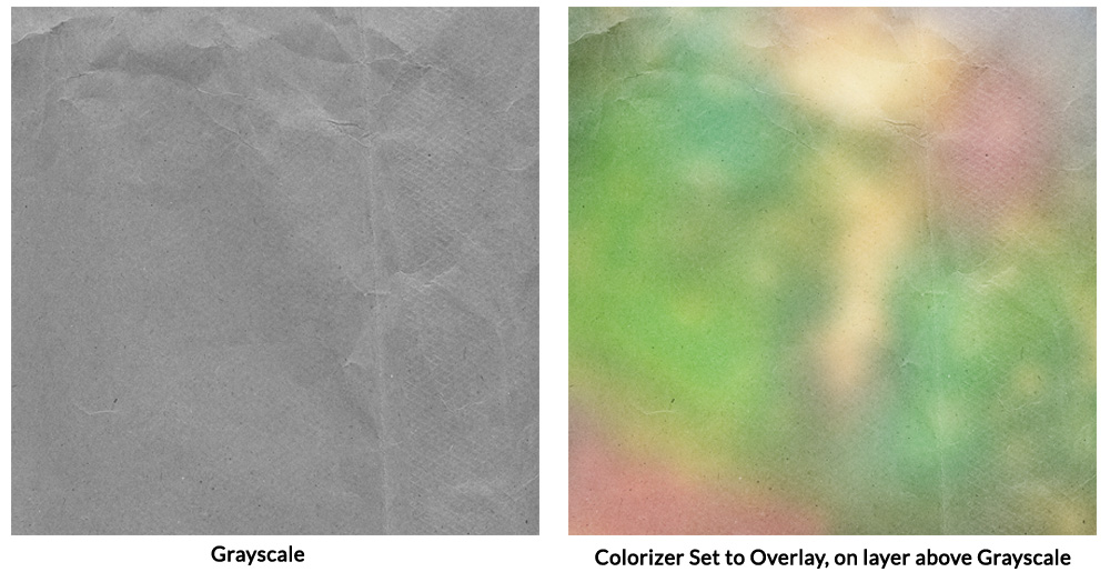
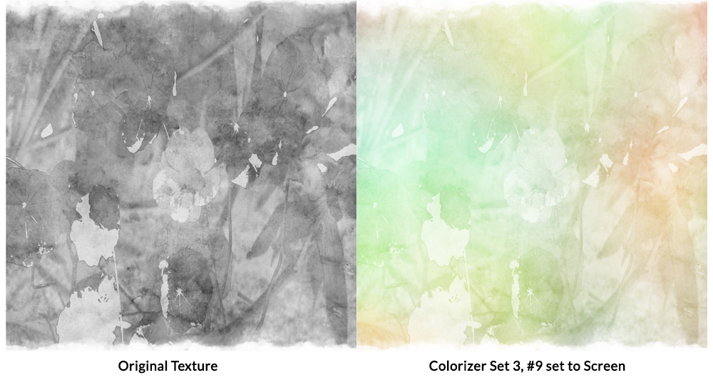
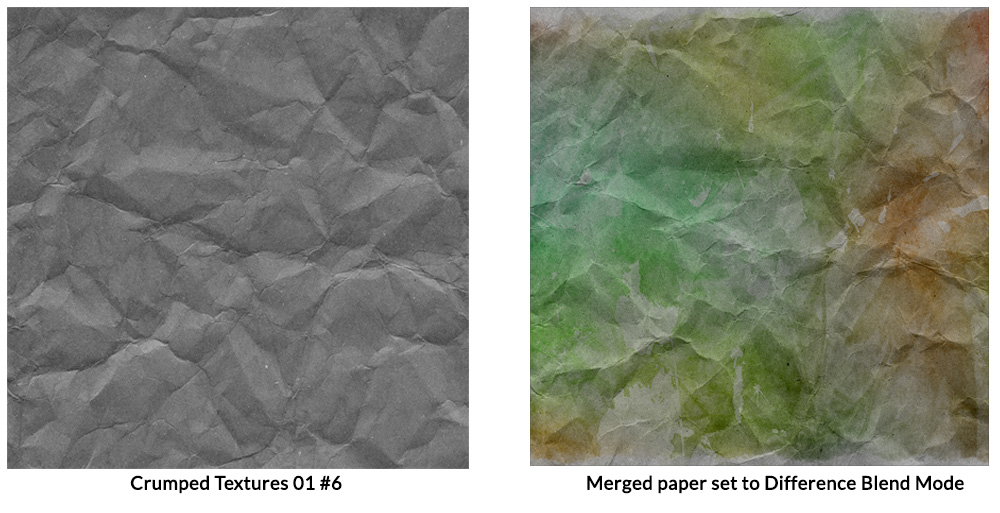
For the purposes of this tutorial, I used my seamless Watercolor Styles 02. Because the styles are seamless, I moved around the pattern in just one of the style effects and was able to quickly come up with 9 different looks. The ability to reposition patterns exponentially multiplies the options you have when using seamless styles with color variations.


There are 15 style effects in this one pack. So if you, by chance, were able to get 9 different looks from just ONE style, it is conceivable that you could get 135 different patterns from this pack (15 styles X 9 looks per style)!  I won’t guarantee you could get 9 different looks from each effect, but just wanted to emphasize how moving a pattern in a style can add to the versatility of many styles.

What about Styles that are not seamless?

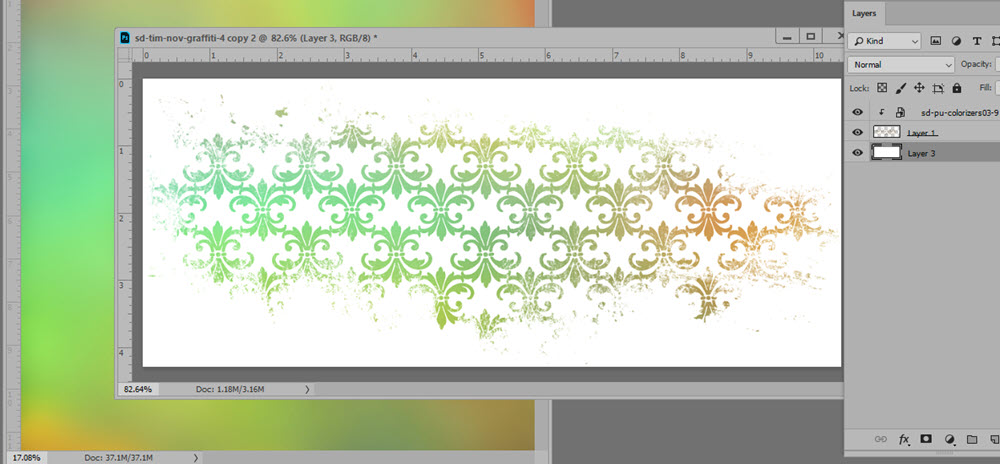
If you are working with a style that is not seamless, and the shape to which you want to apply a style is larger than the pattern size, you will see the pattern seams. Here’s what that would look like:

By repositioning the pattern, depending upon the size of the style and of the object, you have a good chance of being able to hide the seams. By dragging the pattern a bit to the left, this is the result I was able to achieve with this style:

What about Photoshop Elements users?

To date, Adobe hasn’t included the ability to move patterns around in Photoshop Elements.  They can, however, Scale a pattern, which can be helpful.

In the top menu bar: Layer > Layer Style > Scale Effects

Another window will open which has a slider, allowing you to make the pattern larger or smaller. When making a pattern much larger than it is intended, you may degrade the quality of the pattern, so that’s just something to be aware of.


Thanks for stopping by the blog today. I hope you have found this tutorial helpful. If you would like to download a PDF for reference, you may do so here.

Snickerdoodle Designs

What are Blend Modes?

Many of you have expressed the desire to learn more about Blend Modes, so today let’s take a look at this powerful Photoshop tool.

Blend Modes are available both in Photoshop and Photoshop Elements to assist you with your creativity. But what are they and why should you care?

Blend Modes change the way that layers interact with each other, allowing you to create a variety of looks with the same supplies, depending upon the Blend Mode you choose.

Screenshots in this tutorial are from Photoshop CC2019; however, you will find that Blend Modes work exactly the same in Photoshop Elements.

You will find the Blend Mode option at the top of your Layers Panel. The default is set to “Normal.” Click on the down-pointing arrow to the right and a drop-down menu will open with all of the options you see in the image below.

snickerdoodle-blend-modes-tutorial-1

Because the result of a Blend mode will depend upon the colors you are working with, there is not one formula that is perfect for every situation. However, if you have a general understanding of how Blend Modes work, you will be able to have a good idea which Blend Mode to start with when experimenting, depending upon what result you want to achieve.

There are 5 main Categories, each their own use and options.  First listed is Normal. “Normal” is an unaffected image, and “Dissolve” can give your image a “frayed” look. I don’t know if I’ve ever used that category myself.

What I consider the “real” first Category is the are the options which will darken your images. Within that category, your options are: Darken, Multiple, Color Burn, Linear Burn, and Darker Color.

Moving onto Category #2, which lightens images, you also have 5 options, as shown in the image below. Categories 3, 4, and 5 also have their own options.

The best way to see how Blend modes work is to fill a layer with color, place an overlay on a layer above it, and just experiment. Try each Blend Mode to see what it does and how it affects your image. This will give you a good feel for the results of each option and you will be on your way to understanding what you can expect with each option.

Here is an example using a pink colored cardstock, with a grayscale Vintage Book Texture.  Overlay and Soft Light are my favorites here, and those are always good options to start with when you are using a grayscale texture.

snickerdoodle-blend-modes-tutorial-2Time Saving Tip:

Did you know that you can cycle through Blending Modes without using your mouse?  Here’s how:

  • Select the layer that you want to blend. In this example, I want to Vintage Book Overlay with a piece of colored Cardstock.
  • Click on the down-pointing arrow in the Blend Mode box to make it active.
  • Click on any Blend Mode to make it active.
  • Use the Up and Down or Right and Left arrows on your keyboard to cycle through the different Blend Modes

I hope you have found this helpful! If you would like to download a PDF of this tutorial, you may do so here.

How to use Distressed Patterns and a Freebie

Hey everyone! Today I’m here to talk about patterns.  Subtle or bold, distressed or not,  patterns add so much to a digital scrapbook page.

With the use of Blend Modes and Opacity Levels you can convert a plain paper to a pretty paper. Here’s how:

  1. In Photoshop CC or Photoshop Elements, open a background paper.
  2. Place a Pattern on the layer above the background paper.
  3. Experiment with Blend Modes and Opacity Levels of the Pattern.

Yes. It’s really that simple. Sure there are other things you can do to add even more interest, but basically, that’s it.

Here is a simple cardstock paper with a Distressed Pattern in Normal mode on the layer above the cardstock.

snickerdoodle-deslgns-how-to-use-patterns-01

In the image below I’ve changed the Blend Mode of the pattern to Multiply and lowered the opacity to 26%. The result is a soft and pretty look.

snickerdoodle-deslgns-how-to-use-patterns-02

By changing the Blend Mode to Screen, and increasing the opacity (to 73% in this case), we can get a totally different look:

snickerdoodle-deslgns-how-to-use-patterns-03

Here’s another example.  I changed the blend mode of the pattern to Hard Mix and lowered its opacity to 47%. I added a Color Balance adjustment layer to it, tweaking some of the colors. Now we have a totally different paper from the one above.

snickerdoodle-deslgns-how-to-use-patterns-7

Don’t restrict yourself to plain cardstock though. Here is a paper from my This is Me April kit.

snickerdoodle-deslgns-how-to-use-patterns-04

It’s a pretty paper by itself, but if you wanted to add even more interest, here’s something you might try:

  1. Add a pattern on a layer above a paper
  2. Experiment with Blend Modes and Opacity Levels. In this case, I used Color Burn and lowered the Opacity to 84%
  3. I added a Mask to the Pattern, and brushed away a majority of the pattern, just leaving it near the top of the paper to add more interest.

snickerdoodle-deslgns-how-to-use-patterns-06a

There are just so many ways to play with patterns!

These patterns are provided in PNG format, which gives you the ultimate flexibility!

Distressed Patterns 01 & 02

Available at  here in my Commercial Use Store

Take advantage of the 40% sale on these products, valid through March 14th.


Distressed Patterns Snickerdoodle Designs

And here is a freebie for you to experiment with. Just click on the image below to download!

Distressed Pattern Freebie Snickerdoodle Designs


Experiment and have fun!!

4 Ways to Add Color Pop

Colorizers, by Snickerdoodle Designs, are a new product here at Ginger Scraps. But what are they and what do you do with them?

Colorizers by Snickerdoodle Designs

Colorizers by Snickerdoodle Designs

Hi! I’m Karen, of Snickerdoodle Designs; and I’m here today to show you how to use my Colorizers to easily add color to your digital scrapbook papers, text, elements, and shapes.

I’ve prepared a 2-minute video to show you how easy Colorizers are to work with. Take a look at the video, and then scroll down for 4 additional ways to add color to your digital scrapbooking projects.

4 ways to add color pop to your digital scrapbook pages Snickerdoodle Designs

1. Changing the Color of an Element

Many designers include graffiti, doodles, or other graphic elements in their digital scrapbooking kits.   They are usually provided in papers or colors that coordinate with the designers kit, which makes them super easy to use. But if you love a specific graphic and want to use it with a kit of a different color palette, using a Colorizer is a fast and easy way to achieve that goal.

Here is a piece of graffiti from This is Me November Graffiti. While it coordinates beautifully with the kit, it is also a piece that could easily be used on any scrapbook page with a simple recolor.

snickerdoodle-4-ways-to-use-colorizers-tutorial-1

We could add a Hue/Saturation Adjustment Layer, to change the color, from brown to blue in this example.

snickerdoodle-4-ways-to-use-colorizers-tutorial-2

But if we wanted to add multiple colors to the design element, using a Colorizer is a quick method. Place a Colorizer above the graffiti and clip the Colorizer to the mask, and you’re done! The variegated color adds a unique flavor to this piece.

snickerdoodle-4-ways-to-use-colorizers-tutorial-3

2. Coloring Black Stamps

Stamps can add great interest to our pages. Most often they are black or gray in color. We can blend them into our backgrounds, colorize them, and apply Styles to them. Another quick way to color black elements in with Colorizers.

This is an element from You Color my World.” In the kit, it is colored, but I have made it Grayscale for this tutorial. I am going to use Colorizer #8 from Pack 1 to quickly color this Stamp.

I clipped the Colorizer to the stamp and experimented with Blend Modes. We can get a variety of different effects, based on the color of the stamp and the color of the Colorizer that we are using. In this example, Hard Light gives the best result. Sometimes just clipping a Colorizing to an image adds enough color, so you don’t need to do anything else. How easy is that?

snickerdoodle-4-ways-to-use-colorizers-tutorial-16

If you really want to play and experiment try adding a Levels or Curves Adjustment, or a Brightness / Contrast Adjustment. Or use 2 Colorizers – one Colorizer for half the stamp and a second Colorizer for the other half of the stamp.

3. Coloring Grayscale Backgrounds, Basic

No matter what type of grayscale background you have handy, whether it is plain or patterned, using a Colorizer is a quick way to create a lovely background paper.  Place a Colorizer on the layer above your grayscale background and experiment with Blend Modes of the Colorizer. (Grayscale paper from Crumpled Textures 01).

4. Coloring Grayscale Backgrounds, Advanced

If you want a little more fun with the Colorizers, start with an artsy, mixed media background. The texture I am using for this example is from my Artsy Textures 01, #6. I placed the Colorizer on a layer above the grayscale texture and changed the Blend Mode of the Colorizer to Screen.

Next, I merged the grayscale texture and the Colorizer to create one layer.  I placed the merged layer above a Crumpled Texture and changed the Blend Mode of the merged paper to Difference.

It was way too dark for my taste, so I added a Levels Adjustment, followed that with a slight Curves Adjustment. I was happy with that result.

Colorizers were designed to give you a multitude of options. You can get fabulous results by just using one Blend Mode, or you can use multiple techniques to get the effect you want. The key to using Colorizers is to play, experiment, and just have fun!

Go ahead! Give it a try!  Here’s a sample for you to experiment with. Just click on the image to download.

If you would like to download a PDF of this tutorial, you may do so here:  4 Ways to Add Color Pop.

Using the Drag and Drop Feature in Photoshop Elements

With the release of Photoshop Elements 2015, Adobe introduced a new Drag and Drop feature. This component of Elements is activated when using templates that were created specifically with this feature.

The Drag and Drop feature does work in Photoshop Elements versions 10-14, with limited editing capability. It also works in versions released after Version 15.

The Drag and Drop feature does not work in the full version of Photoshop. Those users can use Drag and Drop templates; however, will need to use traditional clipping masks, just as they would with any template.

You’ve got to see how easy the Drag and Drop feature is to use in order to fully appreciate it! I’ve created a 10-minute video  so you can see for yourself how fun these templates are to use.

If you are inspired to use these templates,  you will find them in my shop.

Karen Schulz/Snickerdoodle Designs

How to Use Drag and Drop Pocket Scrapping Templates