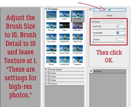
Here we are at another Friday. I hope you have had a great week.
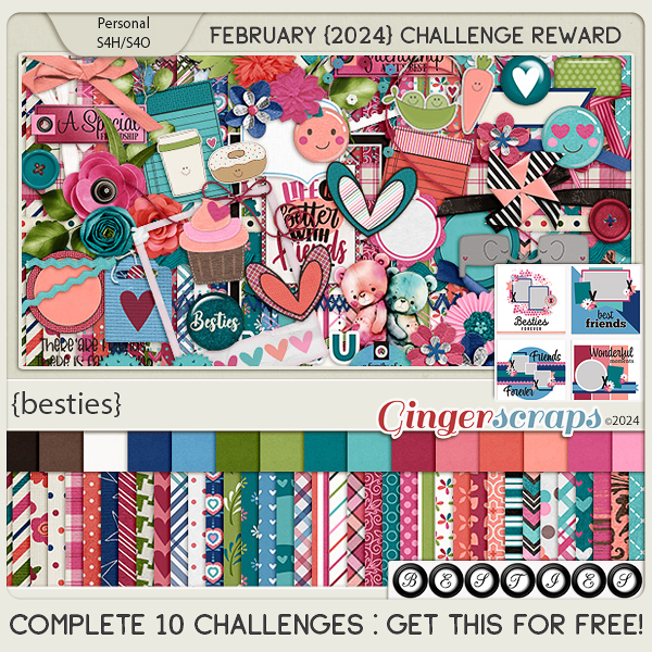
Remember, spend $10 in the store and you will get this great kit for free.

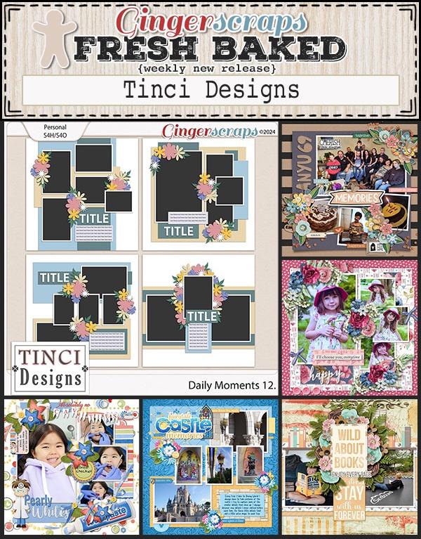
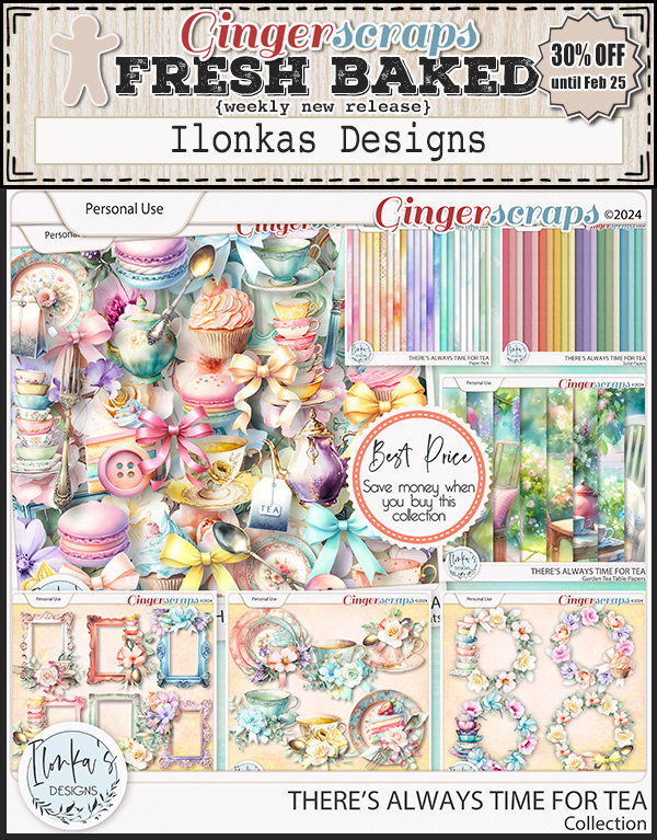
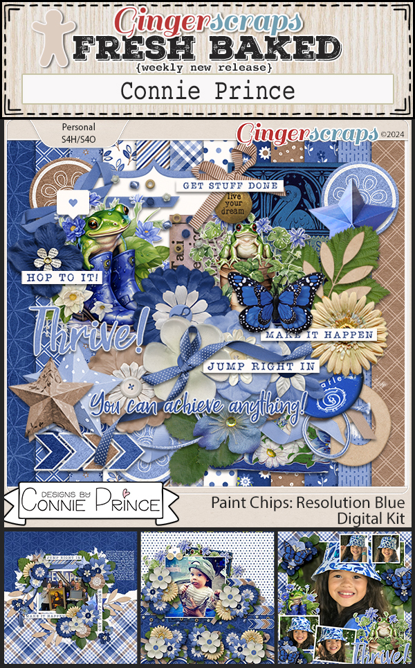
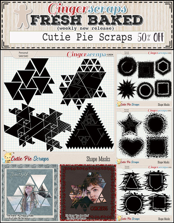
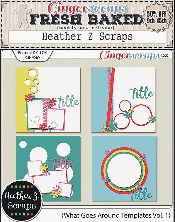
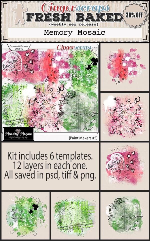
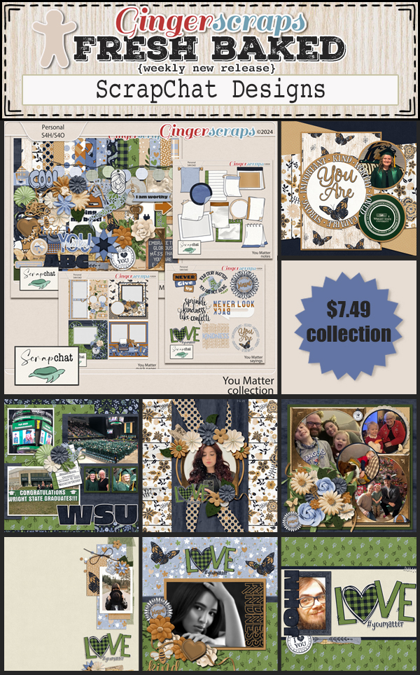
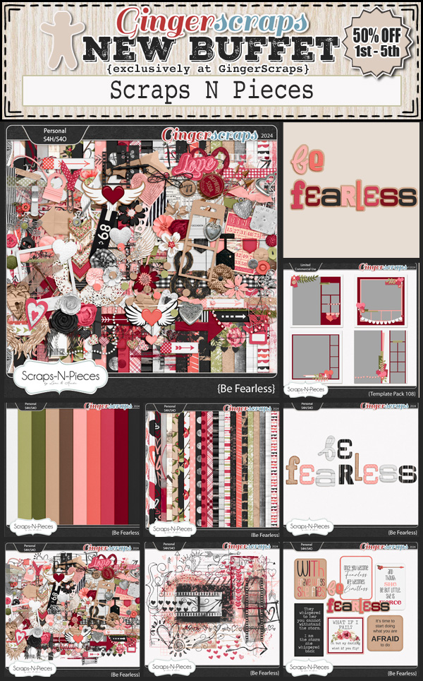
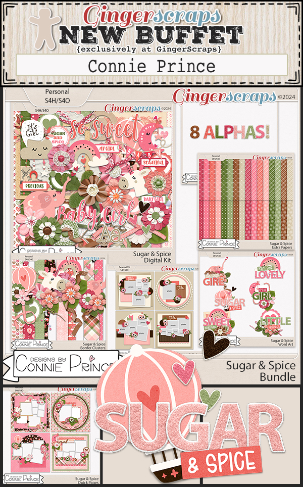
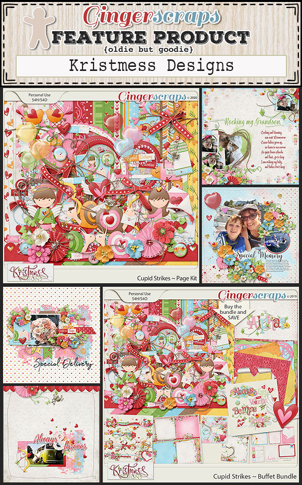
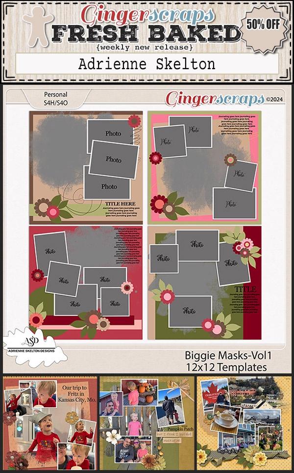
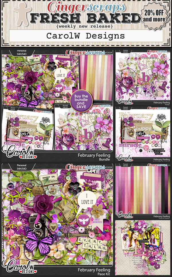
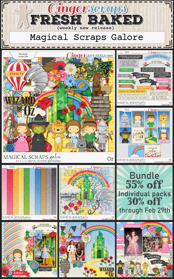
Let’s see what is new in the store.


How are your challenges. Just one more week to get them completed and posted. Complete any 10 challenges to get this reward.
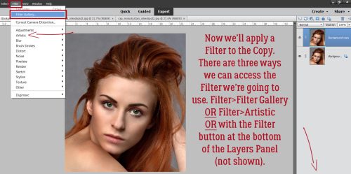
We have teamed up with The Digital Scrapper to bring you another awesome class at an exclusive discount! This is not a new class, but if you haven’t taken it yet, you should check it out, it is super cool!!
The Digital Scrapper : Die-Cuts Gone Wild

https://qwiklearn.teachable.com/p/die-cuts-gone-wild-gs/?affcode=159709_crihvr_k\
In Die-Cuts Gone Wild by Syndee Rogers, you’ll learn how to create an elevated die-cut design with a modern look. Too complicated? No way! Syndee shows you everything you need to know to create designs like these.


Exclusive Sale for GingerScraps Customers
- Save 35% through Friday, February 23, 2024, Midnight Eastern.
- Regularly $72.
- NOTE: This is not a new class.
- I hope to see you in class!