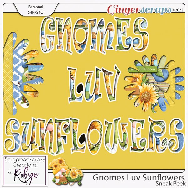
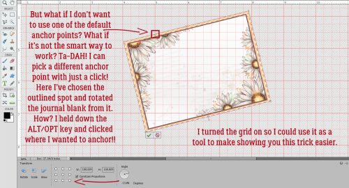
Creating Your Own Stitching [Part One]
![]()
PDF Version: https://bit.ly/3ckOJcE
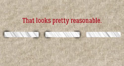
Karen Hampton asked for some guidance on creating her own stitches. Today I’ll talk about stitching in a straight line, which I’ll build on in another tutorial for creating stitched shapes. These are the basics. (Spoiler alert: I learned something while I was playing with this one!)
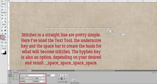
This tutorial will use the Text Tool; it’s readily available and easy to use. My stitches have been created using the underscore key [ _ ], the space bar and white. The hyphen and the period will work too. The font I went with is a default font on Windows machines, Impact Regular set to 30 points. _SPACE_SPACE_SPACE_ to the desired length. This gives 3 1/3 stitches per inch.
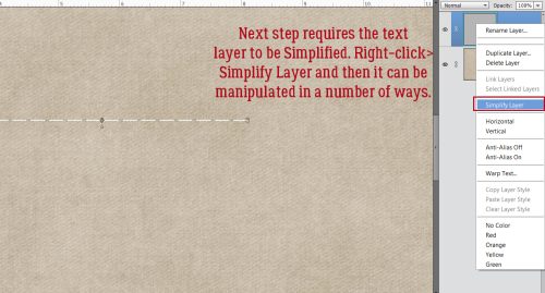
This step, I’ve discovered, may not be necessary, at least with Elements 2021. But we’ll go ahead and do it anyway. Right-click on the text layer then choose Simplify Layer from the drop-down menu. Some manipulations to text can’t be performed unless this step has been taken.
This is an optional step. If you’d like your stitches to be thicker, the easiest way to do it is to Edit>Stroke (outline) Selection. That will add to both length and width.
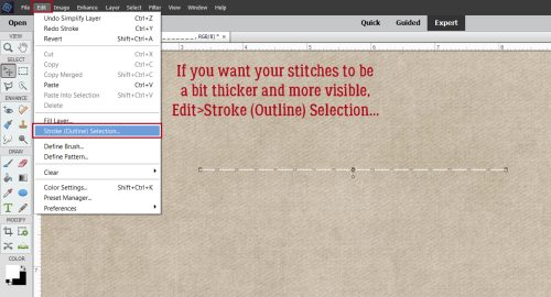
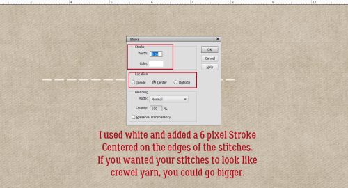
Obviously, I’m using the same colour as for my text layer. I decided on 6 pixels centered on the stitches, which will give nice heft but won’t obliterate the spaces between the stitches.
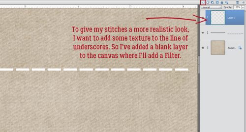
This is another optional step. I’m a bit of a perfectionist, so when I go for realism, I’m all in. I want to add some texture to my stitches. Turns out the best way to do that is to use a Filter, placed on its own layer. (I tried to apply the Filter to the stitches layer and it didn’t work.) So pop a blank layer on top of the stitch layer by clicking on the sheet-of-paper icon at the top left of the Layers Panel.
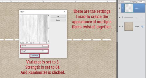
I remember using this Filter for another tutorial but not in quite this way. Filter>Render>Fibers…
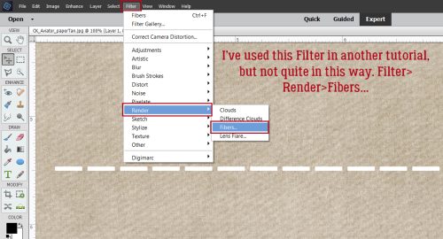
Thread and yarn are composed of multiple fine strands of fibers twisted together to make a single strand. There’s some visible variation in the thread, and I wanted to capture that look. The settings that worked best are shown here. Variance 3, Strength 64 and Randomize.
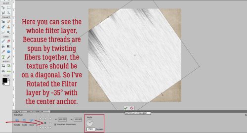
The twists in the thread fibers are usually on the bias, or somewhat diagonal. So I decided to Rotate the Filter layer on a center anchor to -35°.
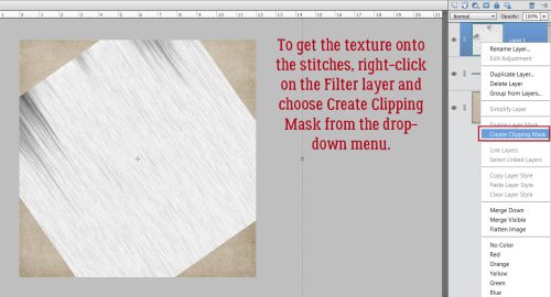
I’ve been having some glitchy things with my Elements lately. Some keyboard shortcuts have failed to work when I try to use them. (Probably time for some system maintenance.) To get the striations onto the stitches, right-click on the Filter layer and choose Create Clipping Mask or use the keyboard shortcut CTRL/CMD>G for versions prior to PSE15 or CTRL/CMD>ALT/OPT>G for PSE15 and later.
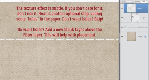
The effect is quite subtle. If you don’t want to add it, skip ahead! For more optional steps, read on. Do you think you’re particular enough to want holes in your paper where the stitches go through it? This step’s for you. Add another blank layer above the stitch layer. Don’t want holes? Keep on scrolling…
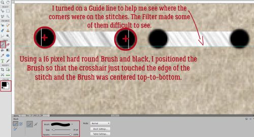
This step gave me some trouble. I played with it for quite some time before all these key points came together. The stitches are in a straight line so the holes should also be in a straight line. I pulled down a Guide line by moving my cursor into the ruler at the top of the canvas and holding down the left mouse button, pulled down to the bottom of the stitches. The needle creating the holes is bigger than the thread, so the hole has to be wider than the stitch. I settled on a 16 pixel hard, round brush for this. Next came figuring out how to position the holes correctly. I found that putting the tip of the horizontal crosshair in my brush cursor right on the edge of the stitch while lining the same horizontal crosshair up with the horizontal middle of the stitch was perfect.
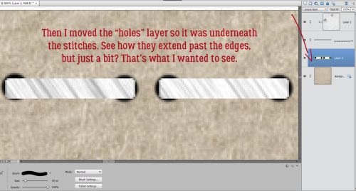
Of course, the holes need to be under the stitches and I tried doing the brush thing with the blank layer under the stitches but it wasn’t as easy lining up placement that way. So because the holes layer the holes layer is above, it needs to be moved down under the stitches. You can drag it down by clicking on the layer, holding down the left mouse key and just dragging it. Or you can use CTRL/CMD>] to go down. (Going up uses CTRL/CMD>[.)
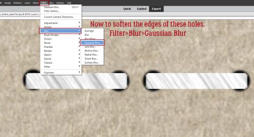
When you see this part, you’ll ask me why I didn’t use a soft brush to start with. I tried it. I didn’t have enough control of it for my liking. So we’ll soften up the edges with a Filter>Blur>Gaussian Blur.
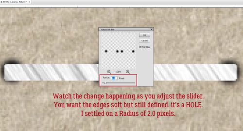
I love it that Elements lets me see what’s happening to my creation while I’m making adjustments. That makes fine-tuning so much easier. I like a Radius of 2.0 pixels for these holes.
It’s starting to look pretty realistic.
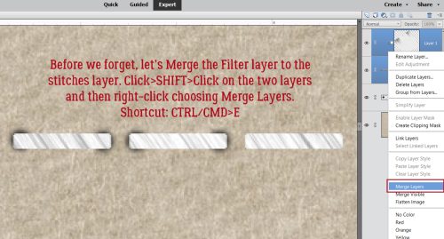
This part could have been done sooner, like before the whole hole bit began. I Merged the Filter layer with the stitch layer by clicking on the Filter layer, holding down the Shift key and clicking on the stitch layer to Select both, then right-clicked and chose Merge Layers from the drop-down menu. Keyboard shortcut: CTRL/CMD>E
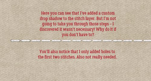
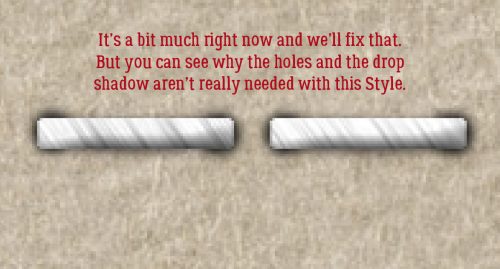
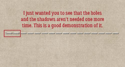
Let’s have a look. The holes aren’t in your face, but visible to the discerning eye. You might see I’ve added a custom shadow layer to the stitches, but I’m not going to take you through that. Turns out it really isn’t needed.
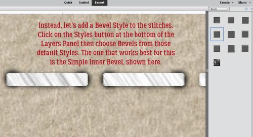
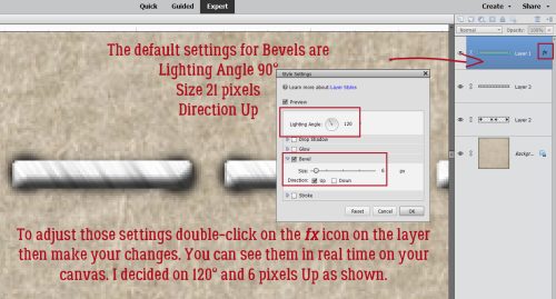
Rather than adding shadows, let’s give the stitches a bit more dimension by adding a Bevel. Click on the Styles button at the bottom of the Layers Panel and choose Bevels. The one I decided works best is the Simple Inner one, as shown here. These Bevels are integrated in the software, so you don’t need to buy and install them.
The default settings are a bit much. And you can see why I realized the holes and shadows aren’t really required.
To adjust a Style, double-click on the fx icon on the layer in question. This menu opens. I adjusted the settings as shown.
Once more, with feeling…
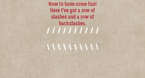
But what else can we do with this besides a straight line of horizontal stitches? Some of the other characters can be turned into fancy stitches. Here I’ve made a row of 10 slashes and 10 backslashes on separate layers.
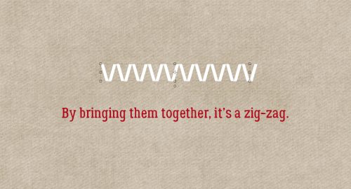
By moving one of the rows toward the other, I created a zig zag.
If I overlap the rows, I end up with a narrow cross-stitch.

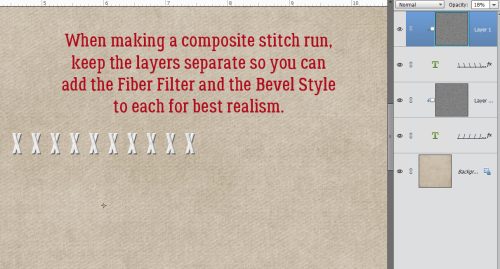
When creating composite stitches this way, keep the layers separate so you can add the Fiber Filter and Bevel to each layer before you Merge them.
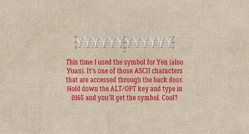
Just for fun, I made a row of really fancy stitches using the ASCII symbol for Yen/Yuan. How did I do that? The keystrokes are ALT/OPT>0165. (I use a lot of ASCII characters in my genealogy research since I have Irish, French and Swedish ancestry in the family.) I bet the < and > symbols on the standard keyboard could be used for stitching, as well as *, + turned 45° then duplicated a few times, =, 8 turned 90° and duplicated, and x in some sans serif fonts. There are so many options!
Part Two of this tutorial will look at stitching around a shape, which involves some additional steps. I may even do a Part Three using brushes instead of text.
If you have an idea for a tutorial, don’t be shy! I love the challenge!! You can easily reach my via Private Message (click on it, there’s a link!) in the GingerScraps Forum. My handle is ObiJanKenobi. Now back to your regularly scheduled programming.
PDF Version: https://bit.ly/3ckOJcE
![]()