Can you believe it is the last month of 2021! It is my favorite time of year! I love the Holiday season and the cold weather. I hope you are all making tons of memories for scrapping this holiday season.
It is the 1st of the month and you know what that means, a huge, exciting newsletter! We have a New Buffet, New Monthly Mix, New Free With Purchase Collab, New Challenge Reward, New Daily Download on the GingerScraps Blog & THREE New Designers!
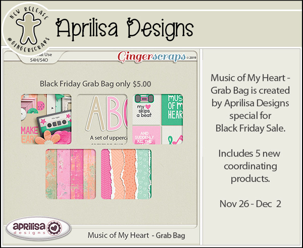
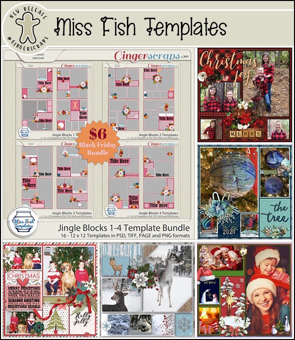
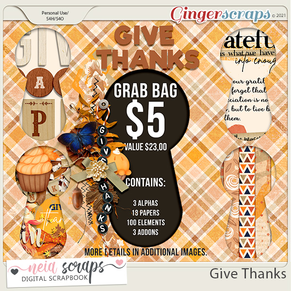
Before I get started, a quick reminder that our Black Friday sale is still happening! There are so many amazing deals and grab bags, if you haven’t had a chance to check them out, make sure you do asap! This sale will end on December 2 @ 11:59 PM Eastern Time.

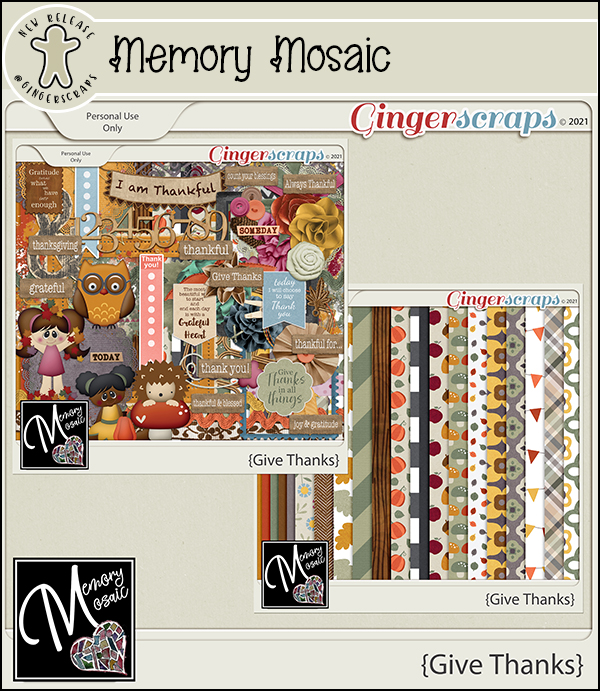
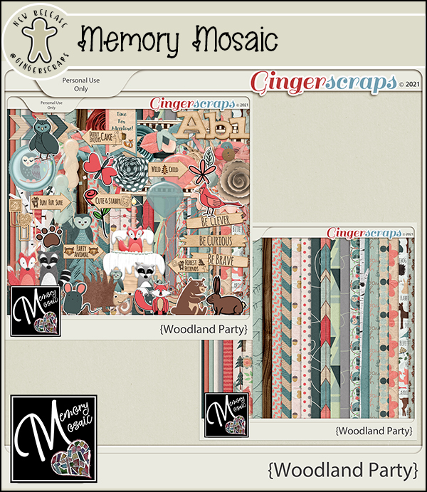
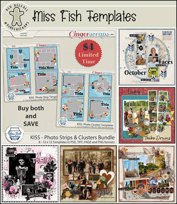
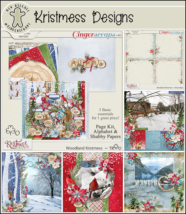
Now onto the rest of our first of the month news! Let’s start out with the December Buffet. Don’t forget to check out the Buffet Bundles. One easy click to add bundles of Buffet goodies to your cart.

Look at these colors. These are so deep and rich.


Remember any $10 spent in the store gets you this great collab.

This new Monthly Mix kit is perfect for the the Holiday Season! {Santa’s coming to town}

Now to the December Daily Download Sneak Peek. This month’s Daily Download is from Wimpychompers.
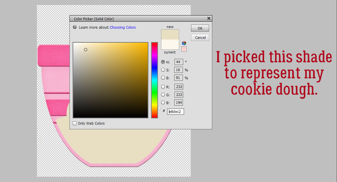
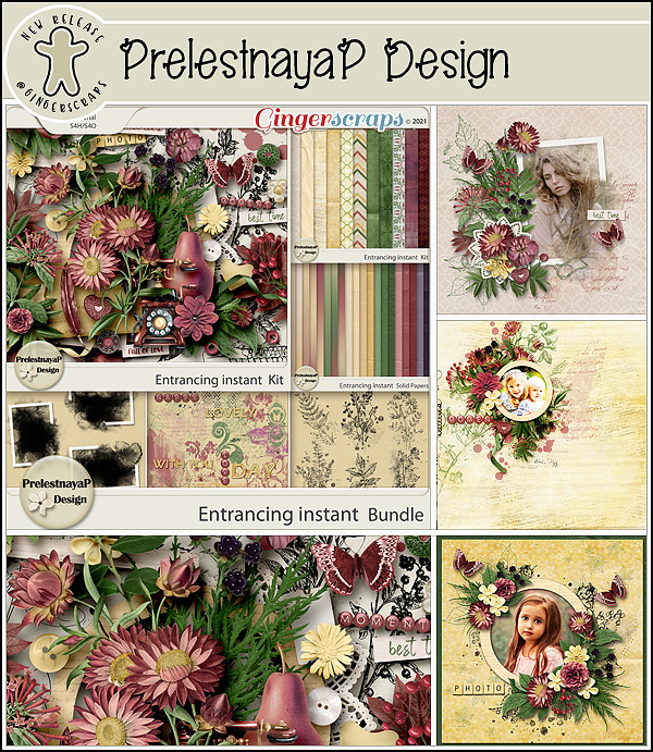
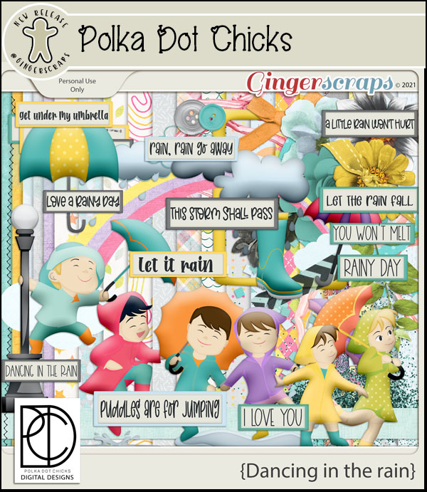
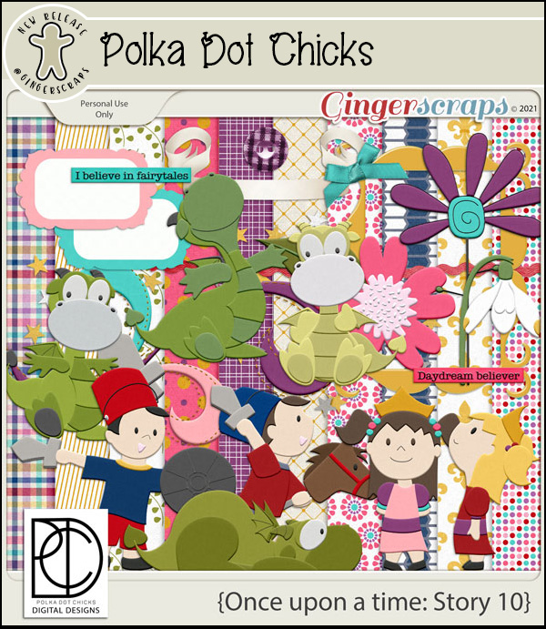
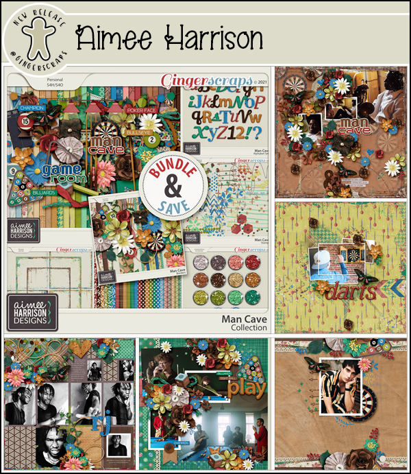
 We don’t have any guest designers this month but we do have THREE permanent designers to announce!!
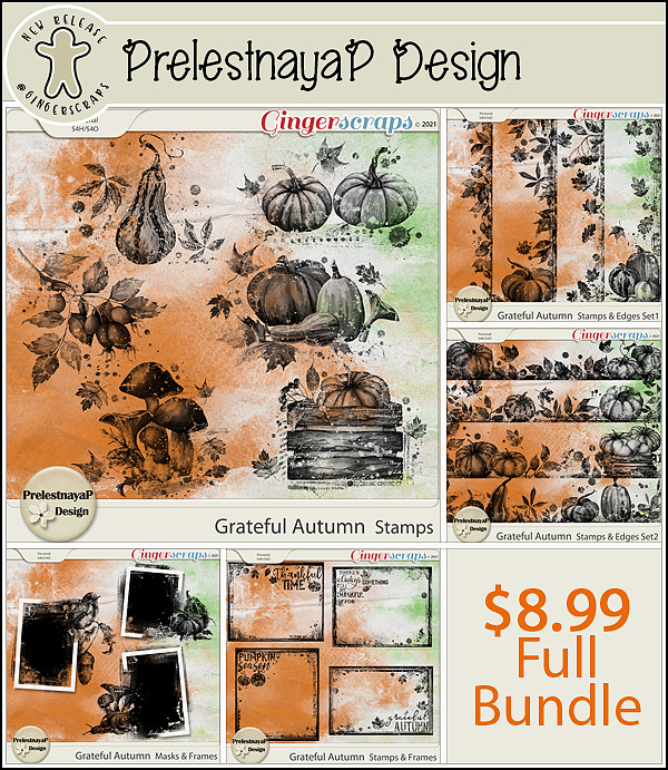
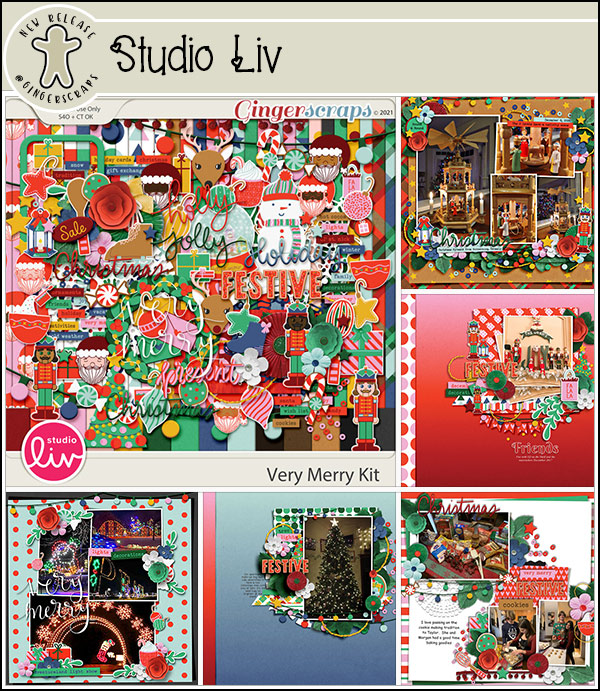
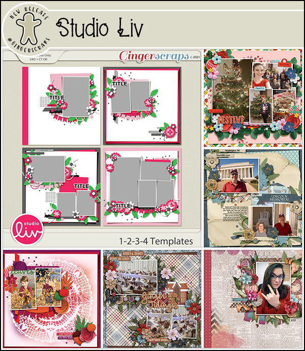
So happy to announce that Studio Liv & Scrapbookcrazy Creations by Robyn will both be staying on at GingerScraps permanently!


And guess who’s back?! Laurie from Laurie’s Scraps just couldn’t stay away, she is back at GS and busy filling up her shop with lots of fun goodies! 
Take a look at the new challenge reward kit. If you complete any 10 challenges this month, you get this gorgeous collab as a reward!

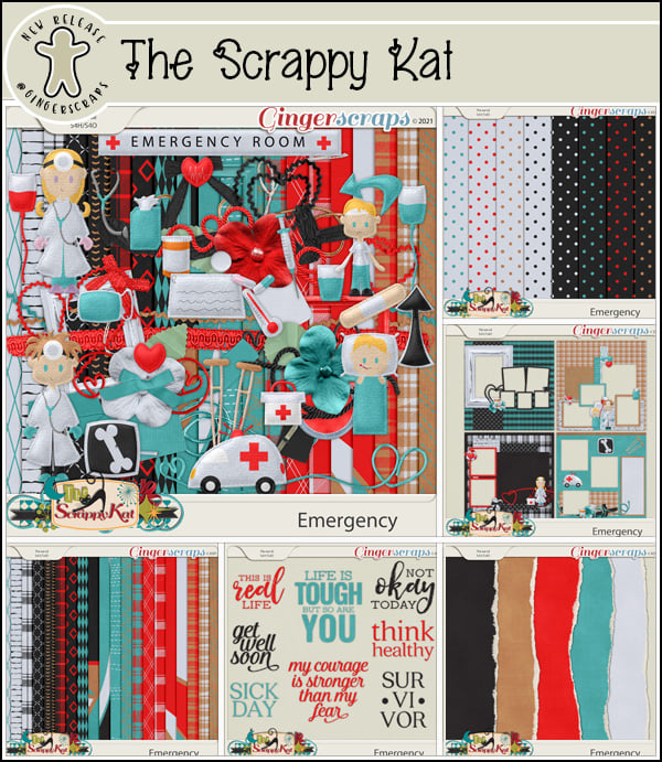
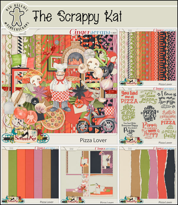
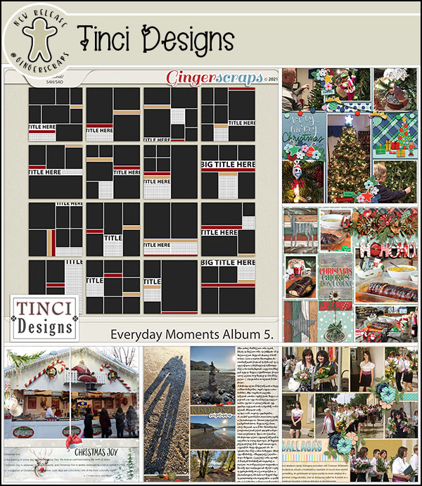
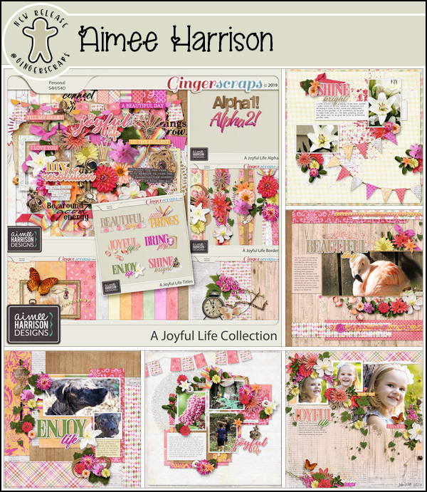
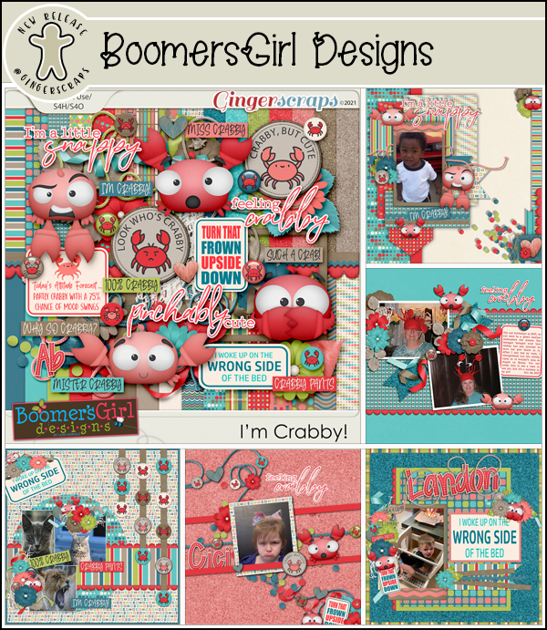
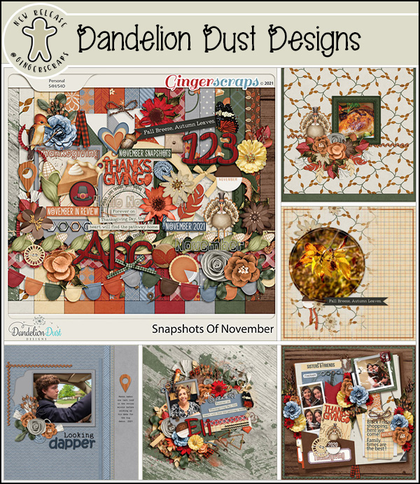
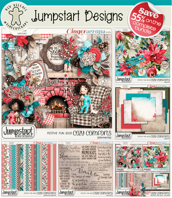
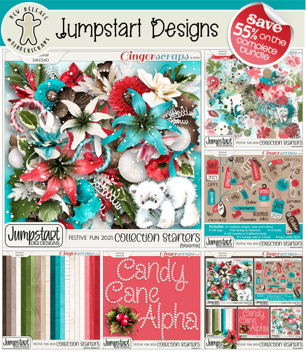
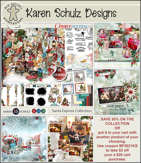
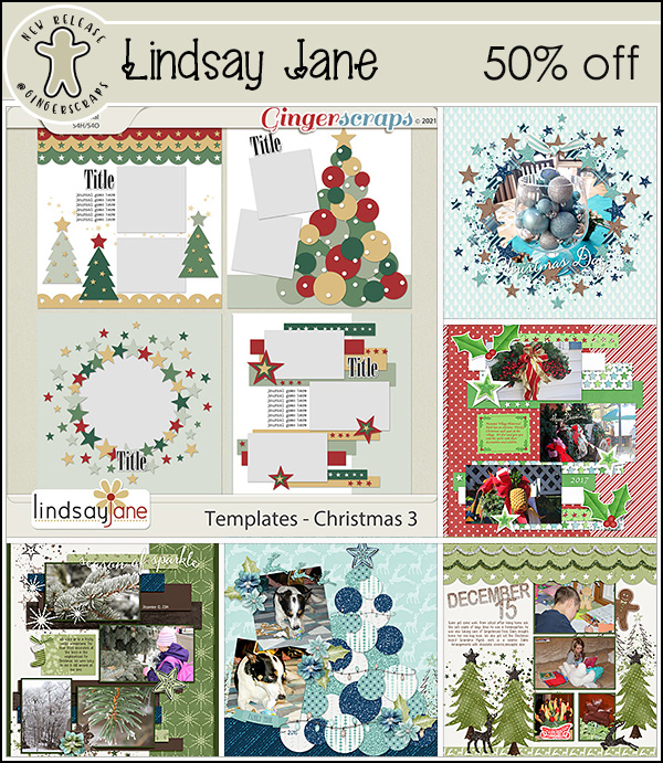
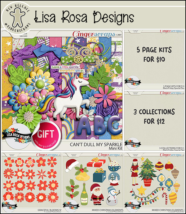
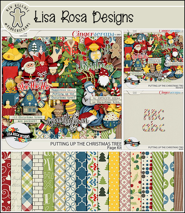
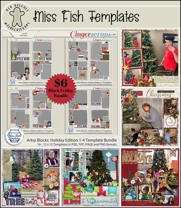
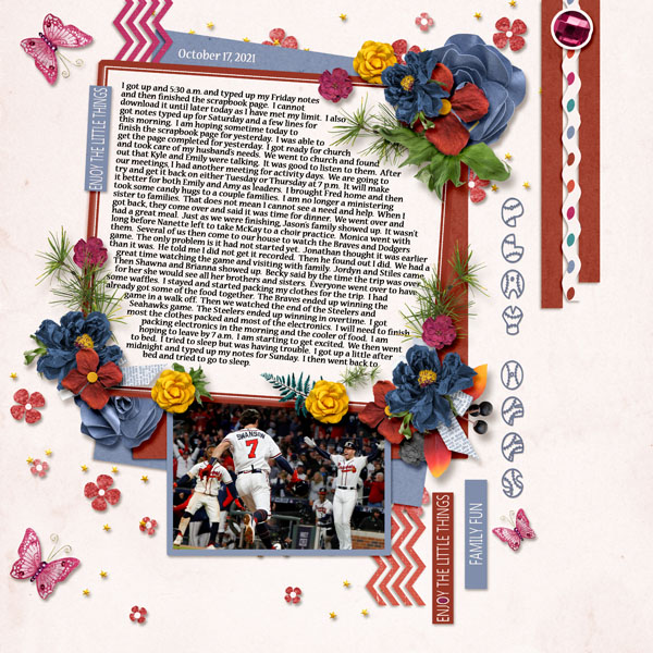
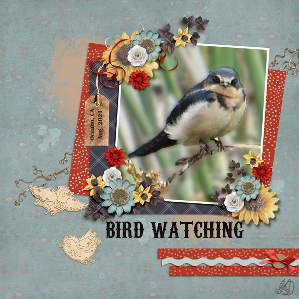
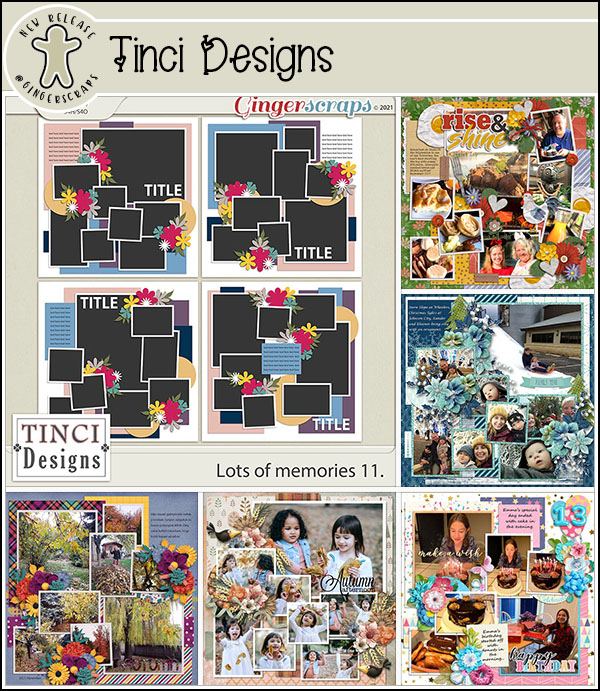
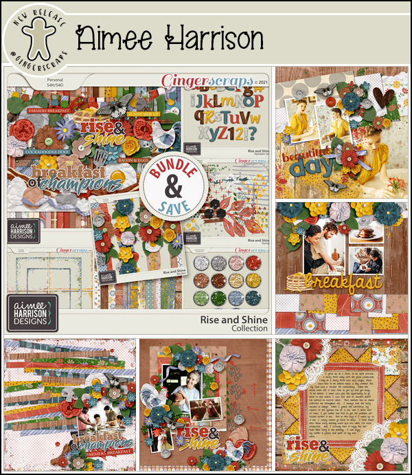
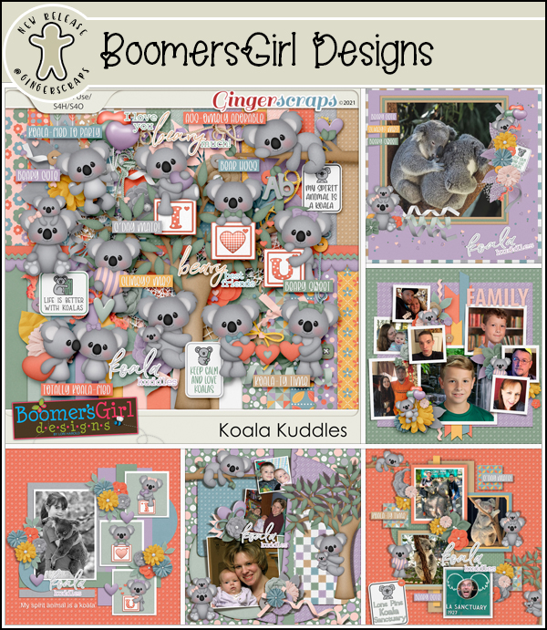
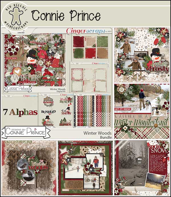
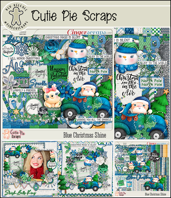
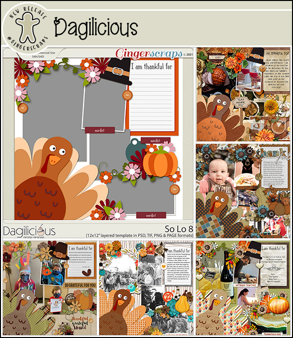
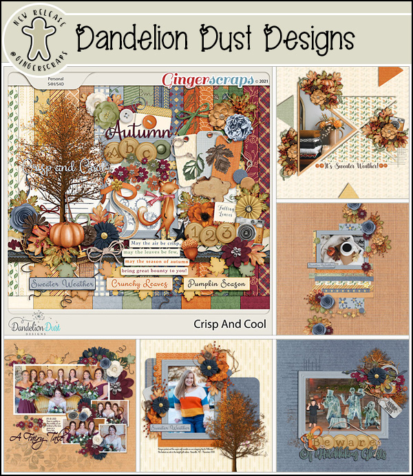
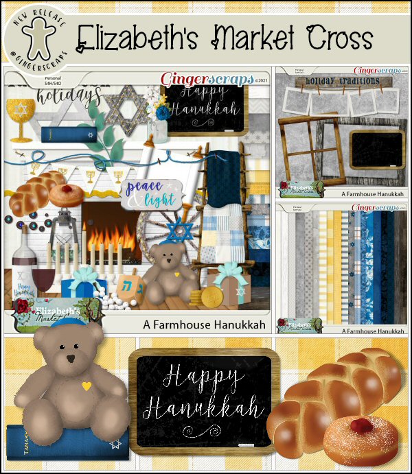
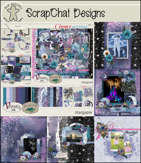
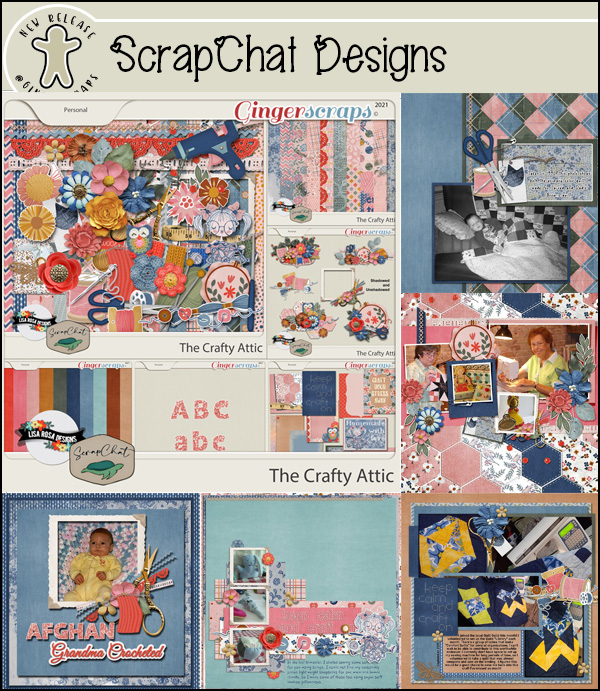
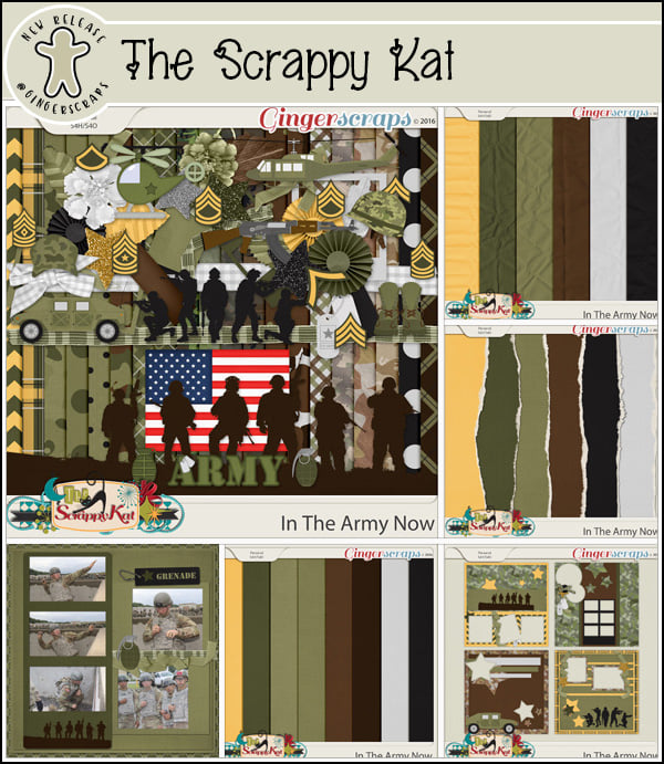
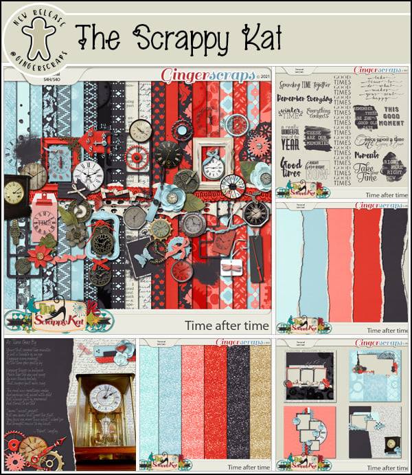
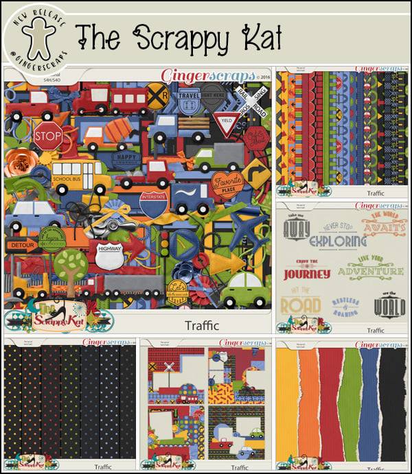
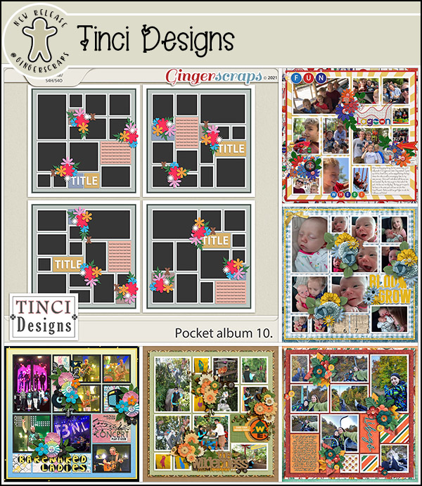
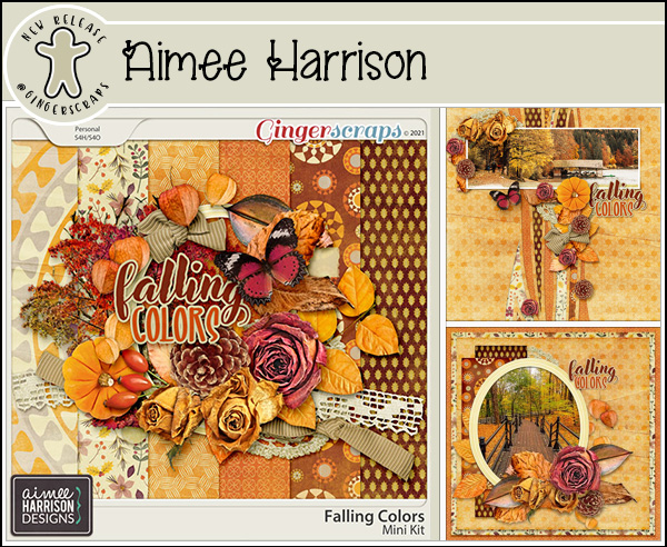
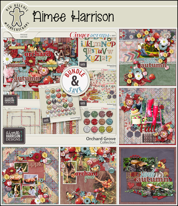
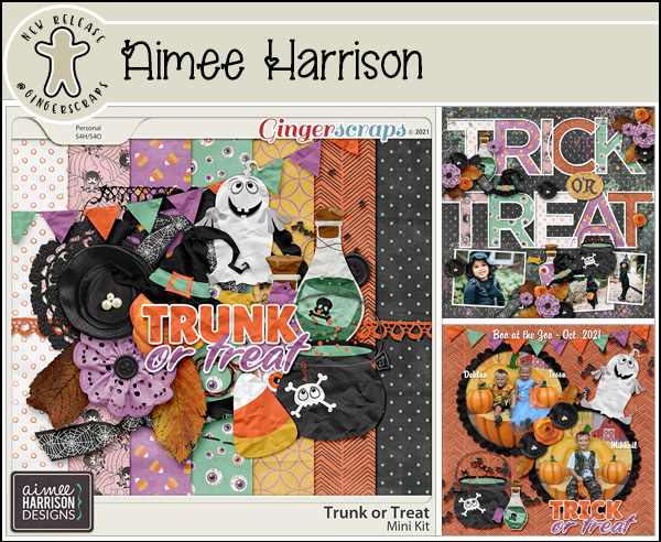
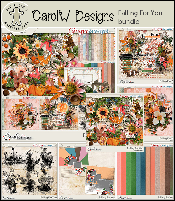
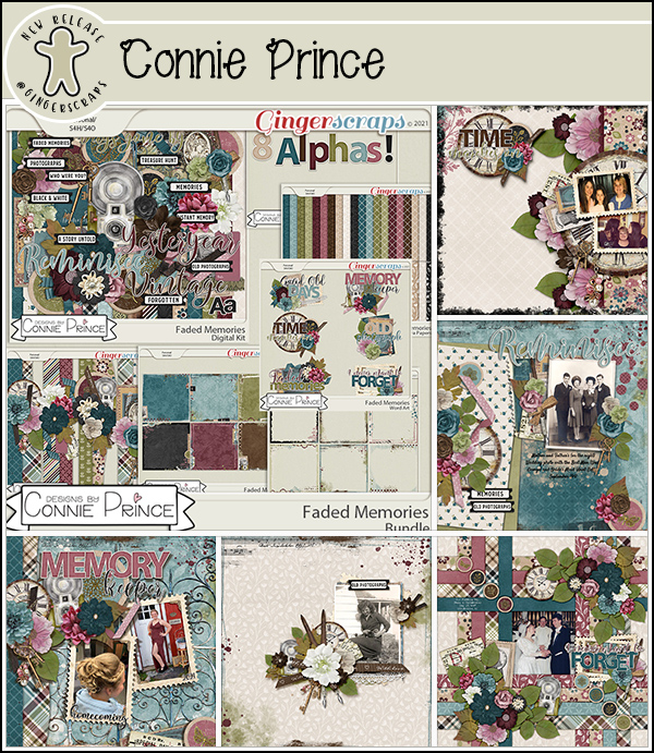
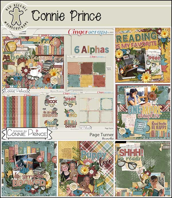
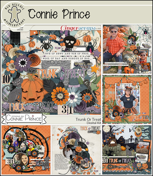
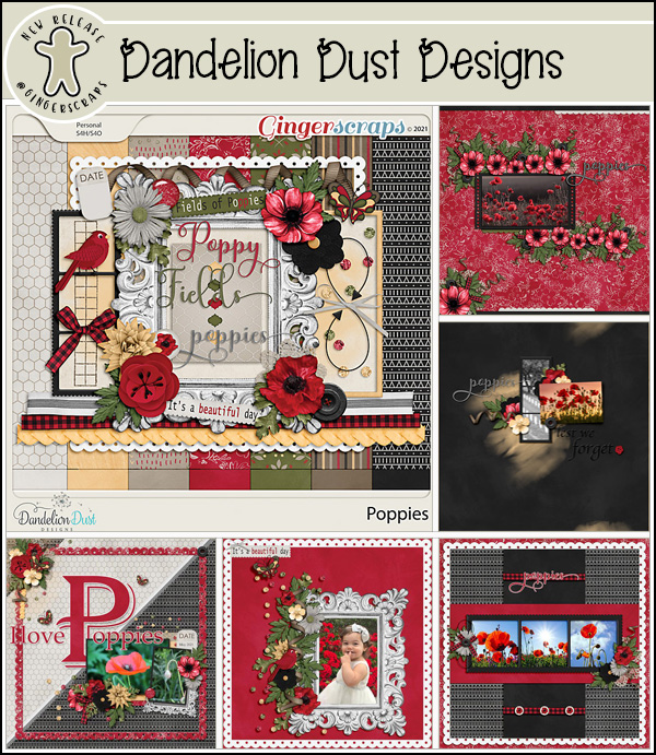
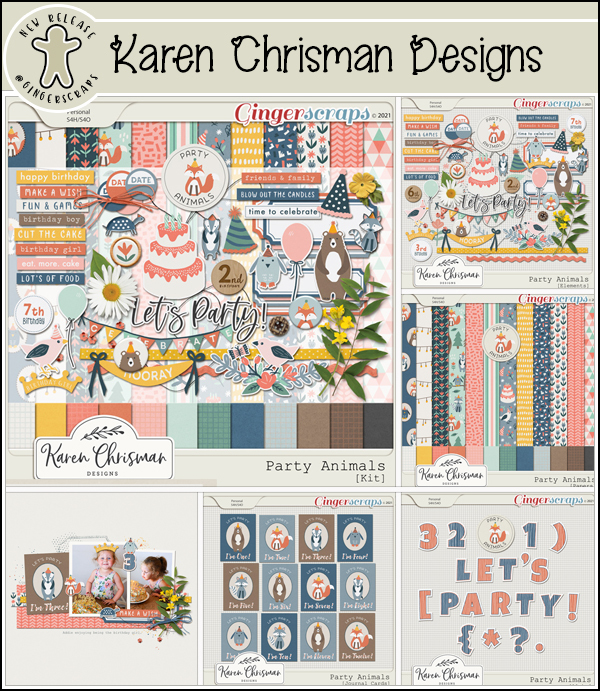
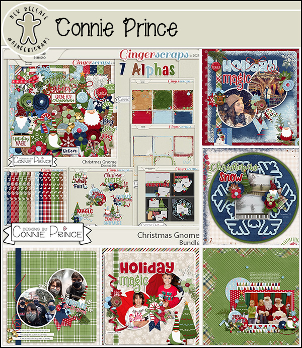
Let’s see some of the sample layouts provided by our amazing store Creative Team.
These layouts were created using the December Monthly Mix: Santa’s Coming To Town