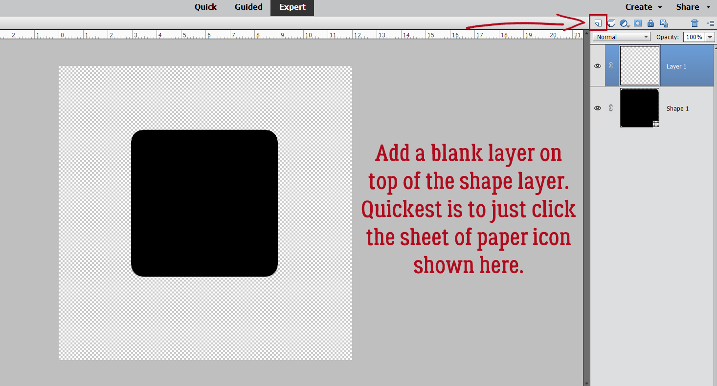
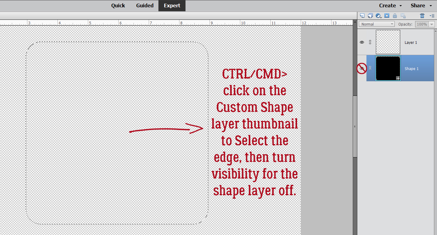
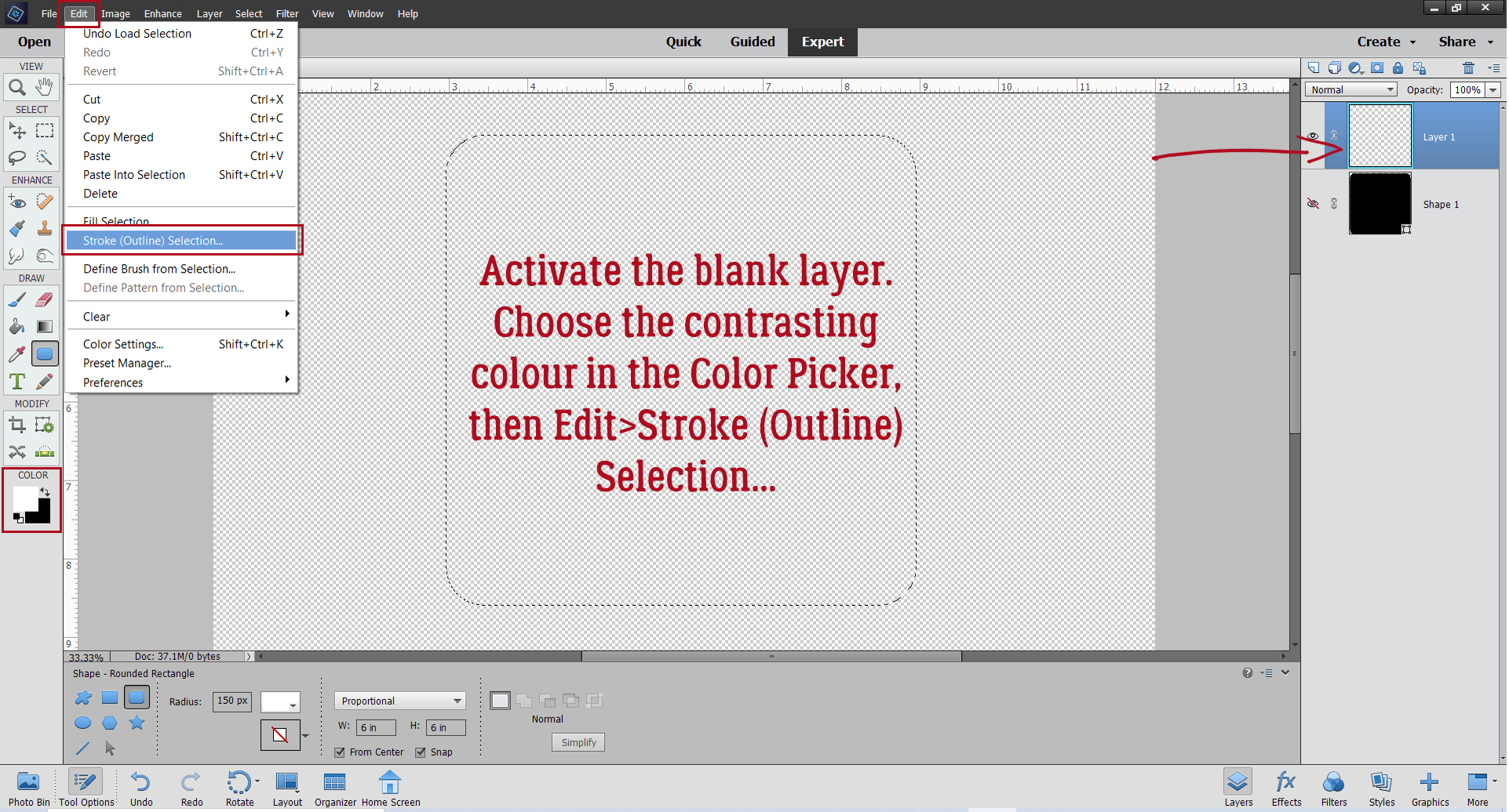
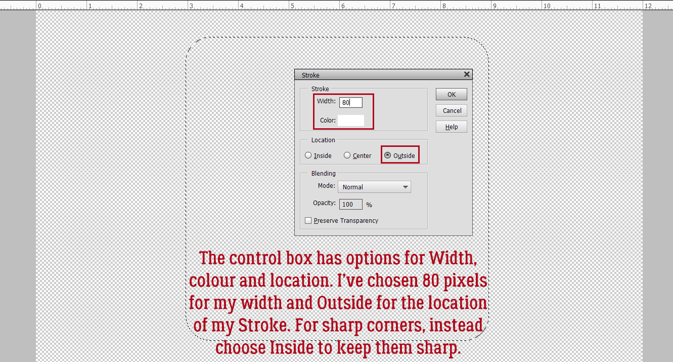
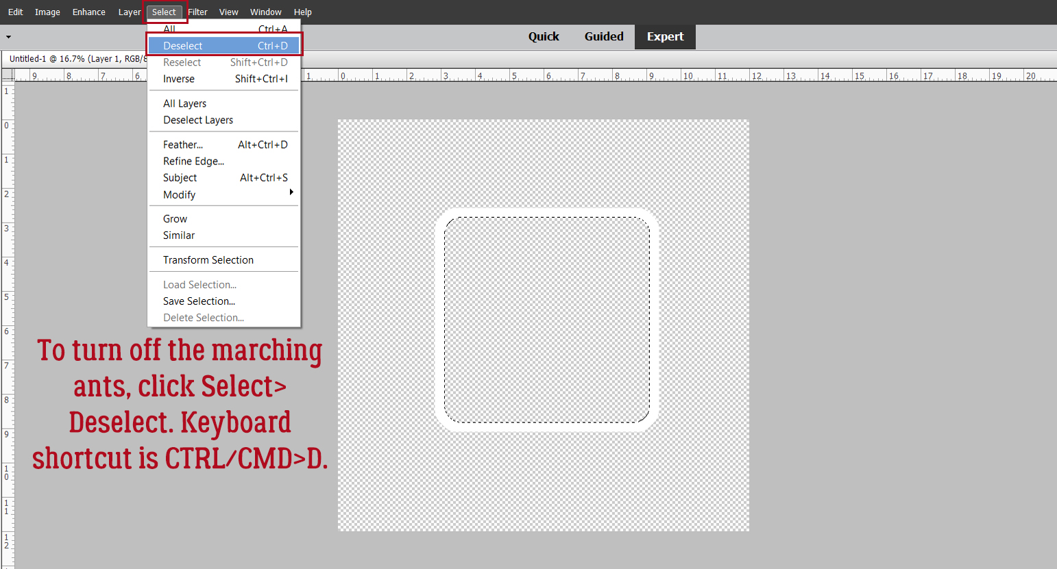
Elements Work-Around: Photo in a Jar
![]()
PDF VERSION: https://bit.ly/3xue7TZ
Sometimes the limitations presented by Elements versus Photoshop seem insurmountable. But if I play around long enough, I can usually figure out how to take the longest route possible to a Photoshop-worthy result. I do love a challenge… Karen (khampton) asked if I could do a tutorial on radial transparency gradients. She wants to do something like this image from Jaydubbya that she found at OScraps. This is something that only takes a handful of clicks in Photoshop, but wouldn’t you know… Elements doesn’t have anything like it. The Gradient Map Adjustment Layer isn’t as versatile in Elements and therein lies the rub.
I tried a LOT of things before I settled on the steps I’m going to share with you, but I think my efforts are acceptable. I’ve managed to condense the process down to a few steps but please remember that NOTHING you do in Elements is ever final unless you decide it is. Anything you do can be undone. CTRL/CMD>Z is the most useful keyboard shortcut ever!! It costs nothing to experiment. So let’s start.
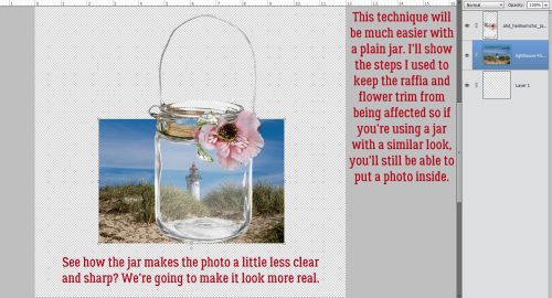
I found a realistic glass jar in my stash. It came from Aimee Harrison‘s Heirloom Chic (retired) collection. Then I chose a photo from Pixabay that has a sharp image, strong colours and high contrast. I positioned the photo under the jar on a 12×12 canvas – love the extra room to work.
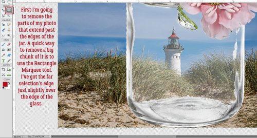
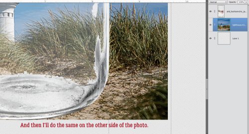
Obviously, if the idea is to put a photo inside a jar, the photo shouldn’t extend past the edges of the jar. So I’ll need to get rid of the parts I don’t need. I used the Rectangle Marquee Tool to chop off big chunks. In this image I’m showing the right-side edge of the selected rectangle just overlapping the left edge of the jar. The removal doesn’t have to be perfect, because the photo will always be behind the jar.
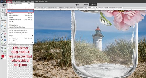
The photo layer is the active layer. To remove that bit of photo, Edit>Cut or CTRL/CMD>X will do it.
Then I’ll do the same thing on the other side.
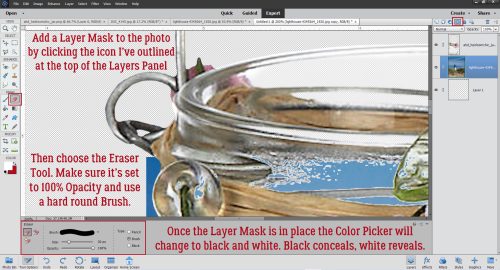
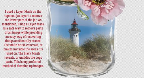
Rather than just use the Eraser Tool to clean up the photo’s edges, I opted for a Layer Mask. Click on the icon above the Layers Panel that looks like a gray circle inside a blue box. Once the Layer Mask appears, the Color Picker will change to black and white. Choose the Eraser Tool, setting the Opacity to 100% and using a hard round brush from the Basic Brushes that come with the software.
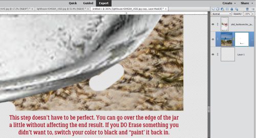
Then just run the Eraser – set to WHITE to conceal or hide – over the parts of your photo you want invisible. If you have an oops, like I sometimes do when the left mouse button sticks and the cursor takes off on its own path, switch the Foreground Color from white to BLACK – which reveals, or unhides what’s been removed – either by clicking on the Color Picker or the X key. Then carefully paint it back in.
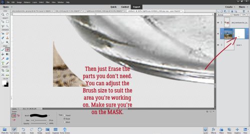
Do both sides of the jar and any other areas where your photo shouldn’t be visible.
One could almost be happy with it just as is! But we’re talking about me… so onward.
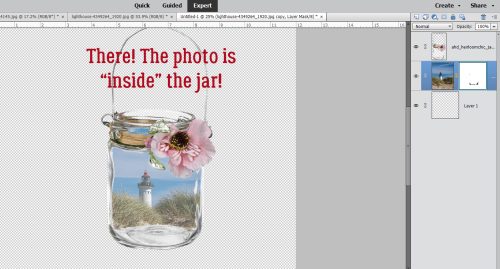
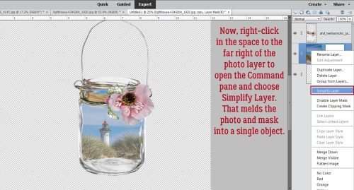
To avoid confusion and other mishaps, right-click on the photo layer in the Layers Panel off to the right in the blue area there then choose Simplify Layer. That will meld the mask to the photo.
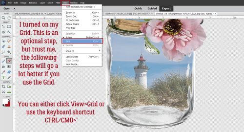
This step is optional, but I like the control it gives me. I turned on the Grid by clicking View>Grid or CTRL/CMD>’. I made sure I had one of the heavy grid lines running through the centre of the image; that’s because the jar curves closest to the viewer right down the middle.
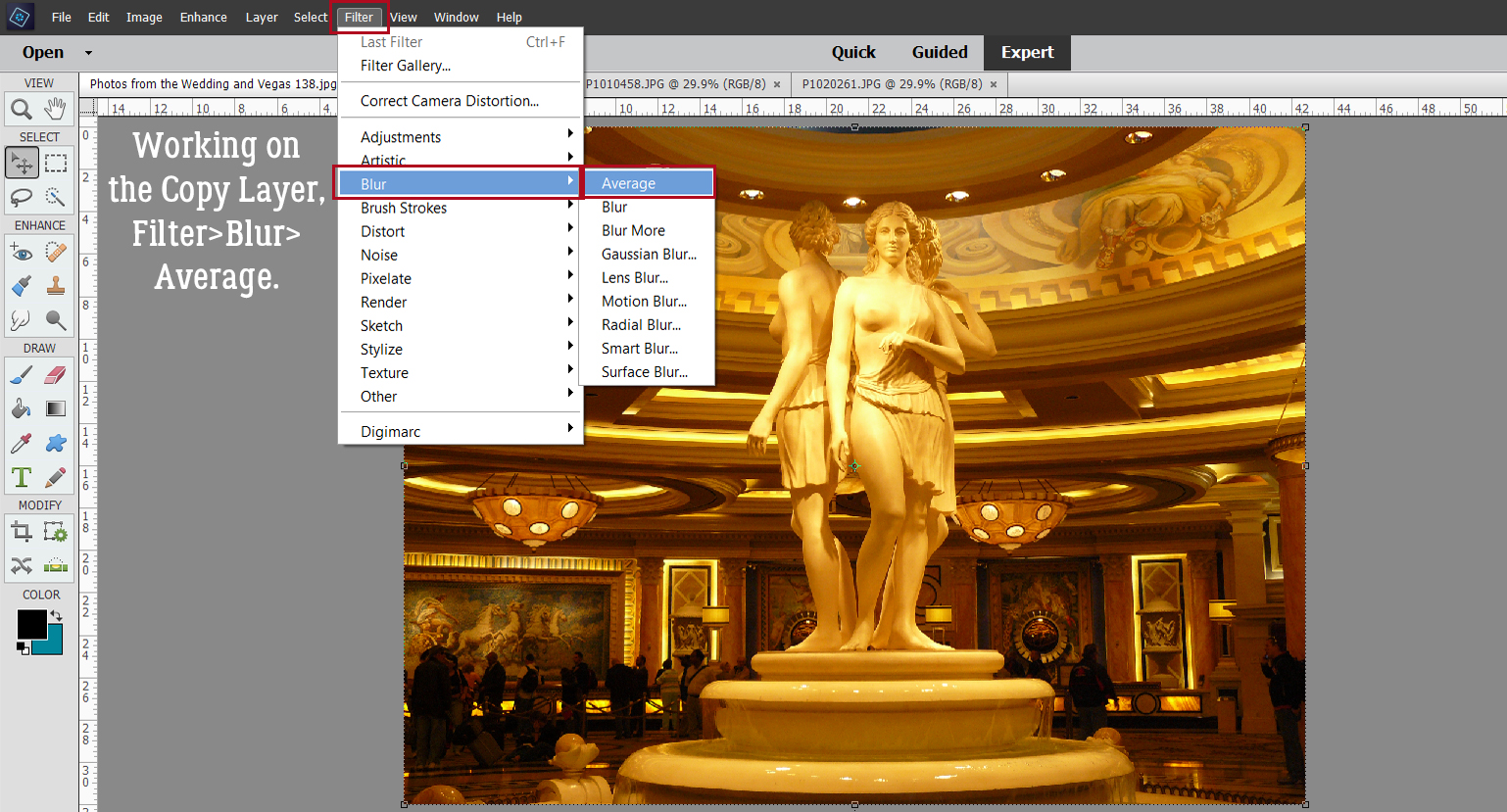
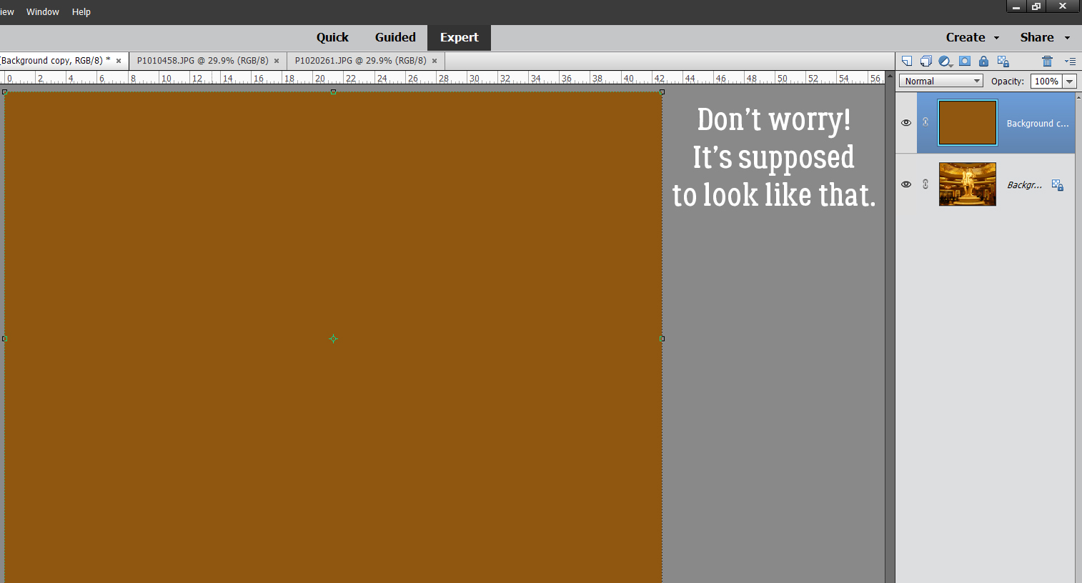
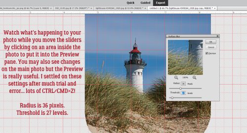
This next step is something I’ve never used before, and when I tried it, I was happily surprised with what it does. Notice I’ve turned the visibility of the jar layer off. Click Filter>Blur>Surface Blur…
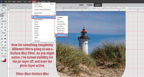
I make heavy use of the Preview Pane. To see where the action is, and what it’s doing, click on a spot inside your image and that will bring it into the Preview Pane. Then you can see a close-up of what the commands do, as well as seeing it on the larger image in the background. Move the sliders and watch the change. These settings were what I settled on after many tweaks. Radius is 36 pixels, Threshold is 27 levels.
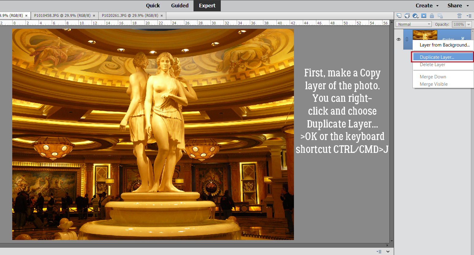
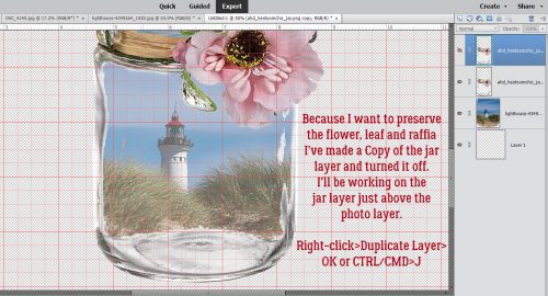
If you’re using an unembellished, straight, plain jar or bottle, don’t worry about this. But if you’ve got something going on like I do with the leaf and the flower and the raffia, make a Copy Layer of the jar and tuck it away for later. Because you’re going to mess them up! Right-click on the jar layer then choose Duplicate Layer>OK or use the keyboard shortcut CTRL/CMD>J.
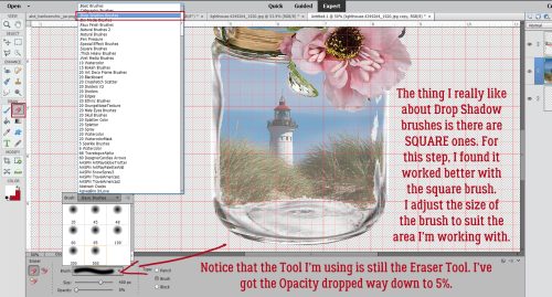
Next, with the Eraser Tool still active, change the brush to Drop Shadow Brushes (one of the brush sets preloaded into Elements) and choose one of the square brushes. I’m going to use a BIG brush for this step, 400 or 500 pixels, and with the Opacity really low, 5-10%. This part demands a light touch, so don’t be in too big a hurry!
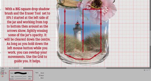
Make the original jar layer active. The jar has only barely-there Opacity but it does dampen the sharpness of the photo, so I want to make the glass a bit more transparent to let the photo shine. Using the Grid to help with brush placement, I put the crosshairs over one of the lighter gridlines to the left of the jar. Then I brushed along the path shown in the screenshot, ending with the brush going right down the centre of the jar. As long as you hold down the left mouse button while you’re brushing, you won’t get lap marks.
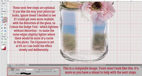
Again, there are some options here. If you’re happy, I’m happy. Go ahead and use your finished image, Save it or do whatever you like. But if you want even more realism, follow along. (NB: *The screenshot below is a composite image showing where the jar layer is most transparent. Yours will not look like this!*) Next I’m going to use the Dodge Tool. It looks like the spatula the optometrist uses to cover up one of your eyes during an eye exam. This Tool lightens whatever it’s applied to without distorting or decreasing its Opacity. Again, this Tool needs a delicate touch so I’ve got the Exposure set to 6% and the size is BIG. One stroke of it down each outer edge of the image might be enough. If not, give it a second run. If the centre of the photo seems a bit pale, switch out the Tool and choose the Burn option – looks like a gang symbol and darkens without distortion – and go HUGE with the brush. Then run it right down the centre of the photo. Stop before you go too far, or back up a step. Less is more here!
The difference is subtle but it looks pretty realistic! And if there were no flowers, leaves or raffia involved, this would be the last step. To turn the Grid off, click View and uncheck Grid, or use the same keyboard shortcut, CTRL/CMD>’ and it’s gone.
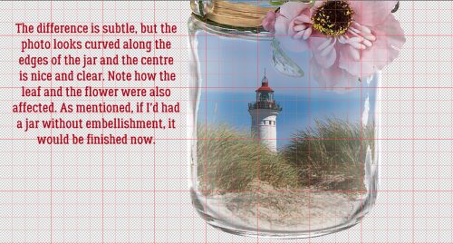
On the jar Copy Layer, I added a Layer Mask as described above. Then I removed the entire jar, leaving the rim with the raffia, the leave and the flower. Sharp and clear again! A little custom shadow and it’s good to go.
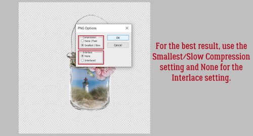
Don’t forget to save your work!! Click File>Save As… or CTRL/CMD>SHIFT>S then give your image a name with meaning. Select a folder you’ll be able to find later. And choose PNG as the file format to preserve the transparency of the background.
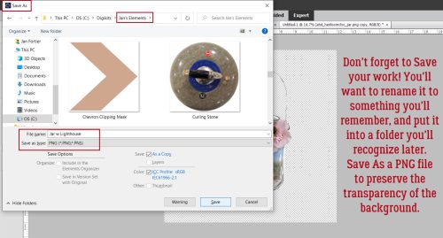
Choose Smallest/Slow for Compression to preserve as much detail as possible and None for Interlace. All done! Now you can use the photo-in-a-jar for your layout.
Have you seen something in a Gallery that caught your eye but you’re at a loss as to how to duplicate it? Send me a message and we’ll figure it out together!
PDF VERSION: https://bit.ly/3xue7TZ
![]()