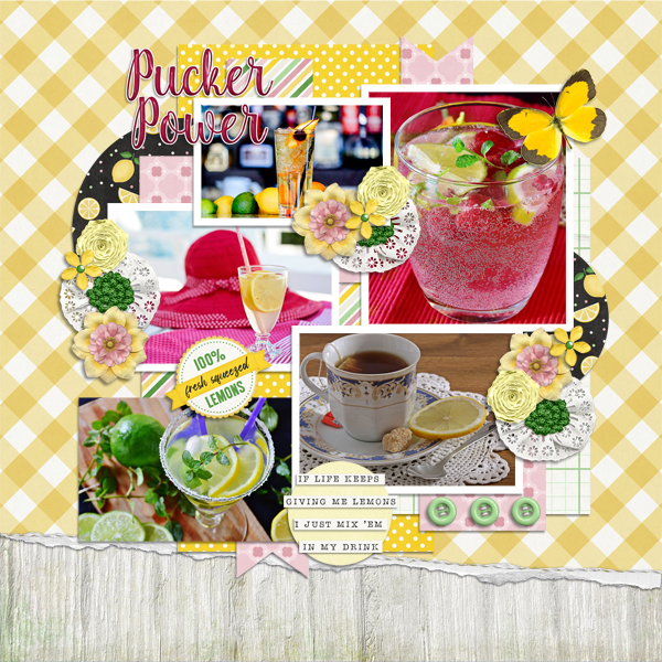
Making Your Own Messy Edges
![]()
PDF Version: https://bit.ly/3uGCI7Z
I had a request from Lorri: “Would you consider a tutorial on making custom paper edges? I’ve thought about how I can do this after viewing the rather simple edges using masks against background papers. But as I look at some more recent edges and the increased complexities, it seems that masking alone is not the technique to use (at least alone).” She provided some examples from the fabulous Connie Prince so I’d know what she was talking about. My response? Of COURSE we can do that!! So here we go…
[Before we start, there are lots of screenshots for this, but they’re not all steps in the process. I want these tutorials to be achievable by everyone; visual and verbal instructions along with repetition help the majority of learners, and that’s why there’s always a review. I don’t assume anyone reading my tutorials is an expert at using Elements, so if you ARE an expert, I know you’ll be gracious. 😉 The other thing I want to mention is that any text you see bold and in colour will contain a hyperlink to the source of whatever I’m showing.]
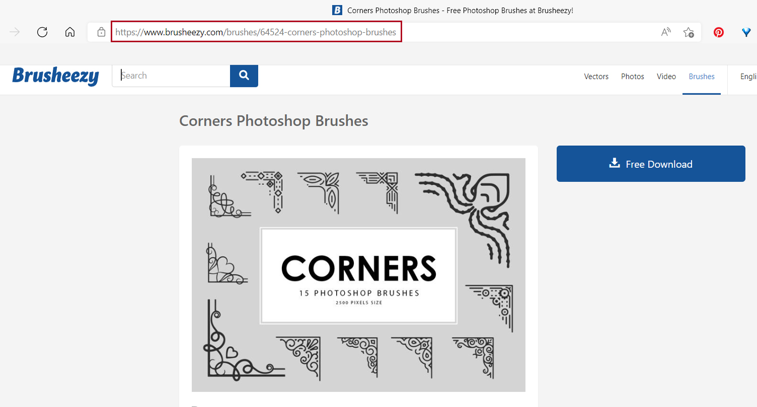
Okay. Let’s roll! This technique uses Brushes. or digital stamps. I have a huge collection of brushes from various sources, but I know lots of people don’t so I’ll show you a dozen free sets I’ve curated for you. They’re all from Brusheezy.com and I’ve linked them all for you so if you see something you like, go grab it! First is this set of funky corner brushes.

Corners make the process simpler so here’s another group of swirly ones.
These corners are a bit more classic.

How do you feel about art deco?

Enough corners! Here are some brush strokes.

These grungy brushes might not be specifically suited for edges, but boy, they can add some amazing texture to a layout!

Same for these heavy grungy paints.

When I saw this set I was hooked! One-stop cursive and crackles? YEAH!

I wasn’t sure about these crosshatch scatter brushes, but once I used them, I’m in love.

Splatters are also high on my list of well-loved tools.

And these paint stroke brushes look very promising for messy edging.

If the whole thought of DIY edges is too overwhelming, try these pre-fab edges. You can add some solid colour layer masks or Clip some patterned papers to them to customize them to the kit you’re working with.

Start off with a blank canvas in your favourite layout size. I like 12×12, so that’s what I’ll show. Open some of the elements you’re planning to use for your layout to give you colour-matching capacity.

Review time: To pull a colour from a photo or element, grab your Eye Dropper Tool and zoom in on your colour source. Decide what colour you want for the brush layer and click on the image. See the crosshairs?

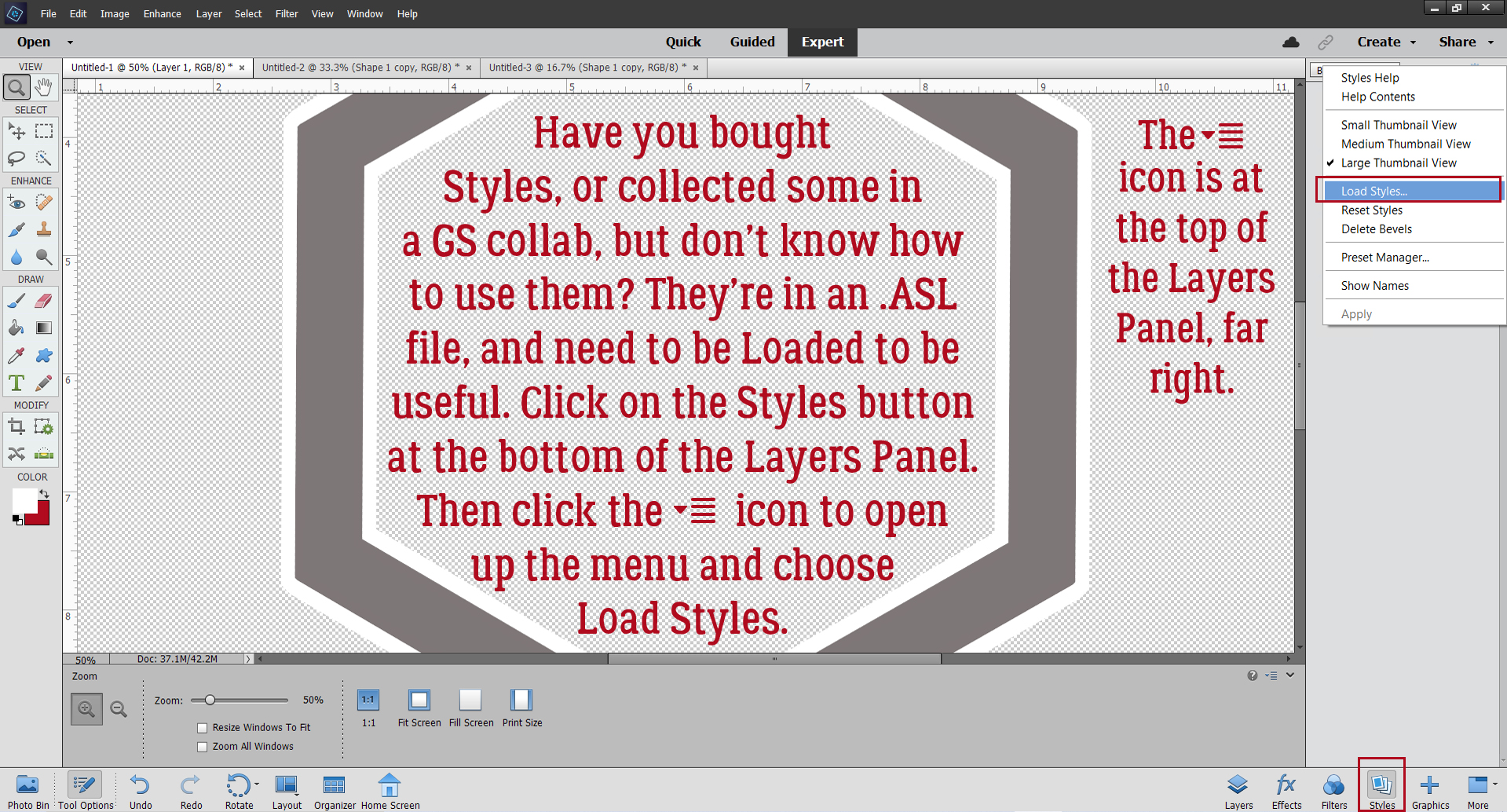
Review time #2: Loading Brushes is easy, but if you’ve never done it, it might be a bit intimidating. You’ll need to know where your brushes are kept on your system though. Click on the Brush Tool, then in the Brush Picker, click on the icon that looks like a stack of lines at the upper right corner of the menu. Then click on Load Brushes…

I’m going to go off on a tangent here for a second and tell you what I do with my .abr files. After I’ve extracted the zip file, I rename the .abr file to make it easier to recognize later. A lot of times, Brusheezy files don’t need this step. I’ll use something like Grungy Paint, and if there’s a specific number of brushes in a set, I’ll put that number in the name. Then I Copy the .abr file to the folder Elements uses to hold all the loaded brushes. On a Windows system that’s This PC>OS (C:)>Program Files>Adobe>Photoshop Elements (version)>Presets>Brushes. (It’s not as complicated as it sounds.) Then the brushes are ready to Load. BUT…!!! You don’t have to do any of that. If you’ve got a brush (set) in a designer folder, you can Load right from there. Find the brush set you want to Load and click it.

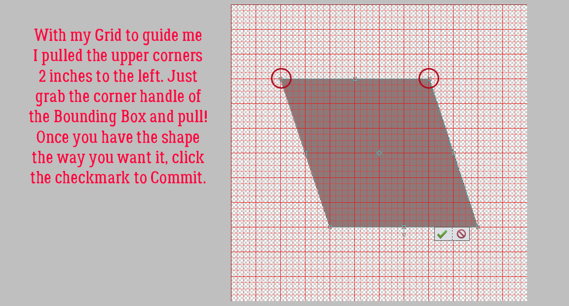
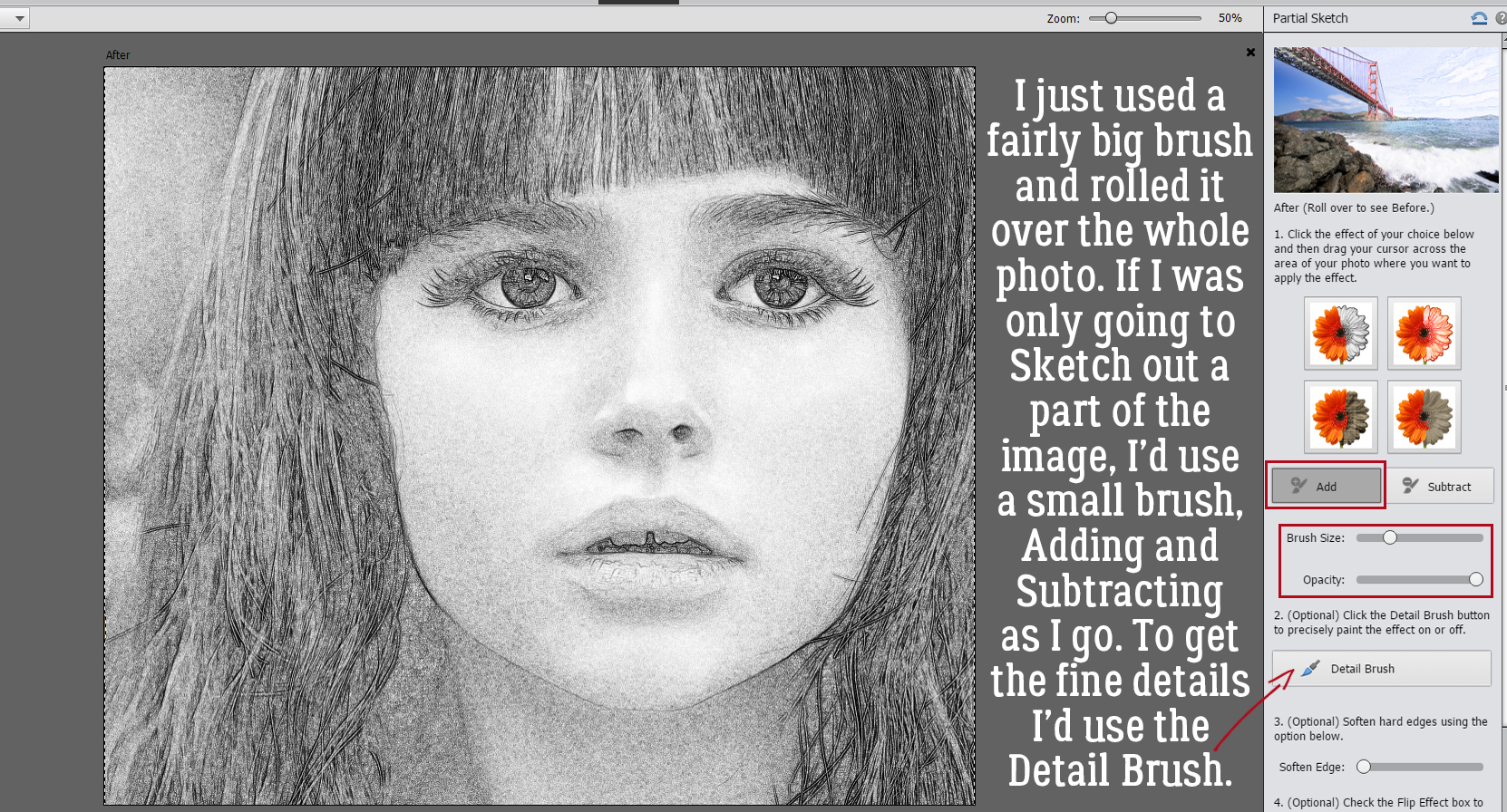
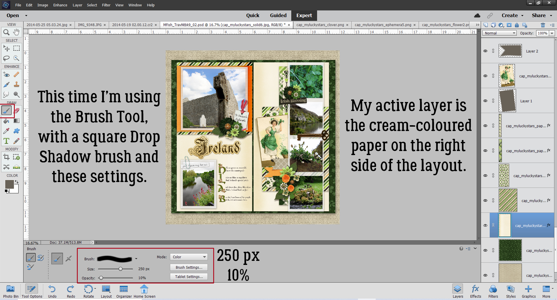
I like to start my messy edges with a corner brush. That takes a lot of guesswork out of positioning. But each of us will have our own ideas about what we like and how we like it, so I’m only offering guidance here. If you’re not a corner-lover, feel free to skip ahead. This whole process is one of experimenting. Try something. If you don’t like it, Undo [CTRL/CMD>Z] it and try something else.

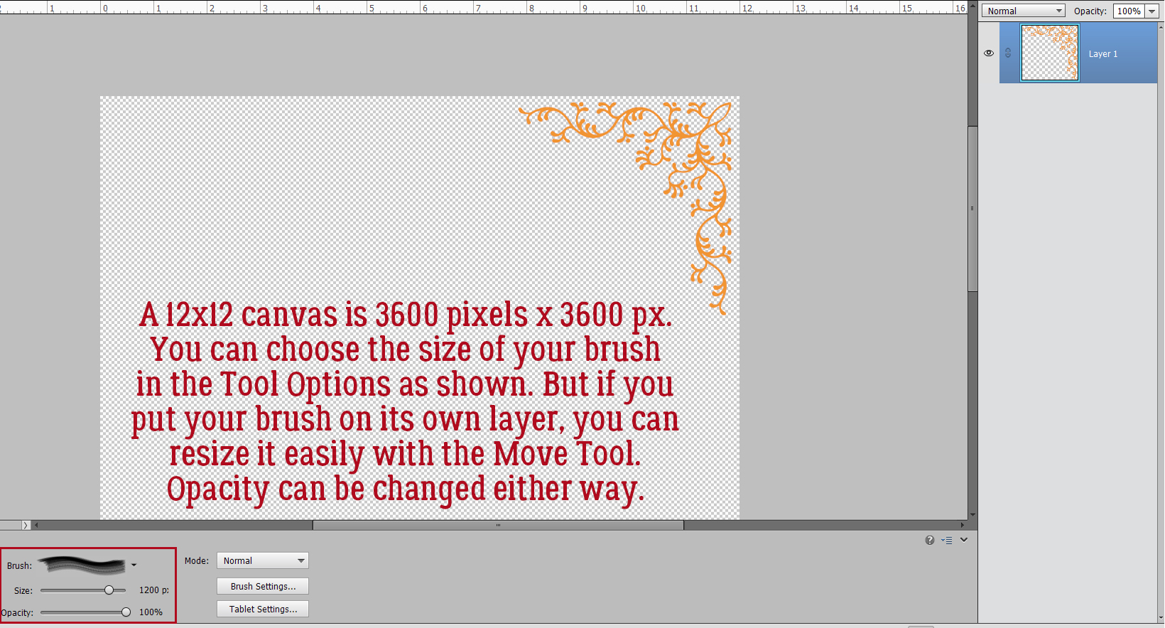
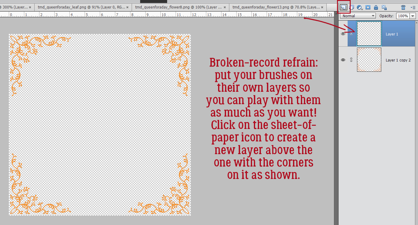
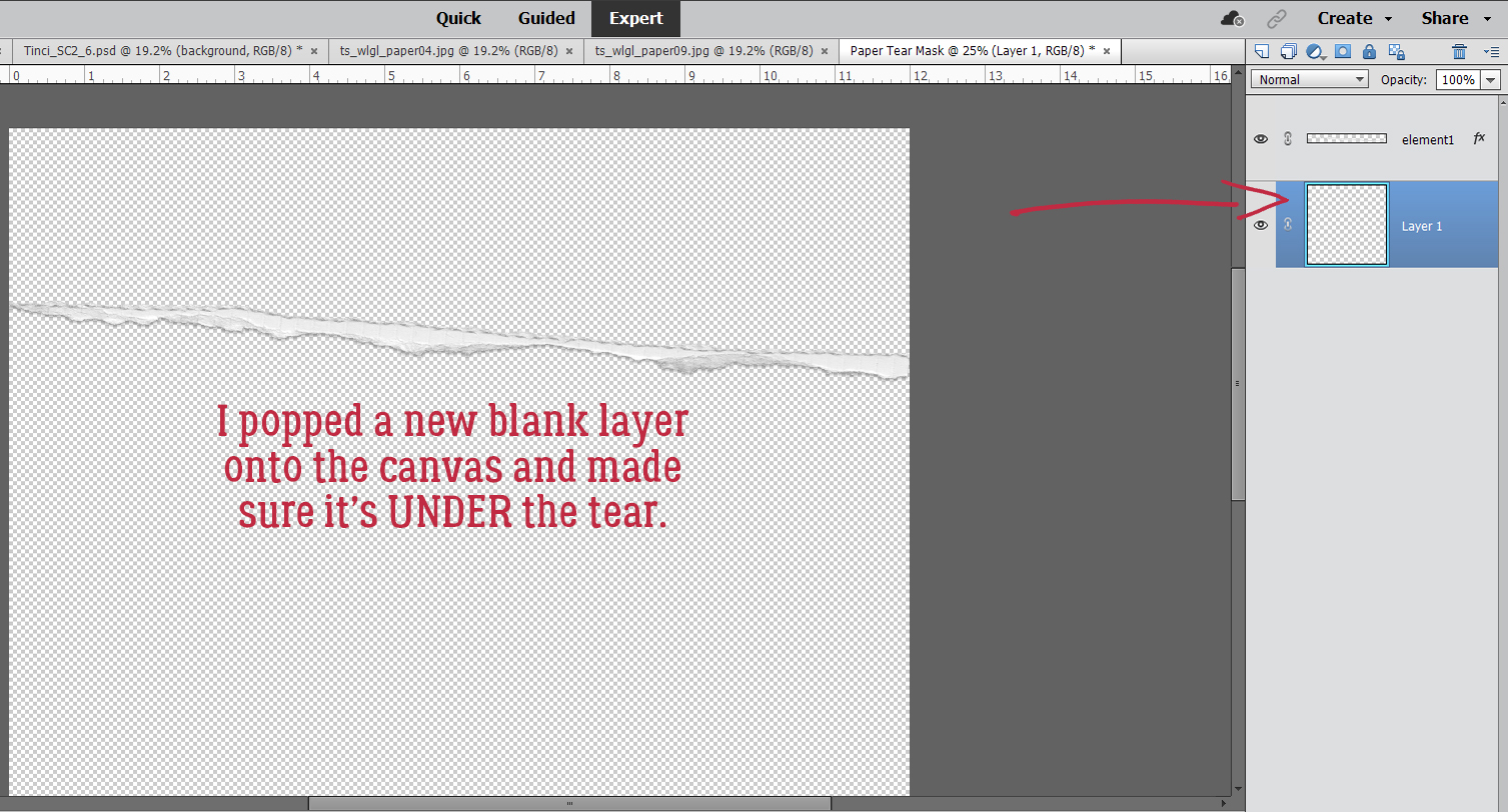
A word about brushes: Many of them are created with a maximum size of 2500 pixels. If you’re a 12×12 girl like me, they’ll need to be resized after use, so keep that in mind. In the case of corner brushes and 12×12 [3600 pixels x 3600 pixels] canvases, going full-size isn’t going to work. Reminder: putting your brushes on their own layers gives you power!
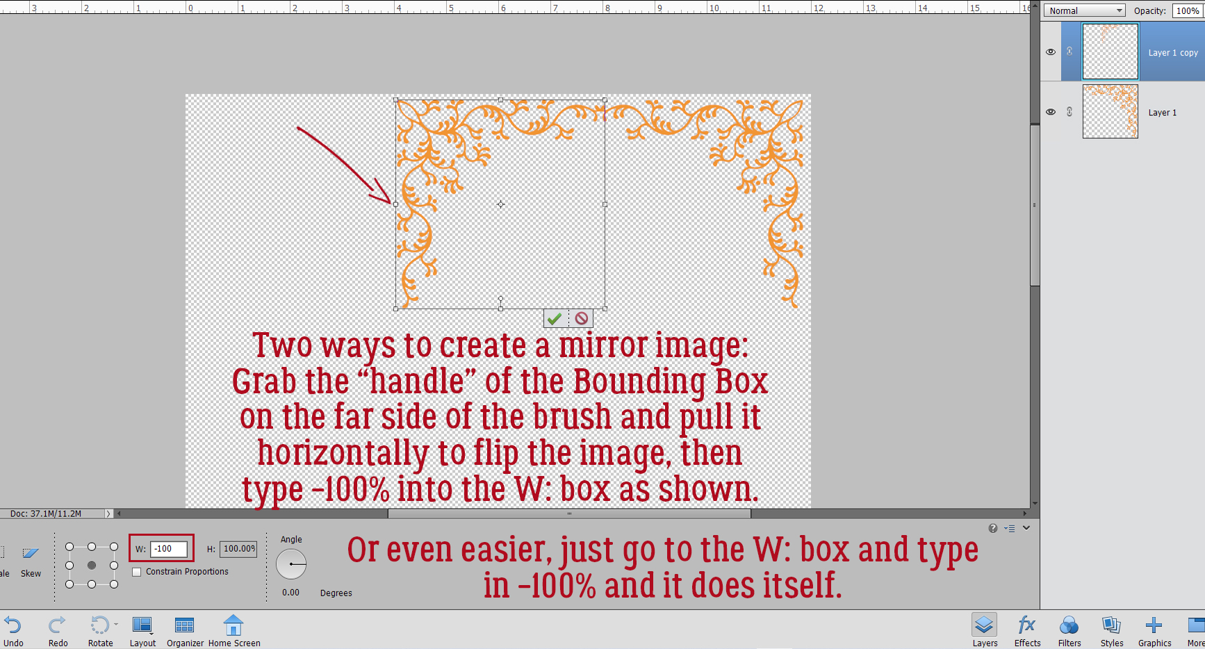
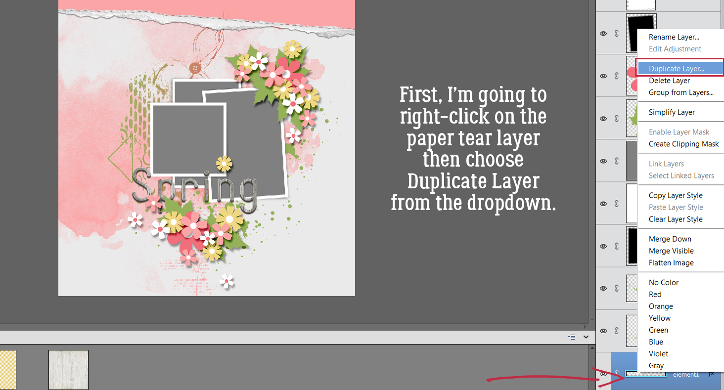
The next couple of steps are for those who want to have corner brushes in all four corners. Rather than try to wing it and hope for the best, using the brush and adjusting Angle and whatever, just Duplicate the brush layer you’ve already made. Right-click on the layer then choose Duplicate Layer>OK. Or use the keyboard shortcut CTRL/CMD>J.

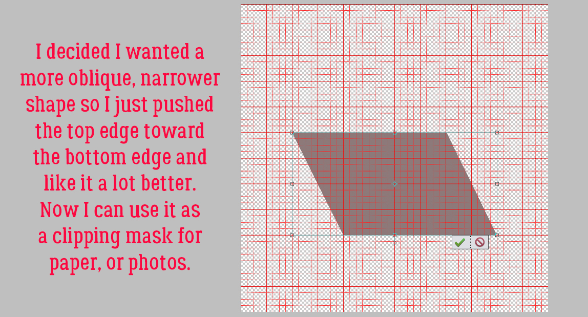
To create a mirror image of the corner, grab the middle handle on the side of the Bounding Box closest to the edge of the paper and drag it horizontally across itself. That’ll flip it. Use the Tool Options to get the size exactly right by typing -100% in the W: box as shown. Or simply go to the Tool Options and type in the -100% in the W: box and not bother with the dragging.
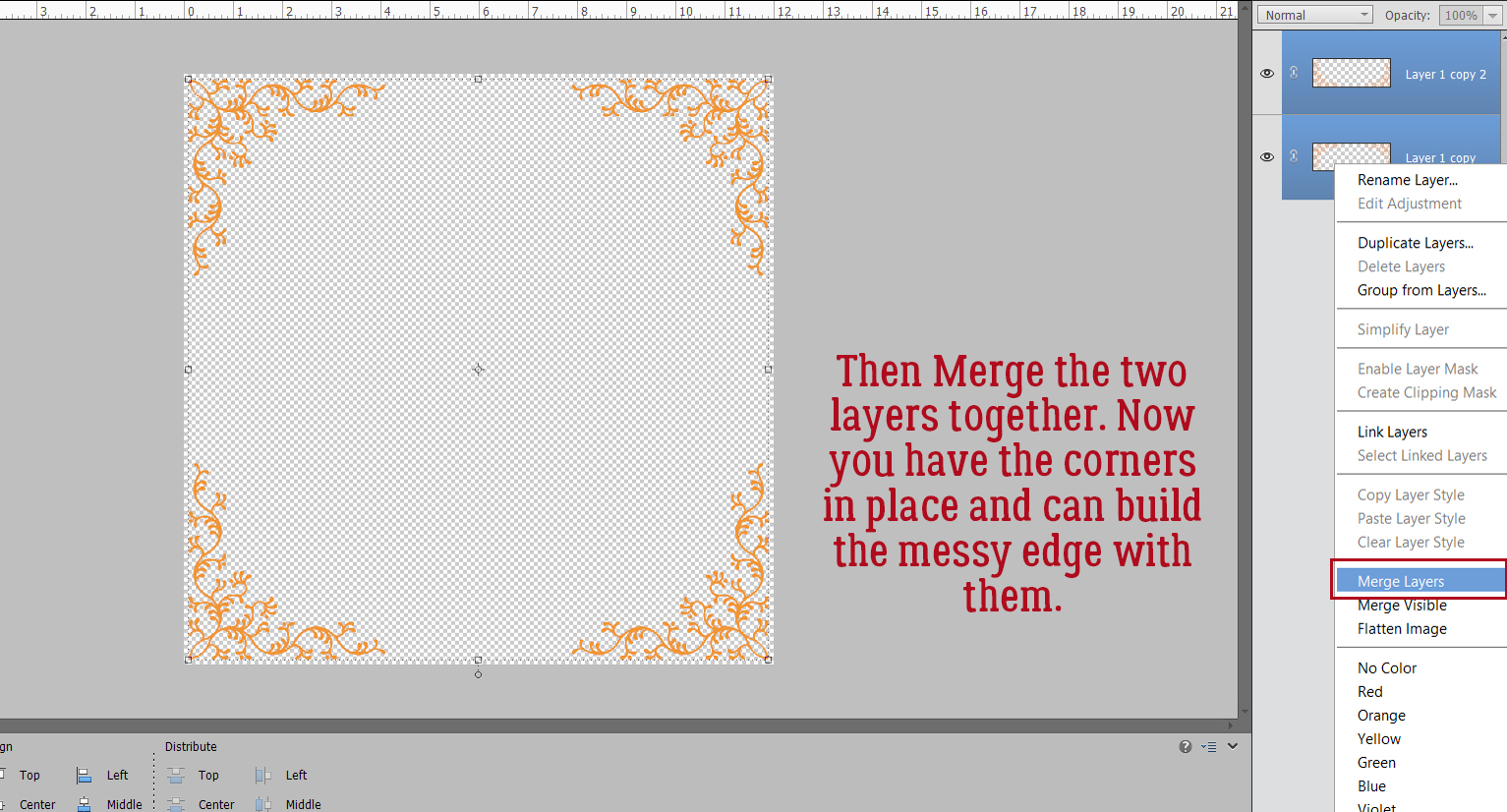
After you’ve nudged the second corner into its spot, click>SHIFT>click on the two layers. Right-click and choose Merge Layers or CTRL/CMD>E.

Now Duplicate the corners layer again by repeating the steps above.

Only this time grab the middle handle of the top of the Bounding Box and pull vertically. Key in the -100% in the H: box and nudge the second pair of corners into place.

Merge the two layers together for a single layer with all four corners in there. CTRL/CMD>E
This is the brush set I used to create the corners for my messy edges.

I know I’m a broken record. I won’t deny it! If you DON’T put your brushes on their own layer, you can’t make any adjustments to size or orientation without affecting whatever else is on that layer too.
I chose a new colour a bit darker gold that for my corners, and another brush to add to my canvas… on its own layer. This time I’m not going to Duplicate because I want it to look more casual. The corners are my anchors. If you hover your brush over the canvas, you’ll see a preview of what you’ll end up with once you commit. If it doesn’t look the way you want it, you can click on the Brush Settings bar and make adjustments, like the Angle as shown.

I’m more or less happy with this, although I think some of the stars extend out too far into the layout. I’ll just Erase some. All four of these star brushes are on one layer, with the corners layer not currently Visible.

For reference purposes.
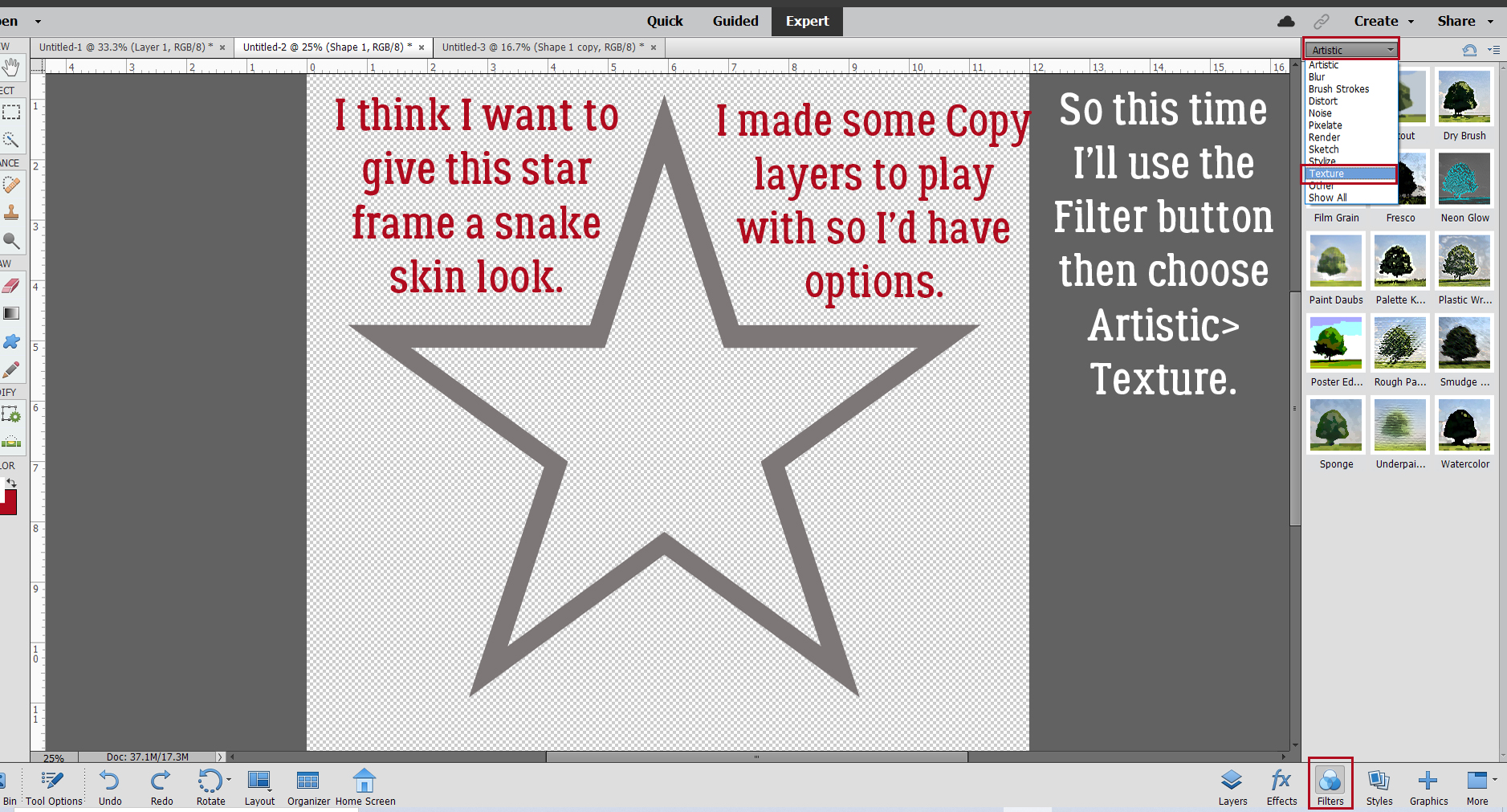
Now I want to use a paint smear brush. At default settings it’s pretty wide, and that might be too much for my border. So I clicked the Brush Settings bar and this time I adjusted the Roundness of the brush. (Yes, I realize the brush isn’t “round”; I’m making it skinnier.)

Here are four examples of the same brush but with different amounts of “roundness”.

Remember when I mentioned the maximum size of the brush? Well, this paint smear has a max size of 2500 pixels. I’ve used four different brushes from the same set, with their widths adjusted, all on a single layer. Now I can resize the whole layer to fill the canvas edge to edge.

Here’s how the three brush layers look all together. I’m not sure it’s finished, but it’s coming along.
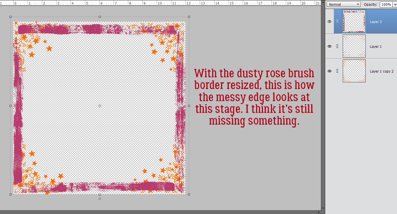
Hmm. Better. But still not there.

I LOVE-LOVE-LOVE this set of brushes! And I think this is just what the doctor ordered.

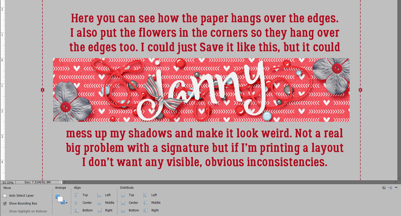
The messy edge is done! I could use it exactly as-is and it would be great. For those who like a little more oomph, let’s see how adding some Layer Styles looks. I added a green fine Glitter Style to the crosshatch layer. The colour is a little different, but I like it.

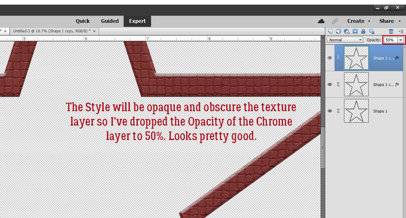
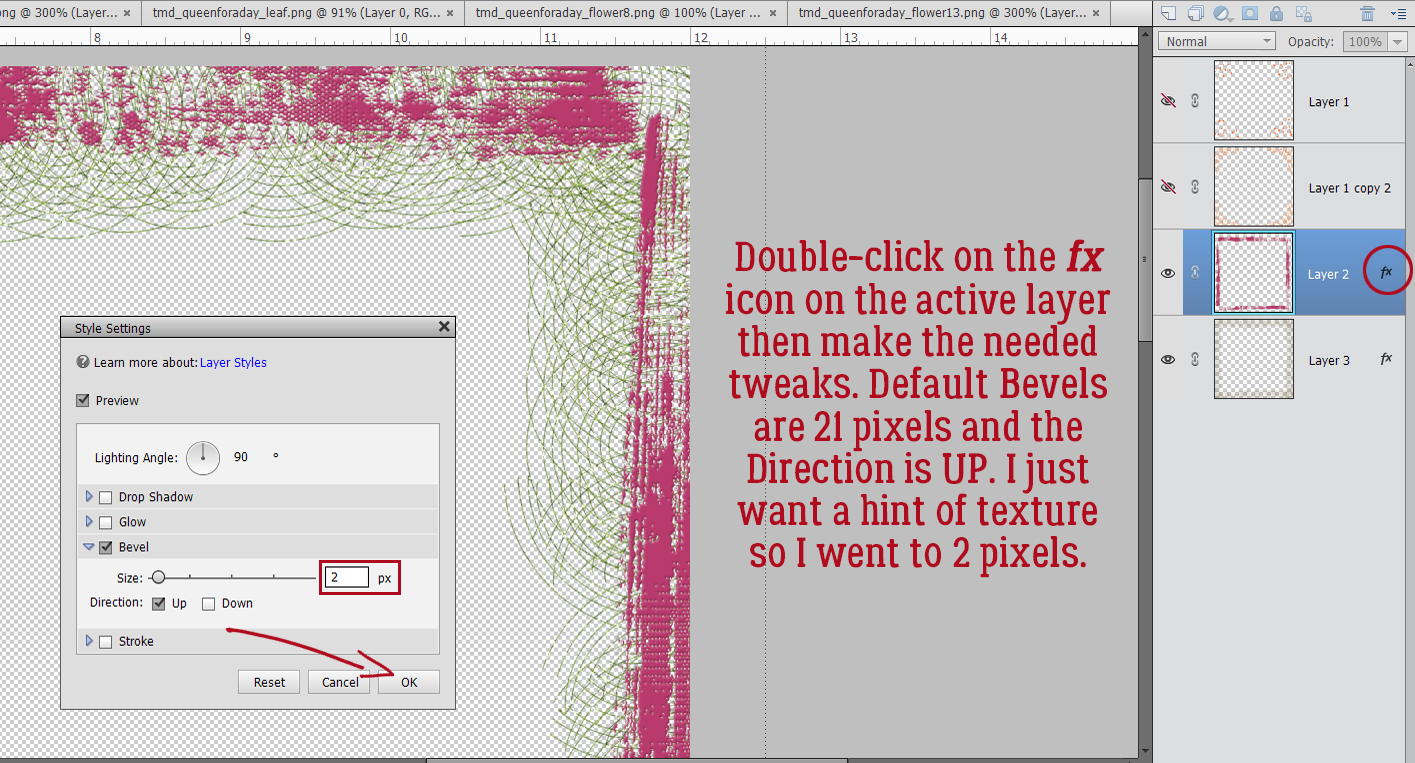
To give the dusty rose paint smears a bit of weight and texture I added a Bevel Style. The Simple Sharp Outside Pillow Emboss Bevel makes it look like dried latex paint. But too clumpy.

The Bevel default Size is 21 pixels. By double-clicking on the fx on the layer, I can adjust that. I want just a suggestion of texture here, so I pulled the slider over to 2 pixels and left the Direction Up.
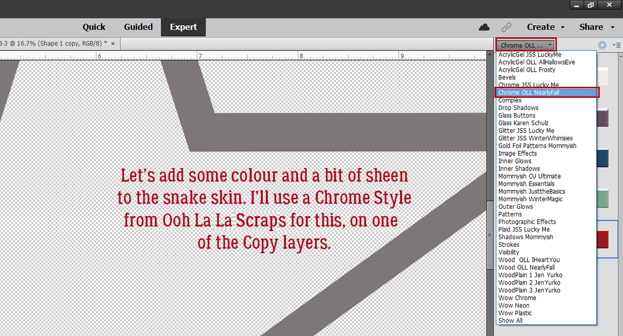
The star scatter got the Chrome Style treatment. It adds some Bevel, some sheen and some colour. The gold is really close to the colour I chose from the flower, so I’m happy.

Here’s a tight shot of the layers with their Styles.

My finished messy edge looks like this. Easy-peasy and so much fun!

Will you try this one? Don’t forget to share your finished work in the Tutorial Tuesday Gallery!!
PDF Version: https://bit.ly/3uGCI7Z
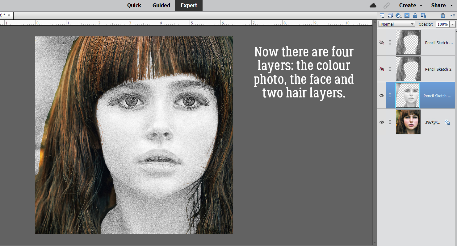
![]()


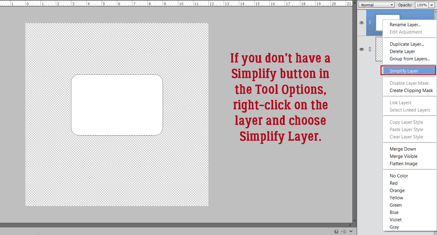


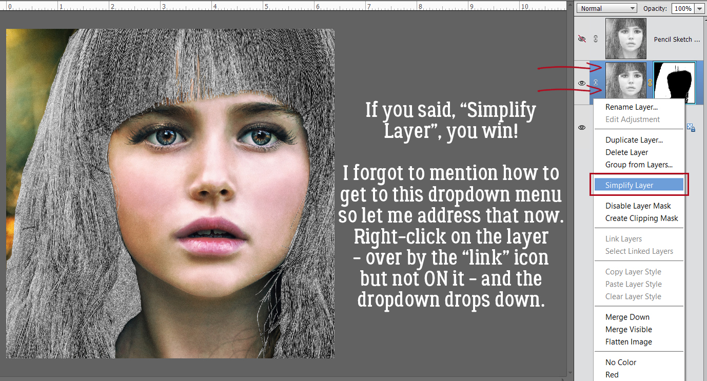
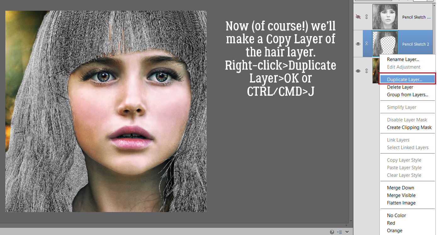
 Now it’s possible to see what Elements was doing in the background while we were busy and oblivious. Now I have 3 layers: the original, a sketch layer with a black Layer Mask and a sketch layer with a white Layer Mask. It’s possible to do the following steps using these two masked layers, but it’s a bit more challenging than my approach, so we’re not going to do that. The layer that I want to work with is the one with the white Layer Mask, but I need to Simplify it. Right-click on that layer – over on the left of the layer near but not ON the link icon – then choose Simplify Layer.
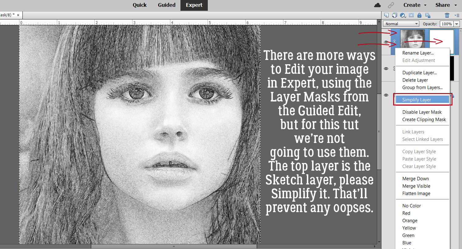
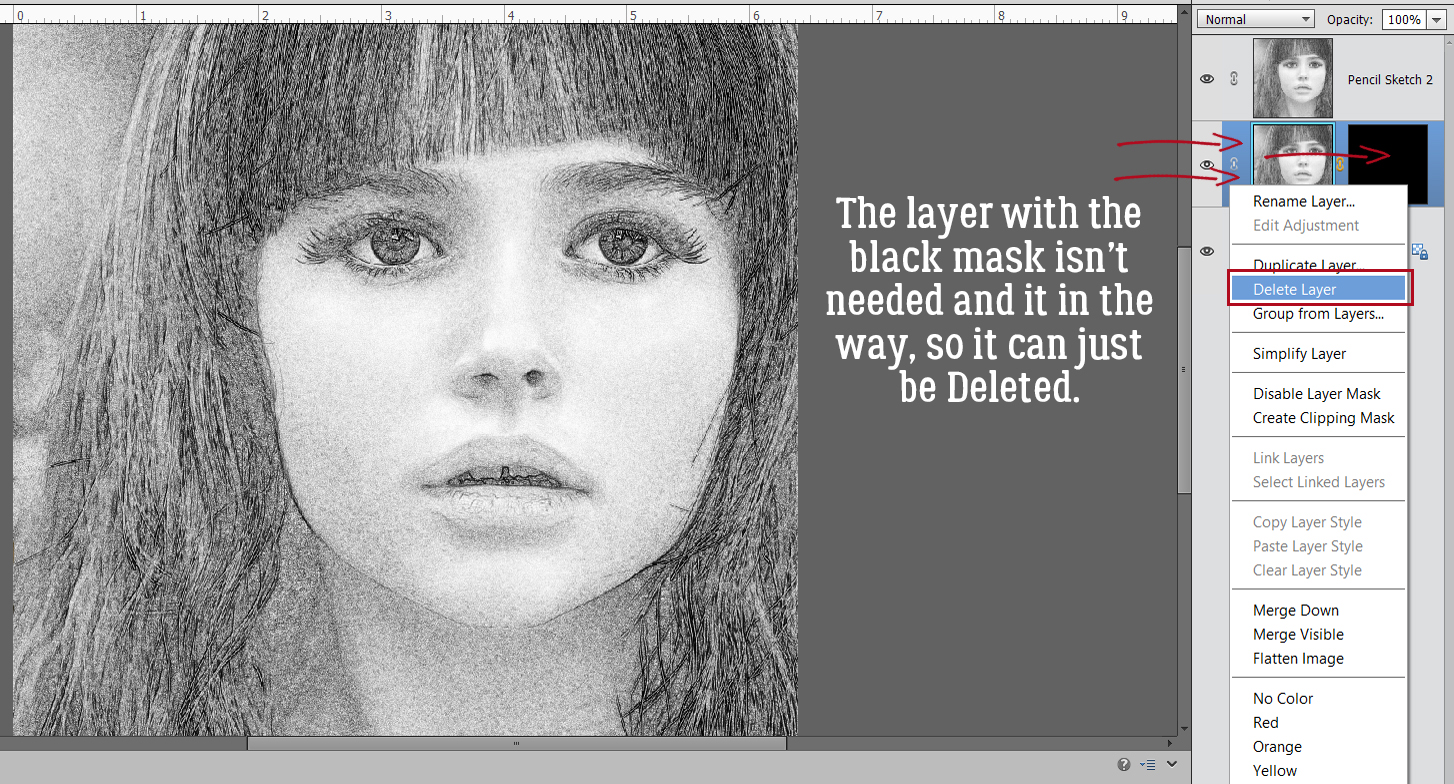
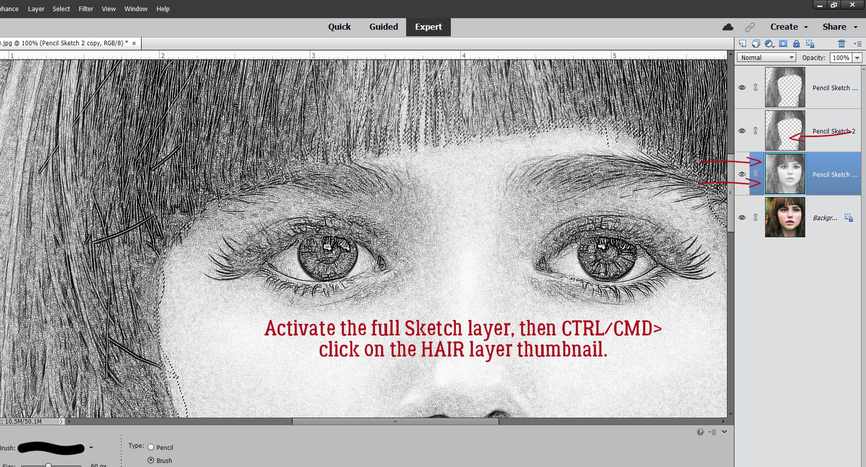
 I also discovered that toggling the colour layer on and off makes it easier to see edges of things better.
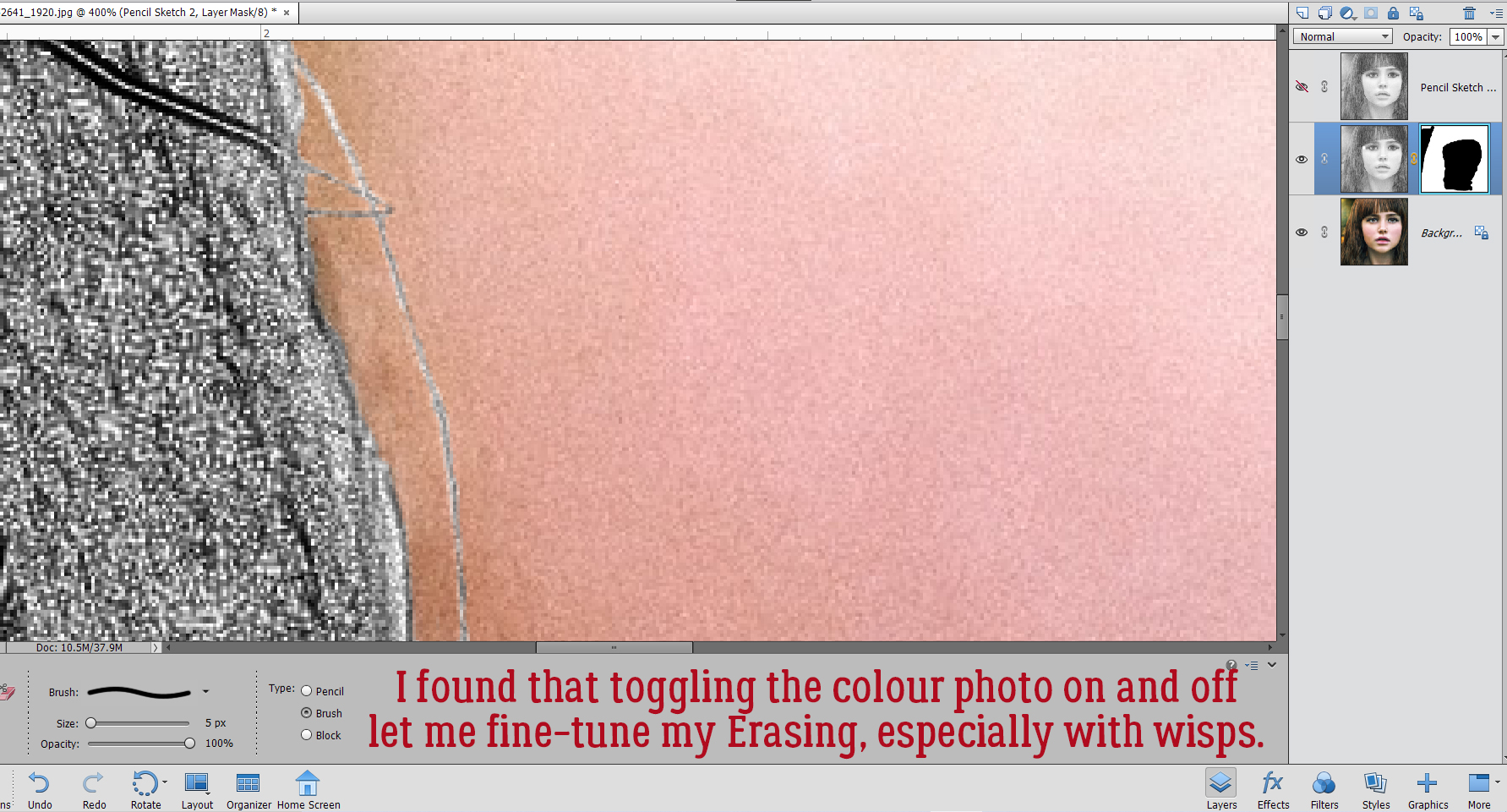 Aaaaaand toggling the sketch layer on and off helped me see where and what needed more help.
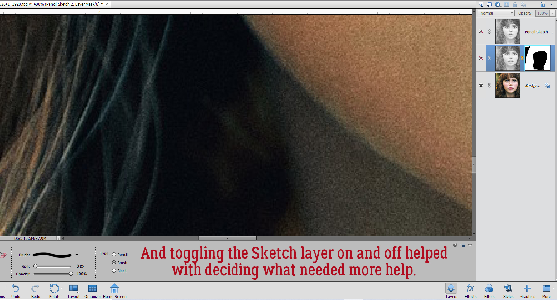


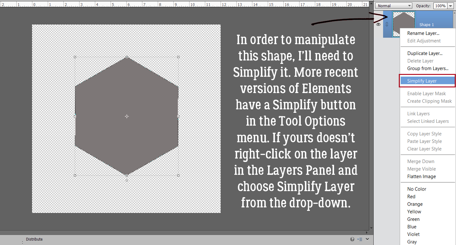


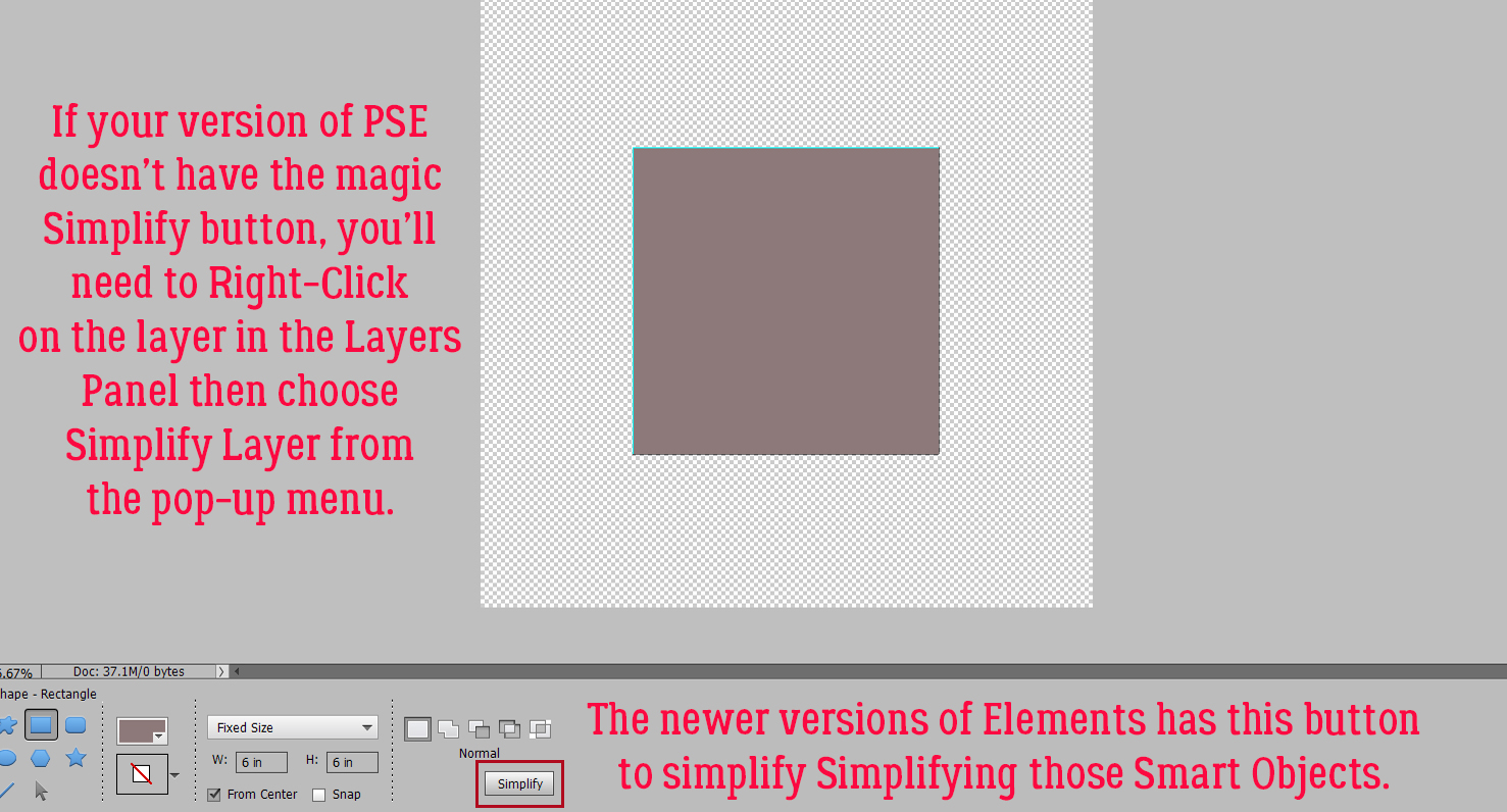
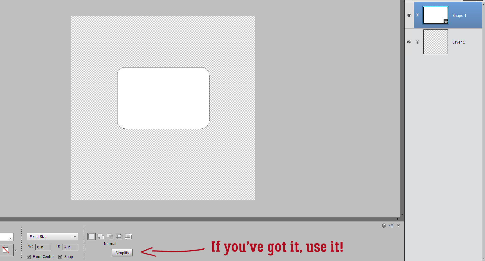
 We’ll come back to the hexagon in a minute. What if you chose a more complicated shape, like this seal? You can use all the controls in the Tool Options, like using Defined Size, and if you tick the From Center box, Elements will put the shape right in the centre of the canvas. Here, I’ve shown the Simplify button (the one you may not have). Experiment with your software; the more you play with it, the better you’ll understand what it can do and what it can’t. (And these tutorials will make more sense…) You’ll find a system and a rhythm that works for you.

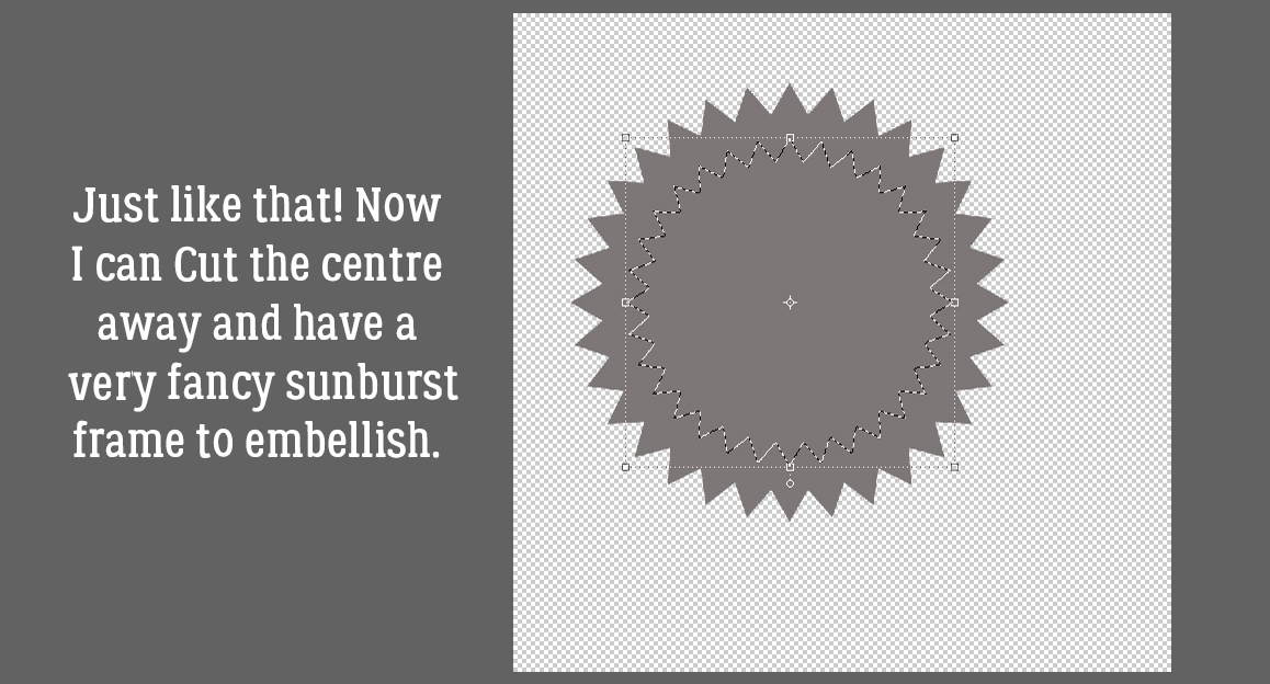
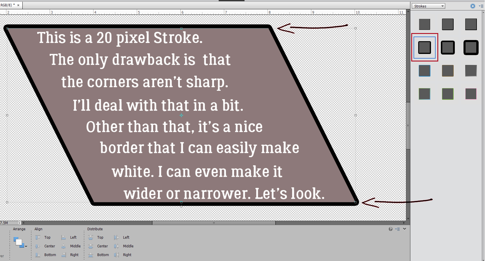
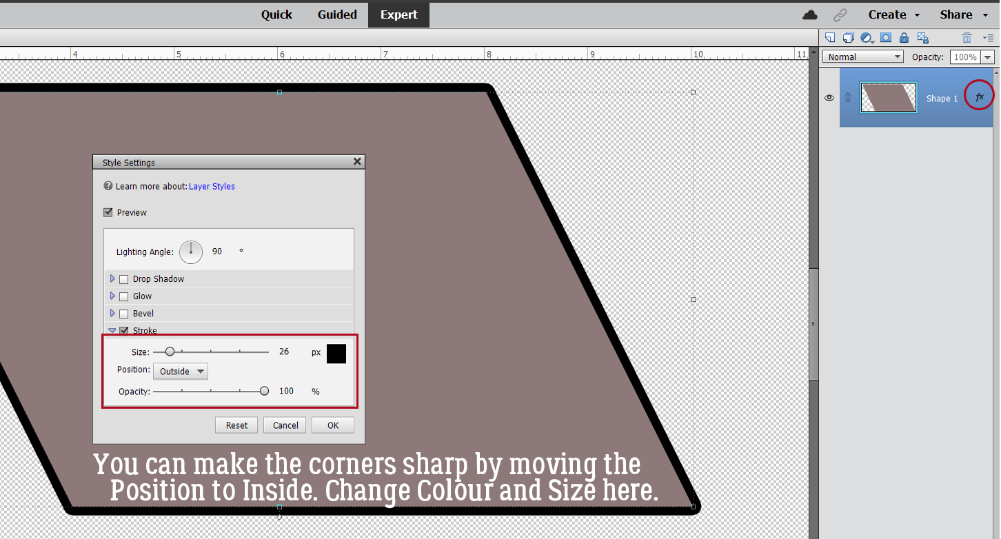
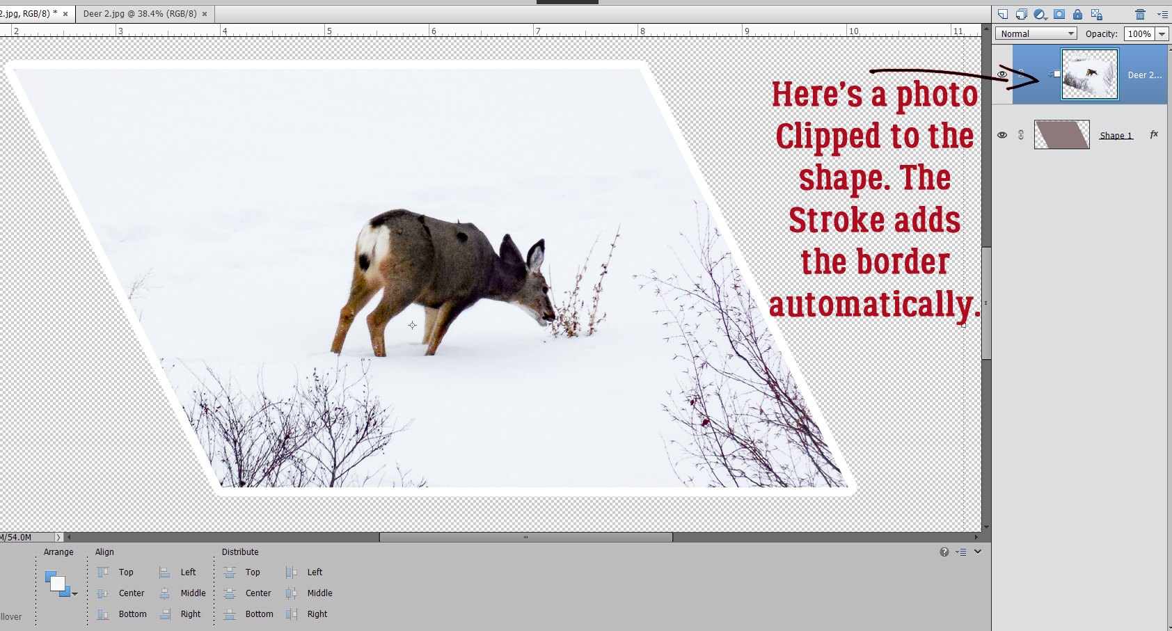
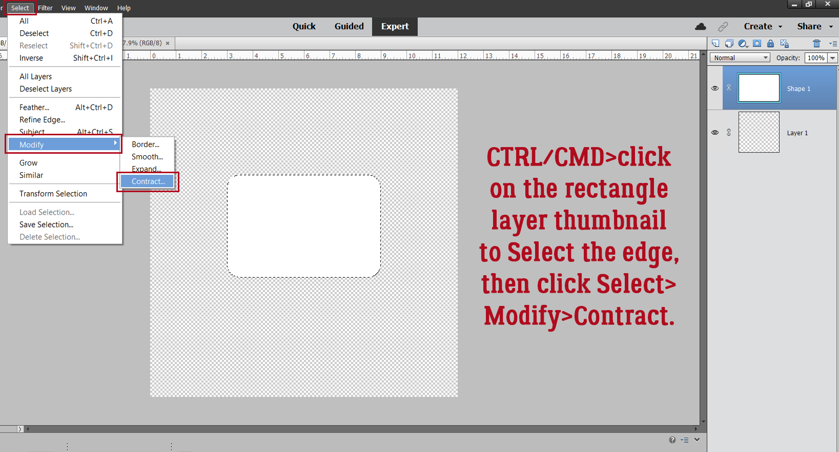
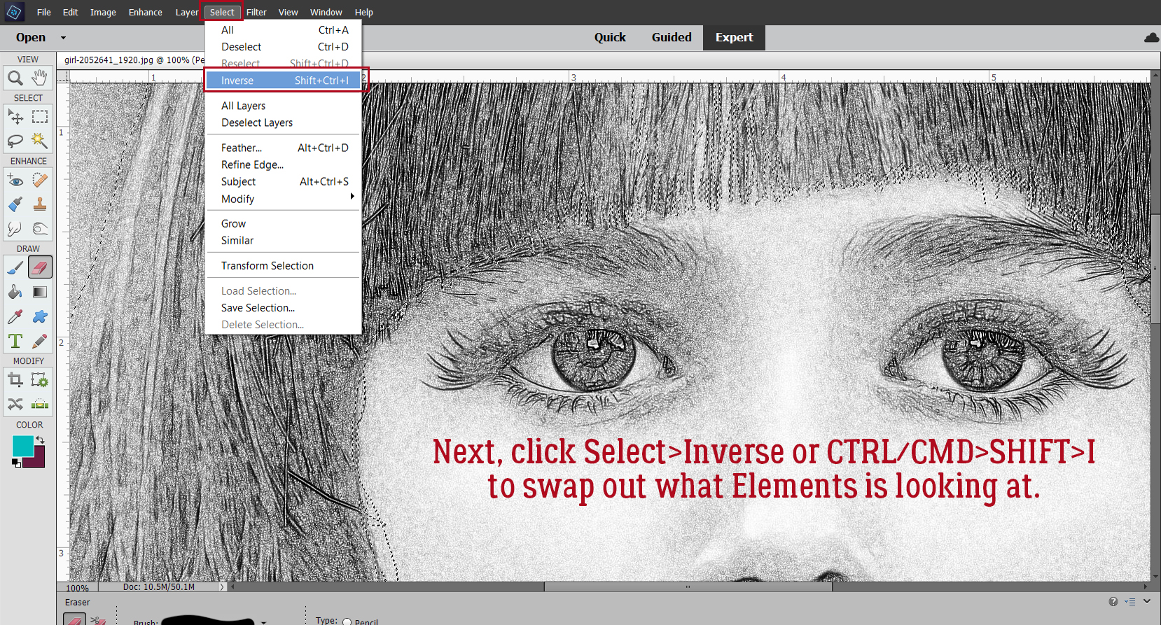
 Quick-and-easy border making uses the Stroke Edit. CTRL/CMD>click on the Layer Thumbnail to “Select” the edges of the hexagon, inside and out. Make sure you’re on the blank layer, then Edit>Stroke (Outline) Selection.