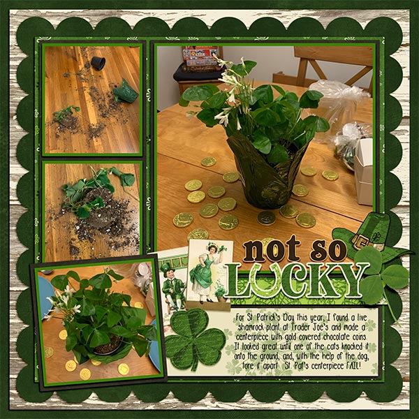
It’s Miss Fish!

Oops! I meant to share my conversation with Juli, aka Miss Fish, with you over the weekend but I fell down a genealogical rabbit hole and spent the weekend reading barely legible military service records looking for proof of a hitherto-unknown marriage in 1915. ( I was successful!) Of course, that opened up a bunch more avenues for research. It’s like a snowball rolling downhill. But I digress again. Let’s get to know Juli. (Since we have the same initials, for clarity I’ll be “O” today.”)
O: Thanks for chatting with me, Juli. Let’s get the mundane stuff out of the way first. Can you describe your work space?
J: I have several workstations. I have a laptop that I move around. I have a desk area in the bookcase of our family room where I spend most of my time designing while my husband watches TV. That way we can talk. I also have a hook-up in my home office and when I have to travel for my full-time job I work from the hotel at night with an extra portable monitor to make it easier.
O: Holy cow! How many hats do you wear?? Don’t answer that. It’ll make me feel really lazy. What motivates you when you’re designing?
J: I am inspired by designs that I would use myself to document our travels. I’m also inspired by ideas I get from my Creative Team and my customers.
O: Admirable! I love to scrap my travel photos… I’m sure the Sugar Cookies are very sick of Ireland by now. What one word would people who know you well use to describe you?
J: Kind. I am a people pleaser and I always try to make everyone feel well taken care of and loved.
O: Hmm. I bet your Enneagram is 9. And what a segué into asking you what you’d do if you won the lottery.
J: Is it bad that I already have this planned out? I would quit my full-time job and travel full time between houses all across the globe. I would spend my days exploring and taking photos and my night making travel albums. That would be heaven!!
O: Is it bad? NO! Especially when you’d do something so life-changing with the money. In a perfect world, I’d do something similar. Okay, time for the really stupid question of the convo… Are you more likely to sing, or to dance in the shower? (I have a HUGE shower in my bathroom, big enough to have a party in, so this question comes from that.)
J: Sing and badly. I’d probably slip and kill myself if I tried to dance in the shower.
O: I understand! But nobody can hear me dancing. The neighbours would complain if I sang. Now, if time travel was a thing, would you go back into the past, or ahead into the future?
J: I would want to go back to the early 1900’s just to experience life as it was so I had a better understanding of the history that created America and the cities I’ve visited.
O: I’d be happy if I could make more than one stop. I’d tell my younger self a few things that would change the future. But I’d love to go back to maybe 1930 and visit my Swedish great-grandmother, about whom I know only basic facts. She would be around the age I am now, and would have so many stories to tell. But let’s move on. What colours are your most, and least, favourites?
J: My most favorite color is blue. I always want to buy blue shirts when I’m shopping for casual wear. My least favorite color is orange. I only like certain shades more in the coral range.
O: I’m with you on the orange! I don’t love it at all. Yellow is a close second. You can bet if there are flowers of either colour in my garden, somebody else planted them. Are you a sports fan?
J: I love to watch American football and I often listen to games while I’m designing.
O: I’m glad you clarified without me asking if you meant FOOTBALL or FUTBALL. I don’t enjoy soccer at all. What did you want to be when you grew up?
J: When I was small I wanted to be a teacher. Probably so I could tell everyone what to do. I liked being the boss (still do!)
O: I can relate. One of the things I really loved about nursing was the opportunity to explain what was happening with my patients to their parents. It’s the only way they can make good choices for their kids. The boss part was what drew me to critical care, where nurses have a lot of autonomy. And there I go again, back to you. Aside from necessities, what’s one thing you couldn’t live without?
J: My cell phone! I use it non-stop to communicate with my kids, work, my husband plus it’s the best way to check in with my fans and my Creative Team while I’m at work.
O: Uh. Necessity!! I know you’re busy with all the jobs you have so I won’t keep you any longer. Thanks for the visit!
Ladies, Juli has put her entire store on sale at 30% off, from April 3rd to the 30th! If there’s a template set (or 6) in her store that you’ve been eyeing up, now’s the time. In addition to this sale, she’s also providing the Daily Download this month and hosting the Designer Spotlight Challenge. You don’t want to miss a minute!
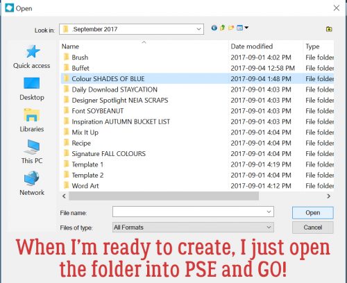
See you all again soon! (Tomorrow. I have a nifty trick for y’all!!)
![]()


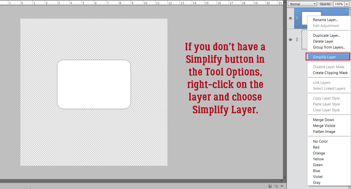


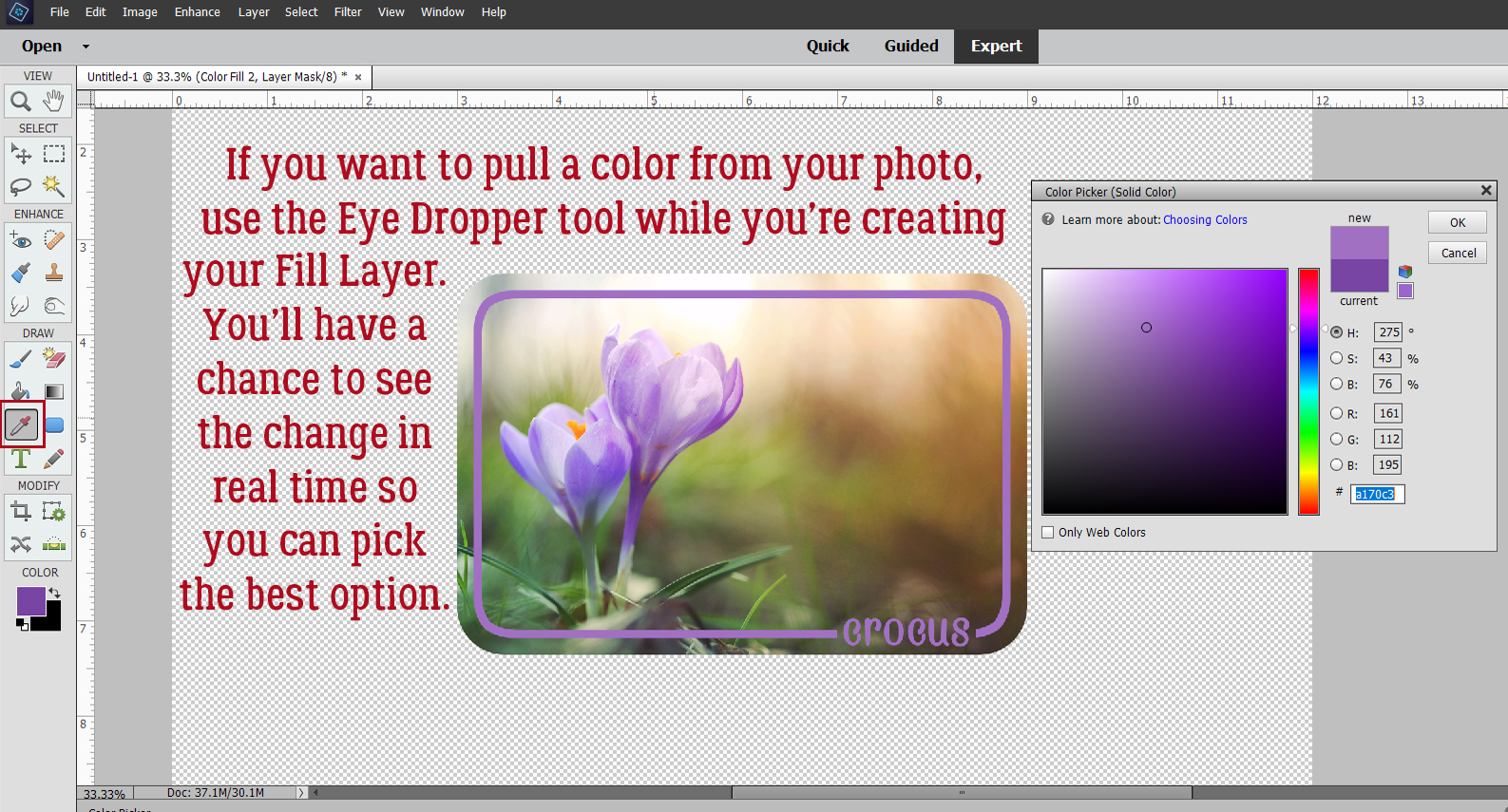

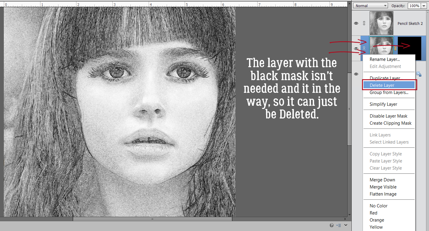
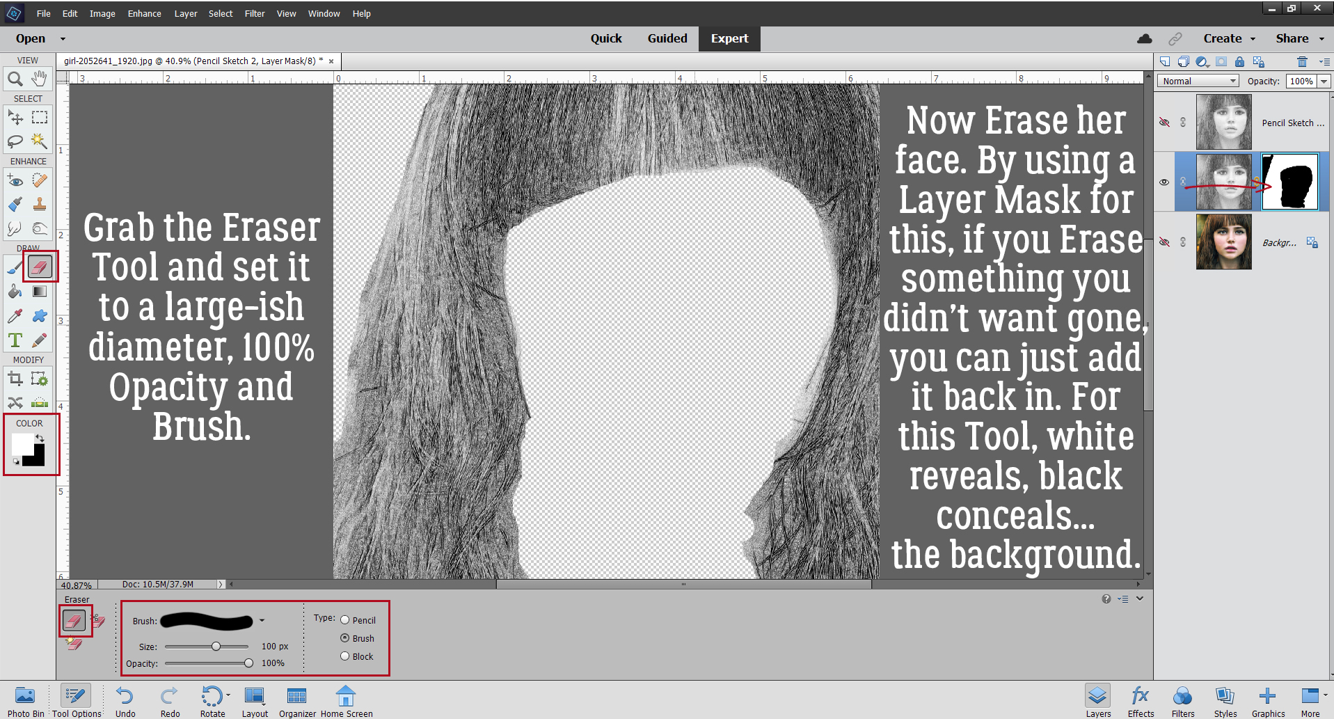
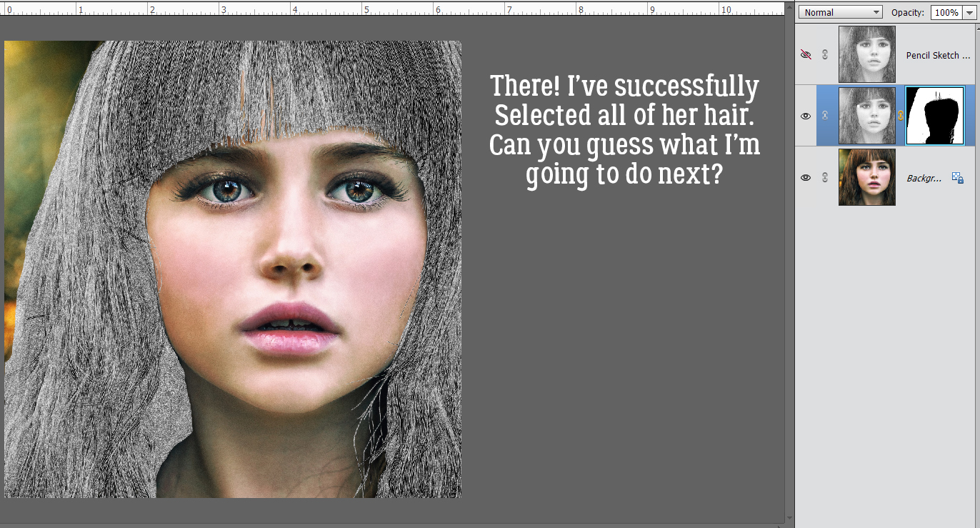
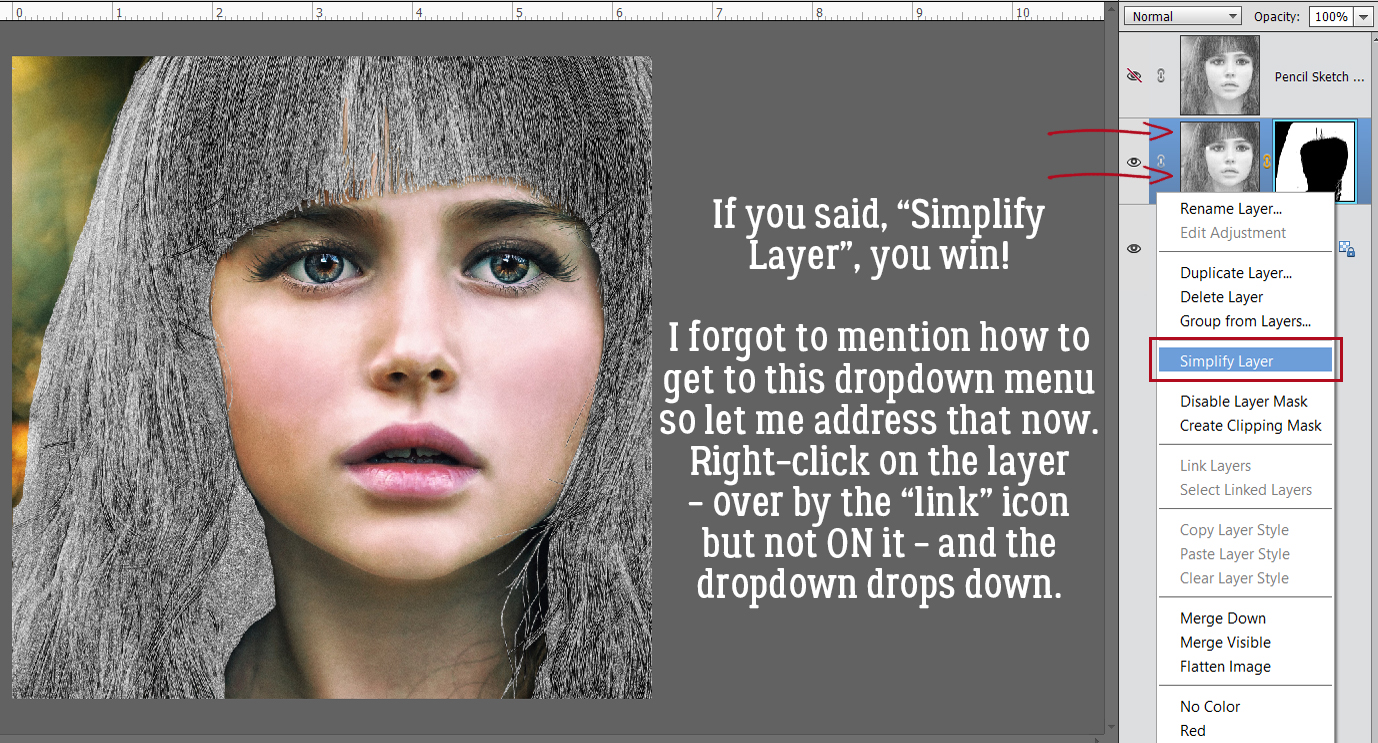
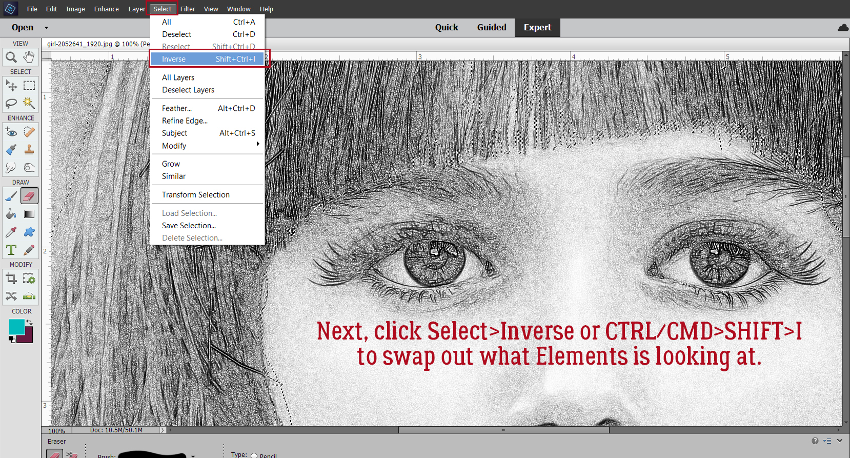
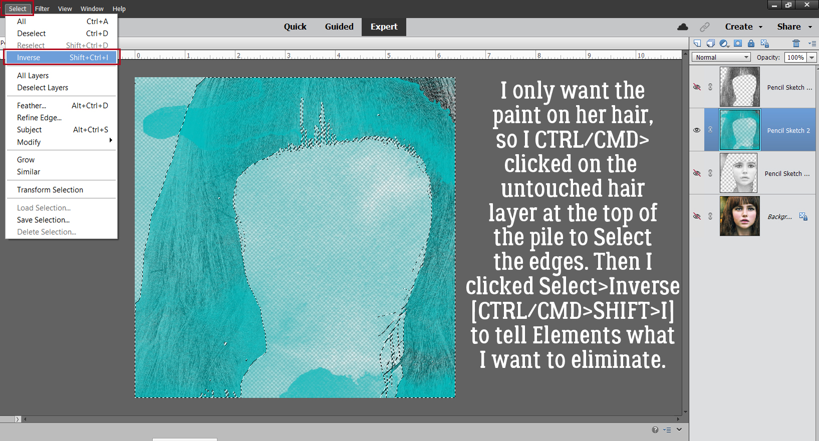
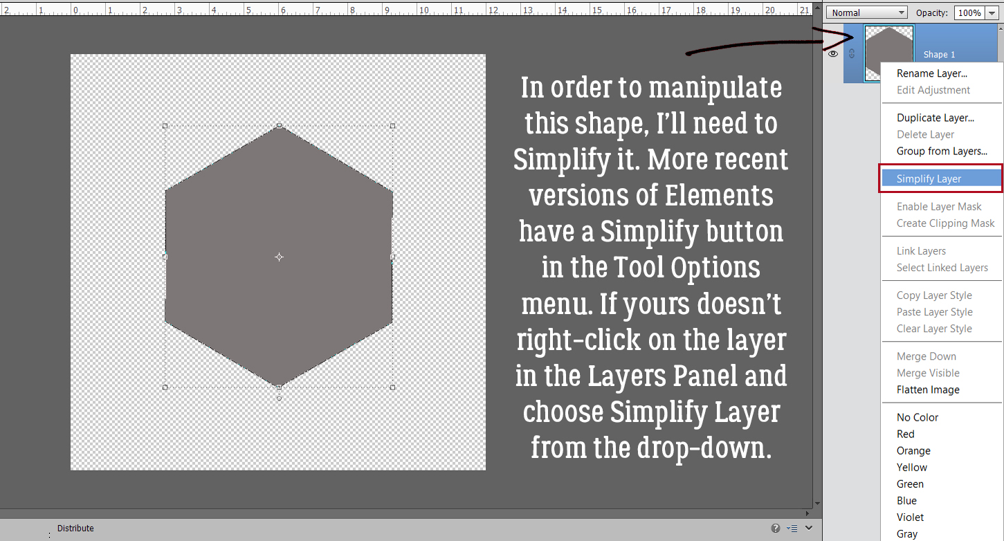
 Now it’s possible to see what Elements was doing in the background while we were busy and oblivious. Now I have 3 layers: the original, a sketch layer with a black Layer Mask and a sketch layer with a white Layer Mask. It’s possible to do the following steps using these two masked layers, but it’s a bit more challenging than my approach, so we’re not going to do that. The layer that I want to work with is the one with the white Layer Mask, but I need to Simplify it. Right-click on that layer – over on the left of the layer near but not ON the link icon – then choose Simplify Layer.
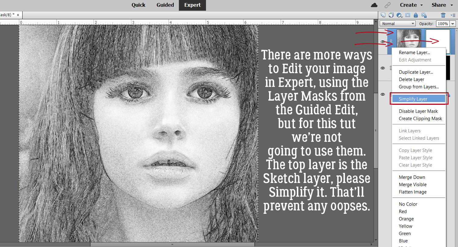
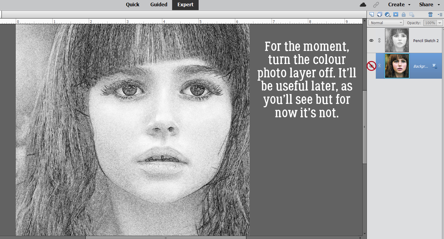
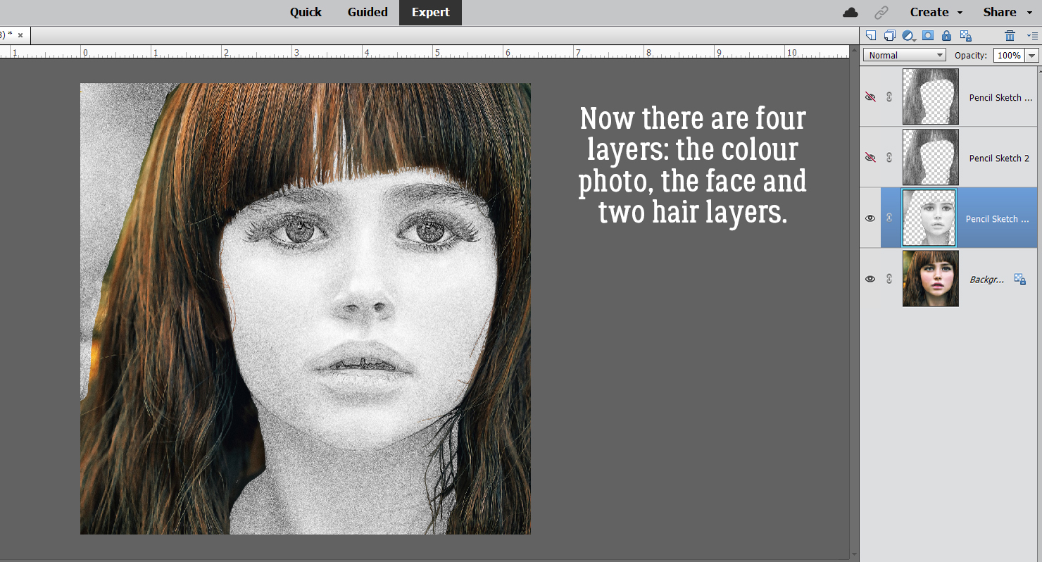
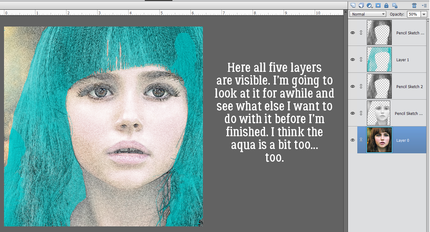
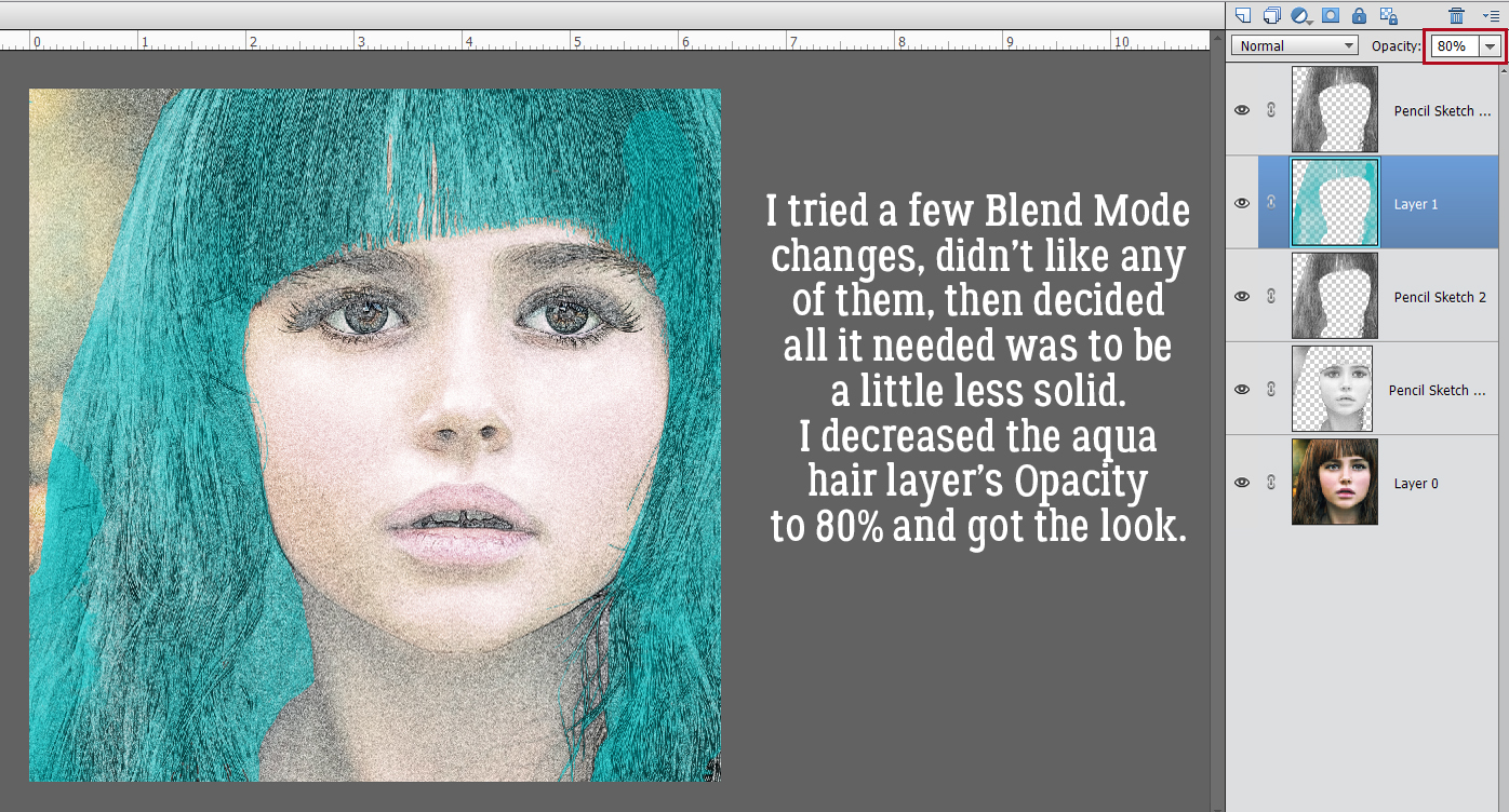
 I also discovered that toggling the colour layer on and off makes it easier to see edges of things better.
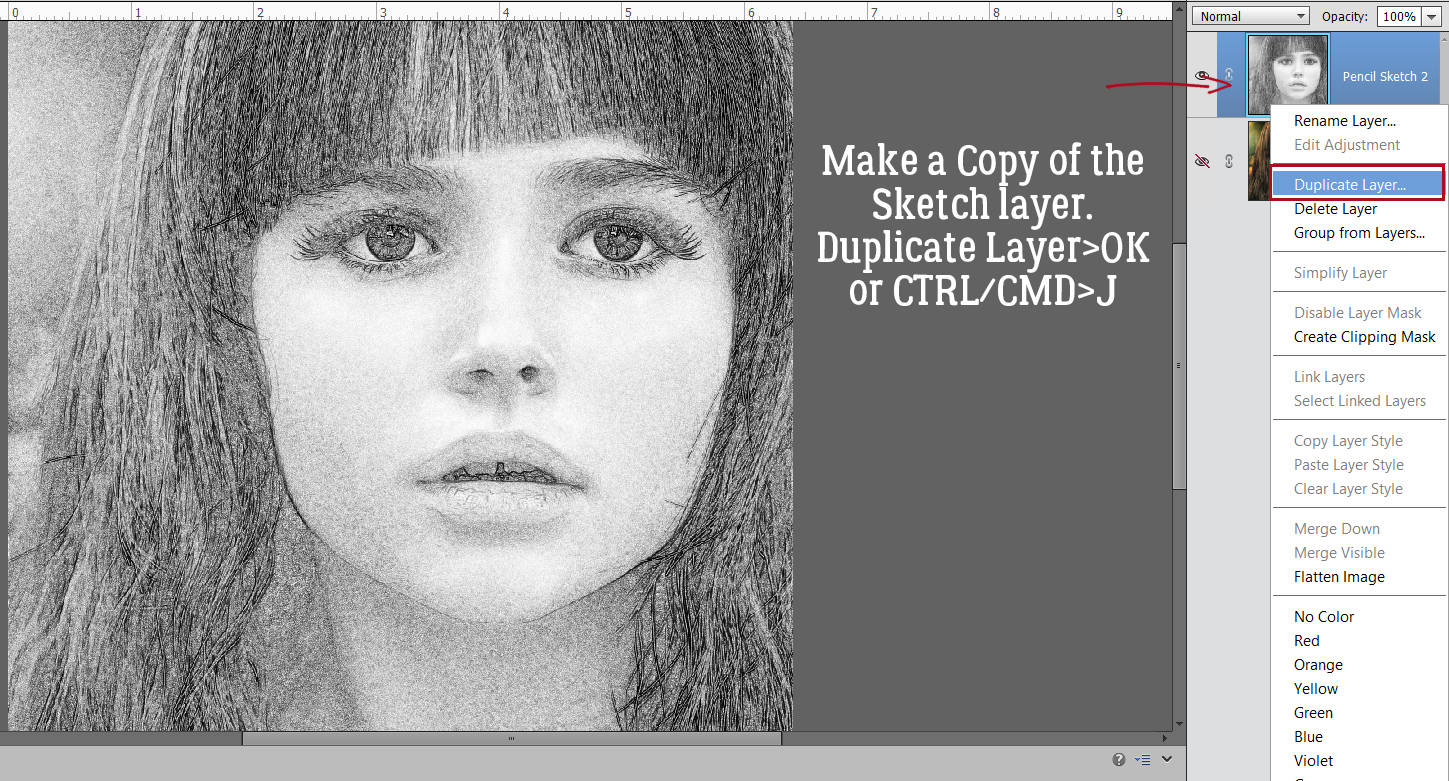
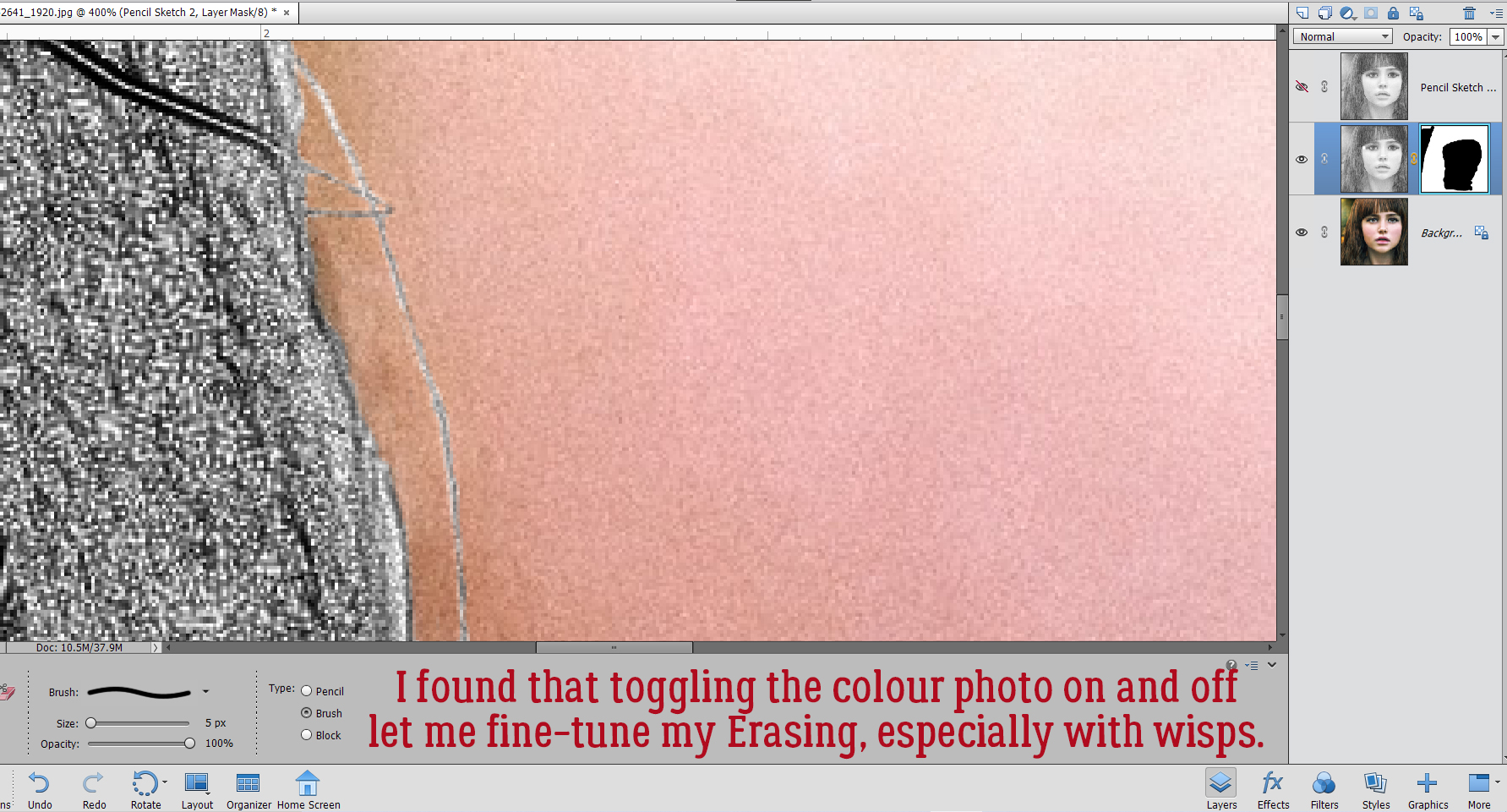 Aaaaaand toggling the sketch layer on and off helped me see where and what needed more help.
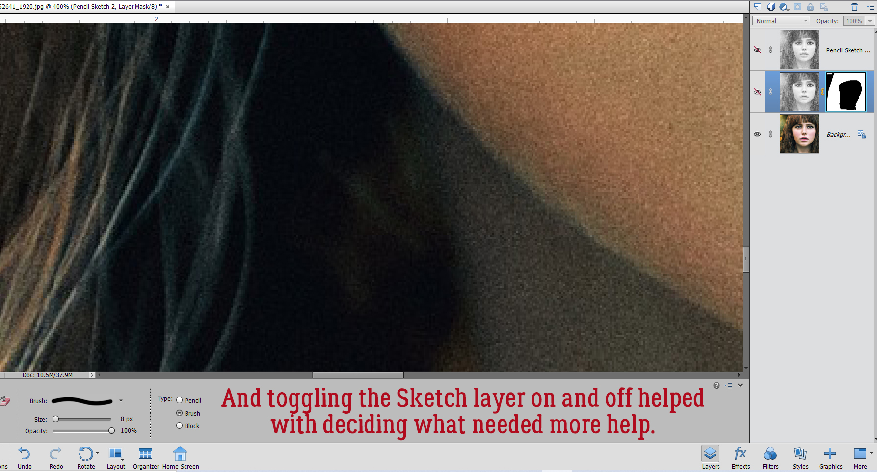


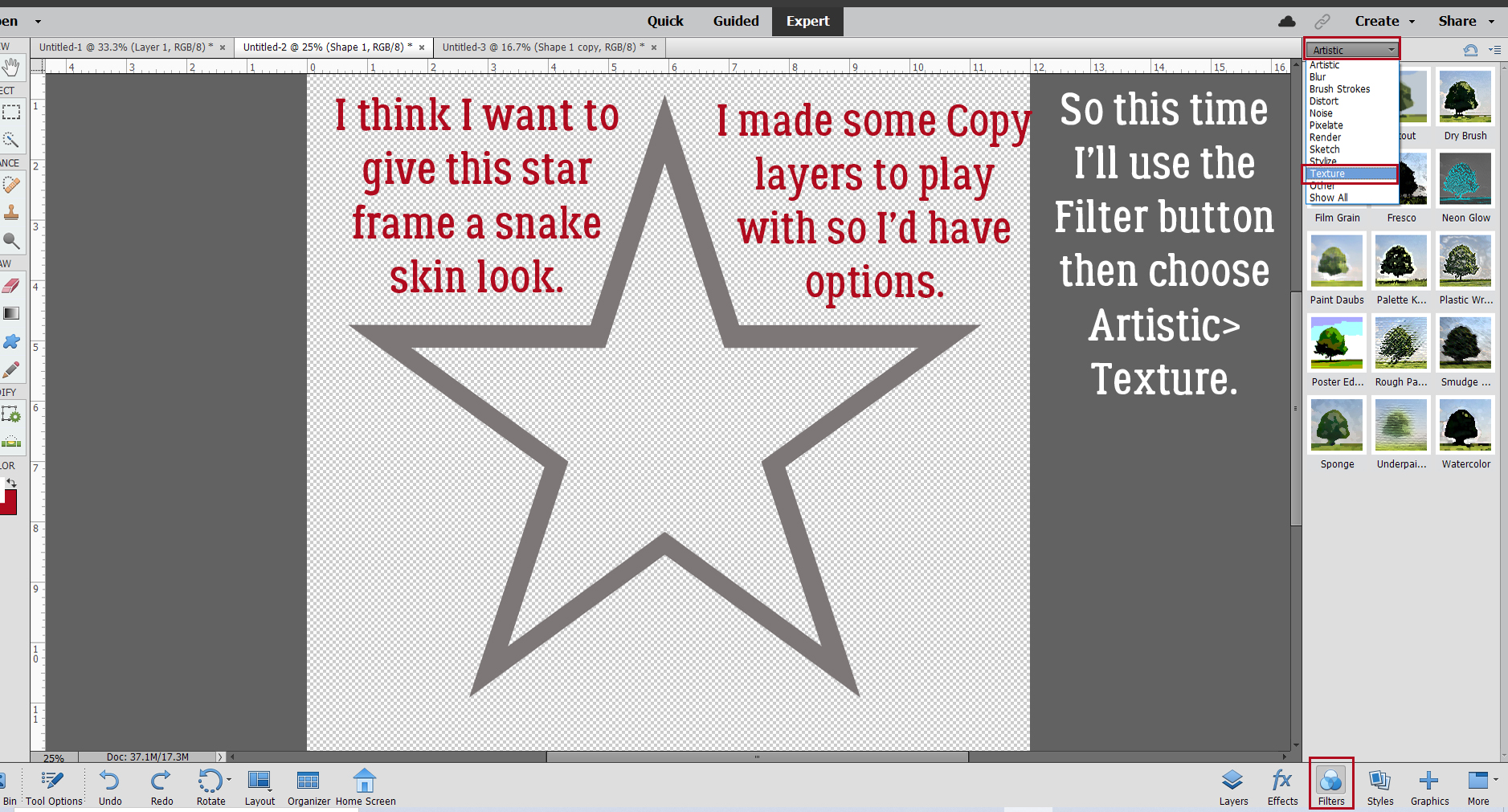
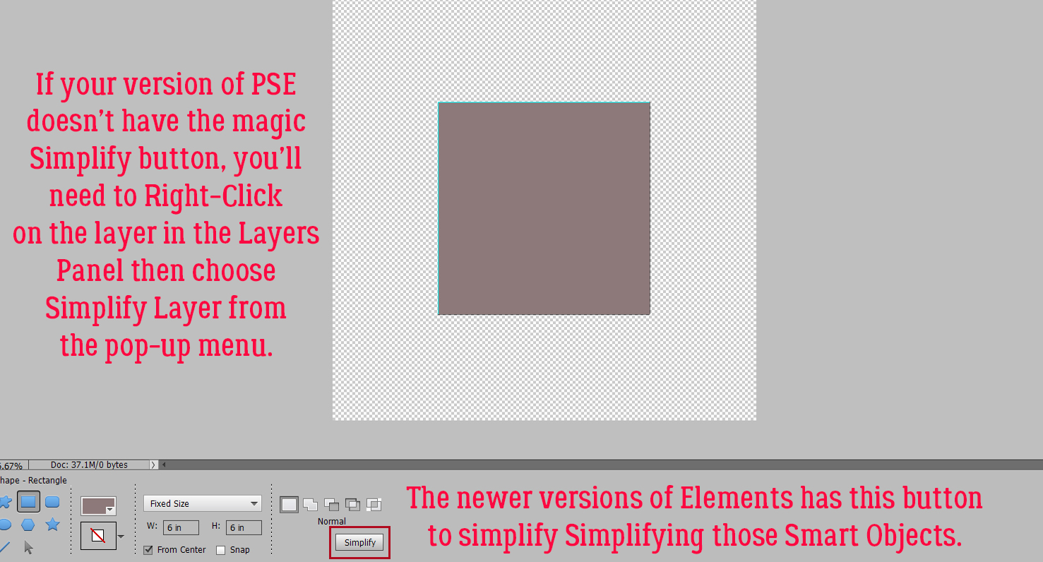
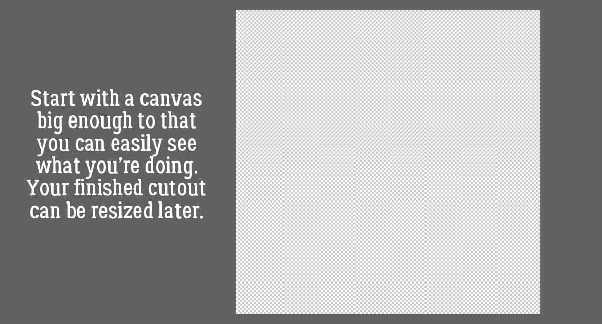
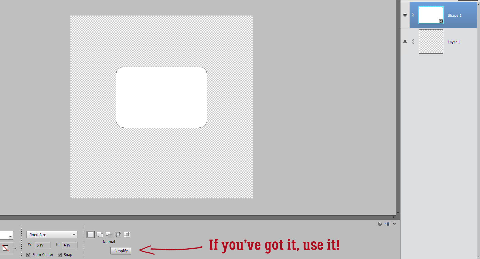
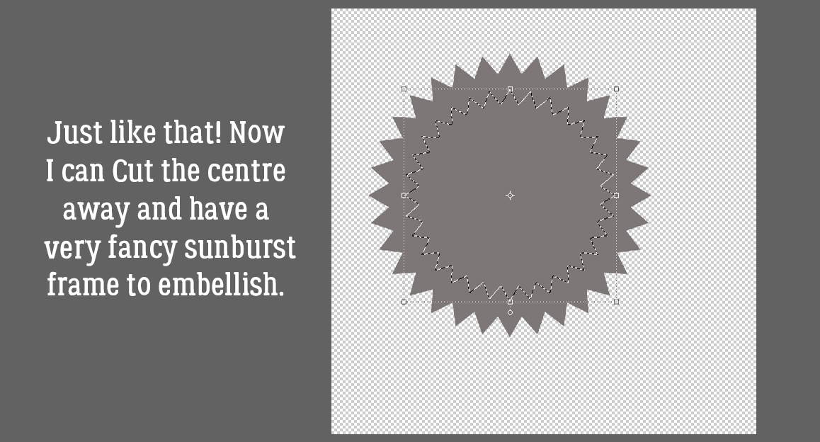
 We’ll come back to the hexagon in a minute. What if you chose a more complicated shape, like this seal? You can use all the controls in the Tool Options, like using Defined Size, and if you tick the From Center box, Elements will put the shape right in the centre of the canvas. Here, I’ve shown the Simplify button (the one you may not have). Experiment with your software; the more you play with it, the better you’ll understand what it can do and what it can’t. (And these tutorials will make more sense…) You’ll find a system and a rhythm that works for you.

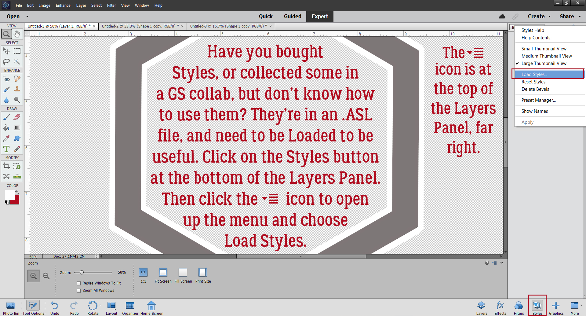
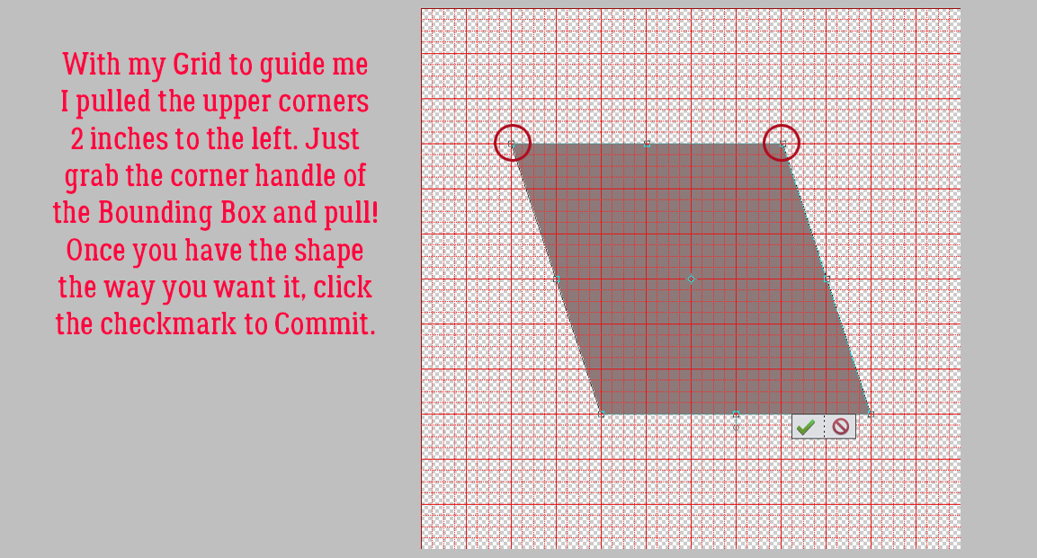
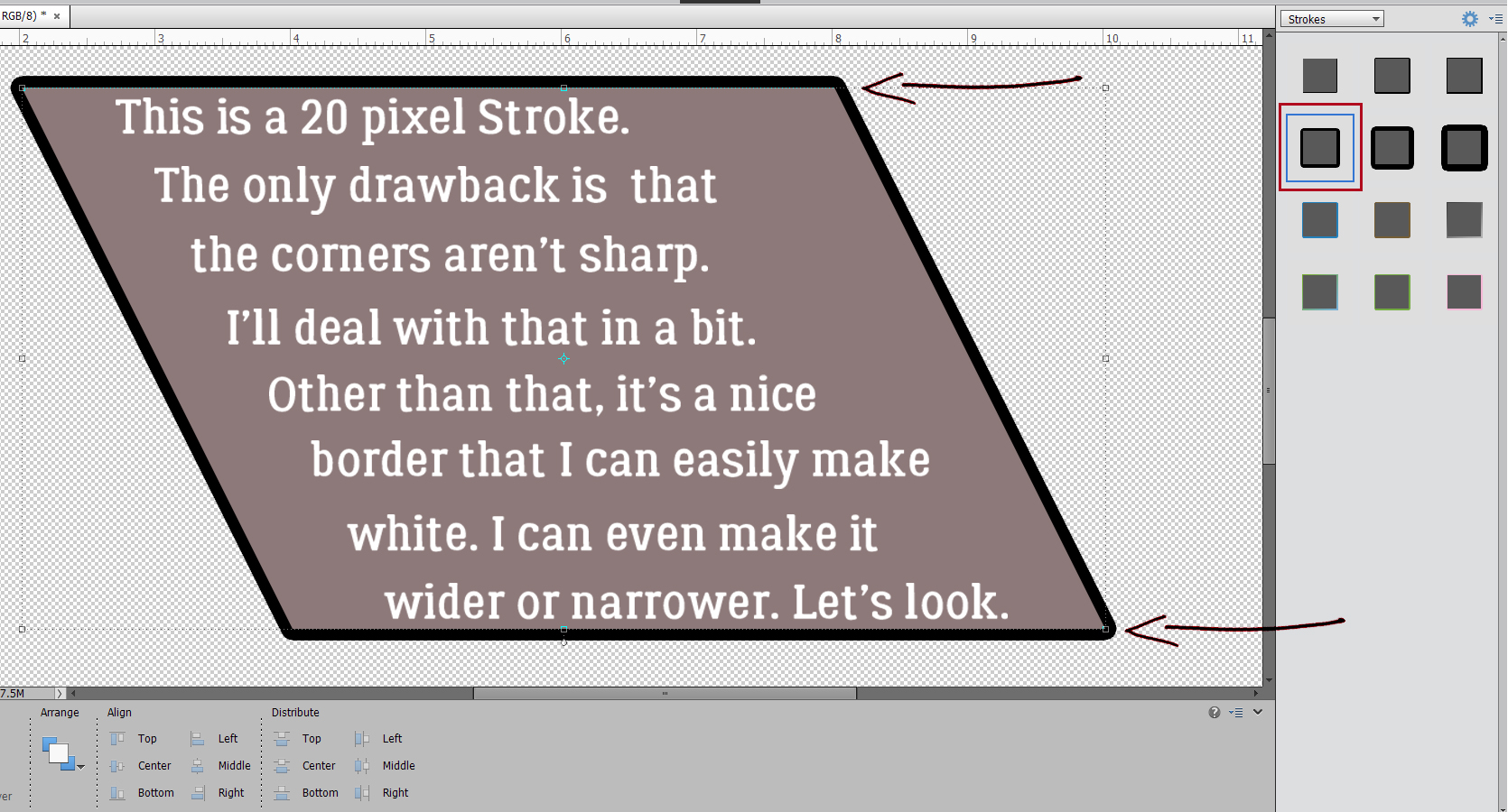
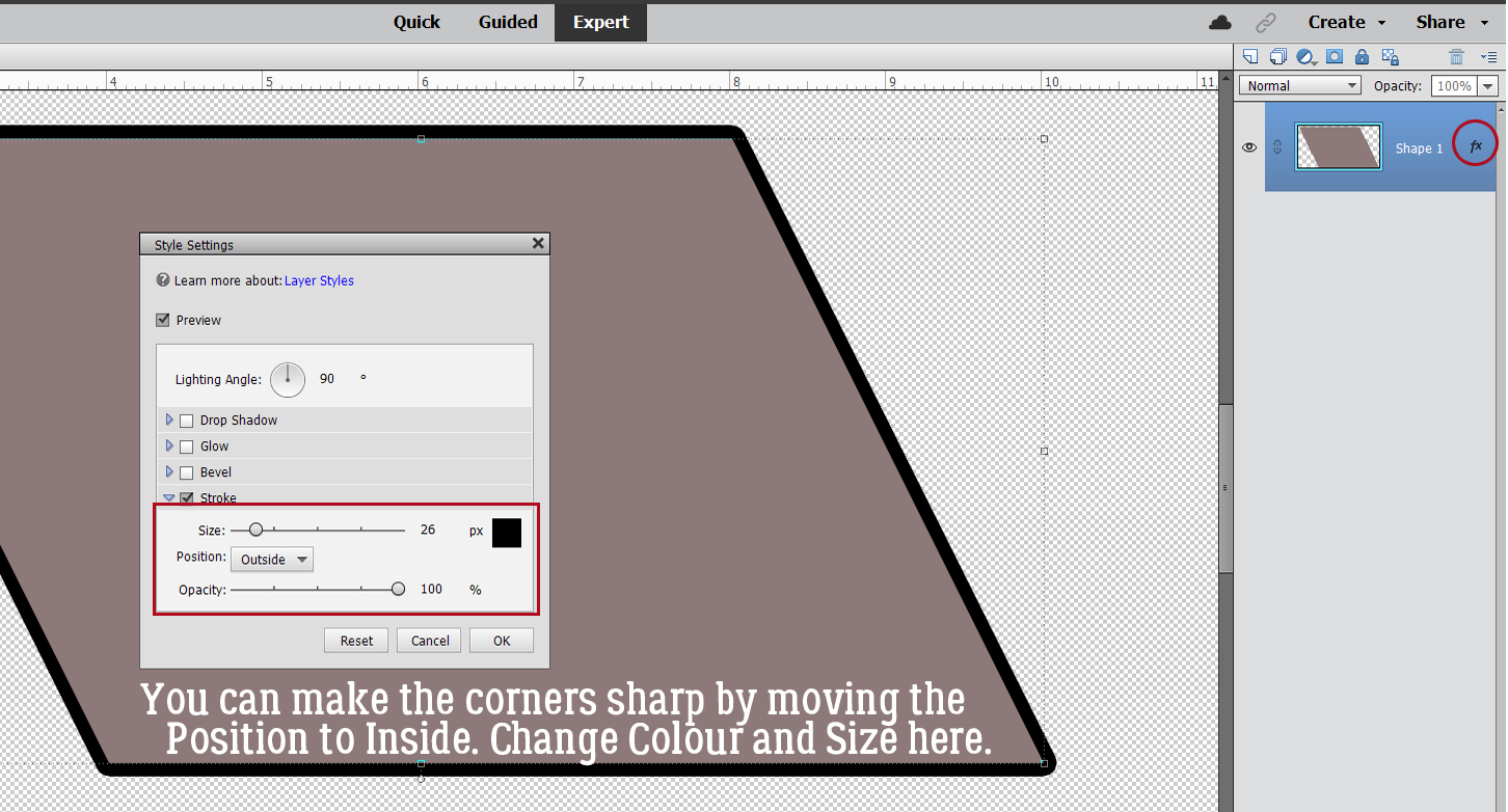
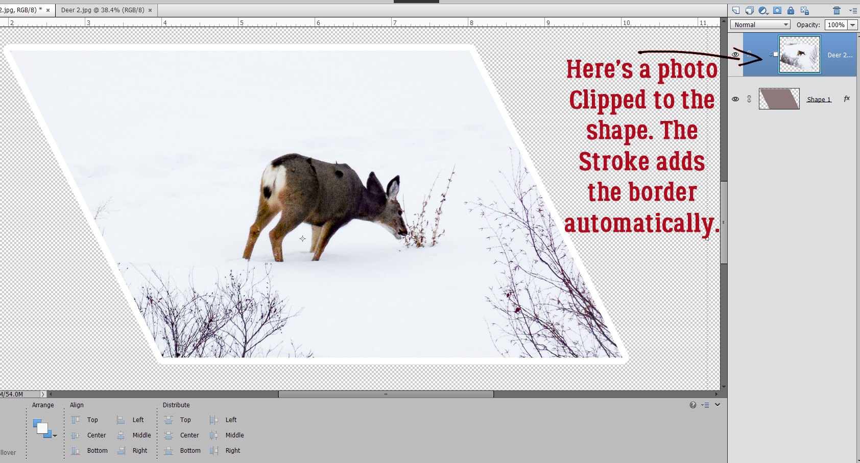
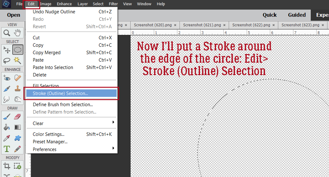
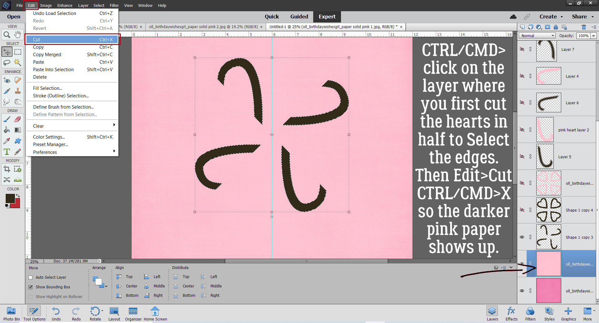
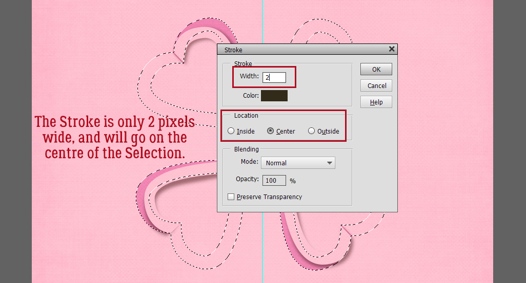
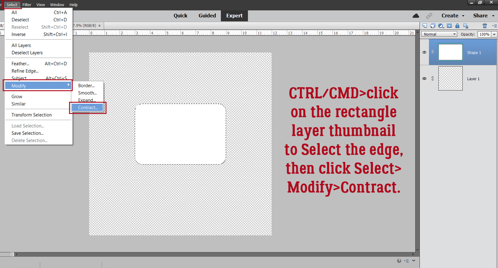
 Quick-and-easy border making uses the Stroke Edit. CTRL/CMD>click on the Layer Thumbnail to “Select” the edges of the hexagon, inside and out. Make sure you’re on the blank layer, then Edit>Stroke (Outline) Selection.