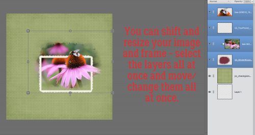
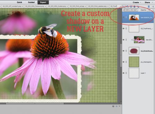
Revisionist History
![]()
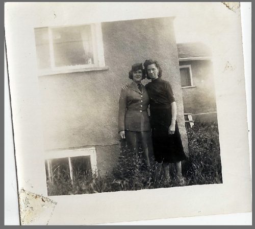
Do we have any family historians in the house? I’m pretty sure we do. And I bet you’ve scanned a ton of old photos, only to find the resulting images dust-specked, foxed (stained with brown ick), scratched, folded or otherwise flawed. Sometimes that’s a good thing, if you’re going for that vintage, grungy, tattered look. But if you’re not, you might want to clean them up a little. That was my thought when I saw this scan of my mom and her sister, taken in the spring of 1957. I love the subject (yes, my mom was in the air force and was home on leave), but I don’t love that it’s crooked, speckled, stained and scratched. And the exposure is pretty wonky. So I set out to make it better without changing it too much.
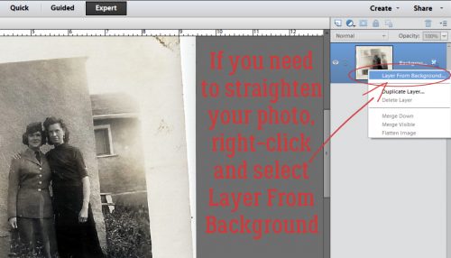
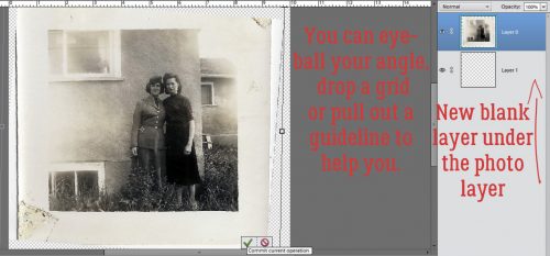
First order of business was to straighten my image. Initially, I didn’t plan to crop it, which would have solved my problem in one step. And I do have lots of photos that were scanned crooked (thanks, honey…) that I won’t be cropping so I’ll show you a quick trick to straighten a photo. I right-clicked on the image layer and selected Layer From Background. By doing this, I could then create a blank layer underneath the photo, then Image>Resize>Canvas (CTRL/CMD>ALT>C) let me make that blank canvas a bit bigger than the photo so I could tip the photo without it hanging over the edges.
When you straighten any object in PSE, there are a couple of tools you can use to ensure its actually straight when you’re done. You can eyeball it if you’re not overly perfectionistic, you can drop a grid over it by hitting View>Grid (CTRL/CMD>’) or you can pull a guideline out from either the top edge or the far left edge of your workspace. Then you’d use the bounding box to adjust your photo.
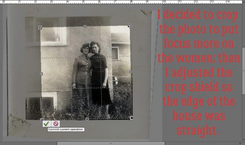
After all that, I decided to crop the photo, so I definitely was working hard, not smart! The crop shield is turnable so I could have saved myself a lot of time.
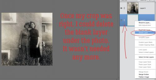
And then I deleted the totally unnecessary bottom layer!
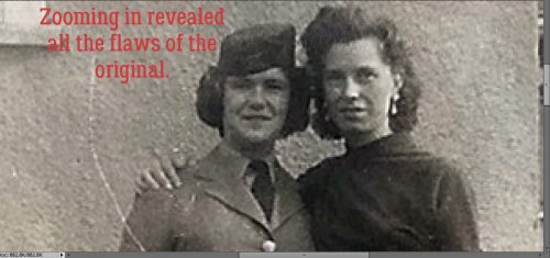
Once I zoomed in on the image, I could see the scratches and dust motes better.
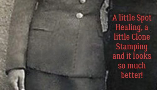
I started with the scratches. Using a small brush size and the Spot Healing tool set on Content Aware, I carefully clicked-and-dragged my cursor over the big scratch. I could have done it a bit faster with a bigger brush, but then it would have been really obvious.
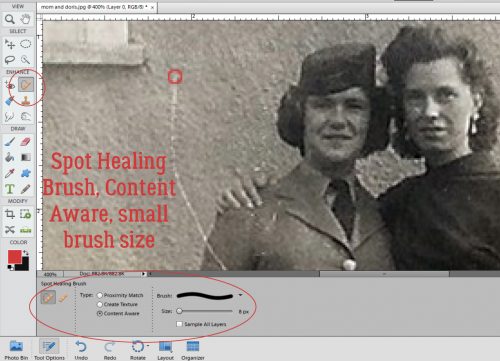
Make sure you watch what’s happening with your image while you’re tidying it up. Zoom in and out often so you have a clear view of the whole image. This scan is really pixelated when I zoom in close, but that’s okay. It’s not going to be big enough on my layout to be a problem.
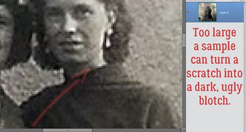
When using the Spot Healing tool, it sometimes picks up the wrong content so you could turn a white scratch to a dark blotch. So make the brush size as small as possible to address those areas.
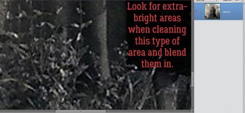
A lot of the time, dust specks are easily seen and Healed just by putting the tool’s cursor over top of them and clicking once. They show up as fairly regularly-shaped bright white spots where the light from the scanner bed couldn’t penetrate. Foxing is the reverse, showing up as brown areas, and can be irregularly shaped because it’s usually caused by moisture. Having said that, when there’s areas of your photo where there are already high-contrast shapes like the grassy part of my photo, seeing the dust specks is a bit harder. So look for those EXTRA-bright white spots and blend them in.
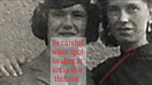
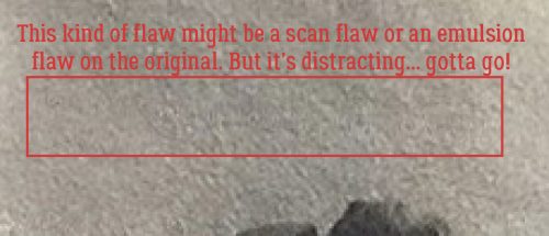
You might not be able to see the flaw I’ve outlined below, but on my screen, it was very distracting – greenish and filled with odd little straight lines. And the area around it is highly textured. So that nice little Spot Healing tool isn’t going to give me the results I want. It would make it more noticeable by blurring the edges.
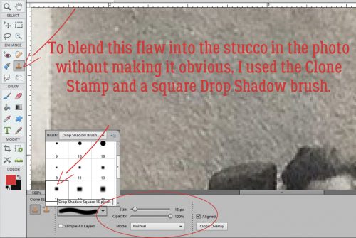
That’s where the Clone Stamp tool comes into play. Unlike the Spot Healing tool, which blends whatever it touches, the Clone Stamp actually duplicates its target area. Depending on the size of the sample, it could actually replicate entire objects. It’s really great for covering up things you want removed from your image (like the overly large woman in the black swimsuit that was growing out of my daughter’s underarm in one of her beach photos). For this image, I chose to use a soft square drop shadow brush from the default set PSE comes with. To choose the sample for covering up this weird area, I put the brush cursor on an area close to where I’d be stamping, then ALT>clicked. That cloned the small area inside the cursor; the duplicated area is visible inside the cursor and there’s a little crosshiar icon that shows what area of the image is being cloned. Then I just moved the cursor over to the weird spot and click-covered the whole area. You want to make sure your clone sample has the same tonal quality and the same light exposure to minimize the hey-look-at-me effect.
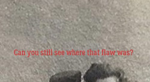
For this area that’s all I had to do… paying attention to the content inside the cursor and where the crosshairs were let me control what sections of the wall I was randomly cloning onto the weird spot.
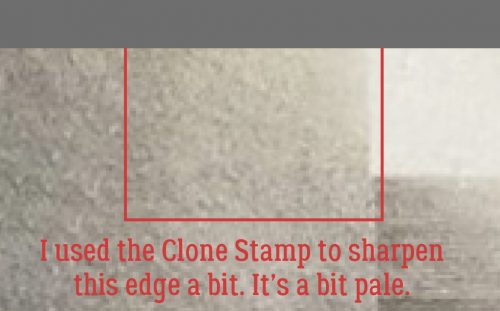
I also used the Clone Stamp to overcome this blown-out area of the upper wall. When cloning along an edge like this, centering the cursor over a clear, clean spot when selecting the sample area will keep the line true.
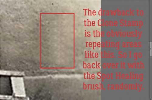
The major positive of the Clone Stamp is also its major downfall. See how there’s a really obvious pattern inside the box in the image below? If you’re seeing that, you can go back over the area with the Spot Healing tool and randomly break up that pattern.
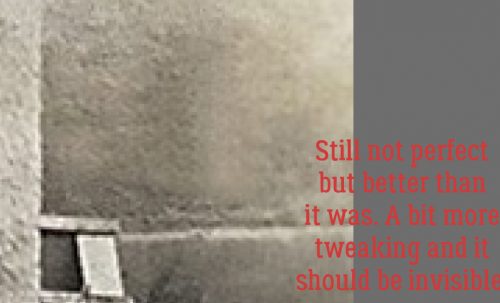
At super-zoom, it’s not perfect, but when I zoom back out, it looks pretty good. I randomly hit it a few more times with a small Spot Healing brush and blended it in a bit more.
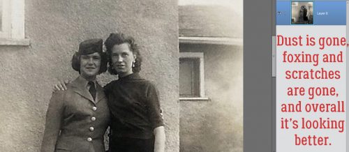
Now you can see a little better how the image is improved by what’s already been done to it. A lot of photos only need a little tweaking.
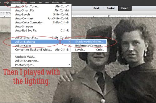
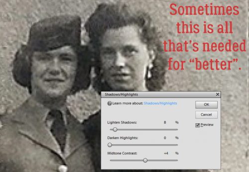
But I wanted to adjust the contrast a bit and see if I could improve detail without sacrificing anything. So I selected Enhance>Adjust Lighting>Shadow/Highlights. Be aware that when you do this, PSE will automatically brighten the shadowed areas by 35%. If the shadows weren’t THAT heavy, you’ll have to scale that back.
These are the settings I ended up with.
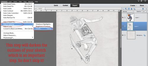
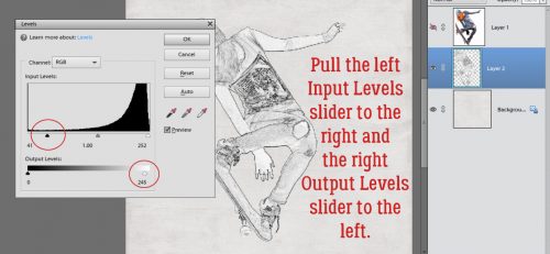
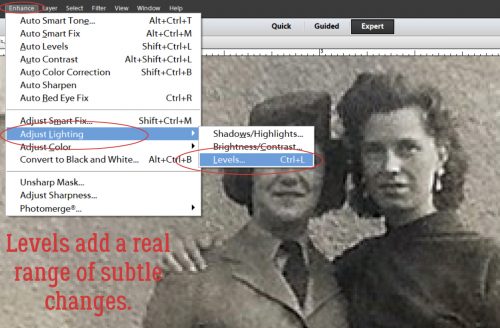
But it still wasn’t making me happy, so I went back into Enhance>Adjust Lighting and chose Levels. (CTRL/CMD>L will get you there too.) I LOVE this adjustment mode! You can really adjust the light and dark areas infinitely with this tool.
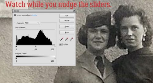
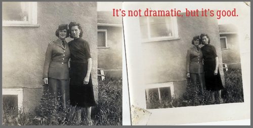
You can see the changes on your original image as you move the sliders. I didn’t move them much, just a skoosh here and a titch there. The Input levels ended up around 12 at the left side and about 240 on the right. Output was maybe 8 and 242. That improved the contrast and tightened up the details a little. Nothing dramatic, but just right.
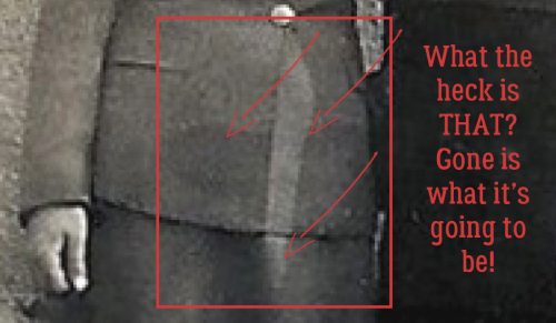
Thinking I was done, I zoomed back out to see how great it looked. And then I saw THIS!
So I played with it a little more.
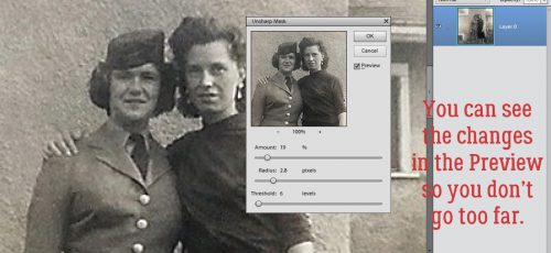
I tried a High Pass filter to sharpen the details a little, but the image is too pixelated for that to look good. So I had to come up with an alternative. And Enhance>Unsharp Mask… was it.
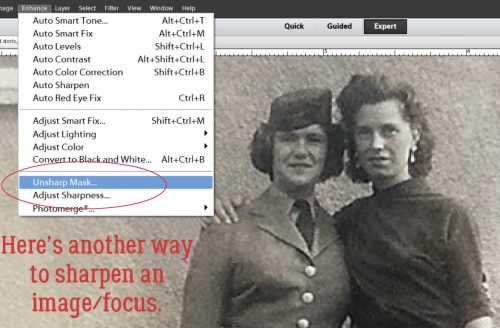
With this tool you can watch what’s happening and fine-tune your results really nicely.
Here are the two images side by side. And I’m really pleased with how my edit looks.
These techniques can be used on colour photos too, in exactly the same way. I have a bunch of new scanned photos my cousin’s son sent me that I’ll need to clean up before I use them for layouts. How about you?
![]()