Title Tweaks
![]()
Titles are an integral part of fabulous scrapbook layouts, whether they’re done the traditional way with papers, printed photos and glue, or digitally. Having a title on your layout that connects with the topic, means something to either the creator or the viewer and is pleasing to the eye, can elevate a layout from merely “nice” to OUTSTANDING. I received a private message last week from GingerScrapper Lisa (slfam in the forum and gallery) asking me if I knew how anGELLeyes created the title for this layout, and if I did, could I make it a tutorial topic. So here we are!

This tutorial is going to build on some of the techniques from previous tutorials, so for some of you, working through it is going to be really quick and easy. But because there are always new viewers to the Blog, I’m still going to go step-by-step.
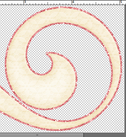
I started with a swirly twirly font called Risthi Script.

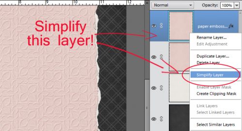
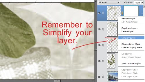
Before you can make alterations and adjustments to fonts other than those related directly to the text itself, it’s usually required that you Simplify the layer. Right click on the layer and select Simplify from the drop-down menu. Now you can play with it to your heart’s content.

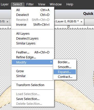
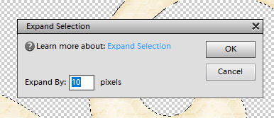
When I looked at the phrase I liked the font but felt like it needed a bit more weight. So I selected the text – CTRL/CMD>click on the layer thumbnail to produce the marching ants – then Modify>Expand.

The fly-out menu looks like this. You can enter whatever number you want into that box where I have the number 4. I wanted to beef up my text a little so I went small.

That move shifted the marching ants out 4 pixels from the edge of the selected object, the text.

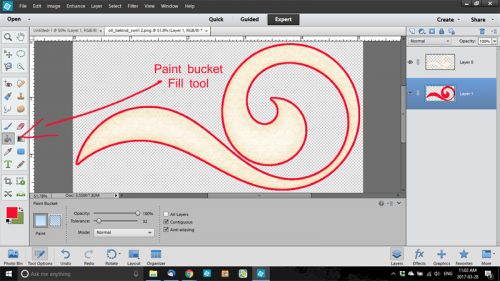
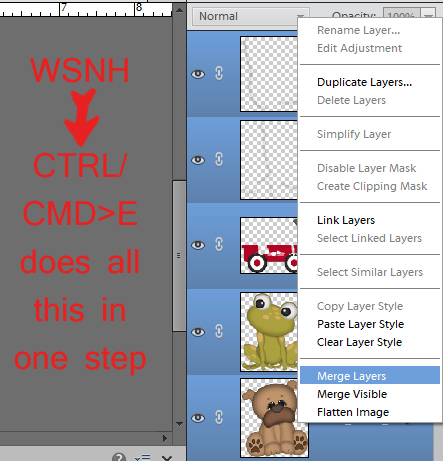
Then I used the Fill tool, aka the Paint Bucket (Work Smart Not Hard – just hit the “K” key on the keyboard) to fill in that blank space.

One problem with this little trick is that it leaves some gaps where the marching ants were. To get rid of the gaps, just hit your text with the Paint Bucket again.

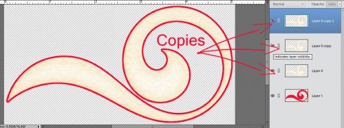
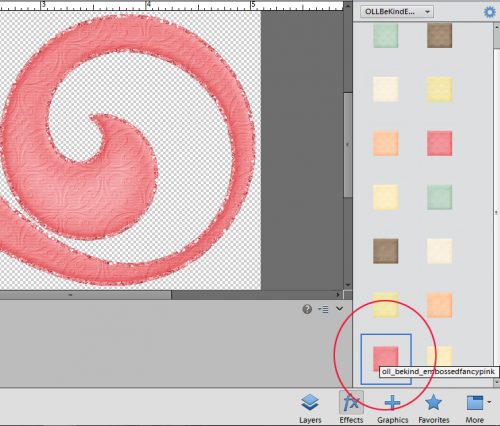
After the gaps were filled, I Duplicated the layer (WSNH: CTRL/CMD>J) so that the original layer would remain untouched, as my base layer. You’ll see why this is important in a minute. The multi-step method for duplicating is to right-click on the layer then select Duplicate Layer… which then opens another menu that asks you where you want the copy to go.

On the new copied layer, I wanted to create a white Stroke around the outside. Edit>Stroke opens this menu. As you can see, I chose a relatively narrow stroke but you can choose whatever number makes sense to you for your title. The other thing I want to point out is that I put the stroke centered over the edge of the text. If I were to zoom in tightly on my text, I’d see that the edge of is it actually quite jagged. If I put the stroke on the outside of the text’s edge, those jaggies would be magnified. Putting it inside would emphasize them. There is some degree of smoothing that comes with centering the stroke, so that’s where it went.

It’s hard to see in the image below but there’s a nice white border around the text and it’s applied to the top layer in my Layers panel.

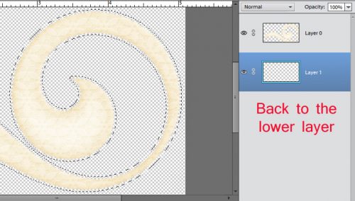
Here we go… see the white stroke now? And the jaggedy edge? It’s not really visible at the size the finished title will be so don’t fret over it. My next step is to CTRL/CMD>click on the layer thumbnail of the base layer. That bottom layer has no white border, so when you click on the thumbnail, the entire text will be selected. You’ll see that in the image following this one.

Because I centered the stroke over the edge, the marching ants are about halfway between the red and the edge of the white, as shown. That’s okay, because what I’m trying to do is create a 3D border and it doesn’t have to be gigantic to look good. Once I had the red text area selected ON THE TOP LAYER I hit CTRL/CMD>X to remove the red text section on that layer, leaving only the white. (The multi-step way is to select Edit>Cut.)

There’s that white border. (Visibility of the red layer is turned off so you can see what I’m doing.)

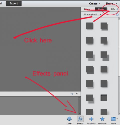
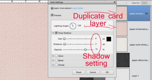
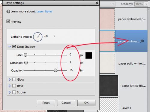
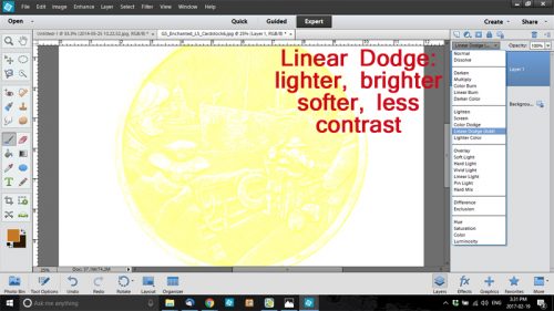
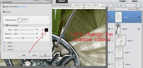
To get the 3D look that anGELLeyes created, I applied a Bevel from the Effects panel. (You’re getting a real good look at where my money goes… Bevels are default effects that come with the software though.)

The Bevel menu looks like this. When you have a few minutes, play with them and see what they do. It’s fun! I chose the Simple Emboss style for this purpose and double-clicked on it, once I was sure I was on that TOP layer that only had the white outline on it.

The default size on this Bevel style is 21 pixels, which is much too much for this technique. By double-clicking on the fx icon on the layer, I can adjust the size of the Bevel.

When I decreased the size down to 4 pixels, I ended up with a nice, well-defined, 3D border with a tiny shadow for added definition. Other than the multi-coloured effect on our example, that’s really all there is to it. You need go no further, your title is already awesome. And you can accomplish all of this in about 5 minutes. No lie!

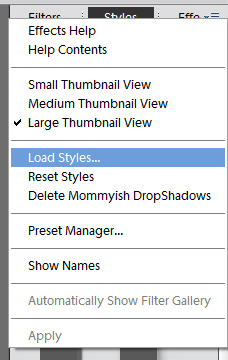
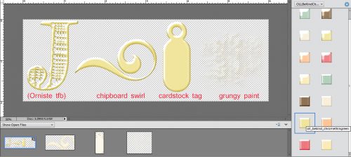
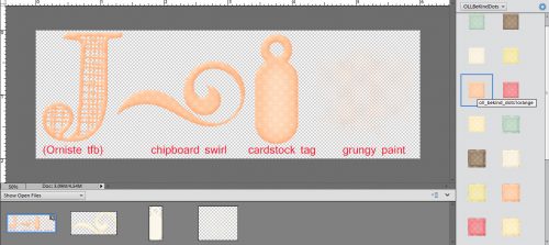
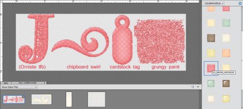
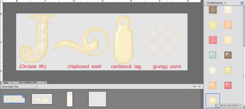
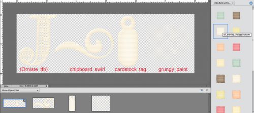
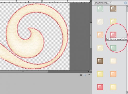
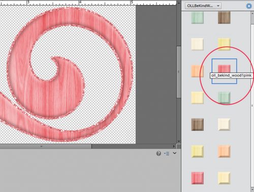
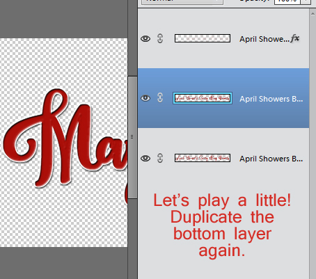
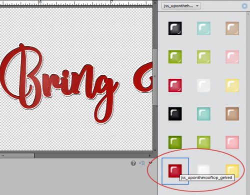
Let’s play with this technique a bit. I created some examples of adding other styles to the same phrase so you can see how easy it is to make your title something really special. For these examples I used a collection of styles from Just So Scrappy‘s Up on the Housetop collection. But first, I again duplicated the bottom-most layer, the one that is only red text.
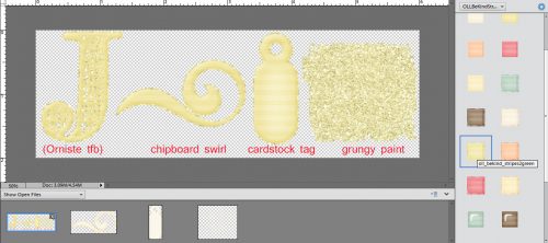
Red coarse glitter…

…looks like this!

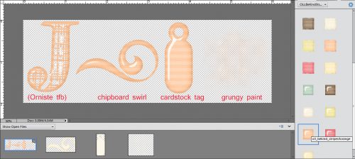
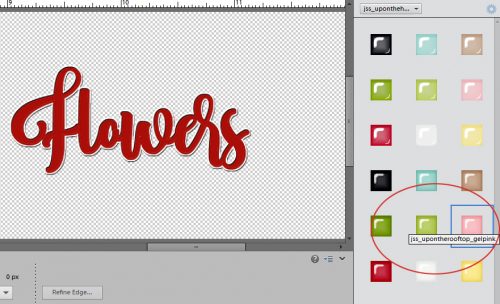
Red glitter gel looks like this. (I LOVE this one!)

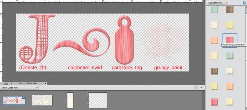
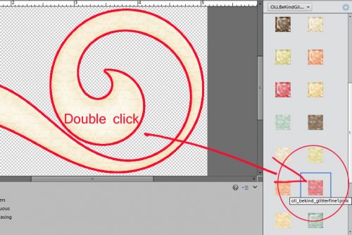
This one is the red fine glitter.

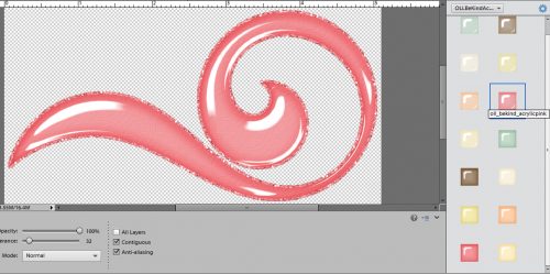
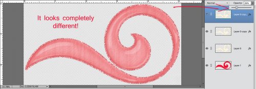
Let’s see what the translucent red acrylic gel looks like.

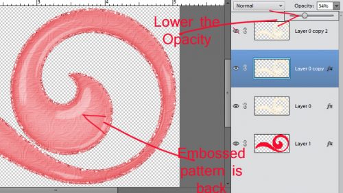
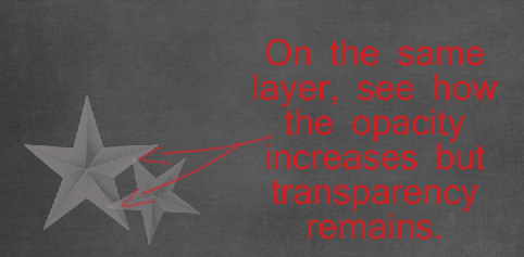
It was really shiny and overpowering, so I pulled the Opacity of that layer down to obtain this effect.

How about changing the colours of some of the words… I used the rectangular Marquee tool (WSNH = “M“) to select the word “Flowers” and Cut it away. (CTRL/CMD>X) Then I Pasted it back onto my work space (CTRL/CMD>V), resulting in it being on its own layer, repositioning it so it lined up with the bottom layer. I did the same with the word “Showers”.

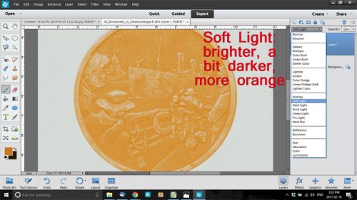
I like to turn the visibility of the other layers off while I play around so I’m not distracted and can see exactly what’s happening. I wanted to apply the opaque red acrylic gel style to most of the phrase so that layer is the active and visible one.

The style gives the text a shiny look, which you’ll see in the image following this one. This is what the base layer looks like without any adjustments.
I like how this looks. So I’m going to leave it alone.

I turned the visibility for the “Flowers” layer on and selected the opaque pink acryic gel style.
Isn’t that cool? It looks like enamel inside a form, which is what I was going for.

“Showers” will go next.

The opaque blue acrylic gel style might be a good colour for something watery, don’t you think?

This is what the final version looks like. I could have played with this for hours, but needed to get all the screenshots edited for the tut, so I stopped there. Total time to actually make all the adjustments to this? 25 minutes start to finish. It’s just that easy!

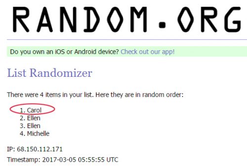
There were only two entries for the Tutorial Challenge in March, and rather than go through the bother of a draw, I’m going to give both gals their moment in the spotlight. Michelle and Ellen, please send me a message with the topic you’d like me to work up for you and I’ll get on with them right away!
Remember, if you’ve used a technique from these tutorials, post your finished layout in the GingerScraps Facebook Tutorial Tuesday Challenge Gallery for an opportunity to have YOUR chance to challenge me. If you’re not a Facebooker, you can post a link to the layout you’ve created with the tutorial you used in the comments section here on the Blog. I’ll get a notification and will then enter you into the draw. The first week of each month I’ll have a random draw of all entries and the winner will be announced at the end of the first tutorial of that month.
See you all again next week!
![]()