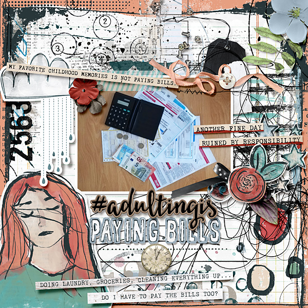
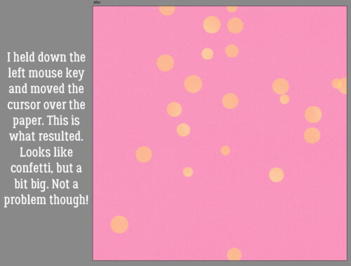
Challenge Spotlight: Inspiration
![]()
It’s spring in the northern hemisphere and the prompt for this month’s Inspiration Challenge is “full of life“, easily fulfilled with all the spring photos that are popping up like wildflowers everywhere. But for those in the tropics and the southern hemisphere, there are lots of ways to hit the mark too! The Challenge is hosted each month by Carol Wen Xin, aka CarolW Designs. If you click on the name of the Challenge at the beginning of this paragraph, you can see all the inspiring images Carol has provided to stimulate your creativity. Below are some layouts built on the prompt; let’s have a look at how each Scrapper has interpreted the Challenge. [If you’ve participated and your layout isn’t here, it’s because it hasn’t been posted to the Challenge Gallery yet.] Each layout is linked to its spot in the Gallery so if you want a closer look, click on the Scrapper‘s name and you’ll be magically transported right to it.
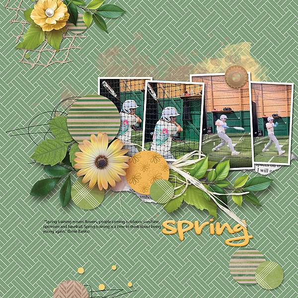
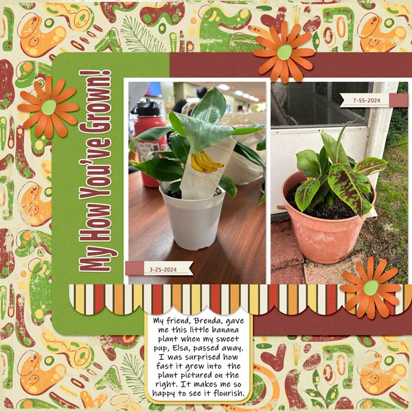
Our first look is from BriannaScrapper. Her banana plant is absolutely FULL of life! She’s used the same palette you can see in her photos to tie the layout together.
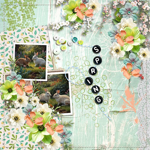
For her layout, lm77west chose some photos of bunnies, a definite sign of spring, to represent life, with a beautiful pastel palette. One thing that caught my eye is how the soft melon colour of her elements replicates the bunnies’ ears wit the sun shining through them. Brilliant!
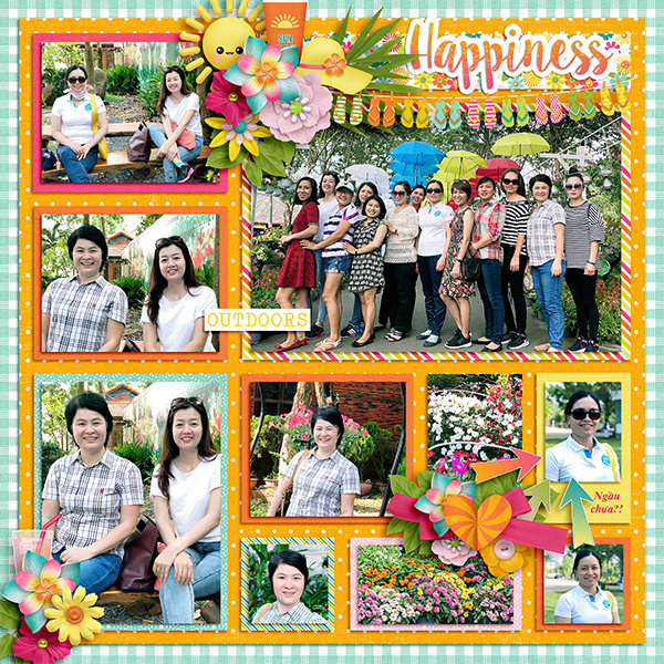
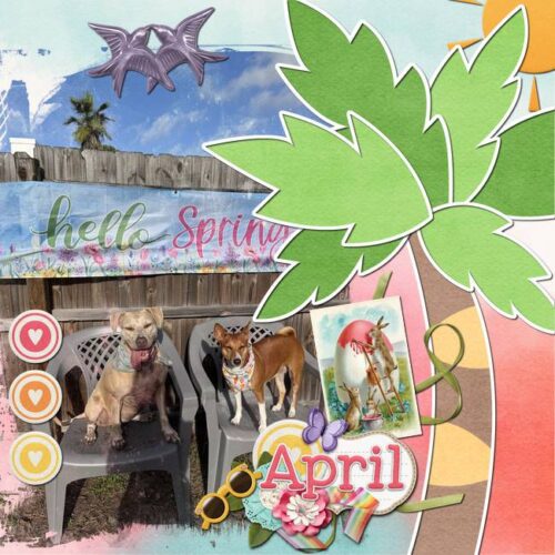
VariaMoon has tied sunshine and grinning pups with palm trees and warm colours to represent warmth and growth.
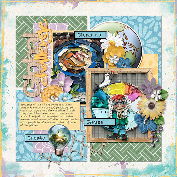
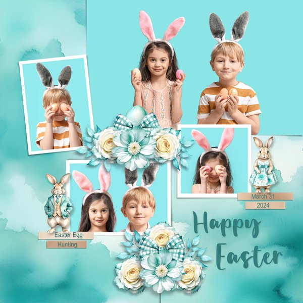
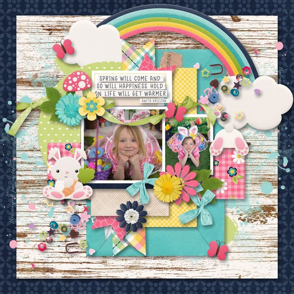
More bunnies! Er… children. The nods to the theme dkane included are found in the eggs… and the children. (What’s more full of life than kids?) I like how she’s pulled the turquoise background from her photos into the palette for the whole layout.
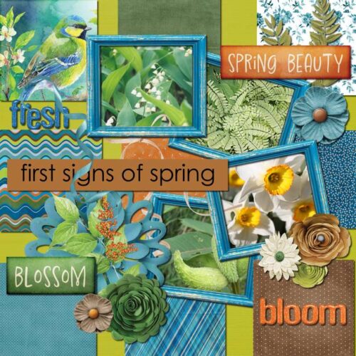
Here, echoes77 has pulled her palette from the watercolour bird in the top left corner. The yellow of the narcissus really pops! Signs of spring reflect new life, and the reawakening of what has been sleeping.
ScrappyMara used a very spring-y palette for her returning, reawakening, refreshing nature layout. One sign of spring that always makes me really happy is hearing the frogs singing in the pond behind our house. That’s when I know winter is really over.
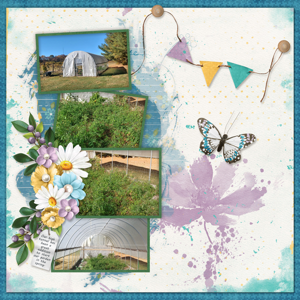
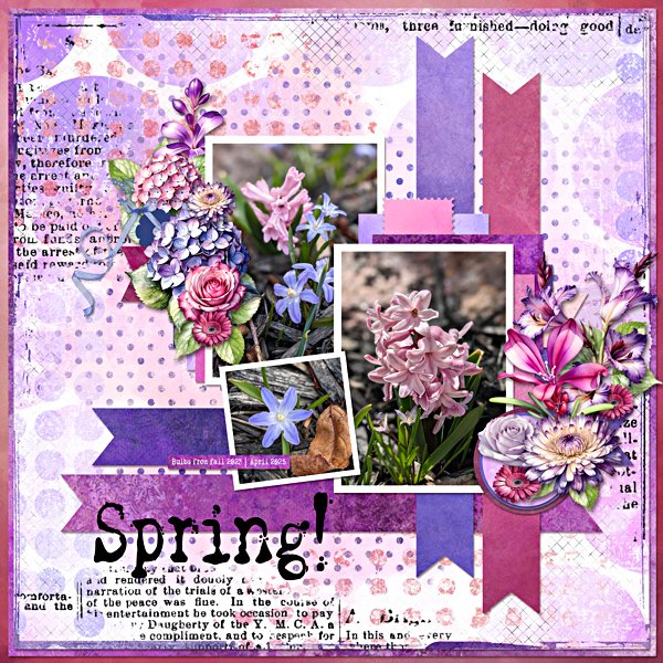
I have such a weakness for spring-flowering bulbs. They’re a miracle of engineering! KatL has created a really eye-catching showcase for her photos, pulling colour from them and standing out from the crowd, much like the burst of new growth she’s documenting.
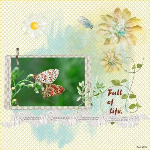
MemmieNelleke has provided us with another example of a natural full-of-life miracle, this pair of mating sooty copper butterflies. By using soft pastel colours and repeating patterns, she send our eyes right to the photo.
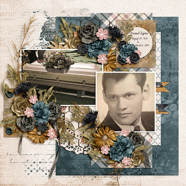
Branma has captured the Easter-resurrection-rejuvenation vibe really well here. Wait while I dig out some Cadbury Mini-Eggs… Her photo subject is full of life and it shows in her eyes!
I hope you’ve been refreshed and inspired by this week’s stroll through the Gallery. I know I have. (And I really needed it!)
![]()