Tutorial Tuesday (Photoshop Elements)

Greatest Hits: Paper Tears Updated

You might wonder why I’m doing another rerun here. If you worked through the shadowbox effect tutorial from earlier this month, you might recall that Jill‘s request had two examples of shadowbox techniques. I showed you how I duped the first one, and mentioned that when I showed the second one, I’d be focusing on paper tearing. Since I wrote the original posts I’m going recap today, I’ve learned a few things… and those tears can look even more realistic. Yes, you read that correctly: I’m doing a double-header today! The first technique tut is 9 years old already…

THIS LOOKS REALLY LONG!! DONT PANIC. IT’S NOT THAT BAD!!!

Obviously, the easiest way to add a paper tear to a layout would be to use an already-roughed-up paper from any of the GingerScraps Designers, or to use a Photoshop Elements Action that automates the process. But if you don’t like those options you definitely can create your own tears.

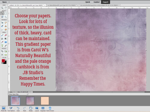
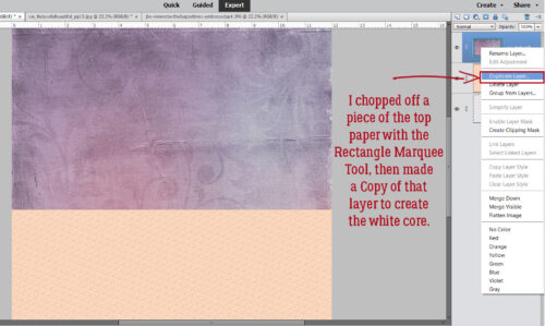
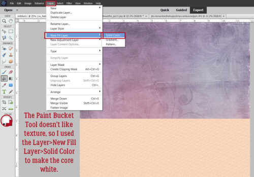
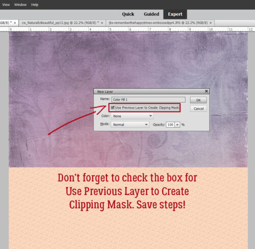
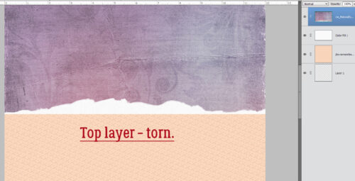
If you were to tear a piece of high-quality cardstock, which generally has colour applied to one or both sides with a white core, you’d get a bit of an irregular edge, with varying amounts of white backing paper showing along it. So to demonstrate this, I’ve used an embossed cardstock from Ooh La La Scraps‘ simply gorgeous bundle You and Me. Fortunately for me, there is also a solid white, textured paper in the kit too, so I’m going to use it for the core. (For the first few steps, I turned the visibility of the white paper layer off.) And to make it easier to see what I was doing, I put a piece of gray patterned paper behind it all.

I wanted to have tears along both vertical edges of the paper and I wanted some of the background to be visible. I also wanted to Work Smart Not Hard. So I selected the layer with my pink cardstock on it and using the Rectangular Marquee tool, I selected a portion of paper then Edit>Cut [WSNHCTRL/CMD>X]I trimmed away some paper from each side. You’ll see why this is a WSNH tip as we go along.

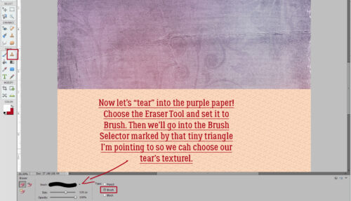
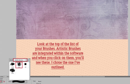
I then selected the Eraser Tool and a relatively small brush size. [Update: Instead of using just a round Basic Brush for this step, check out the Artistic Brush set that’s included in your software. There’s a Rough Bristle option in there and when you set the Size to about 100 pixels, it adds some amazing texture to your tears.] Working along the right side of my canvas, I erased away some of the pink cardstock in an irregular, jagged manner. Don’t try to be too careful because you want it to look… well, TORN. If it might make it easier for you to visualize, take a real piece of paper, any kind, and tear it. For real. Then look at the edge. It’s not gonna be perfect!

Because I wanted both sides to be torn, I repeated the process on the left side of the canvas too. You may have noticed that I broke my own rule of only erasing on a Layer Mask. If you’re wondering why, it’s because it really doesn’t matter if I erase too much of these papers. It doesn’t have to be perfect. It’s better if it ISN’T perfect.

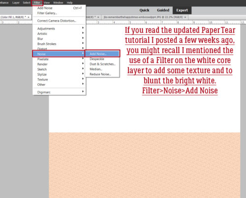
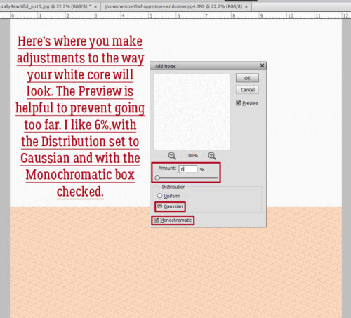
Once I was happy with the edges of my tears, I turned the visibility of my white paper layer back on and trimmed away some of it along both edges in the same way I did with the pink. It made me so happy to see that the texture of the white paper was the same as the pink – that core layer should have some texture to it too. [Update: if you’re using a flat paper or a Fill Layer for your white core, you can get some texture by using a Filter>Noise>Add Noise set to 5%, Gaussian Distribution and the Monochromatic box ticked. If it’s too in-your-face, you can tone it down by adding a Blur>Gaussian Blur>1 pixel.]

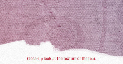
The next step was to erase the edges of the white paper just like I did with the pink cardstock. Zoom in close to your work so you can see exactly what you’re doing.

This time I erased close in to the pink paper in some places and veered away a bit in others.

When you zoom back out, there may be some bits of white paper still there. These have to be erased too.

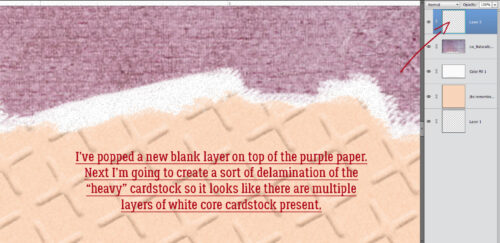
After I had my white edges the way I wanted them, I selected the pink cardstock layer again and went back with the Eraser Tool and created some little slivers of torn paper as shown below. This would happen with real cardstock, so I always include a few little shreds.

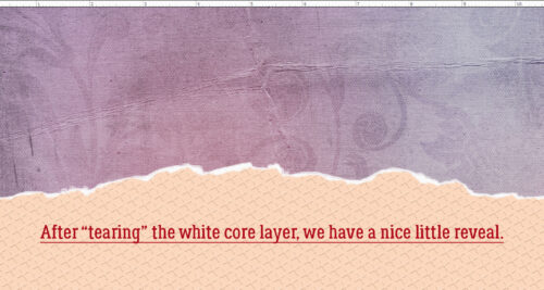
Here’s a full screen view of the two torn edges.

The last step to ensuring realism is to add a very infinitesimal shadow to the cardstock layer. I like to have shadows visible on both edges, so to accomplish that I Duplicated [WSNHCTRL/CMD>J] the pink cardstock layer before I applied a drop shadow. I used a simple shadow, with the following settings: Size 0Distance 2 and Opacity 75. (These aren’t hard-and-fast, use whatever settings look the most realistic to you. Just remember them for later.)

When I had my shadow just so, I Simplified the layer. Doing that locks the shadow to the cardstock so it doesn’t change later.

Then I did the same thing with the second pink cardstock layer, with one difference – the angle of the shadow.

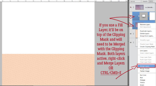
After both layers had that little extra definition provided by the shadows, I merged the two pink cardstock layers with the white paper layer. [WSNH: Select all layers then CTRL/CMD>E]

And here’s the finished layout.

Now, the second trick I’m going to add is to Copy a paper tear from a template! This one is so simple!

There’s a way to import a paper tear from a template into a layout-in-progress that only takes a few easy steps and very little time. However, you must have a template with a paper tear on its own layer, or a commercial-use paper tear template. They have their own limitations, and may not give you the look you’re after. So try this.

I started out with this template from (former GingerBread Lady) Tinci Designs’ Second Chances V.2 collection. I resized all of the layers (except the background paper) to allow for adding a tear.


I was waiting to find a template like this one from CarolW Designs’ Spring Dawn. That tear is moveable!! But how can I move it onto Krizstina’s template?


There are a couple of steps that need doing first. But to start, I found the tear layer in Carol’s template, right-clicked on the layer and chose Duplicate Layer from the dropdown menu.


Now Elements needs to know where to put it. The new menu shows all the files currently open in the Photo Box, and offers the option of creating a New Document. That’s what I’m going to do.


This step is completely optional. I chose to give my new document file a name, Paper Tear Mask, for clarity.


And this is what happens.


But look at that Bounding Box! I was thrilled to see there’s more to the tear that can be used just by Resizing it.


Now to make it useful and not work too hard while I’m at it. I added a new blank layer underneath the tear layer. Just hold down the CTRL/CMD key and click the sheet-of-paper icon at the upper left of the Layers Panel.


Next, I used the Paint Bucket Tool to fill the whole of the blank layer I just created. Pick any colour you like (but not white) for this step.


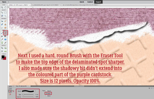
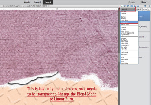
To turn the coloured part into a Layer Mask so papers can be Clipped to it, I used a hard, round brush within the Eraser Tool to remove the coloured part above the tear. This can be done quickly because as long as I don’t cross over the tear into the lower part of the coloured area, I can just scrub it away.


And that’s it for creating the tear mask! To move it over onto Krizstina’s template, I’m going to Activate both layers by click-shift-clicking on each of them, then right-click to open the dropdown menu to Duplicate Layers…


This time, I’m going to send them onto the Tinci template.


‘MKay. there are the tear and the mask, placed on top of the background paper and underneath the rest of the layers.


I don’t like the tear up there, just to be a non-conformist. So I’ll move it.


And all that’s left is to add the papers. I’ve used North Meets South Studios’ March 2022 Daily Download kit, When Life Gives Lemons. I want the woodgrain paper to be my background and the yellow gingham to be a tablecloth, sort of – maybe one of those vinyl ones with the fuzzy background and now it’s torn . By Clipping the woodgrain paper to the coloured part I added to the tear, that’s what I get. Cool, right?


Now, if you’d like to do this technique again sometime, you can Save your work As a .psd or .tiff file and reuse it again and again. By having all that coloured area, you can pretty much put the tear anywhere!

So, how will this novella make next week’s tut easier to follow? The review will ground you in the basics, so when I throw in some curls on those torn edges, you’ll already have great tears to play with! Have I piqued your interest?


DD: SEP 22

DD_Sept_2026_Day_22_jcclfyeh.zip

Follow Jill on her Facebook Fan Page and her Facebook Group.

Remember, the download is kept up for 5 days, and then it is taken down. If you miss pieces, the kit will be available for purchase on the first day of the following month.

Post expires at 10:00am on Monday September 28th, 2026

DD: SEP 21

DD_Sept_2026_Day_21_edptwdlx.zip

Follow Jill on her Facebook Fan Page and her Facebook Group.

Remember, the download is kept up for 5 days, and then it is taken down. If you miss pieces, the kit will be available for purchase on the first day of the following month.

Post expires at 10:00am on Sunday September 27th, 2026

DD: SEP 20

DD_Sept_2026_Day_20_tihfitmb.zip

Follow Jill on her Facebook Fan Page and her Facebook Group.

Remember, the download is kept up for 5 days, and then it is taken down. If you miss pieces, the kit will be available for purchase on the first day of the following month.

Post expires at 10:00am on Saturday September 26th, 2026

DD: SEP 19

DD_Sept_2026_Day_19_ectedfsm.zip

Follow Jill on her Facebook Fan Page and her Facebook Group.

Remember, the download is kept up for 5 days, and then it is taken down. If you miss pieces, the kit will be available for purchase on the first day of the following month.

Post expires at 10:00am on Friday September 25th, 2026
September 18, 2026: New Releases and Bake Sale @ Gingerscraps

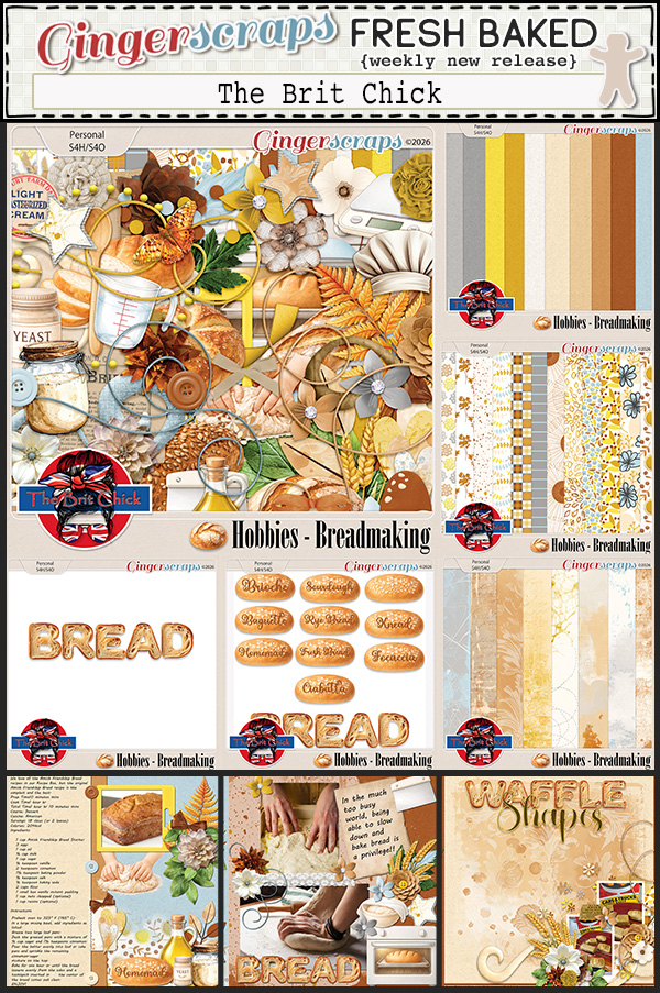
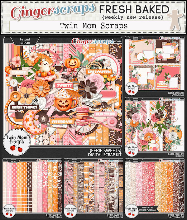
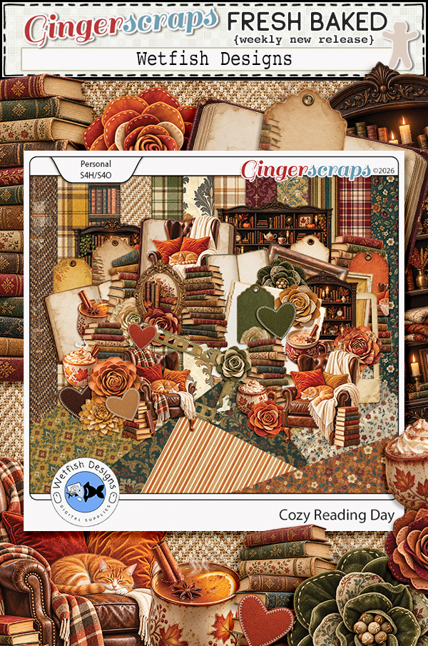
Happy Friday Friends! We hope you have had a wonderful week. In this weeks newsletter, you will find new kits with beautiful colors to get us ready for Fall and Halloween. It will all be here before we know it.

As a reminder, make sure to check out the September Bake Sale going on until September 20th.

Don’t forget this great Free With Purchase kit you get with any $10 spent in the store!

Take a look at the new challenge reward kit. If you complete any 10 challenges this month, you get this gorgeous collab (or a variety of other choices from previous challenge collabs) as a reward!

DD: SEP 18

DD_Sept_2026_Day_18_dkrdqlrw.zip

Follow Jill on her Facebook Fan Page and her Facebook Group.

Remember, the download is kept up for 5 days, and then it is taken down. If you miss pieces, the kit will be available for purchase on the first day of the following month.

Post expires at 10:00am on Thursday September 24th, 2026
DD: SEP 17

DD_Sept_2026_Day_17_avimnlcv.zip

Follow Jill on her Facebook Fan Page and her Facebook Group.

Remember, the download is kept up for 5 days, and then it is taken down. If you miss pieces, the kit will be available for purchase on the first day of the following month.

Post expires at 10:00am on Wednesday September 23rd, 2026
Tutorial Tuesday (Individual Style)

Challenge Spotlight: Initial Inspiration

I must say, September arrived and our weather flipped a switch. It’s chillier than usual and we’re actually getting some rain. We’re so happy!

This month’s Challenge Spotlight is focused on a new Challenge hosted by Alexis Designs. It’s called Initial Inspiration and it looks like a LOT of fun! I’m going to let Alexis explain how the Challenge works:

“Each month, I will choose a letter of the alphabet to use as the starting point for your page. Your challenge is to incorporate words, colors, themes, supplies, techniques, or other creative details that begin with that month’s featured letter.
This month, we will use the letter “S“.
Create a layout inspired by the letter S. You may interpret the challenge in your own creative way, but the featured letter should be clearly represented throughout your page.
Theme: (thought starter)
School, September, Solstice, Students, Scarecrows, Sunsets for a few thought starters.
Background:
Sienna, Sapphire, Scarlet, Sepia, Straw, Saffron or other colors beginning with S
Embellishments:
Stars, sweaters, squash, squirrels, soup or anything else beginning with S
Flowers of September:
Asters, Morning Glories, Sunflowers, Snapdragons, Salvia, Wildflowers and other flowers that align with September. It could be anything really.
Journaling:
Write about back-to-school, late summer days, early autumn, farmers markets, September activities, adventures, or annual traditions.
Photos:
First day of school, leaves turning, long drives, campfires, etc.”

As always with the Challenge Spotlight, I’m going to share some of the participating layouts submitted to the Gallery for this month, and we’ll examine each to see how the Scrapper has met the Challenge‘s criteria. Each layout will be linked to the Gallery via the Scrappers user name so you can get a closer look or leave a comment. Or both! This is your reminder that whenever you see bold text that is underlined and in colour, that’s a clickable hyperlink. There were quite a few entries in the Gallery already so I edited the selection to ODD numbered layouts to keep this from turning into War and Peace. Let’s jump in!

Katherine Woodin was first out of the blocks, as she often is. I think she’s the most prolific Scrapper we have! 😉 She has the letter S in her title, she’s used starry paper, snowflakes to play off the bird’s common name, silver and sapphire colours. That’s a pass!

Windswept chose to stick to sunflowers and the letter S in her title, plus some saffron-coloured paper mats. That’s a pass!

Here, msbrad has lots of places where the letter S appears, including her subtitle, and a bunch of stars.

Grace went with the month, September, and a straw-coloured background for the autumnal elements she used. The tag has sepia inky edges. Those sparkly swirls… that’s also a pass!

Aha, a back-to-school layout, but with a justpennys twist! She’s used a lot of school supplies elements and a classroom photo to incorporate the theme. Pass!

FormbyGirl chose an alliterative title with S for the initial consonants, a straw-coloured background, string, and her journaling is all about the title’s subject. Pass!

BriannasScrapper chose to focus on Sonic for her title, her journaling and her photo. Shall we call the shapes in the background swirls? Pass.

Shadows – the title, photos of them, how they’re created (sunwashed), a stylized sun paper clip, a stamp, some striped paper… glee‘s got the bases covered. Pass!  <whispers: That looks like a tree-of-heaven. which isn’t heavenly at all, it’s demonically invasive.>

I’m going to keep this Challenge on my radar, because I think it’s a fantastic concept. Do I have a layout for it in mind? No, not really, but I DO have thousands of photos of sunsets… What do you think? Something to try, or no?


September 11, 2026: Fresh Baked Friday @ Gingerscraps

Happy Friday Scrappers!! Did you enjoy the Gingerscraps Birthday Party. There were so many sales and games going on.

This week we are jumping both feet into fall it seems. I think these are becoming my favorite color combinations.

Don’t forget this great Free With Purchase kit you get with any $10 spent in the store!

Let’s see what we have in the store today. I’m seeing quite a few kits with apples in them. It’s that time of year.

Take a look at the new challenge reward kit. If you complete any 10 challenges this month, you get this gorgeous collab (or a variety of other choices from previous challenge collabs) as a reward!