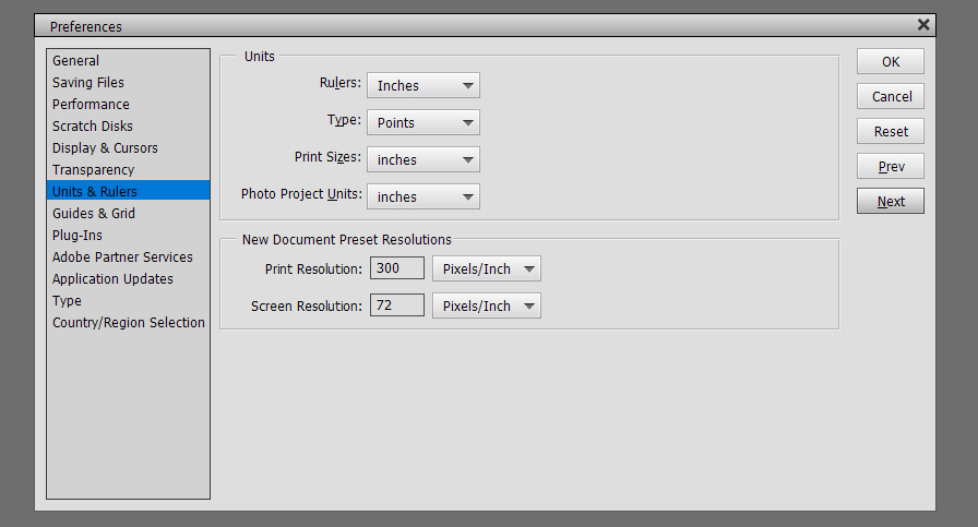
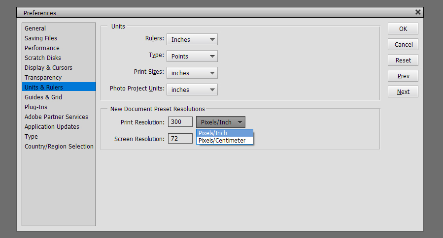
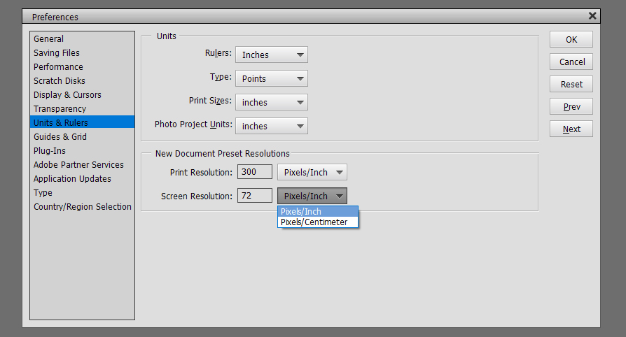
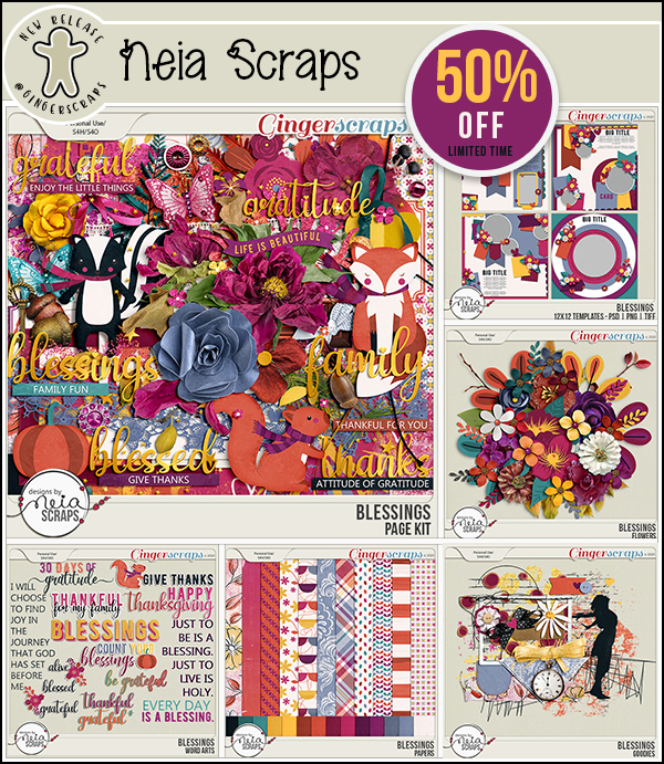
Jazzing Up a Neutral Background
![]()
Let’s see how NOT trying to outsmart WordPress works!
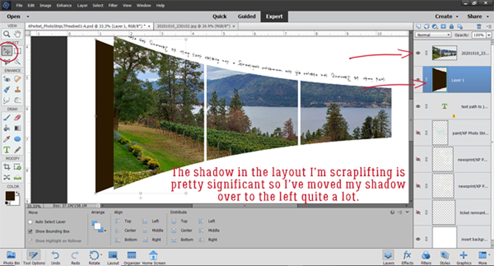
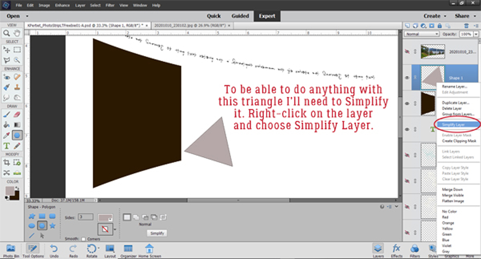
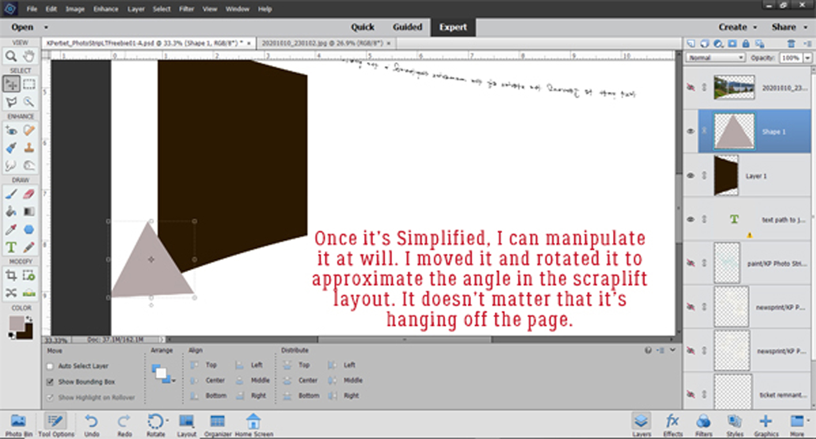
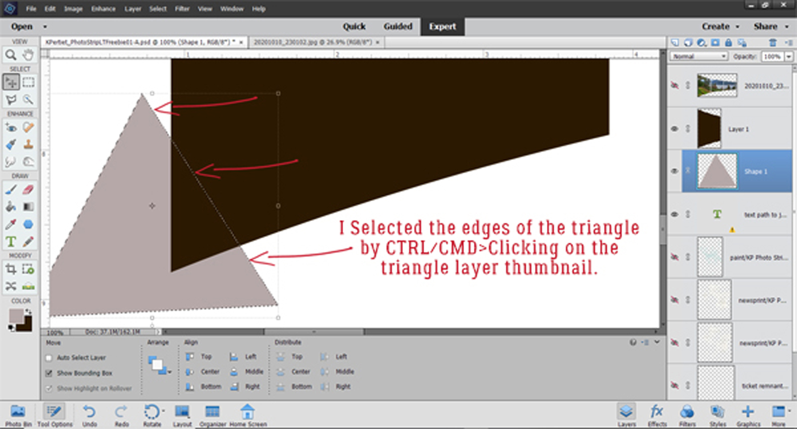
Let’s talk about personal style for a minute. We’ve all got our own preferences when it comes to how we construct our layouts. I like neutral backgrounds and am totally lost (terrified is more like it!) when it comes to using papers with bold patterns. But at the same time, I often feel that using a plain paper or cardstock leaves my layouts looking a little unfinished. So you’ll notice that I add some sort of border to most of them. When I looked at this month’s Bake Sale I was delighted to see that Lindsay Jane had a set of her Edge It border masks in there that I didn’t have. She also has a line of simple doodled borders I’ve been collecting. But she’s not the only one who creates gorgeous borders. Most of our talented designers have border sets in their stores. Take a moment to check them out!
Anyway, I thought I’d show you how to take a simple piece of cardstock and make it into an eyecatching background using borders.
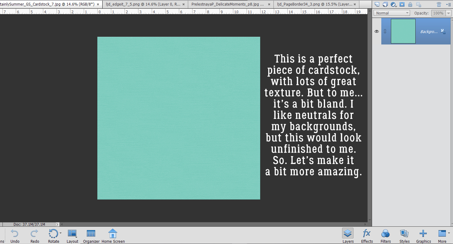
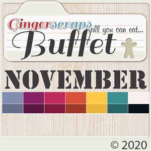
This cardstock came from a GingerBread Ladies collection called Certainly Summer. I like it a lot because it’s got a nubby texture to it. But it’s PLAIN otherwise.
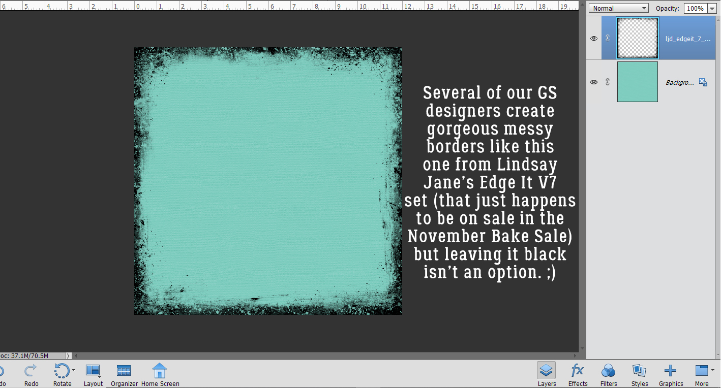
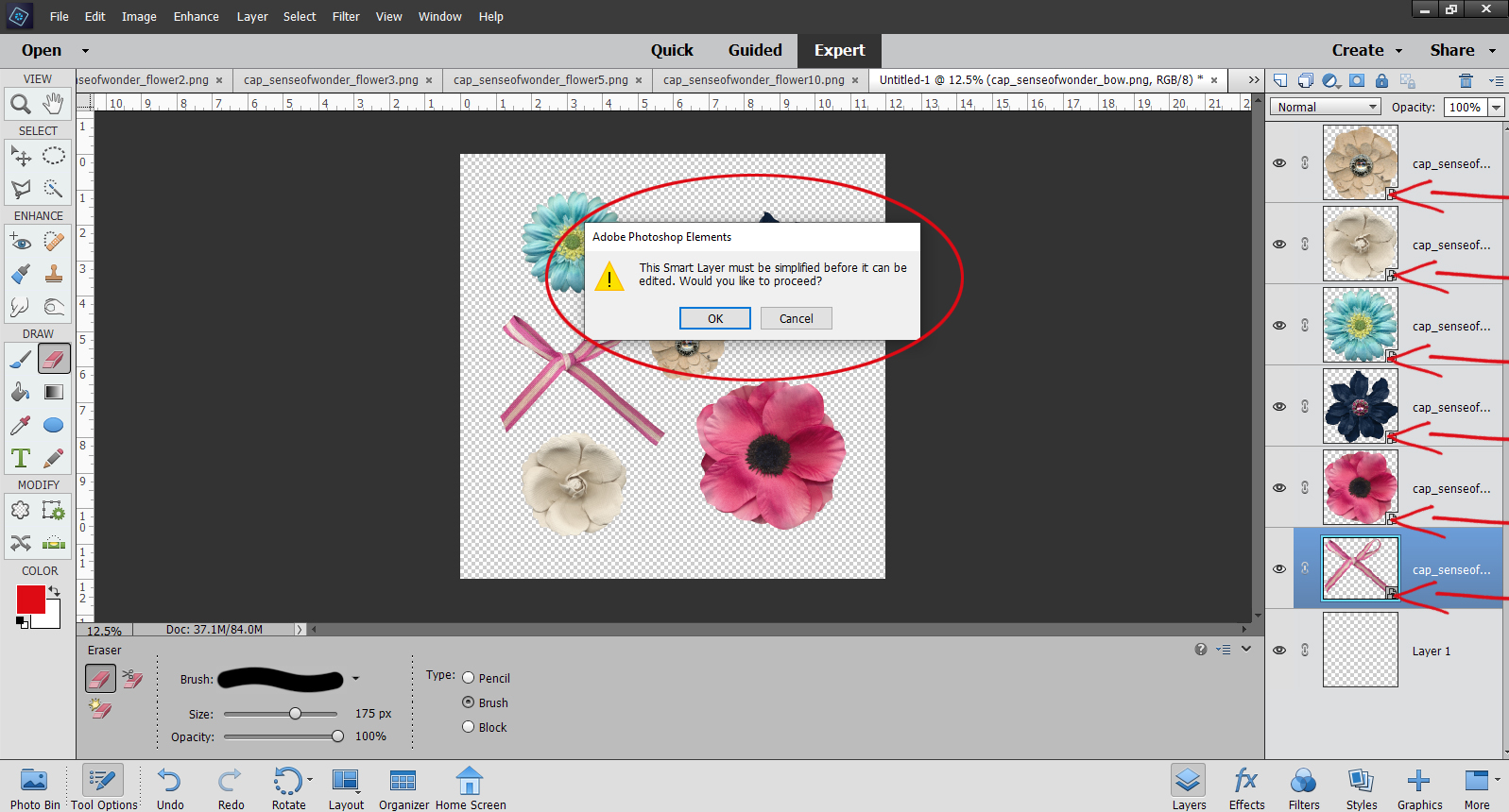
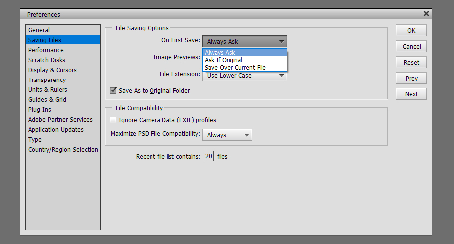
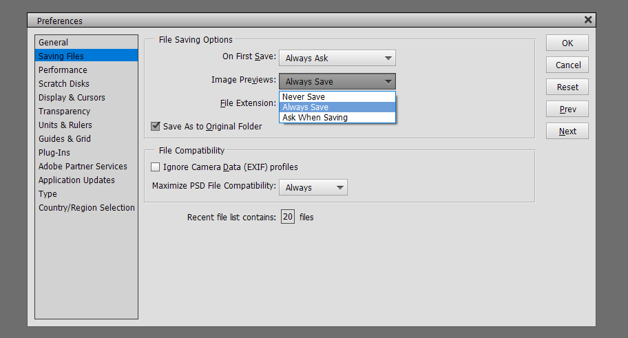
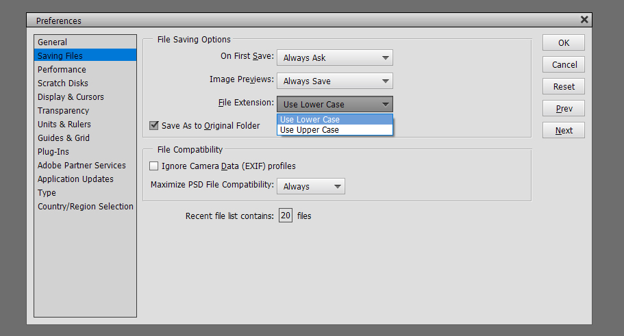
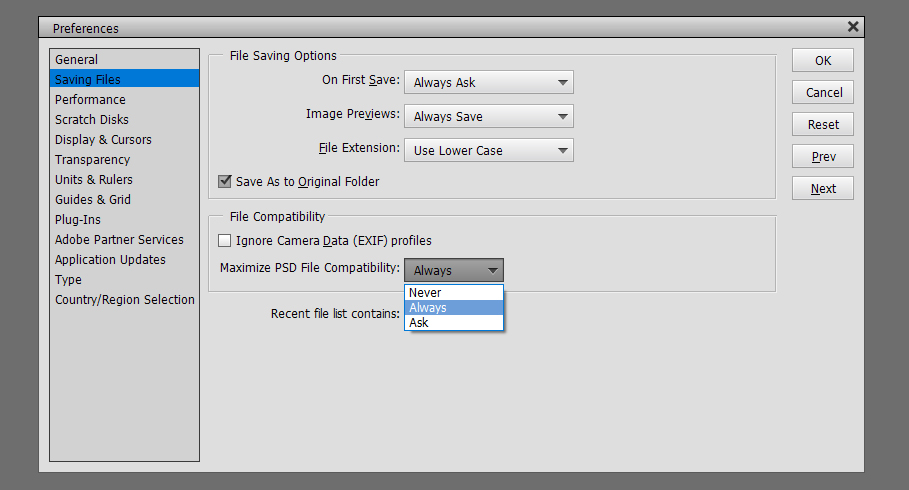
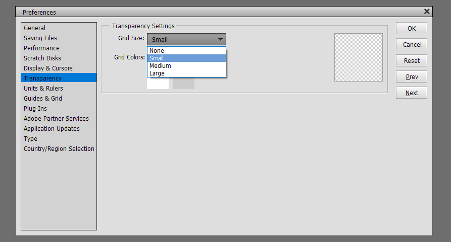
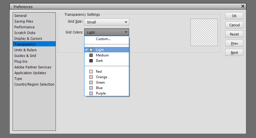
Here’s one of those border masks from Lindsay’s Edge it V7 pack. (Yes! The set of 6 is on sale until November 20, 2020 for the incredible sum of $1!) Of course, it’s black in its original state, and that isn’t the look I’m after…
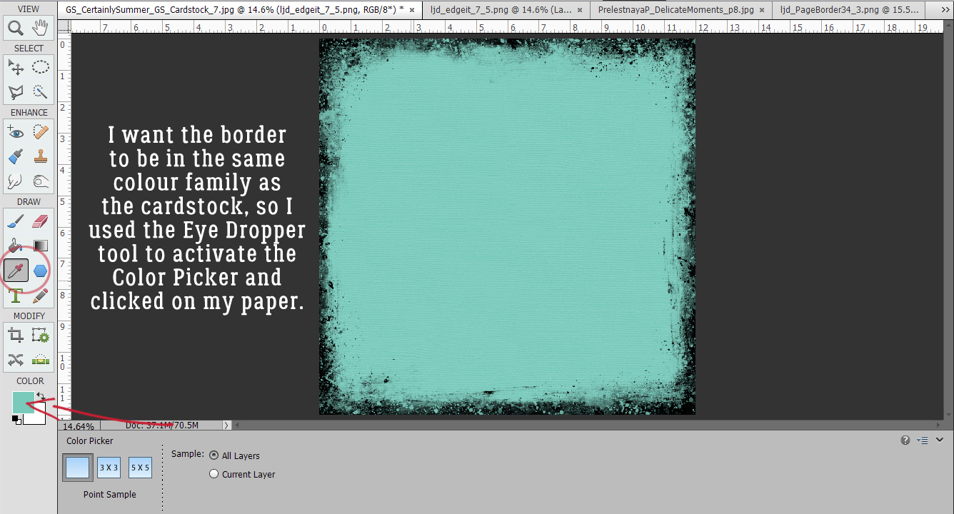
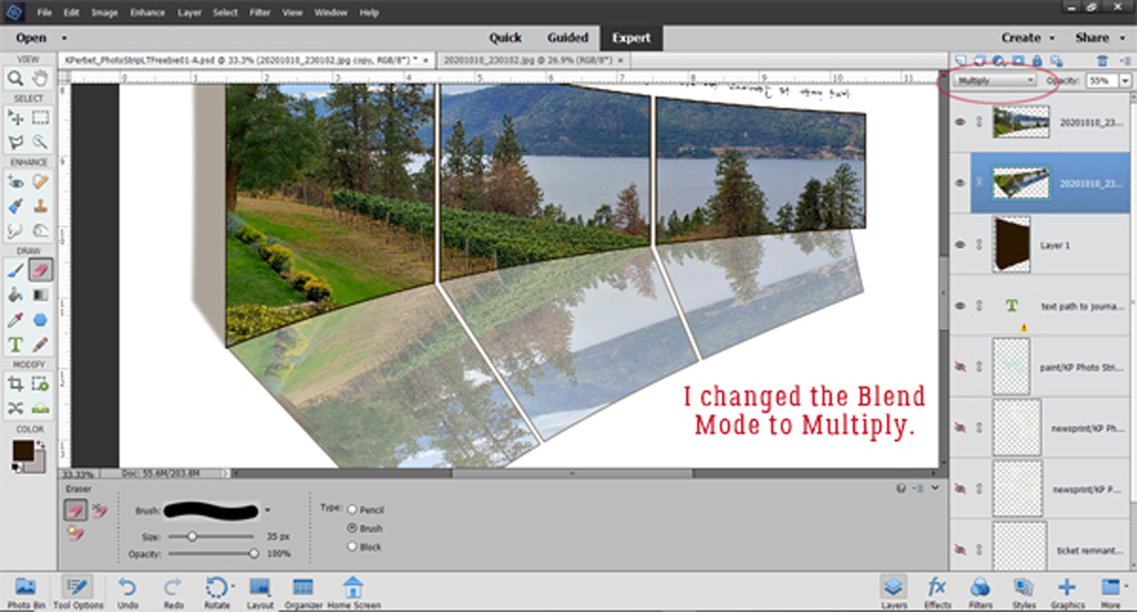
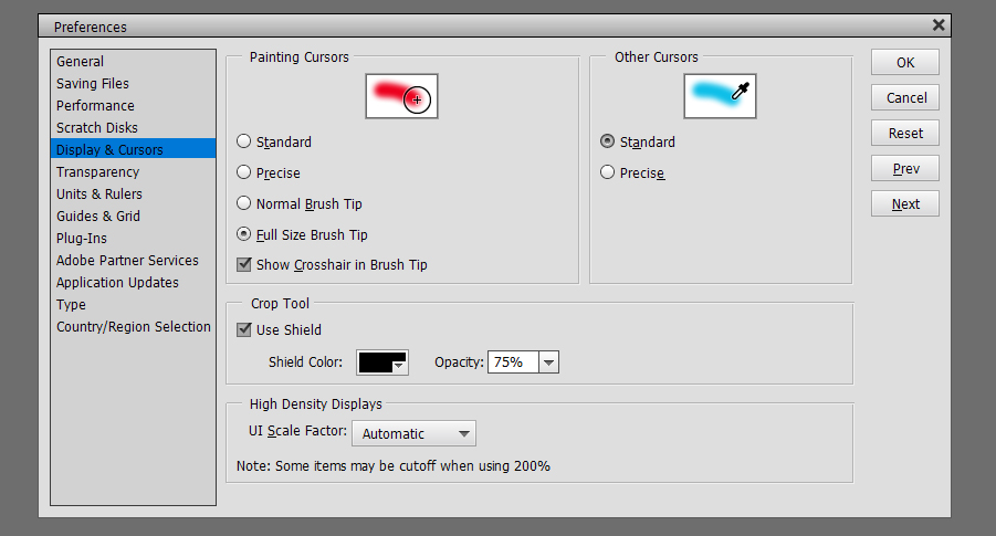
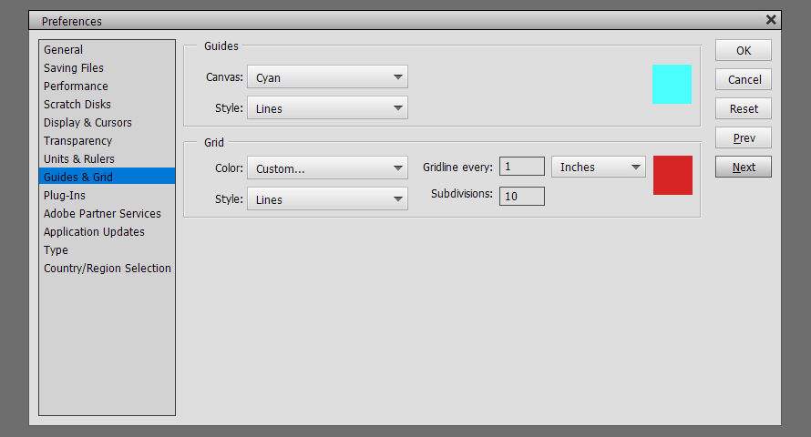
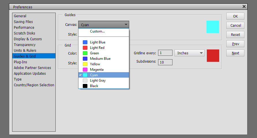
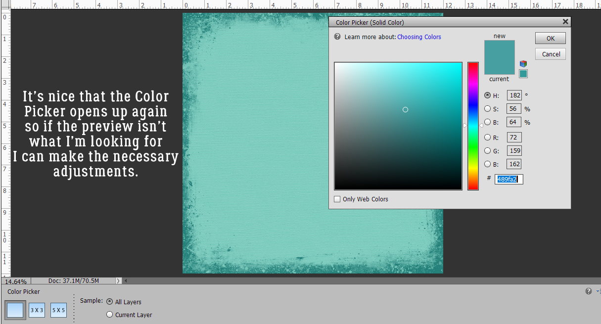
Contrasting borders look great in certain situations, but I really like monochrome looks a lot, so I grabbed the Eye Dropper tool and clicked on the cardstock to activate the Color Picker to keep my border in the same colour family.
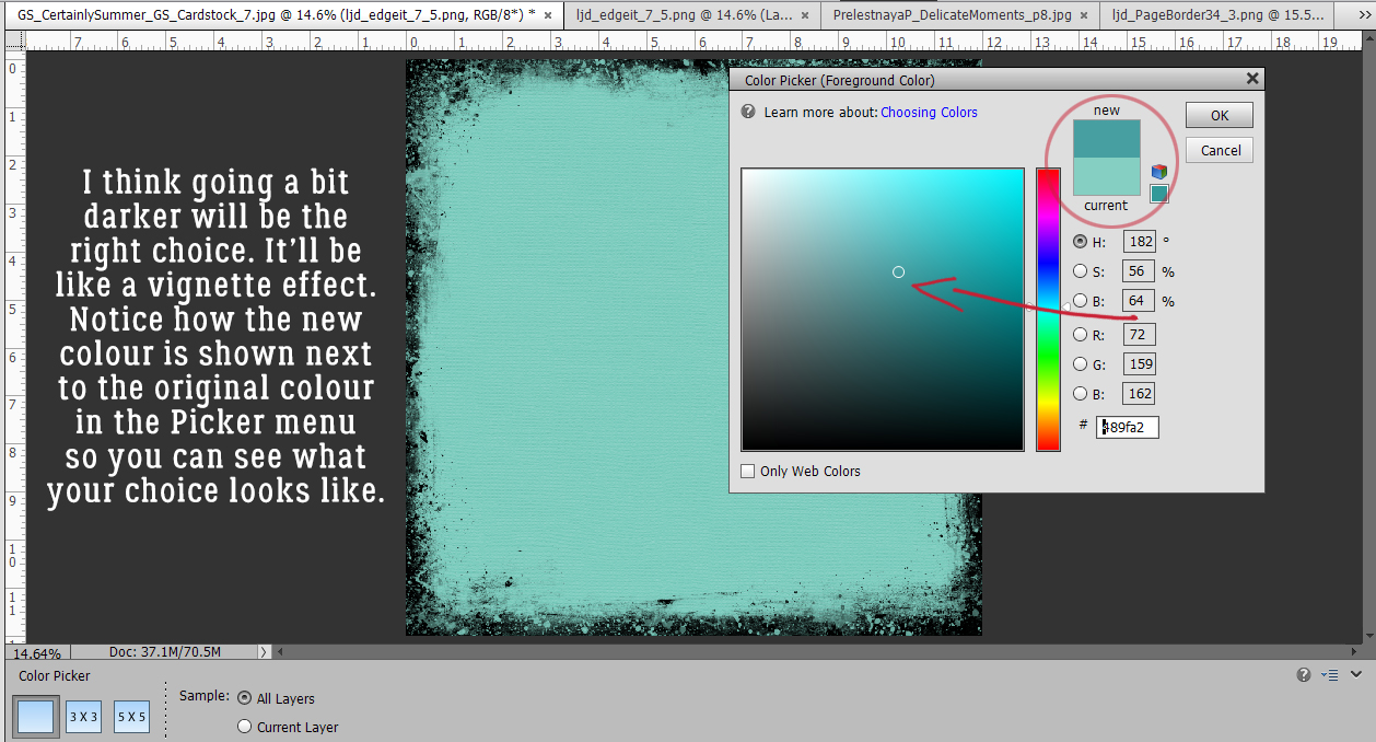
By going just a bit darker, I can turn this border into almost a vignette-like look. I love that I can see the contrast between the current colour and the colour I’m choosing.
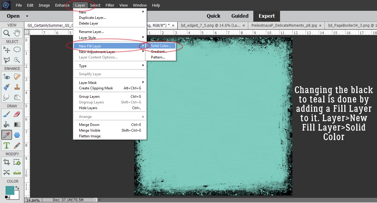
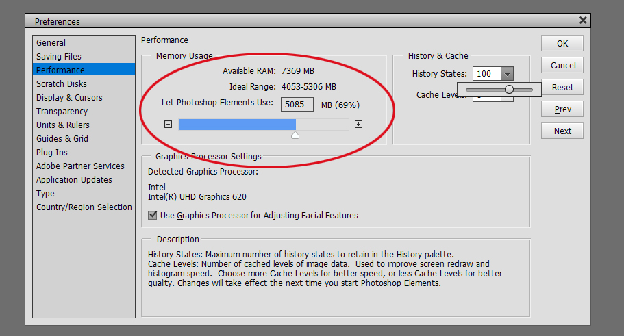
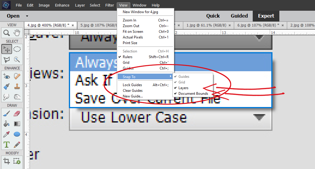
To get that new darker teal onto the border mask, I’ll click Layer>New Fill Layer>Solid Color.
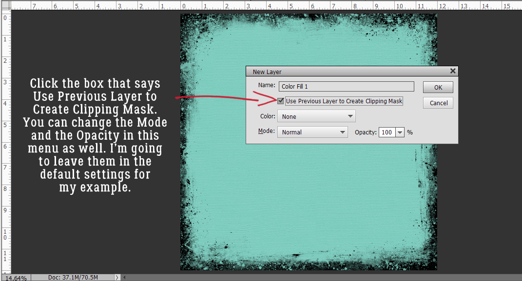
The menu takes a lot of the work out of the process by letting me Use Previous Layer to Create Clipping Mask. In one step I can turn just the border a different colour.
This time when the Color Picker opens, Elements shows me what the new border will look like, and it gives me the option of changing it if it doesn’t please my eye.
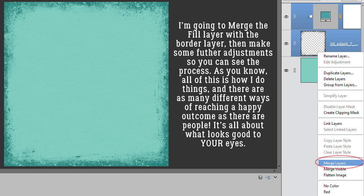
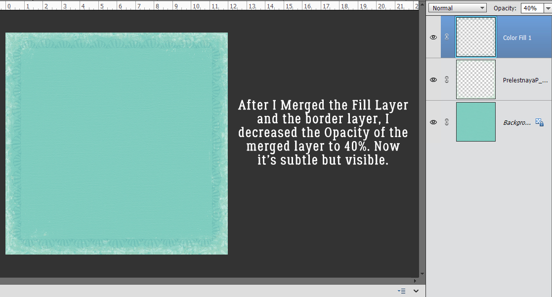
I want to have control over the border as it is with the new colour filling it so I Merged the two layers. I love how it’s coming along.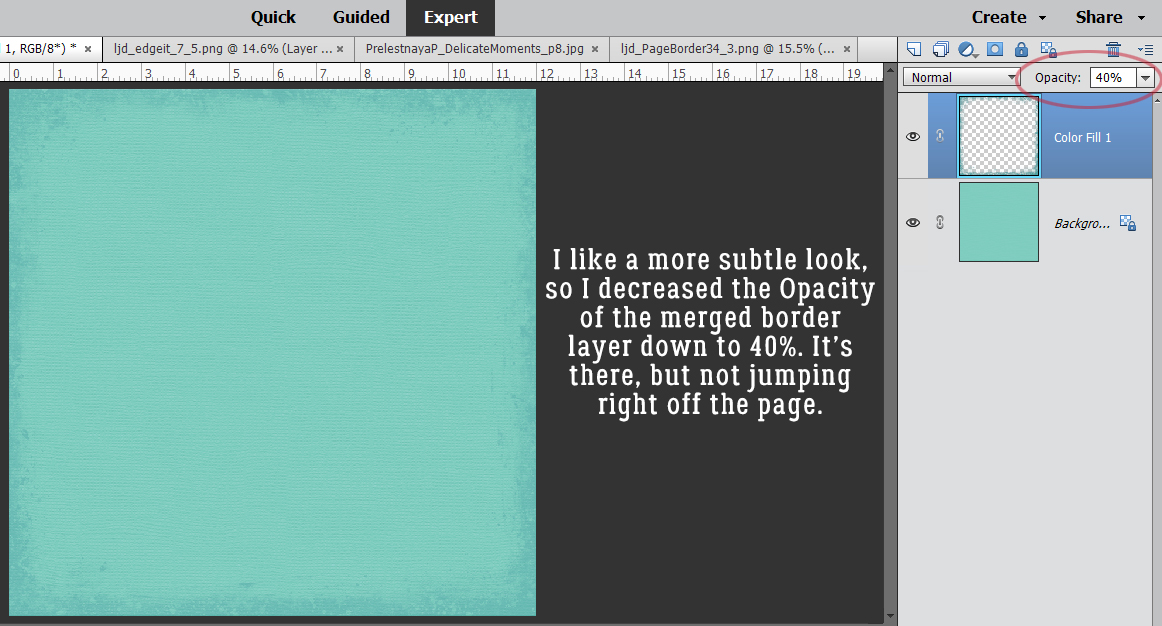
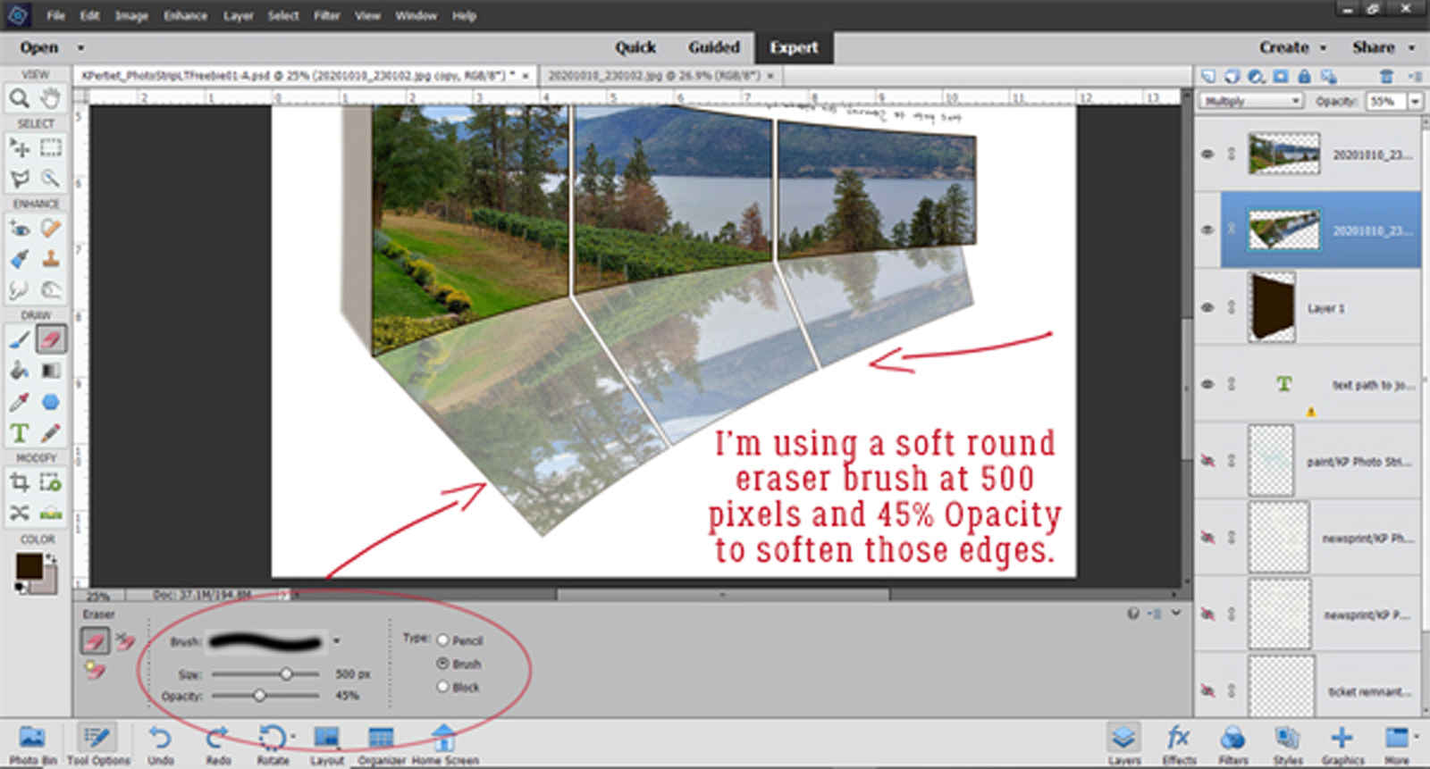
But it’s still a little bright. Wanting subtlety, I decreased the Opacity to 40% and like how it looks.
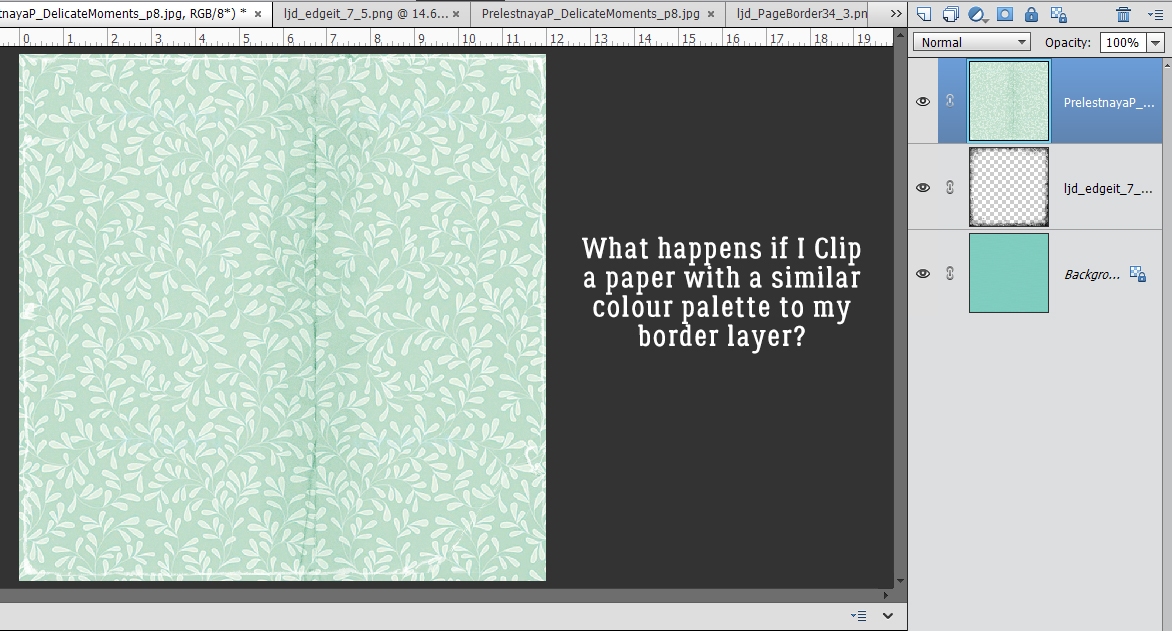
But what would it look like if I clipped a paper (from PrelestnayaP‘s Delicate Moments) to that border? (Or to one of the borders in Irina‘s kit?) Let’s see!
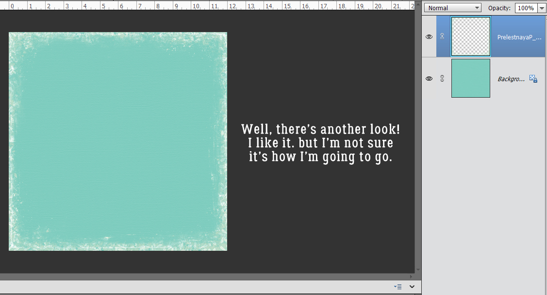
Here it is, clipped to the border and the two layers Merged. I think it looks a bit like snow, with the pattern indistinct. Hmm.
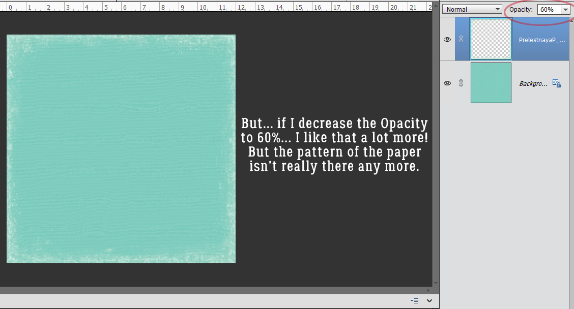
If the pattern isn’t a factor, maybe if I decrease the Opacity to 60%? That’s nice and subtle.
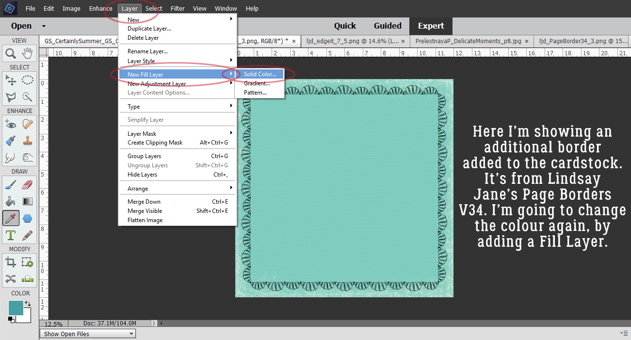
Here I’ve added a doodled border from Lindsay Jane’s Page Borders V34. I’m going to 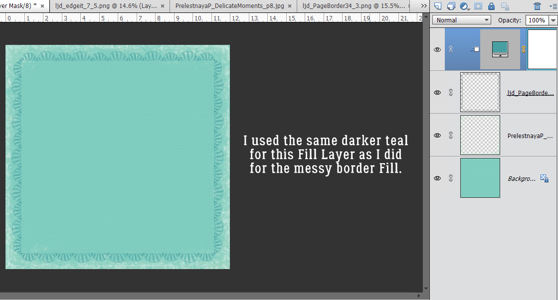 it with the same darker teal that I used before.
That looks pretty!
After I toned it down a smidge, the outer border looks a lot more interesting.
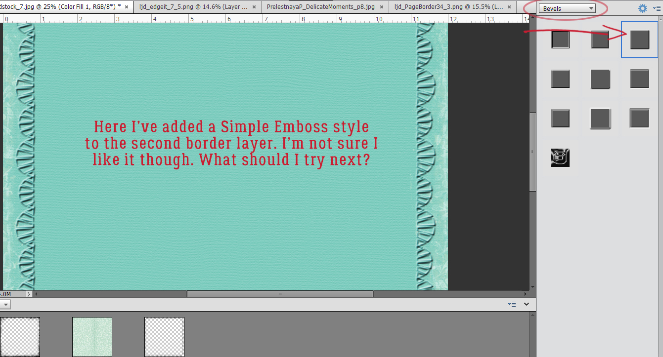
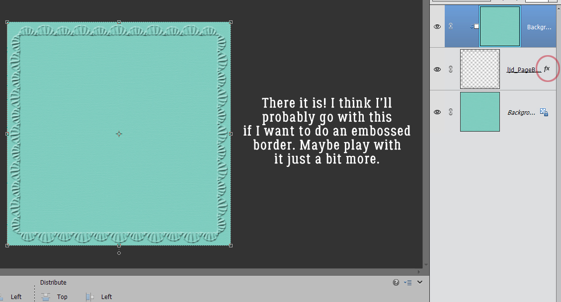
What happens if I add a Bevel Style to that doodle border? The best Bevel for adding visual interest in this situation is the Simple Emboss. I think it’s a bit heavy-handed though.
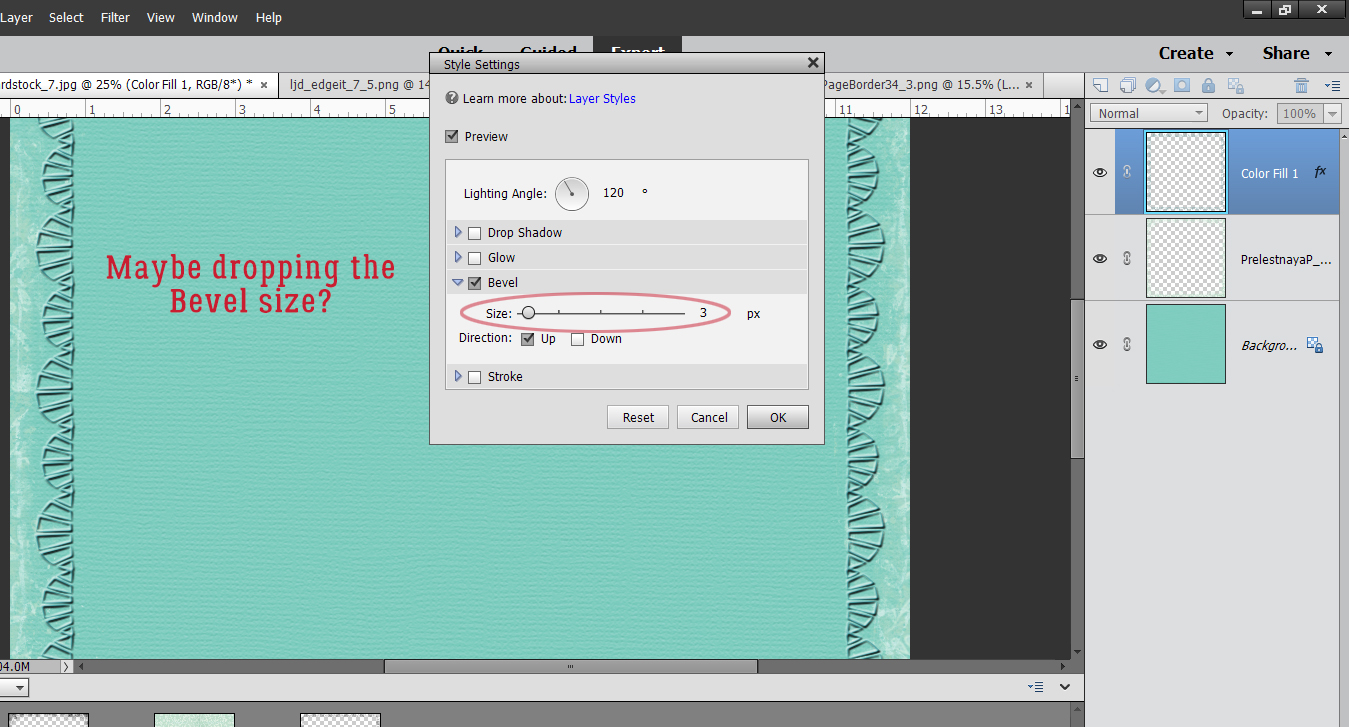
Layer Styles are adjustable, so if you don’t like what you see, play with it! I double-clicked on the fx symbol on that layer and opened up the adjustment menu. Then I dropped the size of the Bevel to 3 pixels. (Default is 21 pixels.) I think it still looks a bit sharp though.
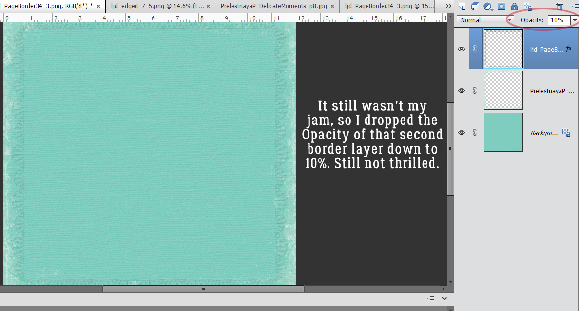
So I decreased the Opacity of that layer to 10%. Better. But still not what I want.
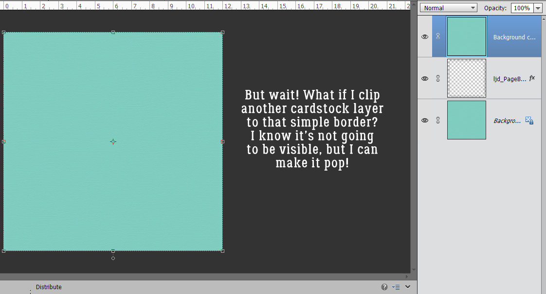
I ended up removing the messy border layer to showcase the embossed border better. And now I’m going to clip another cardstock layer to the embossed doodled border layer.
That looks pretty good, but still too in-my-face. So now what?
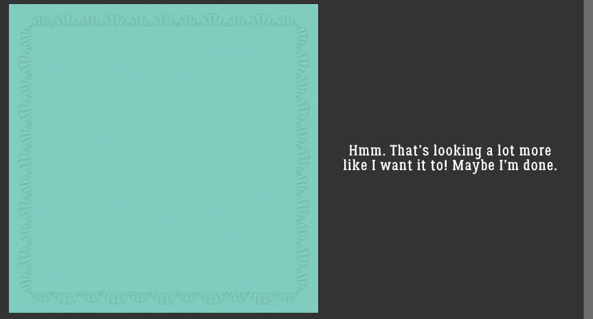
With the Opacity at 10% I have a nice, soft embossed border!
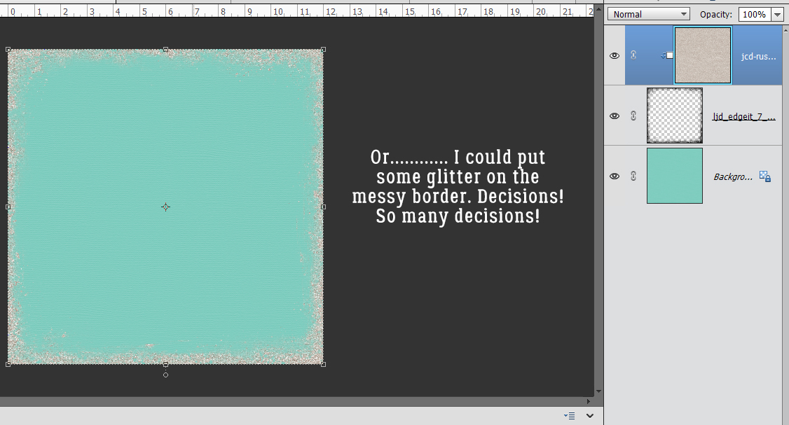
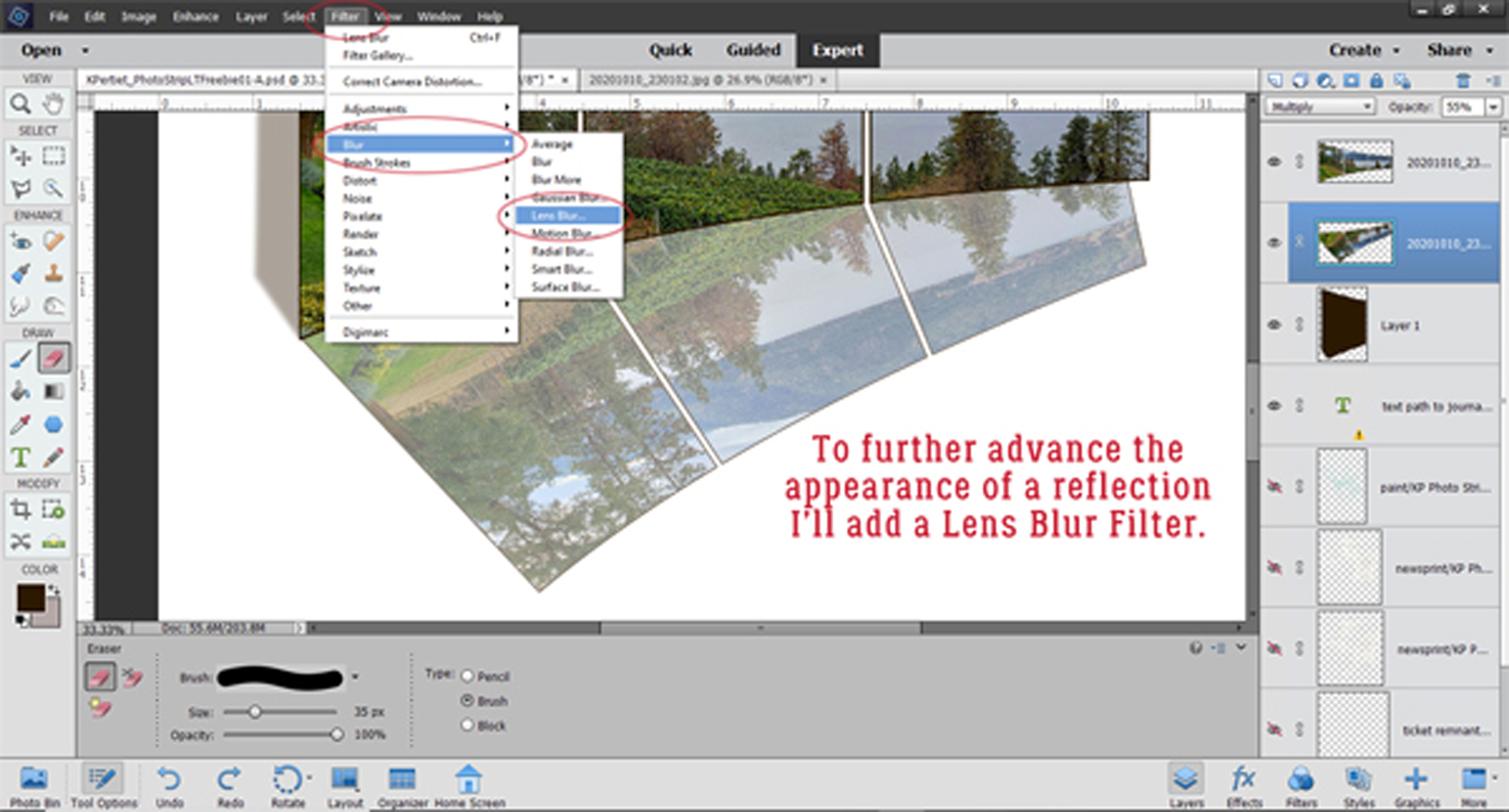
But before we go, let’s see what it looks like if I add some glitter to that messy border. This can be either by using a Glitter Style or by clipping a sheet of glitter paper to the mask. Yes! That might work for a fancy layout!!
There are so![]() many ways to find our own style!
many ways to find our own style!