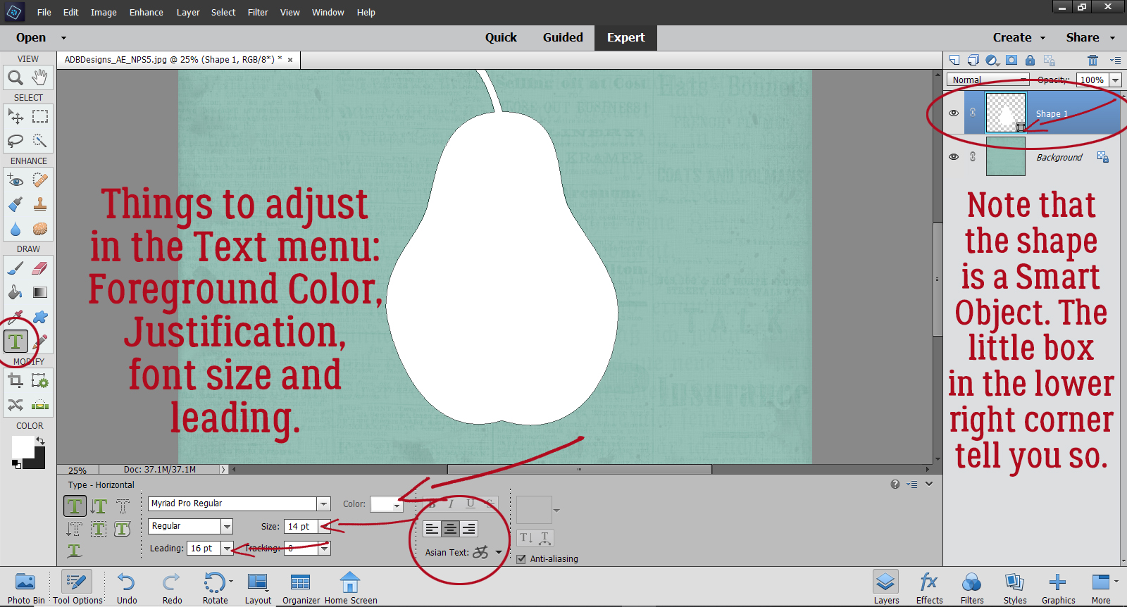
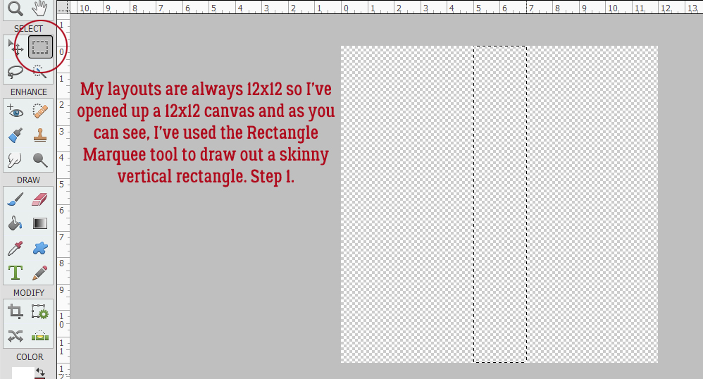
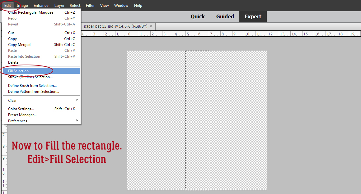
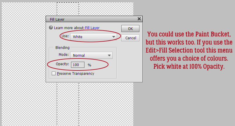
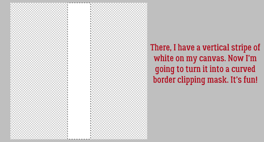
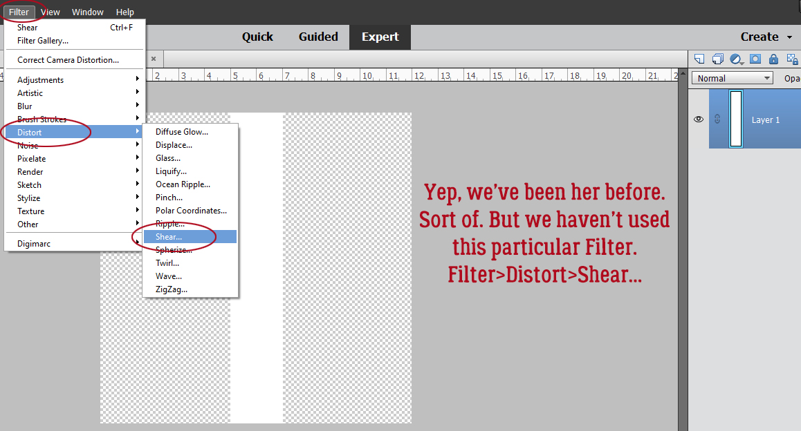
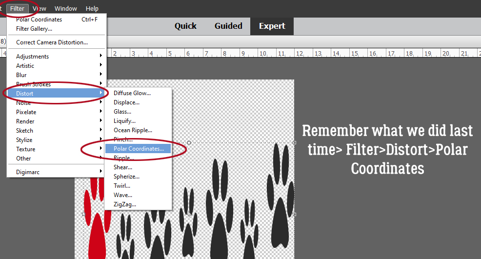
3D Photos – Yes, You CAN!
![]()
Thank you all so much for your kind messages of support! I feel a lot better, although I really poop out quickly if I’m doing something strenuous. And brain fog is a real thing. I’m thankful that my husband and son didn’t catch COVID from me and that we’ll all be vaccinated soon.
So, given I’m still having some issues with concentration and attention, I’ve whipped up a little trick I’ve been thinking about for a long time. I’m going to show you how to give a photo a 3D look. It’s not exactly what I was trying for, and I may play with it some more, but it’s still a neat look. The inspiration for this goes back a long way, to a Canadian TV show called Ancestors in the Attic (2001-2006), where the images on the screen had an obvious 3D look to them. I didn’t quite get it right, but I like it anyway.
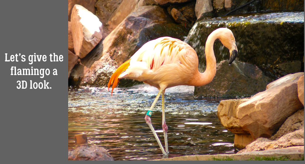
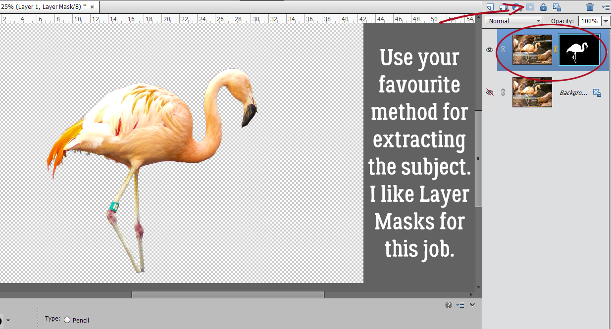
If you decide to try this, I recommend looking for a photo with sharp contrast between the subject you want to bring forward and its background. I chose this photo I took in Las Vegas quite a few years ago. The flamingo wasn’t too difficult to extract. I’m not going to do a step-by-step review of extracting, but you can try any of the methods I’ve shown you here and here. I went with a Layer Mask so I wouldn’t have to think too much!
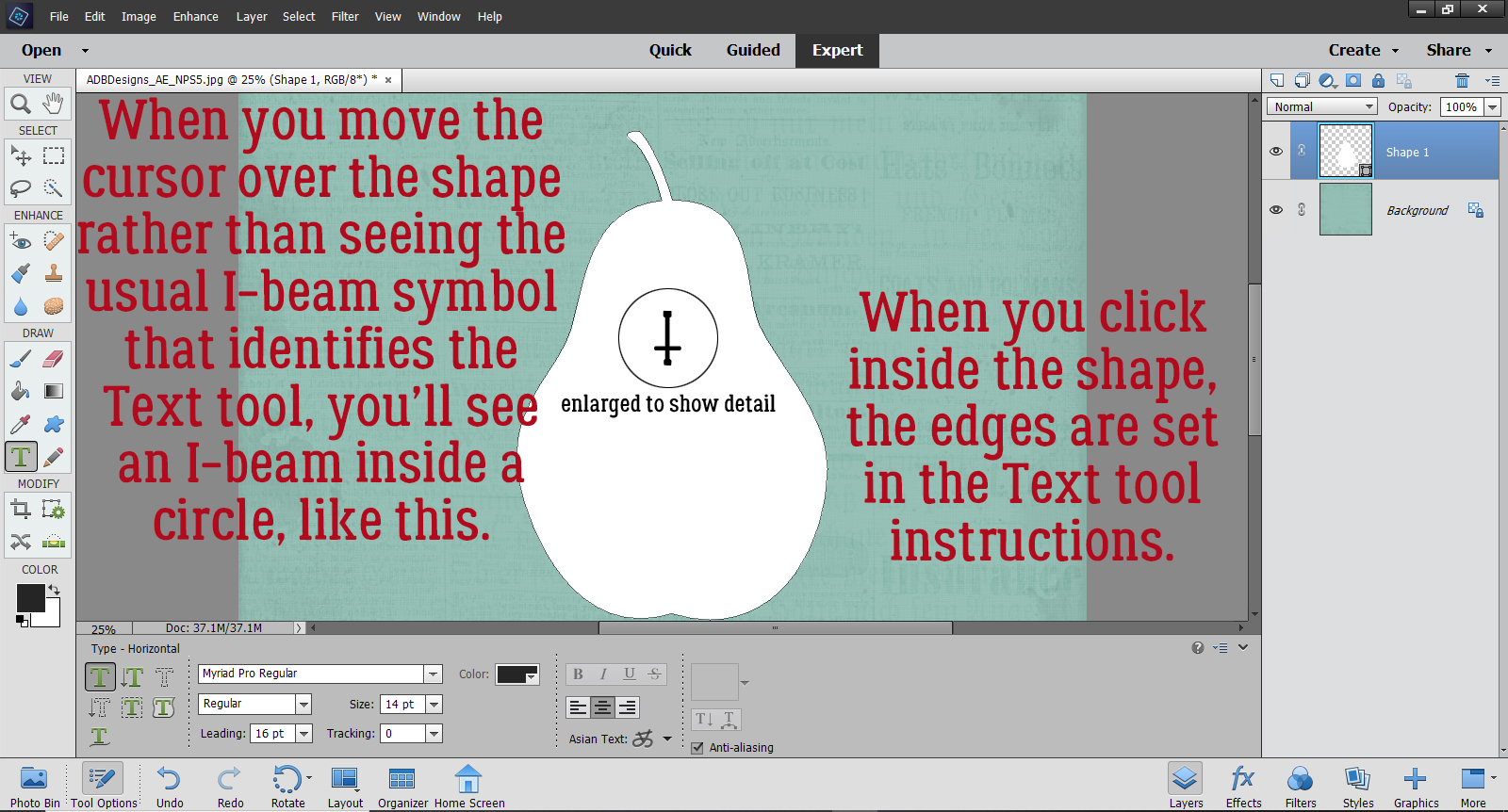
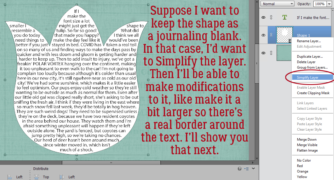
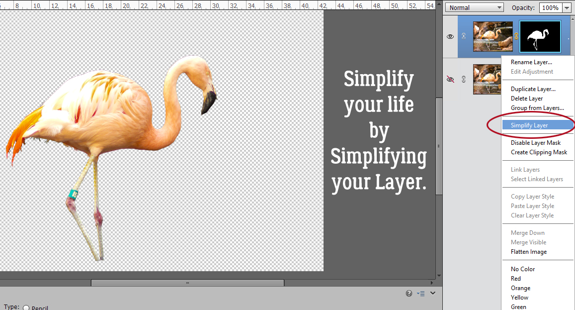
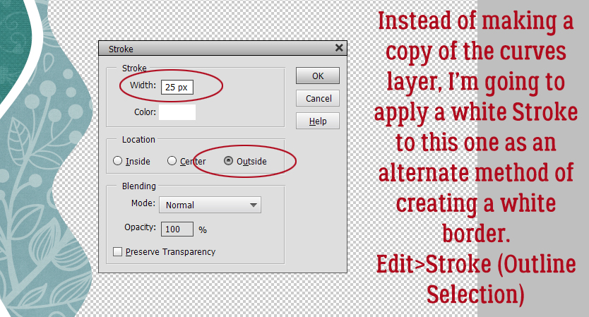
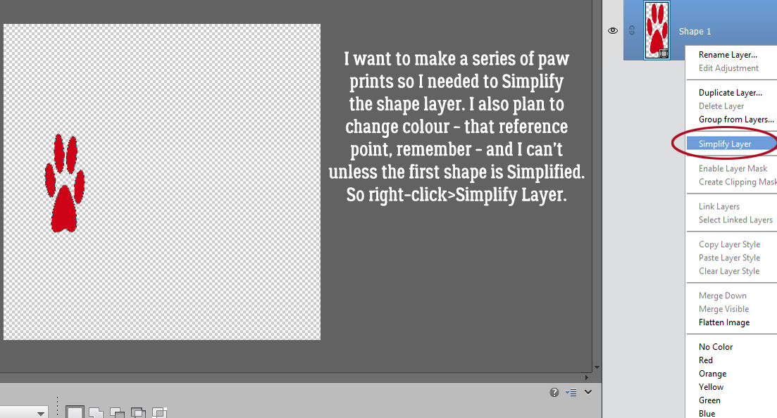
To be able to have the control needed to go forward, I Simplified the extraction layer. Right-click on the layer in the Layers panel, then choose Simplify Layer.
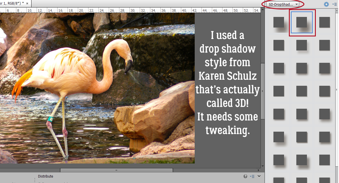
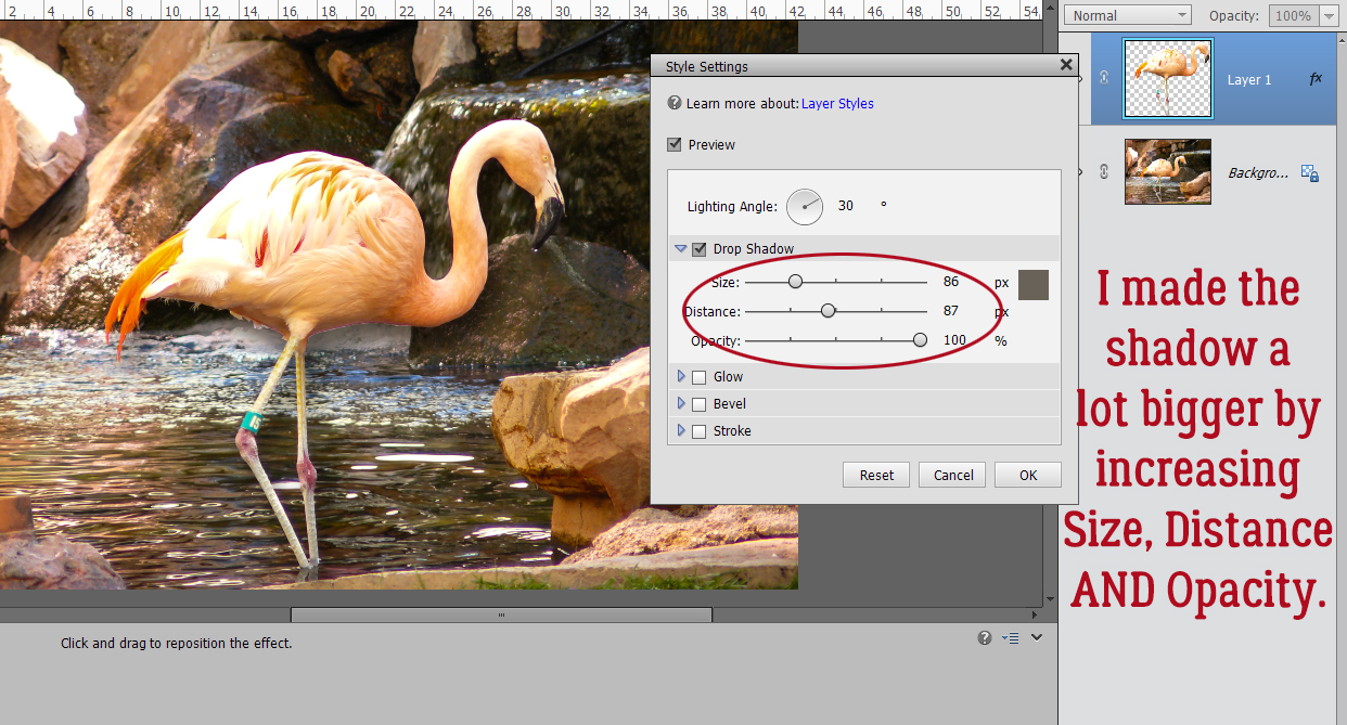
Next I added a drop shadow, using a shadow styles set from Karen Schulz. (It’s named for Snickerdoodles Designs, her former moniker.) In this set there are actually two 3D shadow styles, right at the top of the list. I chose the second one. It’s not quite right, but easily fixed.
To adjust Layer Styles, double-click on the fx symbol on the layer you’re adjusting. This menu opens up with the defaults for the style you used. First, I made sure the shadow on my flamingo was falling in the same direction as the shadows already in the photo. Don’t overlook this step! Otherwise it’ll look really faked. I increased the Size (which softens the edge), the Distance (which makes the shadow wider/larger) and the Opacity. I went all the way to 100%. The 3D effect shows now.
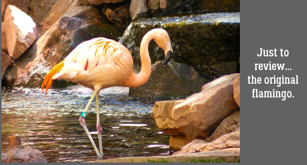
Here’s the original for comparison purposes.
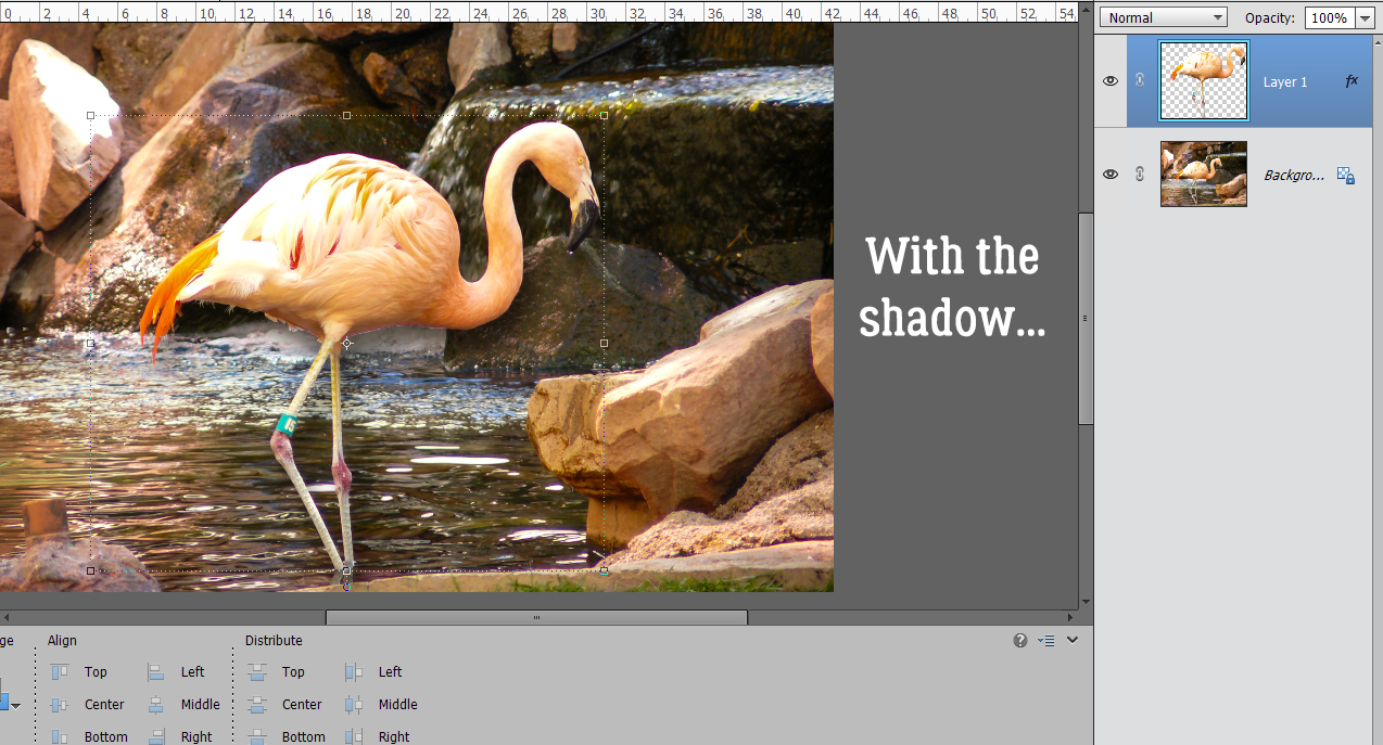
And with the extraction and shadow…
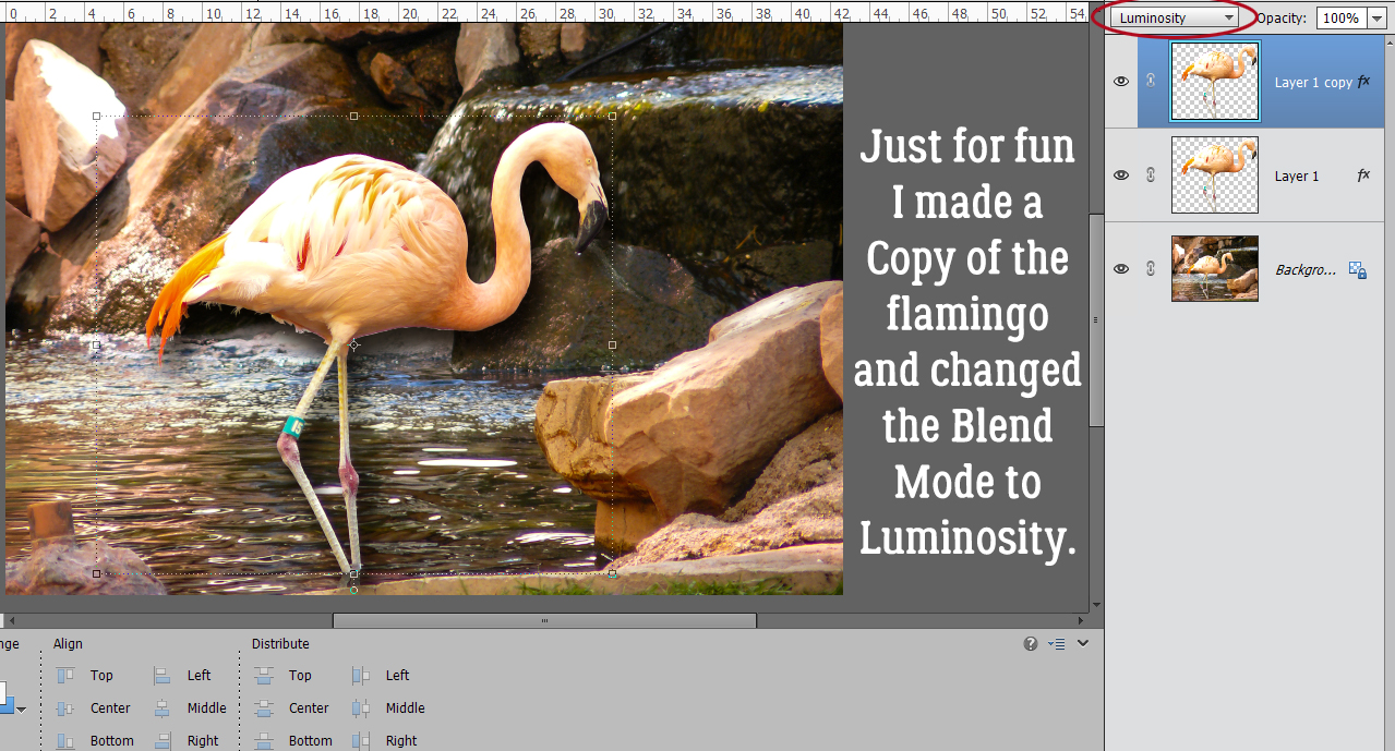
Then, just for fun, I Copied the extraction layer and changed its Blend Mode to Luminosity. What do you think?
I might try this with a photo of the mountains we see from our deck, and maybe I’ll be able to fine-tune it. Who knows? It’ll be fun trying it.
Here is the PDF version of this tutorial: https://bit.ly/3h2BEFb
![]()


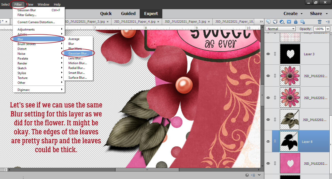
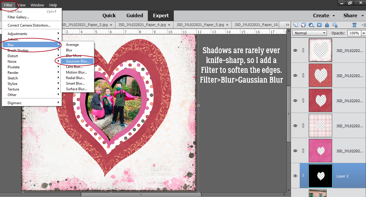
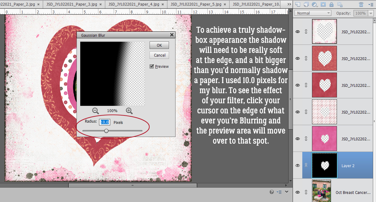
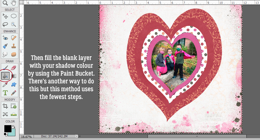
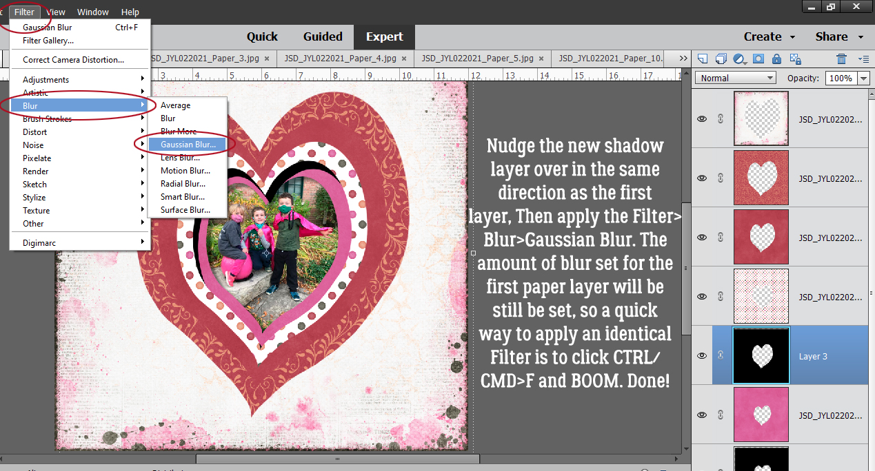
 Apply a filter by clicking Filter>Blur>Gaussian Blur.
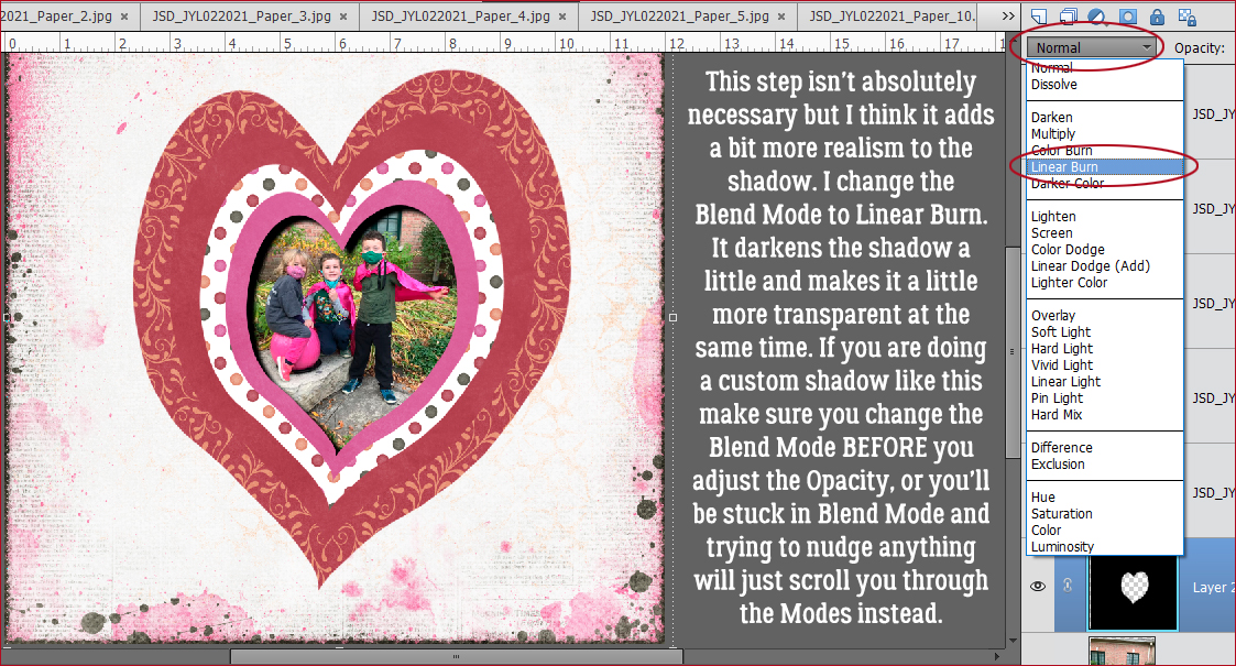
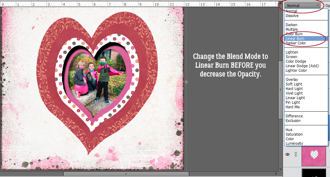
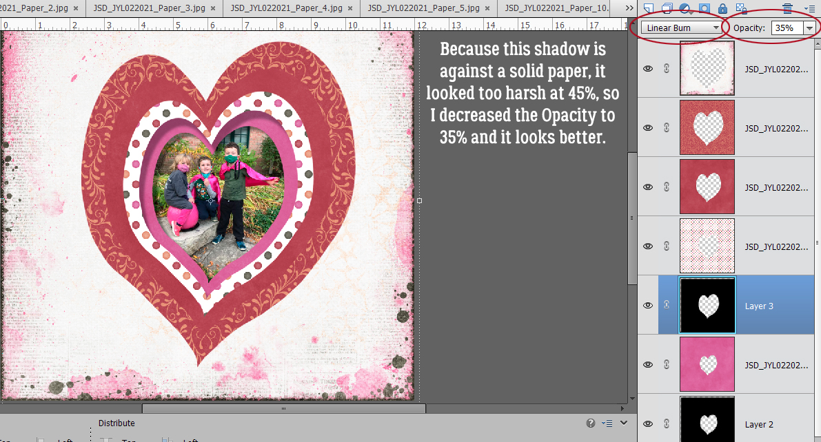
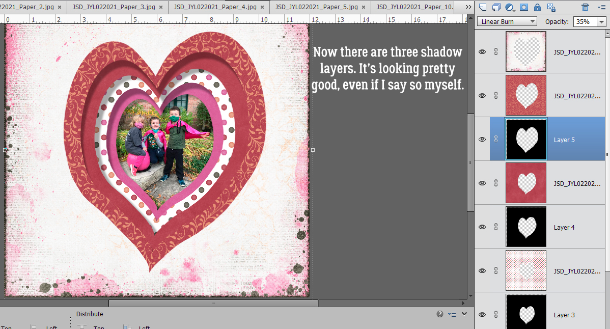
 Change the Blend Mode to Linear Burn.