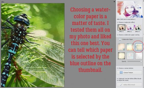
Another Paper-Scrapping Digi-Hack!
![]()
Are y’all enjoying GingerScraps‘ Eleventh Birthday Bash?
So, I was wasting a rainy Sunday afternoon browsing Pinterest, trying to ignore the chill in the air and looking for distraction. And suddenly, there was some inspiration for a tutorial (as soon as I figured out how to do it!) for another digital version of a paper-scrapping technique. And it builds on the heat-embossing tutorial from last week, so it seemed like it was meant to be. Here’s the photo that caught my eye, from the Stampin’ Up design team. Do you see where I’m going?

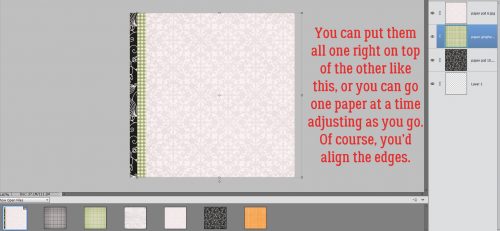
If you’ve read any of my other tutorials, you’ll know that I like to do things like this on their own canvas, and I like to work large, then make small. To that end, I opened up a 12×12 canvas on my workspace. Then I browsed through my brush collection until I found a great set of snowflake brushes that came from a former GS designer, Pretty in Green.

I like the look of my inspirational image so I’m going to use black, but of course you do you!

I enlarged the brush to its maximum size. It can always be resized later (as long as it’s on its own layer).

Then I dropped a tonal paper from Connie Prince‘s pretty Snowflake Kisses kit UNDERNEATH the brush layer.

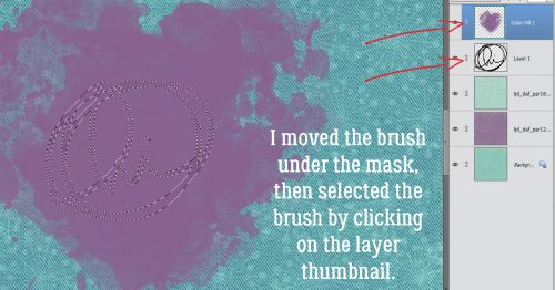
I’m not going to pretend that the next few steps didn’t take a lot of trial and error to get it right. The first step is to click on the Layer Thumbnail of the BRUSH layer to select the edges of the brush.

Then I clicked Select>Modify>Expand to make the selection bigger.

Here’s where the take-a-guess-and-hope-for-the-best comes in. I want all the various parts of the brush area to be contiguous with the others. I finally settled on 75 pixels.

Because the brush was designed by a human and not a machine, the hearts weren’t exactly and precisely spaced away from the solid line outline so the pixel width had to accommodate for that in order to eliminate the gaps. When you try this yourself you’ll soon see what I mean. But the gaps can’t stay, they mess up future steps so getting it right now is vital.

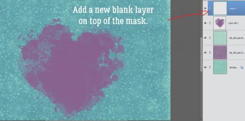
I played with this whole technique for several hours before I got it all settled in my head. I want the paper to be a solid background for the brush, and that meant I had to eliminate those “coffin” areas. I knew I’d have to ensure there are NO tiny little open areas in the paper when I “fussy cut” it, so to make sure I got the job done in the most efficient manner I put a blank layer in between my paper and my brush. (If you look closely you can see the marching ants around the edges of the selection.)

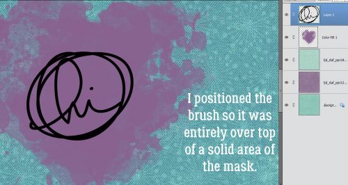
But first I had to fill the selection to be able to see where the little gaps might be. On the blank layer, I chose the Paint Bucket tool and my black foreground. Then I clicked on a random spot inside the snowflake shape.

Of course, the marching ants still outlined the “coffins” so they’ll have to be manually filled.

To turn off the marching ants, you can click Select>Deselect or you can use the keyboard shortcut D.

Then I went back with the Paint Bucket and filled in each “coffin”. After they were all filled in, I clicked in several more random spots inside the outlined area to fill in as many of the invisible gaps as I could.

Then, just because I had tried to make this technique work as simply as possible about a dozen times already, I zoomed in on my black snowflake and using a black round brush, I covered up any remaining gaps.

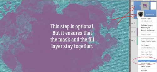
There are two ways to use this shape as a clipping mask. This is the labour-intensive way. With the PAPER layer active, click on the mask Layer Thumbnail to select the edge and get the marching ants. Then click Select>Inverse (CTRL/CMD>Shift>I) to have the PAPER selected, not the shape.

Now you can Edit>Cut (X) the paper surrounding the mask away.

Now the mask layer can be Deleted. (Obviously, to Work Smart Not Hard, I could have moved the mask layer below the paper layer then Clipped the paper to the mask… which is what I did with the second example below. Live and learn!)

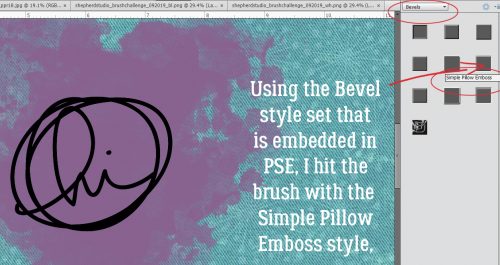
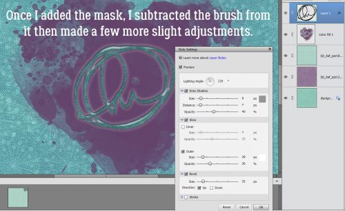
To get the flocked look on my brush, first I applied a Bevel Layer Style. Just as I did last tutorial, I clicked on the Styles button at the bottom of the Layers panel, then chose Bevels>Soft Pillow Emboss.

The default settings are fine, so on to the next step.

It’s a really good idea to Simplify layers when you’re planning to layer Styles, like I’m going to do here. Otherwise that bevel could disappear.

Several GS designers create Style sets to go with their collections but Katie of Just So Scrappy/Ooh La La Scraps is the only one who has a FELT style. I used JSS Lucky Me‘s black felt.

Look at that! And I Simplify…

Now to do the digital version of “fussy cutting”, which leaves a thin white edge around the image. Super simple with a Stroke! Edit>Stroke (Outline Selection)

I just pulled 30 pixels out of the air and applied it to the INSIDE of the edge.

For those of you who have paper-scrapped, you know how the Stampin’ Up designers got the elevated look with their ornament cutouts. They used double-faced foam tape. Digitally, it’s a simple shadow! If you need a refresher on creating custom shadows, you can find my quick-and-easy method here. It starts with a blank layer UNDERNEATH the cutout.

I clicked on the cutout Layer Thumbnail with the blank layer active.

Then I Filled the outline with black.

So there’s the basic shadow layer. Clicking D gets rid of the marching ants and clicking V activates the Move tool.

I decided that I wanted a right-sided 30° angle on my light source so I nudged the shadow layer over as shown. To turn a flat black blob into something that looks like a shadow, it’s necessary to Blur it. Filter>Blur>Gaussian Blur it, to be more precise.

To see the effect the Blur filter has, you can click on an edge with the cursor and it’ll pop up in the box as shown. Slide the handle to the right until it looks good to your eye. I went to 11.1 pixels.

I always change the Blend Mode for my shadow layers, which will change the transparency and the overall effect, but it’s an optional step. With this one I used Color Burn. It’s important to do this step BEFORE you adjust the Opacity, because the Blend Mode tool will stay turned on if you do it later, and then when you use your arrows thinking you’re going to nudge something, it isn’t going to move, but it might change colour or disappear altogether…

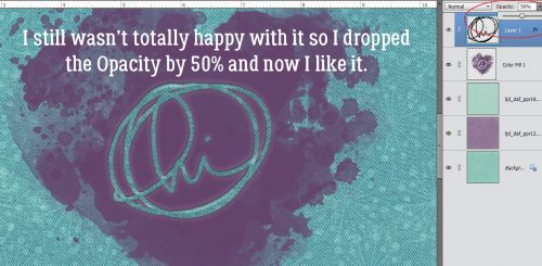
And then adjust the Opacity to what looks right.

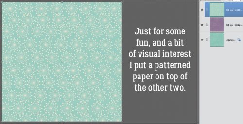
Then I went ahead and made a second snowflake cutout using (most of) the same steps.

When you have two objects overlapping, the shadow will look different where the items actually touch. So I used the Smudge tool (the one that looks like a fingertip) to push the shadow a little closer to the upper layer and to pull it away a little where there would be more space between the paper and the background. It’s subtle but it does make a difference. (Take another look at the inspiration photo if you’re still confused.)

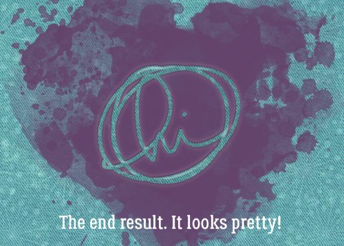
How did I do?
![]()