Fancifying Those Fonts
![]()
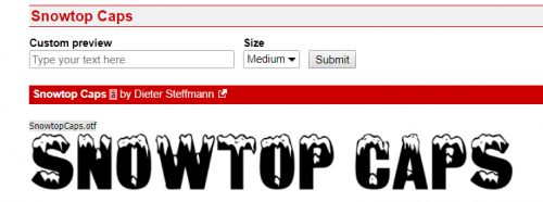
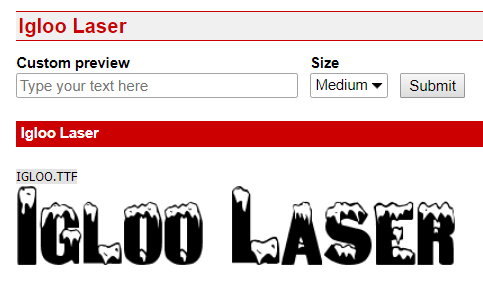
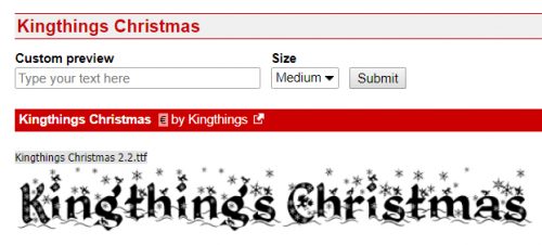
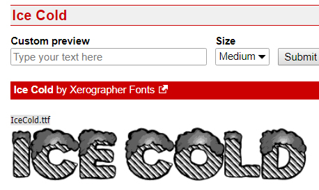
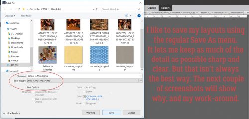
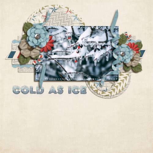
As promised, today’s tutorial is a demonstration of how to add some variety to your fonts. IceCold had the most options so I went with it for the layout I did up for the Mix It Up Challenge. I used a template from Jumpstart Designs that I’ve had forever and CathyK‘s Aviator kit.

If you’re a faithful reader, you’ll recall that I like to create my titles on their own work space so I can play around without distraction and without messing up anything on my layout accidentally.

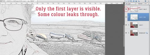
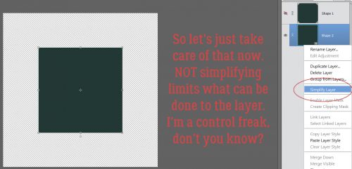
Before I can do anything to the text I first have to Simplify the layer. Right-click on the layer on the Layers panel then select Simplify Layer.

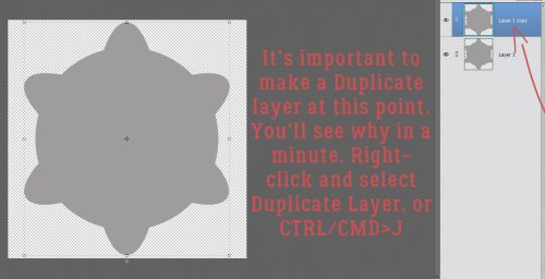
Because I never know where I might go with my experimentation, I like to make several copies of my original layer so I won’t have to recreate it later. Then I play with the copies. CTRL/CMD>J will make one copy for each time you perform the keyboard shortcut. Or you can right-click on the layer in the Layers panel and select Duplicate Layer. (Can you see why I use the WSNH – Work Smart Not Hard – shortcut?)

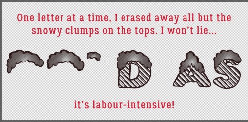
The first thing that occurred to me was to make the snow caps look like snow caps. I was originally going to just Erase the letter parts but thought better of it.

I added a Layer Mask by clicking on the icon that looks like a square of paper with a circle in the centre, right there in the middle of the icons at the top of the Layers panel. Why? Because if I go too far with my Eraser, I can easily change the tool to a paint brush and paint back the part I should have left alone. It’s as simple as toggling between black and white in the Color Selector. To know which color is the one you want, remember the phrase “White conceals, Black reveals“. Keyboard shortcut? Just hit the X key!

Then I started Erasing away the letters from the snow caps.

This part of my technique is VERY time-consuming. And it causes eye-strain too… but that never stops me from trying new things or writing tutorials about my experiments!
Is it just me or do these look more like eyebrows than snow caps?

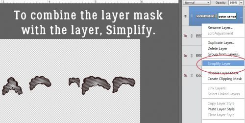
Once I had all the letter parts removed, I Simplified the layer. Same like with the font step. Otherwise, unless you’re paying particular attention (and I’m usually not… watching TV while I work is how I roll!) you won’t know what part of the layer you’re working on until you’ve committed some massive blunder and can’t reverse it. (Guilty as charged!)
Now I want to add some chill to my snow caps. In retrospect, I really didn’t need this step, but I have the screenshots so I’m going to show you because it does tie in with a later step.

To quickly and easily change to colour of fonts and text, just create a Layer>New Fill Layer>Solid Color. It will apply your new colour to everything selected.
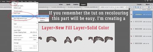
When the New Layer menu box opens, make sure the Use Previous Layer to Create Clipping Mask box is checked. If you don’t take that action, the whole canvas will be filled with that new colour.

I know the blue is impossible to see, and as I said, I really didn’t need to do this step. But can you see in the screenshot that I Copied the snow cap layer BEFORE I added the Fill layer to the original snow cap layer? That’s another WSNH tip. Only do things once!
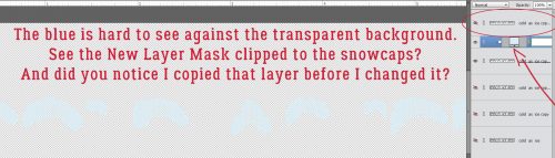
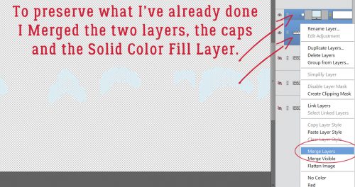
Again, you want to Merge these two layers in the same way and for the same reason you Simplify text and other Layer Masks. It’s to preserve what you’ve already done.
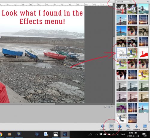
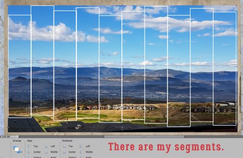
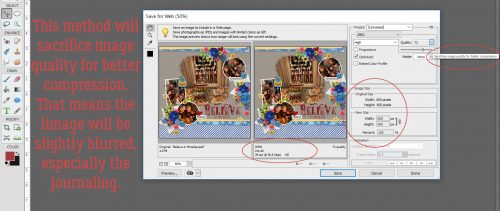
This next screenshot is impossible for anyone to actually read, so I’ve included the pertinent information on it. I’m going to use a glitter Styles set from Just So Scrappy‘s Lucky Me bundle. The fastest way to get to your Styles folder is to just click on the Styles button at the bottom of the Layers panel.

Katie of JSS always includes both chunky and fine glitter in her Styles bundles. I chose the fine white glitter #2 option because my title isn’t going to be huge, and snowflakes aren’t either.

This is the effect it gave my snow caps. Now you can see why I said the colour change wasn’t necessary… you can’t see any of the blue anyway!

On we go to the copy of the snow caps.
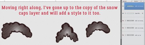
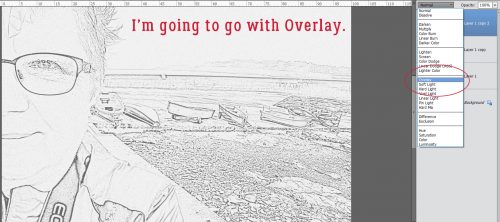
The colours in JSS‘s Lucky Me bundle work for this next phase, so I’m using the Chrome set for this. The Style adds a very smooth shiny look to whatever you hit with it.

Again, Katie offers options! There are thick and thin Chrome coatings here. I knew I’d want the thin one so that’s what I used.

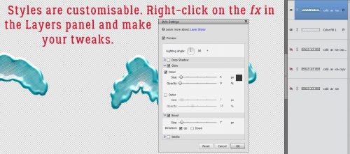
It didn’t look quite like I wanted it to, so I right-clicked on the fx icon on the layer in the Layers panel and opened up the Style menu. I adjusted the various sliders to give me more of a chilly, icy look.
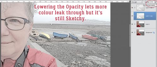
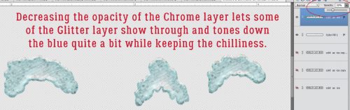
Then I lowered the Opacity of the Chrome layer and the snow cap has dimension, some colour and some sparkle.
I could stop here. HA!

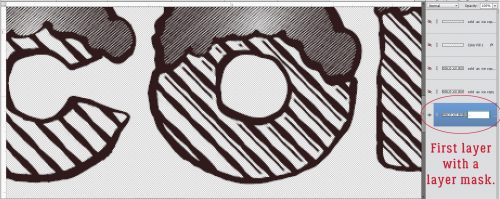
I went down to the very first layer where I’d typed out my title, hid all the other layers, and added a Layer Mask to that first layer.
Then I started Erasing the thin lines from the letter section of the title.

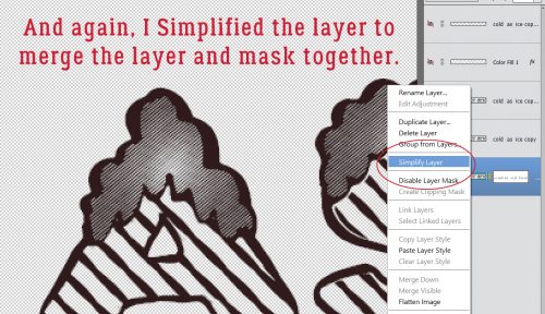
Once I got them all Erased, I Simplified the layer.
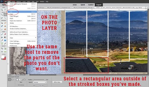
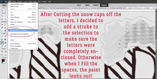
I also wanted to lose the snow caps, but because I’d already isolated the snow caps, it was a piece of cake to get rid of them. I clicked on one of the snow-cap only layer thumbnails to Select the outlines of the snowcaps – while still on my lowest layer – then Edit>Cut (CTRL/CMD>X) them away.

I knew I wanted to use the Paint Bucket to fill the wide spaces with colour and I knew (from prior experience) that if the areas I was filling were not COMPLETELY enclosed, the whole shebang would be filled, I decided to put a Edit>Stroke around the snow caps’ edges. Just a skinny one, 1 pixel wide. Then I erased the parts that weren’t required.
This is where I wound up.

Then I used the Paint Bucket tool to fill in all the spaces inside the letters using the same light blue as before. I decided the dark brown lines were just too harsh, so I wanted to change them to a darker blue/green. So I went to Enhance>Adjust Color>Replace Color.

Another thing I’ve learned form doing it wrong a thousand times is to make sure the colour I WANT is the BACKGROUND colour. Then I clicked on the colour swatch at the top of the menu – the colour I want to replace – and used the eyedropper that popped up to click on the dark brown.
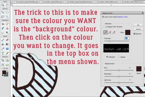
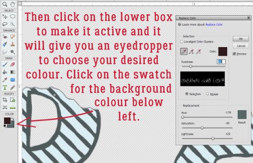
Then I clicked on the lower colour swatch to make it active. If I had a colour on my canvas that I wanted to use, I could then click on it with the eyedropper, but I don’t so I clicked on the background colour swatch where I have my darker blue-green. And bingo! the dark brown is now dark blue-green.
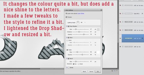
I could stop here. But you know me… I didn’t. I felt like the letters needed some sheen to make them look icy. I opted to use the Wow Plastic Styles that were already in PSE when I bought it. There are 10 options in that set. If you hover your cursor over the little blocks it’ll tell you what each one is.

As you can see, it changed the colours quite a bit while adding that shine I was after. I played around with the fx menu a bit.
Then I checked to see if the title looked the way I wanted it to. And it didn’t.

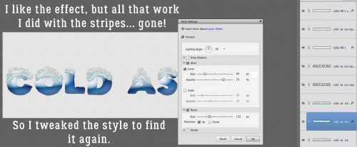
I went back to the title canvas and Copied the white glitter layer, moving the copy layer to the very top, above the shiny blue Chrome layer. Then I Erased some of the top white glitter layer to make it look like freshly-fallen snow on top of some older, crusty stuff. (Those of you who live in the snowbelt know what I mean.) Then I opted to play with the letters layers again. I tried one of the Glass Buttons Styles, which also are integrated PSE styles.

Only snag? All that work I did with the stripes went bye-bye. Boo! But wait… There’s a tweak for that.
And back they come! Almost happy…

I still had some snow-cap-less layers there in the middle so I went to one of them and erased everything but the skinny lines.

Quick change to the colour – Layer>New Fill Layer>Solid Color in white.

It’s pretty subtle, but it’s there and I like it! So let’s see how it looks on the layout.

YES!! I think it’s a lot closer to the colours in the photo and I’m very happy with the outcome!
See you all next week!
![]()