Making a Stylish Sandwich
![]()
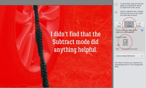
A few days ago I got a private message from Heidi1472 wanting to know more about using styles. I linked her up to some of the tutorials wherein I’ve used styles, but then I thought, “Maybe I should do a quick tut about putting multiple styles on a single layer, because maybe people don’t know that’s a thing.” So here it is!
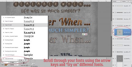
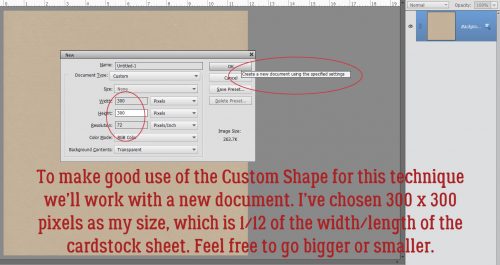
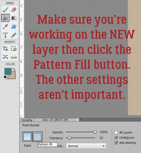
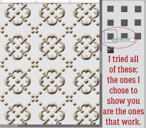
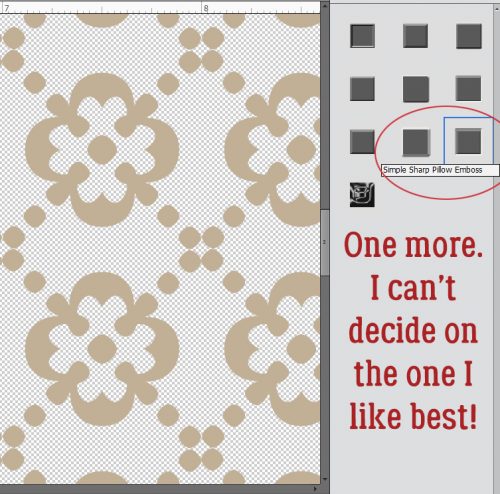
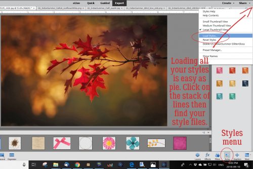
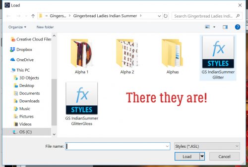
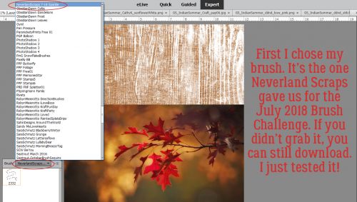
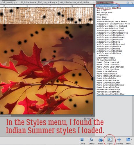
First, does everybody know how to load styles into the Photoshop Elements? In Versions 12 and up, it’s super-easy. All you have to do is open the Styles menu on your workspace then click on the icon that looks like a stack of paper in the upper right corner. This sub-menu opens up. Click on Load Styles then find the folder holding the styles you want to use and it’ll do the rest.
I wanted to load the styles that Natasha of Ponytails Designs had created for the GingerScraps 10th Birthday MEGA collab Indian Summer.

So I found them in my stash and loaded them up. They’re BIG files, so they do take a few minutes. Don’t panic!
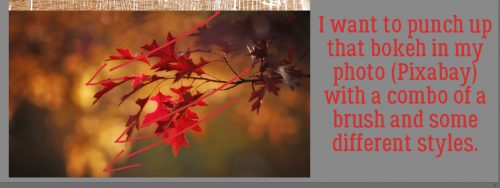
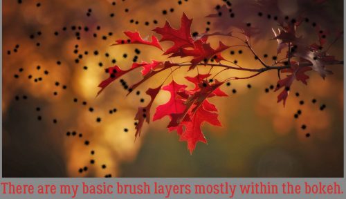
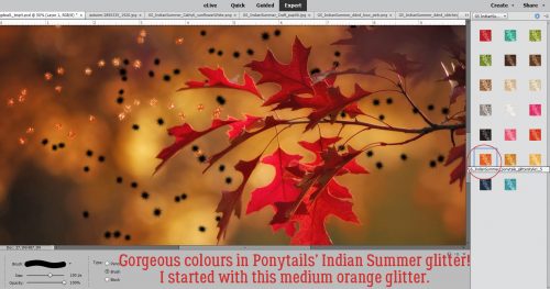
I had this great photo I found on Pixabay of some Amur maple leaves with some gorgeous bokeh in the background. So I decided to punch it up with a brush and a combo of styles.
I never did get to use the lovely brush Wendy of Neverland Scraps created for us for the July 2018 Brush Challenge. It seemed perfect for this technique.
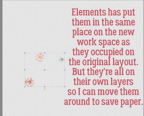
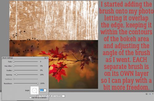
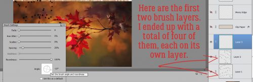
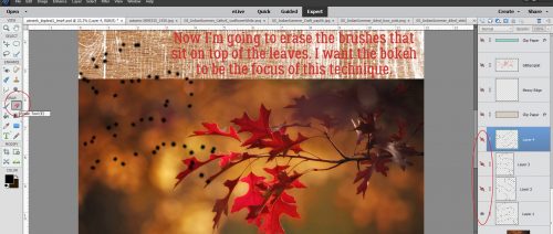
I created a new layer above my photo, shrunk the brush down a little to fit into the left-side area of bokeh and dropped it down. Then I added another layer, adjusted the angle of the brush and did it again. I ended up doing this process a total of 4 times. Putting each brush on its own layer lets me have a lot more creative control over what happens next.
Here’s what I mean about putting the brushes on their own layers.
Now it just looks like a bunch of fruit flies on a chunk of mango, but it’s not going to stay like that. See how most of the brush bits are inside the bokeh area?
Because I want the technique to highlight the bokeh and not the leaves, I went back and erased the bits of the brush that sit on top of the leaves, one layer at a time.
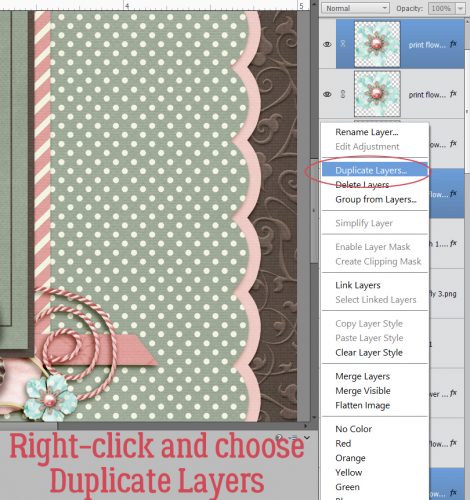
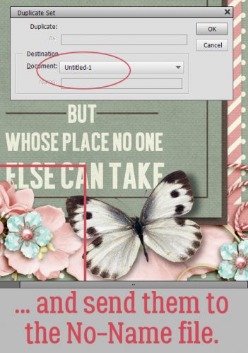
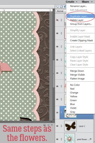
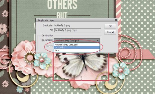
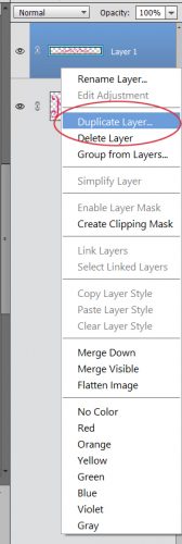
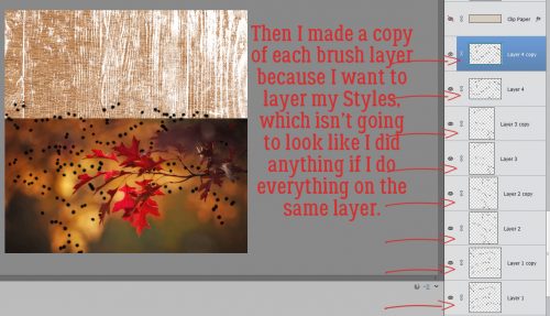
Then I made a copy of EVERY brush layer. You can do it the hard way, selecting the layer, right-clicking on it, selecting Duplicate Layer, waiting for the pop-up then clicking on OK, or you can WSNH and just hit CTRL/CMD>J.
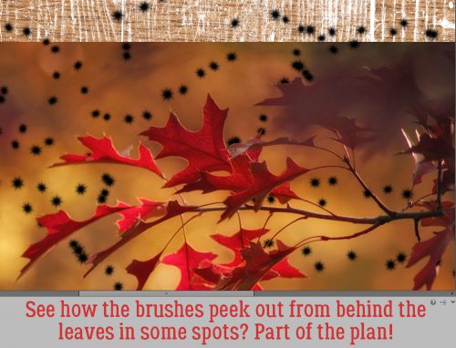
In some spots, the brush still peeks out from behind the leaf, and that’s what I wanted. Then I hid all the COPY layers for later.
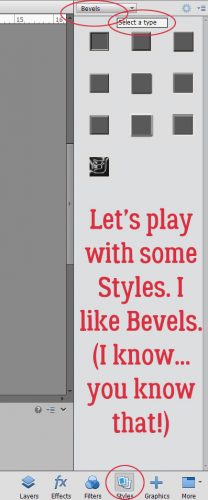
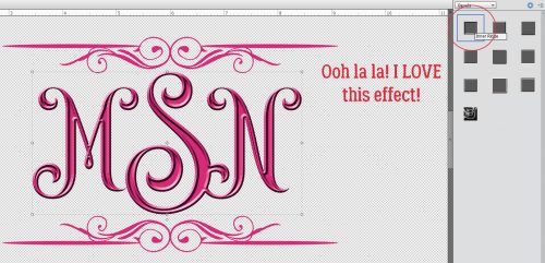
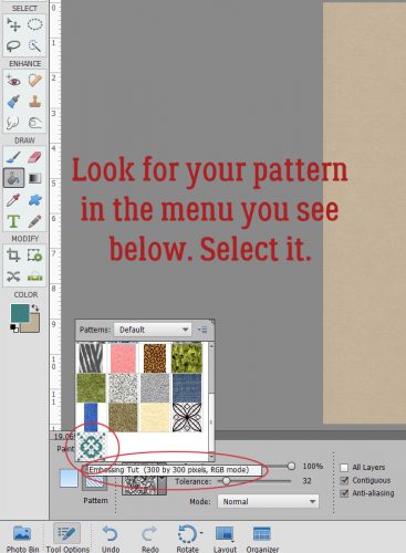
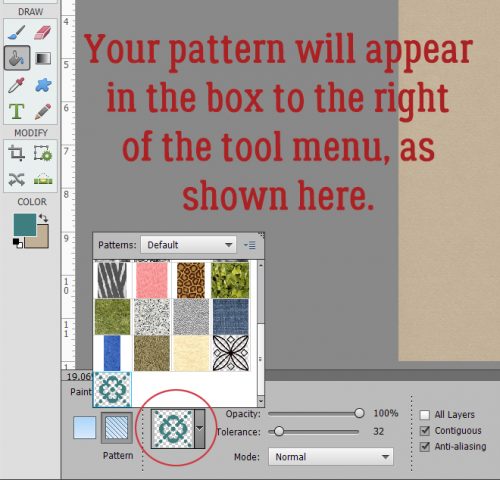
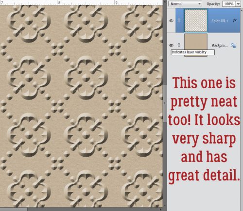
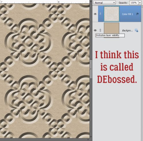
Now for the fun part! I clicked on the Styles button and found my GingerScraps Indian Summer glitter styles.
I started with my first brush layer and used the medium orange glitter style on the sparkles.
I let the colour and intensity of the bokeh guide my colour choices. The second brush set was over a lighter golden area so I went with the gold glitter.
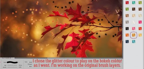
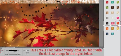
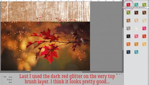
The third (original) brush layer is in a darker area, so it got the darker orange glitter.
The brush at the top was over a darker area so it seemed the red glitter was right for it.
It looks really good, but where’s the layering part? I started unhiding the COPY layers one at a time and applied a glitter style to each of them too.
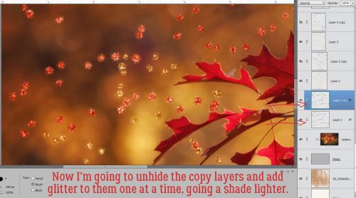
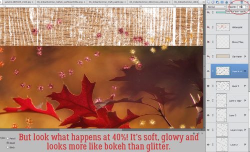
For the most part, I put a lighter colour of glitter on top of each original layer. I also decreased the Opacity of the COPY layers to 40%. That gives the brush layers a soft glow and a slightly different colour.
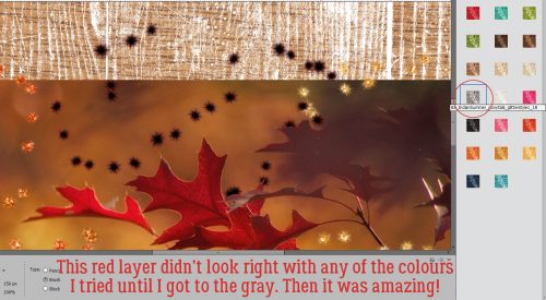
When I got to the red glitter layer, nothing looked right until I tried the GRAY glitter on the COPY layer.
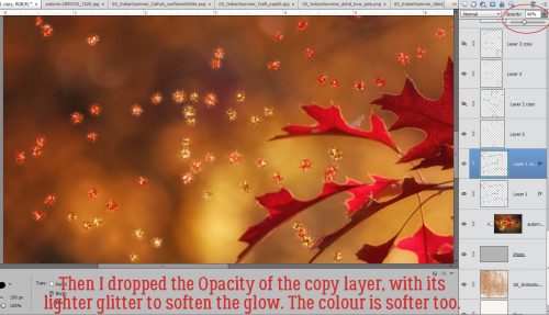
You can see the red around the edges but it’s mostly covered up. But wait. I’m still going to decrease the layer’s Opacity to 40%.
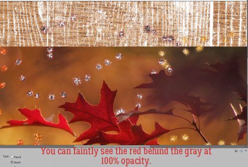
Voilà! A sort of ruby look to it now.
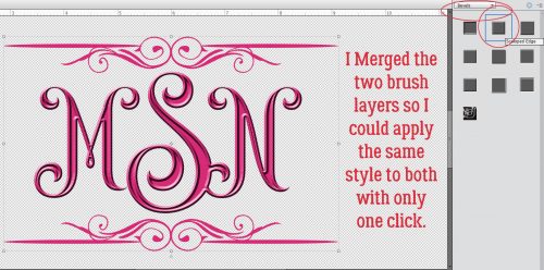
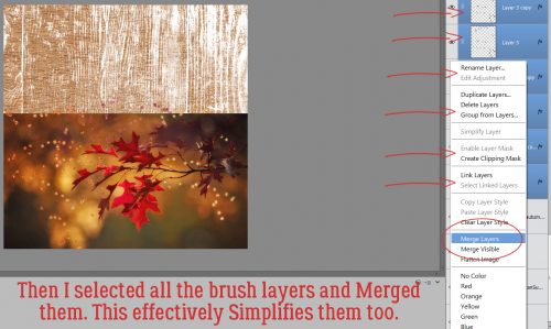
Oh but wait, we’re not done yet! I selected all the layers and Merged them together. (CTRL/CMD>E)
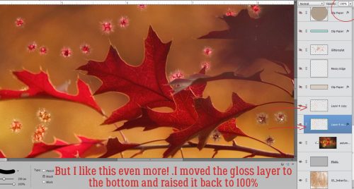
If you’re a faithful reader of this tripe, then you know I still had another idea. So I made a copy of the merged brush layer.
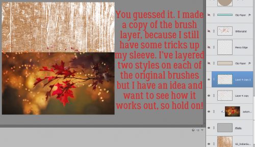
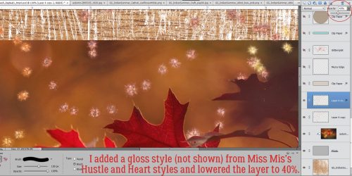
I chose to use a soft yellow gloss style from Misty’s Miss Mis Designs‘s Hustle and Heart styles set (not shown). Then I again lowered the Opacity to 40%. It looked “okay”…
But when I moved that layer to underneath the glitter layer, it really gave a lovely glow to the brushes. I LOVE how it looks!!
Sadly, just as I was getting to the very tail end of my layout, my laptop crashed. So if you were hoping to see the final result, I’m afraid you’ll have to wait… I have to do it all over again, from the beginning…… and that’s gotta wait until after I play with y grandchildren for a few days. See ya next week!
![]()