Fun with FONTS & FOTOS
![]()
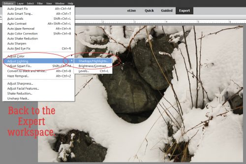
I don’t know about where YOU are, but where I am, winter is in full fury. We got nearly a foot of snow in the last few days, most of it falling at the same time I was on a 52-passenger bus on my way home from a meeting 200 miles from home. So I’ve been living vicariously through my daughter, who just returned from a week in Hawaii. She took some amazing photos!

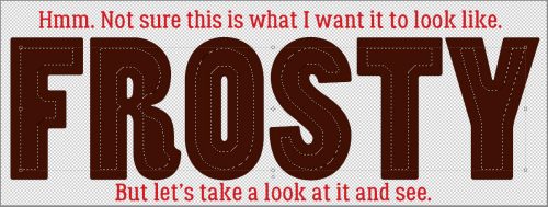
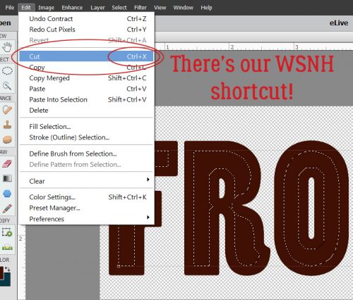
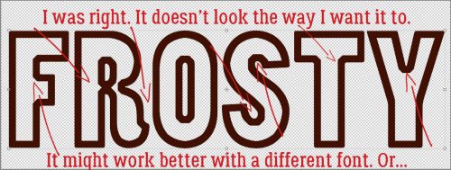
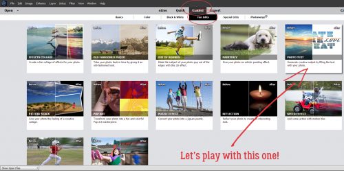
Let’s play with another Guided Edit, from the Fun Edits tab. This one is called Photo Text.
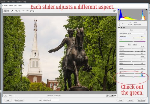
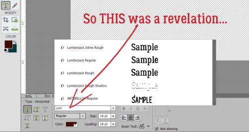
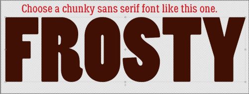
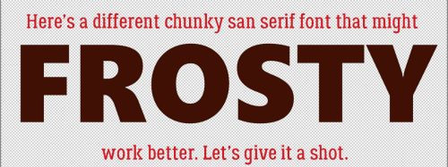
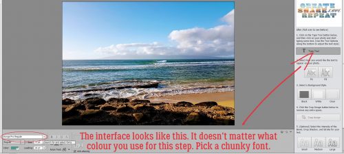
The interface for this edit is quite simple and easy to follow. Click on the Text Tool button and choose a font. Pick something with some presence – a chunky one that will let all the awesomeness of your photo shine. I started with Konga Pro Regular. Don’t worry about the font colour, it’s not going to matter. You can play with the size to maximize the area of the photo your text covers.
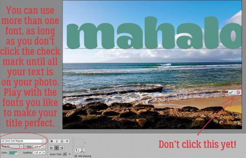
And you can use more than one font, as the software shows in the sample on the menu screen. Don’t click to accept the changes until you’ve got all of your text done though. Move your cursor to where you want the new font to take over, use the font selection menu to choose the new one and type out your text. And don’t worry if your text doesn’t fit onto your photo perfectly either, because you can resize it later. The second font I chose for this example is called LD Zoot Suit, from Lettering Delights.
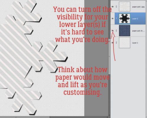
If your text lines overlap, once you’ve got the words you want, you can double-click on the text and adjust the leading – the gap between the lines – so that they’re just touching. Or, because it’s YOUR project, they don’t have to touch… it’s all up to you!

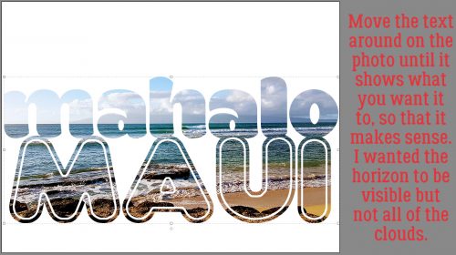
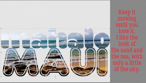
Once you’ve committed your text, the software automatically clips your photo to it. You can move the text around and resize it to reveal the areas of your photo that you want visible.
The image above has the “Fit” option selected, since it’s the default. Depending on your font and the width of the words you used, you might find the “Fill” option works well for you. I didn’t like it, so I undid it.

Then there’s the Background Color option. You can choose Black…

white…

or Clear (transparent). Which one works will depend on what you plan to do with your text later.

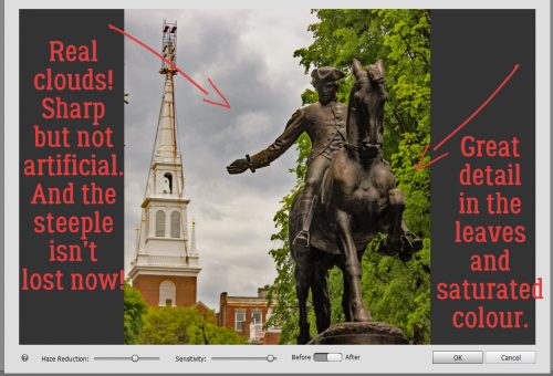
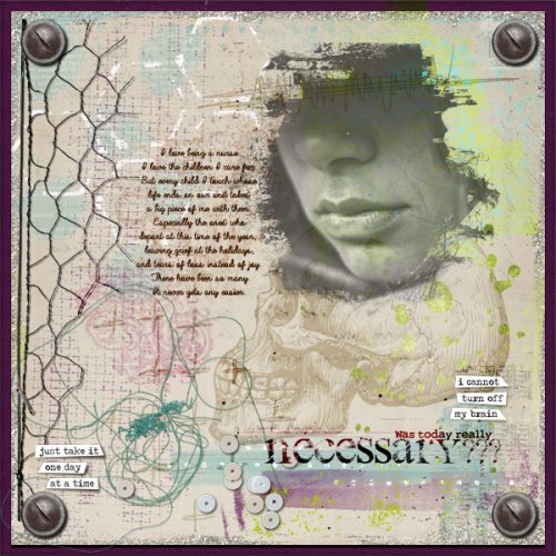
I shifted my text around to show more of the sand and the sea, less of the sky. The clouds on the horizon weren’t defined enough for my taste.
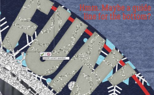
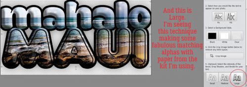
Now for the fun part! There are some more options that change the appearance of your text in some very interesting ways. With one click you can add both a stroke and a bevel! There are three preset adjustments; this one is the Small version.

And the Medium. Looks a little like a marshmallow.

Large is even more puffy and defined. While I was playing around with this technique it occurred to me that this would be a way to make a super-simple alpha set to match a favourite kit, simply by typing out the alphabet to fill up a paper from that kit, then fiddling with the adjustments.
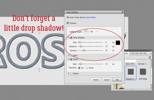
But wait!! There’s more tweaking we can do! By clicking on that Advanced button at the bottom of the interface, this menu opens up. Each aspect can be adjusted to suit the look you’re going for. You can change the angle of the light source, make the Bevel higher or flatter (and sharper), you can adjust the Drop Shadow, the width of the Stroke and even add an Inner or Outer Glow. It’s so much fun to experiment!
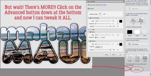
I decided a white Stroke would look better. Right?!

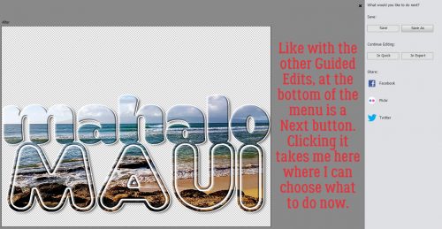
All that’s left is to decide what to do with your finished text. You can save it, share it or move it to the Expert editor to drop onto your layout. The power is in your hands!
With this Guided Edit you can do as much or as little as you like with your text. Of course, you COULD do it all the old-fashioned, multi-step way, but why?
![]()