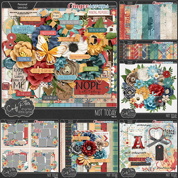
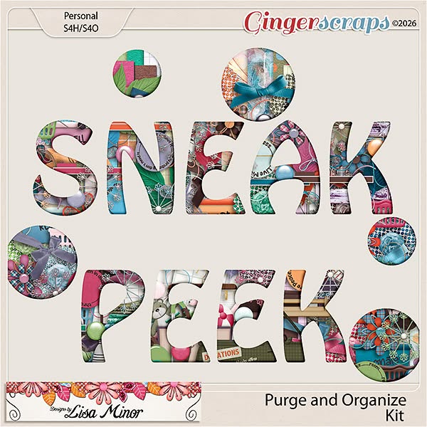
DD: JAN 28

https://bit.ly/3L5h2NT

Follow Neia on her Facebook Fan Page.

Remember, the download is kept up for 5 days, and then it is taken down. If you miss pieces, the kit will be available for purchase on the first day of the following month.

Post expires at 10:00am on Tuesday February 3rd, 2026

Tutorial Tuesday (Photoshop Elements)

Quick Trick: Curses… That Cursor!

Today’s Quick Trick is a touch self-serving, but I can’t be the only one who has old eyes… My mom turned 90 on Sunday and I wanted to surprise her with my favourite black-and-white photo of her, taken in 1963. But it was COVERED in dust specks, and I couldn’t leave it like that! So I opened it up in PSE to fix it. Well. The Spot Healing Brush cursor has become completely invisible to my rapidly declining eyes when the background is any shade of gray and I soon had a headache from trying to see it. There’s a little trick that can help locate it – using the space bar to change the cursor momentarily to the Hand Tool – but it’s very momentary, and if you try to move it, POOF! I needed a better solution, so I did a web search. The results weren’t encouraging… there’s no way to change the colour of the cursor, which would have been perfect. So I tried some of the suggestions people offered. Changing the “pointer” settings in Windows didn’t do anything useful, but I did find something that worked, sort of. I’ll show you what I settled on.

Oy, these screenshots don’t show well here. So I’ll narrate. I clicked Edit>Preferences>Display & Cursors… to access the cursor settings.

These were the settings I was working with for the Painting Cursor, which is what Elements classifies both the Spot Healing Brush and the Clone Stamp. These settings were Normal Brush Tip and Show Crosshair in Brush Tip. That setting appears as a circle with crosshairs inside it. It shows up well on white – it turns black and pops nicely – and black, because it’s white. But any shade of gray and it’s totally invisible to me.

I tested some other options and didn’t like the ones that use an eye-dropper icon. When I switched to Precise and left the Crosshair box ticked. the cursor changed from that faint circle with the crosshairs to just a plus sign, but it was infinitely more visible even against most shades of gray. The one drawback is that the SIZE of the Brush Tip isn’t obvious with this setting. The Shield will appear when you click the Brush over a spot, and you’ll have an idea of size that way. I can live with that.

I will be writing a Lasso-vs-Magic Wand Selection post for you, but I’ve discovered I’ll need more time to prepare it than I expected. Since my husband’s eye surgery I’ve been doing all of our son’s care and transfers in addition to all of my own usual tasks, so I haven’t had a ton of spare time. He has another follow-up with the ophthalmologist on Thursday and hopefully will be cleared to get back to normal. Watch this space!

DD: JAN 27

https://bit.ly/49f1Nd9

Follow Neia on her Facebook Fan Page.

Remember, the download is kept up for 5 days, and then it is taken down. If you miss pieces, the kit will be available for purchase on the first day of the following month.

Post expires at 10:00am on Monday February 2nd, 2026

DD: JAN 26

https://bit.ly/4qvnqwG

Follow Neia on her Facebook Fan Page.

Remember, the download is kept up for 5 days, and then it is taken down. If you miss pieces, the kit will be available for purchase on the first day of the following month.

Post expires at 10:00am on Sunday February 1st, 2026

DD: JAN 25

https://bit.ly/4qzIhiF

Follow Neia on her Facebook Fan Page.

Remember, the download is kept up for 5 days, and then it is taken down. If you miss pieces, the kit will be available for purchase on the first day of the following month.

Post expires at 10:00am on Saturday January 31st, 2026

DD: JAN 24

https://bit.ly/4qzHMVP

Follow Neia on her Facebook Fan Page.

Remember, the download is kept up for 5 days, and then it is taken down. If you miss pieces, the kit will be available for purchase on the first day of the following month.

Post expires at 10:00am on Friday January 30th, 2026

January 16, 2026: Fresh Baked at Gingerscraps!

Happy Friday everyone. I hope you have all had a productive week. For our scrappers in the Southern and Eastern US, please stay safe and warm. It will be a good time to stay in and scrap.

Remember, spend $10 in the store and you’ll get this collab for free.

Let’s take a look at a sampling of this week’s Fresh Baked releases.

Have you picked up the January Monthly Mix Collab? I love the color combinations in this one.

Have you gotten a good start on your January challenges? Complete any 10 challenges  to earn the Challenge Reward collab (or a variety of other choices from previous challenge collabs) as a reward!

DD: JAN 23

https://bit.ly/3MSi54p

Follow Neia on her Facebook Fan Page.

Remember, the download is kept up for 5 days, and then it is taken down. If you miss pieces, the kit will be available for purchase on the first day of the following month.

Post expires at 10:00am on Thursday January 29th, 2026

Tutorial Wednesday (Individual Style)

Challenge Spotlight: Mini Kit

Wow, you GingerScrappers have been busy this month! As of 1:20 pm PST, there have been 654 individual layouts uploaded to the 2026 Challenge Galleries. That’s phenomenal… and I think I should track the totals for the year to see just how prolific we are.

I’ve spoken before about what makes a Challenge ideal for an Individual Style Blog post, but I’ll go over it again. Of course, the participants for every Challenge are given identical criteria for each Challenge. Some Challenges can be met in a really wide variety of ways, while others are more narrowly defined. For example the Color Challenge provides participants with 2, 3 or 4 colors that must be used for their layouts. But there are a multitude of kits in the Shop that will fit the criteria. So narrow, but not. On the other hand, the Use It All Challenge provides a mini kit with maybe 10-12 items in it, all of which must be visible on the layouts. Narrow! These narrower Challenges are best suited for an Individual Style analysis. How does the Scrapper USE IT ALL? Can the viewer identify that Scrapper‘s style? What sets them apart? So with that in mind. this month the Challenge I selected is the Mini Kit, hosted by Lisa Rosa Designs. This is the kit: 5 papers, 3 flowers, some foliage, a film strip and 4 word art bits. It coordinates with Lisa‘s Between Then & Next collection, and participants are welcome to use it to enhance their layouts. Let’s look at how it’s been used.

Before I get rolling, I’m going to add some of my periodic reminders about the Challenge Spotlight posts, which may also apply to other posts too. Every layout I post here will be linked to the Gallery so that you can get a closer look, and maybe leave a comment. The link will be attached to the Scrapper’s user name. It will be in coloured, bold, underlined text. Any time you see some coloured, bold, underlined texts in any of my posts, you can safely assume they’re hyperlinks in disguise. Try it out! One other thing about this series of posts is that when I choose a Challenge to examine, I may not be able to post EVERY layout that has been completed for the month, due to the sheer volume of them! (That’s a good thing!!!) To be completely fair in that situation I’ll select all the odd- or even- numbered layouts, or I’ll use a Random.Org randomizer. That way, it’s not me personally choosing which layouts to post, and I’ll always explain how the layouts were arrived at. This month, I selected the odd-numbered layouts.

Layout #1 belongs to nimble4u. She has used all but the word art bits for her layout. She extended the filmstrip to accommodate the photos she wanted to include.

For her layout, photocrazy used all but the mustard patterned paper – which I feel was the right call – and split the filmstrip into two pieces. Using them as background elements rather than to frame smaller photos allows her sunset photo to stand out. Note how the colours in the sky are picked up by the papers, almost as an extension of her photo. Her choice of word art bits is spot-on. Well done!

Here, dhariana chose not to use the large ivory-backed floral paper and used clipping shapes for her paper accents. She chose a spare, white-space style for her version, and added some stitching as an anchor for her cluster. The simple word art title completes the layout.

SandraJ has used the entire mini kit here. The floral background paper draws the eye in, the single photo stretched the entire width of the film strip and the creative use of the word art bits keep the eye moving.

Nice ‘do, beccasue! She’s used the film strip as a clipping mask for the blue-gray paper, tucking a greatly reduced-size scrap of the striped paper in behind her floral cluster. She has also recoloured some of her flowers. The soft pink background and word art title suggest she really feels transformed.

We have our first adding-to-the-mini layout from justpennys. She’s used items from the mini, such as the flowers and foliage, she’s clipped papers to the tags, blended the mustard coloured mini kit paper with one from the collection and used some of the word art from both to form her title and subtitle. Then she’s added a plethora of elements and papers from the full collection. Nice!

The ivory floral background makes a reappearance with trinanne. It’s the only paper she used, other than a sliver of the pink for a journaling block. She kept the focus on the film strip of smiling faces.

Glori2 chose to document growth in a little person learning new skills. That narrow strip of striped paper divides the layout neatly across the middle, with paired film strips providing the proof. There’s not a shred of pink to be seen. đŸ˜‰

Are you laughing our loud right now? I LOVE the humour in makeyesup‘s layout. It’s true – dogs have masters, cats have staff. đŸ™‚ I like the narrow yellow paper borders overlying the striped paper in the background and the blue-gray paper in the foreground.

For her layout, kabrak1207 has used almost everything from the mini and added some bits from the Between Then & Next. It’s interesting that the way she’s arranged the papers in her stack makes that blue-gray paper look more green. The spray of elements along the edge of her photo adds the perfect touch to bring all the attention to the little girl’s eyes.

I hope I haven’t made any glaring typos! I never realized how much I use my left ring finger before. The splint is doing the job and I might be able to leave it off in a day or so. And I really should analyze how I injured it so I can prevent a recurrence. Anyway, how would you all like me to learn the difference between the Lasso Tool and the Magic Wand Tool and share it with you?

Tutorial Tuesday – Postponed

Hey GingerScrappers!

Things chez ObiJan have been a bit of a dumpster fire the last few days (I’ve sprained a finger again on top of it) so I’m running behind. I’ll have a Challenge Spotlight for you tomorrow. Thanks for your understanding!