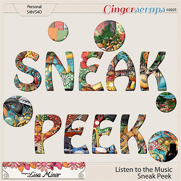
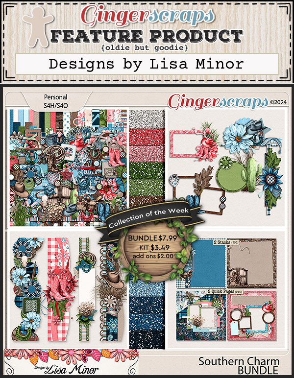
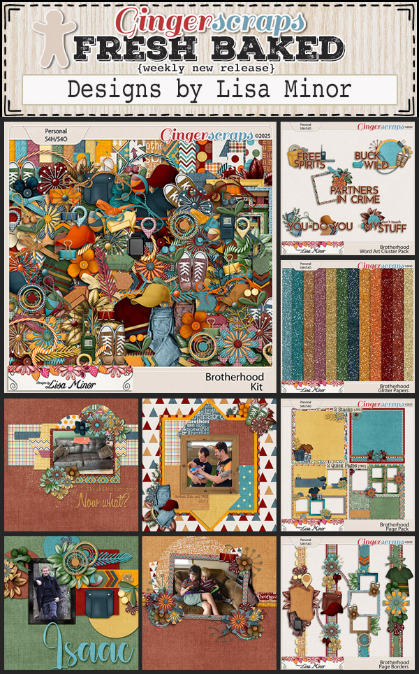
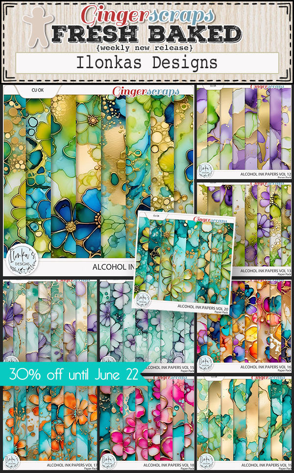
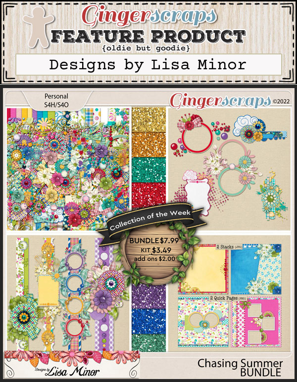
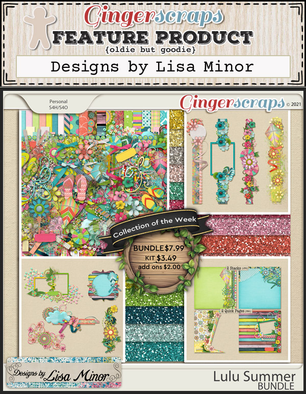
Designs by Lisa Minor

How is it even July already?? This month’s Designer in the Spotlight is Lisa Minor. Today, I’m going to share the tea Lisa and I spilt earlier. She’s recovering from a total knee replacement right now, so let’s make sure she feels the love!
J: Lisa, you must be so uncomfortable with that big surgery you just had. I hope you have someone who’s taking care of you, and a comfy chair to sit in between therapy appointments. Do you have a favorite comfort food that always makes you feel better?
L: Chicken and Dumplings. I have so many fond memories of eating it.
J: Ooh, I love that too! Last night I caught a few minutes of a cooking show where the guy was making chicken and dumplings noodles… without the dumplings. So of course I had to go online and find a recipe! I’d serve it with apple pie for dessert, unless it’s too hot, then I might go with ice cream. If you could BE ice cream, what flavour would you be?
L: Vanilla of course! Plain, simple and delicious!
J: Oh, and versatile too! Don’t tell anybody but I have a pint of Chapman’s Butter Tart ice cream hiding deep in the bottom of the freezer. If the guys don’t know about it, I don’t have to share. 😉 Like our Prime Minister, I like a good wink. 😉 What’s your most used emoji?
L: Anything with a “thumbs up”, LOL. I’m just not that “text” savvy.

J: Let’s talk business for a minute. What’s your favourite part of seeing others use your designs for their layouts?
L: I think it’s how they put it all together. It’s such a personal thing to share photos of yourself and your family and the love shows through.
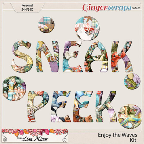
J: That’s something that always appeals to me, the individual style that Scrappers have and how they can take an identical collection of papers and elements then turn them into something beautiful, unique and intensely personal. Can you share any sneak peeks of coming attractions?
L: Yep! Arriving mid-July, Enjoy the Waves.
J: That’s going to sell like hotcakes! We’re a long way from the ocean but our lake gets some pretty decent waves on windy days. I always snicker a little when I see someone asking on Reddit about how choppy it is. Interesting way of staying informed, I guess. The teasing is usually gentle, especially for Reddit, if you know what I mean. Have you ever done anything embarrassing in public?
L: When I was 8 months pregnant with our first, it was the “year of the cicada” in Ohio. One flew down my shirt and I just literally ripped the shirt off in the parking lot. Those things are “buggly ugly”.
J: Oof!! We don’t have cicadas this far north, but we do have junebugs. When my husband and I were dating we were zipping down the highway on his motorcycle when a junebug flew into him. He said it felt like he’d been shot. And there were guts everywhere. It was gross. Another time, again on his bike, a wasp ended up flying into my bra. Stings in that area really hurt! I’m actually having phantom pain there right now… Good thing I wasn’t allergic, but it could have been kinda funny. What’s the funniest thing you believed when you were a kid?
L: I believed I had an “extra” front tooth because my teeth were so crooked. Hey, my cousin told me so, and I totally fell for it.
J: That’s kids for you. I was catfished, before catfishing was a thing. I still hate that girl with the heat of a thousand suns. And she knows it. Same girl who bit me on my thirteenth birthday. The school principal came into the girls’ bathroom to check it out and disinfect the bite before he suspended her for the rest of the week. Oy. I wanted to be anywhere but there. If you could teleport to anywhere in the world, where would you go?
L: Ireland! It’s on my bucket list.
J: Great choice! I’ve been there twice and hope to get back one more time before I get too old to travel by myself. It’s truly a magical place. Last time I was there, the strap on my purse broke and wasn’t fixable, so I went to a discount store near my hotel and bought a new one. I bet the hotel cleaning crew wondered about all the weird things I threw away when I switched them out. What’s the most unusual thing you carry in your bag or pocket?
L: I actually carry a small bag full of things like single use toothbrushes, Tylenol, antibacterial wipes, band aids, eyeglass wipes, etc. You can NEVER be too prepared.
J: I like the way you think! I do the same. Well, maybe not the toothbrushes, but I have some flossers! And a screwdriver. Like you say, be prepared for ANYTHING. One last question, then I’ll let you get some rest. Do you have a guilty pleasure? I mean, one that you can share with our readers? 😉
L: True Crime. I’m obsessed.
J: ME TOO!! Particularly the ones that use forensic genetic genealogy. The things real people do are so much more twisted than any fiction writer could dream up. So fascinating! Well, I promised to keep this short so you’re not wiped out. Go put your feet up and have a nice cup of tea while I finish up here.
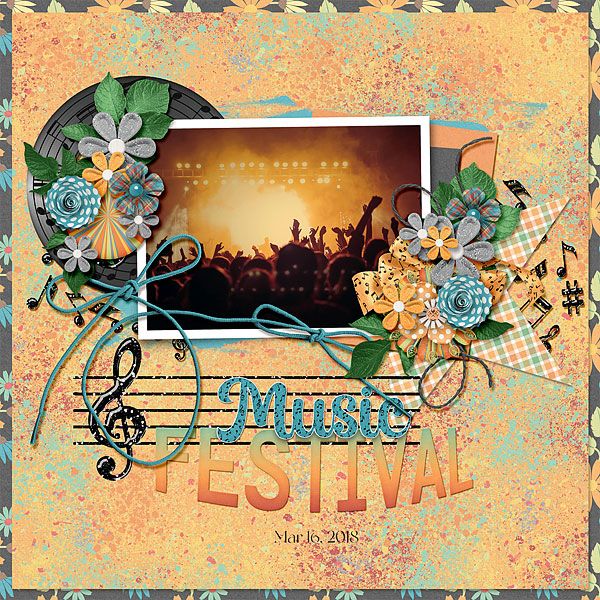
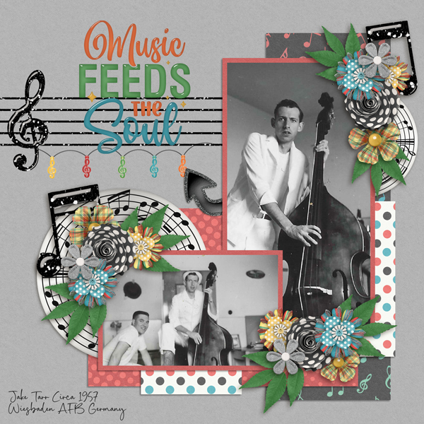
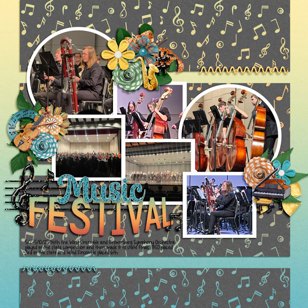
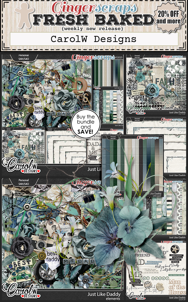
In addition to her usual monthly Pinterest Challenge, Lisa is also hosting the Designer Spotlight Challenge. And she’s providing our July Daily Download kit here on the Blog. It’s called Listen to the Music and I can’t wait to see the whole collection. But that’s not all… she has a coupon code 7sdlm20off …ON TOP of the already 50% off discount this month you can take an ADDITIONAL 20% off a single purchase of $5 or more. What a deal!! (It’s a single-use code, so make sure you fill your cart with ALL the goodies before you use it.) See you all next week for another Tutorial Tuesday.
![]()