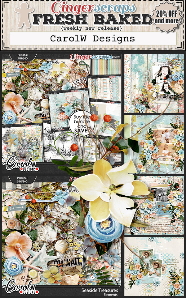
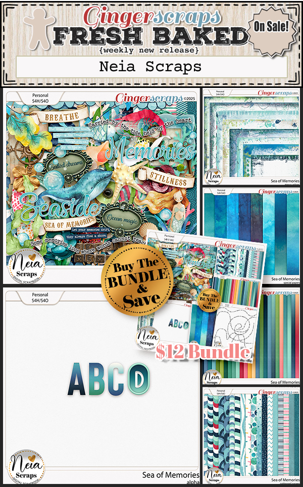
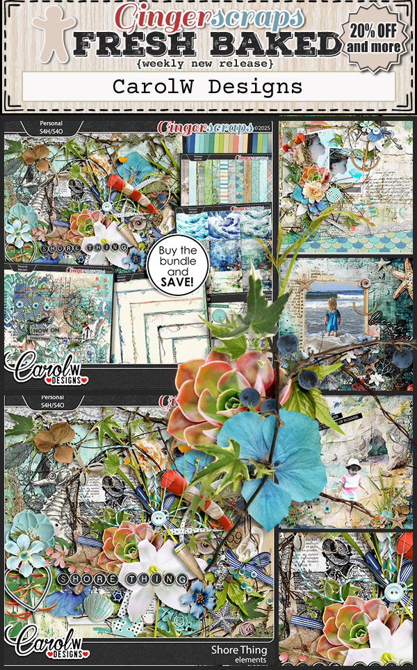
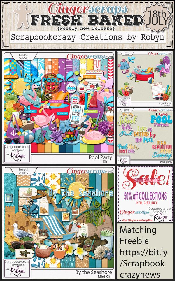
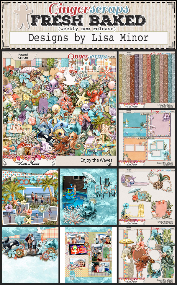
Hello everyone! I’m really excited about some of the new kits this week. I’m loving all the ocean and beachy vibes we’re getting in July.
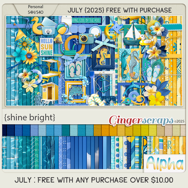
Remember if you spend $10 in the store, you get this great kit for free.
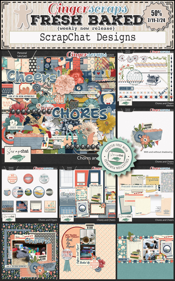
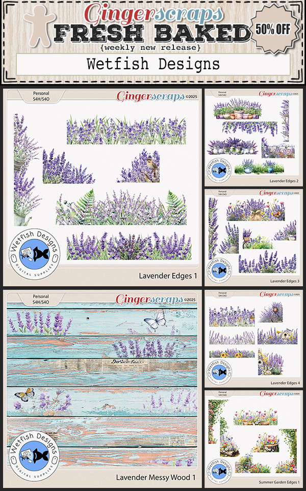
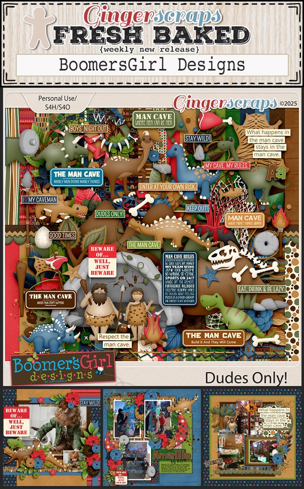
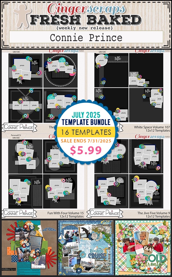
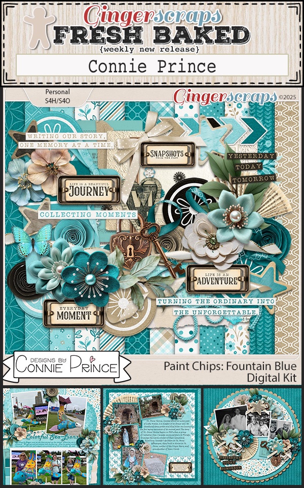
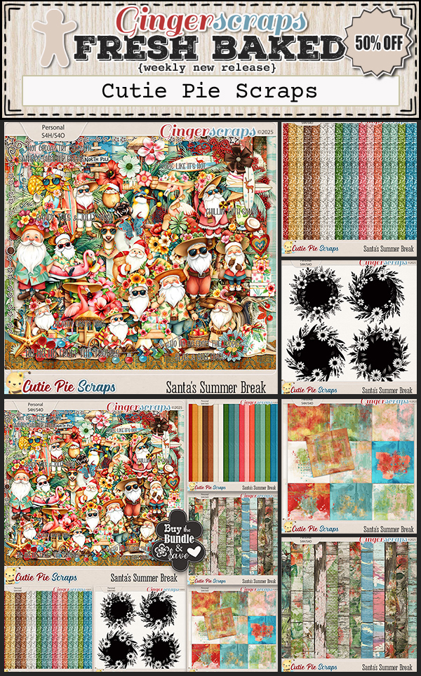
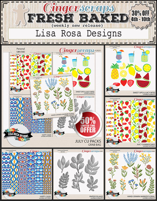
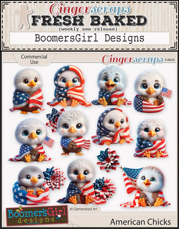
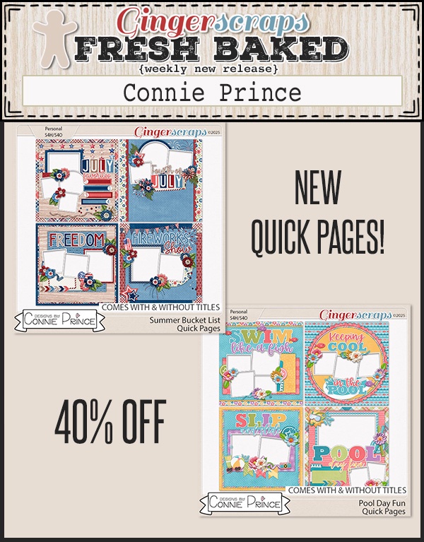
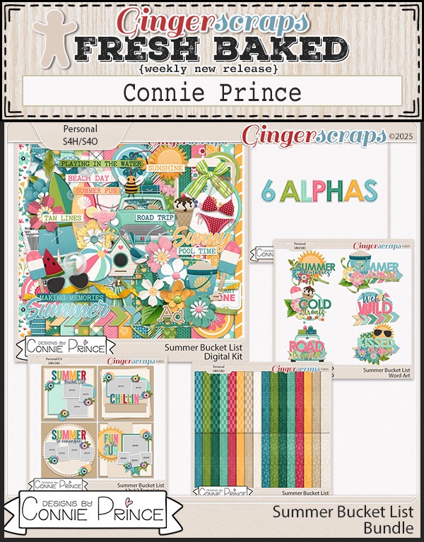
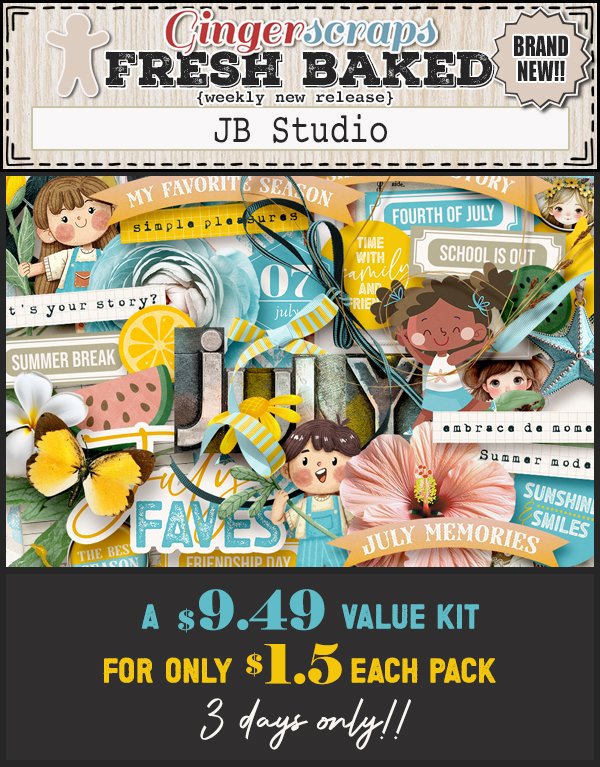
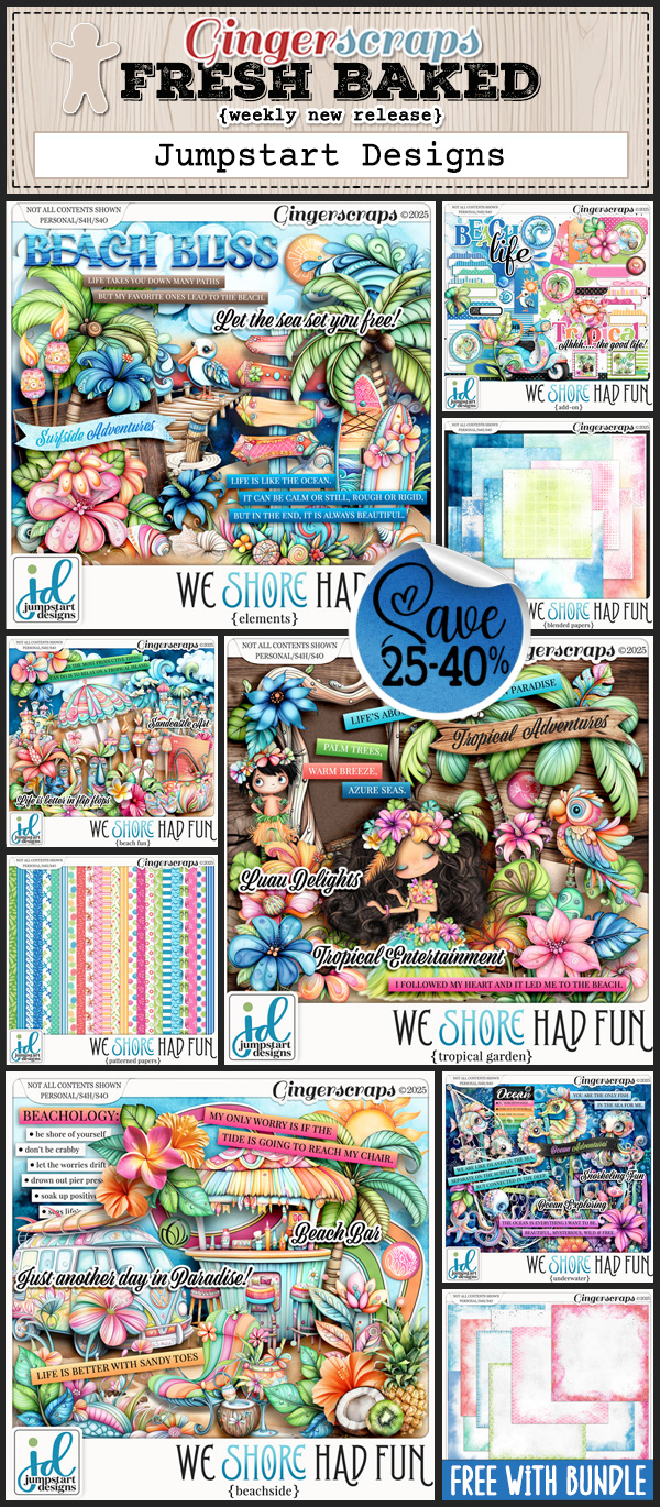
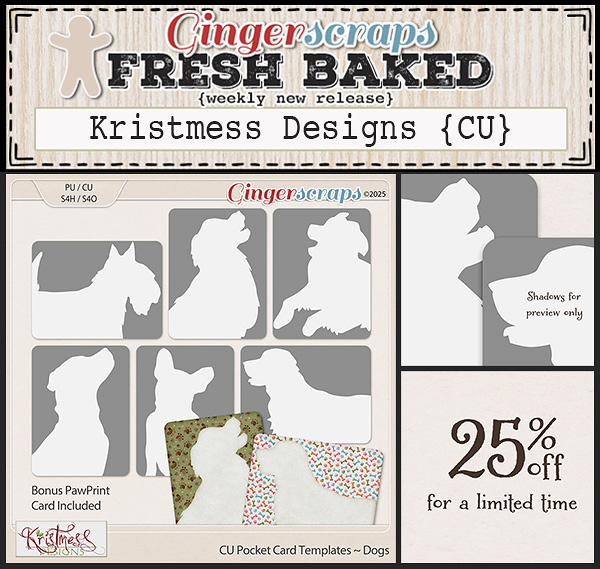
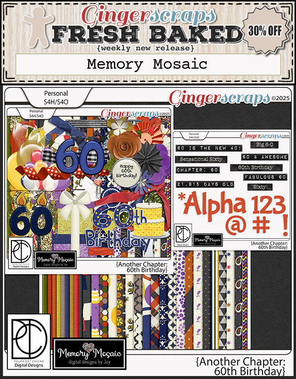
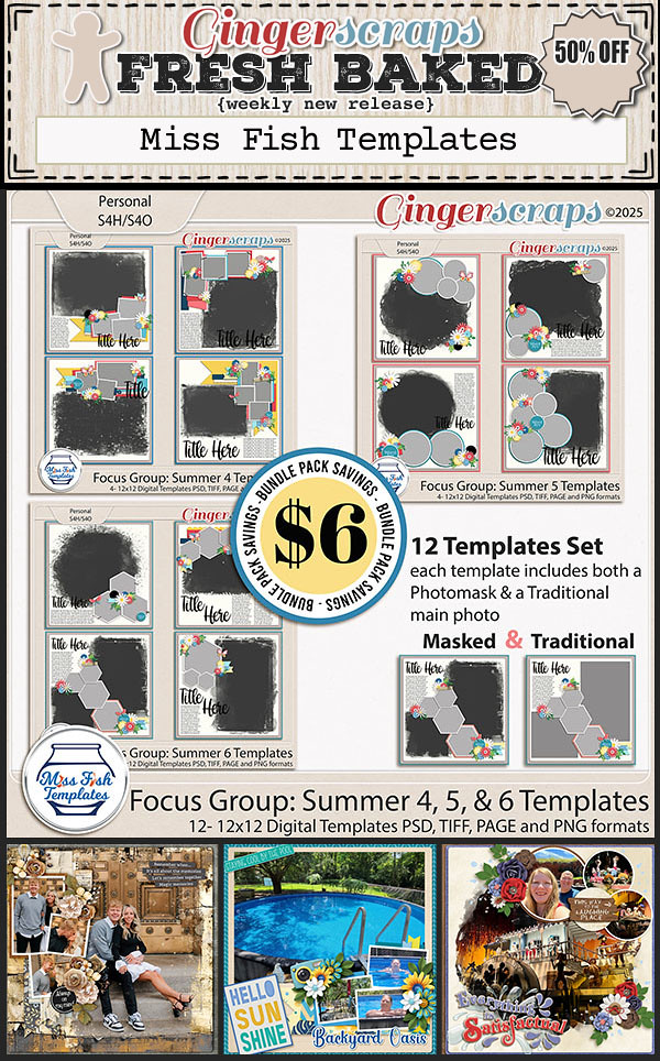
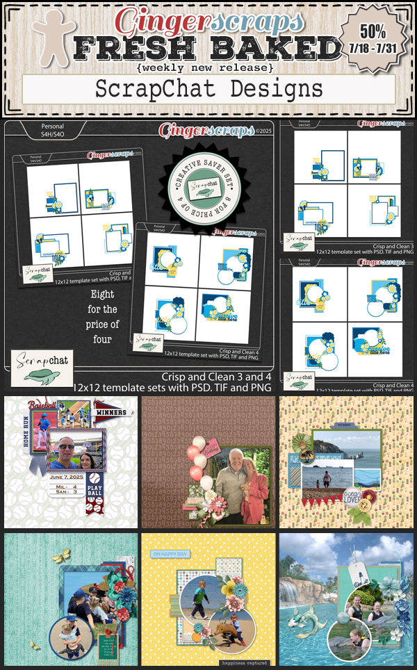
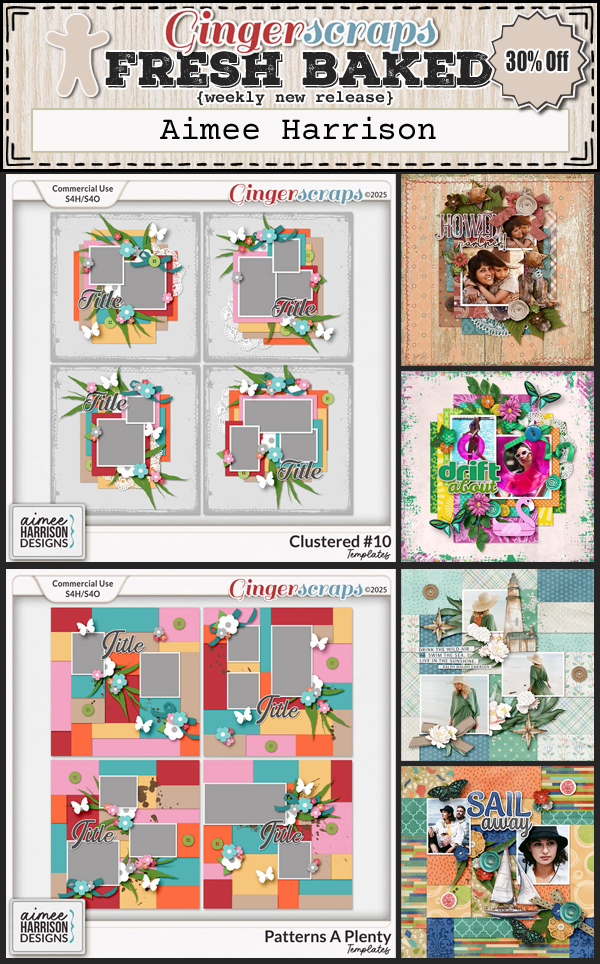
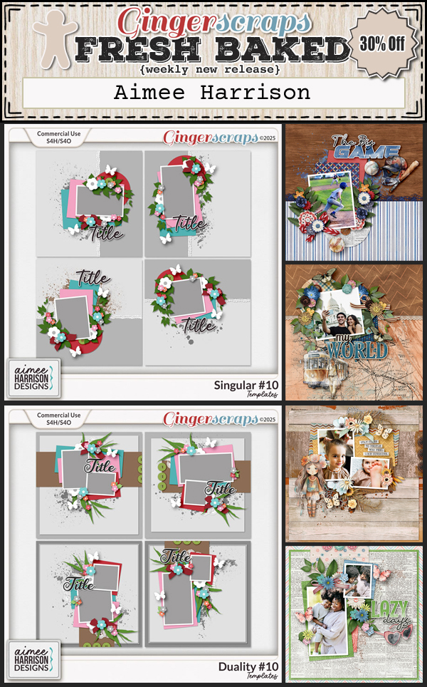
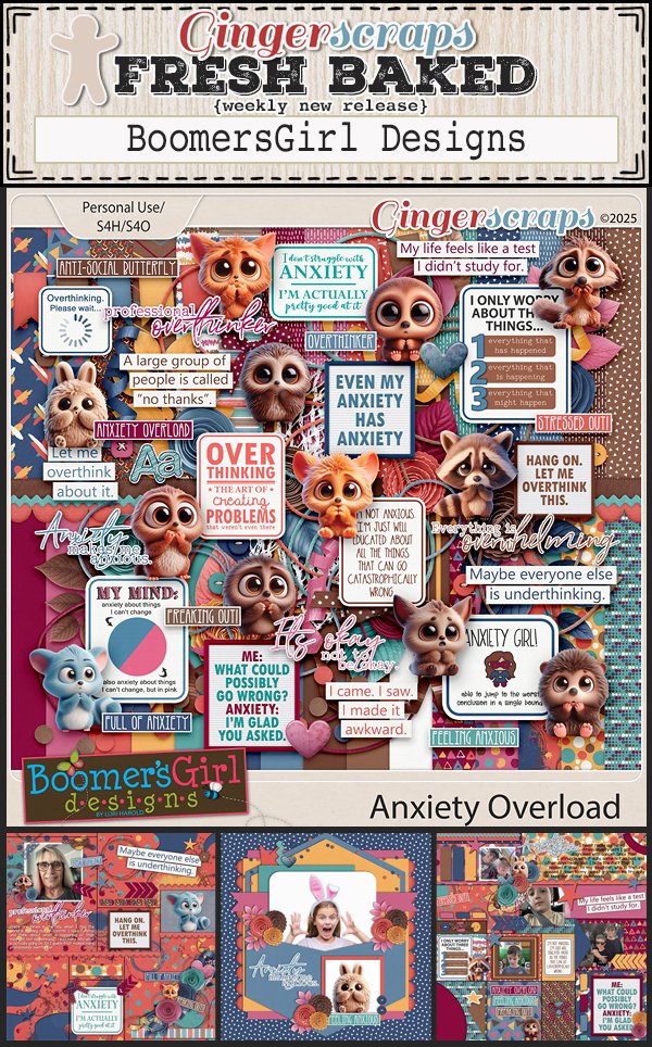
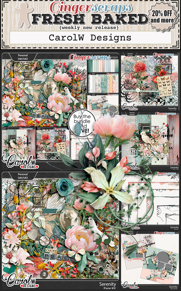
Now let’s check what is new in the store this week. I see a few summer and beachy kits that look fun.


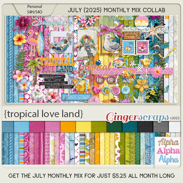
Have you grabbed the July Monthly Mix? Doesn’t this kit look so fun?
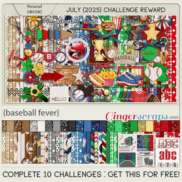
Are you working on your challenges? If you complete any 10 challenges this month, you get this gorgeous collab (or a variety of other choices from previous challenge collabs) as a reward!