![]()
Titles Revisited: Alphas plus Fonts
Hey all you Gingerscrappers! I’m back with another Tutorial Tuesday for your viewing pleasure. Today we’re going to build on that first lesson on titles. If you need a refresher you can find it here. Many of the kits available to digiscrappers come with matching alphabets – I’m always really happy when I find them in the kits and use them a lot. They can be combined nicely with a font or two to create very eye-catching titles and that’s what we’re focusing on today.
If you recall, I mentioned in the first titles lesson that I like to work with a new, separate file when I build my titles. It really does make it easier to see exactly what the title looks like and to line things up the way they look best. (It also helps make these tutorials easier to follow, a nice little side benefit!) One of the drawbacks with version 12 of PSE is that when you drag and drop items onto your workspace, they’re turned into “smart objects”, and are the same size as the canvas… in my case, 12×12! That’s a problem and one of the reasons I started doing titles separate from the layout. I typically use a 6×1 or 6×3 inch workspace, depending on if it’s going to be one line or several. You do what feels comfortable for you.
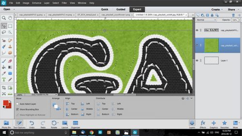
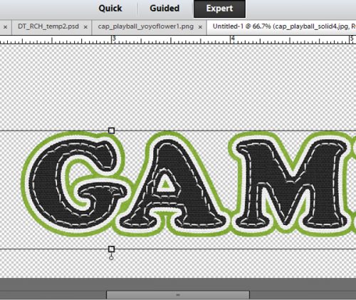
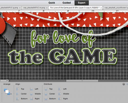
I worked with last month’s Daily Download, Play Ball from Connie Prince, which came with a gutsy, strong serif alpha, for this layout. I wanted a title that was a little different but still well-anchored to the topic, so I chose the title of one of my favourite baseball movies, For Love of the Game.
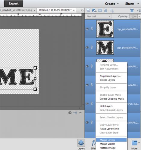
On my 6×3 workspace, I dropped the alpha letters as shown below; they all stack one on top of the other so I selected them all just as they were and resized them down a LOT. Then I started shifting them into place, nudging with the arrow keys.
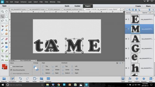
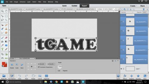
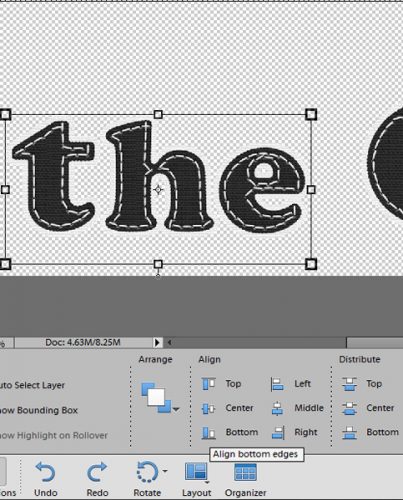
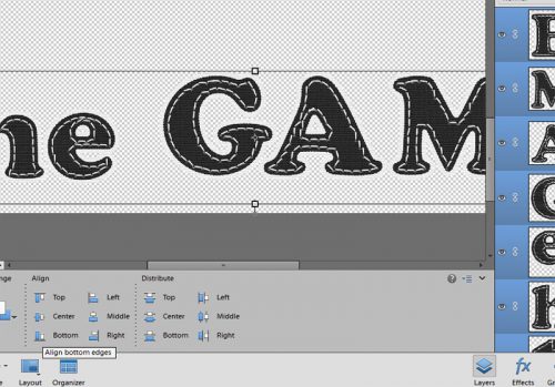
They needed to be shrunk a few more times before they all fit onto my canvas. I decided to make the word “the” a little smaller that the word “game” so I selected those three letter layers and shrunk them a bit more. Then I lined everything up again using the bottoms of the letters. Once that was done, I selected all the layers in the palette and merged them together. I then moved the words to the bottom of the workspace so I’d have room later for my font.
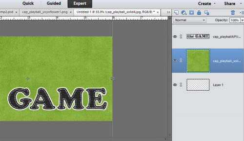
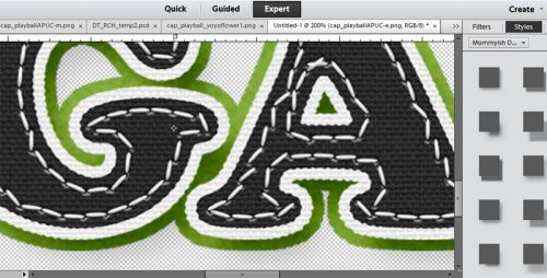
Looks good! But wait, I used a charcoal paper for my background so how can I make this title stand out against it?? Oh, why don’t I paste it on some different coloured paper and make a paper border? Yeah, that’ll work. To do that, I dropped a green paper (I was going to use red but changed my mind at the last minute) UNDER the words.
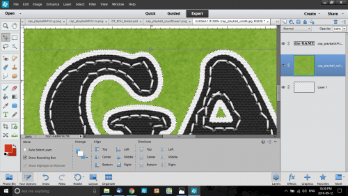
Then I went to the layer with the words on it and CTRL/CMD+clicked on the thumbnail. That put some marching ants around the outside of the letters. (They’re hard to see in the screenshot, but they’re there.) I kept the layer with my green paper selected in the layers palette though.
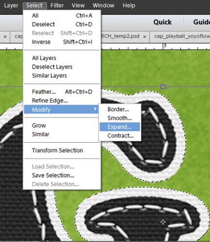
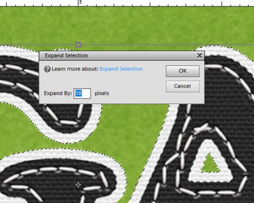
Then, just as I did in the first lesson, I went to the Select menu and chose Modify>Expand from the drop-down menu to expand the selection by 10 pixels. The marching ants are easier to see in the screenshot below, aren’t they? (Well, except maybe in that last one. 🙁 )
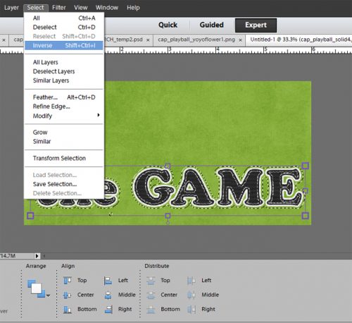
Now comes the tricky part. I want to cut the paper away from the letters, and to do that I have to invert the selection. So back I went to the Select menu and chose Inverse. (Actually I used the keyboard shortcut Shift>CTRL/CMD>I.) That moves the marching ants to the outside of the paper. Next step is to cut the paper by selecting the Edit menu then Cut. CTRL/CMD>X will work too.
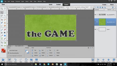
Et voilà!
To show that I didn’t just put a stroke around the alpha I added a drop shadow. That adds some dimension to the words. More about adding dimension to your titles in a future tut.
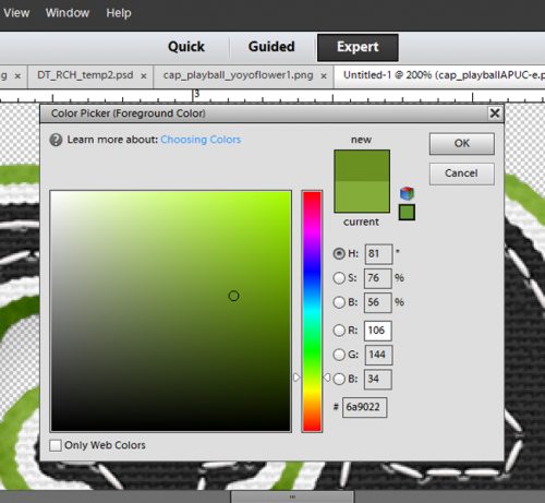
Now on to the font part of our show. I know from a lot of experience that if I use the exact shade of green from my paper, it’s going to look very anemic. Can’t have that! So I used the colour picker (click on the swatch in the foreground) to darken the green but keep it in the same family. I moved the cursor over and down to the right at about a 30° angle and selected a darker lime green.
I wanted a script font with a little bit of heft to it that would balance with the alpha so I chose a font called Silly Me Script. I typed out “for love of” in the space above “the GAME” and adjusted the size and alignment until it looked good. Then I made a sticker!
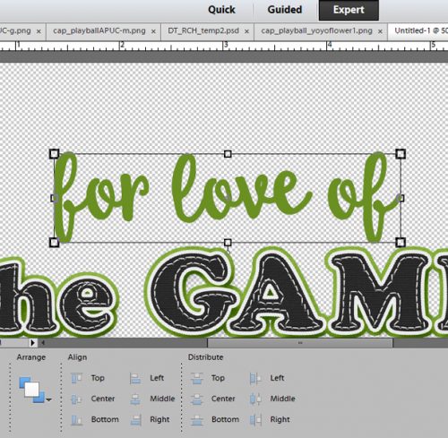
All that was left was to merge the layers and drop my title onto my layout. One really important thing that I can’t emphasis enough is that titles and journaling should NEVER “float” over the layout. So I put my title on a layer just above my background paper and added a narrow drop shadow to it. And there you have it! To see the whole layout, you can look here.
And that brings us to the end of this tutorial. I was really pleased to see so many sticker-ified titles in the gallery after the first tut, so I’ll be watching for some font-and-alpha combos. Have fun… see you again soon!
![]()