Watercolor Effects – SO Beautiful!
![]()
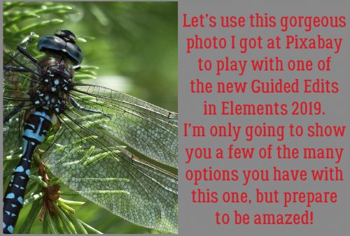
Where did the week go? It’s Tuesday again and as promised, I have another glimpse into the new tools to be found in Elements 2019. There are some new Guided Edits, and we’re going to play with one today. It’s called Watercolor Effect, and you’ll see where to find it in just a minute. I chose this photo that I found at Pixabay (dragonflies are my spirit animal) and it looks amazing in each of the ways I’ve altered it. Wait until you see!
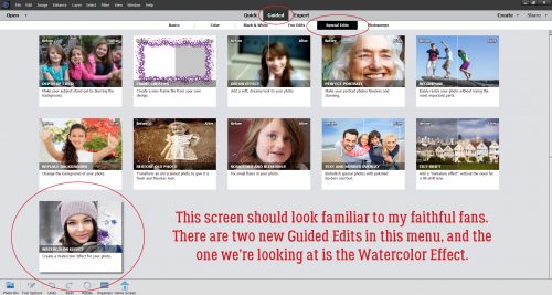
Click on Guided>Special Edits then scroll a little so you can see the Watercolor Effect down there in the lower left. You might notice that there are two new Edits within this menu, but otherwise the interface looks just like it did in previous versions. We’ll look at the other new one in a later tutorial. Promise.
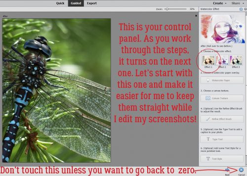
The Control Panel here makes it easy to follow the process. The hard part is making choices! So I’ll be frank, I tried THEM ALL. But for the sake of keeping it all straight in my head – since I made all the screenshots last night – I’m going to go in order here. First up is Effect 1. [Remember that if you hit Cancel when you want to Undo something, you’re going to end up kicked out of the Edit. If you just want to go back a step or two use CTRL/CMD>Z. You’ll thank me!)
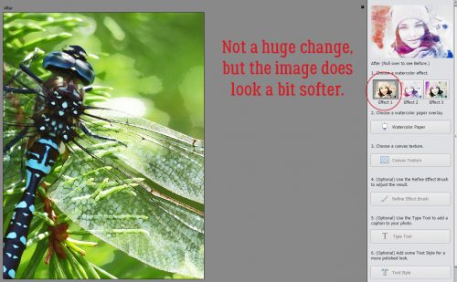
I just clicked on that Effect 1 icon. There isn’t a dramatic change, but the image, especially the background, looks a lot softer.
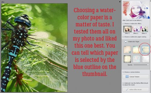
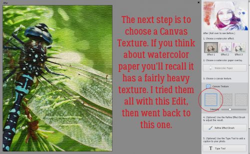
The next step is to choose a Watercolor Paper. It’s purely a matter of taste. Real watercolor paper is thick, heavy and has a very distinct texture to it. Elements 2019 is going to emulate that look. I tried all of the choices with my image and settled on the one with the blue outline.
And then I clicked on the first Canvas Texture button. You can instantly see the difference.
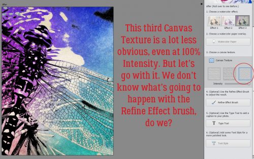
If you love what you’re seeing, you can stop here and move on to the Expert editor to play with it in other ways. But you know me, I’m never going to stop in the middle, because how will you see what you can do with this amazing software unless I keep going? Onward rode the 600! Time to use the Refine Effect Brush.
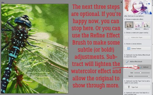
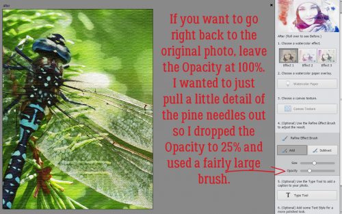
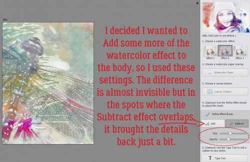
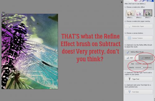
The Subtract tool does exactly that, it reduces the watercolor effect on the area you run the brush over. That means both colour and sharpness will be present again.
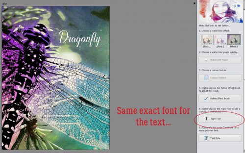
Elements 2019 has thought of everything. If I was going to use my finished watercolor for a greeting card, for example (which would be a perfect way to make use of this Edit!), I might want to put a sentiment of some sort on it. So they’ve included a Type Tool. One thing I discovered when I installed Elements 2019, which hadn’t happened with previous upgrades, is that it automatically transferred my entire font library for me. Dragonflies are ethereal creatures, so I looked for a script font that wasn’t TOO swirly. Indulge Script Regular was what I decided to use.
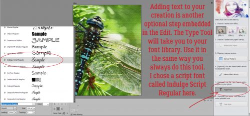
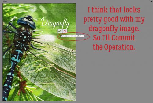
Until you Commit Current Operation, you can change your text as much as you want. You can select your text with the Type Tool and scroll through your library, looking at each font until you find the one that lights up your work. And you can adjust the size too.
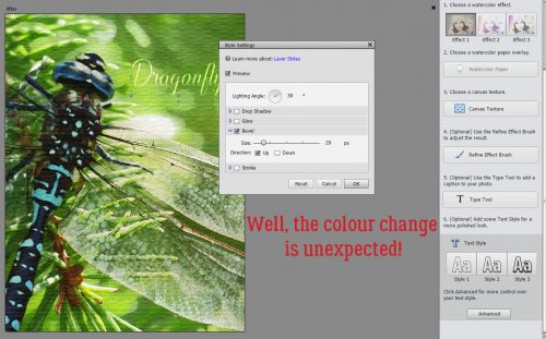
The last optional tool is the Text Style tool. The first one in the group is a basic font style to which I added a slight Bevel.
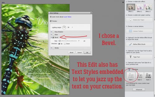
This option actually decreased the Opacity of the text to let the background colour show through!
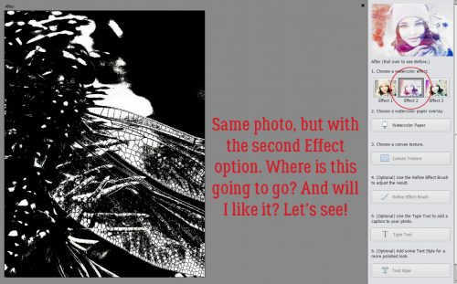
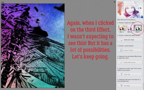
Okay… on to Effect 2! Wow… not what I was expecting at all!
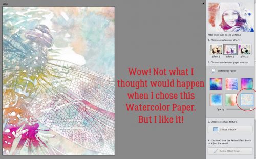
A simple Watercolor Paper choice – a single click – did THIS!
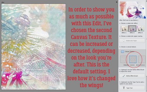
In keeping with what I said I was going to do, I chose the second Canvas Texture so you can see how each changes the image. The Intensity of this effect can be adjusted up or down, as is your choice. The change to the wings is a simple pixelation, but it’s really pretty.
On to the Refine Effect Brush. I went over the wings in the Add mode. Next, I want to pull some of the green back in.
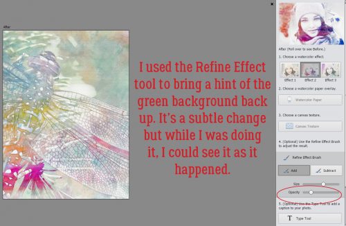
I went back over the head and body with the Add mode and a smaller brush to restore the watercolor effect to them.
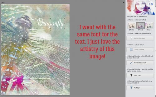
Same font… gets lost a little though.
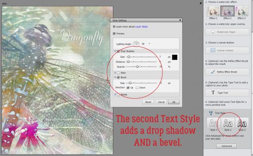
The second Text Style button brought it forward a bit by adding a Drop Shadow and a Bevel.
And now let’s see what Effect 3 does. This background color change appeared with a single click on its button.
I tried ALL the papers more than once until I landed on just adding a bit of colour to opposite corners.
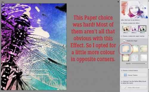
It’s hard to see the texture of #3, but it’s there.
I Subtracted over the background and brought back some green. See how the wings look more iridescent than they did?
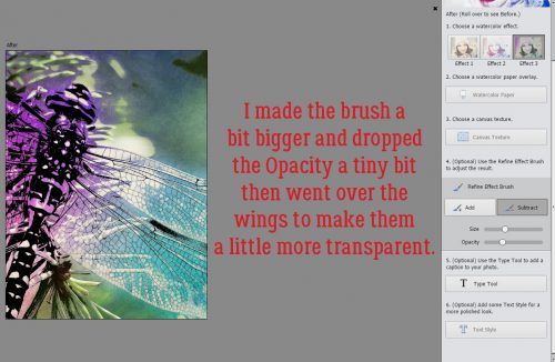
I really wanted to make that iridescence more obvious, so I went over the wings with a slightly bigger brush at a very slightly decreased Opacity.
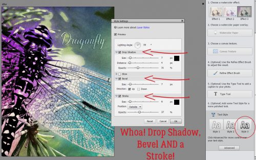
Same font, but such a different look!
That third Text Style went big, adding a Drop Shadow, a Bevel AND a Stroke! I made the stroke a lot narrower so it’s just a hint of an outline, and decreased the Opacity of the Drop Shadow a bit and got a pretty nice-looking label on my image. If I was ready to do something creative with this right now – or to save my work for later – I’d go down to the lower right corner of the workspace, click Next then select either Save As or Expert and carry on in the usual way.
Now that I’ve seen this Edit in action, I know I’m going to use it. A lot! Greeting cards for sure, but imagine what one of these examples would look like clipped to a Layer Mask for an Art Journal layout. I’m sure I’ll come up with many more ways I can use this if I give it some thought. What might YOU do with it?
![]()