Even Sketchier Still!
![]()
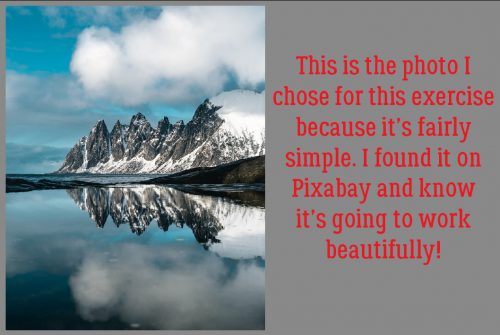
I know, I know… I’ve already shown you more than one way to turn a photo into a sketch. But I haven’t shown you THIS way, which is the easiest and most interesting method I’ve learned to date. And it’s a GUIDED EDIT in PSE 2019 (Amazon Prime Day – $59!) so you know it’s going to be a cinch. Well, it can be as easy or complicated as you make it. I tried this Edit on several photos before deciding that for the sake of expedience, I’d go with the photo below.
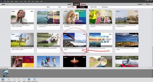
This Partial Sketch Edit is reached via Guided>Fun Edits. Right there in the middle!
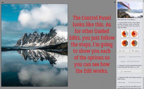
The Control Panel looks like this and completely leads you through the process. I’m going to show you the results of each of the four options so you can see how it looks and lets you imagine how you could use it.
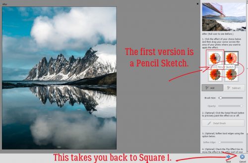
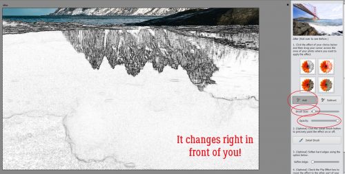
I’m going to move top to bottom and left to right with the options, starting with the Pencil Sketch. This photo is divided horizontally so it’s not going to be a lot of work to make my selection. The selection portion is the most difficult and time-consuming part of the process. (Just a reminder… the Cancel button takes you right back to Square One, literally, so don’t click it unless you WANT to start all over.)
One thing I discovered right off the bat is that the effect appears as the selection is made. You can see it as it changes. I’m showing a selection made with a fairly small brush at 100% Opacity but there’s nothing that says you can’t do whatever you like. If you’re adept at selection, you can use a bigger brush; don’t forget that you can toggle back and forth between Adding to your selection and Subtracting from it. That means you can remove areas from your selection that you don’t want to convert to a sketch while you go. The Undo (CTRL/CMD>Z) command will take you back a single step if you find too much of the photo is selected with one click.
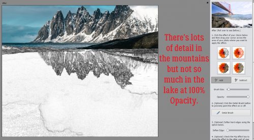
So, in the Pencil Sketch mode at 100%, there’s not a lot of detail visible in the lake. The mountains are well-defined but that’s about all. The clouds are so important to the overall composition so let’s find them.
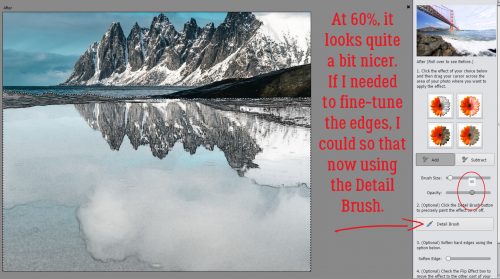
Ah, there they are! To my eyes, this looks like it’s part sketch and part watercolour. After the Opacity is where you want it, if there’s any fine-tuning your selection needs to give you the look you want, you can click on the Detail Brush and fix it up.
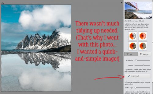
The refining I did isn’t really obvious, and there wasn’t a lot needed.
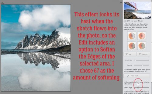
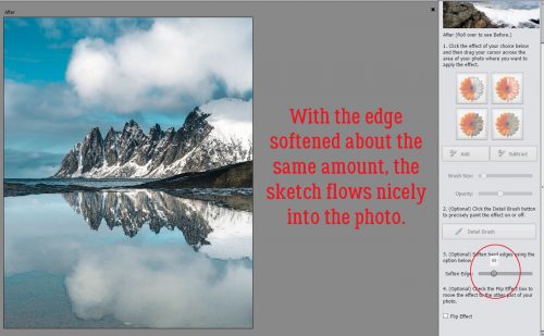
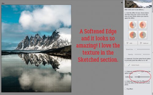
The best sketch effects blend gently into the photo, and PSE makes that as simple as moving a slider over to the right. Watch as you slide so you know when to stop.
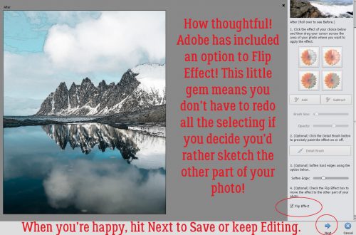
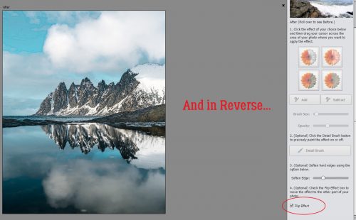
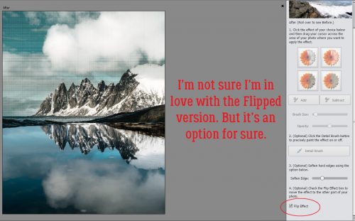
The software developers at Adobe are really upping their game. This Edit also includes a Flip Effect option. So you can turn the part of the photo you DIDN’T select into the sketch and the sketch part back to a photo just with one click.
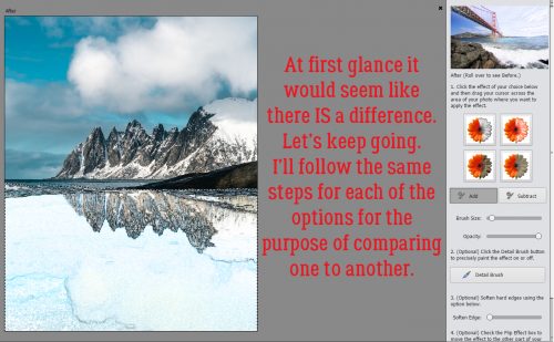
The second option is a Colored Pencil Sketch. I didn’t know if it would look substantially different from the Pencil Sketch version once I adjusted the Opacity, so let’s take a look.

There definitely is a hint of colour in the lake this time.
With a little tweaking I’ve got this.
And with the edge between photo and sketch softened…
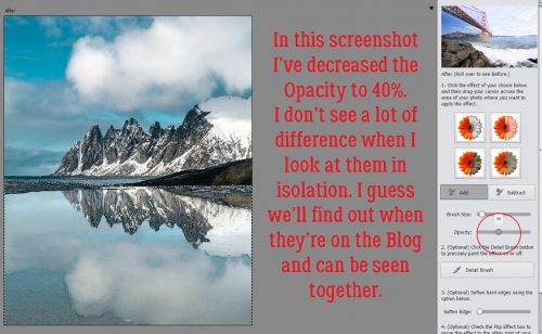
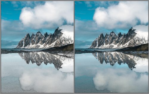
Before I use the Flip Effect button, let’s look at the Pencil and Colored Pencil side by side. Remember there’s a 20% difference in Opacity between them. There is a difference, but I’m not convinced the software is why.
Okay, here’s the Flipped Colored Pencil version.
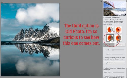
This one has a lot of promise. How will an Old Photo sketch effect look?
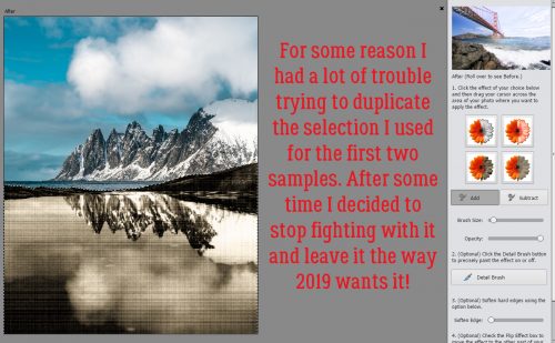
Ah! Very cool!! For reasons I haven’t divined, I had trouble making my selection for this one to exclude the little spit of land at the centre-right of the photo. So after a number of failed attempts to duplicate the selection used in the previous versions, I just let PSE have its way.
See how the mood is SO different with this version? I can’t wait to try it on some of my real old photos.
I really like the way this one looks.
Flipped, maybe not so much. But I do love all the texture.
What will Old Paper do that Old Photo didn’t?
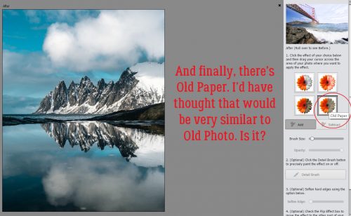
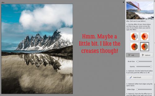
There is a noticeable difference; those creases are awesome!
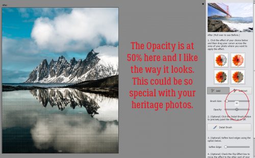
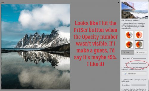
Dropping the Opacity to about 45% (yeah, too quick on the PrtScr finger!) looks like this. Still moody, but not quite as stormy.
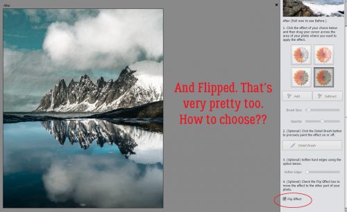
Flipped is pretty. I can’t pick just one!
I can see any (or all) of these printed and framed. Or on a greeting card. Or surrounded by beautiful elements on a layout. So many ways to use this!! I hope you’ll give it a try and let me know how you like it.
![]()