It’s All a Matter of Taste – Black and White
![]()
Well, July is nearly over and I have STILL not managed to get any scrapping done. I thought about it, but that’s as close as I got. We had a crazy-busy week and I think we’re finally (almost) at the end of the big things we needed to do with the house. We have a fence for the dogs, we’re having synthetic turf put down in the yard on Thursday and once I get the plants I dug up from the backyard transplanted, I might be able to relax! Of course, Thursday is forecast to be the second-hottest day of the summer (36°C/97°F) and I’ll be outside shoveling river rock into our son-in-law’s truck. They better bring the beer!
Anyway… I was looking at some back issues of Photoshop Elements Techniques (only available now as an archive) and came across some tips on converting colour photos to black and white to make them look amazing. So I decided I’d check out the options. I’m using Elements 2019, but the tips I’m going to show you are easily found in most versions.
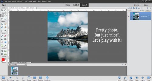
When I took a photography course many years ago, well before the advent of digital photography, my teacher talked about how black and white was THE true art of photography. I tend to agree with that notion. There are so many nuances to black and white photography that just aren’t there in colour images. Digitally speaking, turning a colour photo into a black and white one is easy, but the ART of it is more in the eye of the beholder. So let’s have a look. I’m using a landscape photo I found at Pixabay for my example.
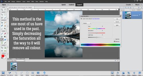
This method is the first one I tried way back in 2006 when I was learning the basics of Elements. Enhance>Adjust Color>Adjust Hue/Saturation can also be reached by using the keyboard shortcut CTRL/CMD>U.

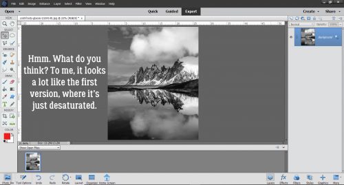
This method has been available in all versions, and so many of us have done it this way. Dropping the Saturation down to 0 removes all the colour. But that’s all.
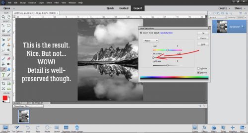
It IS nice. All the detail in the clouds, rocks and reflections is there.
In all but the earliest versions of Elements, there’s an option to Remove Color in the Enhance menu.
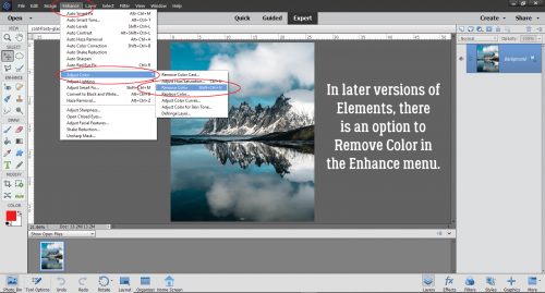
And this is the outcome. I think it looks pretty similar to the desaturated one. Maybe just the slightest bit more contrast.
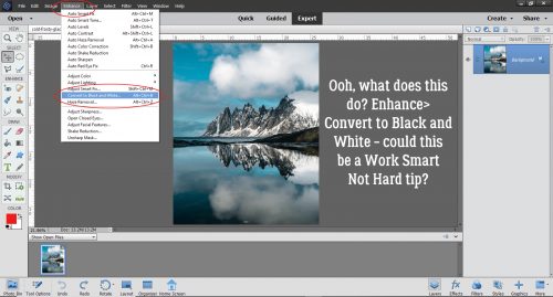
But then there’s this option… Enhance>Convert to Black and White. This option first appeared in Elements 9. Could this be the WSNH (Work Smart Not Hard) method of choice?
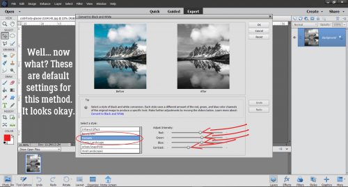
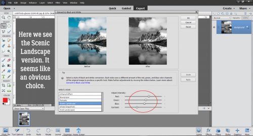
When I clicked on that button this is what came up. Below I’m showing the default settings; it comes up in the Portrait setting with the colour sliders (Red, Green, Blue and Contrast) as you see them. Now, I know you’re thinking, “Colour sliders? But there IS no colour!” Let’s unpack that.
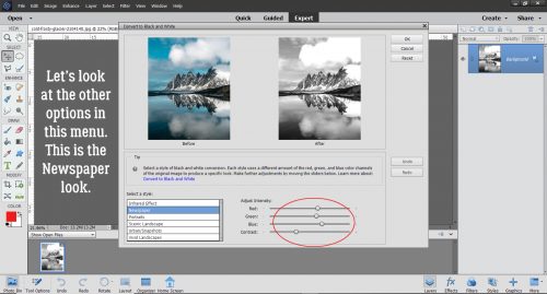
I went through all of the Modes here, looking at where the colour sliders were in their default settings. See if you can see a difference in each of the images as we go along. Newspaper mode looks like this: slightly less Green, a smidge more Blue and marginally less Contrast.
In Scenic Landscape, the Red has been boosted and the Blue reduced. I can see that the image is slightly warmer looking.
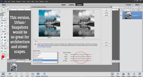
Urban/Snapshots mode has somewhat less Red, slightly more Green, a bit more Blue and the same amount of Contrast, even though it seems like the Contrast is a bit less obvious. I think this mode would be great for architectural photos and streetscapes.
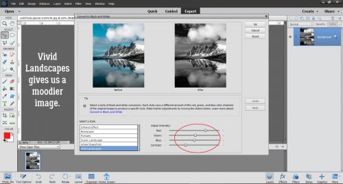
Vivid Landscapes brings the mood with it. Lots more Red, a good bit less Green and Blue, same Contrast. And yet…
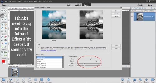
I wasn’t sure what to expect with Infrared Effect. There’s less Red, a LOT more Green, a middling amount less Blue and the same degree of Contrast. I think I need to take a deeper dive into Infrared… stay tuned!
Okay, so I’ve looked at all the options. I decided to go back to the Scenic Landscape settings and play with the sliders.
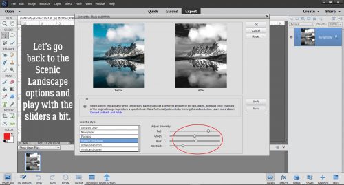
I left the Red and Green as is, decreased the Blue a bit and increased the Contrast quite a bit. I like that the rocks look more carved and stark.
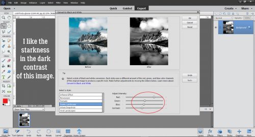
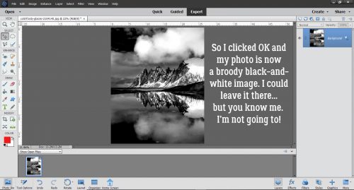
So I went with it. The image is a bit harsh, which suits the subject matter. I could just save it like this, but I want to play with it a bit more.
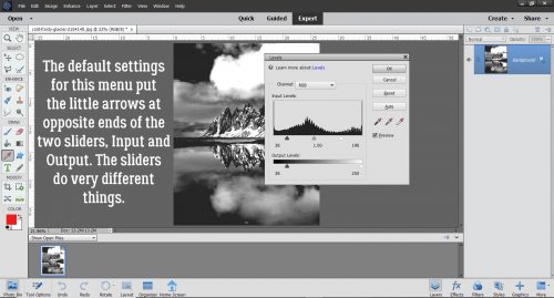
I really like to use the Levels adjustments especially with black and white images. It can be found by clicking Enhance>Adjust Lighting>Levels or with the easy keyboard shortcut CTRL/CMD>L.
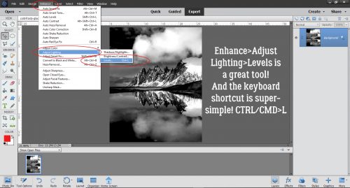
In the default setting for this tool, the sliders for both Input and Output Levels are at either end of the boxes. With the Input adjustment, moving the slider on the left makes the lighting darker, the slider on the right makes it brighter. The centre slider offers a finer adjustment than either of the ones on the ends. For the Output adjustment, the changes are more contrast-related and inverse – the left slider lightens and the right slider darkens.
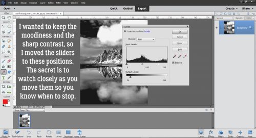
These are the settings I liked. When using Levels the best way to make them work for you is to watch what’s happening while you move the sliders. That way you’ll know when to stop!
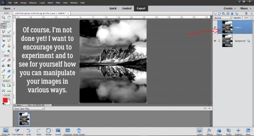
There’s just one more thing I did to this image that I want to show you. As you can see, I added a Copy layer so that whatever I do, my original image isn’t touched. You may wonder why I keep doing more and more, when I have a perfectly useable image already. Well, how better to encourage you to experiment than to do it myself? There’s always the Undo (CTRL/CMD>Z) function! (And I use it a TON!)
I played with some Filters and liked how this one looked, so I clicked Filters>Stylize>Glowing Edges. What do you think happened?
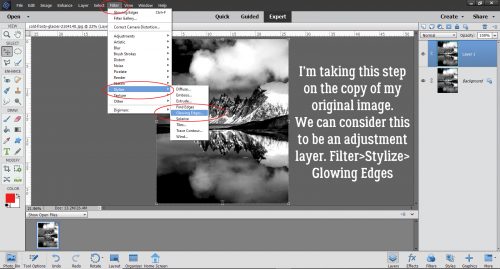
This. This happened. Remember that when you use Filters, you’ll see this screen, with the Filter adjustment panel on the far right. It’s hard to know what it’s going to look like later, but I wanted to have the “glowing” effect to be prominent at this stage.
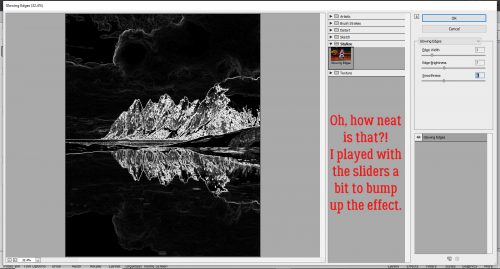
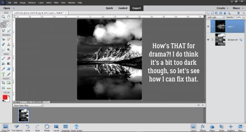
Here’s the result. So much drama! But it’s a bit on the gloomy side.
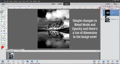
So I changed the Blend Mode (naturally I tried several before settling) to Soft Light and decreased the Opacity to 35%. Now I have what Mrs Hansen would call Photographic Art.
Give these methods a whirl and see which one works best for you!
![]()