Another Guided Edit – Multi-Photo Text
![]()
September first.. ALREADY?!! That got me thinking about other firsts. Like first birthdays and first days of school. My oldest grandson started first grade about 10 days ago and it seems like it was only a few days ago that he was sleeping in his stroller while his parents and I toured the botanical garden. Time flies too quickly but we scrapbookers know we can hold onto those memories. This Guided Edit I want to show you today can be adapted so many ways. Sadly it didn’t appear until Elements 2019, but it’s possible to create the same effect in previous versions, it’s just a lot more work.
Drop a photo or a paper into your Photo Bin then click Guided Edits>Fun Edits>Multi Photo Text. If you don’t have a photo or paper in your Photo Bin, Elements will prompt you.
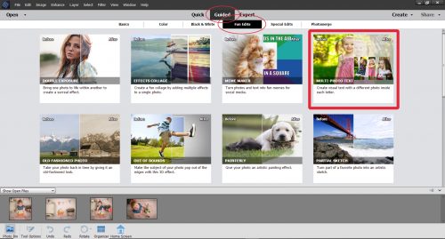
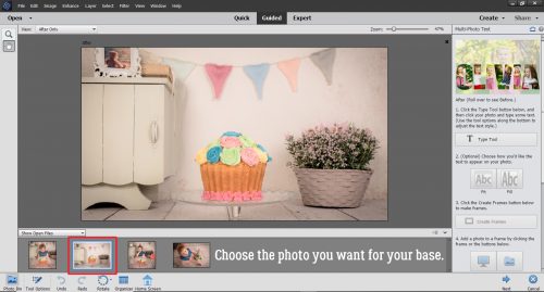
For my example, I’m using a series of photos from Pixabay; the photographer is Tim Kraaijvanger. This photo of a birthday cake is a great background photo. For a back-to-school version, you could have a photo of the school bus with the door open or driving away, your kiddo walking into the school or maybe the school itself. Along the right side of the screenshot you can see the menu for the Edit.
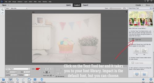
When I clicked on the Text Tool bar, the background photo became very translucent. The Text Tool bar takes you to your font library. The default font is Impact, but you can choose any font that will give you a suitable spot to attach photos.
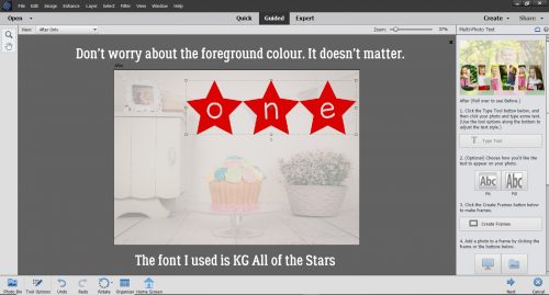
I chose to use KG All of the Stars for this one. It’ll work well. The foreground colour doesn’t matter because Elements will turn your text into clipping masks.
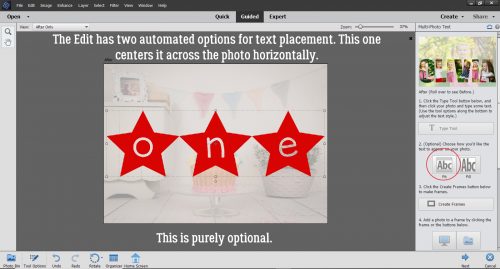
You have total control over the size and placement of your text, but the software developers kindly included two automated options. You can automatically centre it horizontally across your background, as shown, by clicking the optional Fit button.
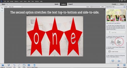
Or you can click the Fill button and have it fill the entire space.
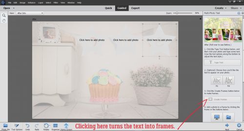
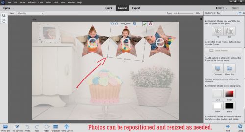
But I want mine to be in the upper right area of my background where the banner is. So I moved it there and sized it accordingly. Then I clicked on the Create Frames button and the text disappeared, sort of.
I dragged and dropped my photos onto the canvas from my Photo Bin. Those thoughtful software developers included an option to pull a photo from the Photo Bin, or to grab it from a folder on my computer. I clicked on the spaces one at a time to make them active and added my photos.
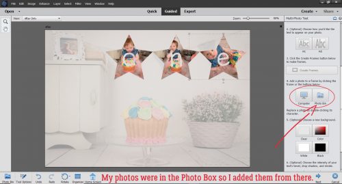
The photos can be manipulated, resized, repositioned or rotated as needed to obtain the best look. I wanted to be able to see her face and her cake in all of them and I wanted to be sure the photos filled the frames. That middle one needed a bit of rotation.
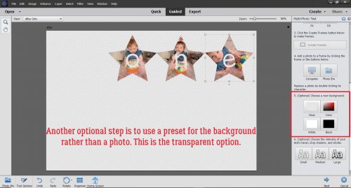
Moving down the menu, there’s an optional step to change the background. This can be useful. Having a transparent background would let me move just that photo-filled text onto my layout.
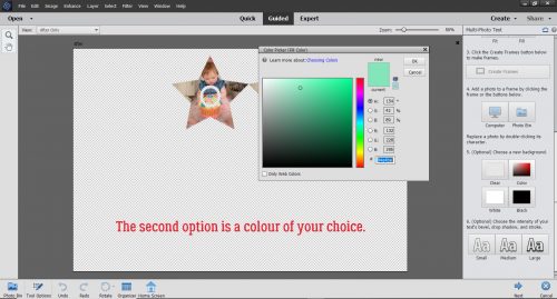
Or I could pull a colour from one of the photos and use that as the background by clicking on the Color button and using the Color Picker.
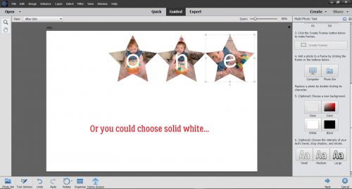
Solid white might work for you.
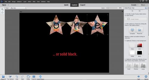
Or solid black.
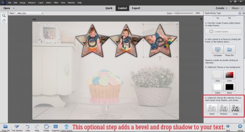
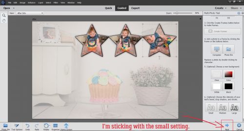
Another optional step is to add a bevel and drop shadow to the text. This sample shows the Small setting.
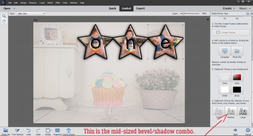
The Medium setting looks like this. I think it takes away from the photos, so I’d not be using this one!
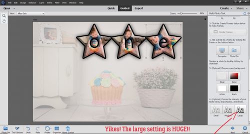
Or this one! Large is just too, too, too!
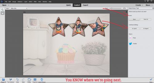
I went back to the Small setting. Then I clicked on Next.
A new menu opened up that allows me to Save my work, or go on to Edit some more, Share or be Done.
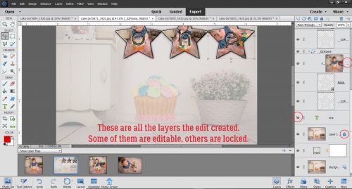
When the Expert Editor opens you can see all the layers Elements created while I was working through the Guided Edit. Some of the layers are Locked, and can’t be altered. Some are invisible and others are completely editable. It gives us a peek into how the Edit works.
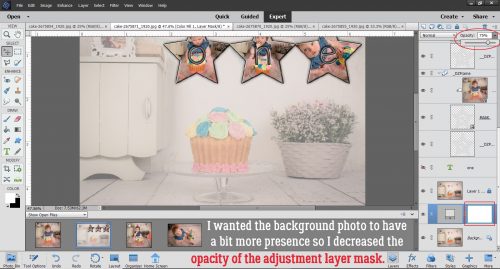
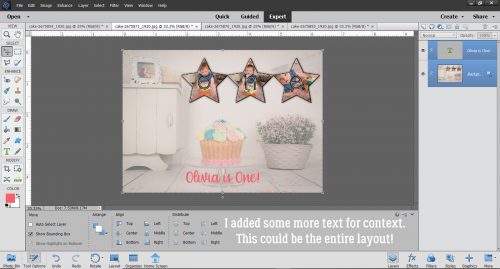
I wanted more of the background photo to be visible so I adjusted the Opacity of the adjustment mask (the active layer with the mask outlined) to 75%.
Then I added some more text for context and it’s ready to Save, or to use as part of a layout. If I’d used a transparent background, I could put that text into a layout anywhere. I could crop that background photo to a square and have an image I could turn into my entire 12×12 layout, and then add some embellies to it for fun. So many options!
What would you like me to show you next week?
![]()
[…] 188. Another Guided Edit – Multi-Photo Text […]