Reflections, Perspectives and Shadows
![]()
Well. Today has been an unmitigated disaster. I should just not try to outsmart WordPress, because I only end up making more work for myself! Let’s see if third time’s the charm.
Have you ever looked at a layout and thought, “Holy cow! That’s so amazing… I have to scraplift it right away!” and then tried to figure out how the original scrapper did it? That’s the challenge that Ginger – Dandelion Dust Designs – threw at me. One of her Facebook fans had seen a totally fabulous layout in Katie Pertiet’s gallery on her blog and wanted to know if Ginger had any tips for recreating it. Ginger came to me… so I scraplifted it myself and now I’m going to show you how I did it. The layout was created by Jane_Bond7, who says in her description that SHE scraplifted it from a layout she saw on Pinterest… and she used a photo strip template from Katie that you can download here. WARNING!! This is an advanced tutorial, with 55 screenshots. You have been warned!
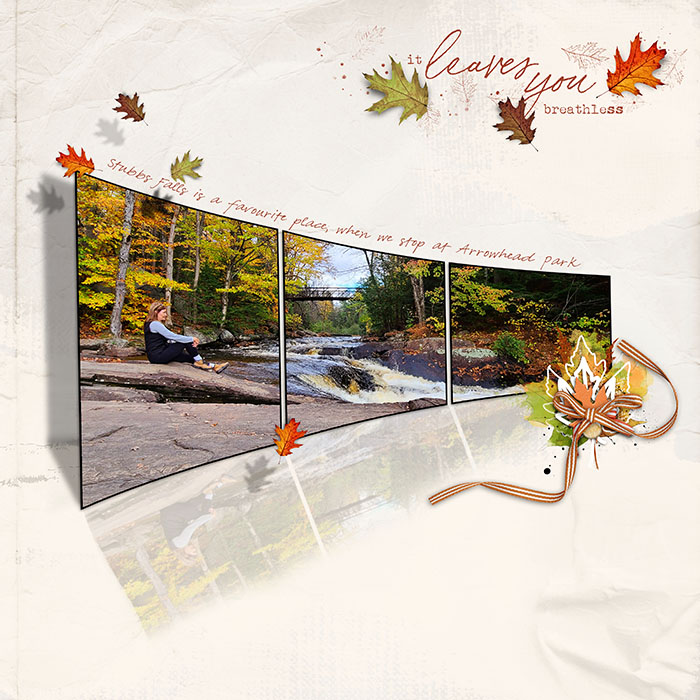
Isn’t that a fabulous layout? The first thing I did was to download the template, choose a photo and some embellies for my layout and got underway.

Then I had a look at things. Obviously, if my layout is going to be true to Jane’s I’m going to need to rotate my template by Image>Rotate>Flip Horizontal.

Next I opted to Merge the three photo spots together into a single photo strip. That’ll save me some effort later. Select the three layers, right-click>Merge Layers or CTRL/CMD>E.

Looking at Jane‘s layout to guide me, I Resized the photo strip to leave room for the shadow and the reflection. 75% of the original size looks about right.
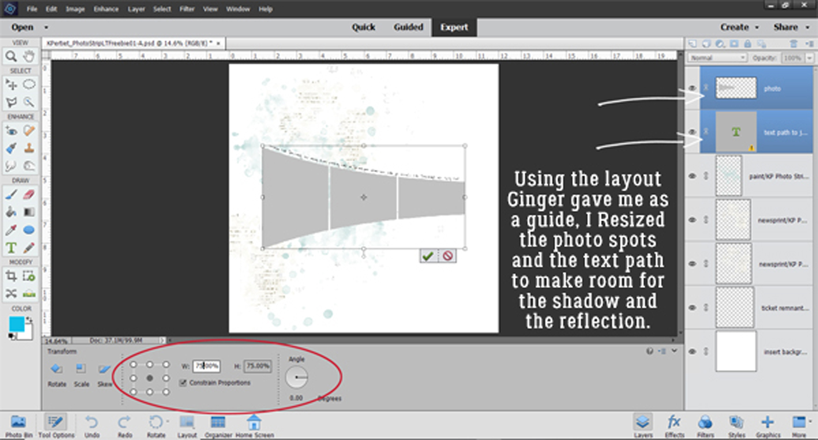
I looked at Jane‘s layout again for awhile and decided the height of the photo strip wasn’t quite right. So I stretched JUST the height by 10%.

Time to add the photo. I’ll adjust its size and position after I’ve got it clipped to the photo strip to make sure as much of the vineyard is visible as possible.

To clip the photo to the strip, right-click on the layer>Create Clipping Mask OR CTRL/CMD>G for PSE versions before 14, OR CTRL/CMD>ALT>G for PSE versions 14 or later.

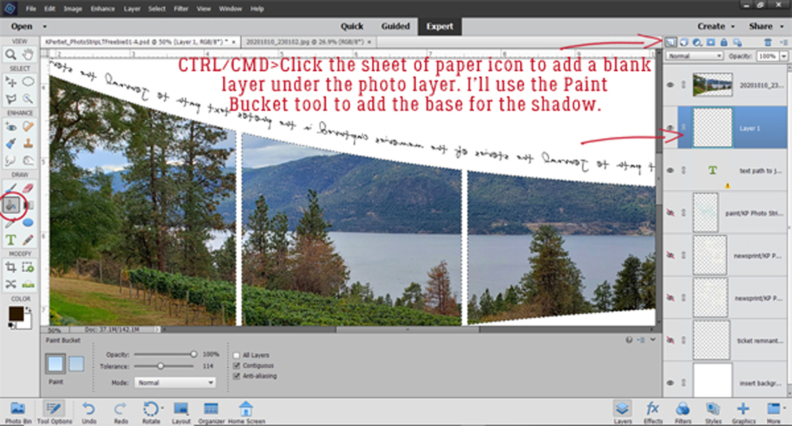
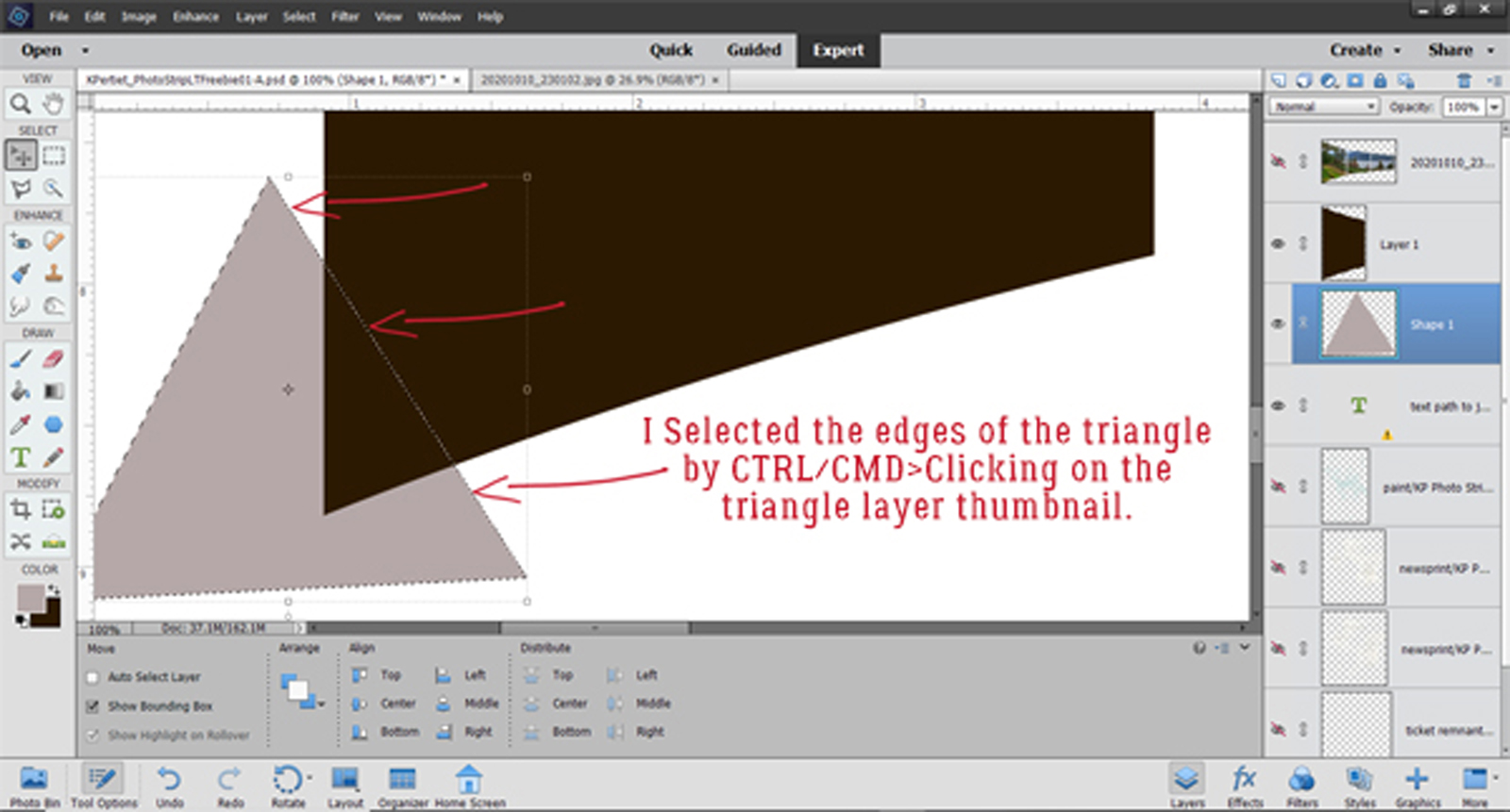
For ease of handling later I Merged the photo with the photo strip then Selected the edges of the photo strip by CTRL/CMD>clicking inside the layer thumbnail in the layers panel. Alternatively click Select>All.

I got a bit carried away and picked the foreground colour for my shadow before creating a blank layer UNDER my photo strip. But not to worry… it’s going to happen. I typed in the dark brown colour I wanted for my shadow, “2c1901” and the Color Picker shows you what it looks like.

The easiest way to add a blank layer under another layer is to CTRL/CMD>click on the sheet of paper icon at the top left of the layers panel. Then I activated the Paint Bucket tool to fill the Selection I made previously, with brown. That’s the basis for the shadow layer.
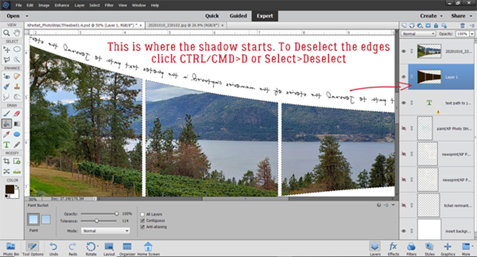
Okay… let’s play with the shadow. But first Deselect the edges either by Select>Deselect or CTRL/CMD>D.
If you need a visual…

Now I’ve turned the Visibility of all but the shadow and background layers off so I can see what I’m doing better.

If you look closely at Jane‘s layout you’ll see the only part of this shadow layer I actually need is the large one at the left end. So I activated the Rectangle Marquee tool and corralled the other two pieces.

And to remove the other two pieces Edit>Cut or CTRL/CMD>X and they go away.
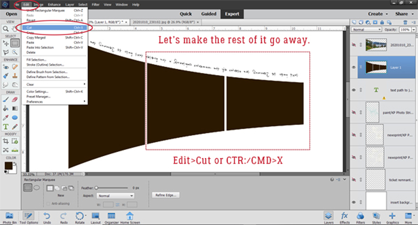
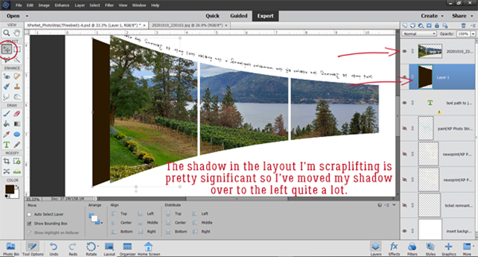
How on Earth’s layout has a lot of air behind her photos strip with the shadow quite a distance off. It also looks like the photo has a fold at the bottom. So I’ve moved my shadow over to the left a fair bit.
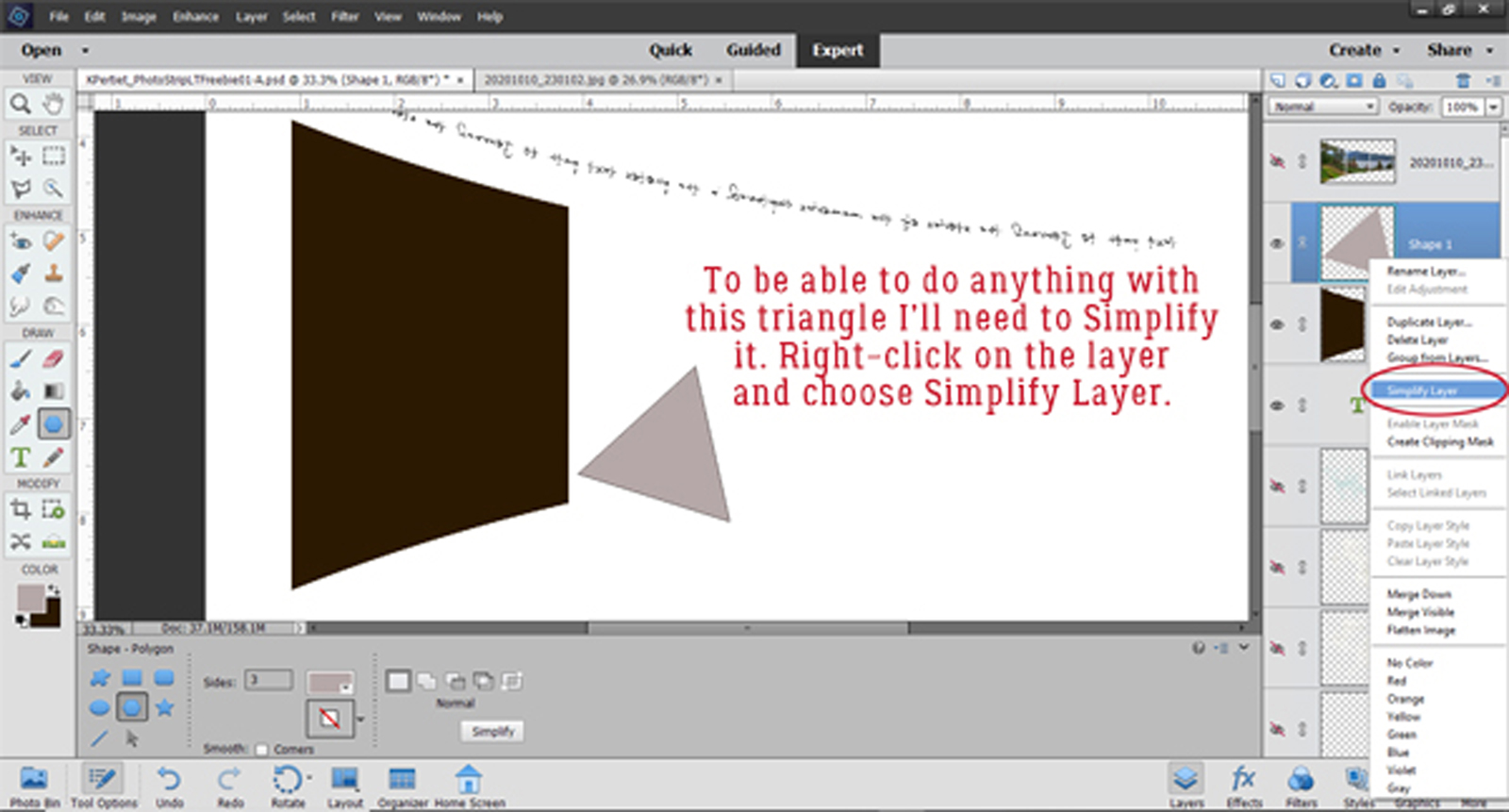
Now, how on Earth did she get that folded look? I think the Polygon Cookie Cutter will help with that. A triangle should work so I activated the Cookie Cutter tool, chose the Polygon and 3 sides.

I made my triangle bigger than I thought I would need, in a colour different from my background and shadow. Remember when I was talking about Smart Objects in the Preferences tutorial? Shapes created by the Cookie Cutter are Smart Objects. So in order to do much with them they need to be Simplified. Right-click>Simplify Layer.

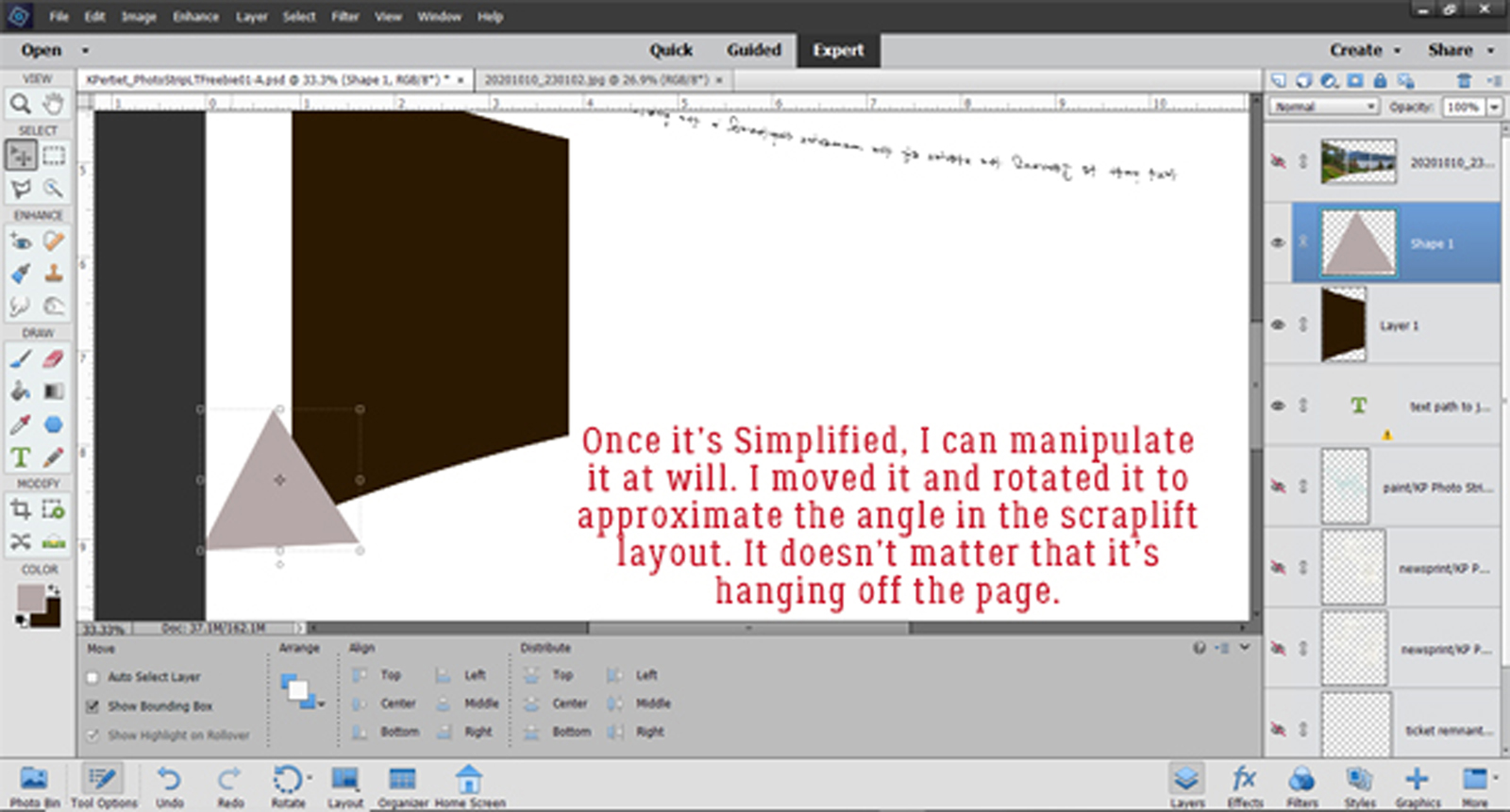
Now I moved the triangle and rotated it so that it’s over the lower left corner of the shadow. It’s not going to hang around so don’t worry if it hangs off the page.
I like to put the shape underneath whatever I’m using it to alter so when I DO the alteration I can see it. It isn’t necessary though.

Time to Select the outline of the triangle by CTRL/CMD>Clicking inside the layer thumbnail as before.
Then I can cut off the corner of the shadow: Edit>Cut or CTRL/CMD>X. TaDA… a “folded” shadow!

If you look at the layer thumbnail in the layers panel you can see the corner’s gone.

The triangle isn’t needed any more. You can turn it off or delete it now. The photo layer needs to be visible so the shadow can be positioned in the correct spot.

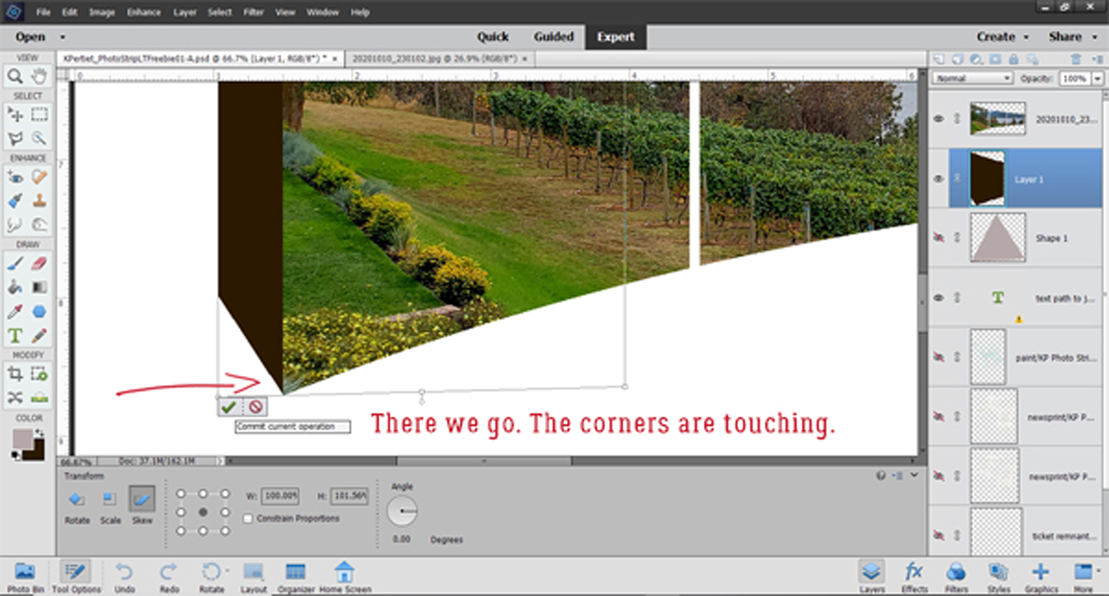
It turned out to be easier to control the corners by using the Image>Transform>Skew tool. This tool lets you move a corner of your bounding box in any direct to skew the shape inside it.

It’s not easy to see but the lower left corner of the bounding box around the shadow is lower than the right corner now.
On Jane‘s layout I think I see a slight curve to the side of her shadow. So I activated the Smudge tool, made it as big as I could but only 57% of its maximum strength then very… very… carefully Smudged it just a tiny bit. The Smudge tool also blurs whatever it touches a bit, which you can see in the screenshot.


What I’ve been showing you in these last few steps is how I manage all of my custom shadows. The next step is to soften it up, using a Filter>Blur>Gaussian Blur.

The Preview pane lets you see what’s happening to your image as you adjust the Blur, so you know where to stop. I decided 6.0 pixels was just right.

I change the Blend Mode to Linear Burn for my shadows. It allows a bit more of the layer below to show through as shadowed, not just covered.

Adjusting the depth of shadow is best done with the image Zoomed out. Then I decreased the Opacity of the shadow layer until it looked right to me, at 40%.

Jane‘s layout appears to have a narrow Stroke around the edges of her photos so I added a 7 pixel dark brown stroke to mine. Edit>Stroke (Outline) Selection


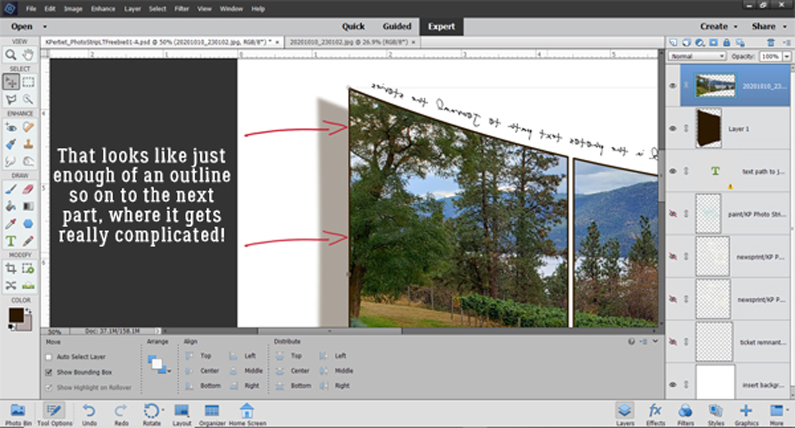
That looks good, so on to the really complicated part – the reflection. Getting it right isn’t going to be easy! I changed the Canvas size to give me some more room to work. I just picked a number out of the air. Image>Resize>Canvas or CTRL/CMD>ALT>C Then I Duplicated the photo strip layer. Right-click>Duplicate Layer or CTRL/CMD>J

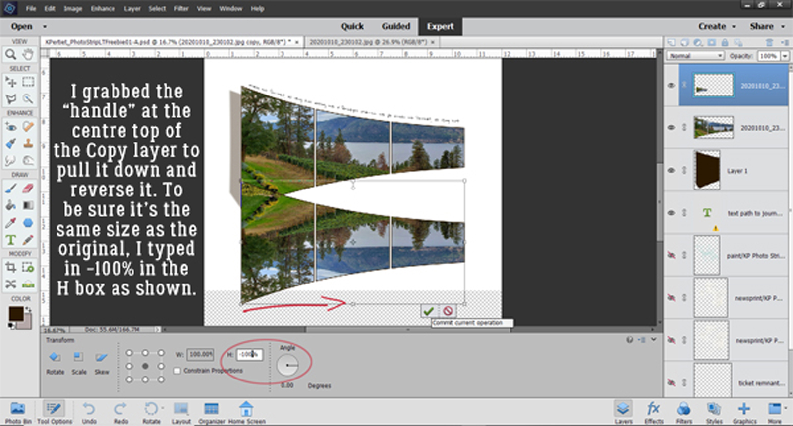
Reflections are mirror images so this Copy layer needs to be inverted. To do this, grab the “handle” in the centre of the top edge and pull it down toward the bottom of the workspace. Type -100 into the Height box and it will be exactly the same size as the initial photo strip layer.
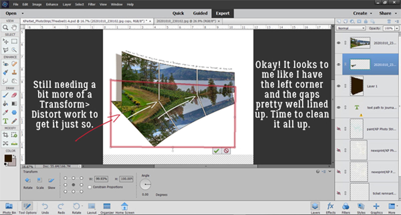
As I might have mentioned, this is the really fiddly part. The reflection layer will need a lot of manipulation to get it right. There can’t be any space between the photo strip and its reflection so I Rotated and nudged the reflection layer so the two overlap.
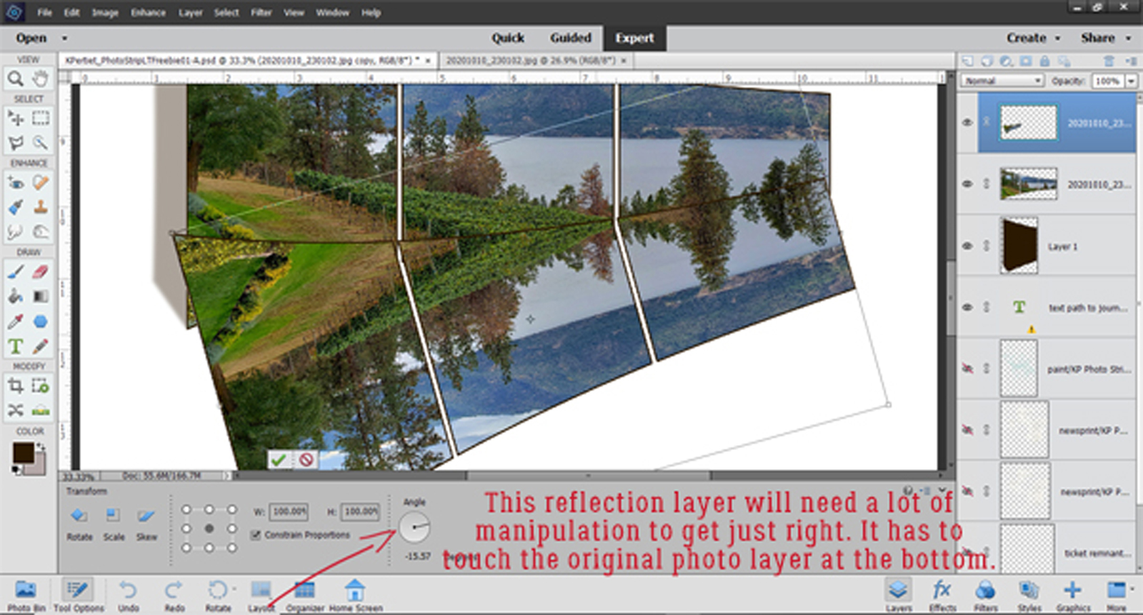
Then I moved the reflection layer down so it’s underneath the photo strip layer. For this reflection to work, the left lower corner and the two gaps have to line up. Easier said than done. Image>Transform>Skew or Distort will come into play here.
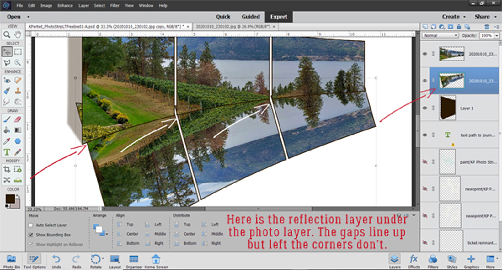
In Jane‘s image, it seems to me that the reflection of the photo at the left side is a bit longer than this, so Image>Transform>Skew lets me pull that corner down and in a bit to more closely approximate what I see in Jane‘s layout. You can see in the screenshot how the bounding box’s corner isn’t 90° any more.

Next… To try and better align the corners and gaps. Image>Transform>Distort gives the ability to move any or all of the corners of the bounding box in any direction I want. So that’s what I did!
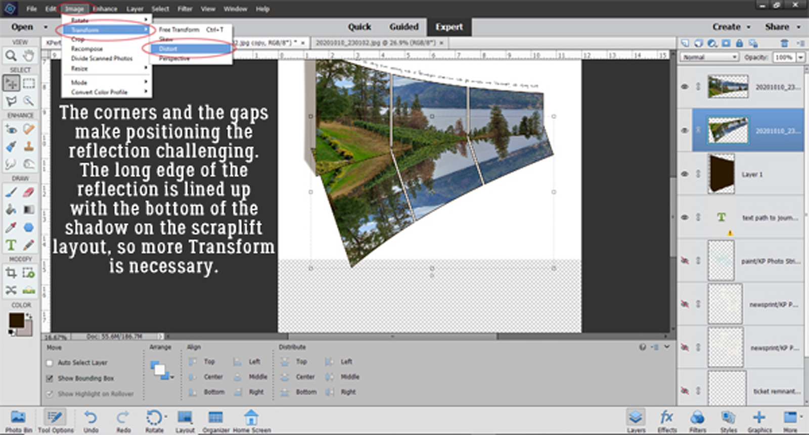
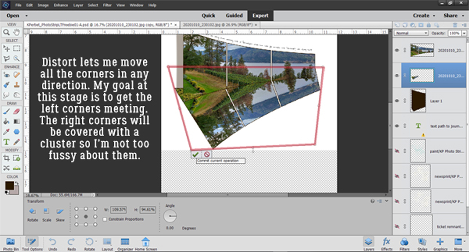
It’s a lot better, but still needs a tiny tweak at that intersection. In Jane‘s layout it looks like the reflection extends perfectly from the folded edge of the shadow so that needs to be dealt with.
It looks pretty good now! Time to clean up. I’m going to Erase the little bits of corners that show where they shouldn’t and I’m going to use a Layer Mask so if I take away too much, I can paint it back.


Once I was happy with the clean-up, I Simplified the reflection layer to absorb the Layer Mask.

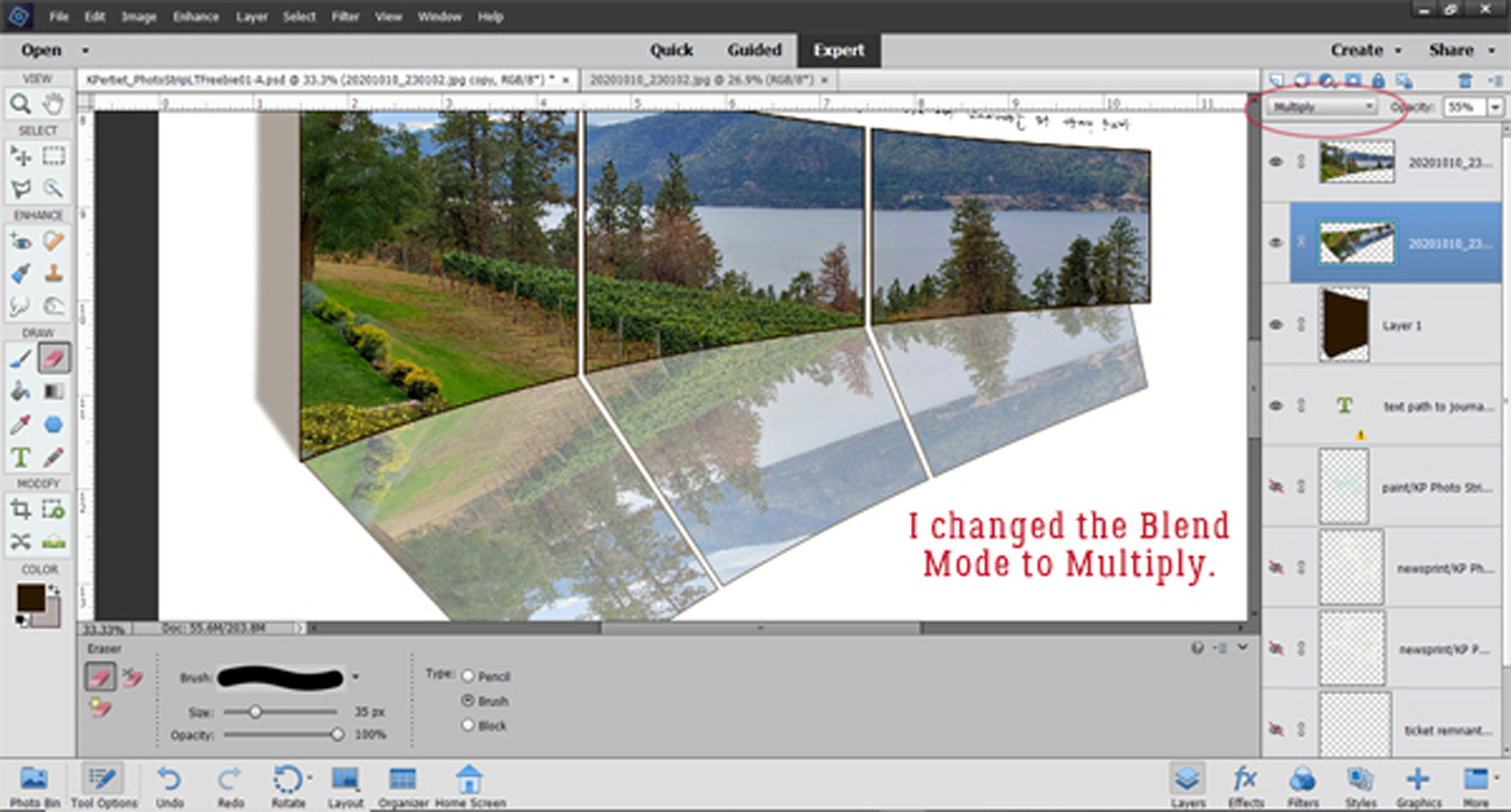
To turn the reflection into more of a reflection I decreased the Opacity down to 55% and it’s starting to look like Jane‘s.

The Blend Mode goes to Multiply.
Then to give the reflection even more realism I’ll add a Filter>Blur>Lens Blur to it.
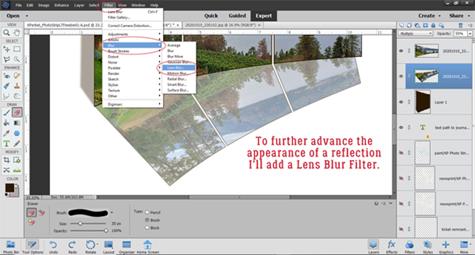
I set the Preview to More Accurate so I can see the changes more easily, then Radius, Blade Curvature, Rotation, Brightness, and Amount are set to 10, Threshold to 255, Distribution is Gaussian and Monochromatic is checked.

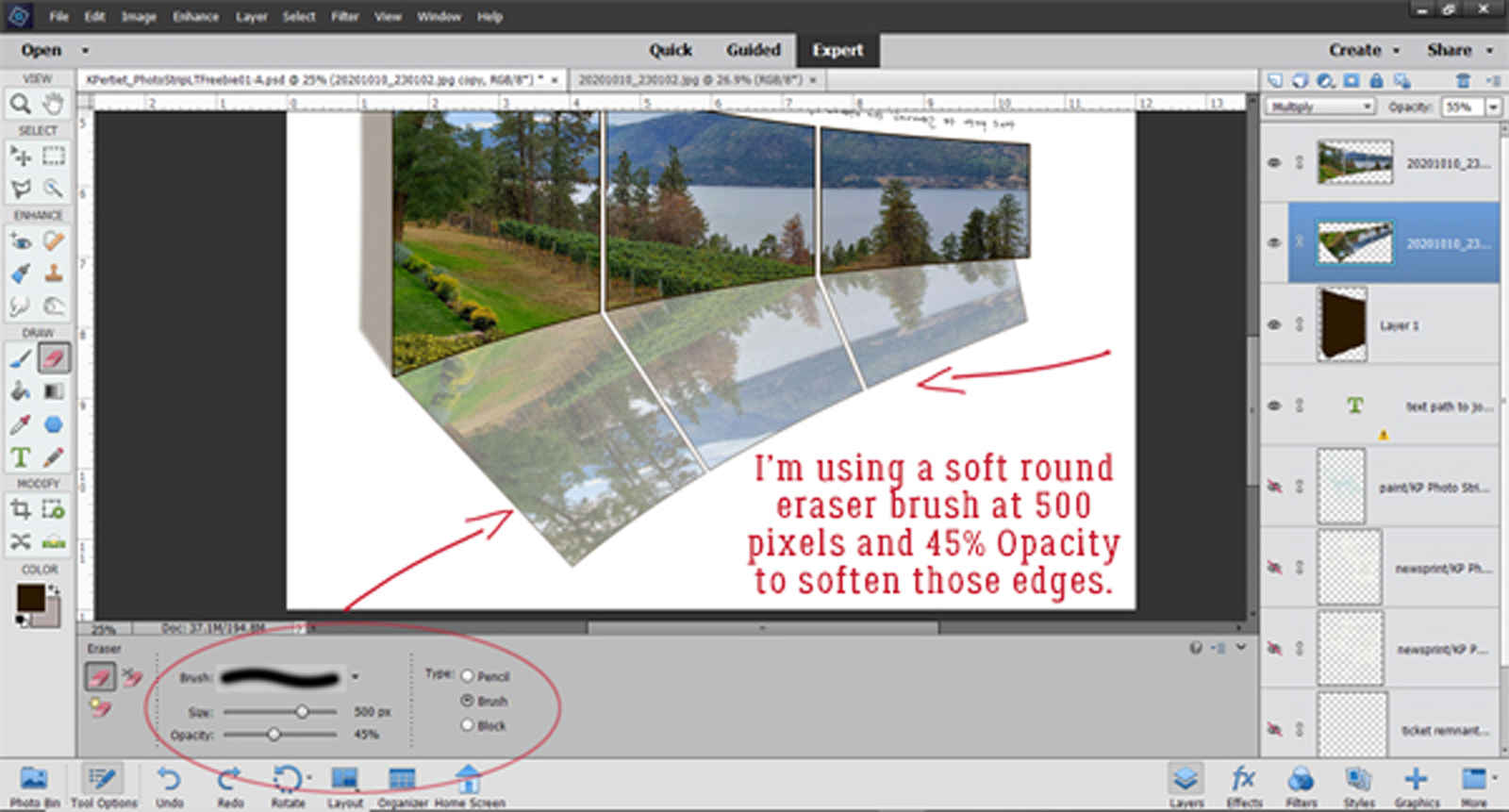
There!! All that’s left is to blend the edges and it’s done!

I used the Eraser tool with a large (500 pixel) soft brush set to 45% Opacity and ran it over the edges.
And it’s done! Now to complete the rest of the layout…

You may have seen my layout in the Gallery. If not…
![]()
