Digital Stamps in Living Colour
![]()
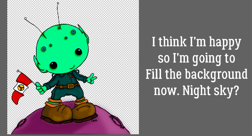
Do any of you belong to Font Bundles or Design Bundles? I love their monthly Dollar Days sales, although I already have more than 1600 fonts and I don’t have a Cricut… I’m also a sucker for digital stamps in addition to my enormous collection of rubber and acrylic stamps. But so far I haven’t found the right combo of paper, stamping ink and coloured markers so my stamped images always end up smudged and smeared. I thought, “Is there a way I could colour a digital stamp or a PNG image from Design Bundles using Photoshop Elements?” I had a podcast I wanted to listen to and some free time so I played with an image from Tiddly Inks, drawn by Cristy Croll, and figured out a method that worked really well. It can be adapted for doddles and brushes too. Read on!
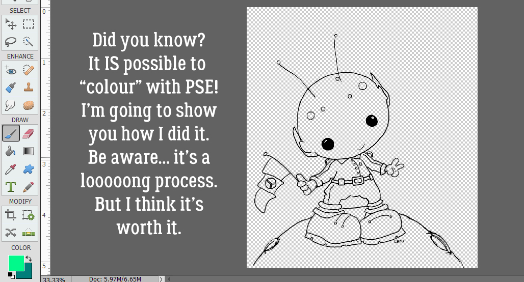
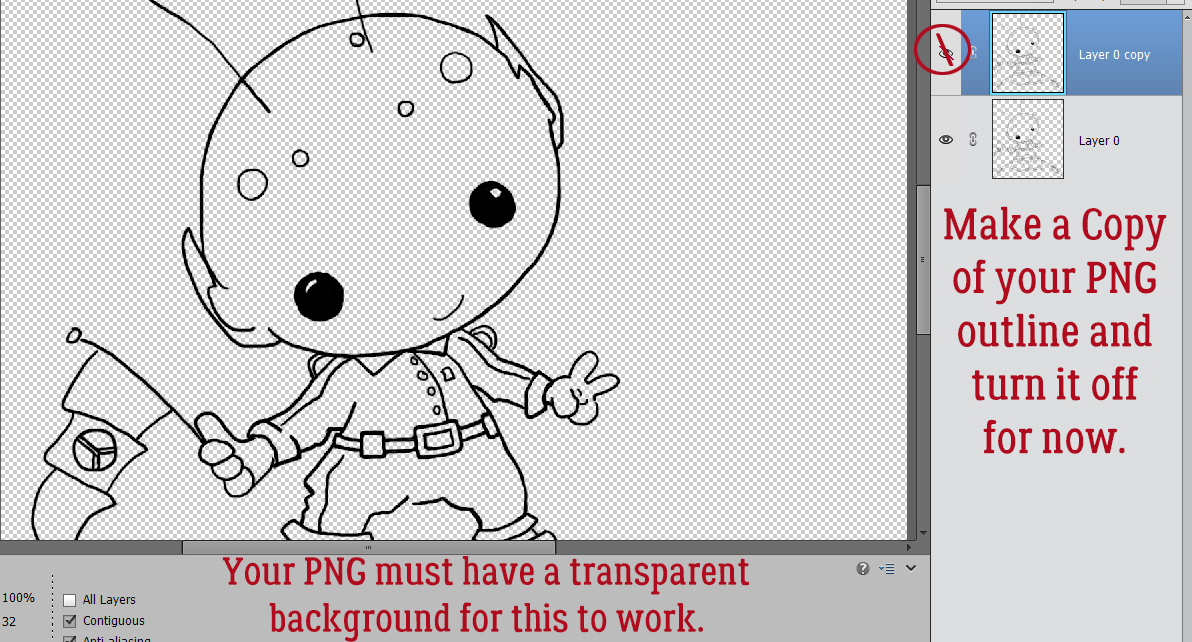
First off, the image used for this technique must be a PNG on a 100% transparent background. You can see in the screenshot above that only the outline of the space alien is visible. While it IS possible to use a digital stamp with the outline filled with white, it’s a lot more work, as you’ll see as I work through the colouring process. I made a Copy (CTRL/CMD>J) of the untouched stamp and turned off visibility (for now). It will become the “clean” outline later.
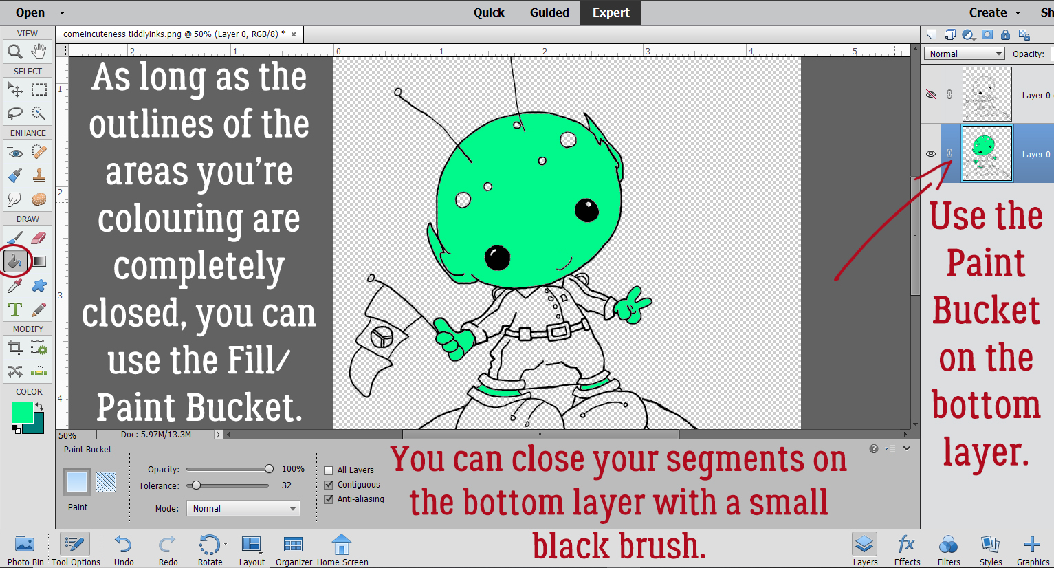
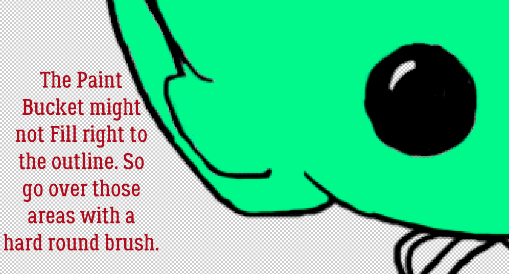
This step won’t work as readily with a white-filled outline. It would involve Magic Wand selection and lots more steps. Doable, but time-consuming. As the screenshot below says, as long as the areas I’m planning to fill are completely closed by the outline, I can use the Paint Bucket tool to fill the area. If the outline has even a microscopic gap in it, when the Paint Bucket is dumped, the paint will escape and fill the entire canvas. (UNDO!!) If that happens, I’ll switch to a small, hard black Brush and close the gaps. I’m going to do all the solid Paint Bucket filling on the bottom outline layer. My little green man has some exposed skin around his ankles.
I found that the Paint Bucket sometimes didn’t fill right to the outline, leaving a faint blank rim around everything. So I switched to a smallish hard round Brush with my green colour in the foreground and painted away the blank spots. I didn’t worry about colouring outside the lines, because I have that lovely, clean outline layer set aside.
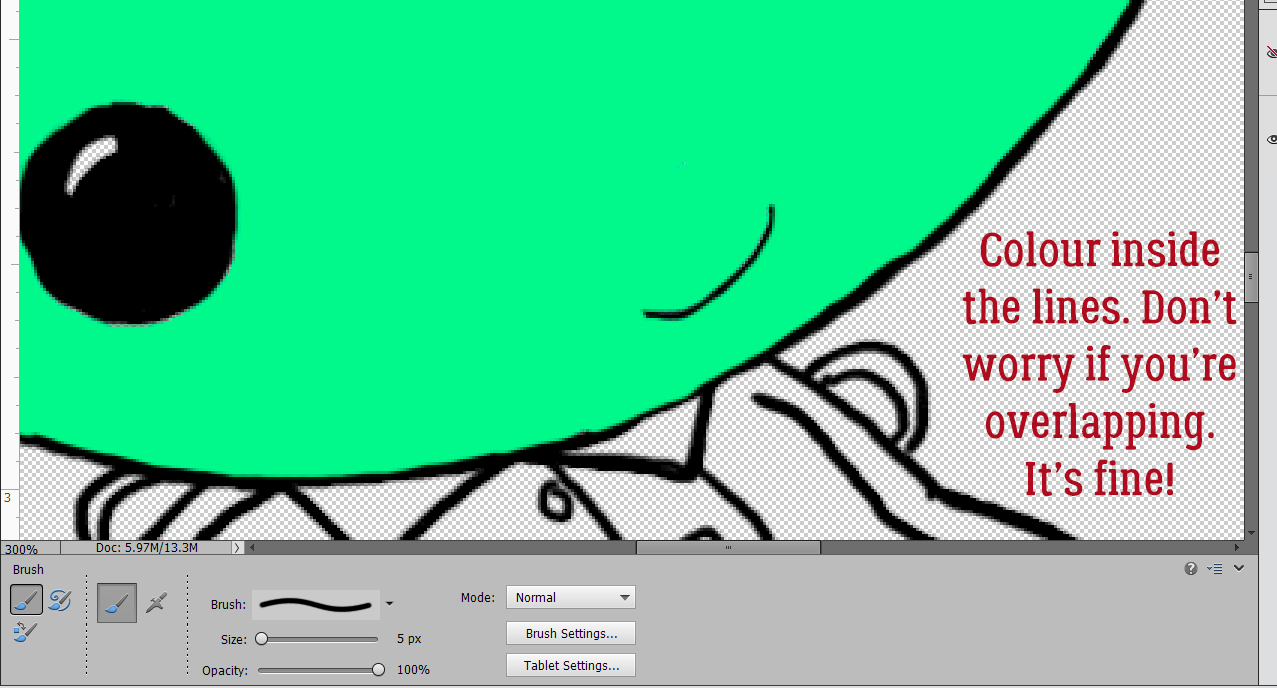
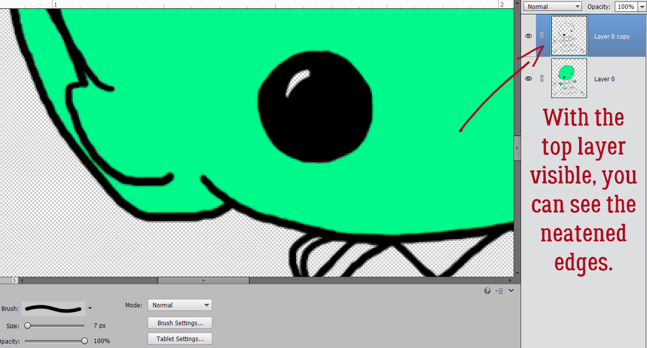
As long as my painting didn’t actually go outside the outline, I didn’t worry about it. Where I couldn’t quite get into tiny spaces cleanly, I switched to the Eraser tool and tidied up. I toggled back and forth between Brush and Eraser quite a bit.
I decided I could work with the top layer visible. See how the outline is much cleaner? I used a black Brush on the top layer to make the eyes a little less jaggy.
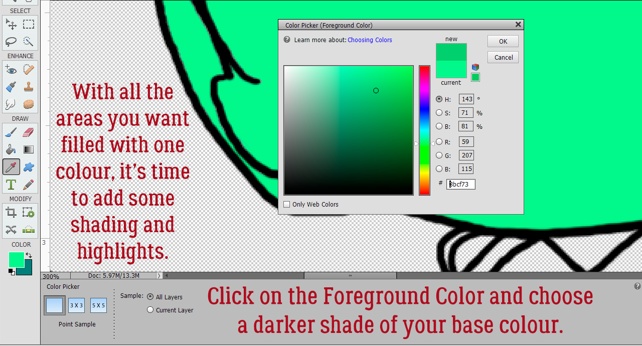
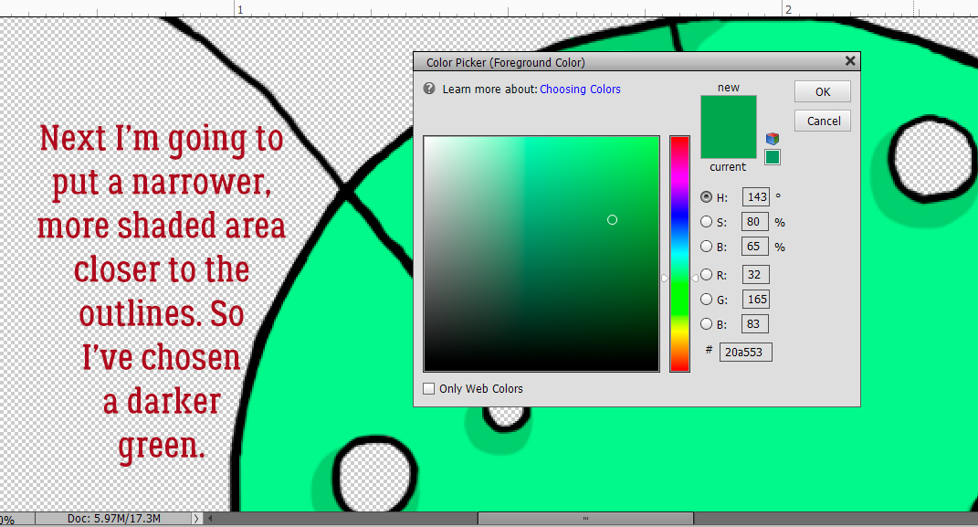
Once I had all the green areas filled and neat, it was time to add some dimension. Working with alcohol inks on paper, this step can be a real challenge for those just learning how to blend and add depth. Digitally, if I make a mistake, I just have to Undo until I’m back at the point where I messed it up. Up to this point in the process, I’d say not more than 10 minutes had passed. I clicked on my foreground colour to open the Color Picker tool and chose a darker value of the original green to begin shading.
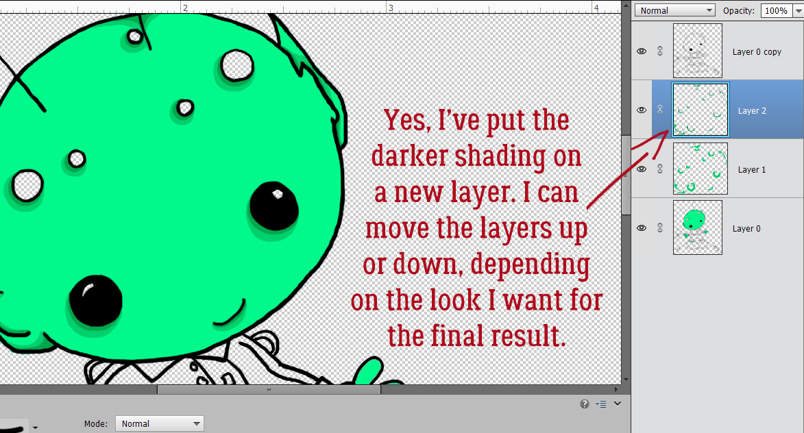
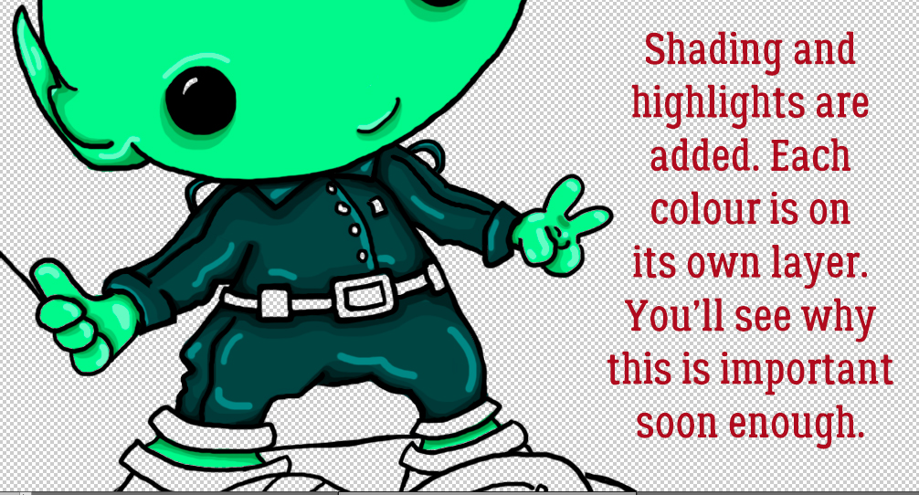
For the technique to work well, all the shading and highlighting will have to be done on its own layer. You’ll see why as we move along.
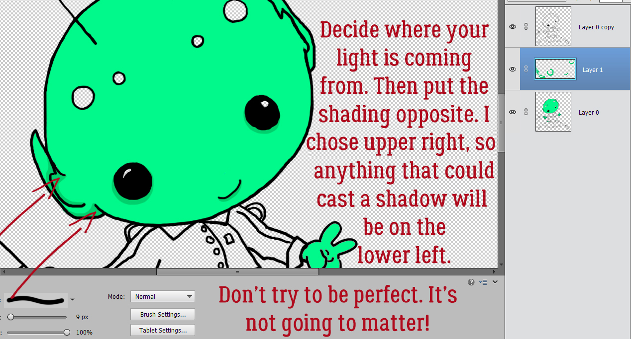
Before I did anything else, I had to decide where my light source was, the same as when creating custom drop shadows. I chose the upper right corner, so shadows will fall to the lower left. Then I Brushed on my shading, based on what my eye saw as contour.
I felt that there needed to be a bit more depth to the shaded areas, so I chose another, darker value of my green and Brushed a narrower area right at the edges of the contours.
I realized that if I added a new blank layer BEFORE I opened the Color Picker, I wouldn’t forget to put each new colour on its own layer. The beauty of having each colour on its own layer is that I can move the layers up or down the stack to achieve the best look. You can see the added depth from the new darker colour quite well.
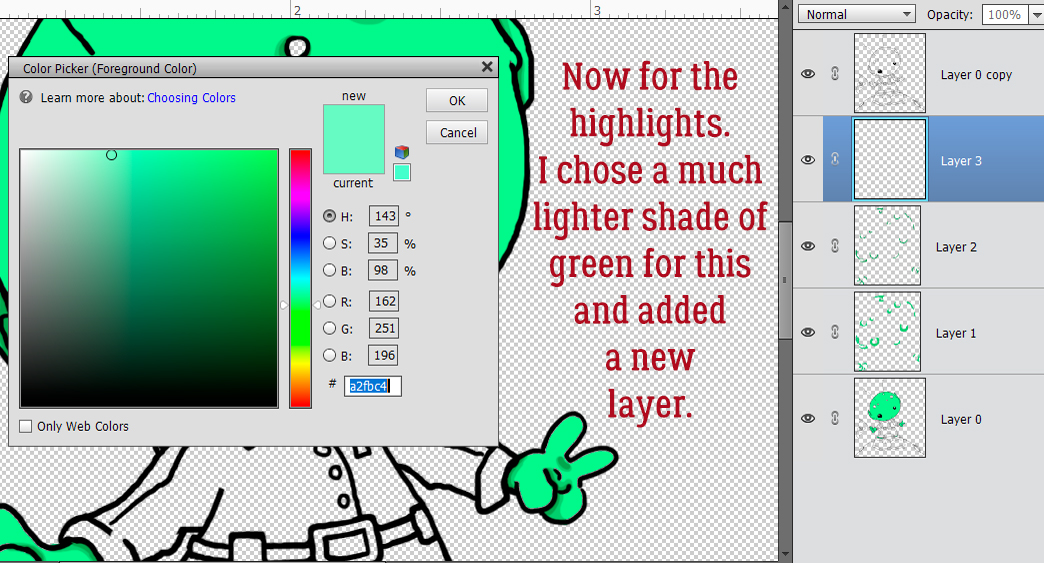
Now for some highlights! I added a blank layer then selected a light value from the Color Picker.
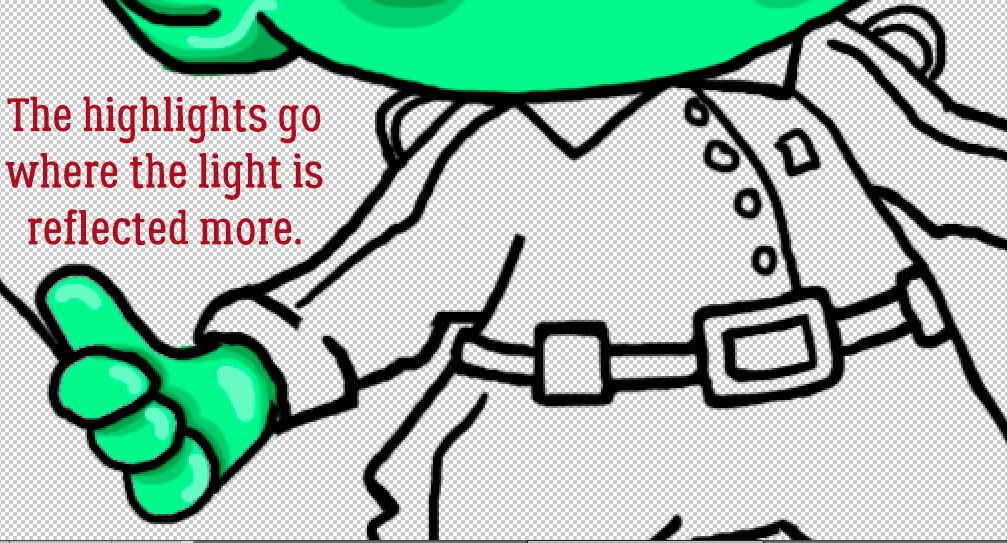
This colour will go on the areas of the image that are rounded or raised, and therefore reflecting more light.
When I was happy with the skin areas, I moved back to the bottom image layer to Fill his uniform.
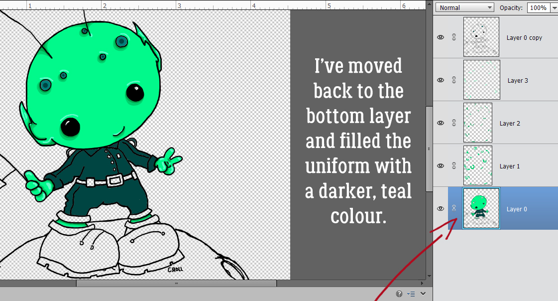
Following the same steps as for the skin, I shaded and highlighted the uniform. Don’t worry about how stark these steps look. They won’t be when I’m done!
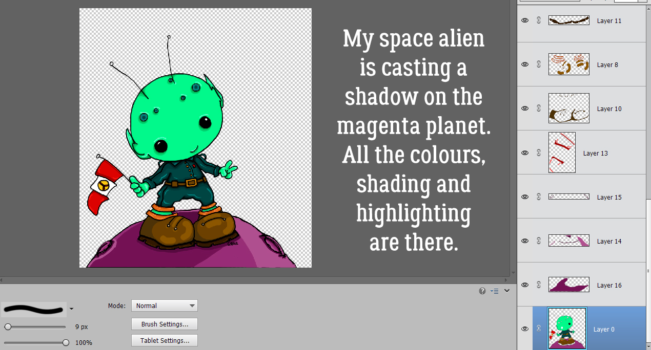
I continued Filling and contouring the image, moving between layers as needed. I went with a magenta planet, and then used deeper values to add a drop shadow to my alien.
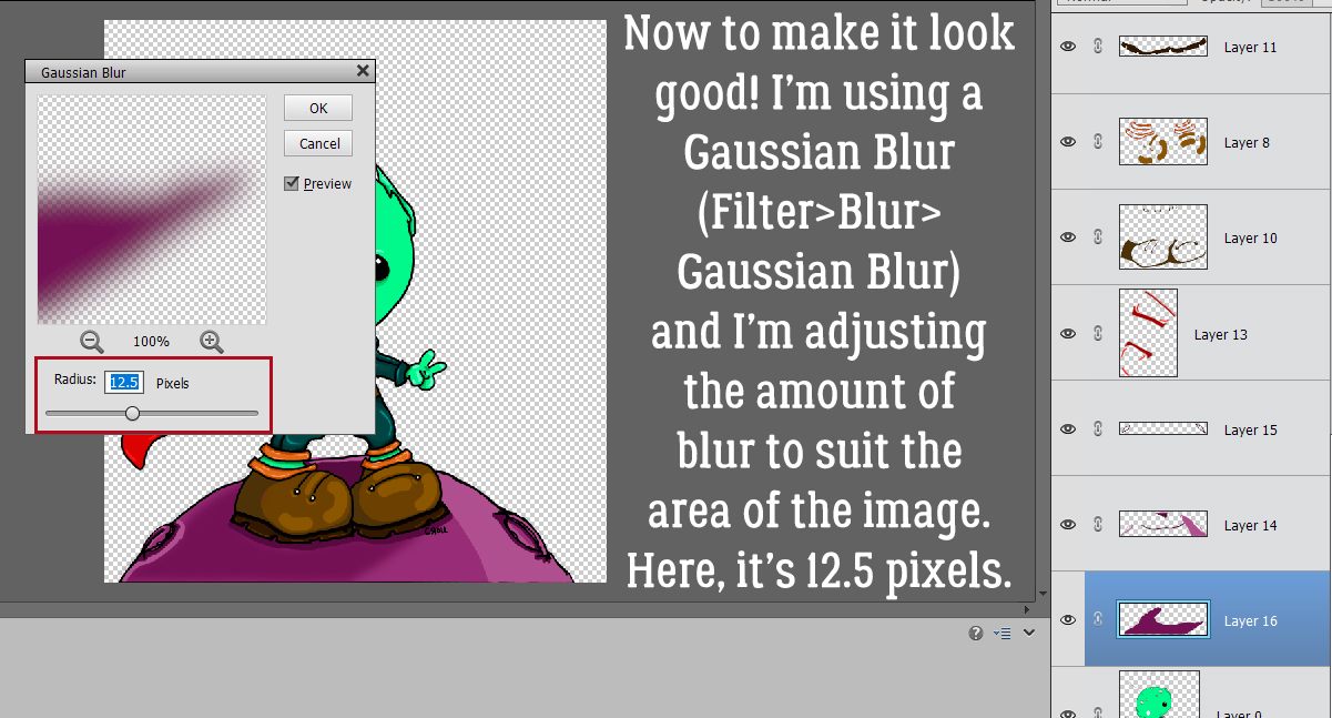
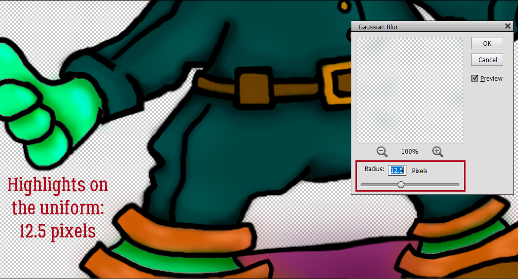
Now for the really fun part! To blend all these edges, I’m going to use a Gaussian Blur Filter. Filter>Blur>Gaussian Blur. The Preview will show what’s happening to the edges, and I can watch it on my actual image as I go along. If the edges of the layer I’m Blurring aren’t visible in the Preview pane, all I need to do is click my cursor on the actual image somewhere that overlaps the edge and it’ll appear. Using the slider, I adjusted the Radius of my blur so that the edges began to blend nicely. 12.5 pixels looks good.
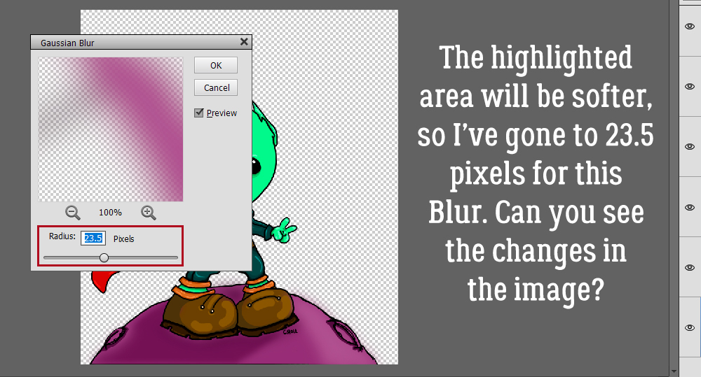
The highlighted area of the planet would be softer in real life, so for that layer, I pushed the slider hard to the right. 23.5 pixels looks right to me.
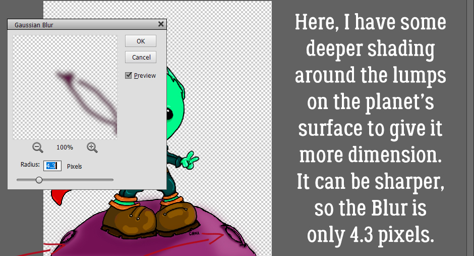
Those lumpy spots needed some deeper shading, and Blurring this layer too much will make the effect pretty much vanish. So the Radius here is only 4.3 pixels.
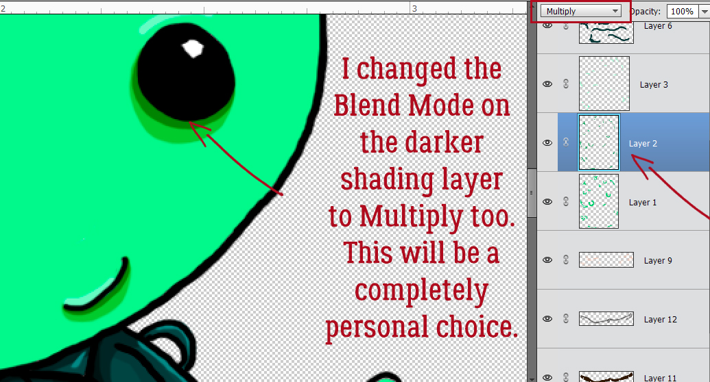
Blurring isn’t the only way to make this technique look good. Don’t forget the power of Blend Modes!
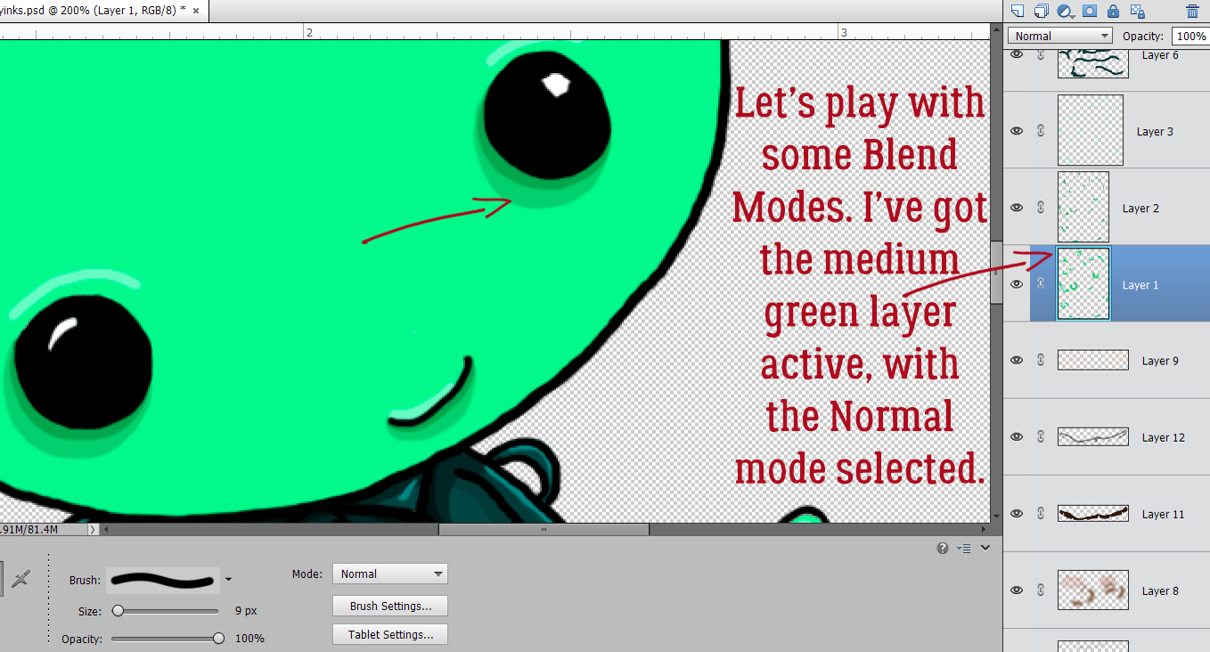
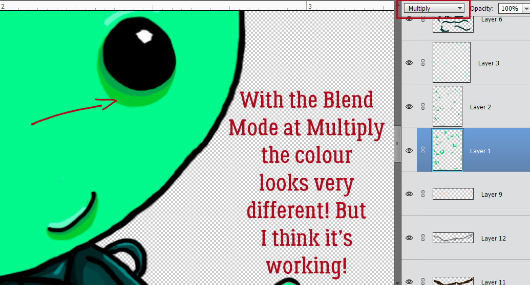
I tried several Modes before settling on Multiply. I haven’t Blurred these layers yet, and it looks pretty ghastly, but not for long.
I did the same with the darker green shading layers. These steps are completely personal preference. If it isn’t making your image look better, don’t do it!
I worked my way up the green layers and Blurred them.
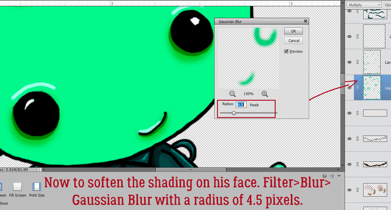
The skin dimensional areas only needed a Radius of 4.5 pixels.
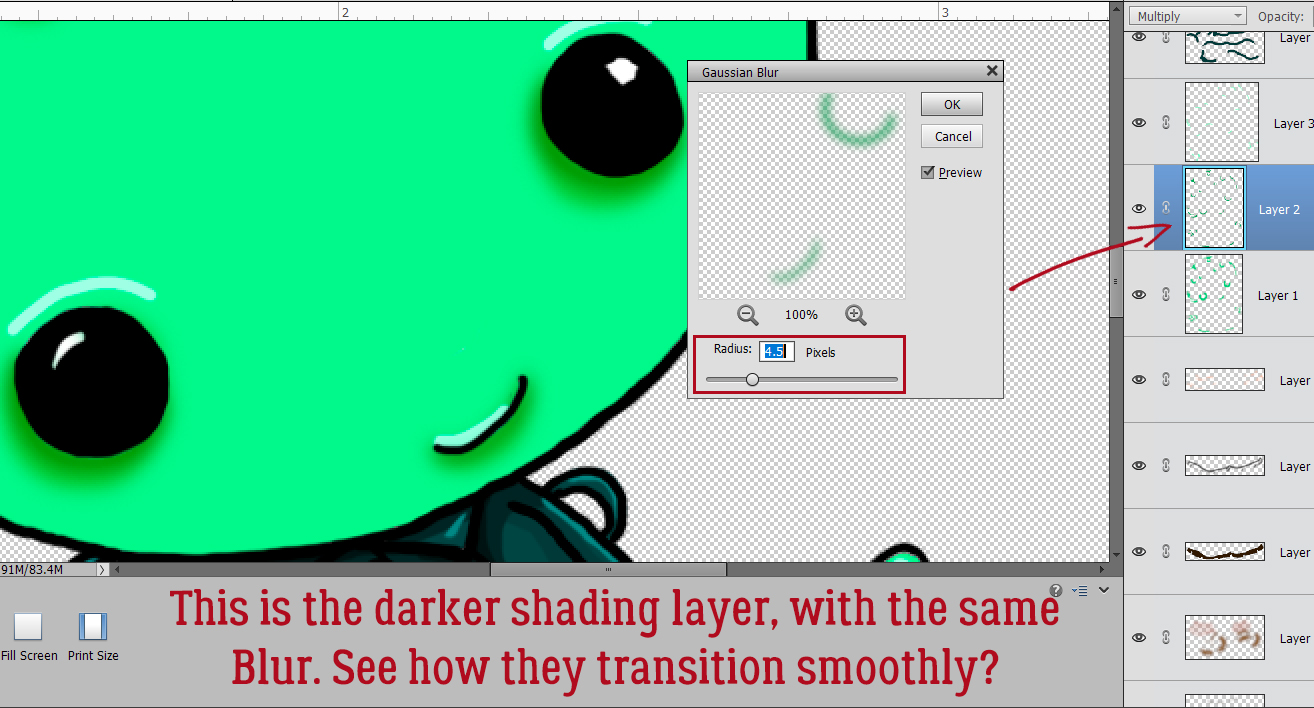
I moved from segment to segment, Blurring as I went.
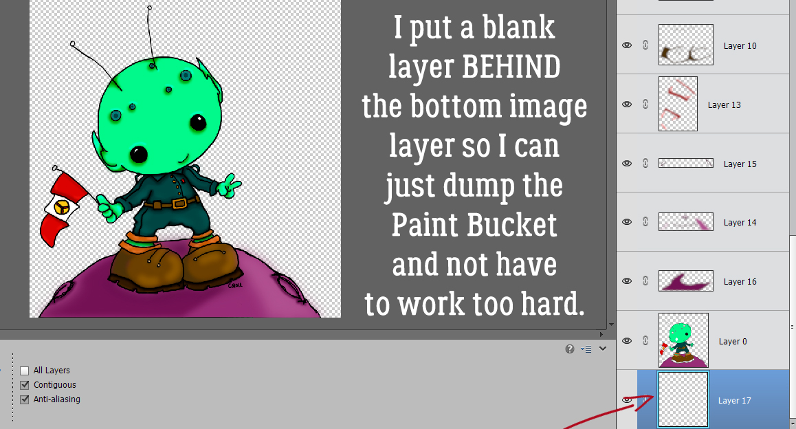
When I got to the last layer of the planet and the alien, I was pretty satisfied with how it looked. Now to add a starry sky to the background!
To make less work for myself, I added a Blank Layer BEHIND the bottom image layer so I could Fill it with colour and let the image do the hard work.
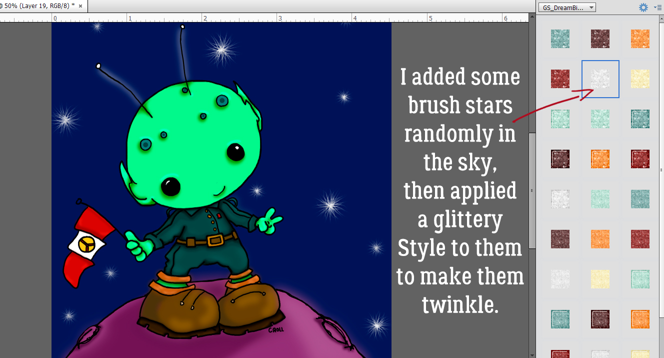
I found a starry brush in my stash. It’s from Key Lime Digi Designs (it was a Challenge brush) and it’s the perfect touch! The stars are, of course, on their own layer. Then I applied a glittery Style from the GingerBread Ladies‘ Dream Big Monthly Mix collab to the stars to make them even more twinkly.
When I was finished, I Saved my creation as a PSD, just in case I look at it later and want to tweak it further. I plan to use it for my grandson’s birthday card, so it may need a little touch-up. I know this isn’t going to be widely popular, but I enjoyed the process and will be doing it again. It took me about the same amount of time it would have taken with alcohol inks or coloured pencils – not taking into account the versions I ruin before I get one like – so there’s that…
PDF Link: https://bit.ly/3q7sQQU
![]()
Love it! I’ve been doing something similar with with my iPad and some of the ios painting apps (Ibis Paint & Procreate are 2 of my favorites. Ibis Paint is nice because it defaults to removing backgrounds and leaving only the outlines!) The one thing I never thought of doing was applying blurs to my shadows! What a great idea! The final result is perfect. Thank you so much for sharing your techniques!
And I agree, this might not be for everyone but I absolutely love coloring using layers
[Not sure if this is appropriate so I made it a separate post.]
A great source of images to color is Dover Publications. Subscribe to their newsletter(s) at https://www.doverpublications.com. Every week they send out sample pages from their newest books. This always includes some coloring pages from their Creative Haven line of coloring books. Click on the link in the newsletter, then right click and save the sample page to your computer.
I have a bone-deep dislike of Apple products, and I wouldn’t have thought to colour on my tablet. I’ll have to see if I can find an app for Windows/Android that will remove the backgrounds. Thanks for the tip. I’ll check out the Dover link too. I have 3 grandkids who all like different things so sources of new content are always welcome!!