Archives for June 2021

Tutorial Tuesday (Potpourri)

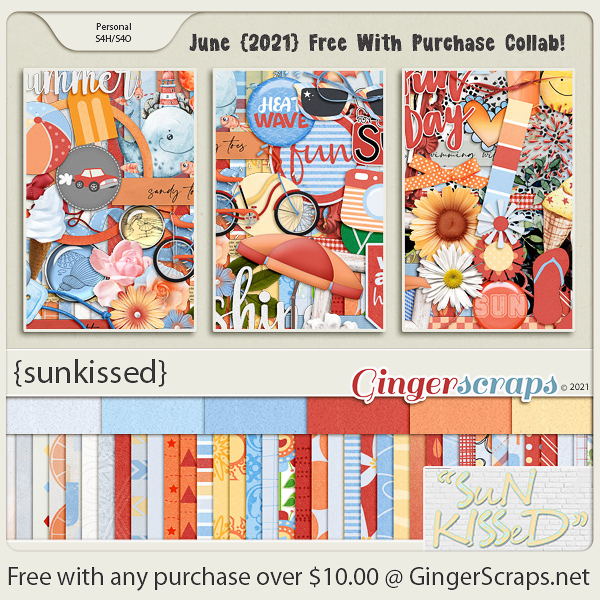
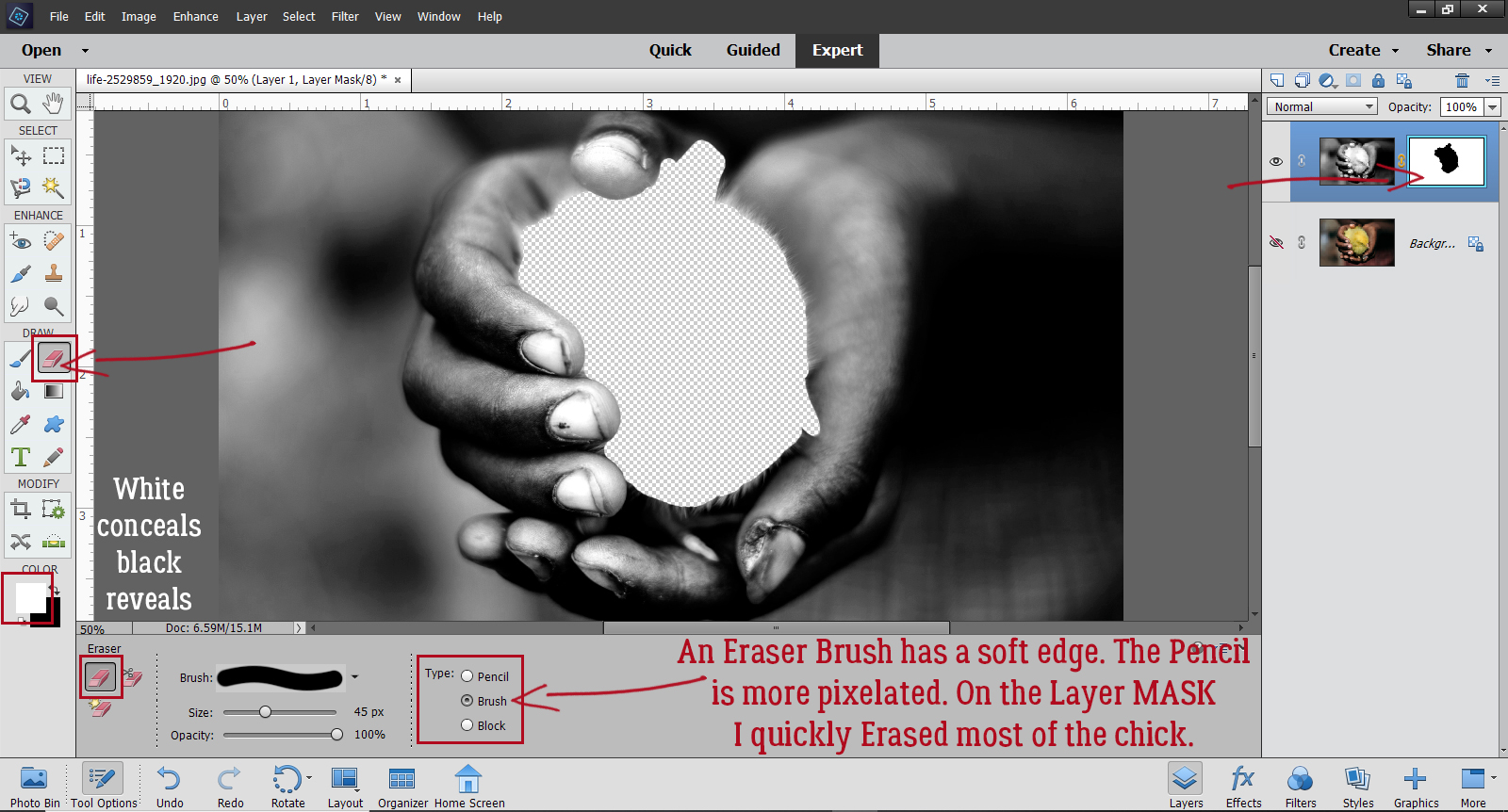
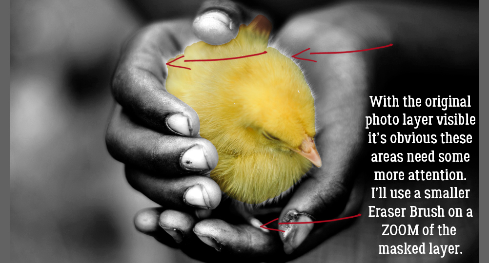
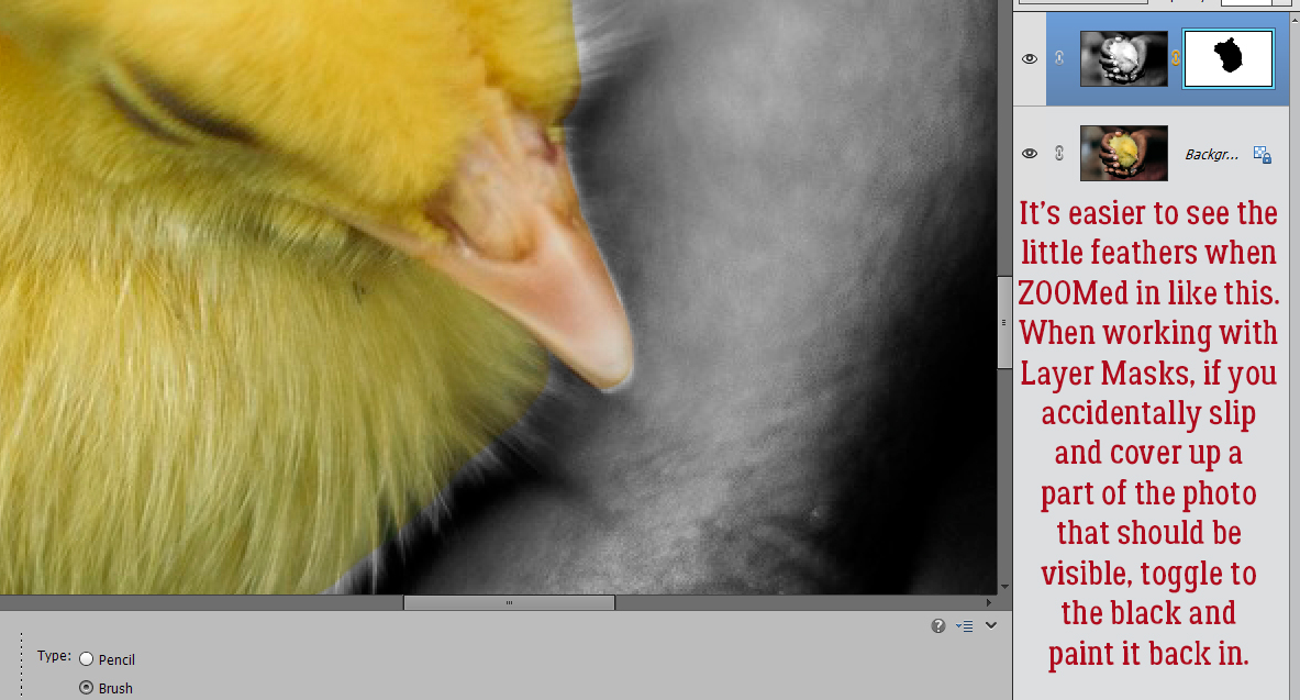
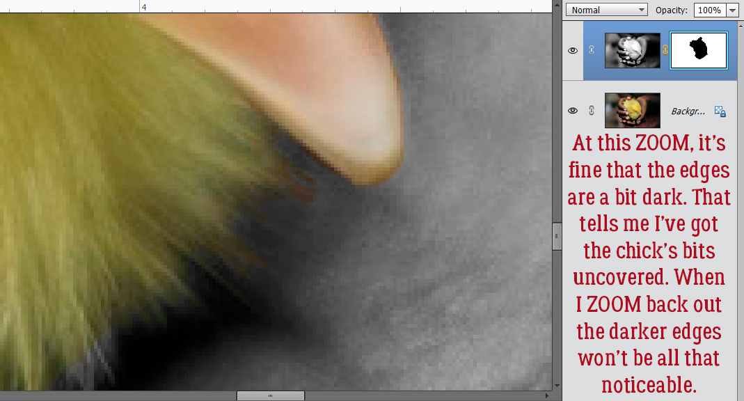
Let’s Talk about Colour!

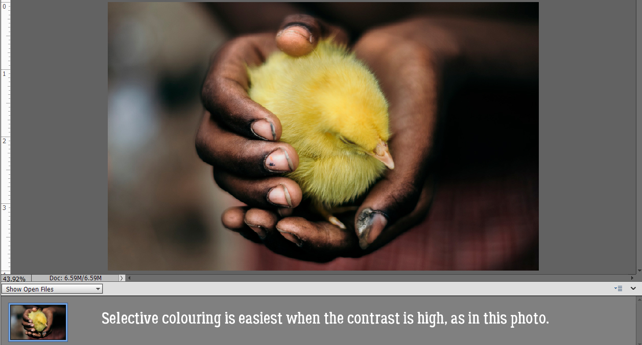
Is it hot where you are? Looking at the thermometer on my deck, it’s reading 42°C… or about 108°F – a smidge cooler than yesterday, but it’s likely to climb some more before the sun goes down. With a slight breeze and only 24% relative humidity, stepping outside is like walking into a pizza oven. (I’ll take that over a sauna.) Our poor dogs can’t be outside and it’s making them a little stroppy. They’re camped out on the tile floor in front of the A/C vents. It’s going to be a long week… we’re not going to cool off until next Wednesday.

Several recent tutorials covered how to add colour in one way or another but it occurred to me that we’ve never really talked about COLOUR itself.  We all have our own preferences when it comes to colour; I recently printed some layouts to frame for my gallery wall and noticed that ALL of them are either mainly green or have a significant green presence. I really don’t like yellow or orange, but they may appear on my layouts as accents. Have you ever thought about why you choose the colours you do, whether in your wardrobe, your home decor or your layouts? Have you ever wondered how designers choose the colour palettes they work with (where they have a choice)? Well, colour theory may offer some clues.

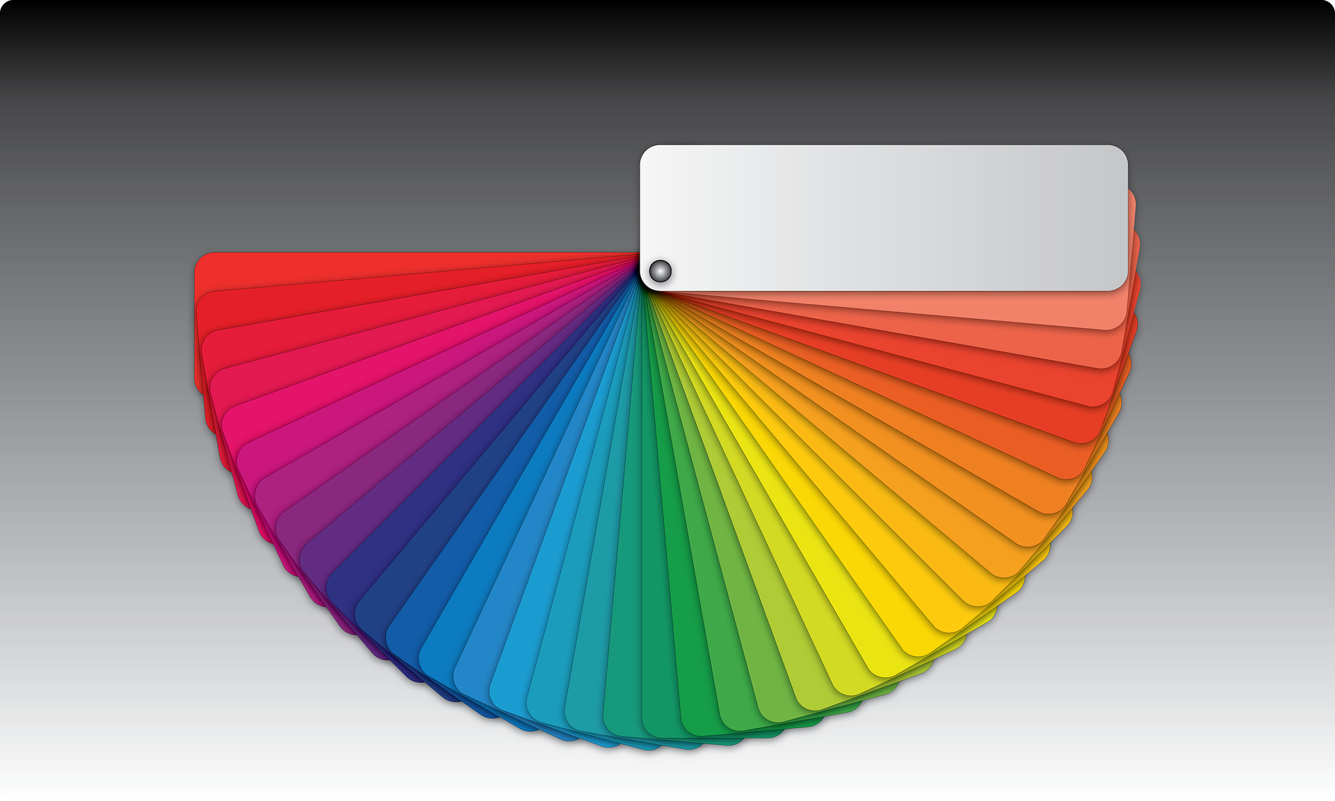
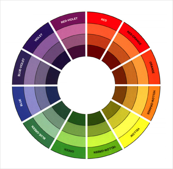
The very first colour wheel was created by Sir Isaac Newton in 1666! I bet he drew his inspiration from the rainbow. If you remember your middle school science, you’ll recall that rainbows are a product of light refraction through water droplets, and each colour has its own visible wavelength, red being shortest and violet longest. Our perception of colour is dependent on sensory cells called cones that are found in our retinas. Most animals don’t have a large number of cones and therefore don’t have the same degree of colour perception humans and other primates do. Insects have some colour perception but are less likely to actually perceive reds. It’s said that humans can distinguish very subtle variations in colour, unless they have the misfortune to be that 1 in 12 males or that 1 in 200 females and have a genetic deficiency in red-green-yellow colour perception. They’re not truly “colour-blind” but have difficulty differentiating between red, green and yellow. The rest of us are so lucky!

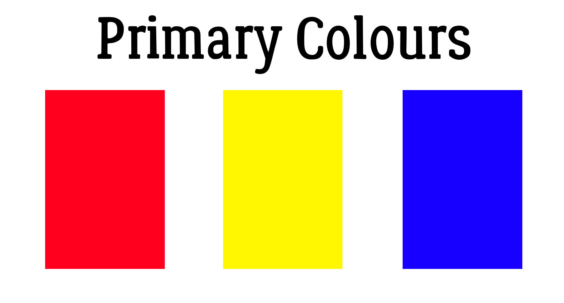
There are about a million terms, concepts and definitions relating to colour theory so we’re just going to scratch the surface here. We’ll start at the most basic: PRIMARY colours. All of us learned about those in kindergarten. They’re red, yellow and blue.

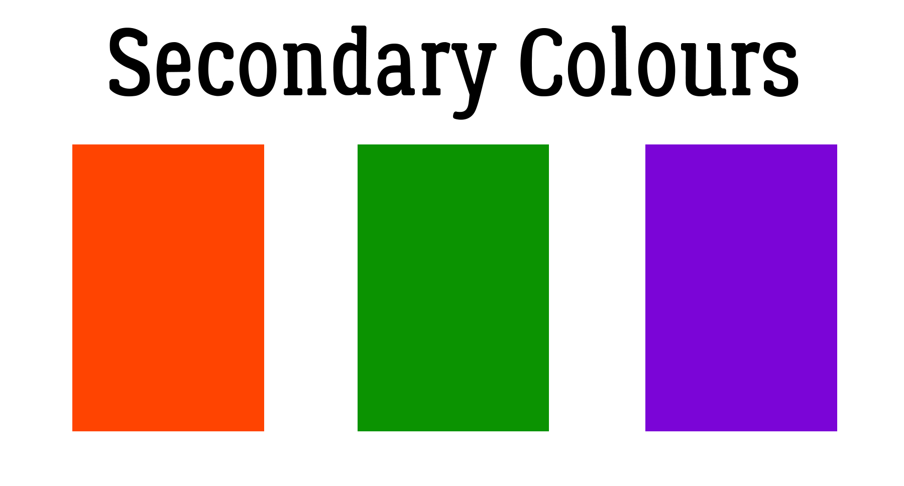
SECONDARY colours are derived from equal parts of two primary colours: orange, green and violet.

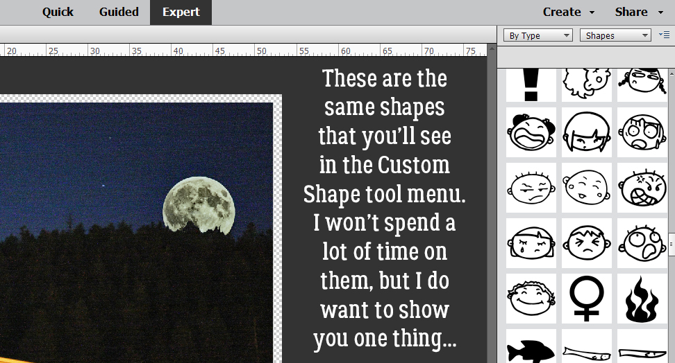
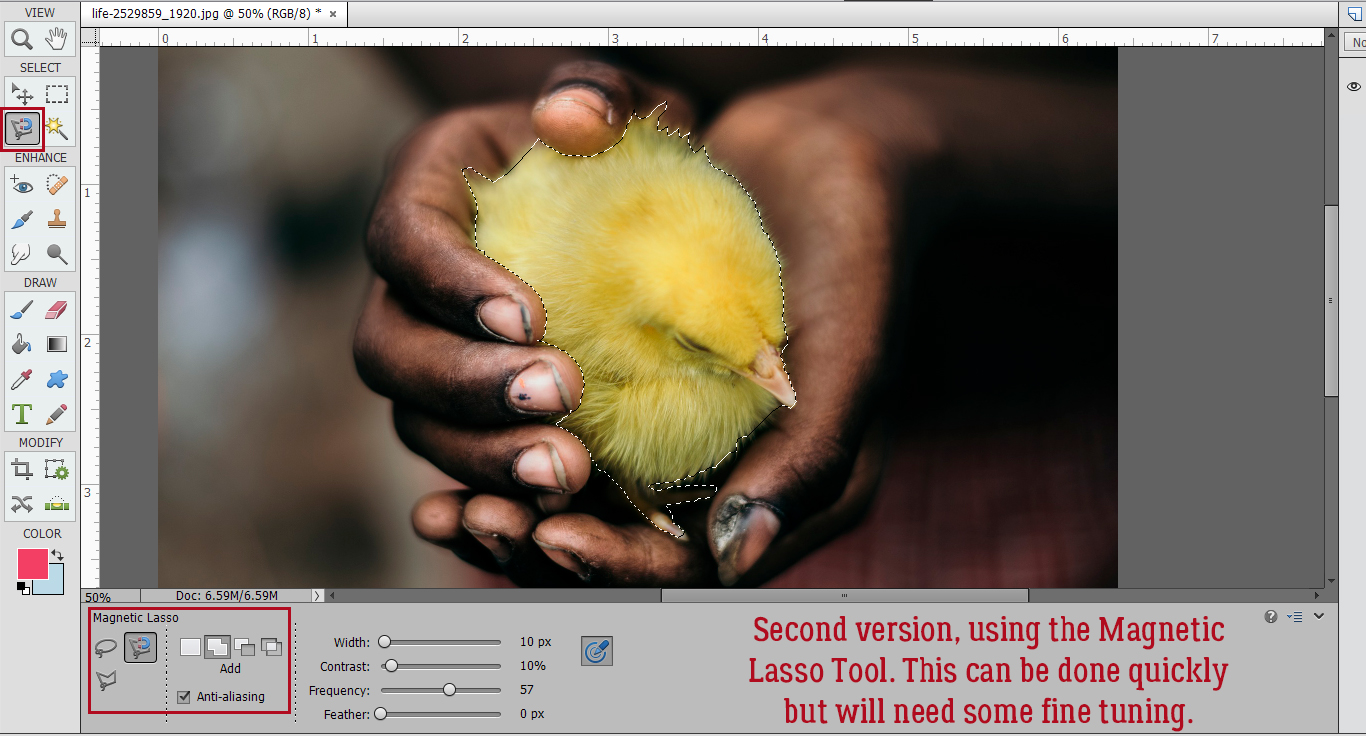
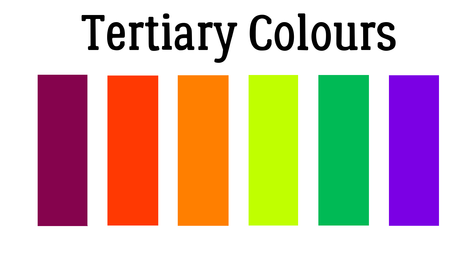
Anybody know what TERTIARY colours are? They’re blends of a primary colour and a secondary colour! Are you confused? Here’s a visual.

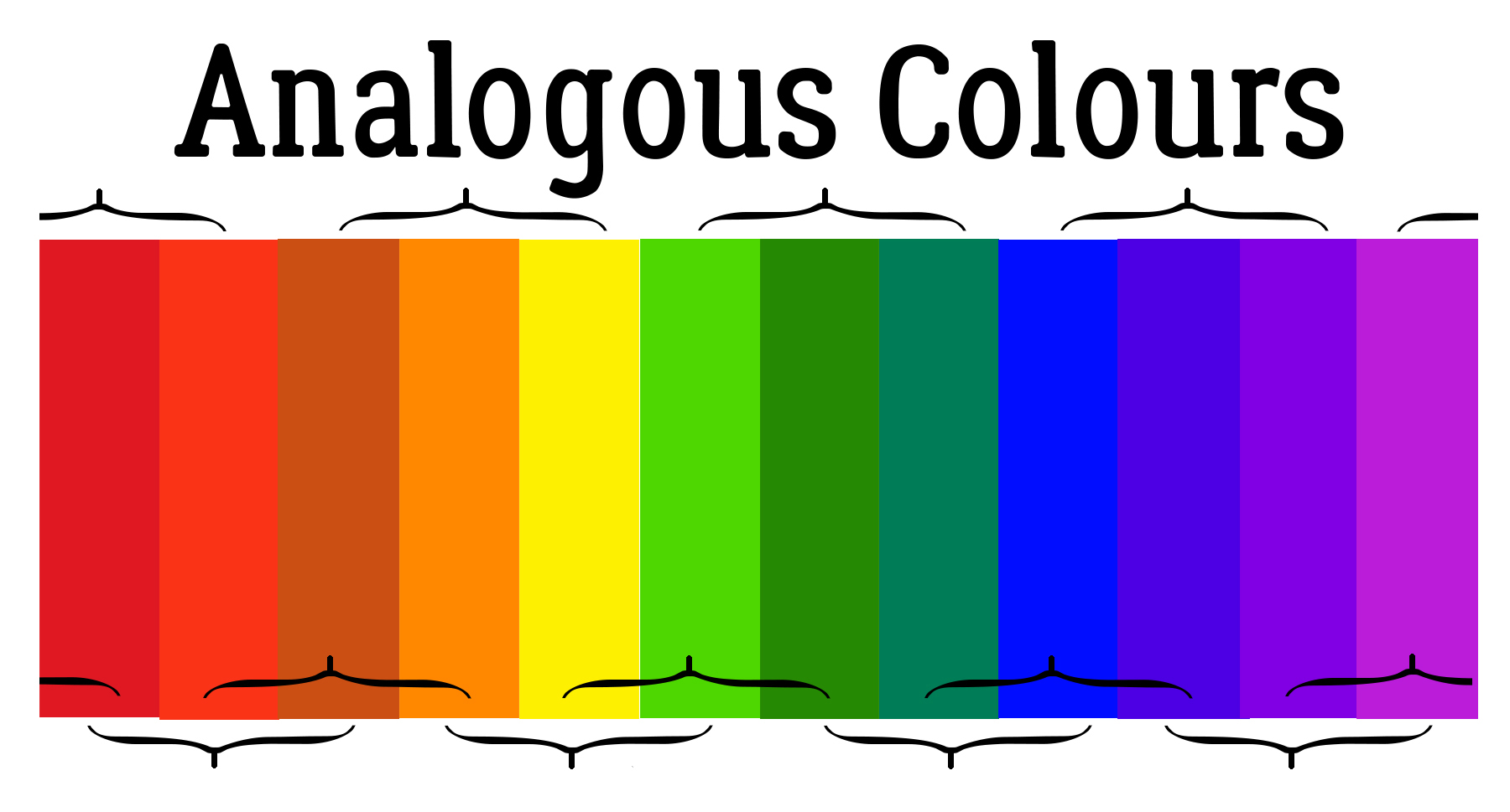
Now let’s discuss how to combine colours to make a pleasing image. The most basic combinations are called ANALOGOUS colours, three shades that are similar to each other and are found side-by-side on a 12-slice colour wheel, like red, red-orange and orange. These combinations have a serene feel to them and are visually pleasing. This scheme is one often found in nature, which makes it very harmonious. The only pitfall is not having enough contrast, so saturation matters. Some possibilities are shown below.

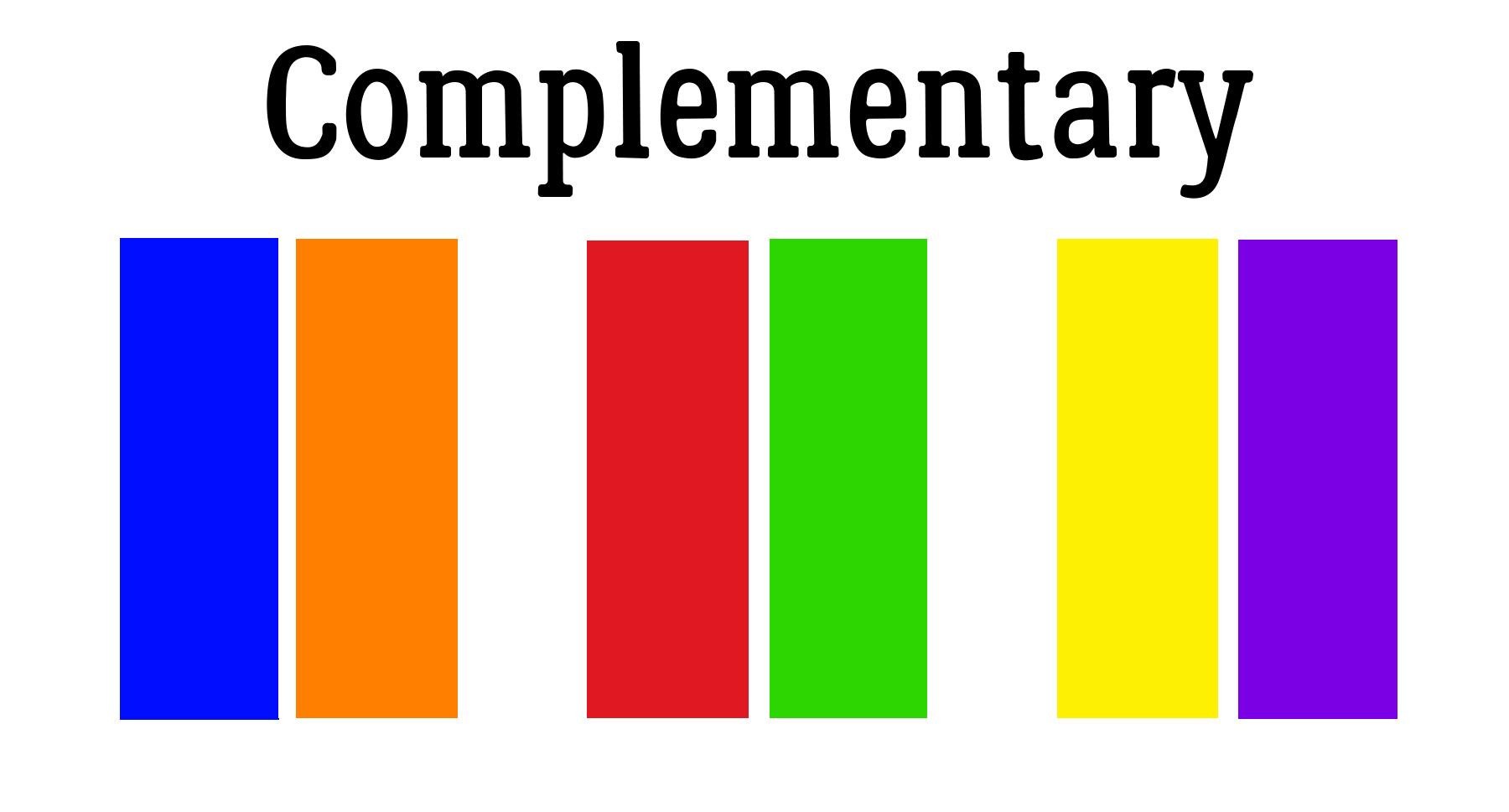
COMPLEMENTARY colours that are diametrically opposite to each other on a colour wheel provide maximum contrast and stability. Their vibrance is tempered by the degree of saturation of each. This scheme isn’t great in large doses but is perfect if you want something to stand out; it’s NOT good for text – too hard to read. They’re not my favourite combos (except at Christmas!) but a lot of people love them.

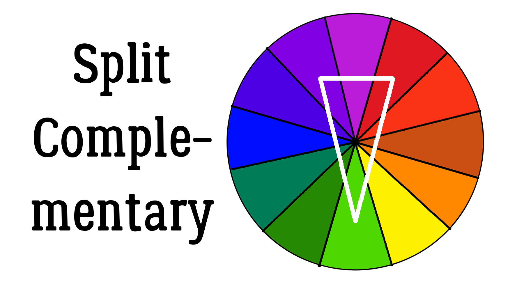
SPLIT-COMPLEMENTARY schemes use a base colour and the two colours immediately beside its complementary colour. Its strong viusal contrast can be very pleasing, since the colours don’t fight with each other as much as the complementary ones do.

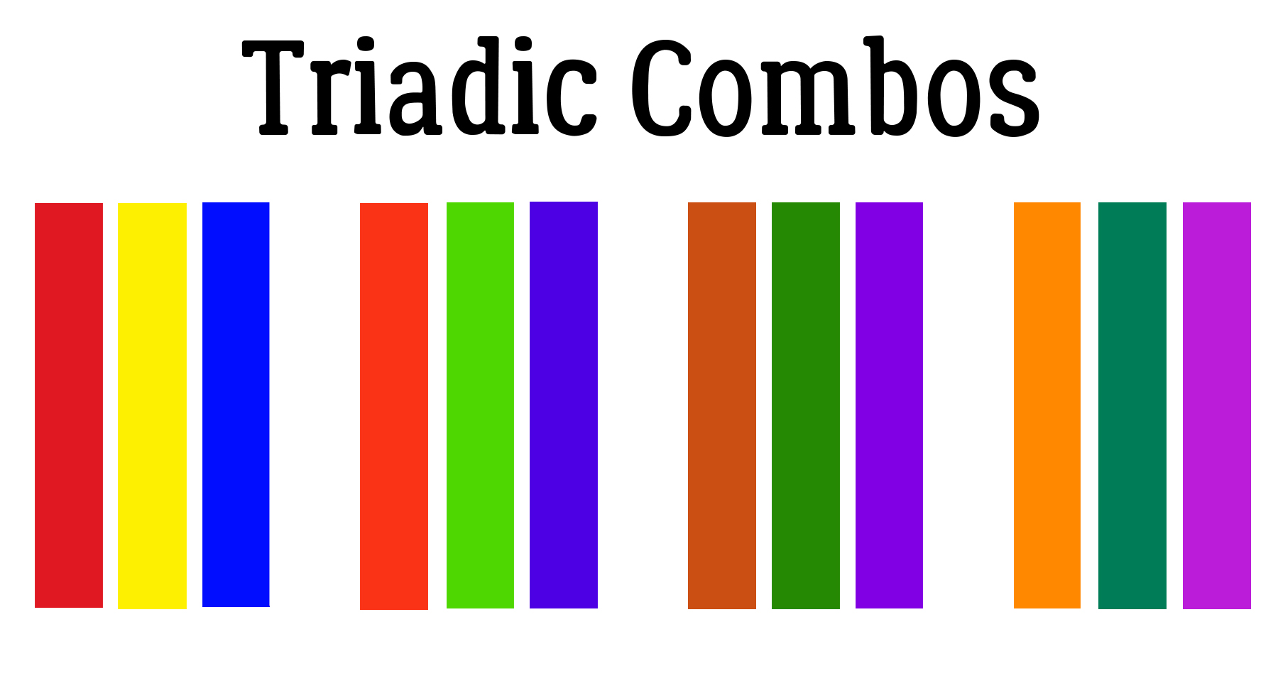
TRIADIC combinations are composed of three colours equally spaced around the 12-slice wheel together. The primary colours of red, yellow and blue form one triadic combo. This can be a tricky scheme to pull off; one colour should dominate with the other two as accents. Balance is key; the combo will tend to be quite vibrant, even when saturation is toned down.

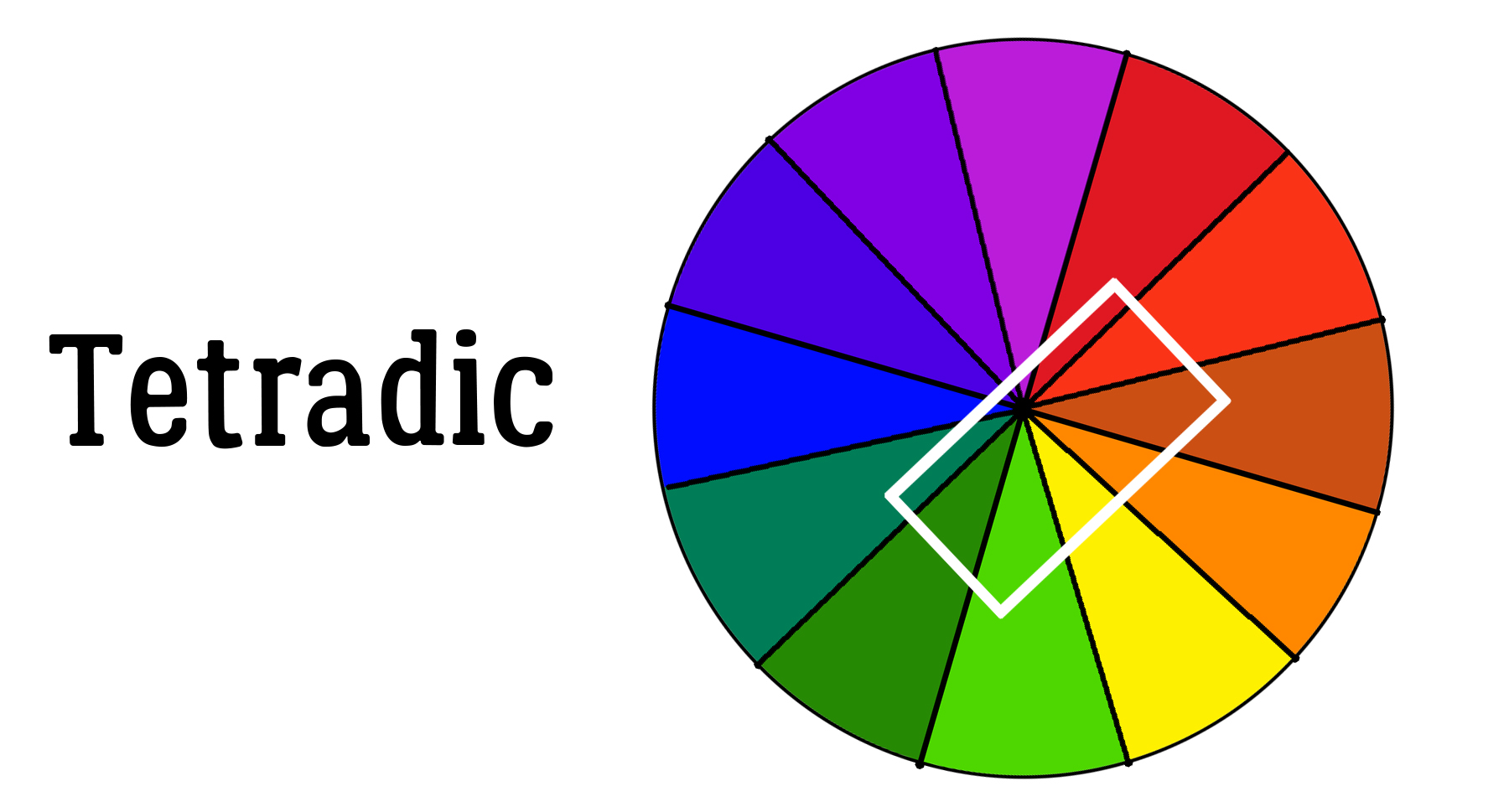
TETRADIC (or Rectangular) schemes make use of complementary pairs to provide a rich look. They work best if one colour is the star and the others are supporting actors. Balance between warm and cool is important.

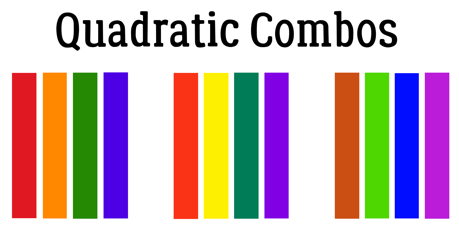
QUADRATIC combinations are created with four evenly-spaced colours. As with all these combos, one colour should dominate and balance between saturation and contrast are crucial.

The last thing I’m going to talk about is context. The background colour will have a great impact on how different colours look to the eye. Red, for example, tends to look more vivid against black than it does white. It becomes muddy-looking when on top of or immediately next to a yellow-orange and appears more brilliant with sharper edges against turquoise. Each of the red squares in the image below is identically sized. But the one on the black appears slightly larger, at least to me. What do you see?

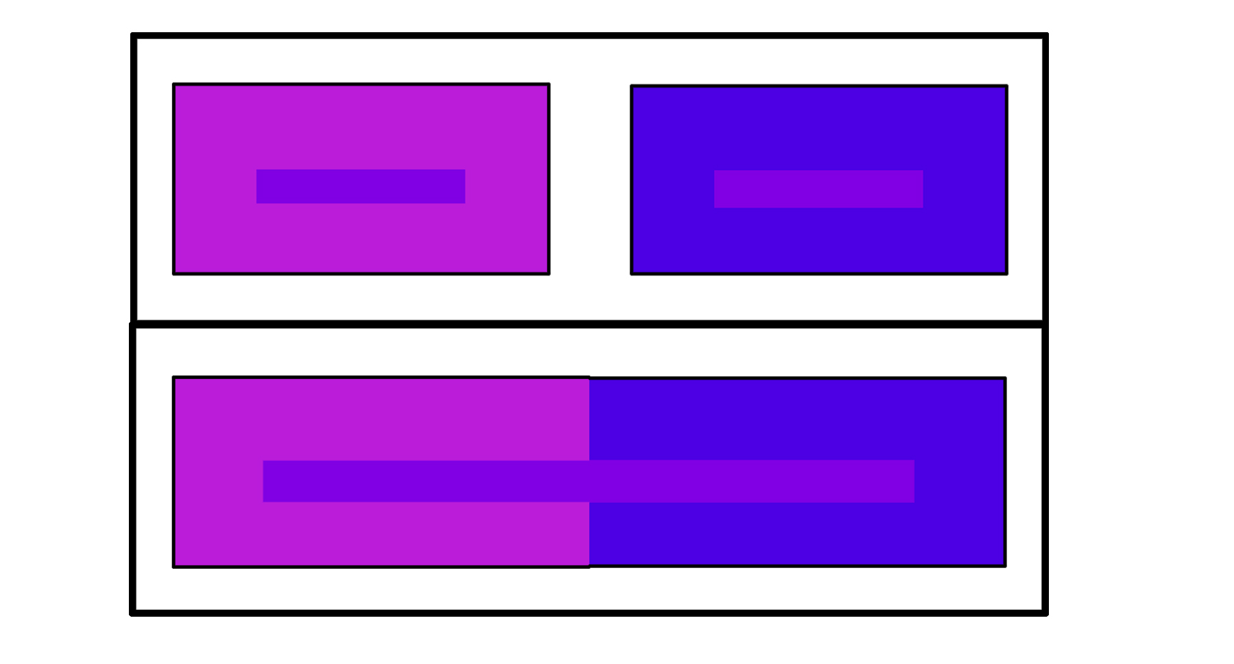
It’s also possible to confuse the eye by putting a colour on top of a very similar colour. The way our eyes perceive them changes. In the upper image below, the narrow rectangle appears to have a bluish hue against the red-violet background, and a reddish hue against the blue-violet background. Would you believe me if I told you they’re exactly the same violet? In the lower image I’ve butted the two background colours and stretched the smaller rectangle over both. See what I mean?

Each of us has our own style and preferences, but some of what we like relates to colour. Something to think about as you create your layouts!

The new laptop I ordered arrived – and it didn’t work. I thought it was a new machine, but they sent me a used one that hadn’t even had a factory reset. The screen continually froze whenever I tried to sort it out, so I sent it back and ordered one from another supplier, coming right from the plant. It probably won’t be here until some time in August so I’m crossing my fingers that this one doesn’t completely fail before then. I’m babying it along. If it does cash in its chips before I’m running on the new one I’ll let y’all know!

PDF Version: https://bit.ly/3hhnBdj


Fresh Baked: June 25, 2021

Happy Friday! Here we are again at another last Friday of the month. How does this even happen to go by so fast. Not only the end of the month, but we’re halfway through 2021. This is flying by crazy fast.

Have you been shopping this month and gotten this awesome Free with Purchase collab? It’s yours for as a gift with any $10 spent in the store.

Let’s see what the designers have new for this last week in June.

POLKA DOT CHICKS

MEMORY MOSAIC

Have you picked up this month’s Monthly Mix? Only a few more days to grab it at this special price.

And just a few more days to get those challenges in. Any 10 completed challenges gets you this kit as a reward.

Tutorial Tuesday (Photoshop Elements)

Exploring Uncharted Territory (Elements Features)

Something about Elements popped up on my Pinterest feed the other night that had me scratching my head. How had I not explored this before? I’m talking about the Graphics menu. It’s a treasure trove! And I think it’ll be really useful for those new-to-digiscrapping who are still building up their stash. I know when I was first finding my way, I downloaded a lot of freebies – because they were free, I had nothing and I was on a budget – that I ended up never using. The things to be found in the Graphics menu will be a bit like that for a lot of us, but without having a look we’d never know. So let’s explore!

If your workspace doesn’t look like mine, you might not have that Graphics button down in the lower right corner. Not to worry. You can find the goodies by clicking Window>Graphics (or by clicking F7). The menu includes two dropdowns chock full of options.


I think top-to-bottom-left-to-right makes the most sense, so we’ll start with By Type: Backgrounds. You can think of Backgrounds as papers. There are a TON of them in this menu. They’re rectangular and in landscape orientation so if you prefer to scrap in a square configuration, you may need to move the Background to give you the section you want visible. They aren’t necessarily as elegant as designer papers, but they’ll do in a pinch!


Okay, so when you see this, don’t panic! Most of these Graphics don’t live inside your computer. You’ll need an internet connection so they can be downloaded into your software for the session at hand. Elements is a real resource hog already, so this is a bonus.


I’m not going to show you a lot of these. I liked the name of this one when I hovered my cursor over it, so I opened it.


Next up are the Frames. I WILL show you a few of these, because they’re pretty awesome! I don’t often use frames of any kind for my layouts, but I may start now that I’ve found these! It took me a minute (or ten) to figure out how to make them work but once I got it, I ran with it! For them to work properly, your photo CANNOT be a “Background“, it has to be a “layer“. Right-click on your photo layer in the Layers panel and select Layer from Background and you’re on your way.


This is the composite photo I created awhile back in the tutorial on compositing. I’m going to use it as my example.


Once you’ve selected a Frame from the menu and clicked on it to apply, you’ll see this. See the transparent background around it? No need for cropping or cutting it out with the Marquee tool! The slider lets you make your photo bigger or smaller so that the area of it you want in the frame can be fine-tuned. And the circular arrows are for rotating the photo 90° left or right.


After you’ve tweaked, hit the green checkmark and carry on!


I tried a few of these Frames. I like the look of this black glossy one for panoramic photos… like the millions of sunset photos I have.


This one didn’t excite me much!

But the collage Frame? I LOVE it!!

This rustic one would be great for an Old-West layout, or a heritage layout of pioneering ancestors.

The late 1950s and early 1960s were the heyday for deckle edges. There’s another one right next to it on the menu that also has a postmark, to give the photo a postage stamp appearance.

Then there are the two stitched borders. Quicker than sorting through my stash to find some stitches…

I do actually have a bin full of vintage photos. These four vintage Frames could be lovely additions to the ones I’ve scanned and cropped.

The Graphics group is also huge. There are all sorts of goodies in here!

Like this fabulous gold filigree photo corner (or is it a corbel? I’m watching DIY shows on HGTV as I work).

If I cropped out those brilliantly-lit houses in the lower left corner of my photo these filigrees would be even more amazing.

Looking for something more traditional? My mom had a box of black paper photo corners. Bet yours did too!

The white ones are a bit more modern-looking, but still traditional.

The Shapes menu is exactly the same as the Custom Shapes/Cookie Cutter one.

The Shape layer is under the photo, with the edge Selected by CTRL/CMD>clicking on the Shape thumbnail. The photo layer is the active layer and I’m going to add a white stroke to the outline.

Cheesy? Yeah, a bit. But it was fun to turn the moon into a flower! If I put this Stroke on its own layer I might Erase the parts of the petals that overlap the trees. What do you think?

The Text options are many! Several variations of effect in every colour. Only drawback is there’s no choice of font.

I think this might look equally “right” if I’d gone with one of the soft yellow gradients like the one two spaces down to the left. But the grey pulls its look from the moon.

Here are a few more samples.

So let’s recap a bit by going over the categories one by one, starting with By Type. Each of the categories will include all the Graphics from each of the groups that correspond to the tag.

Then By Activity.

And By Color.

By Event offers some great choices!

Which of us isn’t moody at times? All the appropriate Graphics here are sorted By Mood.

It might be quicker to find exactly what you’re looking for by choosing By Object.

So many people scrap by the season so this By Season sort takes the guesswork out of finding all the right stuff.

Here, By Style means something different than the usual Elements Styles. There are literally more than two dozen Graphics styles here.

You may never use any of these but isn’t it nice to know they’re there?

The saga of the crumbling laptop continues. The replacement I ordered arrived but it doesn’t work! Turns out it isn’t new (as I thought it was) and hadn’t been factory reset. I’m a bit tech-savvy so I did a factory reset but wasn’t able to go any further. I’ll be shipping it back and waiting on a different machine I ordered that might not be here until some time in August – it’s coming right from the plant. Meanwhile, I’ll limp along with this one, hoping it doesn’t completely die before I have a functioning replacement. Sigh.

PDF Version: https://bit.ly/2SXRK99

Fresh Baked: June 18, 2021

Happy Friday everyone. I know I’ve said it before, but I’m so glad Friday is here. Yesterday was a very long day. Multiple computer and social media issues. I’m just over this week. But we all know Friday at GingerScraps means new goodies in the store.

Remember, any $10 spent in the store gets you this gorgeous collab free.

Let’s see what new and fun kits are in the store this week.

We’re a little over halfway through the month, how are those challenges going? Any 10 completed challenges gets you this great collab as a reward.

Tutorial Tuesday (Photoshop Elements)

Selectively Colouring your Photos

This month’s Color Challenge is a bit different; instead of being presented with a swatch and asked to use those colours, Ivonne (Craft-tastrophic) has asked for layouts in black-and-white, with just some pops of colour. The examples she shows in the Forum are great inspiration, but what if you don’t know how to achieve “selective colour” in your photos? That was what Glee asked me. I thought I had a tutorial on the subject, but turns out I didn’t. So I set out to remedy that. I’m going to show you three different ways to accomplish it, at least one of which should work for you regardless of which version of Elements you have.

Some advice: This task is a lot easier if you have a photo with a lot of contrast between the item(s) you want to colour and the rest of the image. Let’s get started!

I chose this Pixabay photo for my example, a choice I came to regret just a little. More about that later. The first method I’ll show you is the Guided Edit version. I tried to find out when it was added to Elements, but didn’t succeed. I think it was likely Elements 14 or 15, but can’t confirm. I tried it first using the B&W Color Pop edit, which allows you to select a colour from the photo and it’ll automatically convert the rest of the photo to black-and-white, but it’s a lot restrictive. Super easy, but only good for a single colour. So I went on to use the B&W Selection edit.

The Edit comes up with this interface, and it literally tells you what to do first. The B&W Selection brush goes on the part of the photo you don’t want to stay in colour. For this step you can use a pretty big brush to make quick work of the bulk of the background.

The cool part of this Edit is that if you oops and accidentally desaturate some of the part you want to stay coloured, you can toggle from Add to Subtract and just return the colour to the image.

Yep, I got carried away with my big brush and messed it all up.

With a smaller brush I put the yellow back into the chick. But it’s not quite getting all the details… those darned little feathers! So I’m going to go on to Refine Edge.

You’ll be able to see what effect the Edge Dectection slider makes on the photo. Did you notice there’s one fingertip in colour?

Next I’ll use the B&W Detail Brush to fix up the beak and feathers.

I ZOOMed in a LOT so I could be more precise, and used a small brush.

If you want to check your results, you can Invert the effect and it’ll show you where you’re still not quite there. When all the details have been fine-tuned, revert it so your coloured area is the actually desired area, and click on the Next arrow. Then you can Save it for later, or Continue Editing.

The second method I want to show you uses the Magnetic Lasso Tool, first seen in Elements 12. It’s a bit less automatic, but can give you great results. Not familiar with the Magnetic Lasso? It looks for contrast between the object you’re selecting and what’s beside it. Pick a spot to start from and click on the edge. You don’t have to hold down the mouse button, just draw a line around the edge of your object. Elements will add attachment points as you go. It won’t be perfect, but it’ll be pretty good. When you get back to your starting point, you’ll see the marching ants appear around the outline of your object. As you can see in the Tool Options box, there are many ways to tidy things up. I Added the tiny feathers into the selection area using a smaller tip.

The next step is to Invert the selection. Select>Inverse or CTRL/CMD>SHIFT>I will move the edges of the selection to the background, ignoring the chick in the centre.

To change the background to black-and-white, click Enhance>Convert to Black and White… or CTRL/CMD>ALT>B. If you don’t have that option in your version of Elements, instead click Adjust Color>Adjust Saturation and pull the Saturation slider all the way to the left.

Did you know there were a variety of B&W styles? If you have the time, try the options. It’s fun! Each of these styles can be further adjusted with the color channel sliders. You can watch what happens to your image in the After pane.

For a quick selection this isn’t too bad! If your object has very smooth edges, this method can work really well and be as effortless as the Guided Edit.

This final method is achievable with all versions of Elements. It’s the most labour-intensive, and if you’ve got a very irregular edge on your desired object, it’s the one that will give you the best results. First things first – make a Copy of your photo and do all your adjustments on the Copy. You can right-click on the photo and choose Duplicate Layer, or click Layer>New> New Layer via Copy or CTRL/CMD>J. Then convert the Copy layer to B&W as I showed you above.

I wanted this B&W layer to have an even higher contrast to make the Selection part easier, so these are the adjustments I made.

ZOOMed in you can see how much easier it is to see those little feathers. Now to add a Layer Mask.

The easiest way to add a Layer Mask is to use the Layer Mask button. (Duh.) It’s the one that looks like a circle divided into two halves, one blue and one white. When you click on it, the mask appears to the right of the photo. To be positive you’re working on the MASK and not the photo itself, look for the blue outline around the blank mask.

Layer Masks are considered non-destructive edits, because they don’t Erase the image, they only conceal it – even though I’m using the Eraser Tool! If the foreground colour is white, whatever I Erase will be concealed. If I make a misstep, I can toggle the foreground colour to black and un-Erase it. I like to use a Brush tip with the Eraser Tool when working on Layer Masks because the edges are softer. The Pencil tip is more pixelated. I’ve made the original photo layer invisible. See the transparent area where I’ve removed the bird? I prefer to do that for the initial scrubbing, where I can use a big tip and go as quickly as my laptop will allow.

For the detailed areas, having the original layer visible helps to see where more touching up is needed.

I ZOOM right in so I can see exactly what I’m doing, and bring all those darned feathers back into colour. The beak and feet need attention too.

Up this close, I can see a dark edge to the beak and some of the feathers. That tells me I’ve got the precise edge where the chick meets skin. It’s not going to be noticeable when it’s back at a more usual size.

Yes, I used a 3 pixel Brush tip on some of these feathers. I actually went all the way down to 1 pixel, because that’s how I’m made. In later versions of Elements Adobe has introduced a Refine Selection Brush that I haven’t mastered yet, so I still do it the hard way. Later…

Almost there!

And this is the final result. I do like this method best for really detailed images, but isn’t it great to have some options?

As I mentioned in my last tutorial, my laptop is literally crumbling, but it still lets me get things done. I have a new one coming next week; I’m dreading the setting-up but have backed up all my important files so it should be okay. If you haven’t backed up YOUR important files, you might want to do it now, so it doesn’t get forgotten. Who wants to lose everything?!

PDF Link: https://bit.ly/3cM8l6E


$1.00 Bake Sale & $2.00 Tuesday NOW OPEN at GingerScraps!

It’s time for the $1.00 Bake Sake … but wait there’s more … it is also $2.00 Tuesday for the next 24 hours!

You will not want to miss these deals!

*$1.00 Bake Sale* June 15-20

$2.00 Tuesday! 6/15

Remember, any $10 spent in the store, gets this great collab. I’m loving those flip flops in the sneak peek.

Have fun shopping and we will see you on Friday for some fresh baked goodies!!

June 11: 2021: Fresh Baked and Summer Dreamin Sale

Hey there Gingerscrappers. Are you ready for some Summer Dreamin? From today through June 14, enjoy 55% off store wide (most items). Sale ends at 11:59 on June 14, just in time for the June Bake Sale.

Remember, any $10 spent in the store, gets this great collab. I’m loving those flip flops in the sneak peek.

Let’s see what our designers have this week. There is a great mix of colors and themes this week.

POLKA DOT CHICKS

MEMORY MOSAIC

How are those challenges going. This kit is so awesome. Just complete 10 challenges and you get it as a reward.

Tutorial Tuesday (Fabulous Fonts)

A Baker’s Dozen of Father’s Day Fonts

It’s been a while since I showed you some new fonts, and with Father’s Day coming up I thought I’d look at the selection at dafont.com to see if I could find some more great masculine fonts to share. I have so many frilly, scripty, swashy fonts, but not so many that are more suited to the men in my life. I found a dozen that fit the bill very well and have a bonus set of dingbats at the end. (I also downloaded <coughcough> fourteen others…) Each font name is linked to the dafont.com website so you can quickly and easily grab the ones you want. Let’s have a look at what I’m liking.

First up is this one that made me laugh out loud. Daddy Cartoon is cute, but still would work for those layouts where Dad’s being silly.

Next is this Indiana Jones-inspired font Adventure. Great for titles and easy to read, this could be your go-to for your manly layouts.

Pac-Font took me right back to the early days of my marriage, when we had one little person in our house. My husband has always had a deep and abiding love for video games, and this one would be right up his alley.

I like the grunginess of Campus. It makes me think of workshops, garages, paint shops and that sort of stereotypically male environment.

This serif-style font is pretty grungy too, but in a less formal way. It’s called Sketchzone and I could see it working well for both titles and subtitles.

For some reason, this one made me think of tree houses and forts with “No Gurlz Allowed” signs. Don’t you think Drift Type would fit right in?

Woodcut immediately made me think of chisels and carving tools. A bevel added to this would turn it into a stunning alpha and it’s already shadowed!

I could see Sherlock Press as a stand-out title font for heritage layouts, with photos of men with handlebar moustaches and neatly parted hair.

Sketchup is another font that looks hand-drawn and would look wonderful on any layout about creativity.

I think Rumble Brave has a steampunk look to it. I’d probably use it for layouts filled with gears, nail heads, staples, maybe a pocket watch… Yes?

To me, 1-2-3 Go! suggests car racing, with the checkered-flag bits embedded in the characters. With a little manipulation it could be a smashing alpha.

The last font on the list is one I HAD to include after my tutorial last week. Decaying Felt Pen just made me laugh.

Now for the one dingbat that has the incongruent name Tool Font. It’s not really a font… but the silhouettes are pretty sharp!

I’ll be making a Father’s Day card and some birthday cards soon for my grand-daughter, whose birthday is June 29th, and her big brother, birthday July 1st, Maybe I’ll make one for my son-in-law whose birthday is July 3rd……. we’re THAT family. You may see one of these turn up in a tut in the coming weeks, if inspiration strikes and it’s worth sharing.
Link to PDF version of this tutorial: https://bit.ly/2SCNmfD

Designer Spotlight – June 2021

Hey Y’all! It’s MAGICAL SCRAPS GALORE!

First, I want to apologise to Marina (the creative mind behind Magical Scraps Galore). We were supposed to do this chat over coffee a couple of days ago but I got knocked off schedule. So without further ado…

J: Thanks for agreeing to share a little bit about yourself and your creative process with our faithful GingerScrappers. Let’s start wit how long you’ve been designing.

M: I’m celebrating my 10th anniversary this year!

J: Wow! That’s a long time. You clearly have a passion for it! How did you get into designing?

M: I started creating my own digital papers and embellishments for scrapping our second trip to Disney World, since the digital offerings were very limited back then. It didn’t take long to realize that scrapbook design was my passion, and I started participating in the design challenges hosted by MouseScrappers. I opened my first shop in 2013 and I’ve been part of the wonderful GingerScraps family since 2014.

J: Well, that explains how you named your shop, doesn’t it? I came to GS in 2013 and quickly found it to be the friendliest digiscrapping site on the Web. What tools do you use to create your designs?

M: I use Photoshop, Illustrator, and Procreate.

J: You must be very proficient, using three different platforms. That must mean you have a dedicated design workshop. Can you tell us about it?

M: I design in my studio at home, with my two cats sleeping by my computer or on my lap. Sometimes they like to sleep ON my computer and they mess with my designs, LOL! I have to be very careful!

J: I’m not a cat person but have two dogs. One of them likes to “help” me too, by flipping my elbow up when she thinks her input is needed. She’s one of my favourite subjects though; my inspiration for scrapping comes from a lot of places. What provides your design inspiration?

M: My main motivation and inspiration are my kids and my trips around the world.

J: Do you have a favourite kit in your store? I know, it’s an unfair question.

M: It’s hard to pick just one, that’s mean, it’s like choosing your favorite child, LOL … I have several kits that I love, especially my travel collection, but one of my favorite kits is Magical Memories, it’s all about my happy place and it’s a reminder of all the magical moments I spent there with my family.

J: I’ve been to Disneyland twice, but a long time ago. The memories we made on both visits are definitely magical. On a somewhat related note, if you could have a superpower, which one would you want?

M: Teleportation, so I can travel anywhere in no time and with no jet lag!

J: YES! That would be amazing!! I used to wish I could teleport home from the hospital after a long day at work. It would be even more valuable for travel. With all the globetrotting you’ve done, have you ever met anyone famous?

M: Yes, I met Tom Felton (Draco Malfoy in the Harry Potter films)

J: Interesting! The famous people I’ve met haven’t been that kind of famous. Did you ever want to be famous when you were growing up? What did you want to be?

M: I wanted to be a flight attendant or a rock star

J: Ah! So fame was in there! You might have met more rock stars as a flight attendant though. I once met a songwriter on a flight from Chicago to Edmonton, Alberta. His SONGS are famous, but not many people know who HE is. So, last question: If you came with a warning label, what would it say?

M: Warning: Crazy cat lady!! LOL! I’m a huge cat lover, and if my family would let me, I’d have 10 cats or more!

J: I should have seen that coming! Thank you so much for the visit. I think our readers know you a bit better now. But ladies, don’t forget, Marina has the Daily Download throne this month as well as being in the Designer Spotlight. She’s created a beautiful summer-fun kit and oh wait!! Stop the presses!!! She’s also got an add-on bundle for even more amazingness!! Look at this sneak peak…

Cats and flamingos!! Before I forget, Marina also has a coupon for y’all. Check it out!

Thanks again, Marina! I love bringing good news to the GingerScraps world!

Fresh Baked: June 4, 2021

Welcome to the first Friday in June. Have you checked out the June buffet? It’s still going on through June 5th.

Remember, if you spend $10 in the store, you get this great collab for free.

Let’s see the goodies from our designers.

Have you started on your challenges yet? Complete 10 challenges and you will get this great reward!