How Did They Do That? (Outlining a Title with Paper Cuts)
![]()
Are the kids all back to school now? Are you able to just sit in silence for a while? I remember how that feels! This week’s tutorial is a short snapper, not too complicated, since I don’t want to distract you from your relaxation. Sherry (spenny) messaged me a couple of weeks back, asking for some help. She’d seen some really interesting titles in the Gallery where the scrapper had lined her title up so it overlapped a series of paper/photo strips. Then she cut some of the paper strips away, leaving a background paper border visible around the alpha she used. Sherry wanted some input on how it’s done. This is what I’ve come up with. Now remember, you don’t have to follow my instructions to the letter; do what looks good to your eyes. I’m offering guidance only!
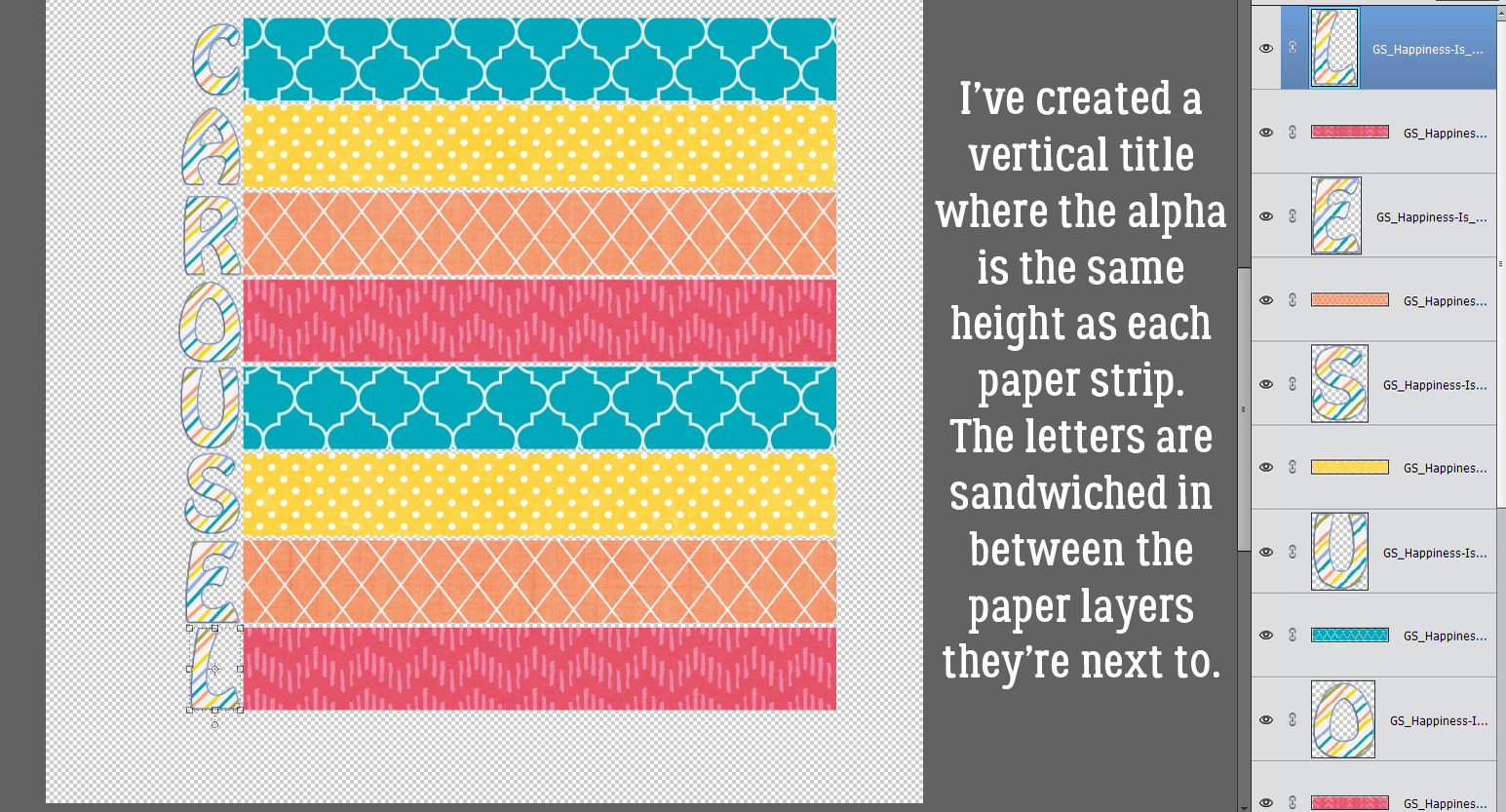
This technique can be used at any angle. Vertical, horizontal, diagonal… all the same steps. If you want a crisp look, choose a sans-serif (no extensions on the terminal strokes) alpha with some substance and clean lines. I went with a bit more of a fun alpha from the GingerBread Ladies‘ collab Happiness Is. My papers are also from this collab. Here you can see I have 8 paper strips, one for each letter in my title. I’ve resized the alpha so each letter is the same height as the paper strip. If you want to, you could double up some of the letters to a single strip for a really unique look. To make the steps easier, I’ve sandwiched the letters between the paper strip layers.
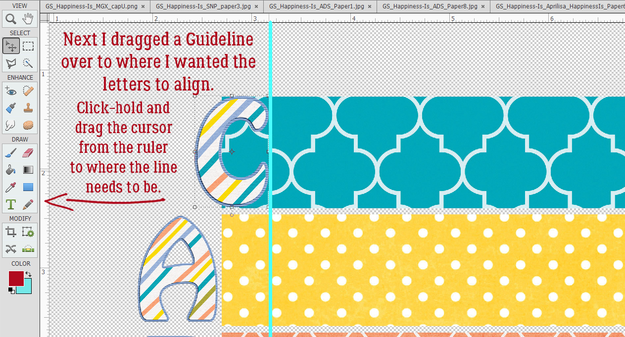
I decided how far over I wanted to move my letters so that they sit on top of the paper then I dragged out a Guideline to snug them up against. Guidelines are really useful for precision. All you need to do is ensure the Rulers are active [View>Rulers] then with your cursor inside one of them, click-hold and drag the cursor to the place where you want the Guideline. The actual Guideline won’t be this obvious. I’ve enhanced it for better visibility.
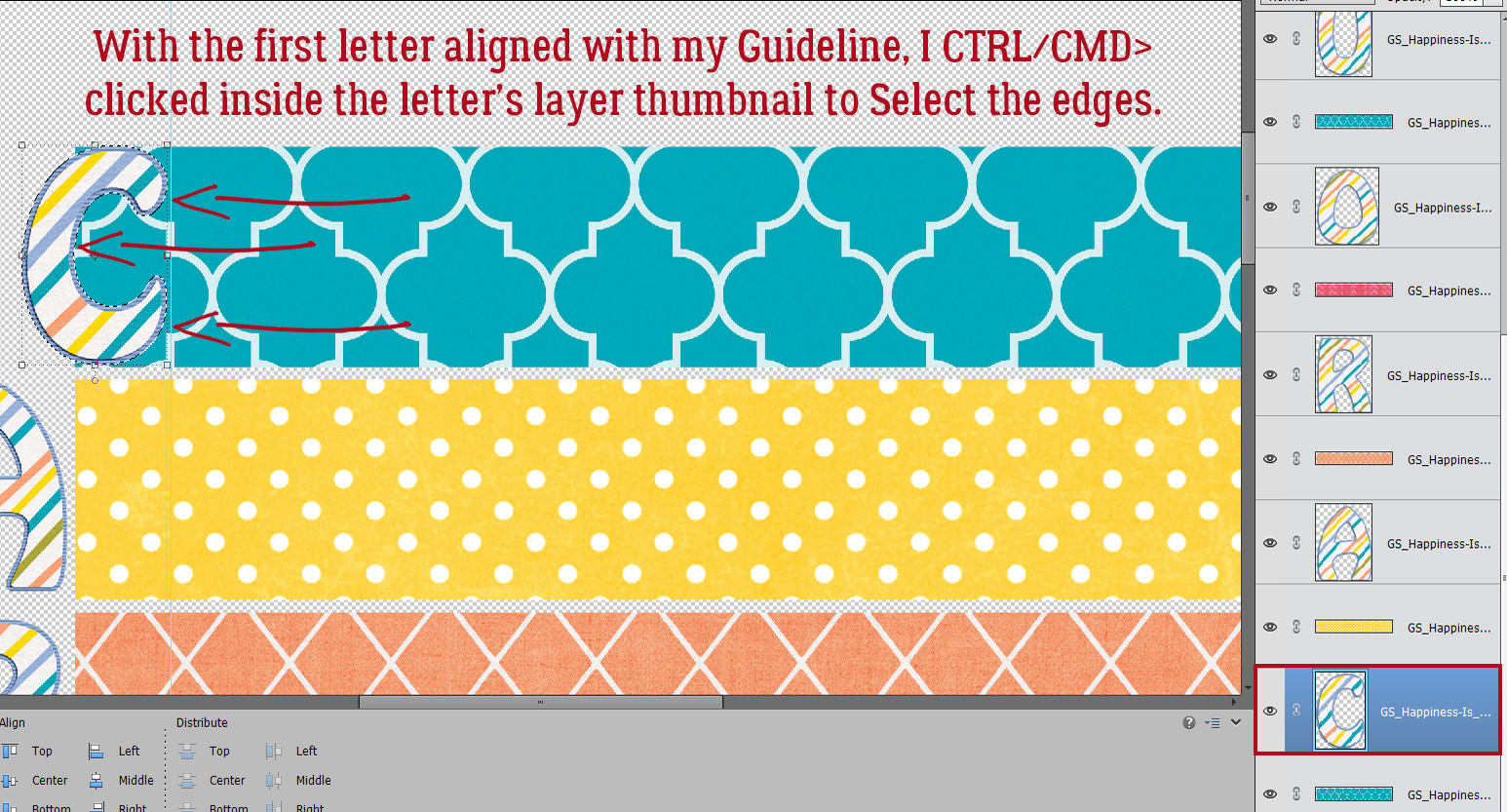
Next, I nudged the first letter over so it’s just touching my Guideline, and then I CTRL/CMD>clicked inside the LETTER‘s layer thumbnail in the Layers Panel to Select the edges of the letter. See the marching ants?
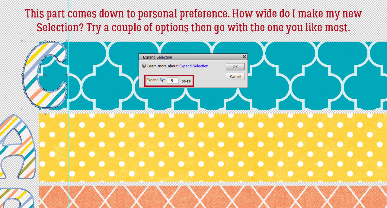
I need to make the area inside the marching ants a bit bigger. Otherwise there won’t be a border around the letter later, right? Select>Modify>Expand will make the Selection grow.
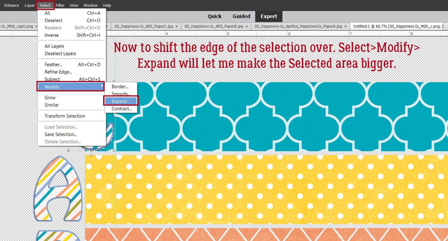
Here’s where personal preference comes into play. There’s no hard-and-fast rule for this step, and it may take some experimentation to find the right number of pixels to go with. I ended up at 15 pixels, but 20 or 25 might have worked well too.
Here you can see where the new line of marching ants, the new Selection, is.
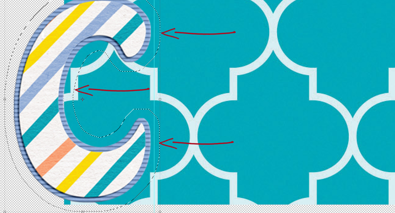
Now, with the turquoise paper layer active, I Cut some of the paper away. Edit>Cut or CTRL/CMD>X will work for that.
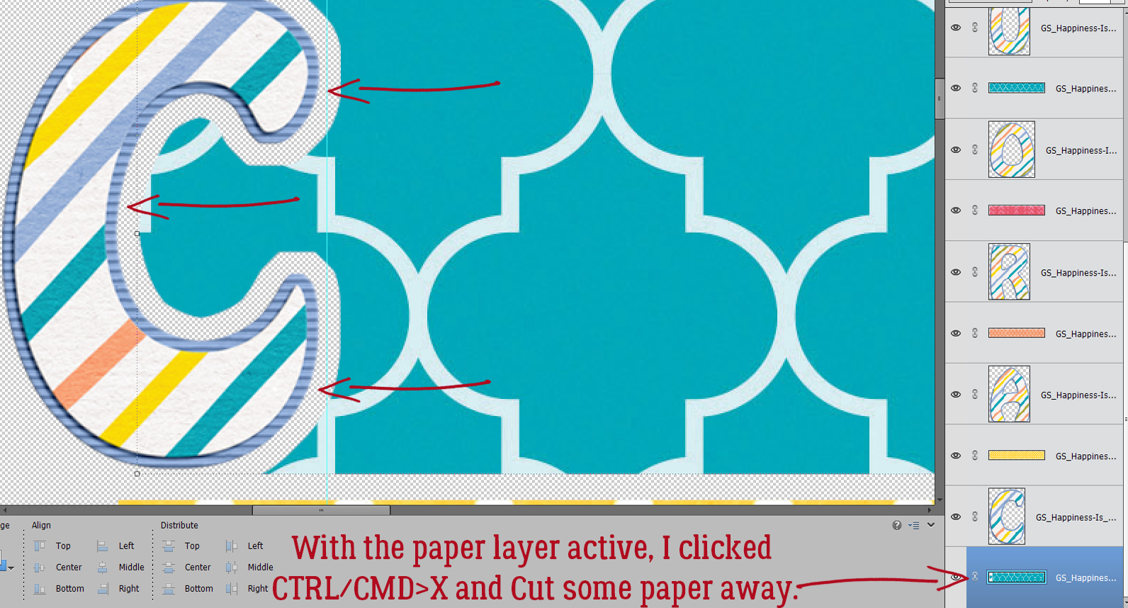
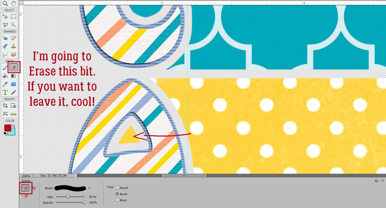
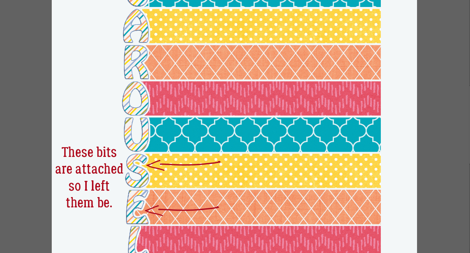
I followed the same process with each of the letters in the title. Where there are little bits of paper completely disconnected from the paper strip, I used the Eraser tool and got rid of them.
Where the paper bits are still attached, like inside the C, the S and the E, I left them there.
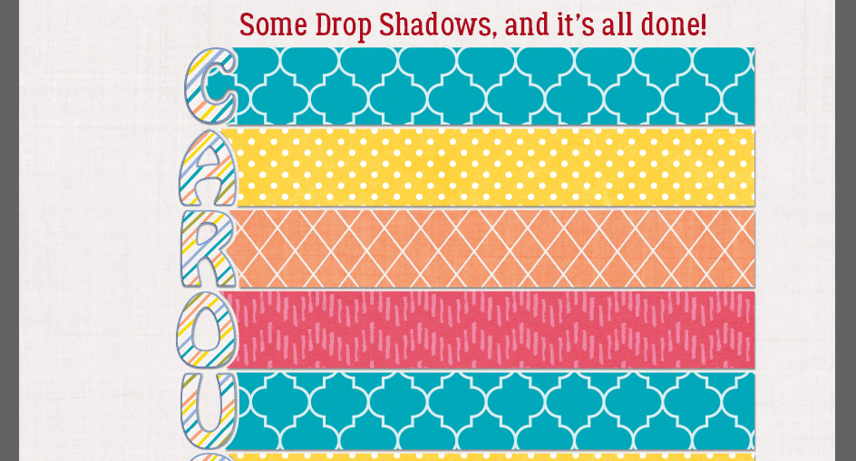
Then I shadowed up each layer and my title is done!
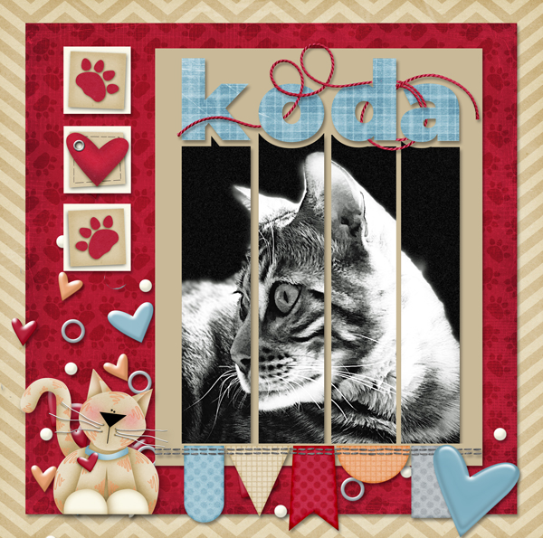
The layouts Sherry showed me as examples can be seen here, here and here.
If you try this tip, let me know so I can leave you some Gallery love!!
PDF Tutorial: https://bit.ly/3kYGNyg
![]()
Couldn’t you have merged all the letters of the word, than get marching ants, expand, than cut the needed papers. Seems like you took extra steps to do each letter at a time.
That might have worked. I didn’t even think to try it. To be honest, my head wasn’t totally in the game today.
This is awesome Jan !! Thank you so much 🙂
I would not have guessed that could be so easy.
I can’t wait to try it out.
HMMM Gives me an idea for a challenge. Thanks! Now I just have to see if my idea alterations work lol
Very fun – thanks, Jan, for the great information.
Love the tutorial, and love the pdf version so I can save it for reference later!