November Challenge Spotlight: Template Challenge
![]()
Is the timing for our Challenge Spotlight perfect this month, or what? This week nobody has to try following Jan’s twisted and tangled directions! Because who’s got time for that right now? This month I’m shining a light on one of my faves, the Template Challenge. I LOVE templates… and for those who think they stifle creativity… well that’s simply not true. Templates enhance creativity! I look at them as a foundation, not something to follow slavishly; the template designer takes some of the guesswork out of layout creation, but leaves the scrapper in the driver’s seat. Sure, if you love a template exactly as you see it, you can faithfully duplicate the designer’s vision to create a beautiful layout. But if you’re like me, you see a template as more of a springboard; I often flip or rotate my templates, resize or reposition photo spots, add, subtract or substitute elements and make my layout uniquely mine. Let’s look at some examples of what can be done with a single template and how amazing the results are.
Before I forget, I’d like to welcome Dagi back to the family. Dagi has been designing templates for many years; her nom-de-plume was originally Dagi’s TEMPtations, then more recently Dagilicious. She’s taken a couple of sabbaticals from designing when life has required, and now she’s back again with lots of fresh looks. She has provided the November challenge template (did I forget to mention they’re FREE every month?) and it’s fantastic! Here’s a peek, in case you haven’t seen it.

Her Creative Team member Karen took the template and created this layout with it. As you can see, Karen kept her layout true to the template, and it’s gorgeous.

Now on to the Gallery! [PS… Each Challenge has its own Gallery. You can find the Template Challenge Gallery here. Each layout is also linked: click on the scrapper’s username!] First up is a cute layout by Yvonne55. She stayed pretty faithful to the template, but has blended some papers, added a stitched border, substituted some string for wordstrips, stitched down the journal card and added that little clothespin to anchor her single wordstrip.
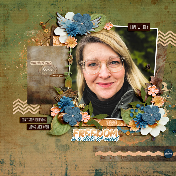
I’m going to guess that Cinna doesn’t like bows… she’s substituted wings for one and some brass elements for the other. She tossed in some sequins, some scribbles and extra paint, but the bones of the template are easily identified.
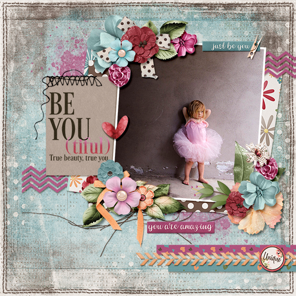
KatherineWoodin is a storyteller. Her layouts are daily diary entries and she does a beautiful job of enhancing those stories with her choices. Here, she’s rotated the template 90° to the left. The large photo spot became her notepaper and the journal card is replaced with a photo. She added some scattered flowers and butterflies too. And check out that cool font for her title!
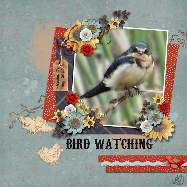
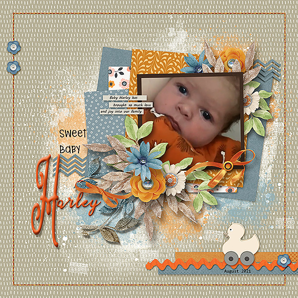
I admire people who can capture good photos of birds. granny5pics subbed a tag for the journal card, some fine curly ribbon for one of the bows and some wooden bird cutouts for wordstrips. She added some twigs behind the paper/photo stack.
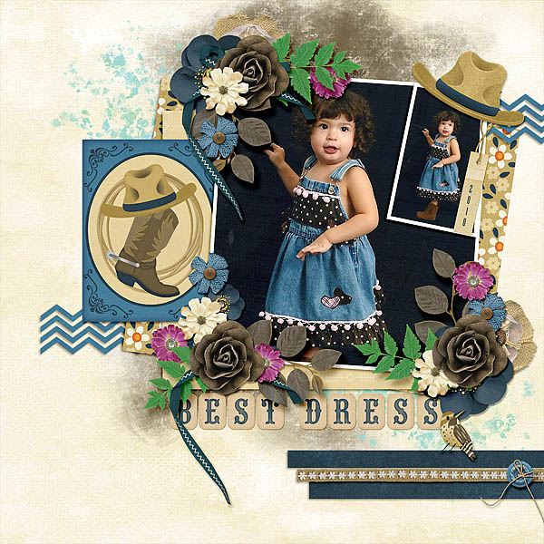
Look at this little cutey! Got2Scrap has added a photo in the upper right, a grungy brush behind all the paper and photos, eliminated the wordstrips and perched a cowboy hat on the photo stack. The template is recognizable, but not in a cookie-cutter way.
This layout from Glee is a significant departure, but the bones are still there. She eliminated the paint splatters, going with a patterned paper instead. Her focal photo is long and skinny, and she’s filled the space with doodles. Then she tied the ribbon cluster to the photo/paper stack with a hot air balloon. She’s used word art rather than wordstrips. Very cool!
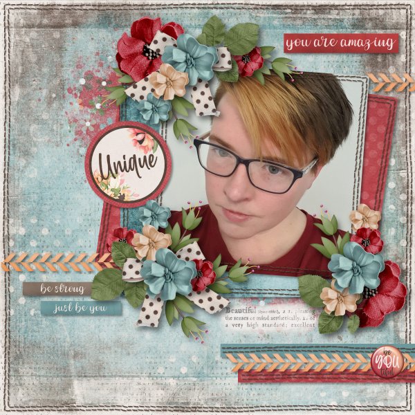
When I look at Jill‘s layout, the template influence isn’t really obvious, but the more I look at it the better I can see it. She’s made the photo spot smaller and framed it in black rather than white. She moved one of the large clusters to the opposite corner and tucked it underneath. She deleted the journal card, filling it instead with paper. Her stitched border and the addition of a pair of buttons to it is a deft touch. And what can I say about the rubber ducky?
There are SO MANY creative tweaks to the template in cinderella‘s layout. She’s turned the photo spot into a cut-out and has that amazing extracted photo popping up from inside it. The elements in her clusters are positioned with the template’s placement as a guide, but she has a very different look with the die-cuts. Tucking some strong into the background and scattering some beads rounds out a interesting and eye-catching layout.
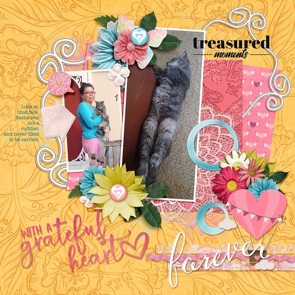
At the most basic, makeyesup‘s layout has the look of the template, but not. I know that’s not really sensible, but she’s made a lot of choices that really sets her layout apart. Her dark background and muted colours are visually pleasing. Rather than use a journal card, she’s created a dialog box to describe her photo. The primitive bird atop the paper immediately made me think of “plain” folks, like the ones who settled Salem more than three centuries ago.
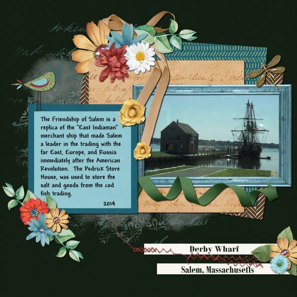
Derby Wharf
Now, where have I seen that background paper before? Oh yes… in the first layout I showed you. And the template’s form is quite apparent. But the layouts couldn’t be more different! greenfiend127 replaced the journal card with a circular tag and it works beautifully. She replicated the stitched border on each of her papers and her photo, giving the layout such an organic look. Exchanging the zigzag paper strip borders for a narrower papercut border is another way she’s made the template her own.
I hope you’ll find some inspiration in these layouts and begin to see templates with a new perspective. If you see the Challenge layout I’m going to post later, see if you can identify the changes I’ve made. What are some ways you can bring your unique style to a template? Give it a whirl!
Next week I hope to have something really different to show you. If my experimentation works the way I think it will… Meanwhile, Happy Thanksgiving to all of you in the USA. While y’all are watching football, I’ll be binge-watching Yellowstone. See you soon!
PDF Version : https://bit.ly/3IbAXo7
![]()