Clearly Complete – Adding Some Background
![]()
Whew… we’re in the 2021 home stretch now! Twenty-three more days and it’ll be over. This last week has been a whirlwind for me! Last Tuesday my daughter and I spent 5 hours – the first 90 minutes in torrential rain! – in a car so we could spend 3 hours with my parents on the day before their 65th anniversary. On the first we set a temperature record, 63°F. Now we have 6 inches of snow! And later today I see the ophthalmologist to find out when he can remove my cataracts. [I thought the dramatic changes in my vision were related to having had COVID in the spring. Surprise!] It’s a good thing I already had a lot of the work done for this tutorial! Today I’m going to show how I added some “wallpaper” in the background behind my glass mixing bowl and made it look realistic-ish. We’ll pick up right where we ended last week.
It was a challenge to find the right paper for this part. I tried a few and didn’t like the results, so let me offer some tips on selecting. Pick a paper with some pattern, but not too small or large. Choose something with colour, but not too light or dark. Texture is good, but only to a point. I think I might try to fake some subway tiles later and see how that goes… The paper I liked best was from ADB Designs‘ Antiques Emporium. It kind of reminds me of my grandmother’s kitchen. The way I imagine it, not how it really was – she had no running water! As you can see, the paper is behind everything except the original bowl layer.

I was really glad I hadn’t Deleted the original bowl layer when I started figuring out how to make this work, because it DOESN’T work using the glass version of the bowl at all. With the paper layer active, I Selected the edges of the bowl by CTRL/CMD>clicking on the Layer Thumbnail (that little picture of the bowl in the Layers Panel).

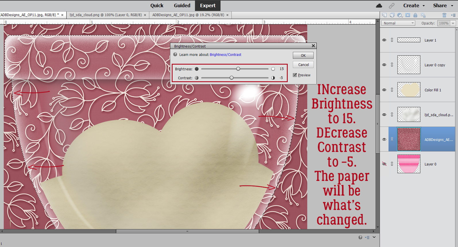
Light changes as it passes through glass. This step adds that effect. Enhance>Adjust Lighting>Brightness/Contrast.

When the Tool Options menu opens, adjust the Brightness by INcreasing it to 15, and DEcrease the Contrast to -5.
Now, it could be my eyes, but when I was looking at real curved glass with a pattern behind it as I figured this out, the glass created a slight blur on the paper. So Filter>Blur>Gaussian Blur. But just a little bit, 1.7 pixels‘ worth. Keep the edges of the original bowl Selected until I tell you to Deselect it!

It looks okay, but there are still a few things it needs. I added a new blank Layer immediately above the paper. Click on the sheet-of-paper icon to the upper left of the Layers Panel.

Next, I Filled the outline of the bowl on that blank Layer with black using the Paint Bucket tool. Looks awful, but it’ll be great! Now you can Select>Deselect the original bowl outline (CTRL/CMD>D).

Don’t worry about that black, and don’t be intimidated by this step either. It’s going to work beautifully, I promise! The black is going to become a shadow, and bowls cast very complex shadows. To make it work, Image>Transform>Distort.

The best thing about Distort is that you can adjust the image in a single dimension, or multiple dimensions, depending on what your goal is. I know the light is coming from the top right part of the bowl because of where that big shiny spot is. For the shadow effect I arrived at through lots of trial-and-error, discarded screenshots and Undos, what worked best was just to pull the lower left “handle” straight out as shown. The image comes out from behind the bowl. I clicked the checkmark.
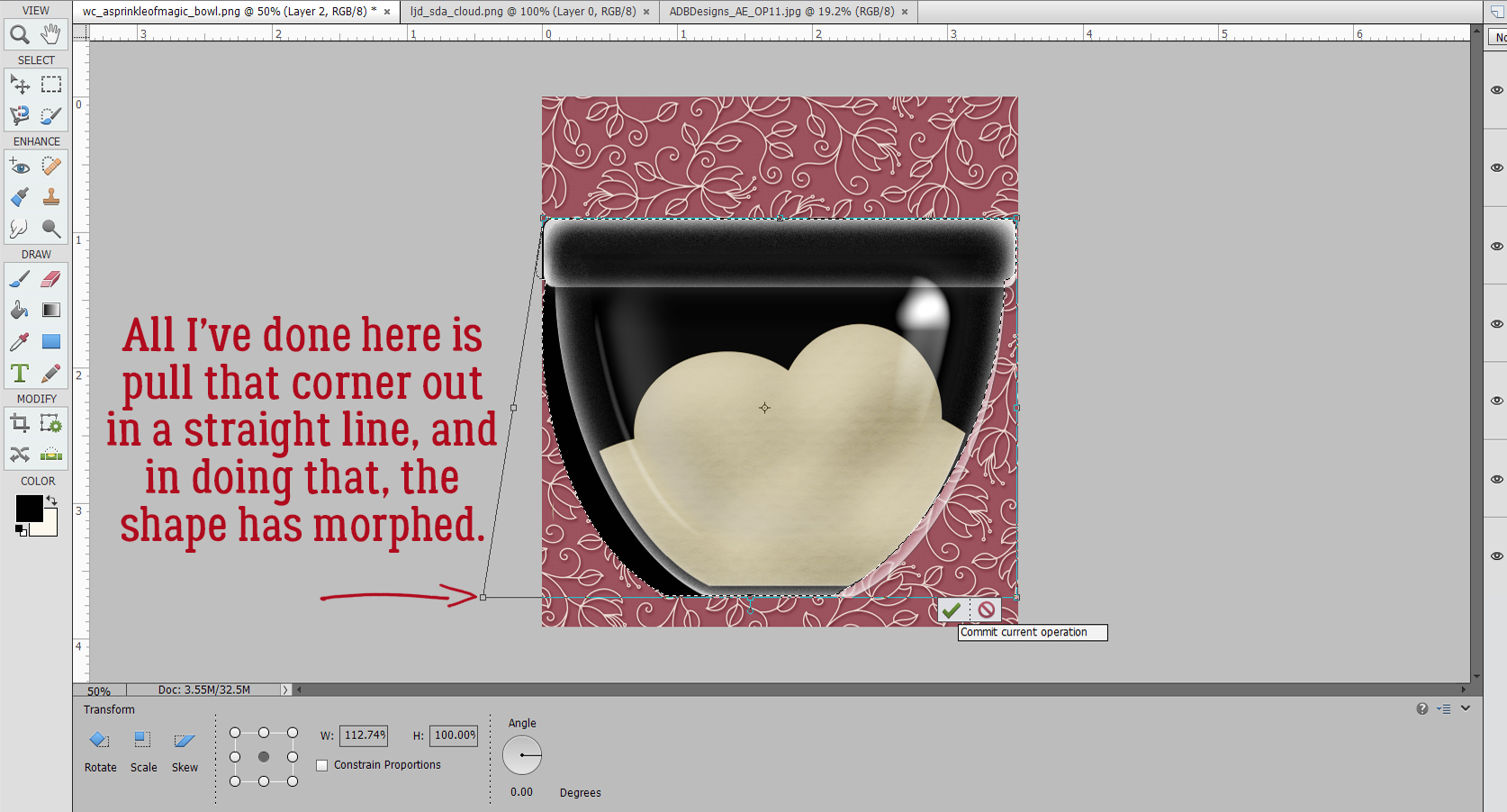
Then I Rotated the black image to the left, keeping the corners of the bowl and shadow layers aligned. And yes, it looks like it’s just a mess.

But not for long! Remember, the outline of the original bowl is still Selected. So now I’m going to Cut out the black that sits inside the outline. Edit>Cut or CTRL/CMD>X.

That wedge of black has to go too. I used the Rectangle Marquee tool to draw a box around it.
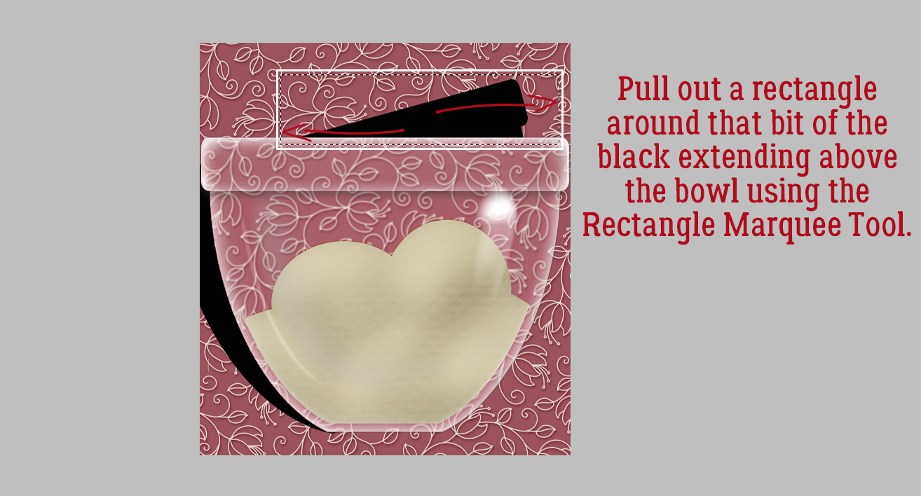
And again, Edit>Cut (CTRL/CMD>X).

Now to soften it up. Clear glass will never cast a harsh shadow. Ever. Filter>Blur>Gaussian Blur.

This shadow needs a LOT of softening, so I pushed the Blur all the way to 24.9 pixels. See how it spreads behind the glass a bit? Exactly what I wanted to see.

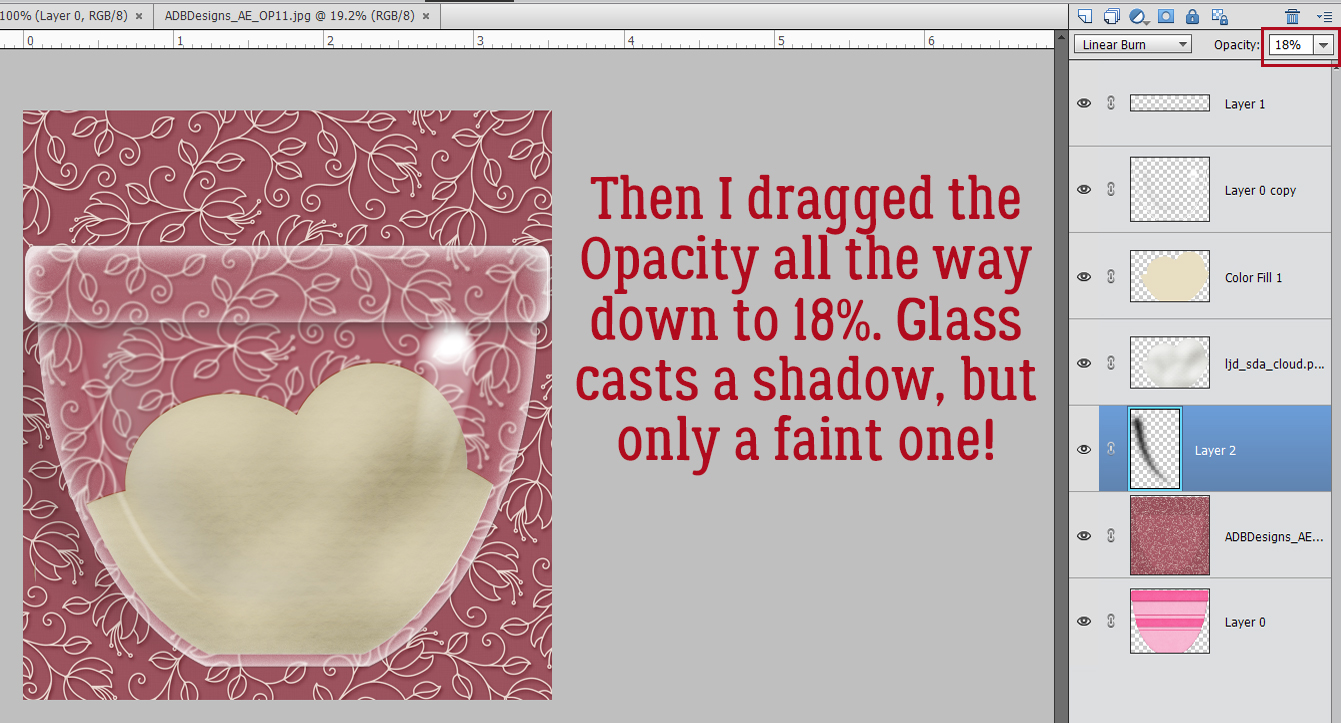
I know I’ve mentioned why I change the Blend Mode on my shadows to Linear Burn, but I think it bears repeating. The Normal Blend Mode remains opaque and doesn’t allow any of the colour under it to show through. Linear Burn will let both the colour and the texture be visible.

Last step for this shadow is to decrease the Opacity down to about 18%. It’s subtle, but quite nice!
All that’s left is to add a smidge of shadow behind the “dough”. Remember the steps for custom shadows?
1- Select the edges of the object by CTRL/CMD>Clicking on the object’s Layer Thumbnail.
2- Add a blank layer underneath the object. CTRL/CMD>Click the sheet-of-paper icon if you have the object’s layer active.
3- Fill the Selection from Step 1 on the new blank layer with your shadow colour using the Paint Bucket Tool.
4- Select>Deselect (CTRL/CMD>D) the object’s outline and nudge the filled layer so that the light source conforms to the rest of the layout.
5- Smudge the shadow layer to change the contours a bit, making the shadow look more natural. This is based on how the light would penetrate to the background. Thick, flat things will be more snugly connected to the background and the shadows here will be sharper and closer. Thin, curved things might be farther away from whatever is behind them and the shadow would be less distinct.
6- Filter>Blur>Gaussian Blur the shadow layer to the degree the object will block passage of the light.
7- Change the Blend Mode to Linear Burn.
8- Decrease the Opacity of the shadow layer until it looks “right” and you’re done!

I really enjoy trying to make two-dimensional images look real, and think it’s worth the effort. My next attempt might be a snow globe. If you choose to give this a try, don’t feel like you have to use exactly the same settings and what-have-you that I’ve used. Play a little so that when you’re finished, it looks good to YOU! Because you’re the only one who gets to have an opinion.
Anybody have a great idea for next week’s topic? Drop a comment below and I’ll see what I can do.
PDF Version: https://bit.ly/3pYuqon
![]()
Jan,
Have you done a tutorial on making torn edges? Showing the “white” of a torn colored or patterned paper? How to make your own template so you can use it over again to make a new paper.
Thanks!
Wow, it turned out wonderful !!
Definitely worth the effort.
PS: A snow globe tutorial would be wonderful, not to mention very handy at this time of year 🙂
Thanks again for a wonderful tutorial !!
You Rock …….
I love you but you’re clearly insane! hahaha
NO way would I spend this much time although I totally agree the end result is spectacular. I’m just hoping one day my kids will look thru my scrapbooks before they pitch them in the dumpster!! (too bad I didn’t have daughters!)
You are the best!
ps, my dh had the deluxe cataract surgery w the implanted trifocal lens. He says he feels like the bionic man now; loves his new vision. Doesn’t even need sunglasses in situations where he’d be reaching for them (blue eyes) and whining (says his brown eyed wife). Best of luck. and thanks for all you do.
Merry on!
pps (i have a hard time ending, clearly)
We had torrential rains past two days here, too.
I am looking for any tutorial on how to make those worn wood papers that I love so much. Have you ever done a tutorial on that, if so how do I find it?
I have done a torn-edges tutorial, quite a while ago. https://gingerscraps.net/gsblog/2017/03/tutorial-tuesday-photoshop-elements-28/
I have NOT done a build-your-own template tutorial though, and I LOVE the idea! I’ll start working on it ASAP!!
Thanks, Sherri! I think a snow globe would be fun, so I’ll give it a shot.
Well my dear, a lot of the time these tutorials take for ME comes from all the experimentation to get it right. I would hope following a tutorial isn’t as labour-intensive. I know the screenshots make the tutorials look super-complicated and time-consuming, but I want even the newest-to-digi to have the tools they need to be successful. An experienced scrapper like you won’t need all the minutiae. If you have a hard time ending a comment, I have a harder time looking at a work-in-progress and seeing “good enough”.
My ophtho appointment was interesting, to say the least. Imagine a surgeon advising AGAINST surgery… that so rarely happens that I sat up and listened. He said he could make a case to qualify my right eye, but it would be marginal… the cataract isn’t big and it isn’t central. My left eye wouldn’t qualify for at least a decade! He also said my prescription hasn’t changed enough to warrant new lenses either. So we talked about my driving-at-night vision and he ran a brief test that showed most of my issue is psychological – I used to drive to and from work in the dark half the year for decades and now that I’m not doing it I’ve lost some confidence. He gave me some tips on overcoming that and I practiced on the way home while DH was driving. Guess what – I had no trouble at all seeing from the passenger seat.
We’re getting some more snow, although the temp is right at the freezing mark. Makes the roads on all these hills a little tricky!
Oh hey! That would be an awesome thing to play with! Are you talking about the ones where they look like wallpaper that has been rubbed off and dirtied up a bit? I think I can manage that.
Oh, I just came across an idea for a tutorial.
Paper with a hole in the center (or anywhere) and the edges all jagged and rolled around the hole.
(Sort of looks like thin parchment paper) so you can see the photo through the hole.
Could be a template so you could place it where ever you wanted it on any page 🙂
Wonderful tutorial, Jan! I like the idea of making the glass bowl’s shadow look more realistic. I like trying to make shadows more realistic, but like glee, I’m not sure I would have the time to go to such great efforts to make it so. I have little time to scrap & I am still a bit slow. But maybe someday… I appreciate all the detailed steps though & the snapshots of your screen!! 🙂
I like the idea of a template for those torn paper edges … and working with a snow globe. Thanks, Jan!
Wow, that would be a complicated tutorial, but absolutely doable! Do you think it looks like vellum? I’m making a list…
You know, Pam… when I first started learning how to create custom shadows, I thought they were too much work and not really worth the effort. But the more I played with them, the easier they became. Now I find it comes almost automatically and takes me no more time than using a Style.
I’m glad you find the way I organize the information to be useful.
Hi Jan.
I am not sure if it was me that you ask if it looks like vellum or someone else ???
Just in case it was me I have 3 links for you to get an idea of the type of tutorial I’m looking for.
1) https://www.freepik.com/premium-vector/realistic-hole-sheet-paper-with-torn-edges-transparent-background-isolated-vector-illustration_16332478.htm#page=1&query=hole%20in%20paper%20paper%20hole%20ripped%20paper%20texture&position=27&from_view=search
2) https://www.freepik.com/premium-vector/sheet-paper-with-hole-inside-template-realistic-page-scrap-paper-with-rough-edge-banner-illustration-transparent-background_9605784.htm
3) https://www.thecommittedcrafter.com/product-page/into-the-woods-collection
Ah! Yes, I was asking you. These links make it so much clearer. It could be any paper! Still complex, but doable!! Thanks again!