Archives for January 2022

Fresh Baked: January 28, 2022

Happy Friday everyone! I cannot believe it’s the end of January already. I hope your 2022 has started off well.

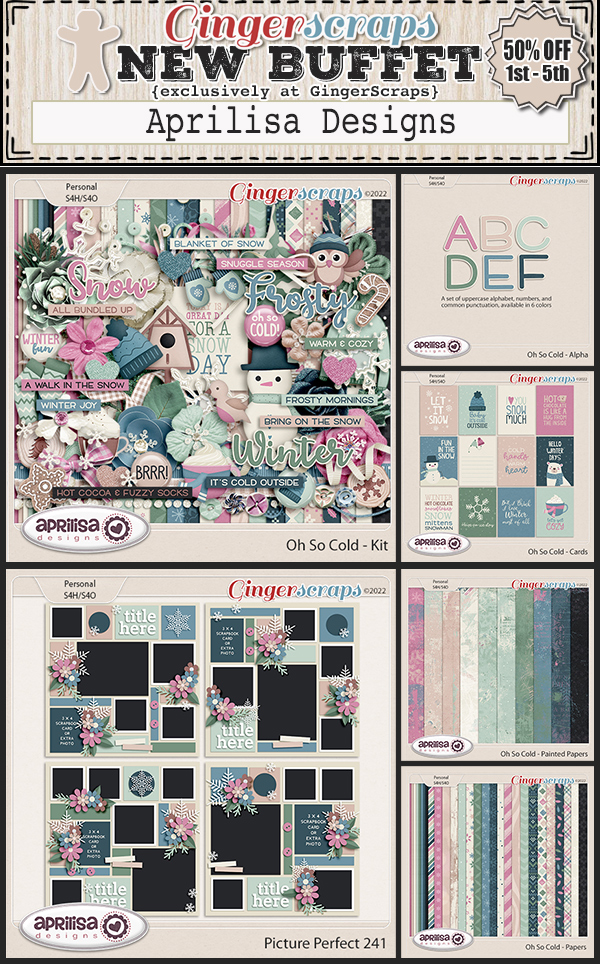
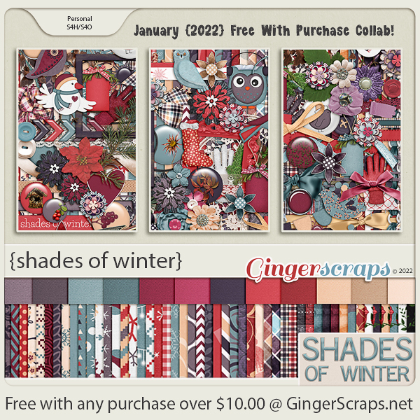
Remember, spend $10 in the store and get this amazing kit for free.

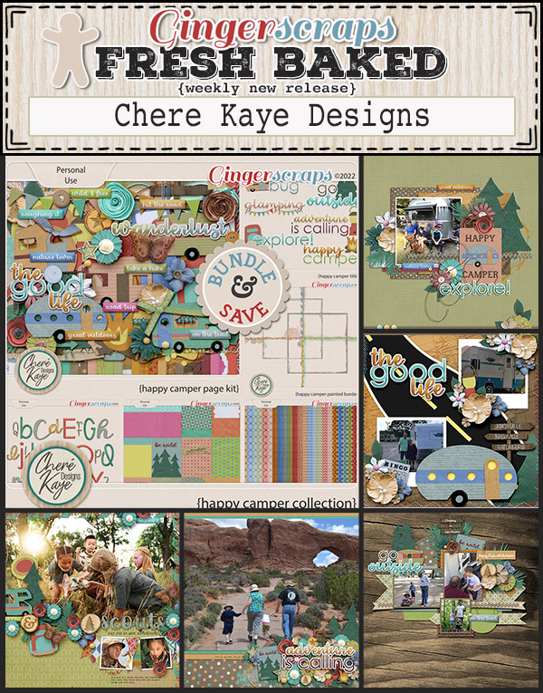
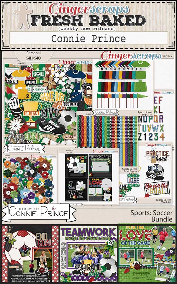
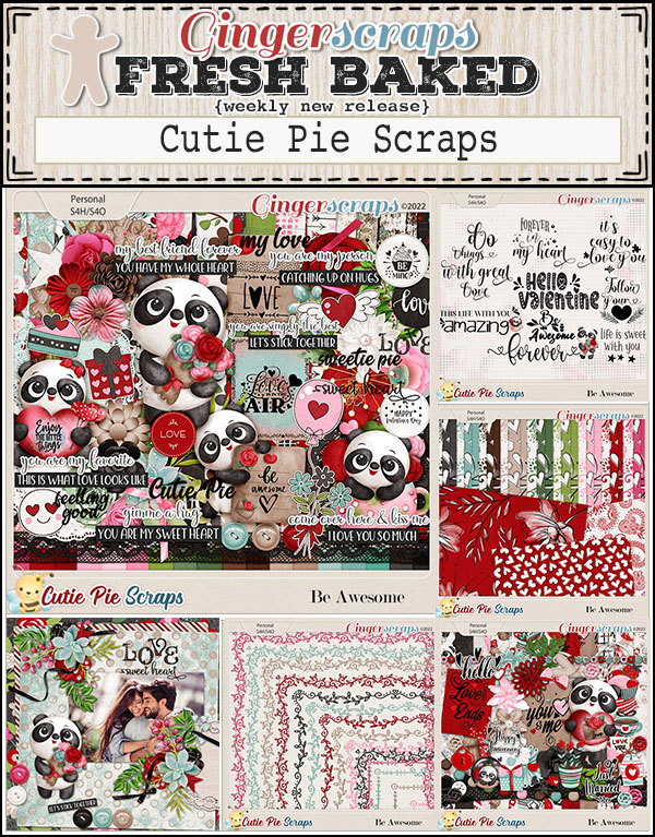
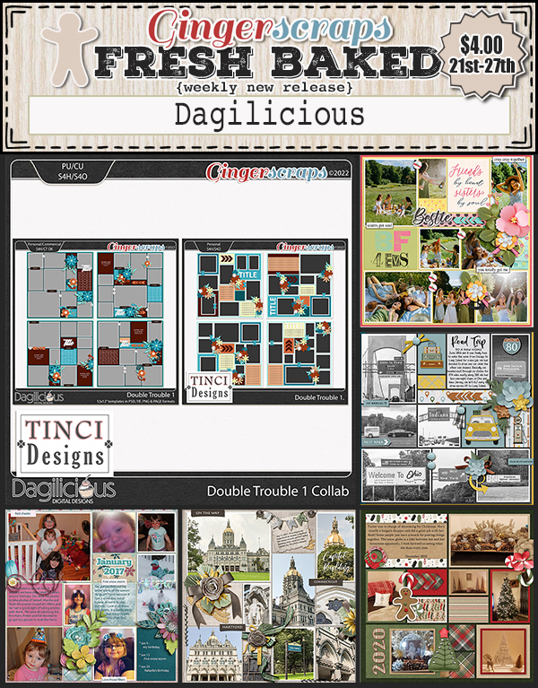
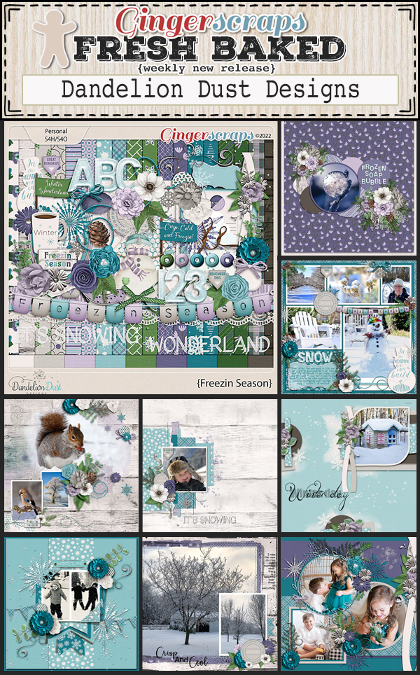
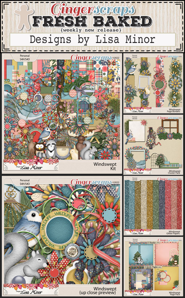
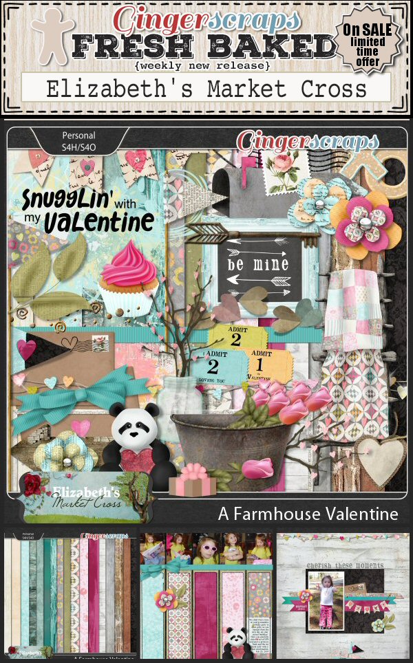
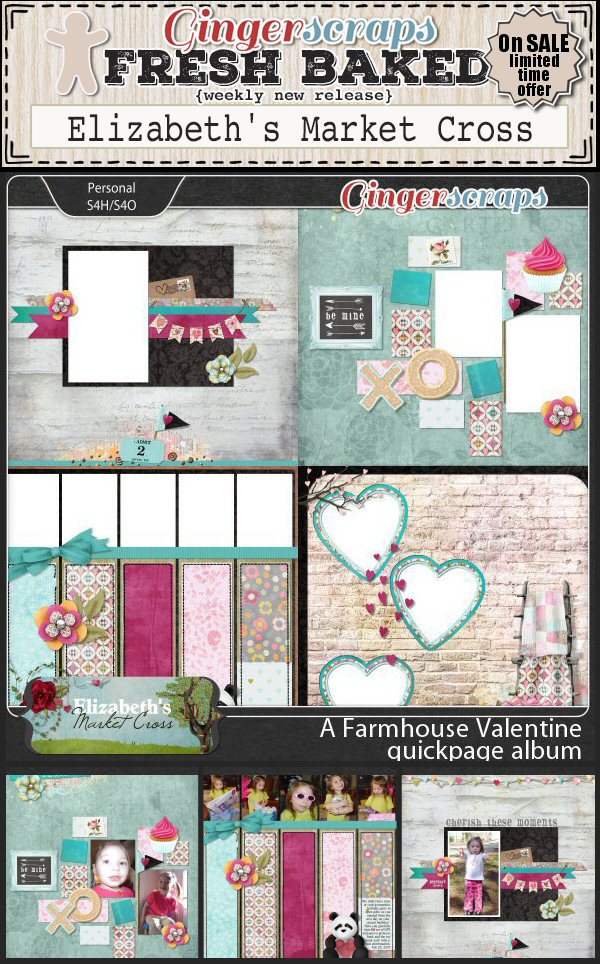
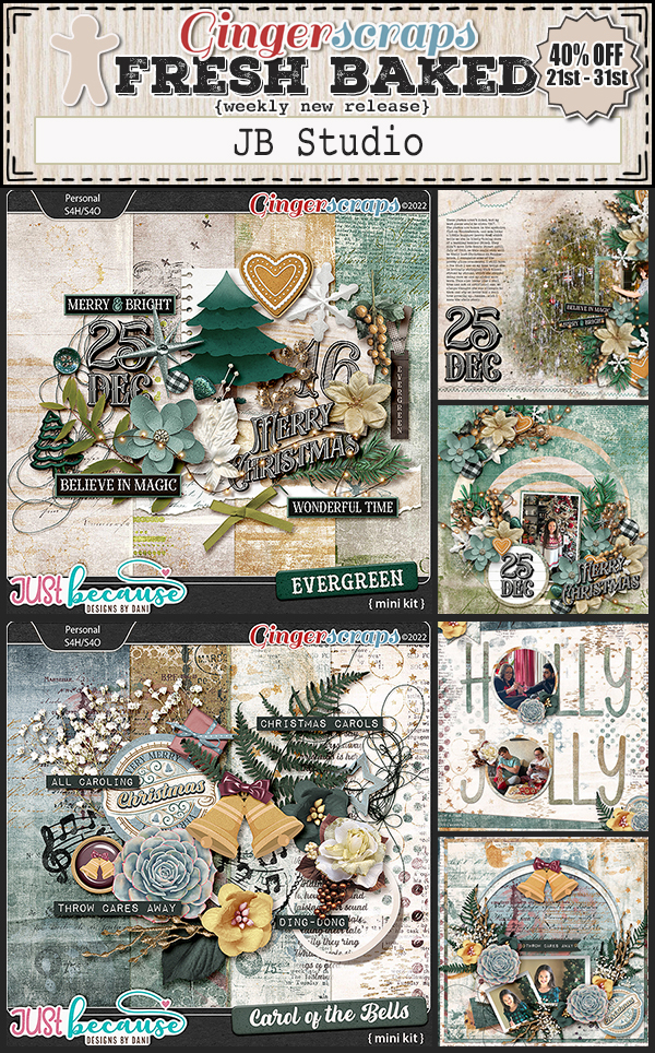
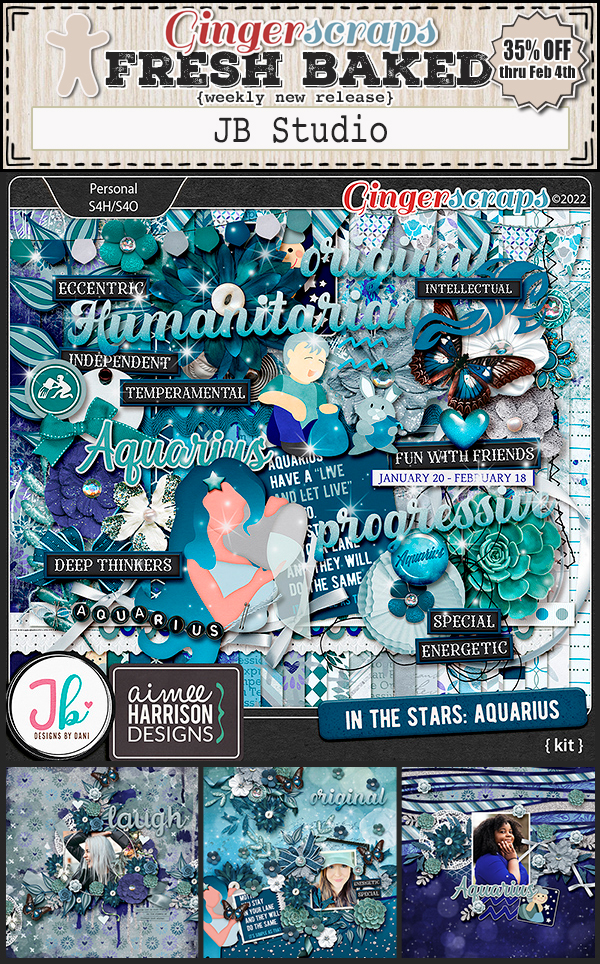
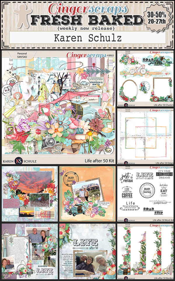
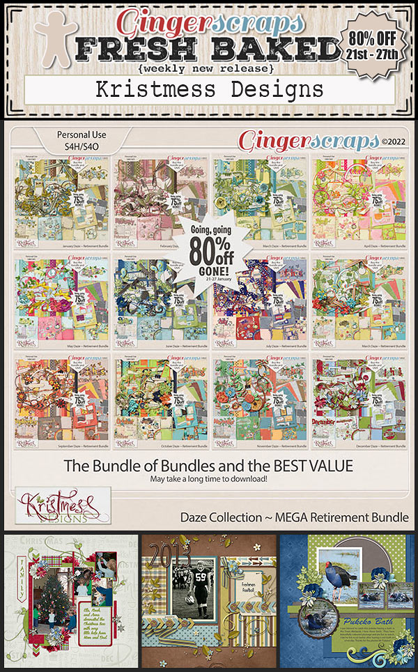
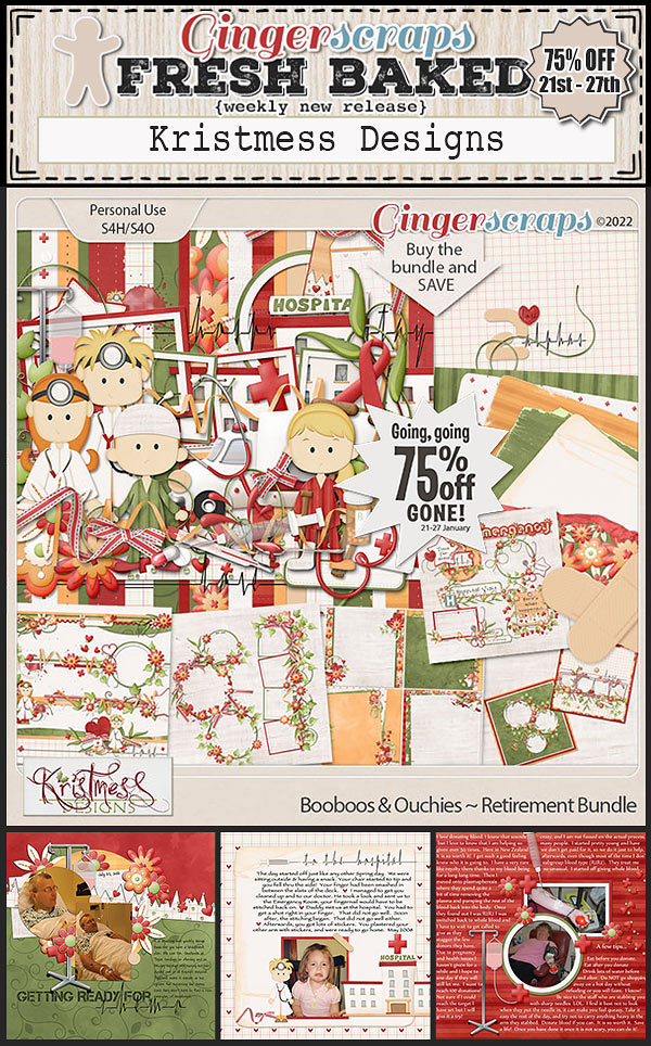
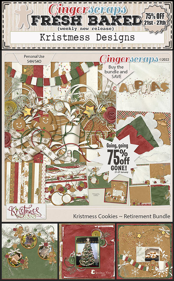
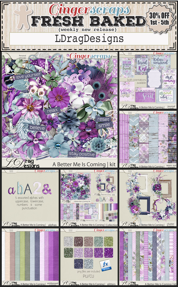
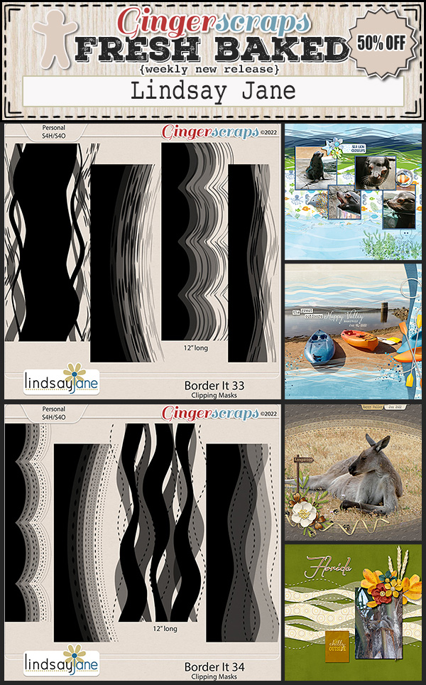
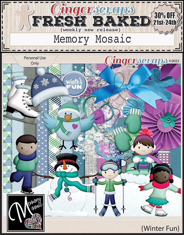
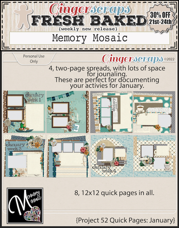
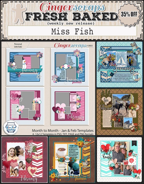
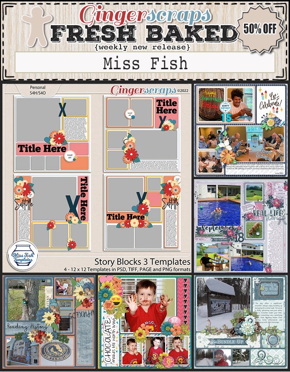
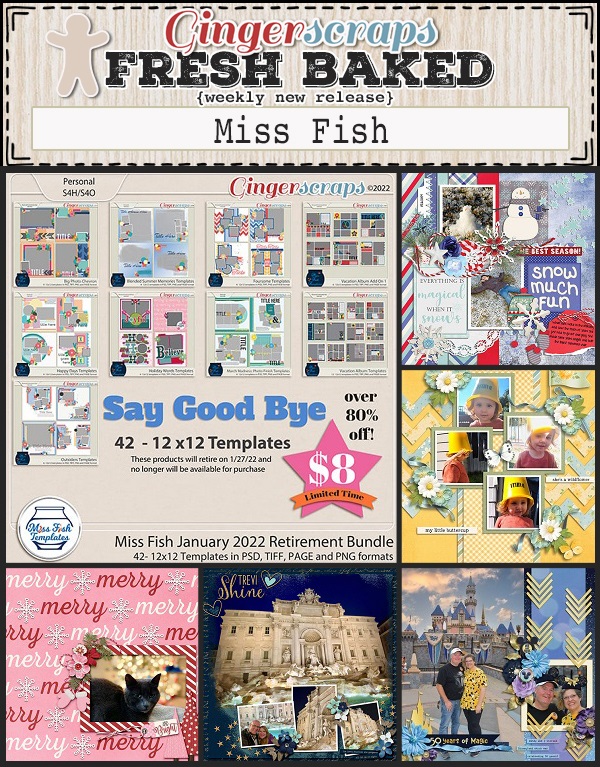
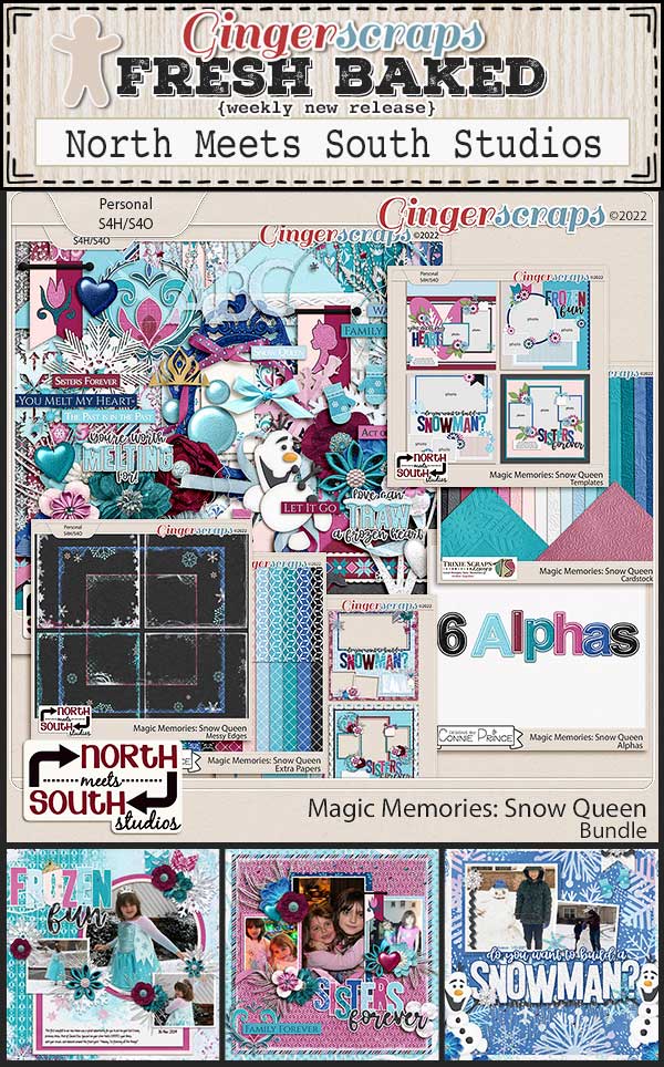
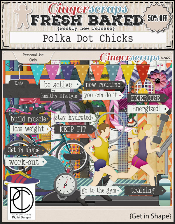
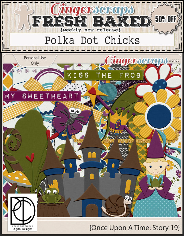
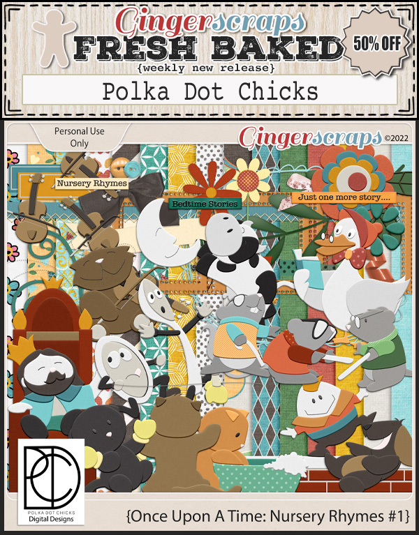
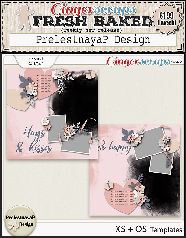
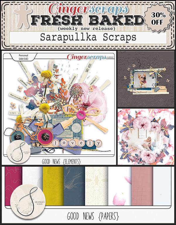
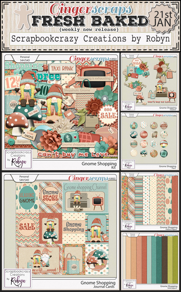
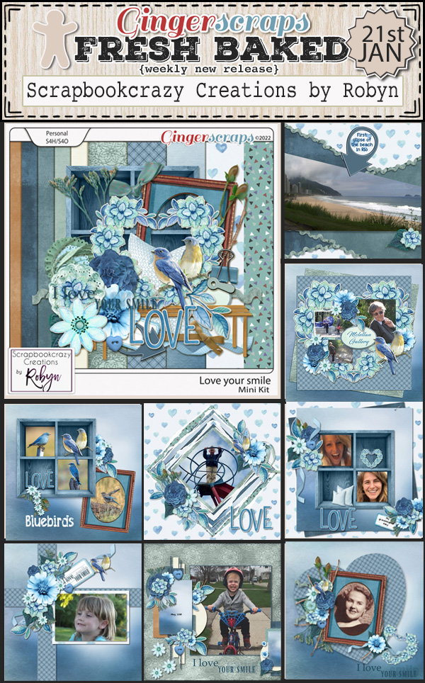
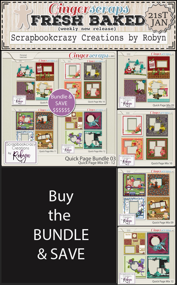
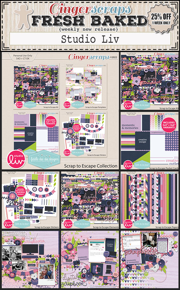
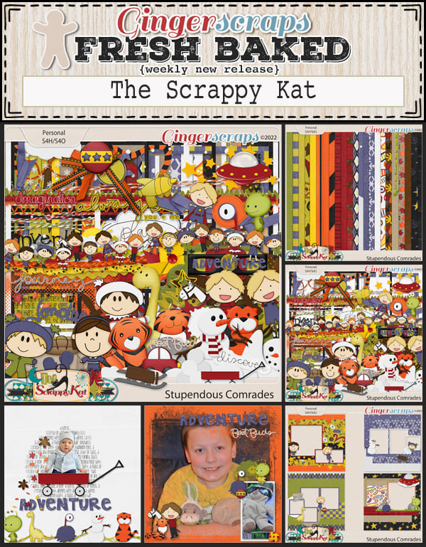
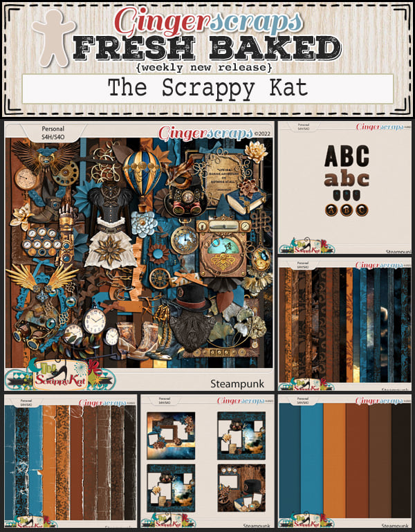
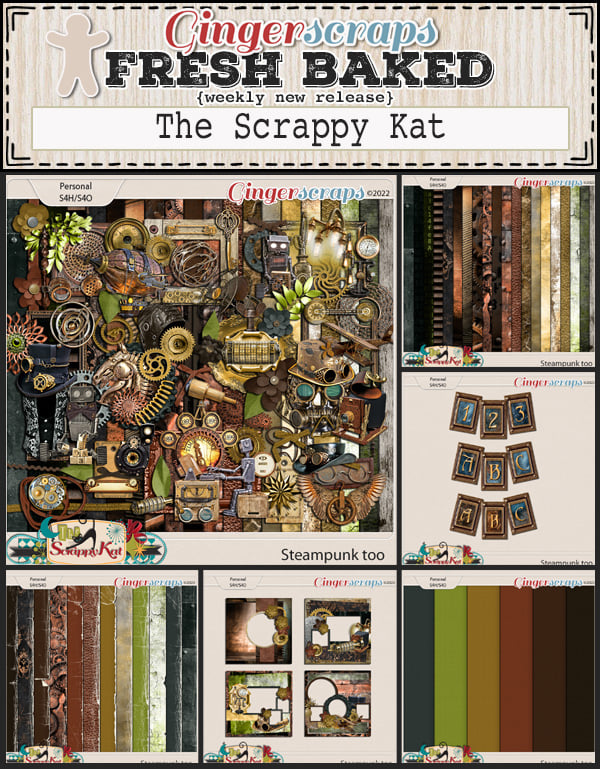
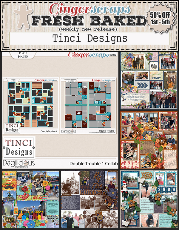
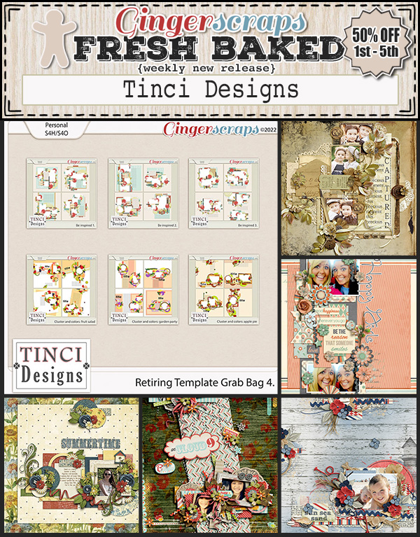
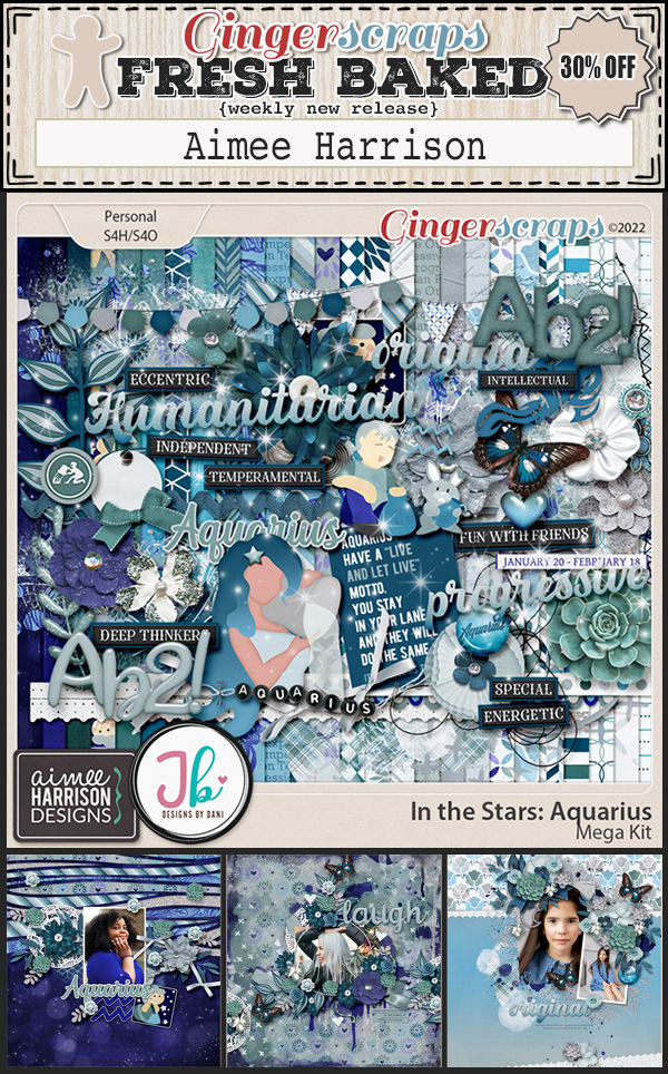
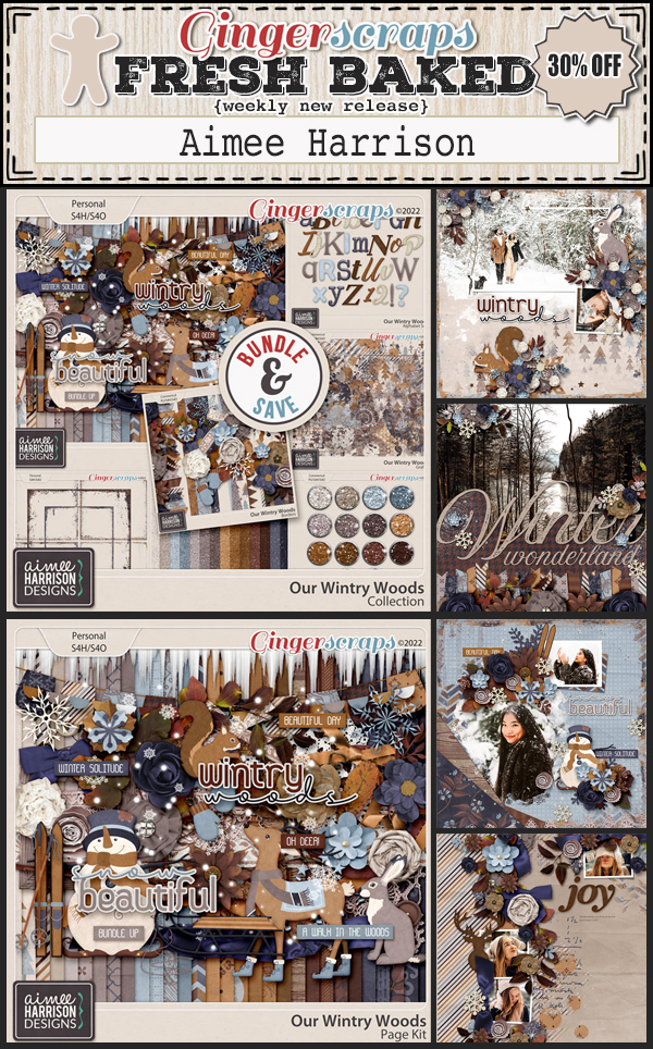
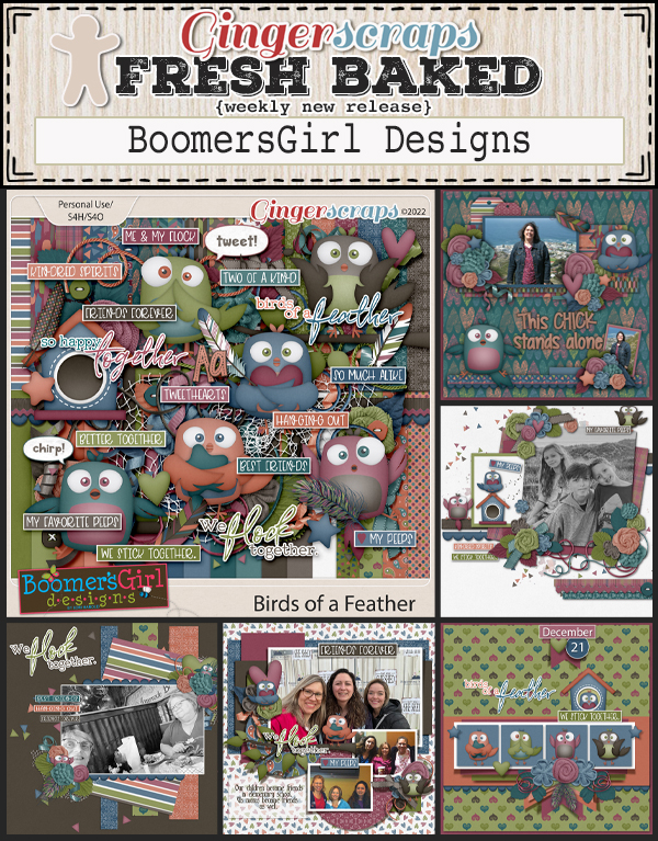
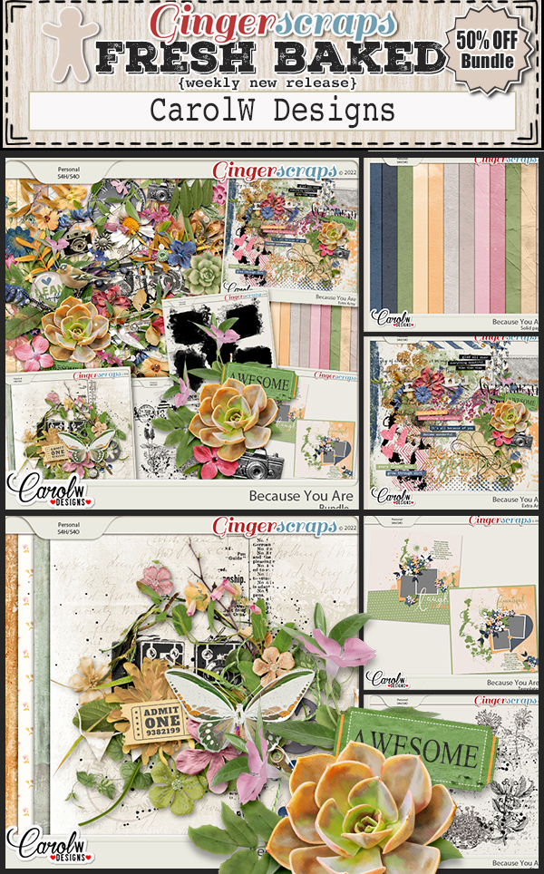
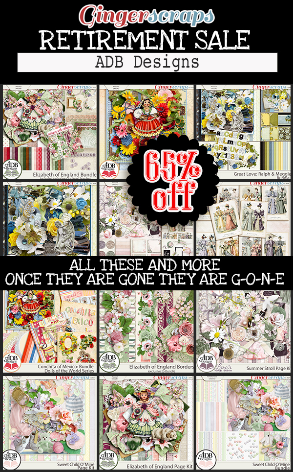
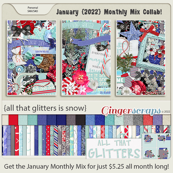
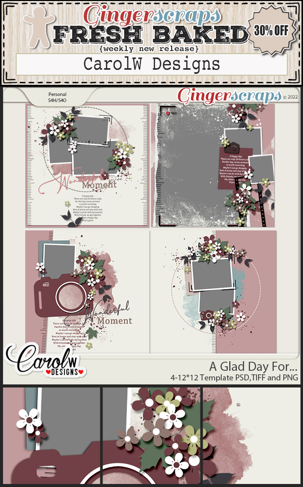
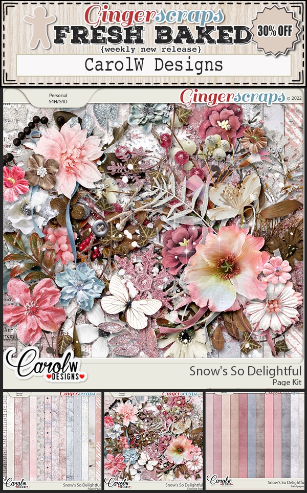
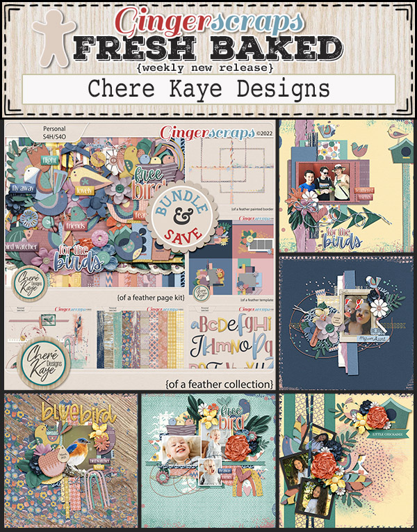
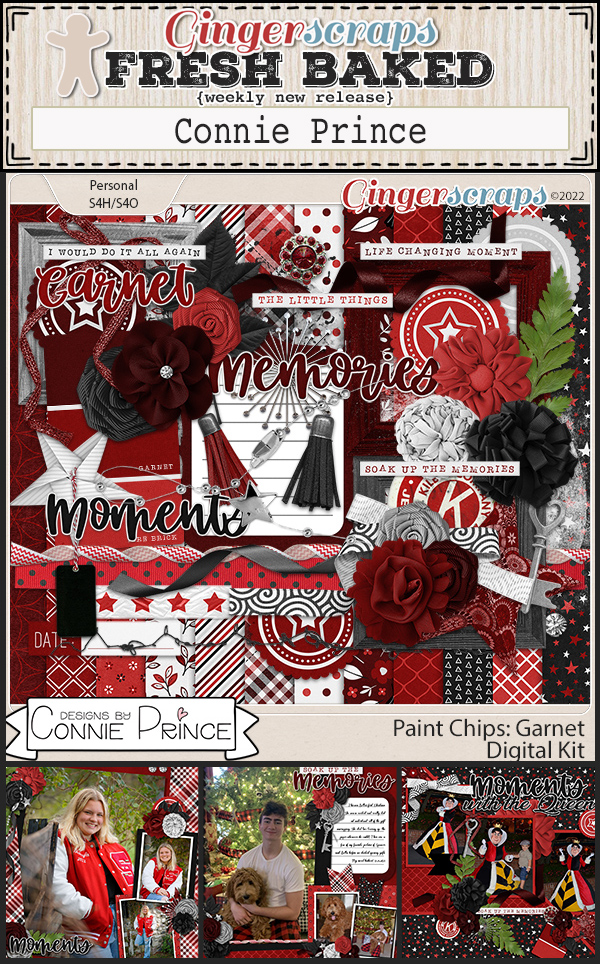
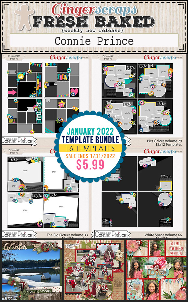
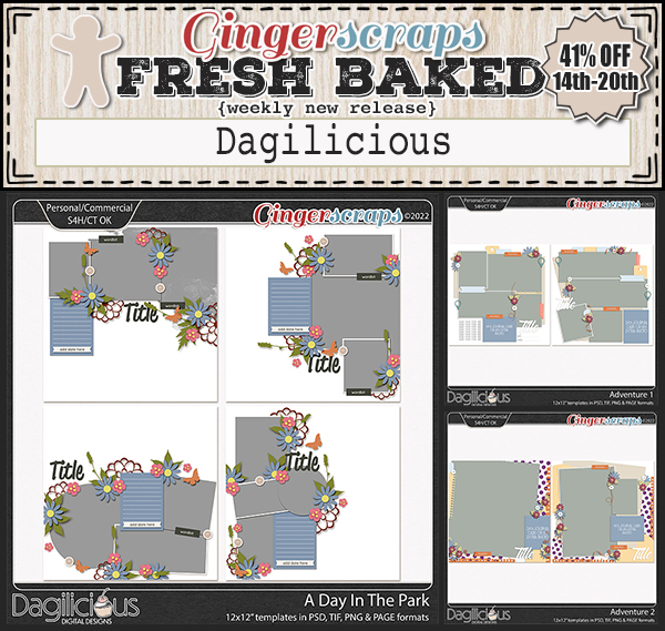
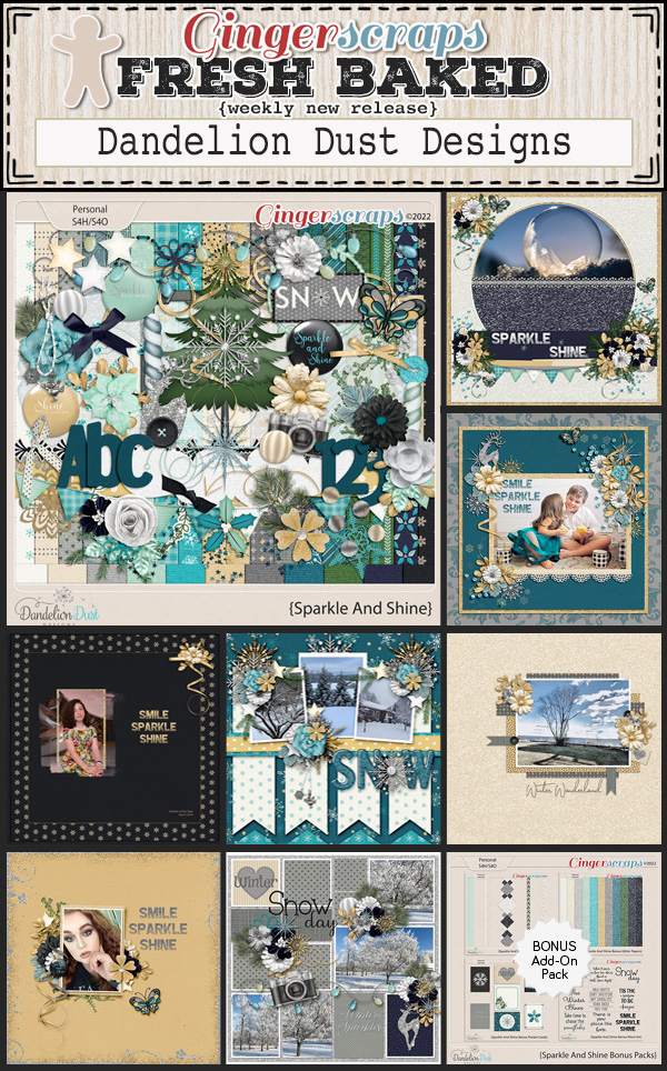
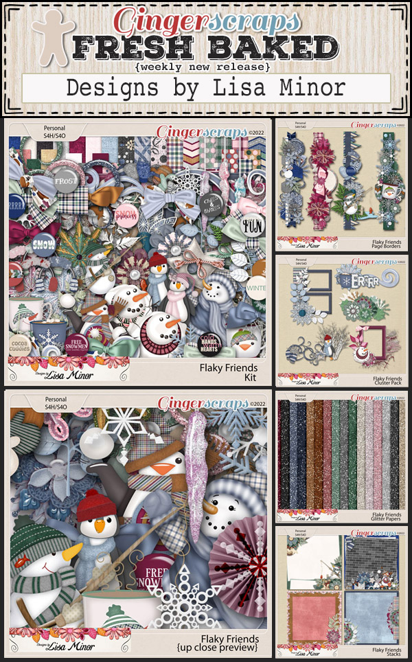
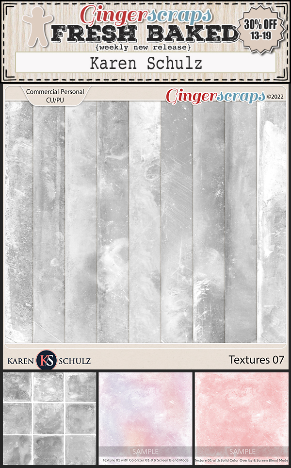
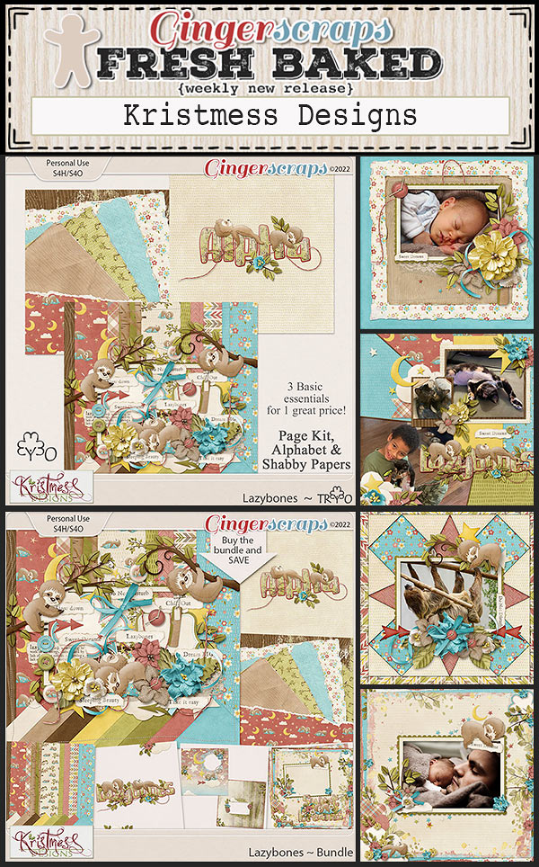
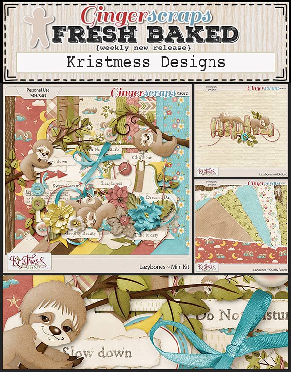
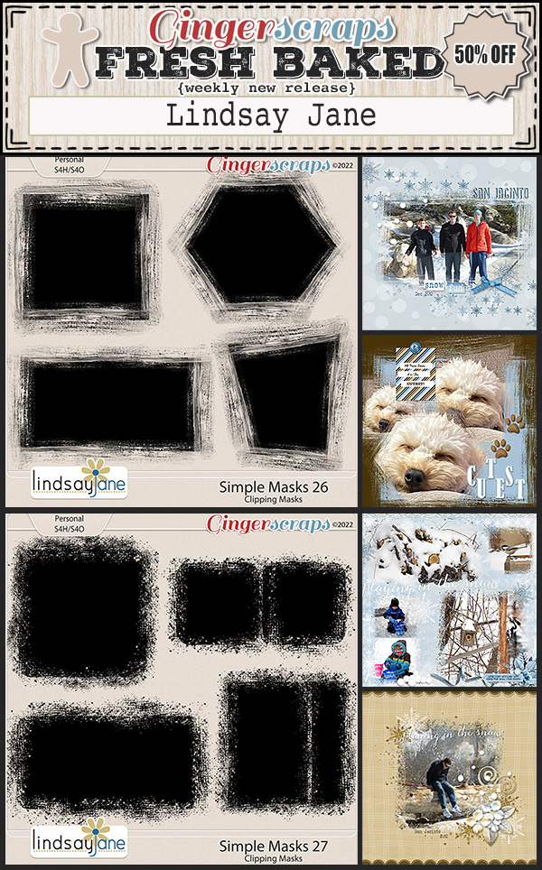
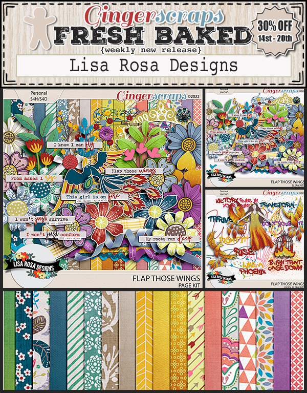
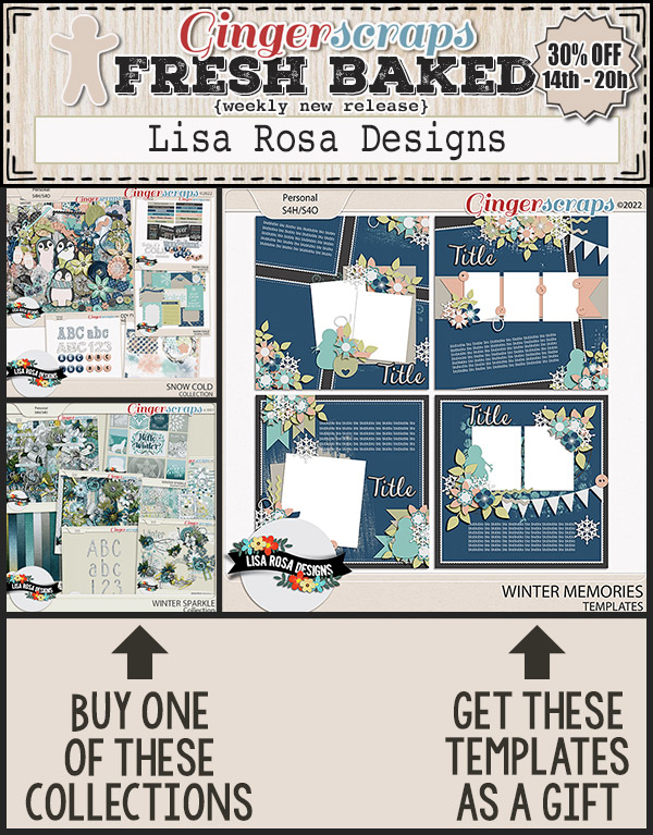
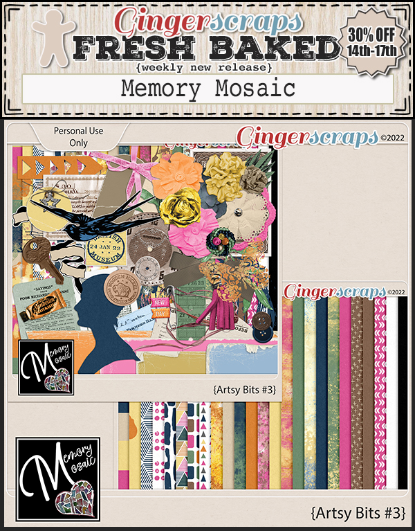
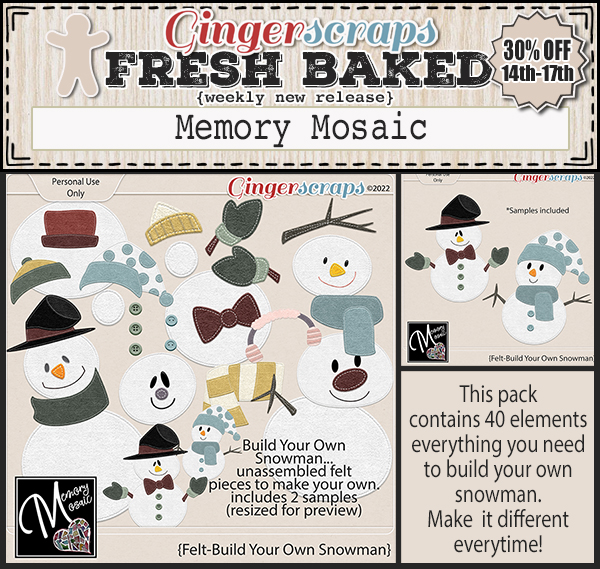
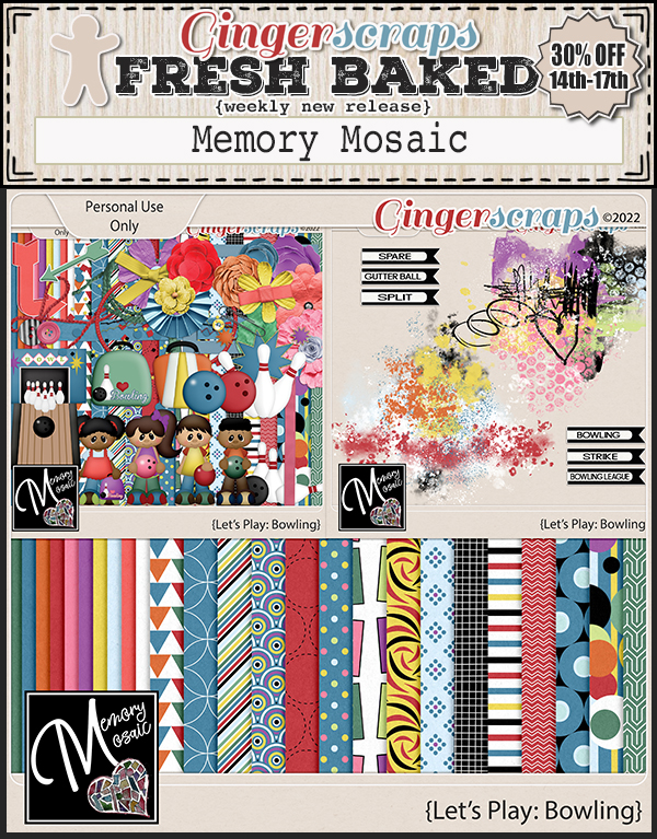
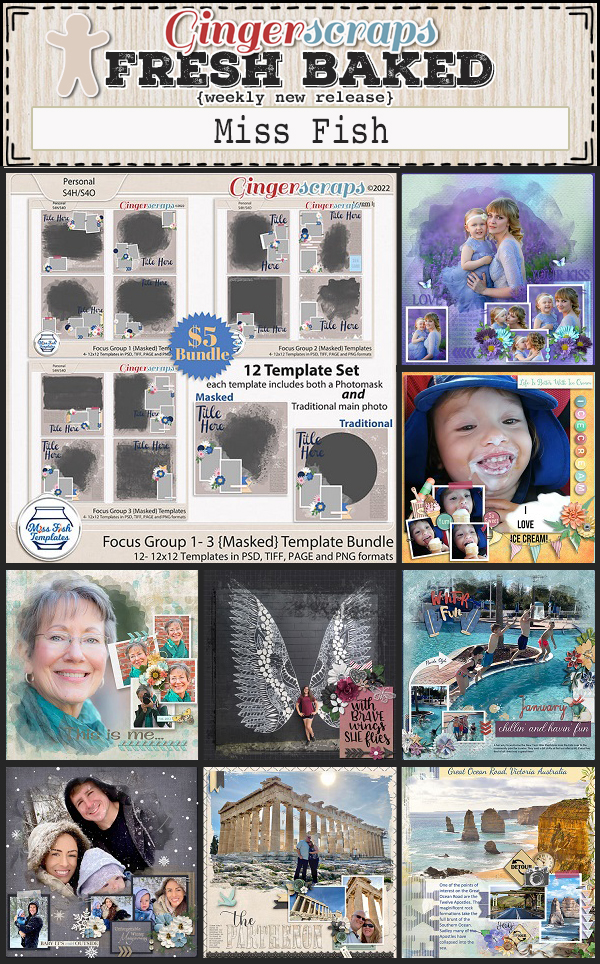
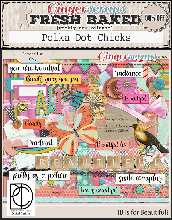
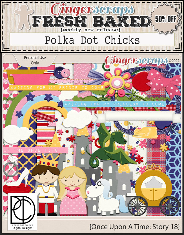
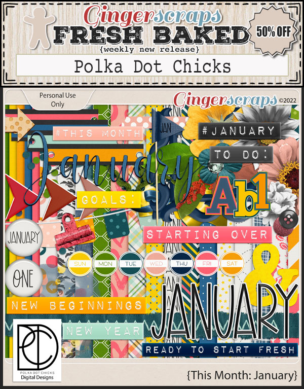
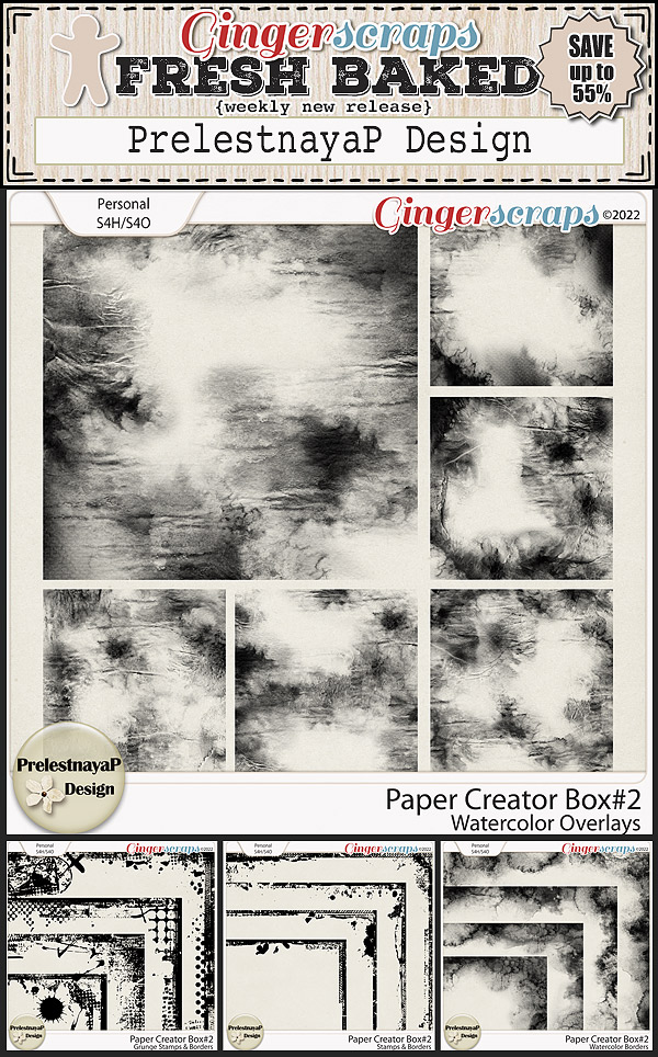
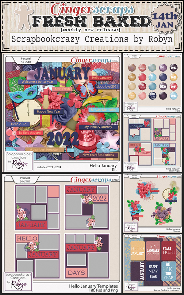
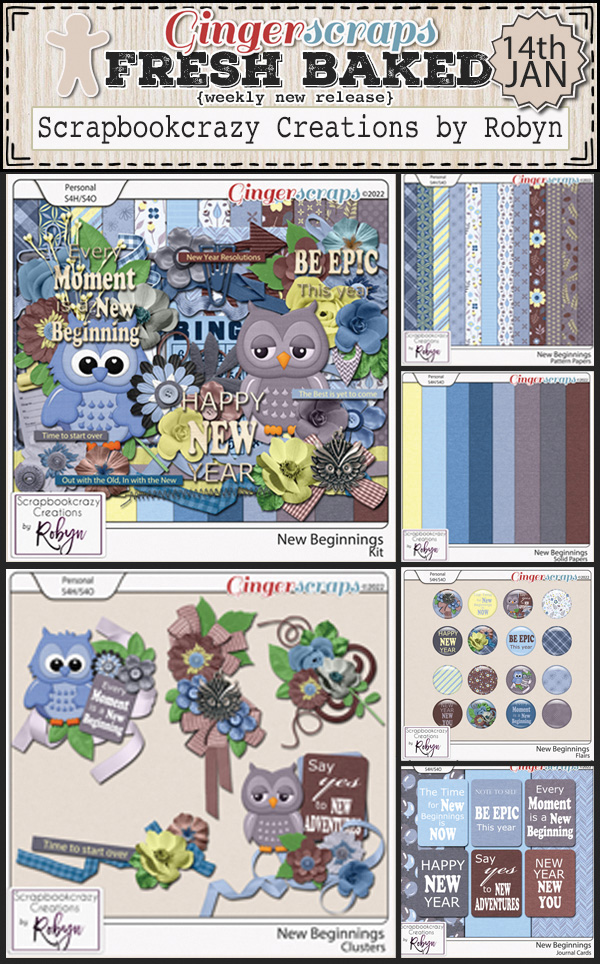
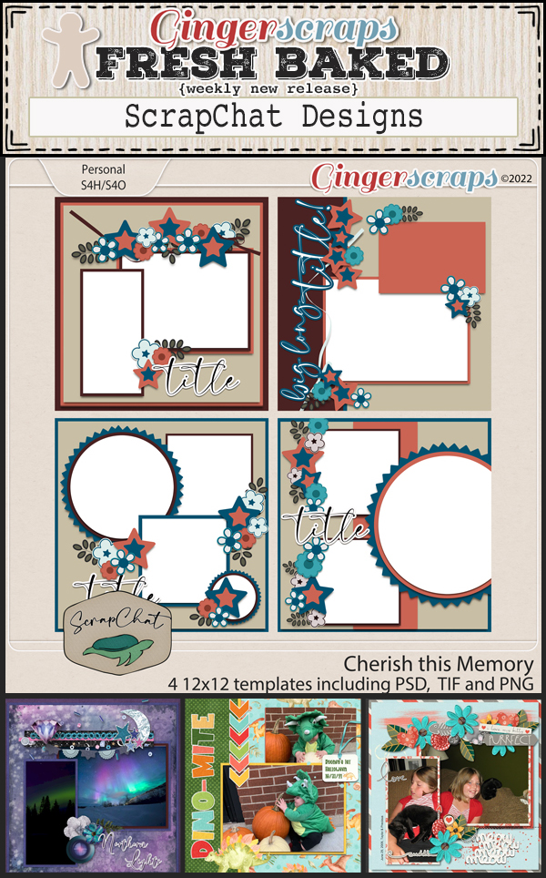
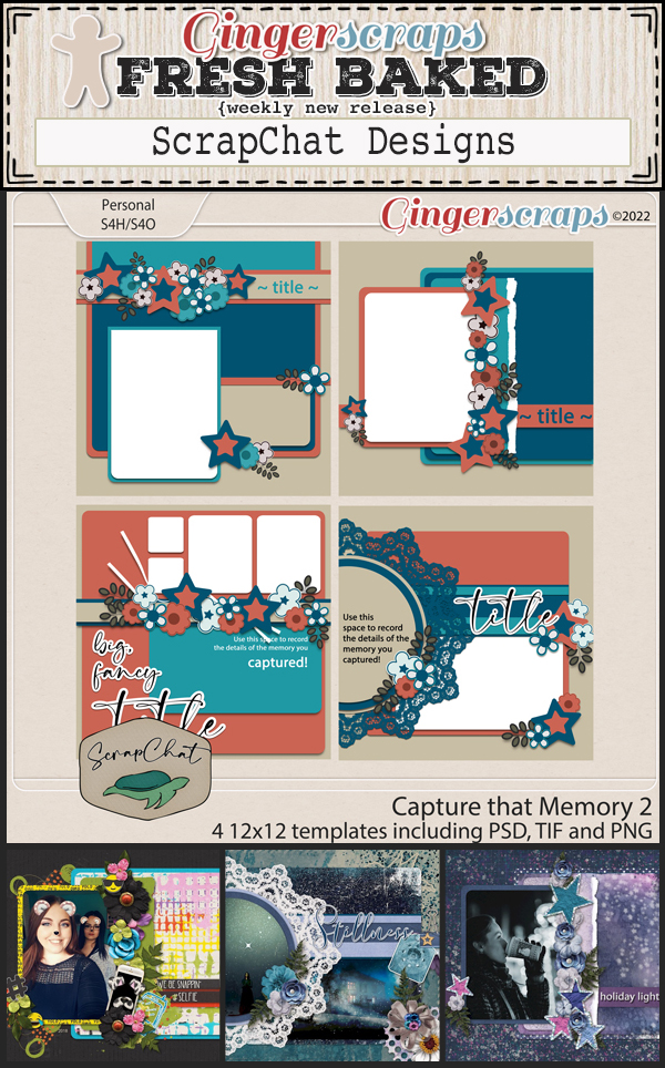
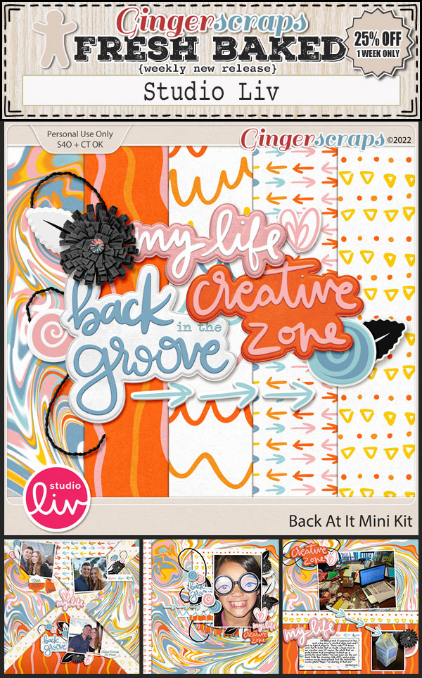
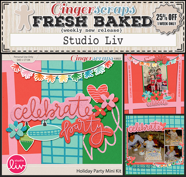
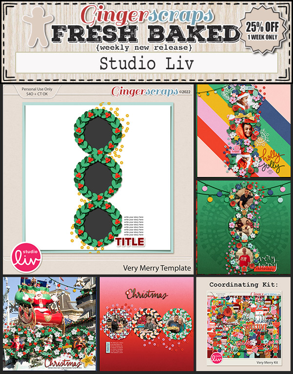
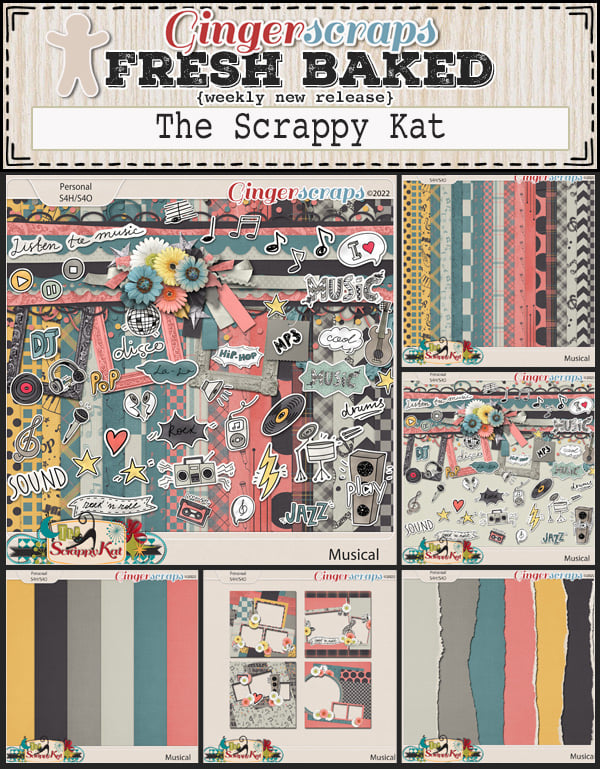
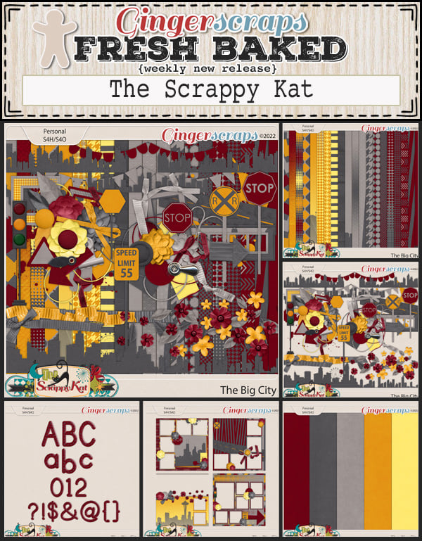
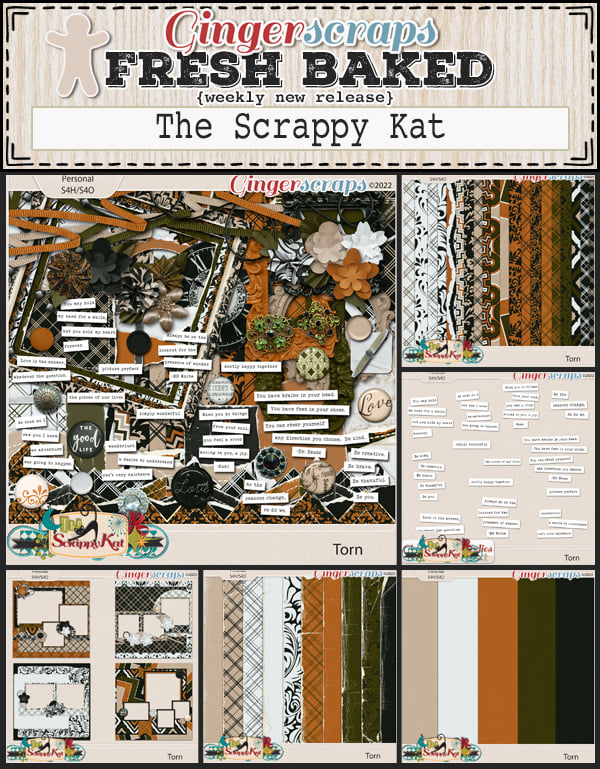
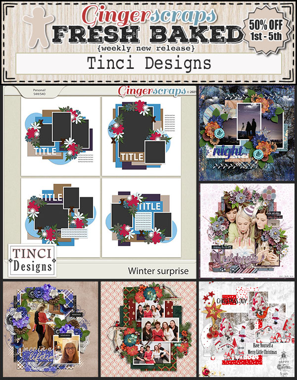
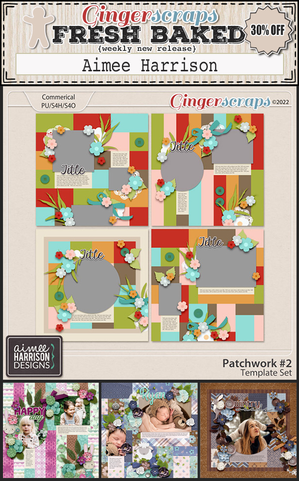
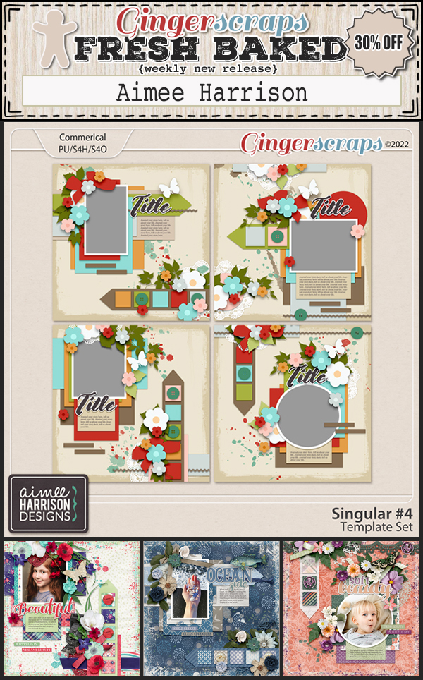
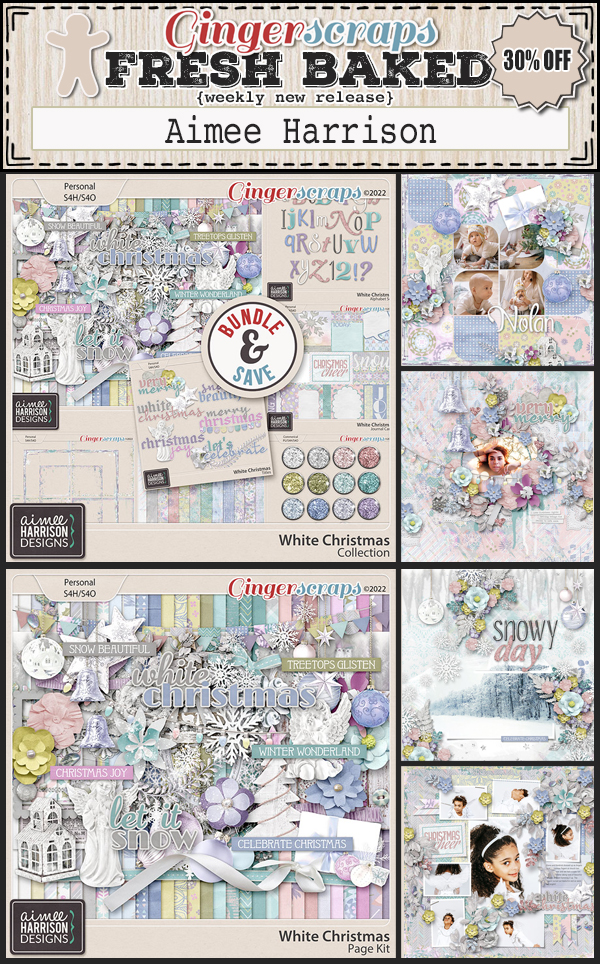
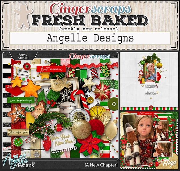
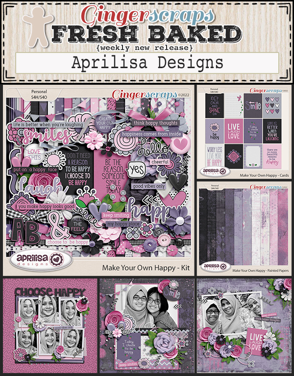
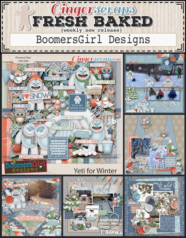
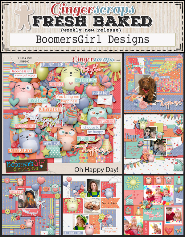
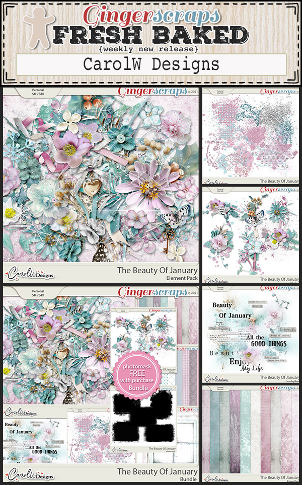
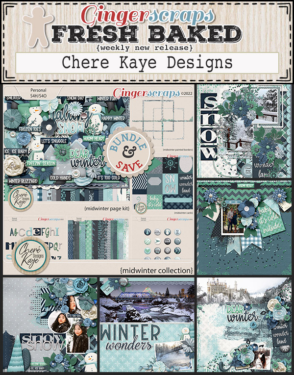
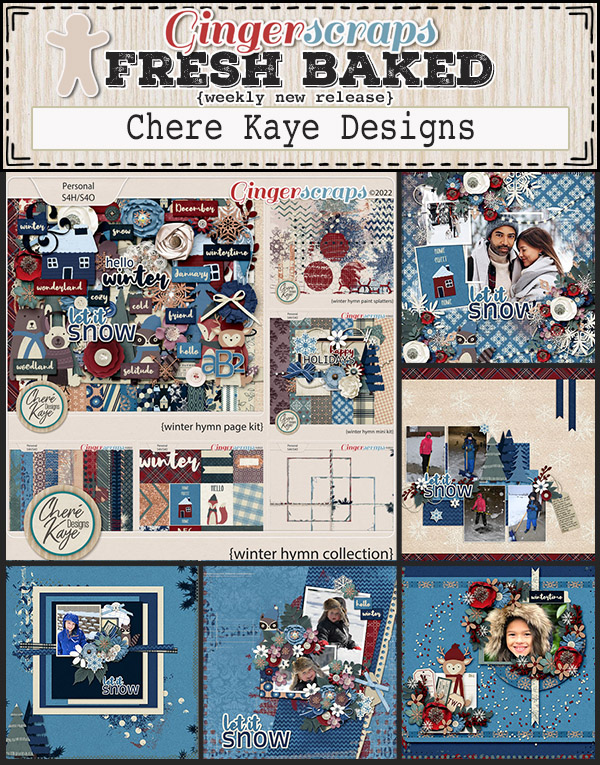
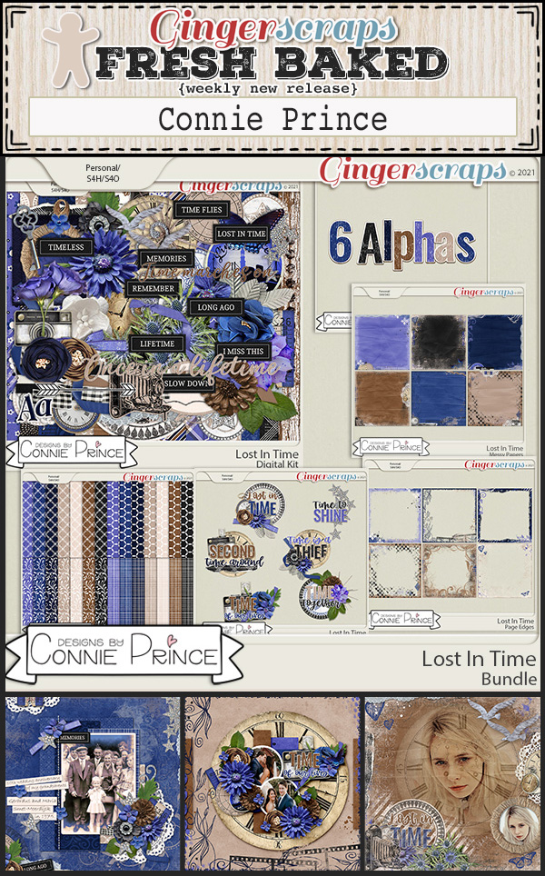
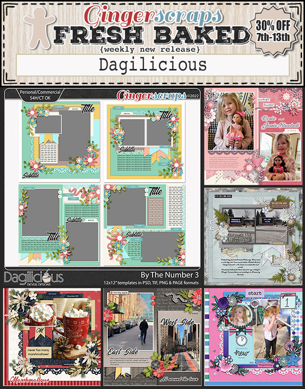
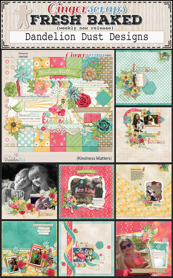
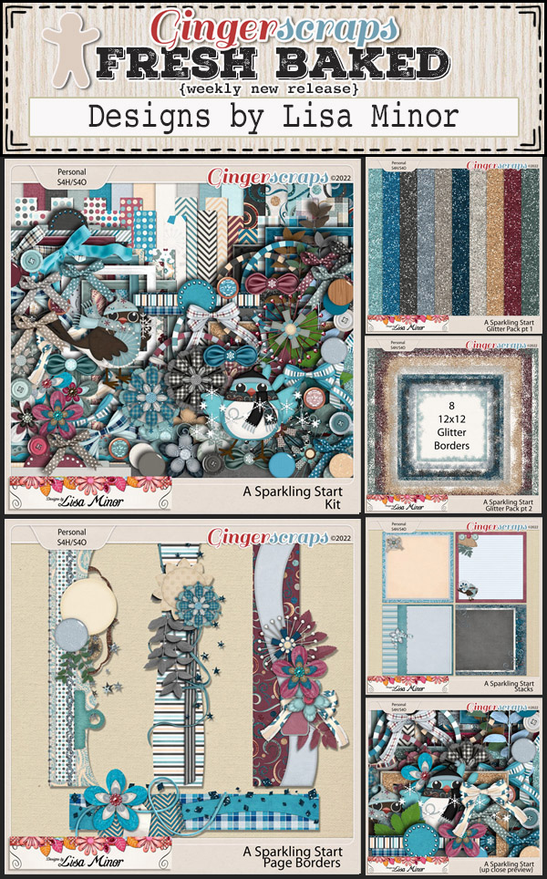
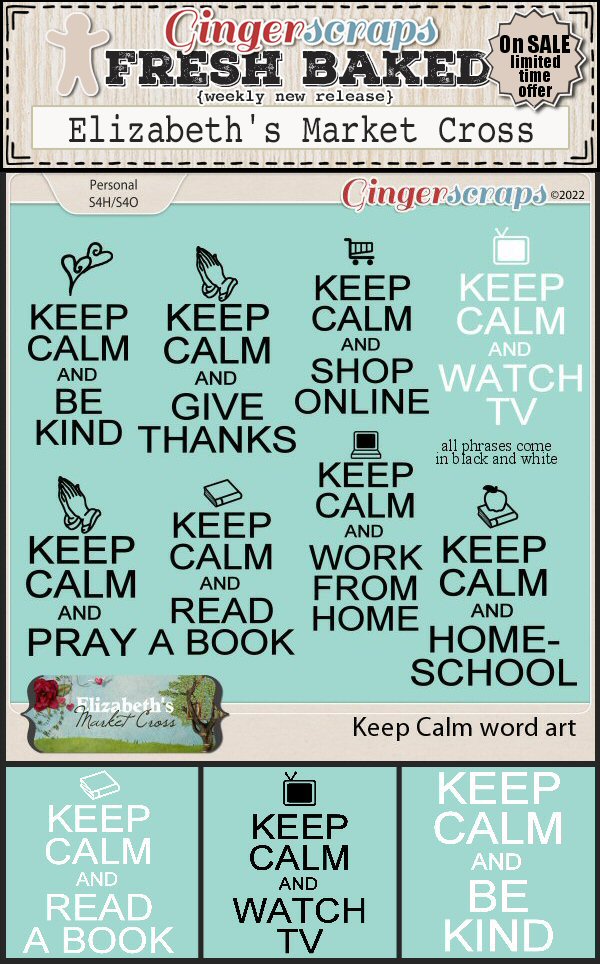
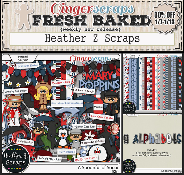
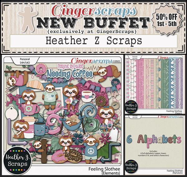
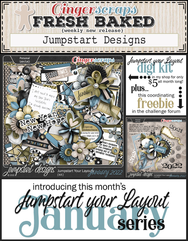
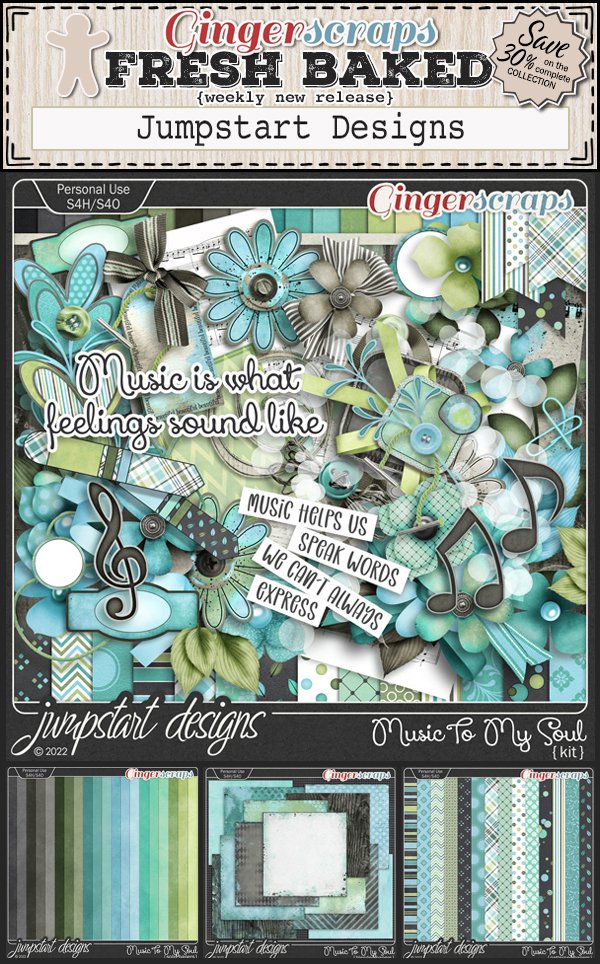
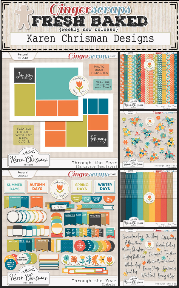
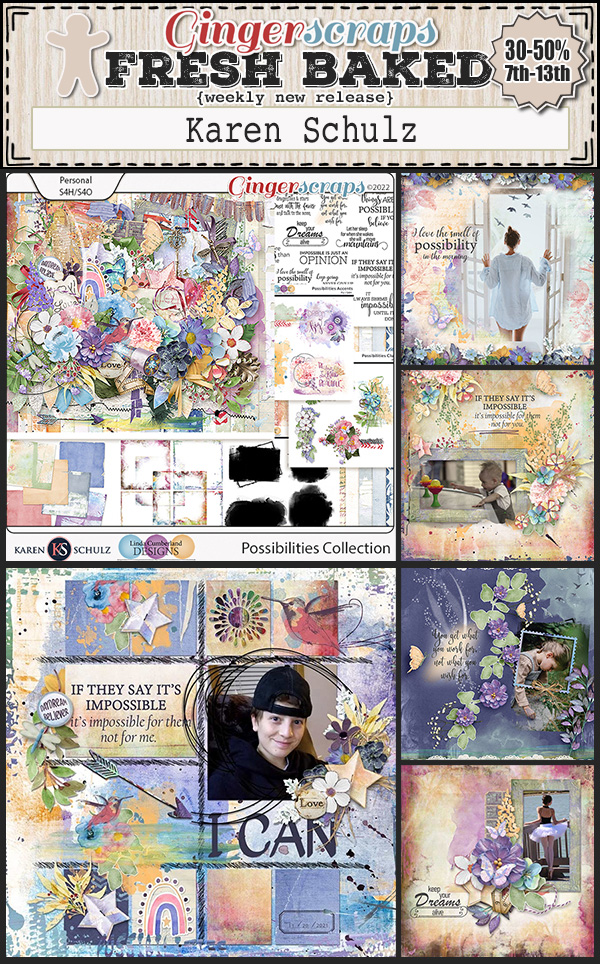
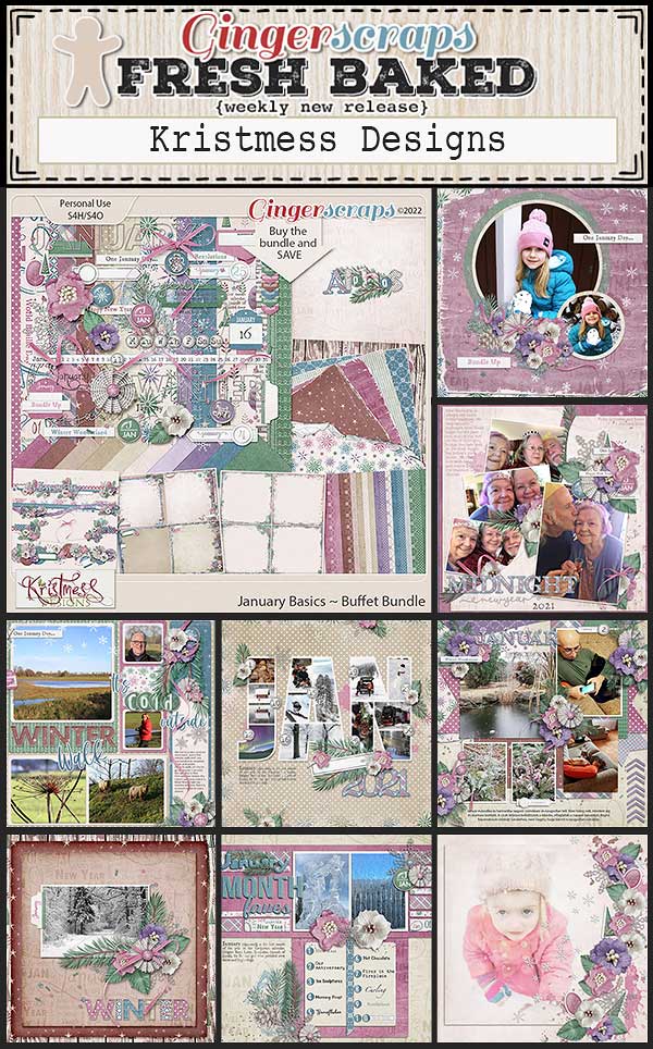
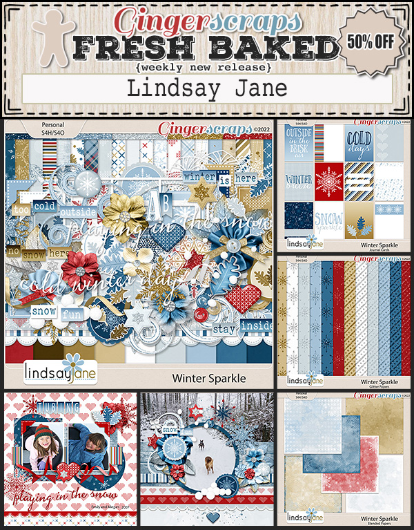
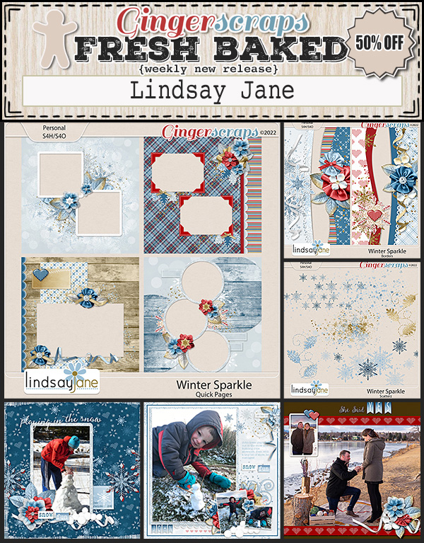
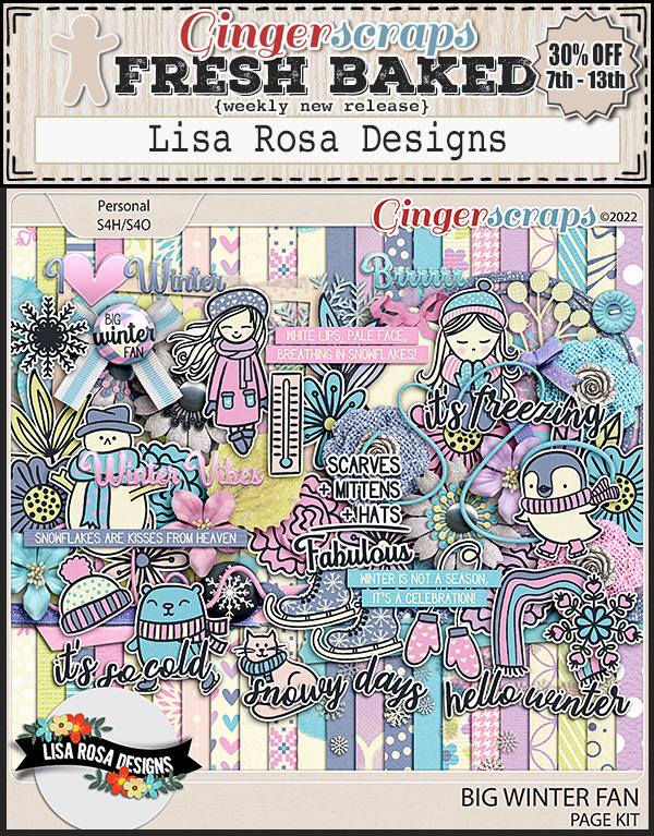
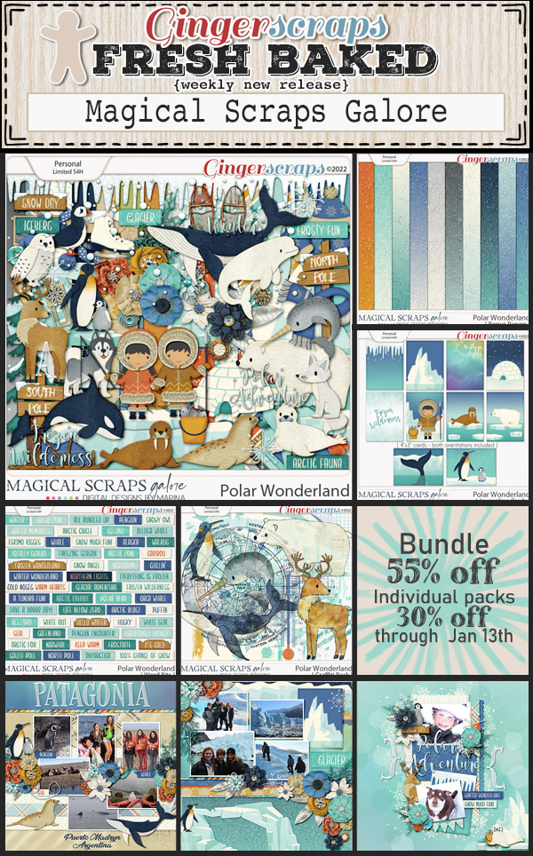
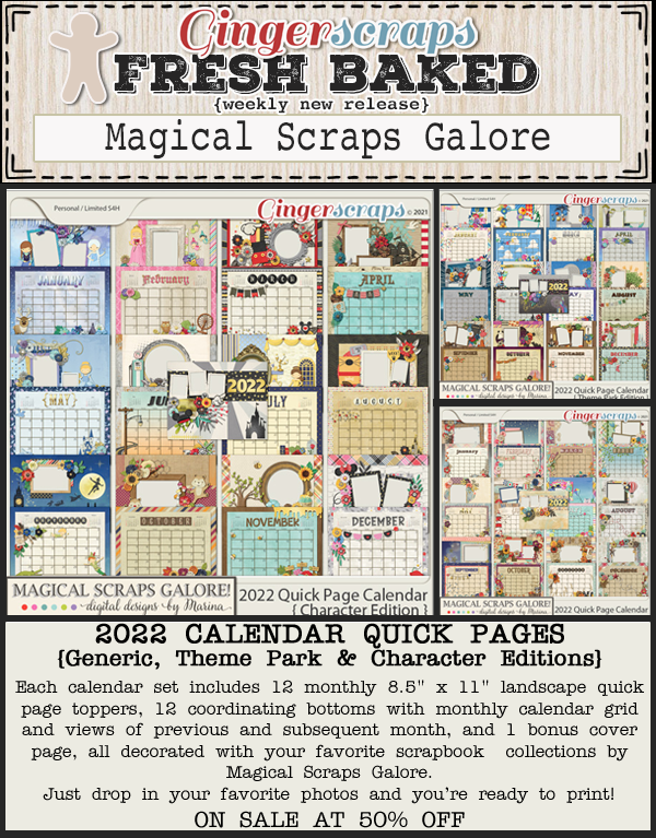
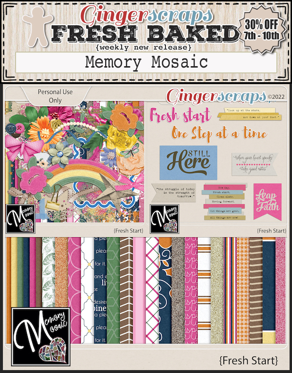
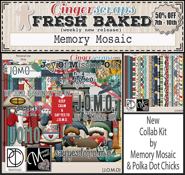
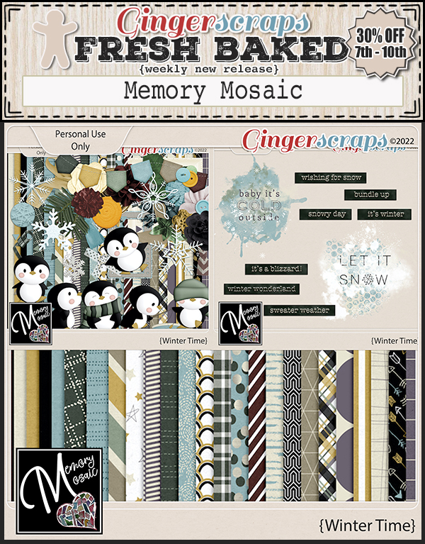
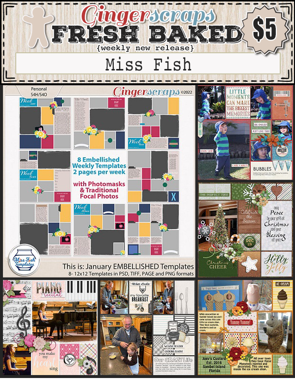
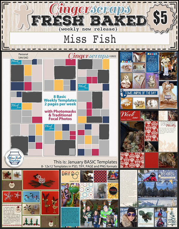
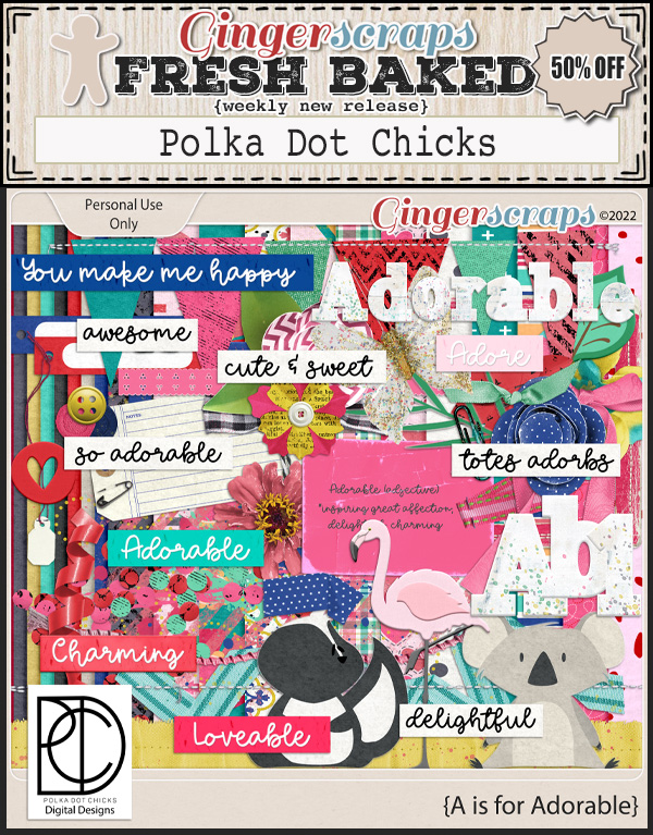
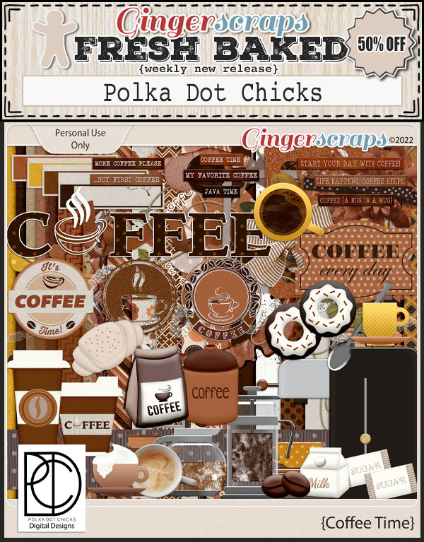
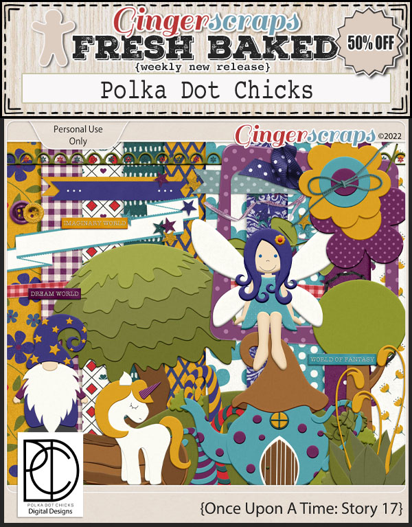
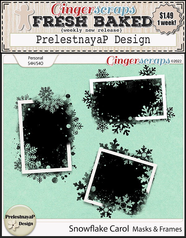
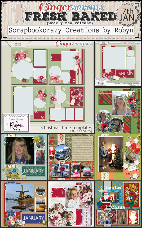
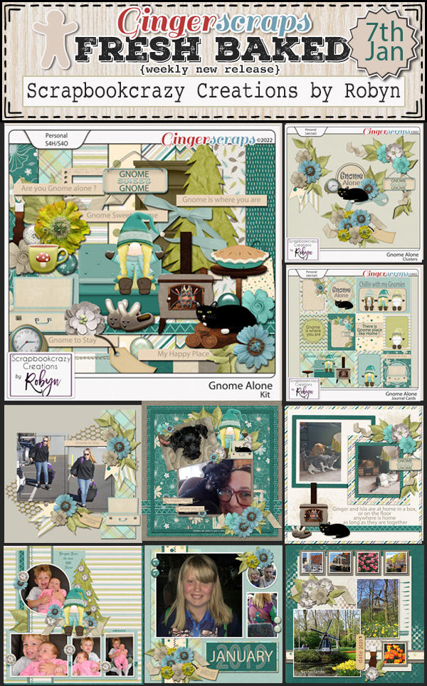
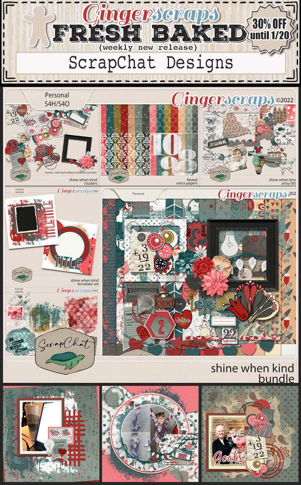
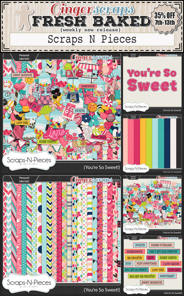
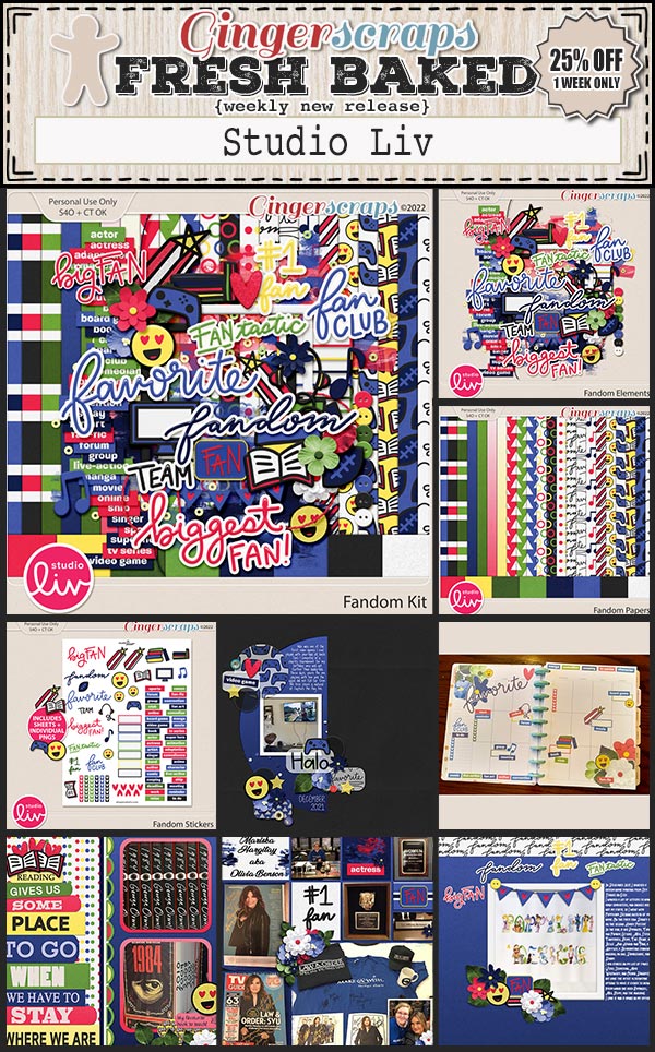
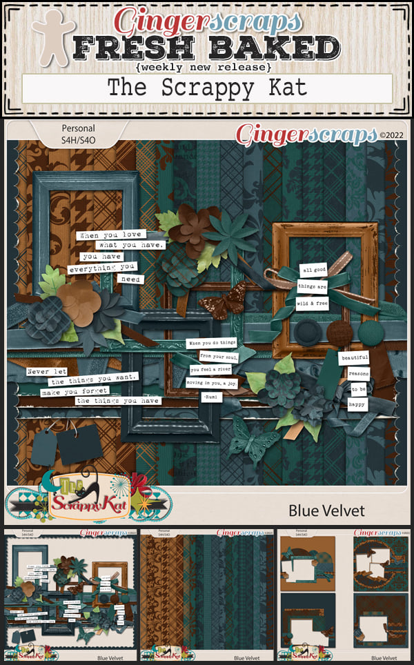
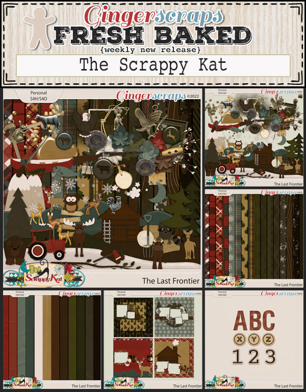
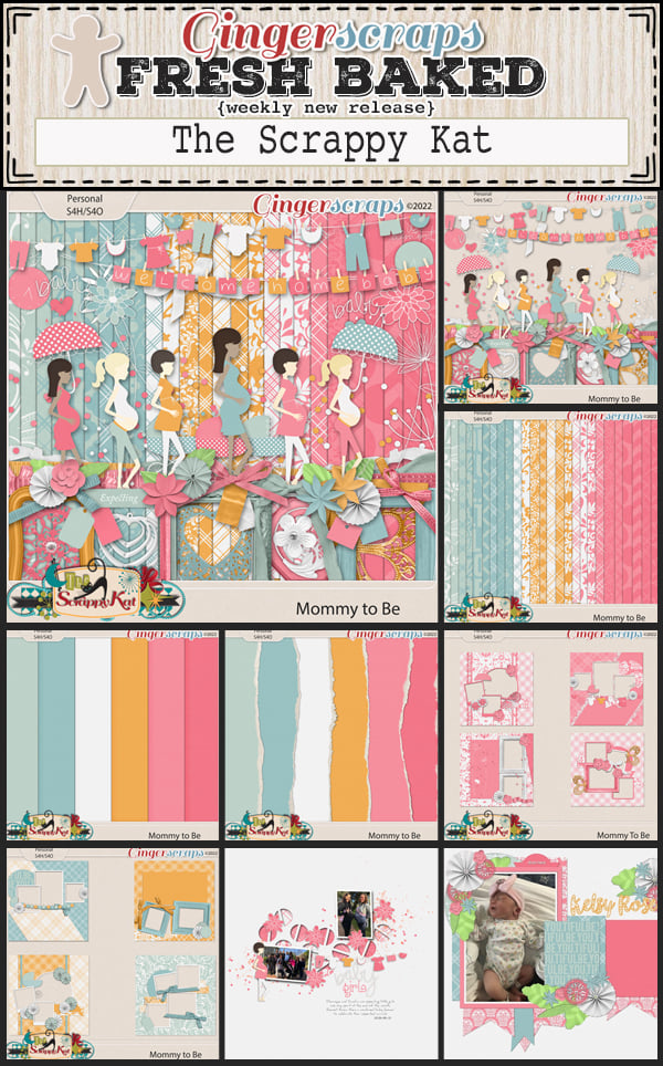
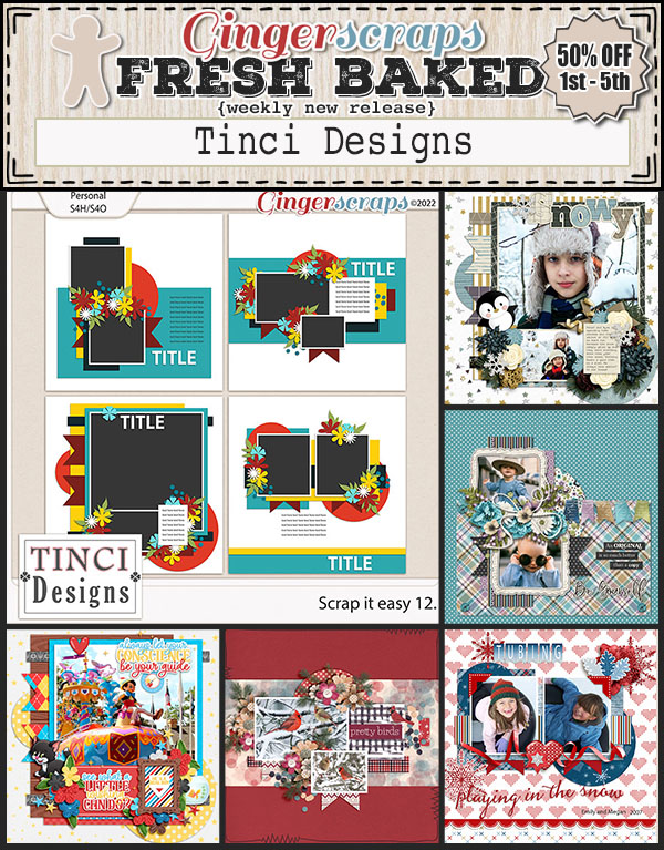
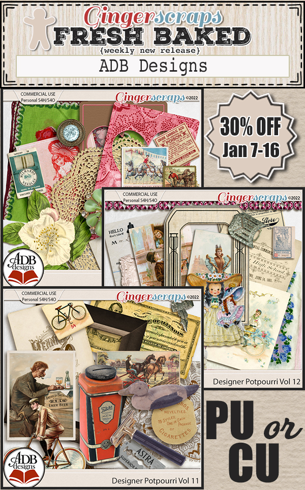
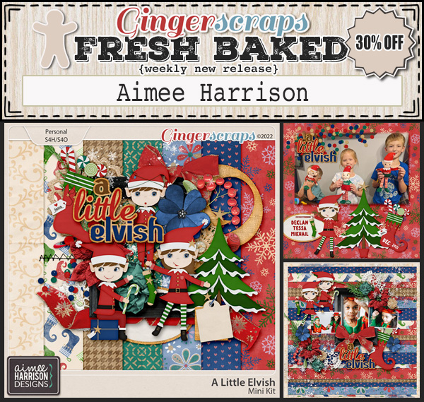
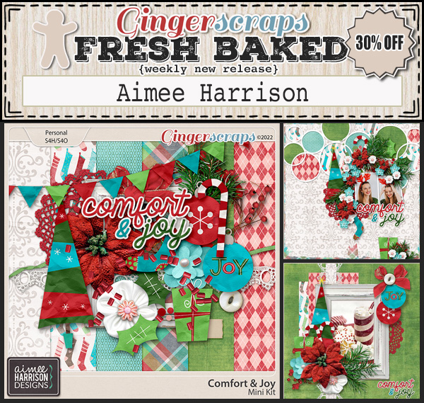
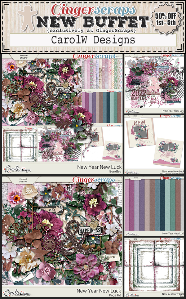
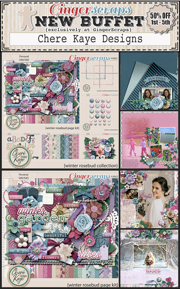
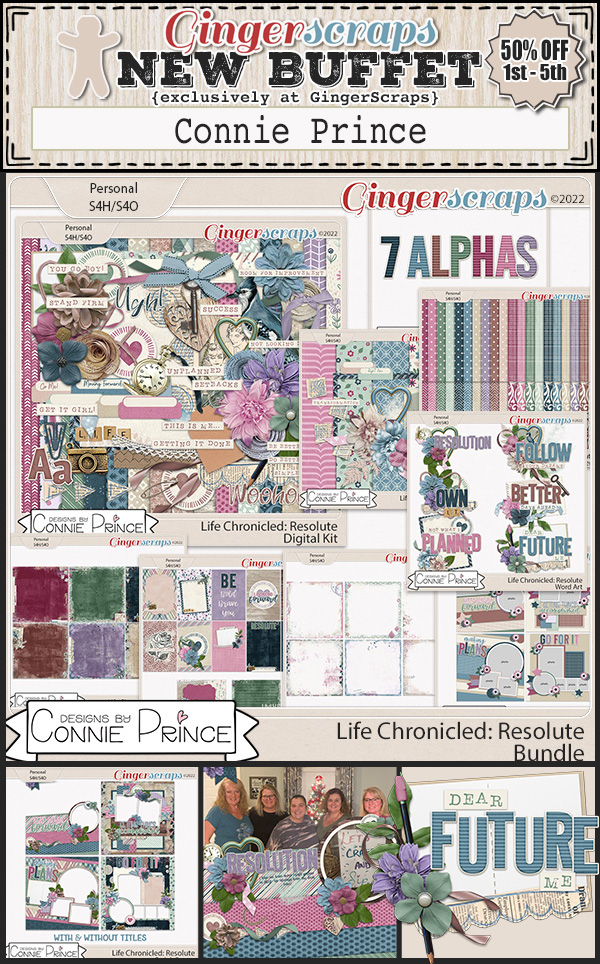
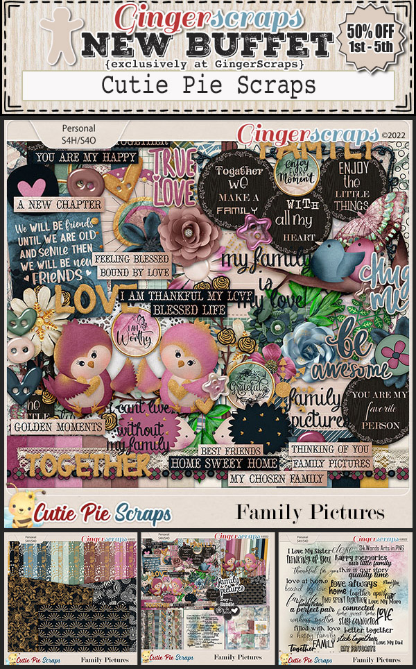
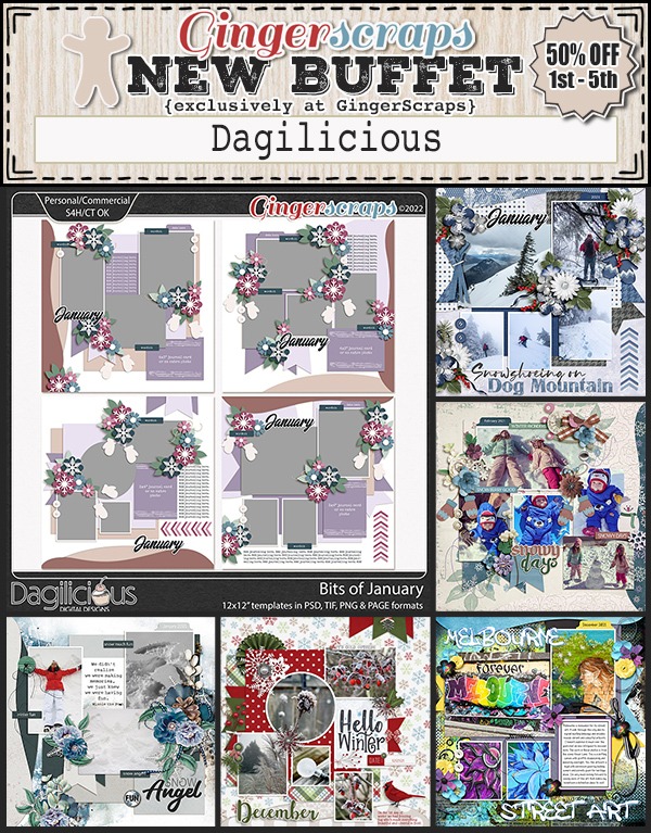
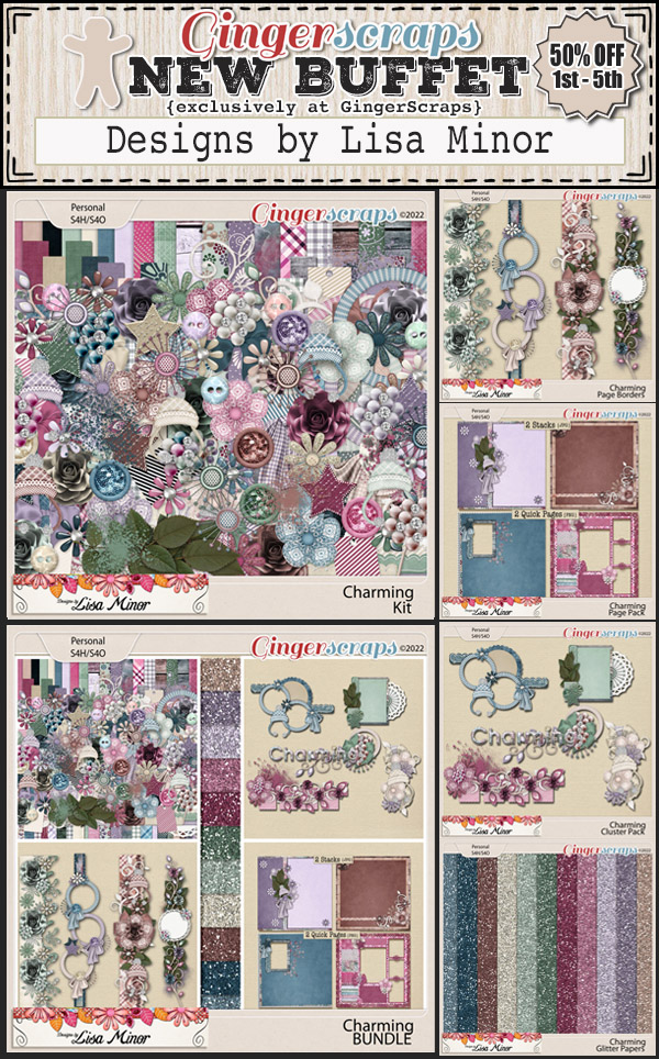
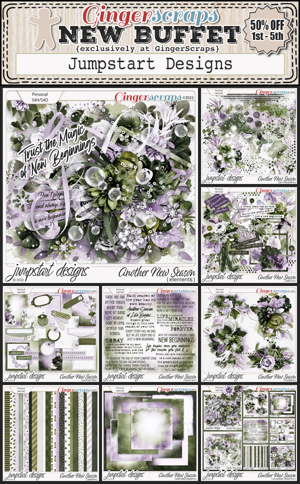
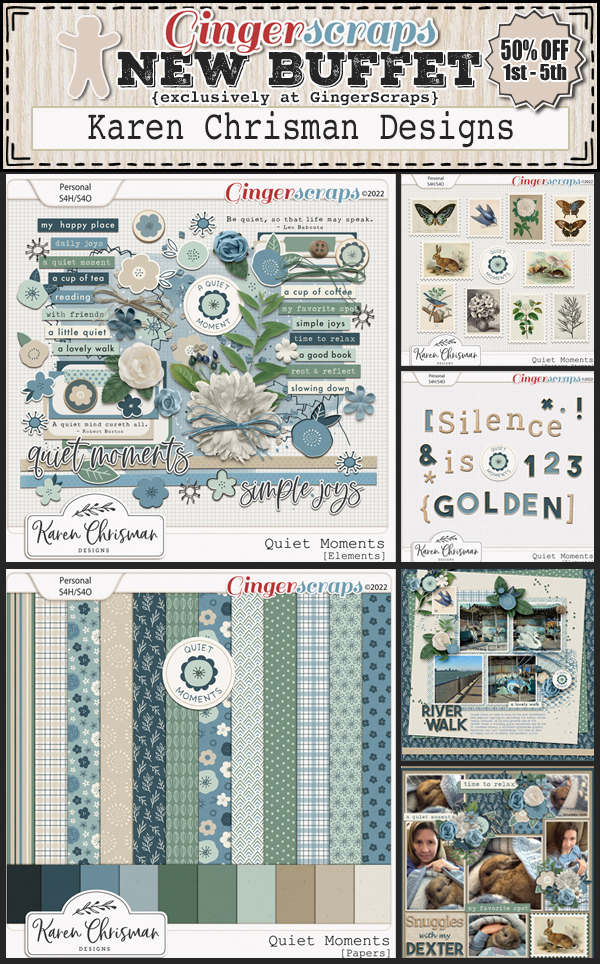
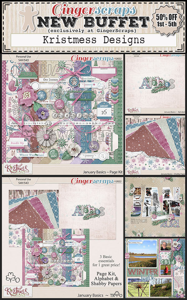
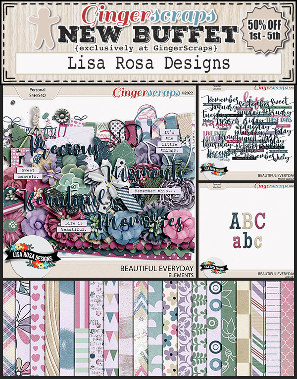
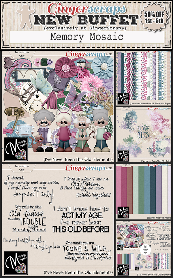
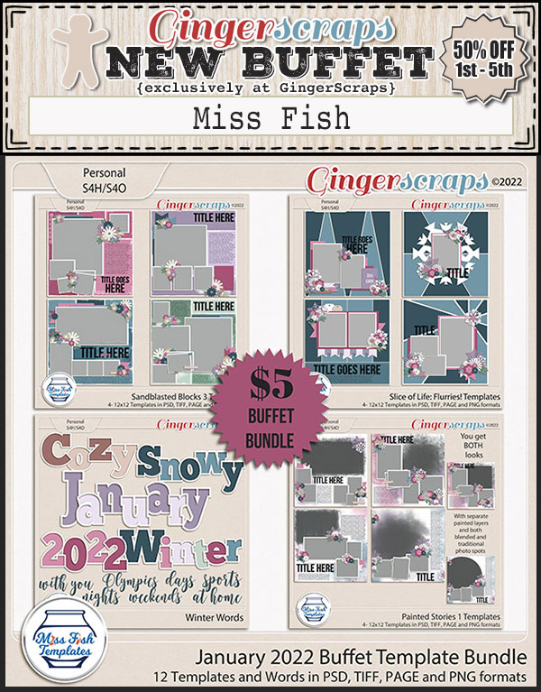
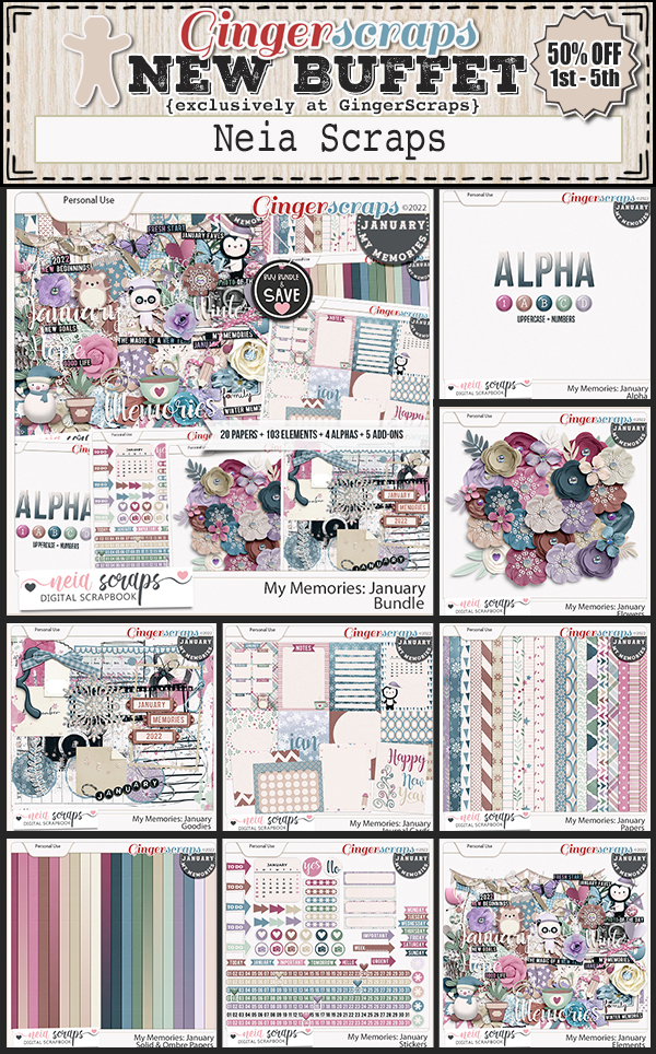
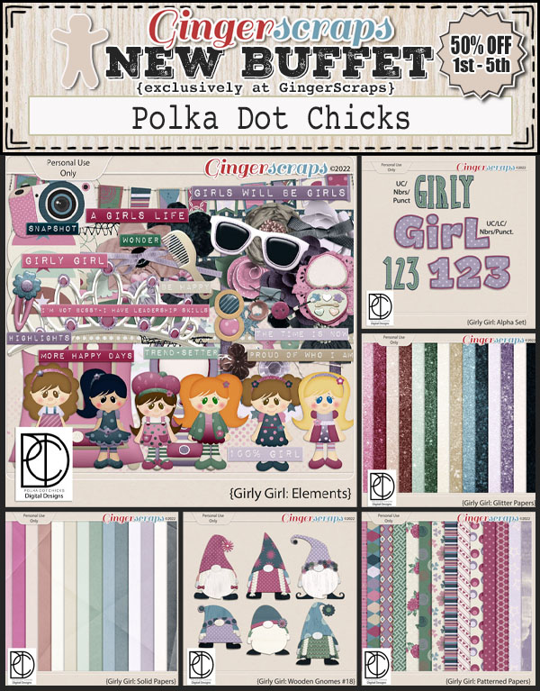
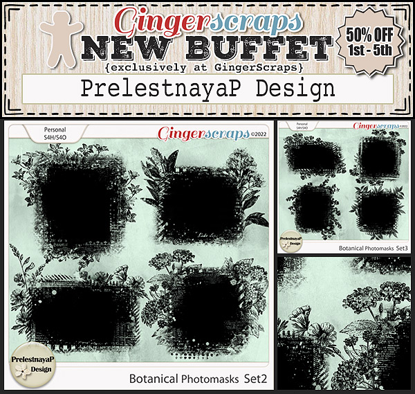
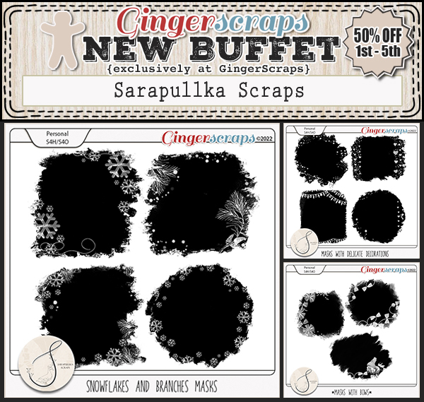
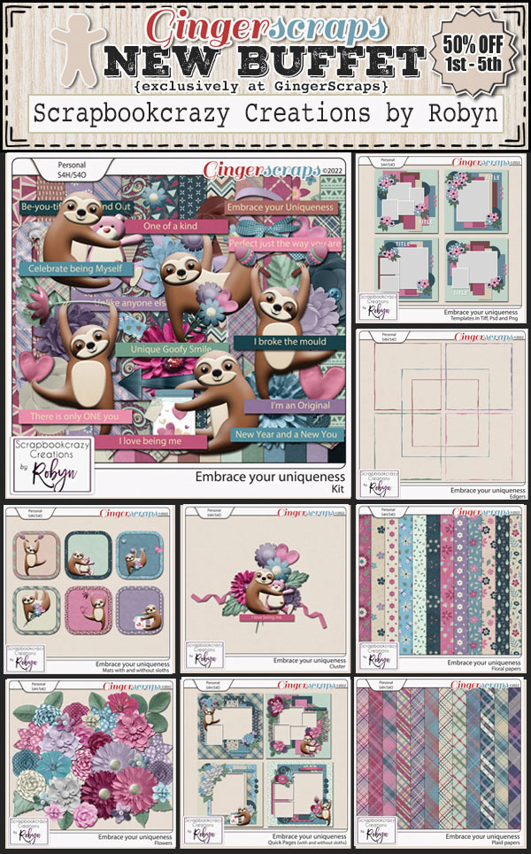
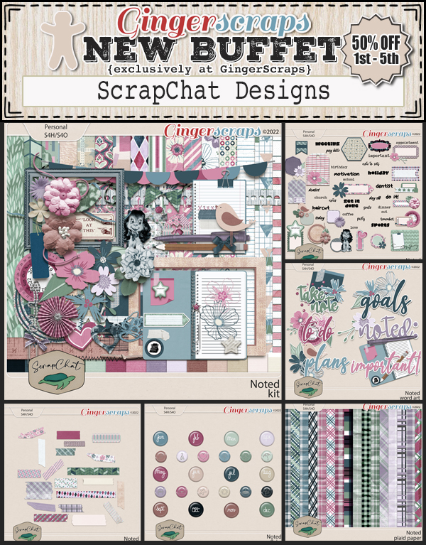
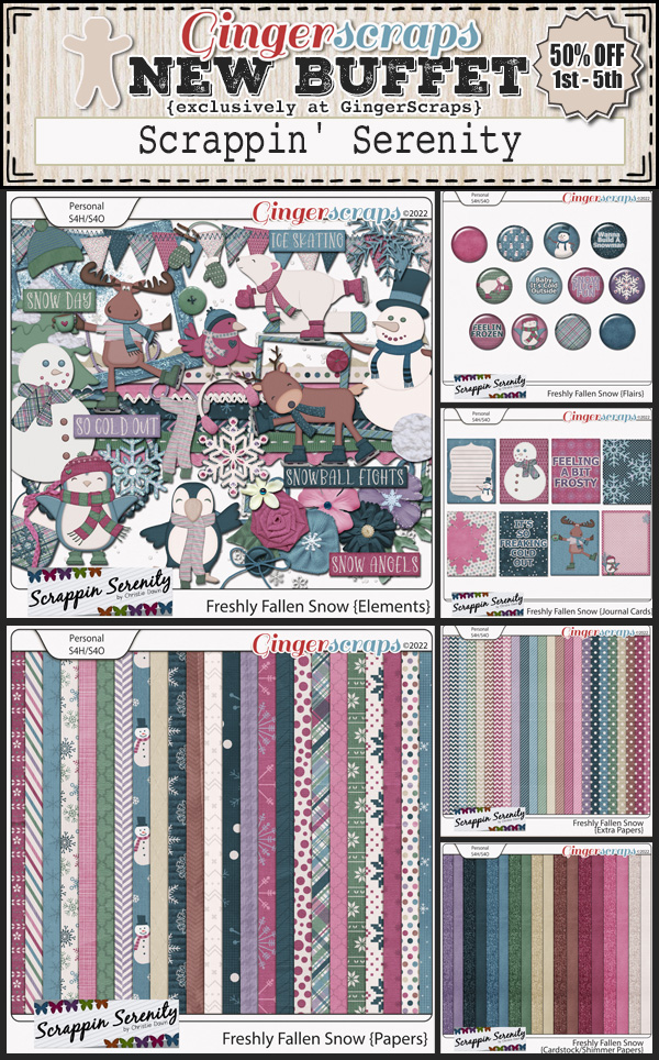
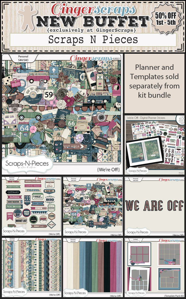
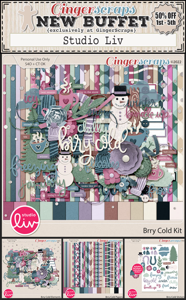
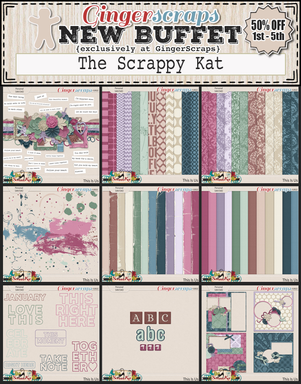
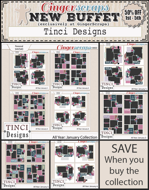
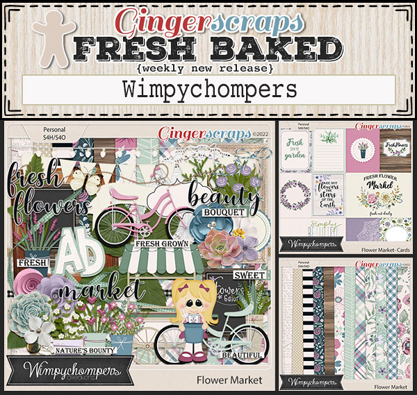
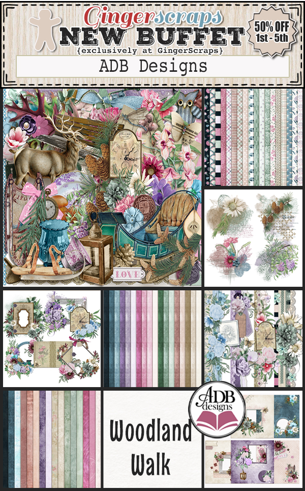
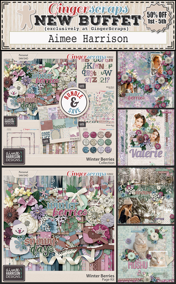
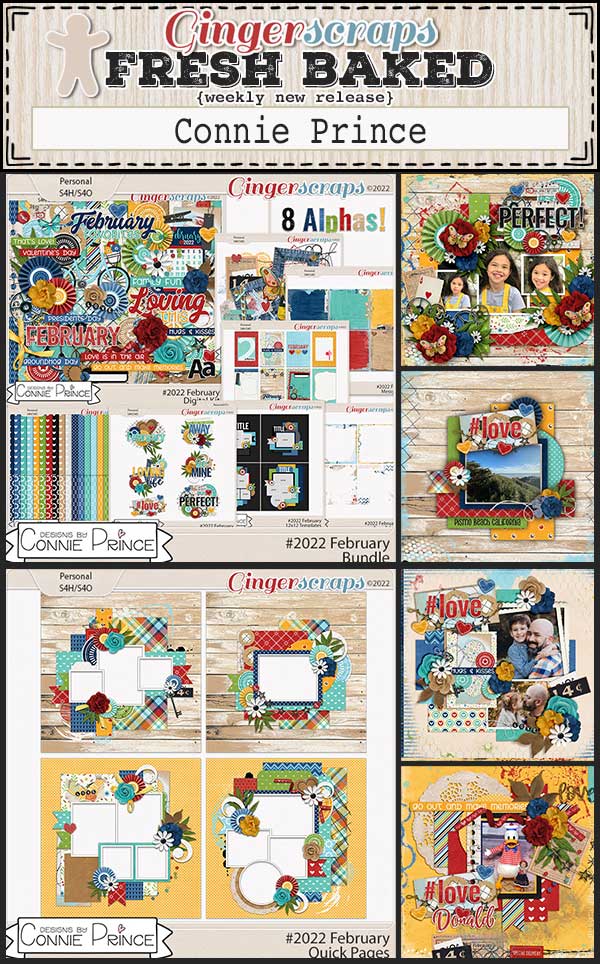
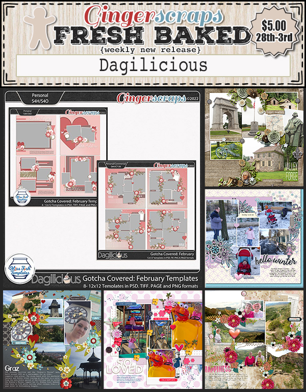
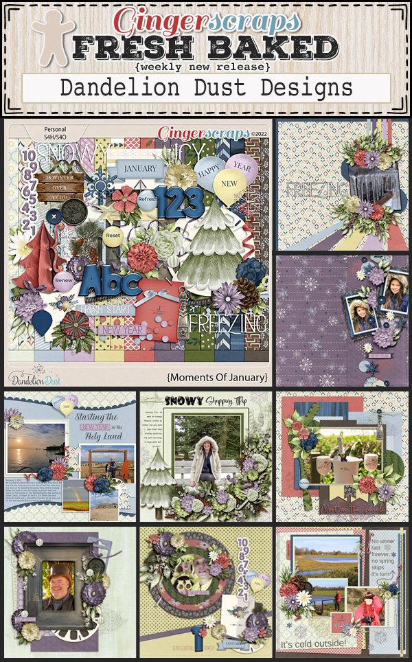
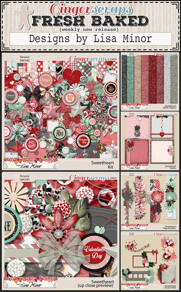
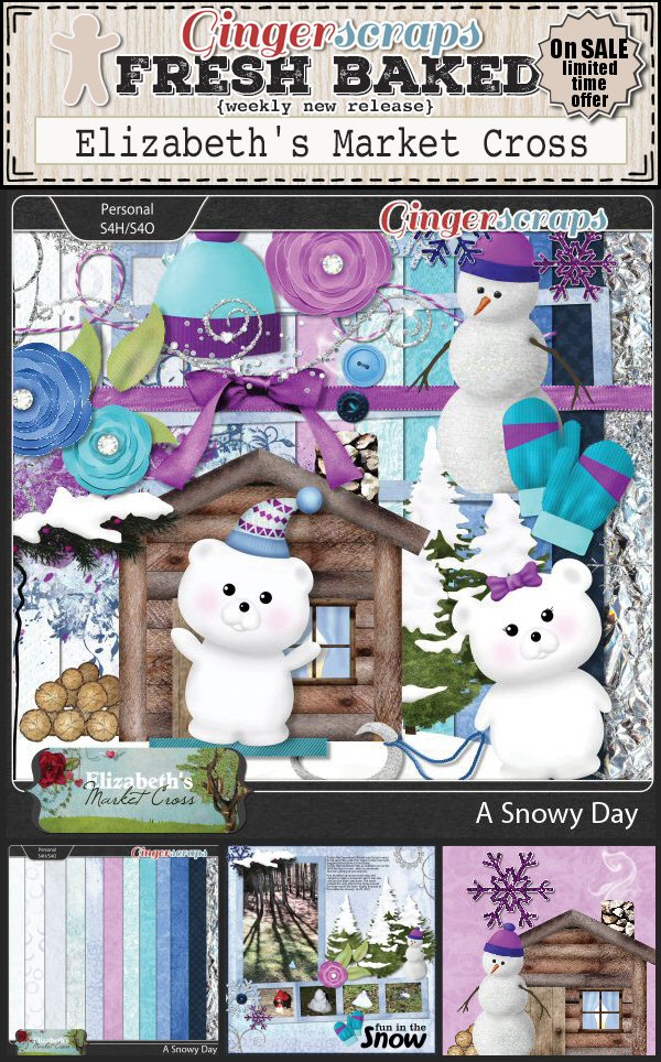
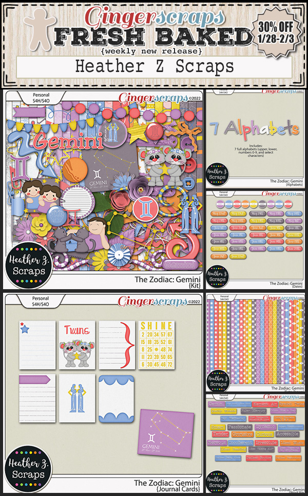
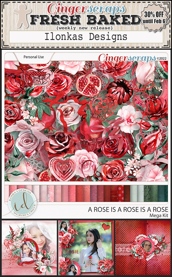
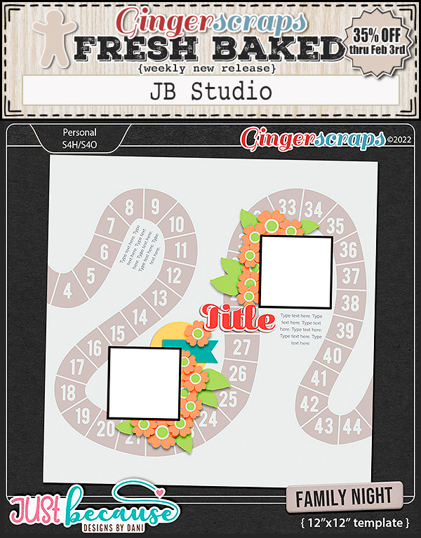
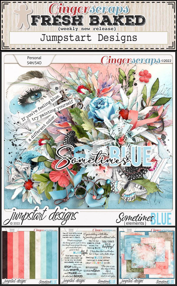
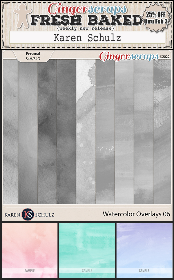
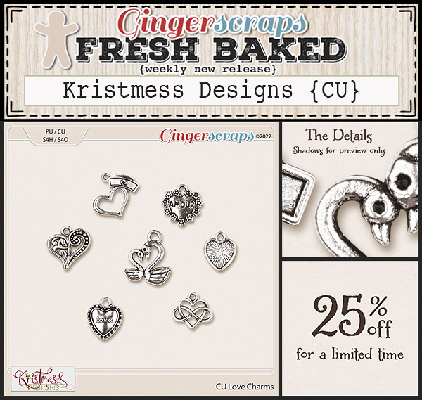
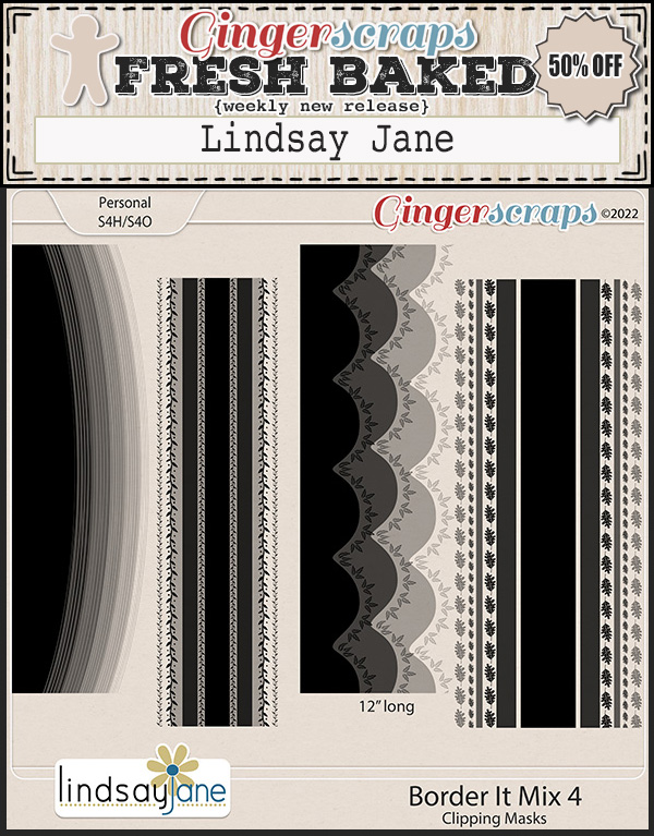
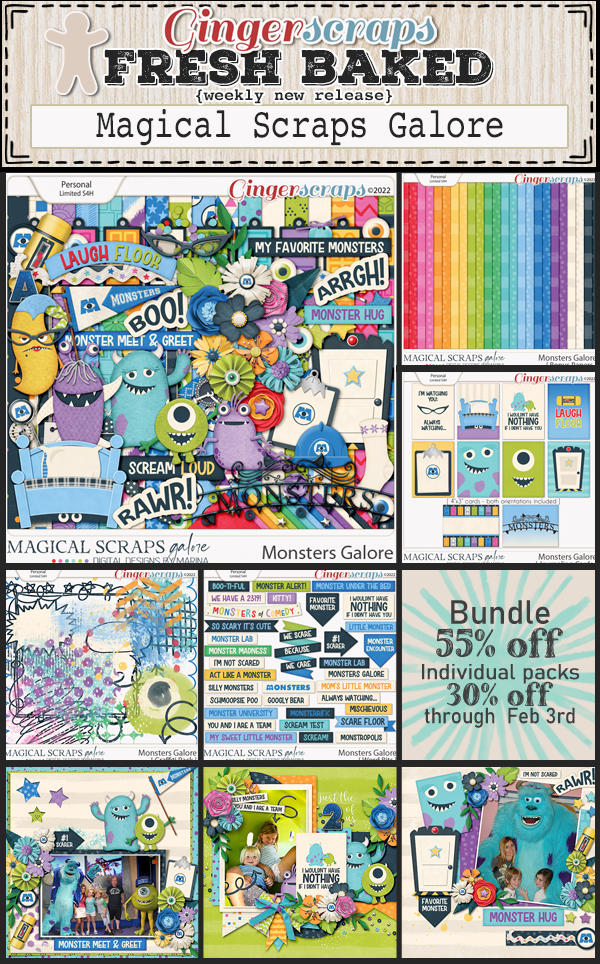
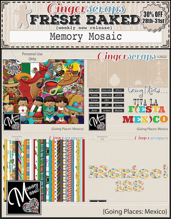
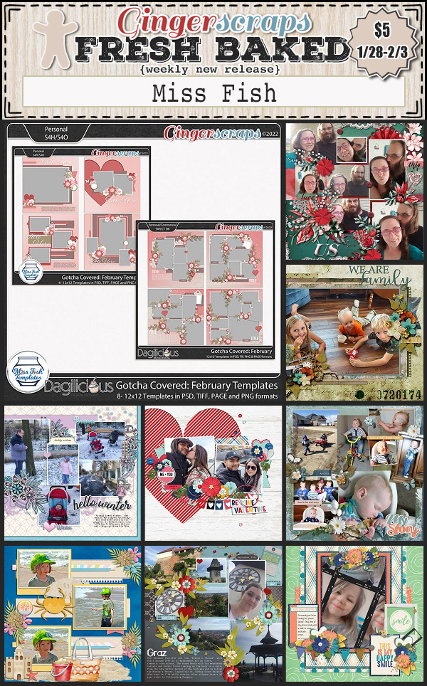
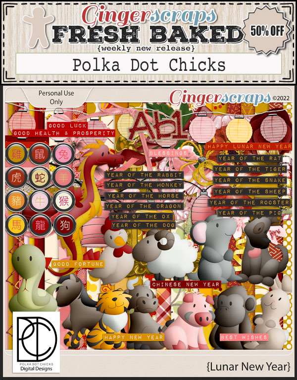
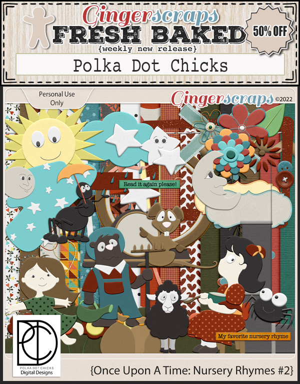
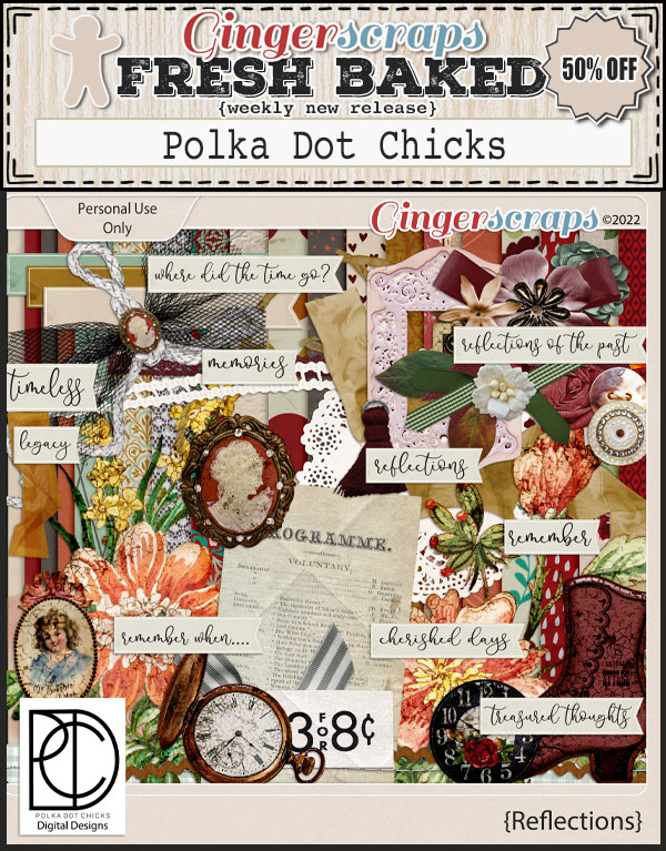
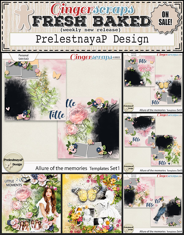
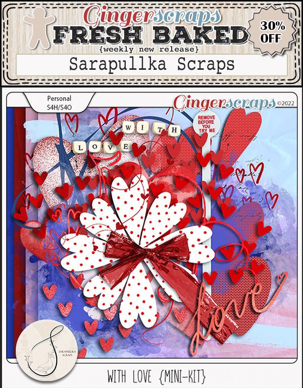
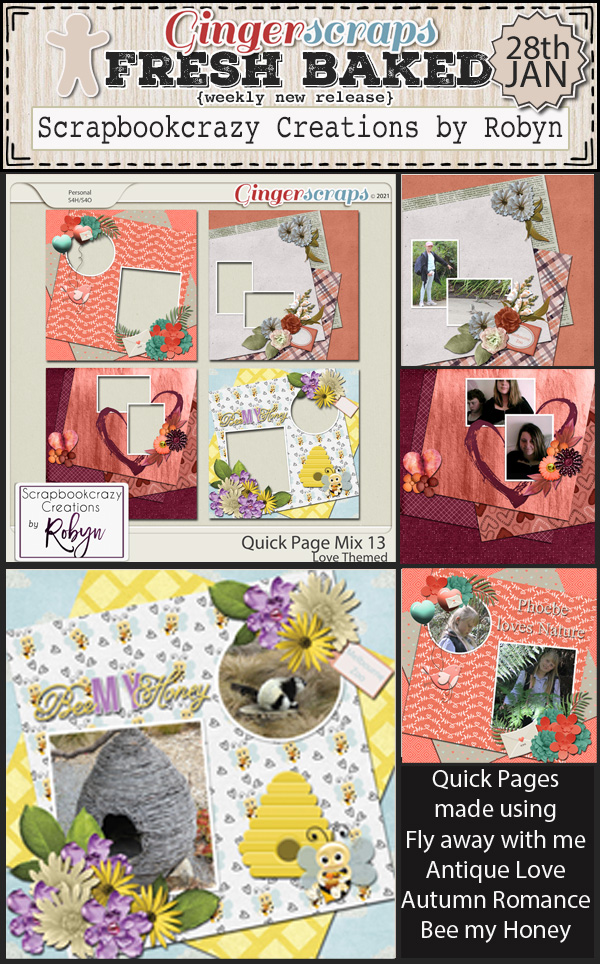
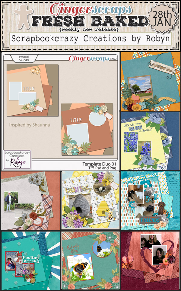
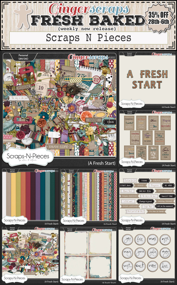
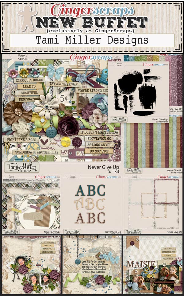
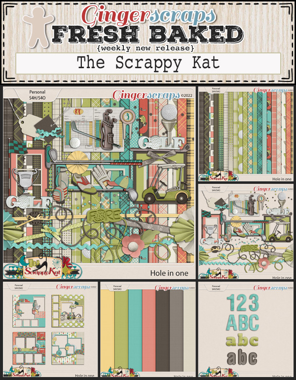
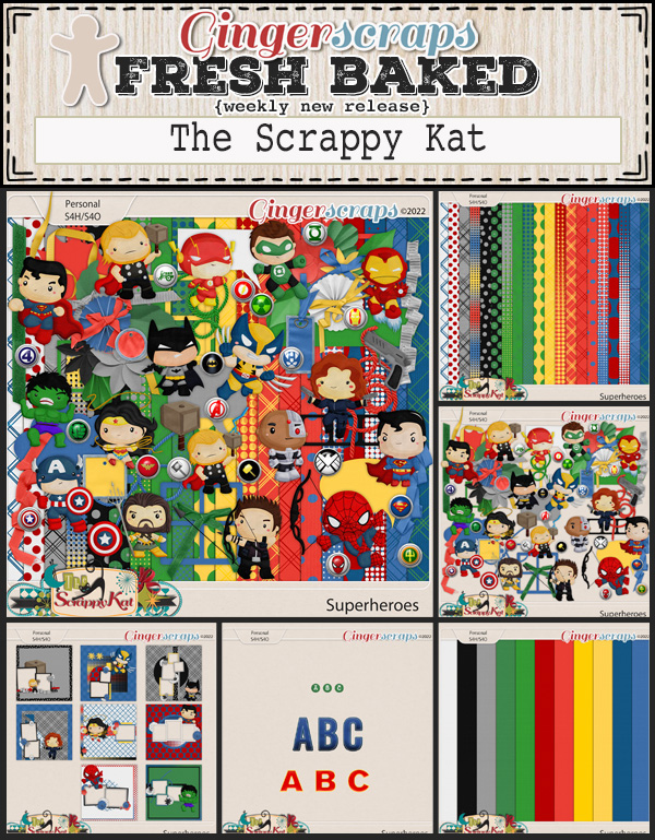
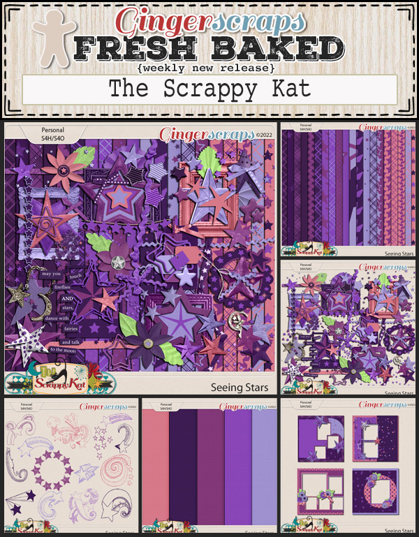
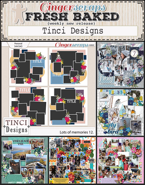
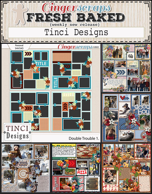
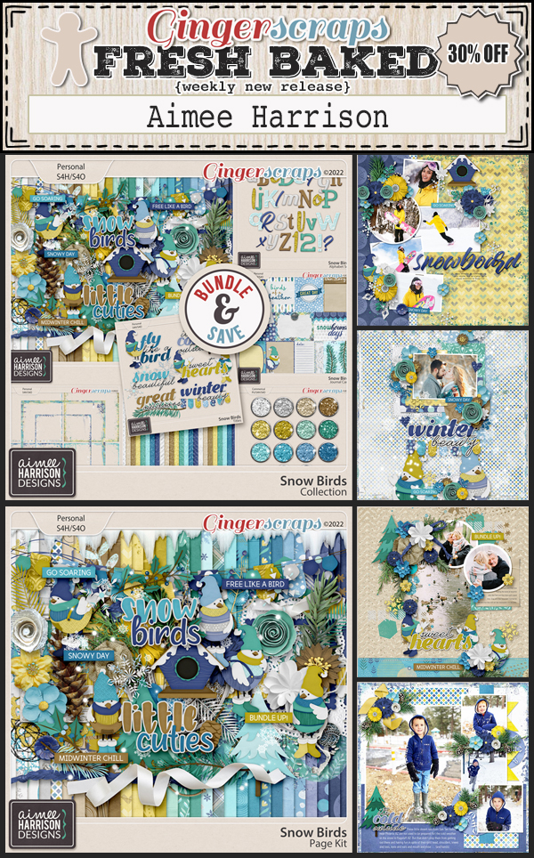
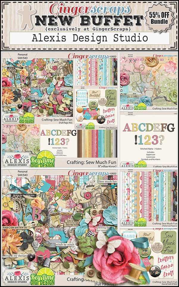
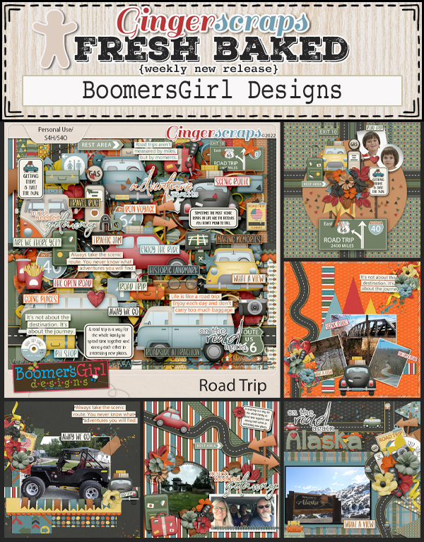
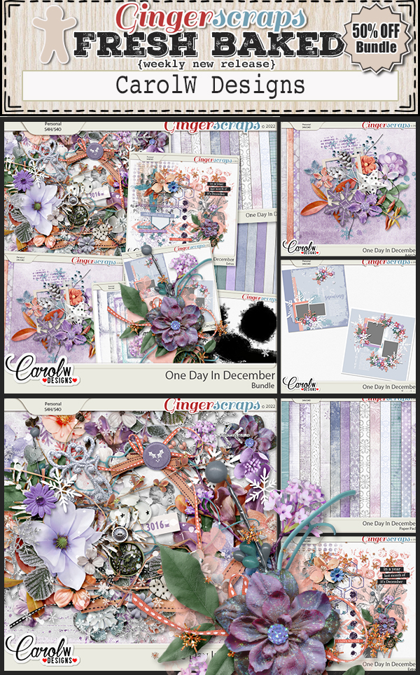
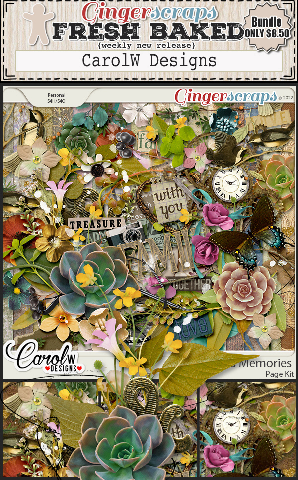
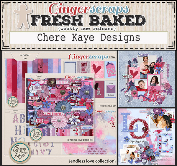
The designers have given us some great new releases for this week.

ALEXIS DESIGN STUDIO

KEY LIME DIGI DESIGN

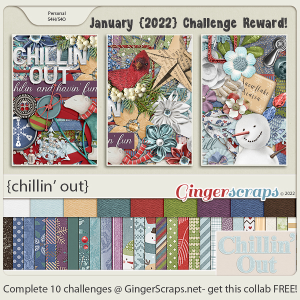
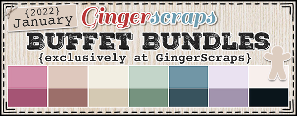
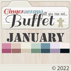
Have you completed your challenges for January yet? Only a few more days to get them posted. Complete any 10 challenges and get this great kit as a reward.

Tutorial Tuesday (Fabulous Fonts)

Romantic and Corny… Valentine’s Day Fonts

How is it even possible that January is almost over already? It’s not even like I got anything accomplished this month. Except getting back on the one med that controls my “functional dyspepsia” and also treats my insomnia… that was a good thing. Anyway, I thought we’d get a jump on Valentine’s Day and check out some new(er) fancy fonts that would be useful for layouts, wedding invitations and cards so I popped in at DaFont.com and had a look. They’re always adding new fonts (and dingbats!) so there’s often some new and unexplored (FREE) goodies there. Each of these is linked through the name of the font – bolded and in red. Just click on it and you’re there. I’ve got a dozen fonts and three sets of dingbats, so let’s have a look!

First up is Xhers Alove. As shown, both regular and italic versions are included. It would be good for titles and to draw attention to your message. Look at all those cute little heart cutouts!

Ready Lover can be manipulated in SO many ways. I’d throw a Bevel at it to bulk it up and maybe put it on top of pink or fuchsia paper. It’s a title font, without question.

I’m such a sucker for swirly script fonts. Billy Bella ticks so many boxes for me. I can see it as a subtitle or without the extra glyphs, as text. What are your thoughts?

I adore this upright script font, Hanifah. It’s sophisticated, pretty and only a little fussy. It would work nicely for journalling, I think.

This one, Romantic Dates, is a bit sturdier but swirly. It’s versatile like Billy Bella, with many options for use.

Beauty is another very useful font. Pretty, swirly but highly legible, you can use it for anything your heart desires.

Isn’t Love Match quirky? With or without the glyphs, it’s got potential.

I think I swooned a little when I saw Hello Valentine. That cupid-heart dot over the “i” is so fun! The uneven baseline and the scripty look are so current.

Valentine Soul has a broader wheelbase than some other script fonts, and it’s a great all-purpose font too!

This font is such a contradiction… compact AND zaftig at the same time! I can see it on a wedding invite pretty clearly. Lovea Hegena could even be used as a divider.

Love Story has those cute little cutout hearts, and would be a perfect title font. I might apply an acrylic Layer Style to it, and then stick it on a contrasting paper to give it real presence.

This is an older font, but I’ve never seen it anywhere else. Don’t let it throw you, it’s Kinkee in name only. It’s got so much potential too. Layer Styles would turn it into a phenomenal alpha!

Now for some dingbats. These are little pictograms tied to the alpha keys. Hey Babe looks a lot like graffiti and could be stunning on a chalkboard paper.

Loveya Doodle is chock-a-block with doodly hearts. They could be used like brushes to jazz up your background papers.

Last, but not least, Romantine Dingbat is a more solid doodly set, and I think they’d make amazing scatters. Maybe with a glitter-gloss Layer Style?

For next week’s tutorial, I’m planning another paper-to-digi technique very appropriate for Valentine’s Day. It’s coming together in my head, I just have to translate it into something approaching coherence. Til then,

PDF Version : https://bit.ly/3AMYGYw

Fresh Baked: January 21, 2022

Happy Friday! Hope you have a great week. We’re starting off with a bang this week. Make sure to head over to the store to check out the huge “Out with the Old” retiring products sale. Select items are 65% from January 21 to January 27. 

And remember, spend $10 in the store and get this full collab for free.

Let’s see what our designers have new in their stores this week.

Have you grabbed the January Monthly Mix? I really love the colors in this collab.

Don’t forget to participate in the challenges in the forum. Complete any 10 challenges and get this GingerBread Ladies collab as a reward.

Tutorial Tuesday (Individual Style)

Photo Mask Challenge with PrelestnayaP

Omigosh, the 2022 Challenges are fabulous! There are some new ones that I’m still familiarizing myself with, but I wanted to highlight the new-for-2022 Photomask Challenge brought to us by the incredibly talented PrelestnayaP Design (Irina). I’m always intrigued by how each of us interprets a Challenge based on a single, specific element and how we arrive at such unique results. For this Challenge, Irina has provided this photo mask that must be part of the layout.

I visited the Challenge Gallery and randomly (well, not exactly) selected a dozen layouts to share with you. I’ll offer my critique and why it caught my eye. Each layout will be linked to the Gallery so you can take a closer look if you like, and maybe leave a little praise for the scrapper too. Just click on the scrapper’s name!

The first layout is from etycz. She’s blended the plaid paper with a snowflake paper quite seamlessly by placing the mask the full width of the page. I suspect there’s another mask at play here too, under the Challenge mask. Then she concealed the edges of the mask with clusters. Beautiful!

PixyGirl has used the mask to create a paint swatch, and then used it again for her photo. See how the photo follows the contours of the larger painted mask?

The way chris01 has used the mask is to focus the eye on the heron in her photo, an effect she amplified by framing it with foliage. It looks like it could just fly away!

I love this layout by HalinaMiga. She’s used the mask to make the skier look like he’s surrounded by blowing snow. The stone cottage, fir tree and leafless bush with birds in it create such a charming image.

What drew me to Pippin‘s layout is the overall vintage look she’s obtained by using the mask to blend her sepia-toned photo into a dark brown background. It’s hard to tell where the photo ends and the cup-and-saucer-pitcher cluster starts.

Jill‘s layout is another example of flawless blending. The grungy paper she chose for her background is an inspired choice. Her clusters enhance the overall look of the layout and the whole effect is amazing.

Here, gmae has created an echo of sorts with the build-up of colour variation. It reflects the principle behind the cairns in her photo, careful stacking to achieve a stable foundation. And what a whimsical touch, tucking the photographer behind her cluster.

Wait! What?!! How clever of fontaine to cut the mask and rearrange the pieces to create a mask map of California! (Please tell me I’m not the only one who sees it…) Her layout is super-simple, but eye-catching nonetheless.

Katherine Woodin documents all the little moments of each day through photos and layouts. Here, she’s used the mask to frame that beautiful snow-covered mountain. The kit she chose pulls colours from her photo so accurately!

I’m positive Karen Diamond has used multiple brushes and masks for her layout. I zoomed in on it and there are so many layers of paint and snippets of paper, then a stack of paper pieces, the Challenge mask and her photo. That cluster is exquisite – balancing out the photo stack without taking centre-stage.

For her layout, Lisa Campbell has used the mask to create a paint swatch that ties the the whole layout together. Her clusters are perfectly positioned to put the focus on her photo.

And finally, NHSoxGirl has evoked a sense of dreaminess and imagination with both the photo she’s masked and the elements she’s surrounded it with that wouldn’t be there if she’d simply framed her photo.

Examining all these layouts has given me some inspiration for my own Challenge layout. Off the dig through my supplies!

PDF Version : https://bit.ly/3GIbxx8


Fresh Baked: January 14, 2022

Happy Friday!! I hope you have had an enjoyable week. I’ve been trudging through work and now preparing for a winter storm. We don’t do snow and ice well where  I am. 

Remember, any $10 spent in the store gets you this wonderful kit!

Let’s look at a sampling of the new items in the store this week.

How are your challenges going this month? Any 10 challenges completed gets you this kit as a reward!

Tutorial Tuesday (Photoshop Elements)

Build-Your-Own-TEMPLATE!

A few weeks back I asked for some tutorial topic suggestions and there were some really good ones! Steph brought up the idea of building templates from your favourite (unique!) layouts, and it was something I’d given some thought to already so it was a slam-dunk that I’d take it to the next step. The layout I created and based the save-a-cluster tutorial on last week was purposefully 100% designed in my own head with both the cluster tut and this template-creation tut too. Working Smart, Not Hard, I am.

This is the layout I’m talking about. The kit I used is Aimee Harrison‘s Winter Blush. When I create a layout I always Save As a PSD file in case I need to make some adjustments. That’s also a necessary step for turning a layout into a template.

I build layouts from the bottom up, just as I would if I was using paper and glue rather than digital supplies. That’s how I’m going to build the template too. I turned the layers’ Visibility off for clarity but if you choose not to do that, no problem!

This background layer reads to Elements like it’s completely flat, so using the Paint Bucket to fill it with a solid gray worked out.

To make it easier on the eye to distinguish between paper layers, I chose a lighter gray for the second paper layer.

Wait. What?? Oh, the grungy paper doesn’t Fill completely and cleanly with the Paint Bucket. That could be a big issue later when I go to use the template. Clipping a paper to this could look really awful!

I’m going to take you on a little detour for a second. When I was experimenting with Filling layers and Merging them to simplify things, I discovered that once the layers are Merged, the Shadow Style on the base layer becomes embedded in the image but isn’t adjustable. Adding a Shadow Style to that makes for VERY dark and odd-looking shadows. So I experimented some more and came up with this. Before I Fill the layer to create a place-holder, I Right-click on the layer and choose Copy Layer Style. Then I Right-click on the layer again and choose Clear Layer Style. That removes the Style from the layer, but puts it in safe-keeping for later.

To achieve a solid Fill on this paper, I’m going to use the Layer>New Fill Layer>Solid Color command. Each of the place-holder layers will be created the same way. (You’ll get lots of practice, and it’ll be almost automatic by the time you’re done!)

This command prompt opens up; make sure Use Previous Layer to Create Clipping Mask is ticked. That tells Elements to Fill ONLY what’s on the layer under it. You can Name the layer with the type of object you’re creating a place-holder for right here. Just delete that Color Fill 1 and type in your object. (Pardon the typo on the screenshot. Sleep is in short supply here at the moment.)

Here’s what happens when you’ve clicked OK. The Color Picker opens and the image on the workspace shows a preview of the end result. See how it’s now a Clipped layer above the patterned paper?

The utility of your template will be greatly enhanced by Selecting both the base layer and the Fill layer then Merging them. Click>SHIFT>Click on the layers then Right-click and choose Merge Layers. The keyboard shortcut is CTRL/CMD>E.

Time to add back the Shadow Style. Right-click on the layer and choose Paste Layer Style.

Now let’s do some BRADS. The process for each layer will be the same: Copy Layer Style, Clear Layer Style, Layer>New Fill Layer>Solid Color, Merge Layers, Paste Layer Style.

Merge the layers and now you’ve got a BRAD place-holder. CTRL/CMD>E

Don’t forget to Paste the Layer Style back onto the place-holder.


Here’s where we get into the real Work Smart Not Hard groove. When you have multiple identical elements on your layout, don’t make extra work for yourself. You’ve already done the work, now just make Copies! Either Right-click on the layer and choose Duplicate Layer or CTRL/CMD>J. When the Command prompt opens, remove the “copy” part of the name and click OK.


For each of the identical elements, make a Copy and move it into place. Once you’ve got them into position you can Delete the original layers. Your place-holders are on the job.

But wait! Don’t make more work for the second grouping of brads. Select all three BRAD layers and Duplicate them!!

Then move the place-holder versions into position.

You can also Delete multiple layers in a single step. Select them all, then Right-click>Delete Layers or simply click the Delete key.

Here’s my finished template, with a recap of all the steps to create the place-holder layers.

Now to Save it! You can Save As either a PSD or a TIFF, whichever is your preference. Your Layers and Layer Styles will be preserved with either format for use again whenever you want.

Figure out where you’re going to keep it, give it a unique name and choose your format. All done!

This is only one way of creating a template. To me it seems the easiest. Another way would be to use the Custom Shapes tool and replace each element on the layout with one that represents it. I may try that method and see if there are efficiencies. If I do, I’ll let you know!

Next week I’ll be doing a Challenge Spotlight. Did you see the new ones? How accommodating that we’ve been given so many more options!!

PDF Version: https://bit.ly/3txC2Bx

January 7, 2022: Fresh Baked

Happy first Friday in January! I hope your 2022 is starting off well and that you are finding time to use all those new kits you bought for Christmas. 

Remember, any $10 spent will get you this collab for free. Love these colors.

Let’s see what our designers have for us this week.

Have you gotten started on your January challenges? Only 10 completed challenges gets you this great kit as a reward.

Tutorial Tuesday (Photoshop Elements)

How Do I Build a Reusable Cluster?

Happy New Year, GingerScrappers! The holidays were quiet at our house, but exhausting anyway. In a few days it’ll be time to put all the decorations away and turn to figuring out what life will look like this year. Sort of depressing, isn’t it? Thankfully we have our digi-scrapping hobby to distract from all that!

This week’s tutorial was inspired by a question from Rachel M. She wanted to know how to create a cluster that she could save and reuse on other layouts – for themed albums, I’m guessing – with the separate layers preserved. She’d experimented but just couldn’t make it work. So I took over the experimenting and came up with a way to do it. Why keep the layers separated though? So the clusters can be modified a little, of course! To keep them from looking too contrived, to maybe substitute some of the elements, to rotate and manipulate easily while keeping the overall look consistent. Now, I’m going to climb up on the soapbox for a second before we go on… I strongly suggest you create your own unique clusters if you plan to do this. If you’re using a template created by someone else, there’s really no need to save a cluster, right? Because the original creator has already saved it… O-o-okay. Onward and upward.

This image is of the cluster I created for Magical Scraps Galore‘s January Surprise Challenge. I used Aimee Harrison‘s Winter Freeze kit (no longer available) and a photo from Pixabay for my layout. The cluster is simple, but has several layers so I figured it would be a good one for demonstrating this technique. The layers are all together in the Layers Panel to make the next step easier. As you might have noticed, I’ve used Shadow Layer Styles rather than custom shadows. I know, how unlike me! But for the cluster to be really reusable, custom shadows would need to be added to individual layers once the layout is completed. The reason for this will become a bit more clear as we work through the tutorial.

I Selected all the element layers by clicking on the top layer of the cluster, holding down the SHIFT key and clicking on the bottom layer. It works the other way too, clicking on the bottom layer, SHIFT>clicking on the top. You do what works for you!

Next, I right-clicked on a random layer. (With them all Selected, what happens to one happens to all.) Then I chose Duplicate Layers from the drop-down menu.

PSE will need you to tell it where you want those Duplicated Layers to go. If you just want to add them to the canvas you’re already working on (named Untitled-1 here), all you need to do is click OK. But for this exercise, I chose New.

PSE will create a whole new canvas and to help keep track of it, I recommend giving it a name. I went the lazy route and just called it Cluster, but if this was a cluster I planned to use over and over again, I’d give it a more descriptive name, maybe with the layout name, the kit name, the theme or a combo of all of them.

The new canvas is the same dimensions as the original one, 12×12. All the individual layers are there, all the Shadow Styles are there. To make it a little less cumbersome, I Cropped it down to a more manageable size, with a little border of white space around it for future tweaking.

Now, the reusing part isn’t quite as straight-forward. If I just drag-and-drop the layered cluster from the Photo Bin onto my layout, it comes up as a single, Merged/Flattened layer. That might be okay, but what if I decide I want to Rotate it? The Shadow Styles aren’t going to adapt to the new position! And that might be okay, unless your eye sees the inconsistency and it drives your OCD crazy. Oops, projecting!

When I Open the cluster while it’s in the Photo Bin, all the layers and Styles are still there. How can I harness that so that I can have my cluster and tweak it too?

Answer? Do the tweaking right there on the layered cluster canvas! Here I’ve used the Rotate command to Flip the cluster Horizontally, then I Filled the word strip with white and oh yeah. I rearranged things a little.

This step can be done before you play with things, rather than after like I’ve done. But the tweakability is there either way. The goal is to be able to use the LAYERED cluster again, so it will need to be Saved As a layered cluster – a Photoshop document, so make sure it’ll preserve the Layers and Color Profile. You could alternatively Save As a TIFF to save some hard drive space. Go with whichever format you’re more comfortable with.

Here I’ve Saved the PSD to the folder for my Challenge layout. If it was going to be used again and again, I might put it into the kit folder so it would be right there to mix and mingle.

Now, how is it reusable once it’s been Saved? As I said, just drag-and-drop isn’t going to work.

I could decide how I want the cluster to be oriented on the layout, adjust all the shadows to sync with the rest of the layout and then drag-and-drop. But that’s a lot of work and might need a bunch of Undo and Redo [CTRL/CMD>X and CTRL/CMD>Y]. Surely there’s a better way… one that’ll keep the layers loose. Just build the layout behind it!

But to do that I’ll need to Image>Resize>Canvas [CTRL/CMD>ALT>C] so there’s room.

I used the default center as my Anchor point but it isn’t essential. What does matter is making the Canvas the size you want your finished layout to be. I work with a transparent background, so I want that preserved too.

Bingo! All the layers are there, I have room to add papers, photos and other elements, and the canvas is the correct size to become a layout!

I just popped a paper behind the cluster layers to show you how it works. I hope this is what Rachel had in mind when she asked her question…

Next Tuesday I’m going to use this same layout as my example. Can you guess what the topic will be?

PDF Version : https://bit.ly/3EVpJRJ


Designer Spotlight: January 2022

Studio Liv

Happy New Year! I hope the dust has settled at your house and you’re getting a little chill time in. I also hope we’ve gotten an upgrade on the last couple of years. We all need a break.

With the new year, GingerScraps has been freshening up and building on past successes. Our community is the our biggest strength and the Designer Lineup is spectacular!! Let’s get acquainted with one of our newest Designers, OliviaStudio Liv. Of course, I started our chat with the most ordinary question…

J: How long have you been designing?

O: I started designing scrapbook supplies in July 2021, and I’ve been designing at GingerScraps since September 2021.

J: Ooh, you’re a real newbie! Welcome, welcome!! What made you decide to design?

O: I studied graphic design in college, and I’d given some thought to opening a shop to sell stickers and stationery. Then I tried making scrapbook kits which led to me joining GingerScraps!

J: I bet you know lots of industry-insider things the average digi-scrapper would  never know. What tools do you use  to create your designs?

O: I design using Adobe Photoshop CC and Illustrator CC. I illustrate elements using Procreate on my iPad Pro.

J: Did I call it? Now we know what you’re designing with, please tell us about your design workplace.

O: Currently I work out of my bedroom. I have a gaming PC with two monitors (a recent addition that I highly recommend). On my desk I keep my planners, iPad, and pens and markers. On the wall, I have a cork board displaying my enamel pin collection, whiteboard, and framed art.

J: So you’re a bit of a hybrid, and you sound very organized. I used to have an enamel pin collection too! But I think it got lost in a move. Here’s a hard question for you. What is your favorite kit currently in your GS store and why?

O: I really love my Very Merry Kit! I am proud of the illustrations I made for this kit.

J: So cute!! Here’s a softball question now. If money was no object, what would your perfect vacation look like?

O: Any location, but something with no agenda! Just deciding what to do as the day arrives, if anything.

J: It’s so much more relaxing to just do what you feel like doing when you feel like doing it, isn’t it? I’d say that’s what a vacation should be. What would you do if you won the lottery?

O: Pay off my college loans, help my family out, buy a home, and donate to charities.

J: Being debt-free would be like a dream, wouldn’t it? If you could have a super power, what would you like it to be?

O: Teleportation! I want to see the world without all the driving and plane rides.

J: YES! I used to wish I could just blink and be home, instead of having to drive across the city in all kinds of weather after a hard ICU shift. Have you ever met anyone who’s famous?

O: I’ve done a couple meet and greets after concerts, including BarlowGirl, Superchic[k], and Andy Mineo.

J: I have to admit, none of those names ring any bells for me. Wait while I Google them… I see they’re Christian rockers. I’m more of a country music fan. But I’ve met Fred Penner. Hahahahaha!! What did you want to be when you were small?

O: When I was a kid I wanted to be a teacher. In high school I wanted to be a photographer. Then in college I decided graphic design was more my thing!

J: Well, let’s make sure you make a living!! Ladies, Olivia has a super-sweet Daily Download for us that you can pick up right here on the Blog. Here’s a sneak peek:

And because she’s generous to a fault, she’s also giving everybody 25% off everything in her store this month!! She’s hosting the Designer Spotlight Challenge, and because she’s new, here’s some help for your chance to play along.

Check out her designs – I linked her store up there at the top of the post – and get her Spotlight month off to a roaring start!


GingerScraps: NEW Buffet, New FREE collab, New Designers & MUCH MORE!

HAPPY NEW YEAR!! We hope that 2022 brings you great health and happiness. And of course, lots of time for scrapping.

It is the 1st of the month and you know what that means, a huge, exciting newsletter! We have a New Buffet, New Monthly Mix, New Free With Purchase Collab, New Challenge Reward, New Daily Download on the GingerScraps Blog & TWO New Designers! 

Let’s start out with the December Buffet. Don’t forget to check out the Buffet Bundles. One easy click to add bundles of Buffet goodies to your cart.

I love these colors. Bold but muted at the same time.

Remember any $10 spent in the store gets you this great collab. 

This new Monthly Mix kit is perfect for the the upcoming snowy season (for those that get snow).

Now to the December Daily Download Sneak Peek. This month’s Daily Download is from Studio Liv.


We don’t have any guest designers this month but we do have TWO permanent designers to announce!!

So happy to announce that Lisa Rosa Designs and The Scrappy Kat will both be staying on at GingerScraps permanently!

Take a look at the new challenge reward kit. If you complete any 10 challenges this month, you get this gorgeous collab as a reward!

Let’s see some of the sample layouts provided by our amazing store Creative Team.